The Transform module is a powerful tool for creating captivating 2D and 3D animations, adding depth and motion to your web pages.
Head over to Style Panel > Transform on the right-hand side of your screen to start playing with this module.
Basic Transformations
The Transform section offers four different types of transformation:
- Move
- Rotate
- Scale
- Skew
Move
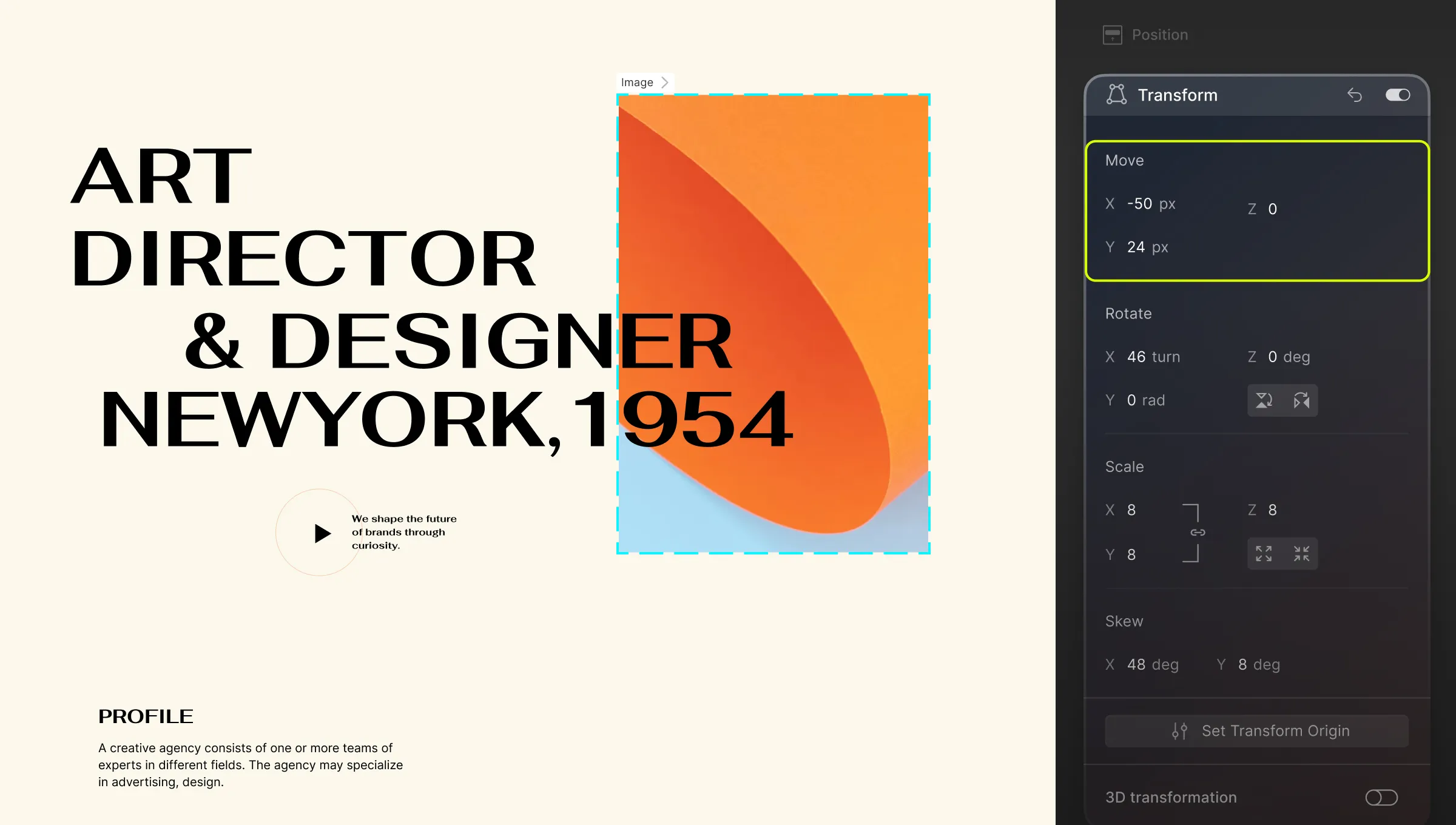
As the name suggests, the Move Transform lets you shift your element across the page without affecting any of the other elements.
- X: Move the element horizontally to the right.
- Y: Move the element vertically downwards.
- Z: Move the element forward or backward i.e. into or out of the page.
Similar to Rotate, you must apply 3D Transformation and set the Perspective for Move Z to have any effect.
Rotate
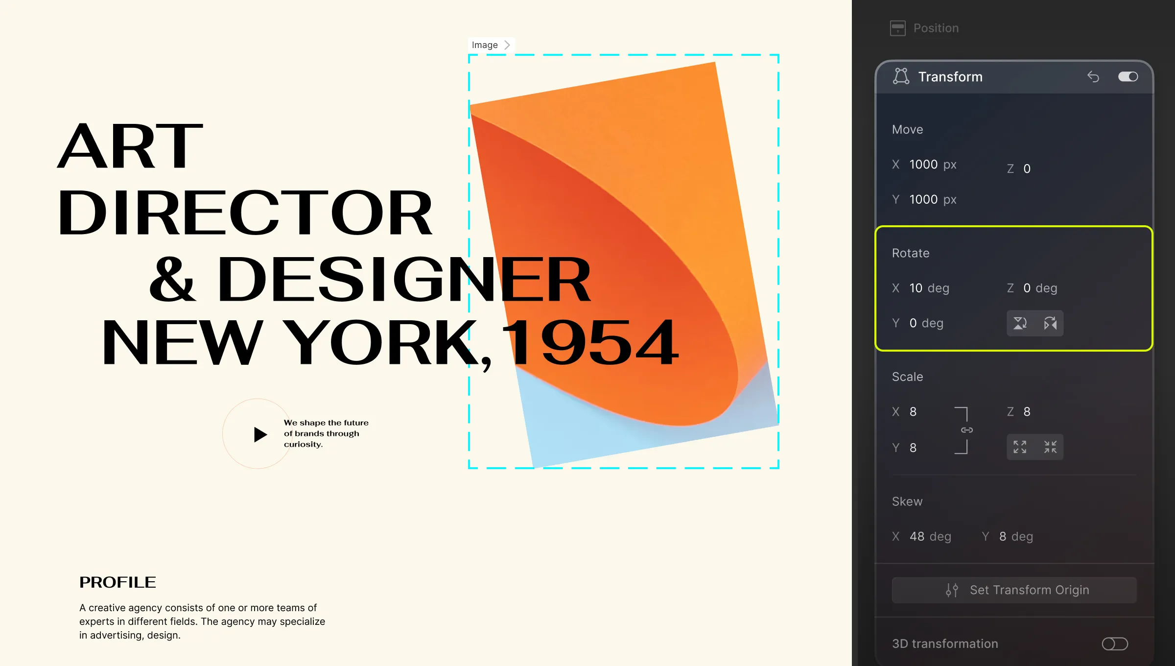
Using Rotate Transform, you can tilt your element by any given angle.
- X: Rotate the element along the X axis or in other words horizontally.
- Y: Rotate the element along the Y axis or in other words vertically.
- Z: Rotate the element along the Z axis.
The two toggles below Z Rotate allow you to tilt the element 15 degrees clockwise or anti-clockwise respectively.
On its own, rotating along the X or Y axes will result in a flat, 2D Effect, and rotating along the Z axis will have no effect at all. To get a 3D effect, you’ll have to do the following:
- Select the parent element which may be a div, section, etc.
- Go to Transform and enable 3D Transformation.
- Set the Child Perspective to 1000.
Doing this should switch the Move effect to a 3D perspective instead of simply 2D.
Scale
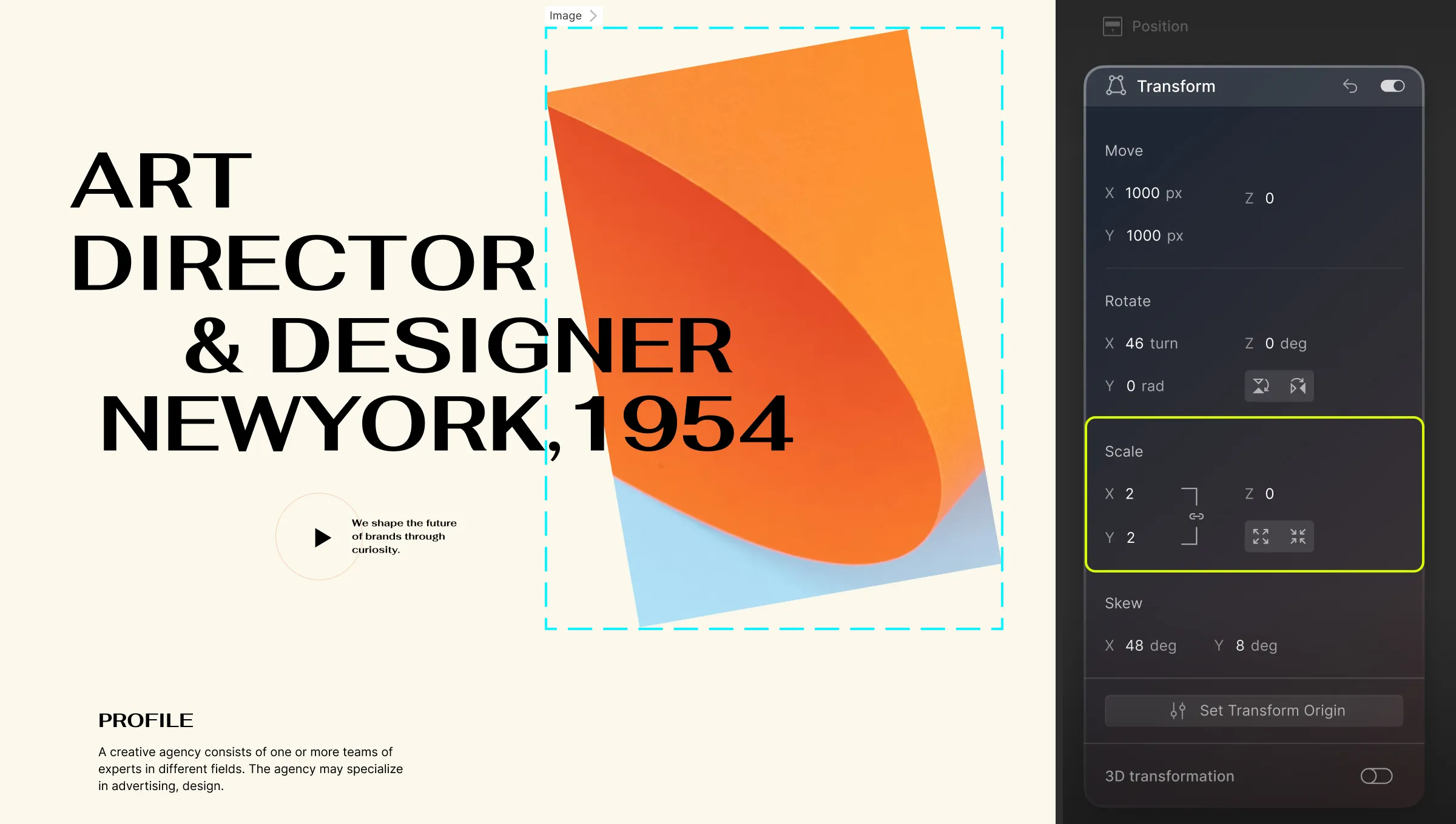
The Scale Transformation lets you increase or decrease the size of an element.
- X: Transform your element to have greater width.
- Y: Transform your element to have greater height.
- Z: Scale your element along the Z-axis. This effect works well when a parent element has children with varying Z values for either Move or Rotate. (More on how this works later in the documentation!)
💡 Tip: Click on the link icon to link X and Y values which will cause elements to scale proportionately.
You can also use the two buttons below the Z-axis toggle to proportionately scale your element to be bigger or smaller.
Skew
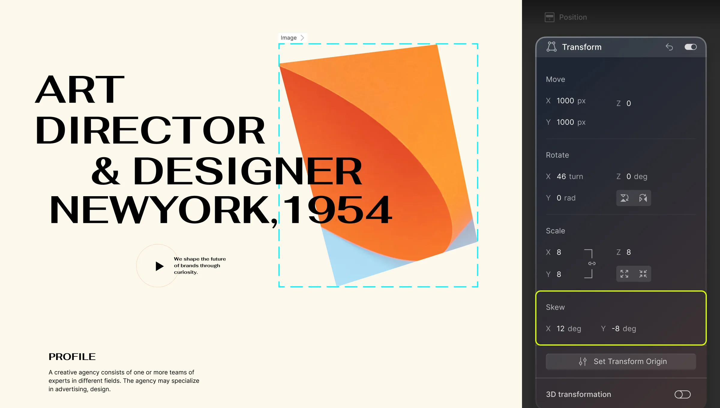
Using the Skew feature you can stretch your element.
- X: Stretch your element along the x-axis.
- Y: Stretch your element along the y-axis.
Fun Fact, know that for Skew, 3D Perspective doesn’t affect any change.
Set Transformation Origin
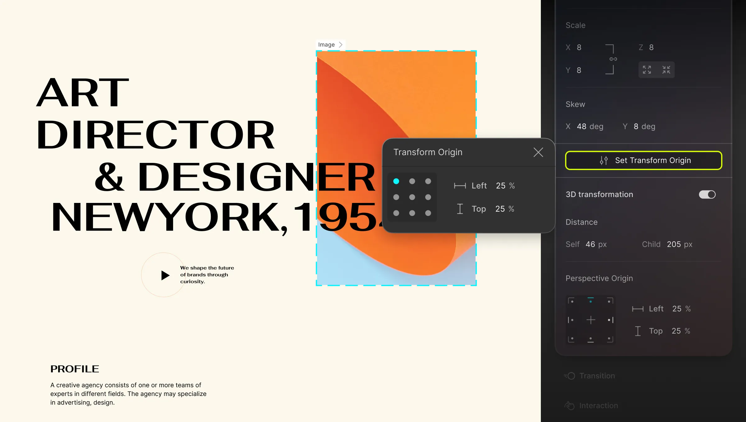
You can define the point from which the transformation originates. By default, this point is at the element’s center. You can set the origin using the grid model or the input fields on the right.
- Right: Set the Origin’s distance from the left edge.
- Top: Set the Origin’s distance from the top edge.
3D Transformation
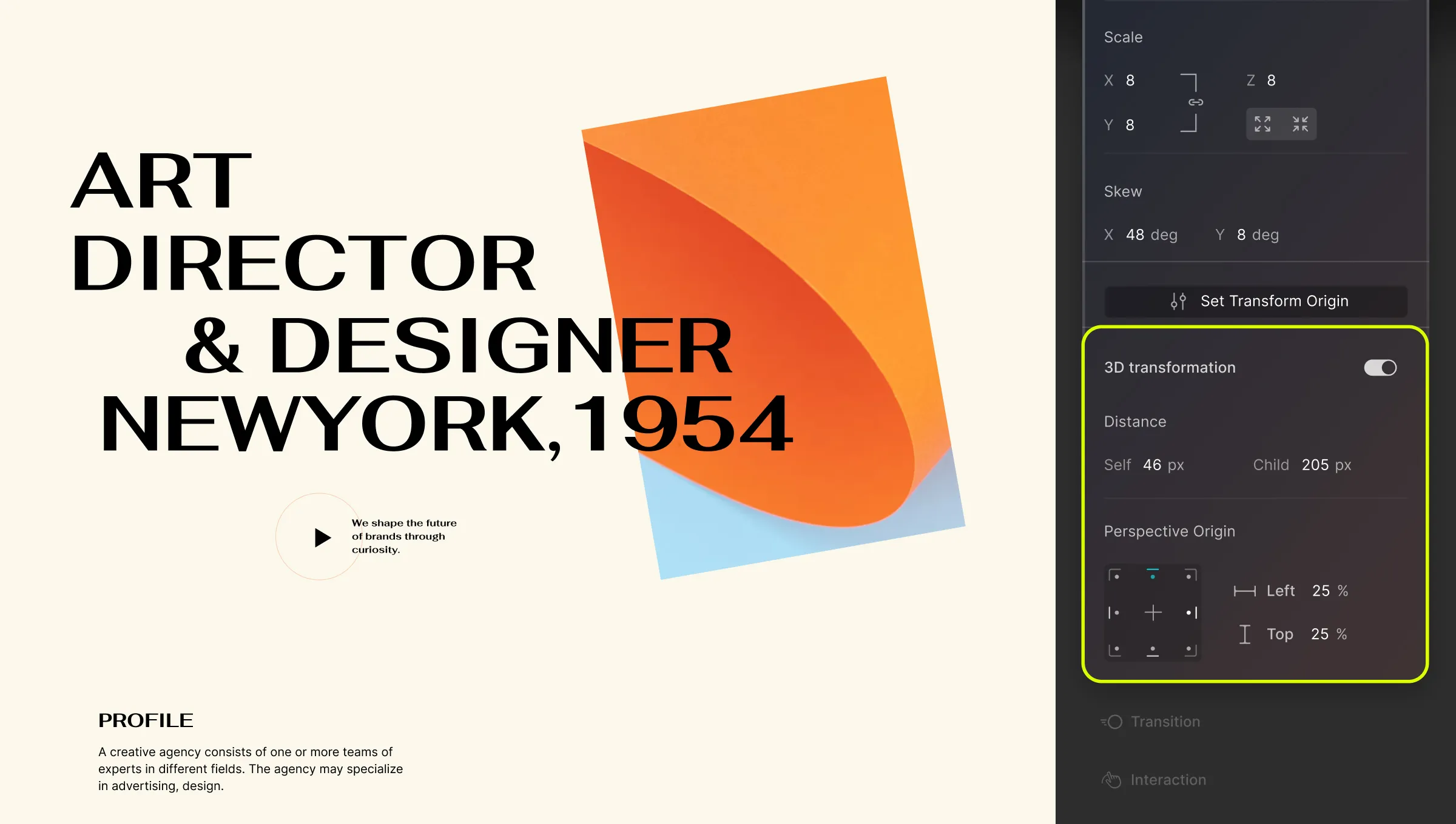
Enabling 3D Transformation is where the magic begins. It allows you to set the Perspective, which represents the 3D view on a 2D plane. This Perspective provides depth to 3D Compatible transformations.
Perspective can be set in two ways under the Distance section:
- Self: Applies to the element and its children. Distortion is relative to this element.
- Child: Applies to all child elements. Distortion is relative to the viewport.
Self Perspective
To set the Self Perspective:
- Select the element you want to transform.
- Then, go to Transform > 3D Transformation > Distance
- Set the value for Self.
As previously mentioned, this distortion will be relative to this element and because of this nature, Self Perspective works best when you’re transforming a single element.
Child Perspective
Similarly, to set the Child Perspective:
- Select the parent element that contains the child elements you want to transform.
- Go to Transform > 3D Transformation > Distance.
- Set the value for Child.
As you may know, this distortion is relative to the viewport. This means that the parent element acts kind of like a camera through which the elements are viewed.
In contrast to Self Perspective, Child Perspective is more realistic and is especially great when transforming multiple elements.
Perspective Origin
Following this, you can set your Perspective’s origin, i.e. at which position the user is looking at the element. Similar to Transformation Origin, you can use the grid model to set this or use the input fields on the right to define your own values:
- Left: Set the Origin’s distance from the left edge.
- Top: Set the Origin’s distance from the top edge.
Scale Z
Using the Scale Transformation, you scale an element along the X, Y, and Z Axes. But unlike Scale X and Y, the true effect of Scale Z is not as obvious on its own. But in the right setting, Scale Z is a highly powerful feature.
As mentioned earlier, you will notice its true effect when applied to a parent element that contains a group of child elements with varying Z values (for Move or Rotate).
Scale Z Explained In Action
Let’s now go over exactly how you can make this feature work.
Consider a scenario where you have a Section containing a Container, which, in turn, holds three SVG Icons.
To grasp the concept, follow these steps:
- Child Perspective: Begin by selecting the Section. Set its Child Perspective to 1000px. Achieve this by navigating to Transform > 3D Transformation > Distance.
- Container Rotation: Proceed to select the Container. To better visualize the Scale Z effect, rotate the Container horizontally using a 50px Rotate X setting.
- Icon Z-Move: Apply the following settings to the three Icons within the Container:
- Icon 1: Move Z by 10px
- Icon 2: Move Z by 20px
- Icon 3: Move Z by 30px
- Container Scale Z: Return to the Container and set its Scale Z value to 2. Observe how the effect appears to double the three Move Z values.
Basically, increasing or decreasing the Scale Z of a parent element will increase or decrease all varying Z values of the child elements be it Move Z or Rotate Z.
Adding 3D Animation Effect on Hover
Transform offers exciting possibilities for interactive animations. Let’s create a turning effect on images when hovered over:
Setup Your Page
- Design your page by starting with a Section element.
- Inside the Section, insert a Flex element with 3 Flex Tracks.
- Add an Image element to each Flex Track and choose the media you want to use for each Image. Use the Add From Media button for this purpose.
- Set the Flex’s alignment to Center and justify it to Space Evenly.
Transform Your Elements
Now, let’s turn our images so that they face away from the user. Do the following to achieve this:
- Select the Section and go to Transform.
- Enable 3D Transformation and set the Child Perspective to 1000px.
- Select the first Flex Track and rotate it vertically by 60 degrees. You can do this by going to Transform > Rotate and setting the Y value to 60.
- Repeat the same for the other two as well.
Animate on Hover
Your images should now appear turned to one side. Let’s add the animation:
- Select the first Flex Track again.
- From the Class & Sub-class section on the right, click on the expansion icon to reveal the States Menu.
- While the Flex Track is selected, switch to the Hover state.
- Within the Transform settings, set Rotate Y to 0.
- Repeat these steps for the other two Flex Tracks.
Get a Smoother Transition
The images should now turn towards you when hovered over. However, the animation might look abrupt. Here’s how to fix it:
- Once more, select the first flex track.
- Then, from the Style Panel, go to Transition.
- Click on the + icon to add a new Transition and from the new pop-up window set the type as Transform, Duration to 300ms, and Timing Function as Ease.
- Now repeat the same for the other two as well.
And this is just one example of 3D Animation and you can apply the same concept to add any kind of animation to any elements of your choice.
