The Borders section in Droip’s Style Panel allows you to add and customize borders or outlines around elements.
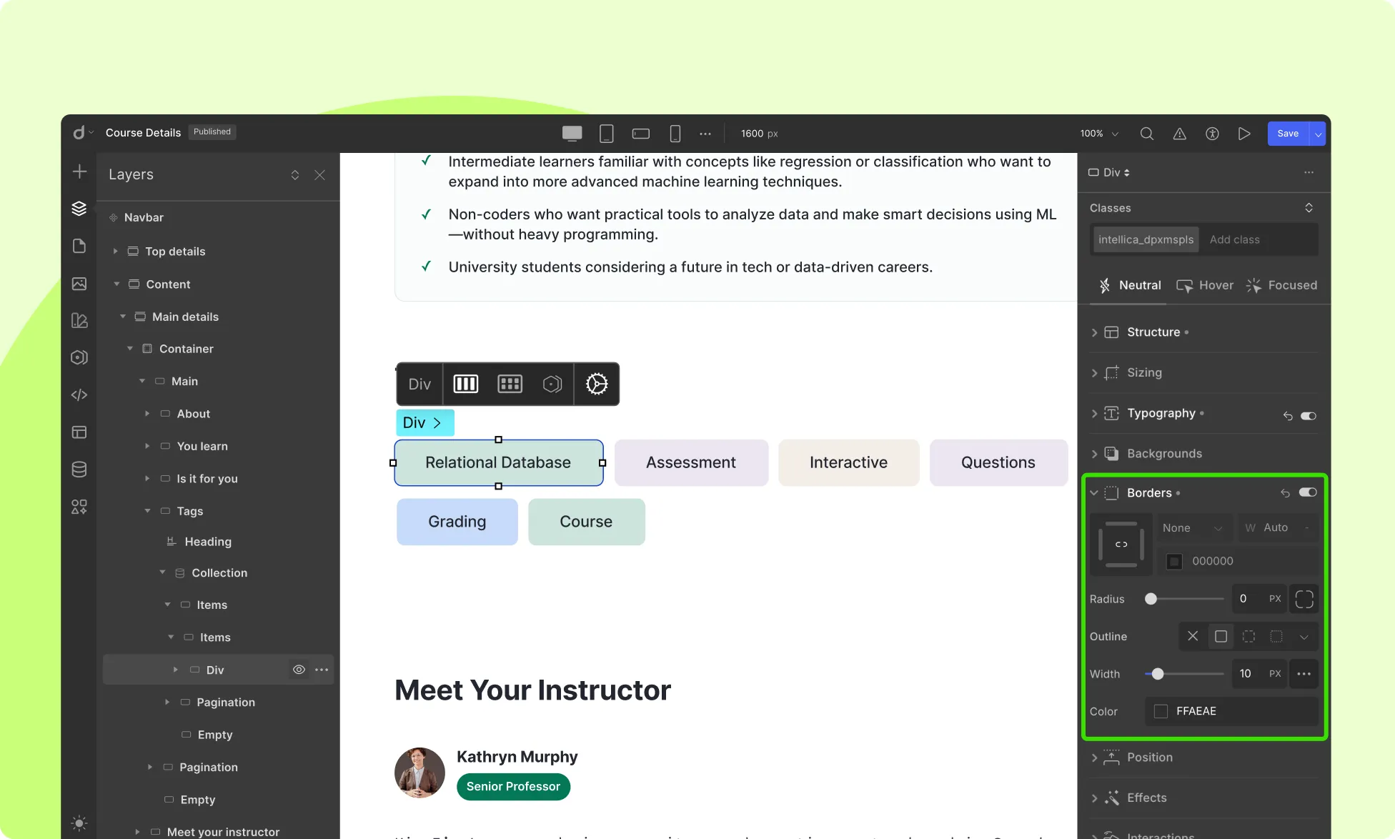
Border
A border consists of lines drawn around an element’s edge, enclosing its content. You can adjust the following options:
- Size: Define the size of the border and its unit.
- Color: Select the color of the border.
- Radius: Set the corner radius for rounded corners.
- Individual Radius: Click on the small border icon beside the Radius input field to customize corner radius individually for each corner.
Individual Border
Droip’s border control lets you individually style each side (top, right, bottom, left) of an element’s border. You can:
- Click on each side of the border icon to activate/deactivate it.
- Apply different border widths, colors, or styles to each side independently.
This is especially handy when you want subtle detailing like a bottom-only underline effect or asymmetrical card designs.
💡Tip: Use this feature to set one edge of an element a lighter color than the other three to create a 3D effect as shown in the image above.
Visibility
Click on the eye icon to disable/enable the visibility of the border.
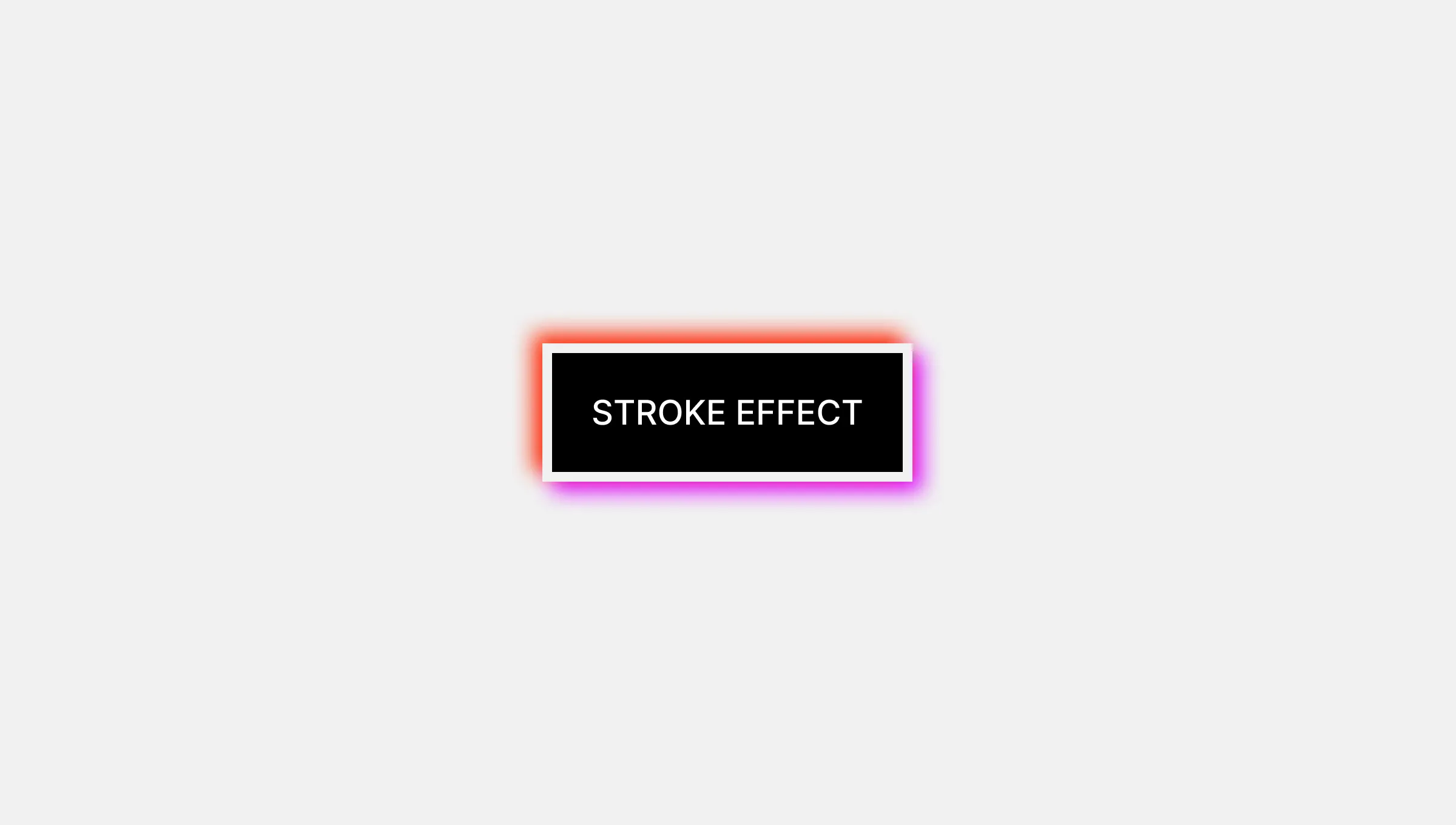
Outline
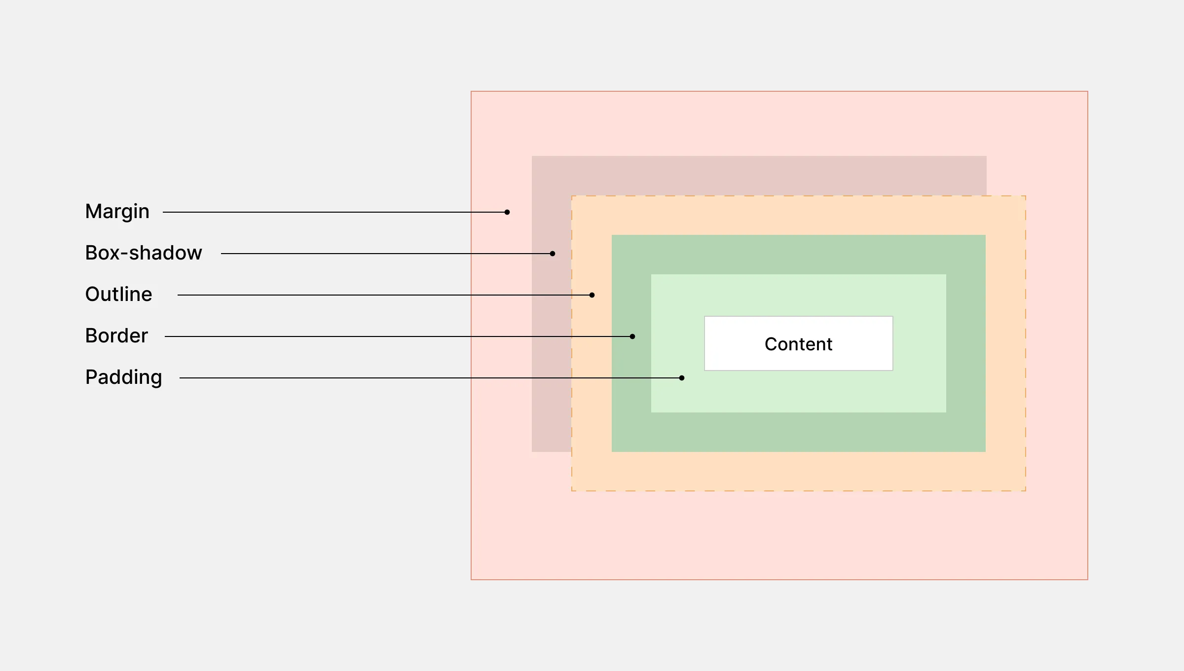
Outlines fully enclose an element and are drawn outside its edges. Customize your outline with the following options:
- Size: Define the size of the outline and its unit.
- Color: Select the color of the outline.
- Offset: Set the space between the outline and the border/edge. Click on the ellipsis icon to access this property.
- Visibility: Toggle the outline’s visibility using the eye icon.
Styles
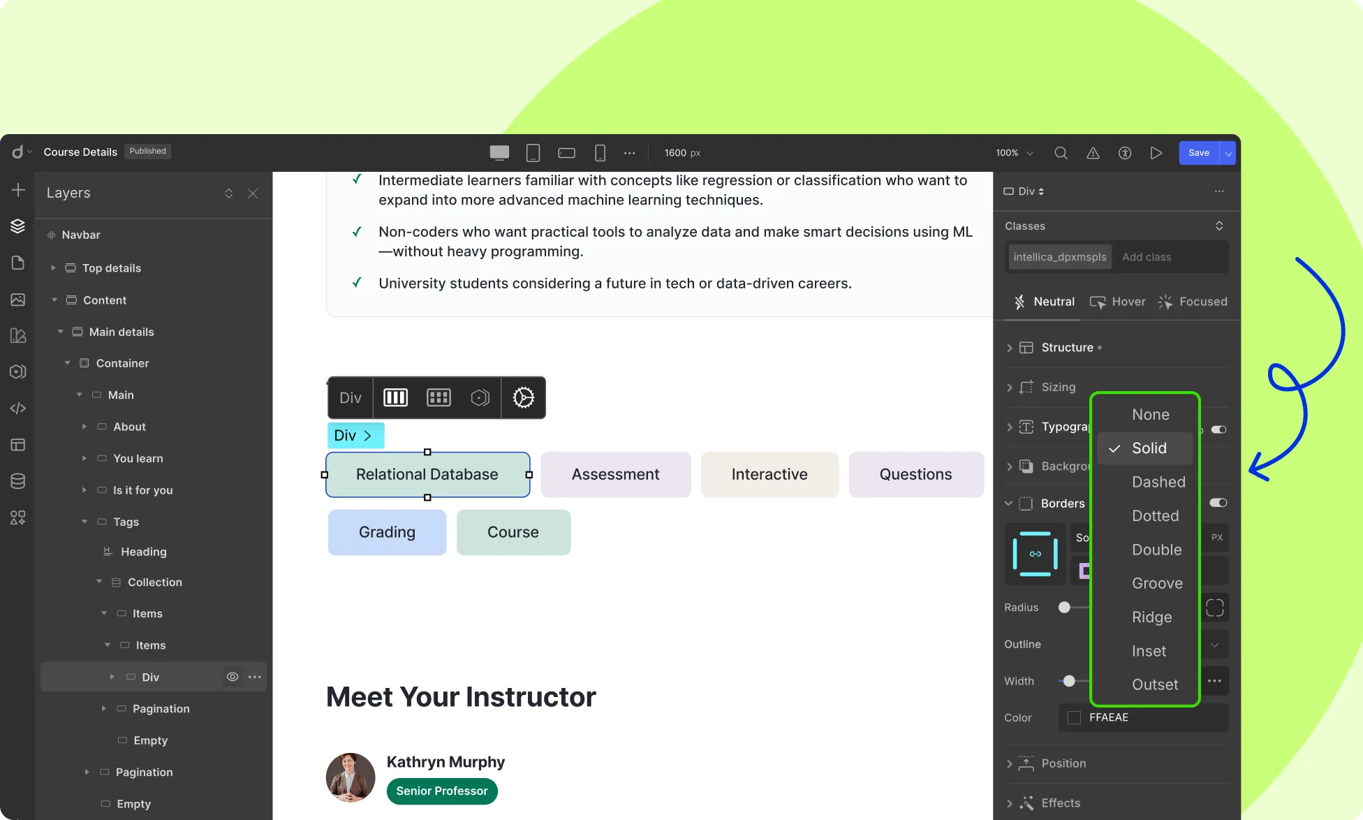
You can choose from various styles under the Border and Outline Tabs:
- Solid
- Dashed
- Double
- Dotted
- Outset
- Inset
- Grooved
- Ridge
- None
Use Cases
Borders and outlines can be used creatively to enhance your designs:
- Emphasizing Elements: Use bold borders to draw attention to specific elements.
- Creating Depth: Apply subtle outlines to give elements a sense of depth and separation.
- Highlighting Interactivity: Add dynamic transitions to elements on hover or focus states.
Using Borders For Animated Transitions
You can use borders to emphasize elements during Hover or Focus states. Here’s an example involving an Image element but this can be applied to other elements too:
- Select your Image element and from Style Panel > Borders, set its border size to 8px and radius to 100%. Also, select a color for your border from here.
- Then, go to Style Panel > Class & Sub-Class > States Menu. (If you don’t see the States Menu, don’t forget to click on the Expand icon on this section’s top-right.) and select the Hover state.
- Next, go back to the Borders section, and set the border size to 0px and the radius to 0%.
Now set up a Transition for smoother border appearance:
- Go to Style Panel > Effects > Transition and click on the + icon to add a new transition.
- On the new pop-up window, click on the dropdown on the top-left and select the Border Radius option as the transition property.
- Set the Duration as 300 ms and the Timing Function as Ease and you’re done!
Click on the Preview icon which you’ll find on the right side of the Top Bar to see this transition in motion.
Best Practices
For effective design with borders and outlines, consider these best practices:
- Consistency: Maintain consistent border widths, colors, and styles for a cohesive design.
- Contrast: Ensure sufficient contrast between borders and backgrounds for visual appeal.
- Accessibility: Use contrasting colors for borders to aid users with visual impairments. Also, ensure sufficient contrast between elements and background.
Was this page helpful?