In the Style Panel > Sizing section, you can adjust the Width, Height, and other measurements for your element.
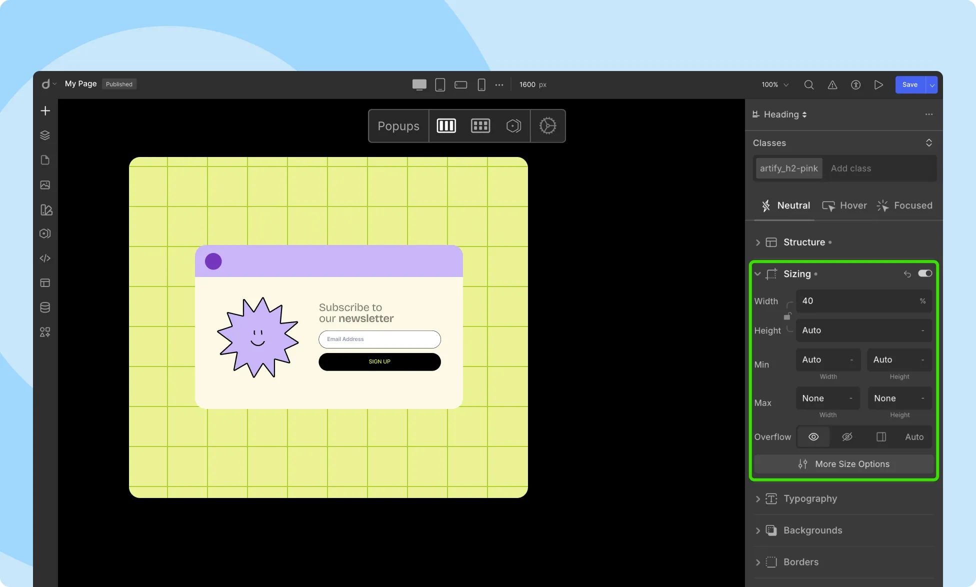
Customize the dimensions of your element with precision:
- Width (W): Set the Width of your element.
- Height (H): Set the Height of your element.
By default, these dimensions are defined as auto, meaning the element will occupy the size of the container.
💡 Tip: You can also adjust width and height by dragging any of the elements’ side handles.
Minimum Dimensions
Define the minimum width and height of the element from here. Here’s how this property affects the appearance of an element:
- Width: If the content is smaller than the minimum width, the minimum width will be applied. If the content is larger, this property is ignored, preventing the width from becoming smaller than the defined minimum.
- Height: Similarly, if the content is smaller than the minimum height, the minimum height will be applied. If the content is larger, this property is ignored, preventing the height from becoming smaller than the defined minimum.
Maximum Dimensions
Define the maximum width and height of the element from here. Here’s how this property affects the appearance of an element:
- Width: If the content is larger than the maximum width, the element’s height will automatically adjust.
- Height: If the content is larger than the maximum height, overflow occurs. The container handles this according to the overflow property. If the content is smaller, the maximum height is ignored, preventing height from exceeding the defined maximum.
Clip Content

By default, the Overflow of an element is set to Visible, meaning it’s not clipped and can extend outside the element’s box. However, using the Clip Content option, you can specify how overflow will be handled.
To enable this function, check the checkbox. You’ll have three options to choose from:
- Hidden: Overflow is clipped, and the clipped portion of the content is not visible.
- Scroll: Overflow is clipped, but a scroll bar is added to view the clipped content.
- Auto: If overflow is clipped, then a scroll bar is added for the remaining content.
Keep in mind that this property only works for elements with a specified height.
Fit
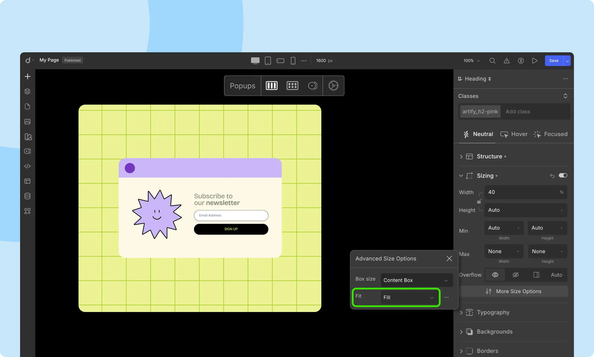
Use the Fit property to define how replaced content fits its container. Choose from options like:
- Cover: Replaced content is sized to maintain the aspect ratio while filling the whole content box of the element. If their aspect ratio does not match, then the object is cropped to fit.
- Contain: Replaced content is scaled to maintain the aspect ratio while fitting inside the content box of the element. The object is made to fill the box while keeping the aspect ratio.
- Fill: Replaced content is sized to maintain the aspect ratio while completely filling the whole content box of the element. If their aspect ratio does not match, then the object is stretched to fit.
- Inherit: This is a Global keyword. Property behaves according to this element’s parent.
- Initial: This is a Global keyword and resets a property back to its initial default.
- None: Replaced content is not resized.
- Unset: This is a Global keyword. For an inherited property it behaves like Inherit and for a non-inherited property, it behaves like Initial.
- Scale-down: The content is sized as in None or Contain, whichever version is the smallest.
- Revert: This is a Global keyword. For an inherited property it behaves like Inherit and for a non-inherited property, it reverts to the value specified in the browser stylesheet.
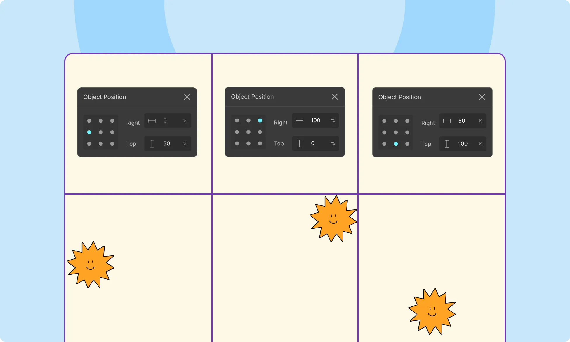
Object Position
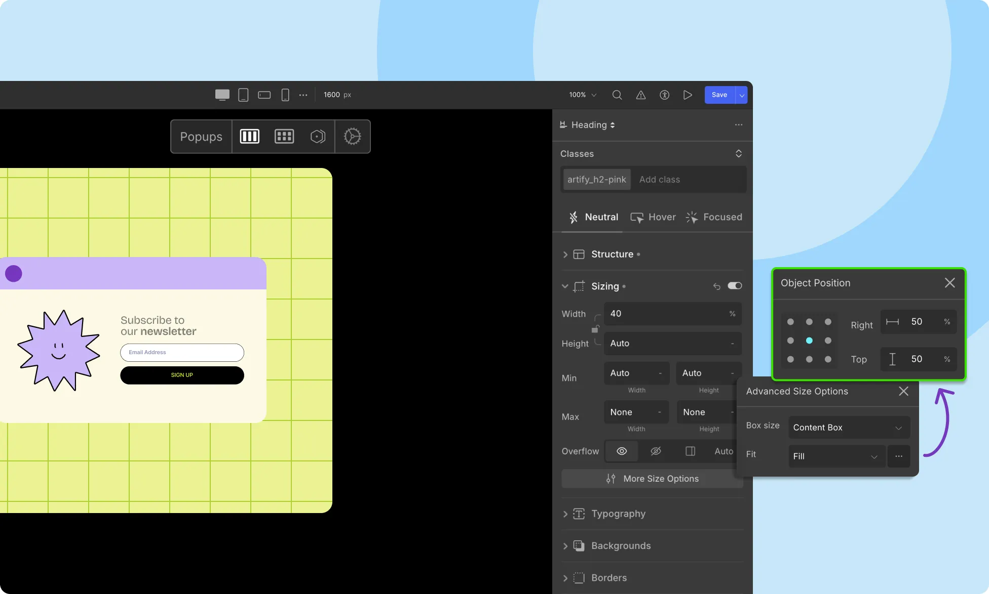
The Object Position property defines the alignment of the content of the selected replaced element. You can open its window by clicking on the ellipsis icon beside the Fit option.
Below is a description of the two toggles used to adjust this property:
- Right: Define by what percentage the object will be offset to the Right.
- Top: Define by what percentage the object will be offset from the Top.
The initial value of this property is 50% by 50%, which positions the content at the center of the container. You can adjust these values to align your content top-left, bottom-right, etc.
You can also use the Grid Toggle to set the Object Position. Simply click on any one of the dots to make your content follow the same alignment. Below are a few examples of how this property works.
Was this page helpful?