Buttons are essential elements in web development used to prompt user actions, such as submitting forms, canceling operations, or navigating to different pages. This guide will walk you through how to add and customize buttons using Droip.
Adding a Button
To add a button to your web page, follow these simple steps:
- Open the Insert > Elements panel on the left sidebar.
- Drag and drop the Button element onto the canvas.
Customizing the Button
With Droip, you have full control over the appearance of your buttons. You can easily customize various properties to match your brand’s identity and engage your users effectively.
Changing Button Text & Font
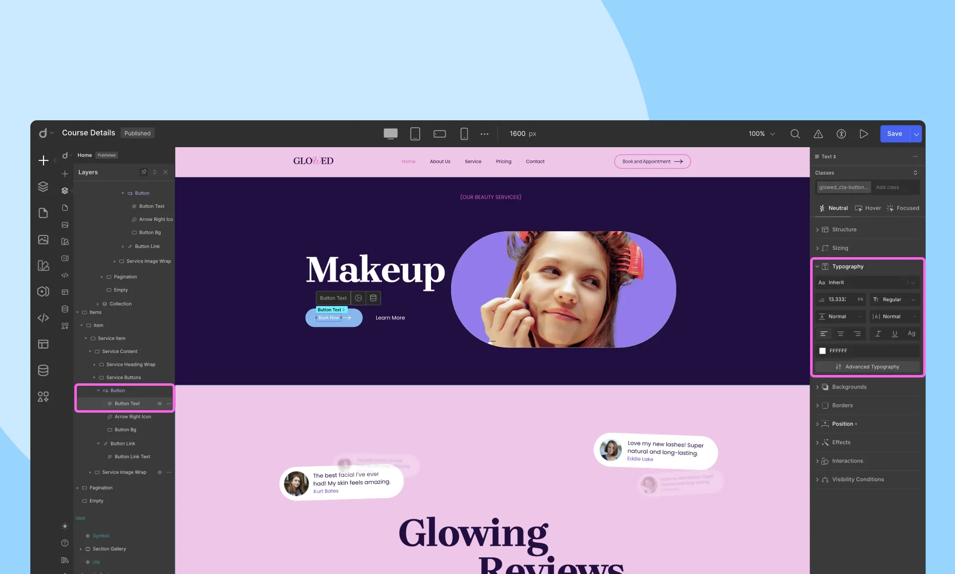
To edit the button text, simply double-click on the text to start editing. To modify the font and other typography styles, use the Style panel on the right sidebar.
You can also change the text color, style, and contrast ratio from the Button Inline editor.
Changing Background Color
To add a background color to the button, follow these steps:
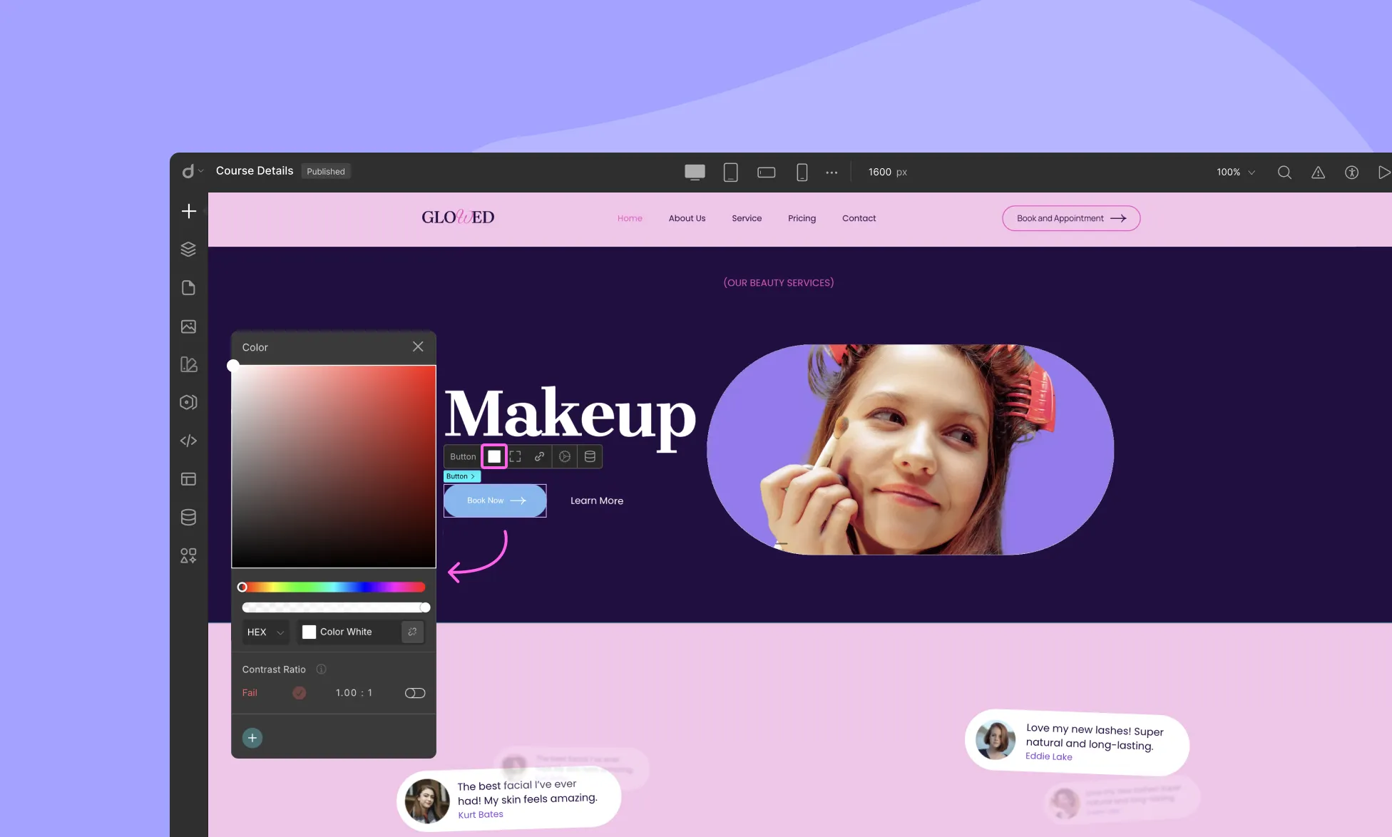
- Select the button and go to the Style panel on the right sidebar.
- Scroll down to Backgrounds.
- Choose a color from the color picker to set the background color.
Changing Corner Radius
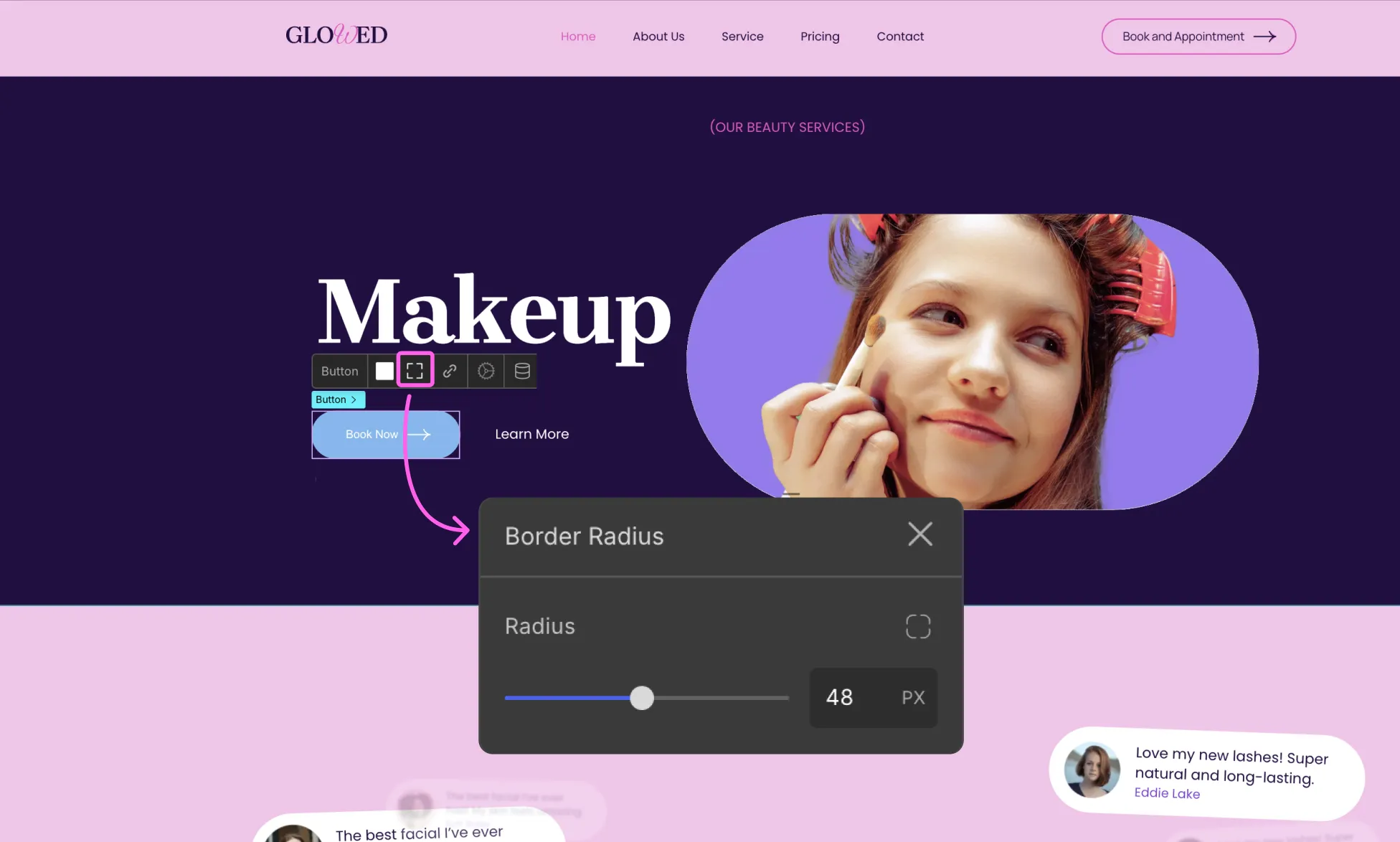
The Corner Radius defines whether the border corners are rounded or straight. Click on the button to open its inline editor and select the border radius. Here, you can adjust the Border Radius value in pixels or percentage.
For further customization, you can also set the border radius for each corner individually by clicking on the Radius icon.
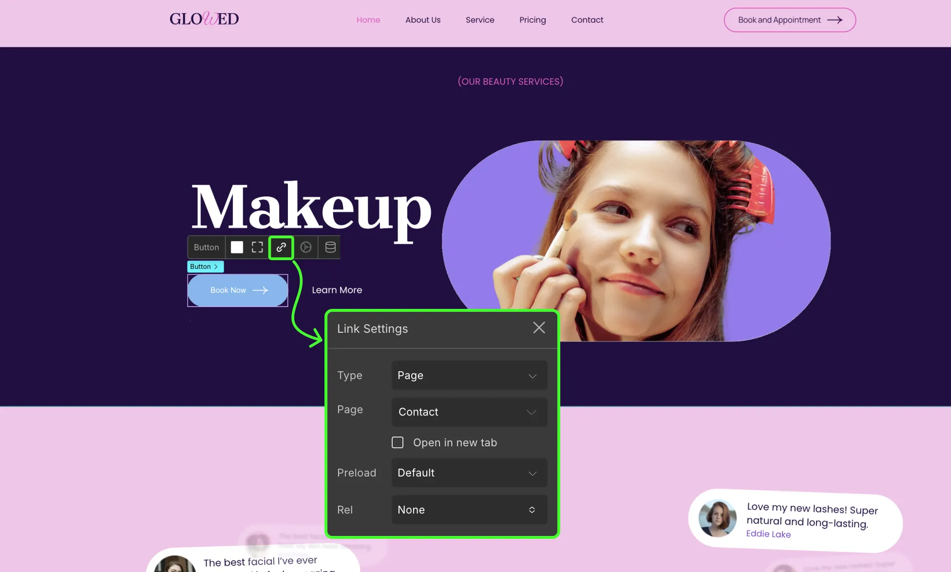
Adding a Button Link
Buttons can serve as links to various destinations. You can link a button to the following:
- Web Address: Enter the URL of the page you want to link to in the field below. Tick the checkbox to enable Open in New Tab.
- Email: To link an Email, enter the Email address and the Subject in the available fields.
- Page: Select the Page you want to link from the following drop-down list and tick the checkbox for it to Open in New Tab.
- Phone Number: Enter the Phone Number you want to link along with its country and area code in the following field.
- Section: Type in the Section Id in the text field below to link to a particular Section that is on this page.
- Pop-up: Select the Pop-up you want to link from the following drop-down list.
Changing Button Color on Hover/Focus State
Enhance the user experience by changing the button color when transitioning between none and hover/focused state.
To change the background color on hover:
- Go to Style Panel.
- In the element state controls (Neutral / Hover / Focused), choose Hover.
- From the background section, select a different color from the color picker.
Creating a Download Button
Download buttons are another necessary feature of any webpage. To create a download button, follow these steps:
- Copy the source URL of the file you want users to download. Ensure that the URL is the complete link address, not a shortened version.
- Select the button you want to use as the download button and access the link settings.
- Choose Web Address as the link type.
- Paste the copied URL into the provided field in the link settings.
- Close the link settings window and preview your webpage. Clicking on the button should initiate the file download.
For further customization, you can utilize the custom attributes feature of Droip to customize the name of the downloaded file.
Was this page helpful?