The Flexbox layout provides a highly efficient way to organize, align, and distribute space among items within a container. It allows elements to expand and fill available free space or shrink to prevent overflow.
The flexbox layout is direction-agnostic as opposed to the regular layouts. It is:
- Vertically-based
- And, inline which is horizontally-based
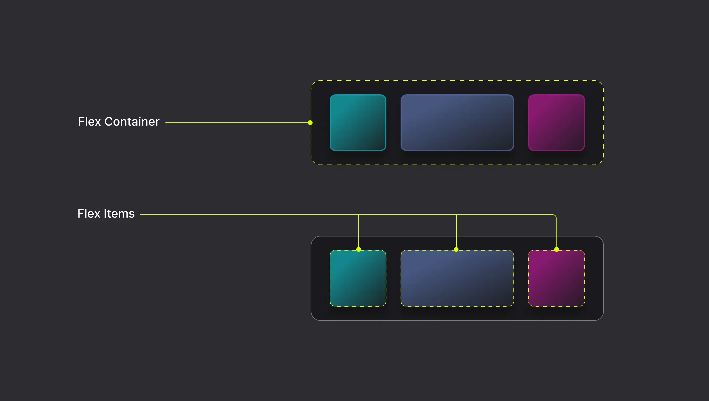
Flex Container and Flex Items
A Flex Container is the parent element and the direct children of that element become Flex Items.
How to Add a Flex
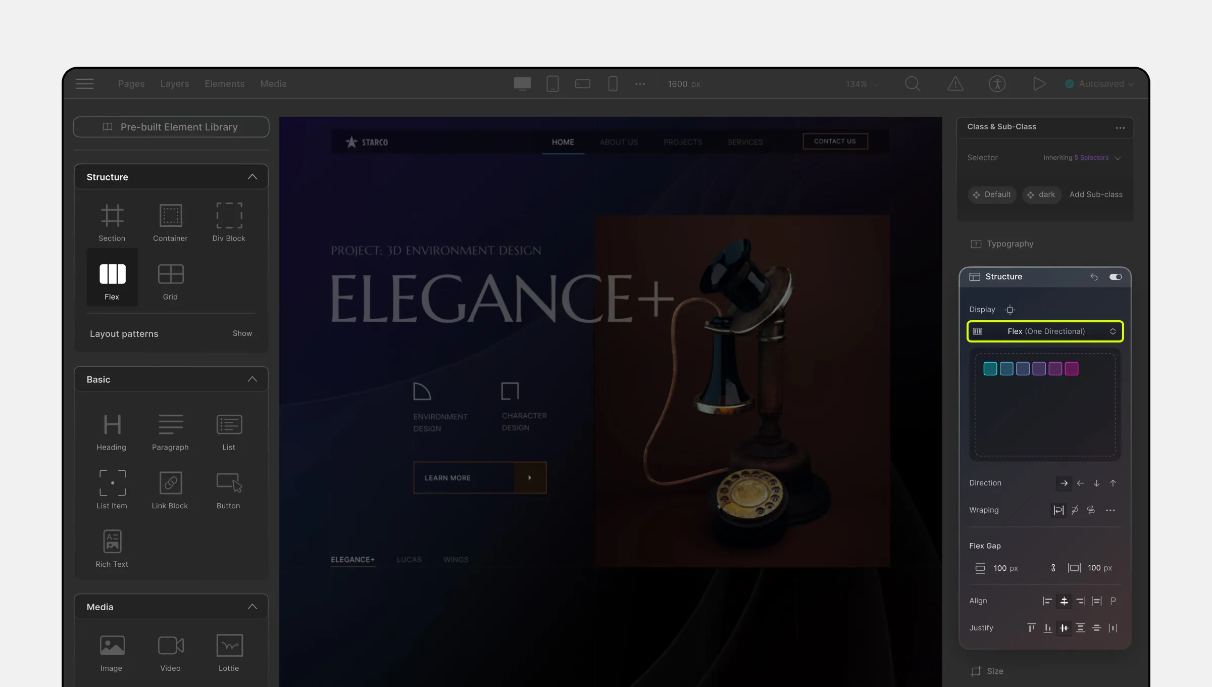
To enable the Flex display for any element that contains other elements inside it:
- From the right-side panel, go to the Structure section.
- Select Flex (one-directional) from the drop-down menu.
Alternatively, you can add a Flex element to your page from the Elements Panel to start from scratch.
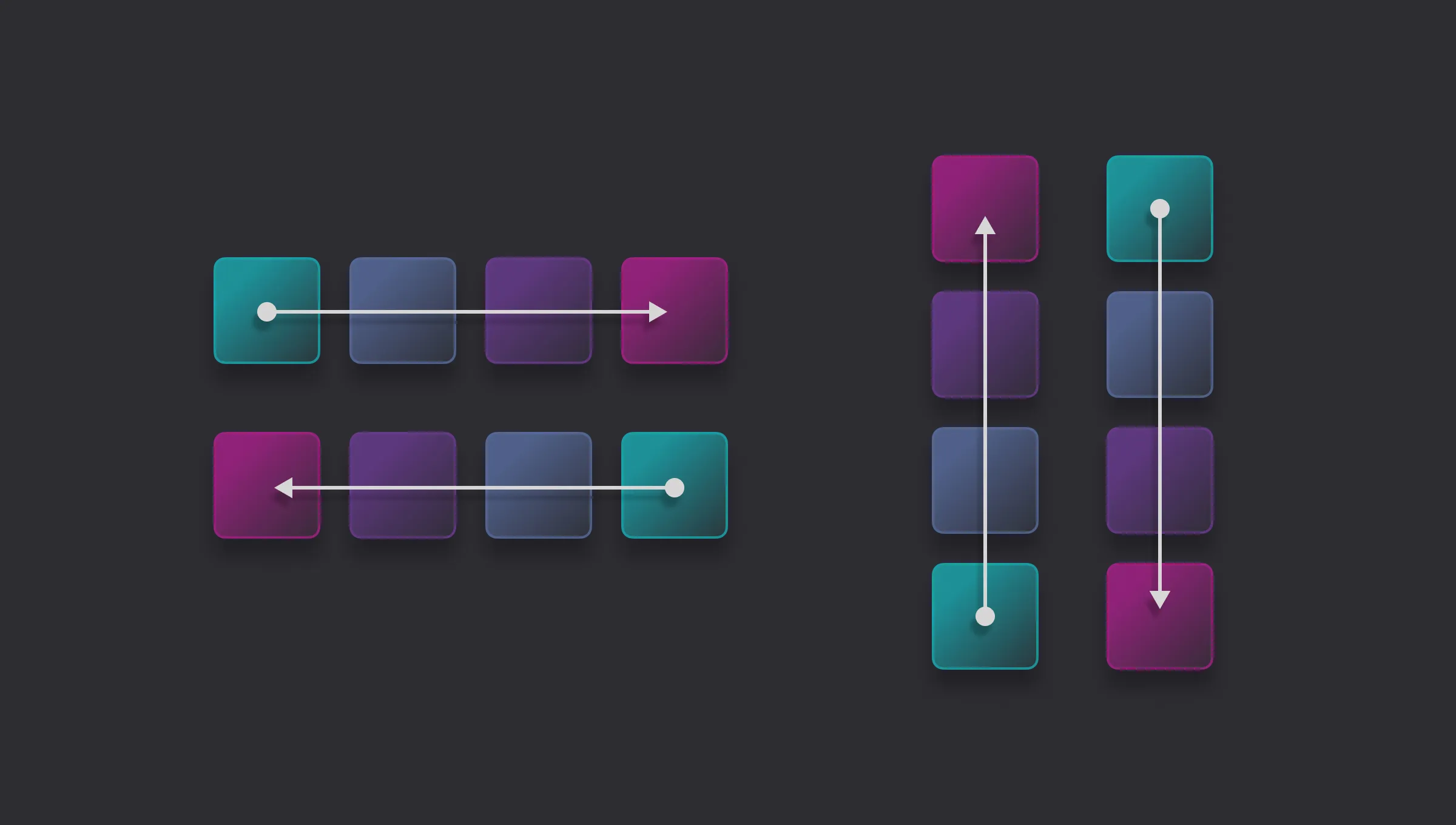
Flexbox Direction
The flex-direction property specifies the direction of the flex items. It can be set to:
- Row: Left to right in LTR; right to left in RTL
- Row-reverse: Right to left in LTR; left to right in RTL
- Column: Same as row but top to bottom
- Column-reverse: Same as row-reverse but bottom to top
Cross-Axis
The cross-axis is the perpendicular axis to the main axis within a flex container. The main axis is defined by the flex-direction property, which can be set to a row or column.
For example, if the flex-direction is set to row, then the main axis will be horizontal, and the cross-axis will be vertical.
Flex Wrapping
The flex-wrap property sets whether flex items are forced onto one line or can wrap onto multiple lines.
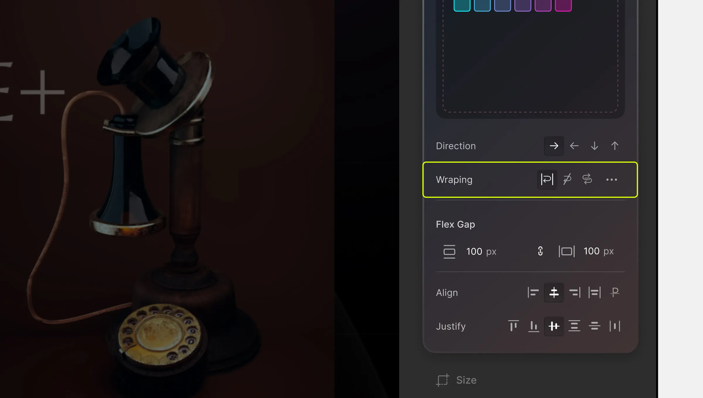
- wrap: The flex items break into multiple lines, with the cross-start either equivalent to start or before depending on the flex-direction value, and the cross-end is the opposite of the specified cross-start.
- nowrap: The flex items are laid out in a single line, which may cause the flex container to overflow. The cross-start is either equivalent to the start or before, depending on the flex-direction value. This is the default value.
- wrap-reverse: Behaves the same as wrap, but cross-start and cross-end are permuted.
Align Content
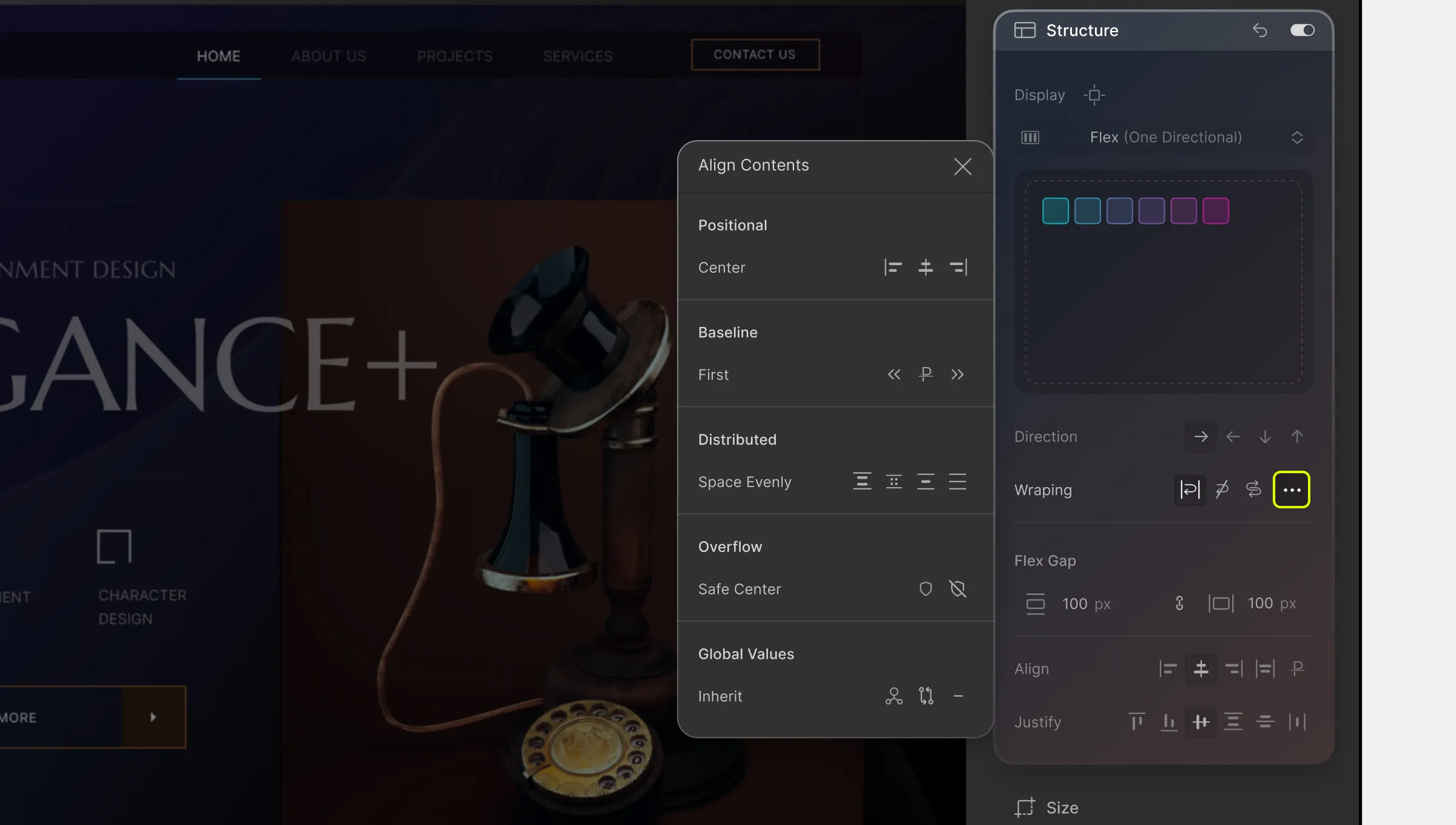
If you have added flex-wrap: wrap to your flex container and have multiple flex lines, you can use align-content to align your flex lines on the cross axis.
The align-content property modifies the behavior of the flex-wrap property. It is similar to align-items, but instead of aligning flex items, it aligns flex lines.
📝 Note: There must be multiple lines of items for this property to have any effect!
Position
- Start: Lines are packed toward the start of the flex container
- Center: Lines are packed toward the center of the flex container
- End: Lines are packed toward the end of the flex container
Baseline
- Flex-start: Lines are packed toward the start of the flex container
- Flex-end: Lines are packed toward the end of the flex container
Distributed
- Space-between: The items are evenly distributed in the flex container.
- Space-around: The items are evenly distributed in the flex container, with half-size spaces on either end.
- Space-evenly: The items will be evenly distributed in the container, and the extra space will be shared out between and on either side of the items.
- Stretch: Default value. The items stretch to take up the remaining space
Overflow
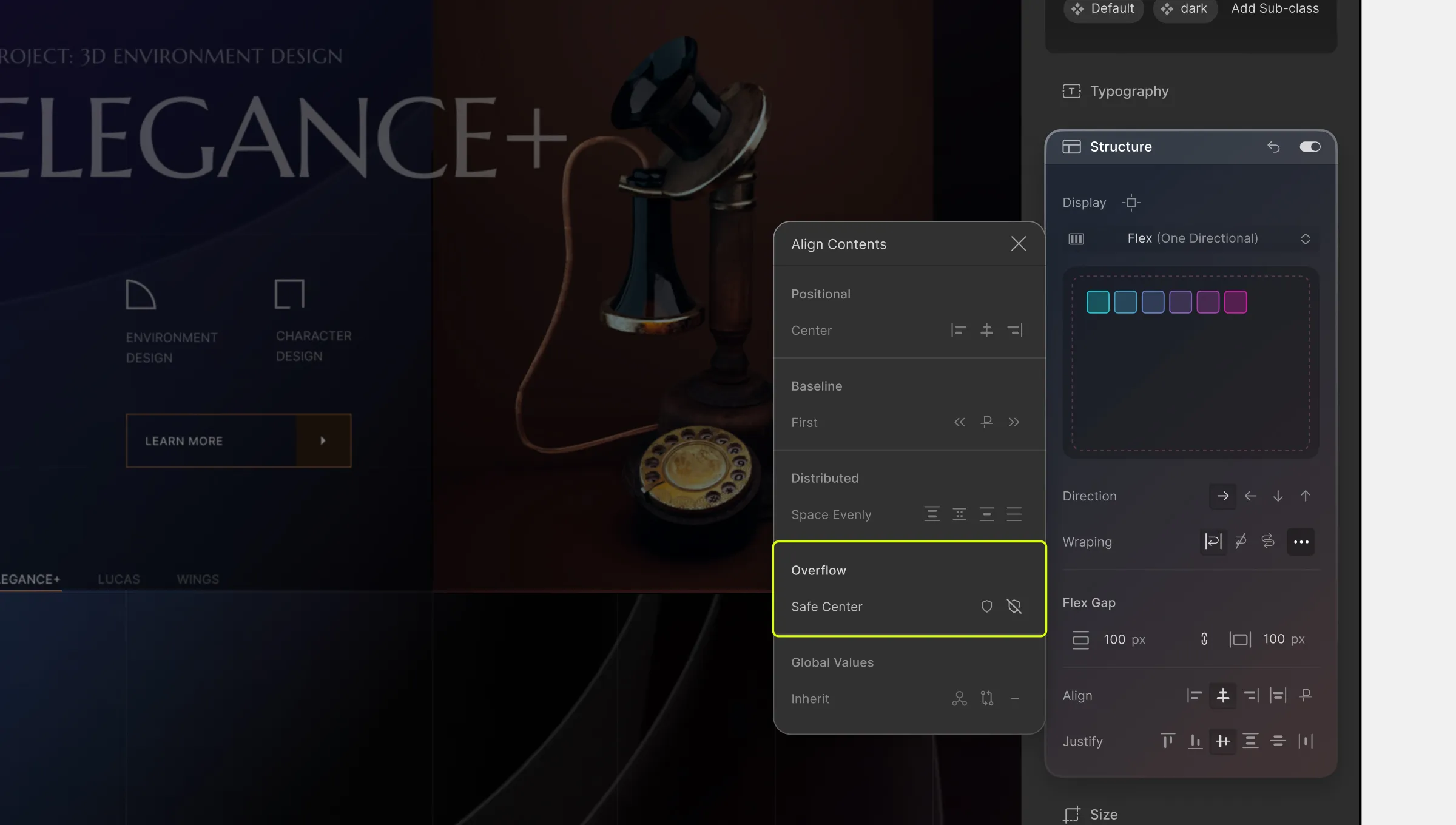
Due to Flexbox alignment, elements are centered, causing child elements to overflow on the right and left sides.
The problem is that the overflowing area on the left side is past the viewport’s start edge. You can not scroll to this area hence leads to data loss.
To handle overflowing situations, the align-items property can help:
- safe-center: If set, aligning elements will switch to start alignment in case of an overflowing situation.
- unsafe-center: If set, aligning elements will stay in center alignment in case of an overflowing situation
Global Values
The global values can be used for various Flexbox properties:
- inherit: Inherits the property from the parent element.
- initial: Sets the default value for the property (the browser default).
- unset: Acts as either inherit or initial based on the parent’s value.
Flex Gap
The gap property explicitly controls the space between flex items. It applies spacing only between items and not on the outer edges.
- row-gap: Sets space between rows in Flexbox.
- column-gap: Sets space between columns in Flexbox.
Align – Vertical
To align flex items vertically, select one of the following alignment options:
- Flex-start: Items are positioned at the top of the container
- Center: Items are positioned at the center of the container
- Flex-end: Items are positioned at the bottom of the container
- Stretch: Default. Items are stretched to fit the container
- Baseline: Items are positioned at the baseline (the invisible line on which the texts sit) of the container.
Justify – Horizontal

The justify property aligns flex items horizontally when they do not use all available space on the main axis.
To align flex items horizontally, select one of the following alignment options:
- Flex-start: Items are aligned to the left (start) of the container.
- Flex-end: Items are aligned to the right (end) of the container.
- Center: Items are centered horizontally within the container.
- Space-between: Items are evenly distributed in the container, with space between each item.
- Space-around: Items are evenly distributed in the container, with space around them.
📝 Note: Many of these options can also be found on the Flex Controller. To access this controller, simply click on the blue settings icon on the flex element’s top-right corner.
Flex Child
A flex child is also referred to as a flex item. Here, you can control the order, alignment, and spacing of flex items within the flex container.
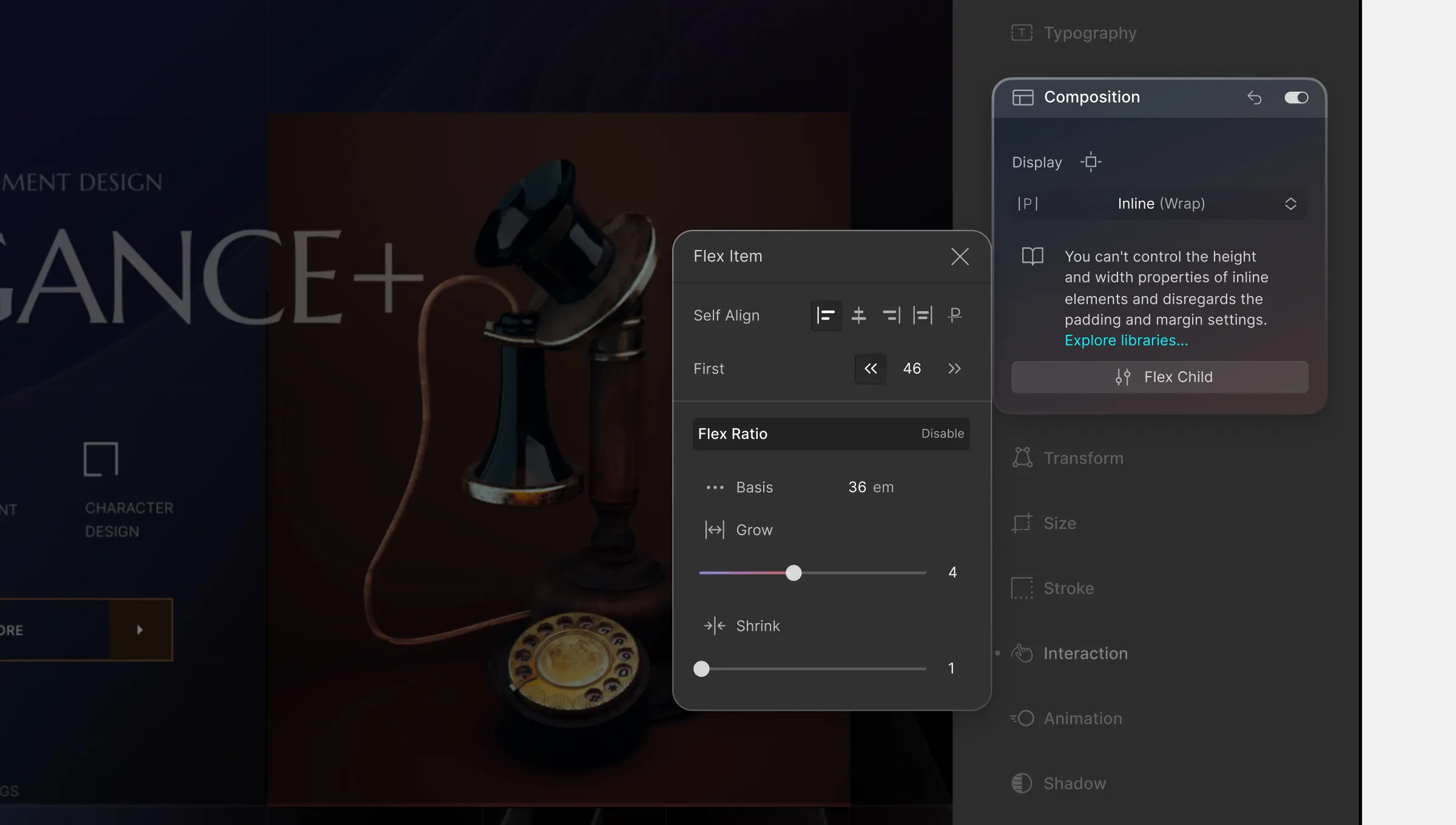
Self Align
The align-self property controls the alignment of individual flex items along the cross-axis of the flex container. It applies only to individual flex items, whereas align-items applies to all flex items within the container.
Available Values for align-self:
- flex-start: Aligns the item to the start (top) of the cross-axis.
- center: Centers the item along the cross-axis.
- flex-end: Aligns the item to the end (bottom) of the cross-axis.
- stretch: Stretches the item to fill the entire cross-axis of the container.
- baseline: Aligns the item’s baseline with the baseline of other flex items in the container. This option is typically used for aligning text within a line of text.
Order
The Order property controls the order in which flex items appear within the flex container.
By default, all flex items have an order value of 0, but you can change it to reorder items based on different screen sizes, create a responsive layout, or for accessibility reasons.
The order property accepts integer values, and you can assign a different order value to each flex item within the container. Flex items with lower order values appear first, followed by items with higher order values.
For example, if you set the order value of one flex item to -1 and another to 1, the flex item with the order value of -1 will appear first, followed by the flex item with an order value of 0, and then the flex item with an order value of 1.
Flex Ratio
In Flex Ratio, you can set the flex-basis, flex-grow, and flex-shrink properties to create flexible and responsive layouts.
flex-basis
This property sets the initial size of a flex item along the main axis of the flex container. It specifies the default size of the flex item before any remaining space is distributed according to the flex-grow and flex-shrink properties.
The flex-basis property can be set to a length value, such as pixels or percentages, or it can be set to the auto keyword, which means the initial size of the item will be based on its content.
flex-grow
This property determines how much a flex item will grow when there is extra space available along the main axis. It accepts a unitless value that represents the proportion of available space that the flex item should take up relative to other flex items within the same flex container.
flex-shrink
This property controls how much a flex item will shrink when there is not enough space to accommodate all the items within the flex container. It also accepts a unitless value that represents the proportion of space that should be taken away from the item when
