In Droip, a Class serves as a blueprint for creating objects, defining their structure, and initial style attributes. On the other hand, a Sub-class is a child class that inherits the attributes of its parent class while also having the ability to possess its own unique characteristics.
Applying Classes and Creating Sub-classes
Utilizing Classes and Sub-classes in Droip significantly streamlines the styling process. Here’s an overview:
- Applying Classes: Apply Classes to elements to establish their initial style. These Classes can then be reused on other elements, ensuring design consistency.
- Creating Sub-classes: Sub-classes inherit the initial style attributes of their parent Class. When an element’s style is customized, Droip automatically generates a Sub-class to store these changes. This Sub-class can then be further edited to accommodate unique style attributes.
Creating a Sub-class
To create a Sub-class, follow these steps:
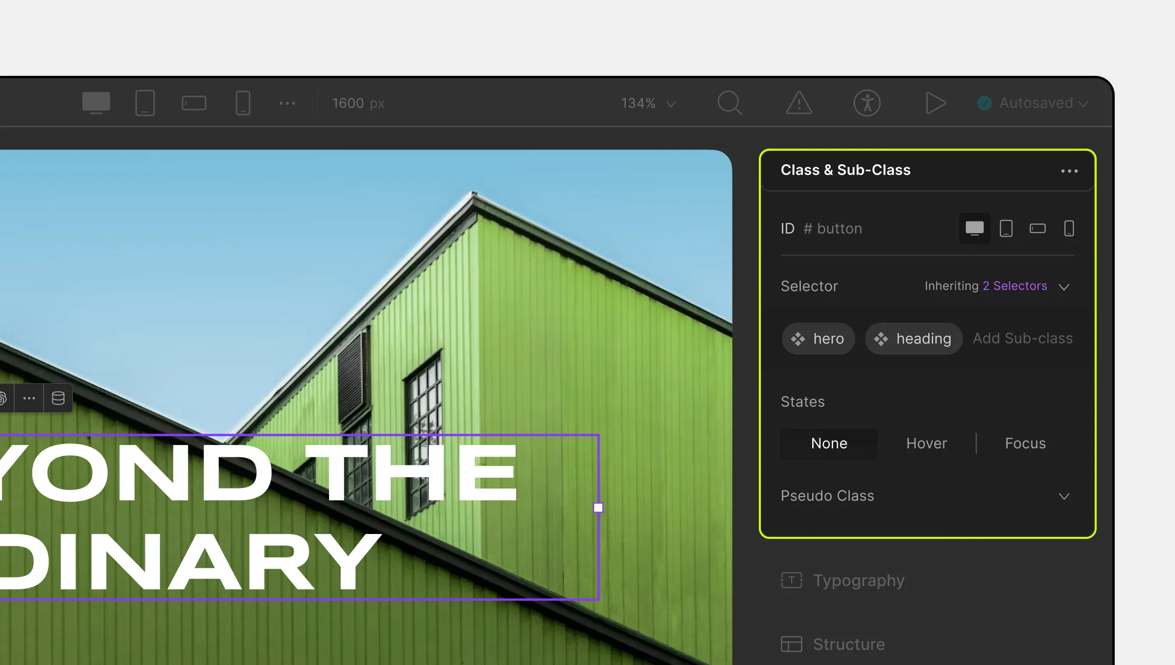
- Select an element and go to the Class & Sub-class section on the right-side panel.
- In the Selector Field, provide a unique name for the Sub-class. This action automatically generates your Sub-class.
📝 Note: A Sub-class is automatically created in Droip if you don’t create one yourself as soon as you start customizing an element’s style.
Editing a Sub-class
A new Sub-class will inherit the element’s parent class attributes. Once you start customizing the element, those attributes will be automatically saved to this Sub-class as well. Any changes made to this Sub-class will reflect in all instances where it is used.
Duplicating Style Settings Using Sub-class
To make another element adopt the same style, simply add this Sub-class in the same way as you created it. However, this will only work if you call a Sub-class after calling its parent.
To get a better understanding of how this works, let’s go over an example scenario. In this instance, suppose you add a Heading element to your canvas.
Then, without creating a Sub-class, you start making some style changes. As soon as you do this, you’ll notice an automatic Sub-class created to store this information.
Next, you add a second Heading element and want it to mimic the same style as the previous one. You can do this by going to the Class & Sub-class section and adding the first Heading element’s Sub-class.
Now, if you make any more style changes to this second element, the first will also change because both call the same Sub-class. To avoid this, simply create a second Sub-class for the new Heading.
Finally, if you want a third Heading element to have the same style as the second, then do the following. First, call the initial Sub-class that’s common between Heading 1 and Heading 2. Then, simply call the second Sub-class that only Heading 2 has, and you’re done!
Renaming and Removing Sub-classes
To rename a Sub-class, either click on its label in the Selector Field and edit it or right-click on the element and select Rename Class from the Context menu.
To remove a Sub-class, click on the x icon on its label in the Selector Field. You can also permanently delete Sub-classes you don’t need from Layers > Components.
Inheritance Menu
Above the Selector Field, you should see a dropdown named Selectors. Clicking on it opens the Inheritance Menu, which lists all Inherited Classes of an element.
States Menu
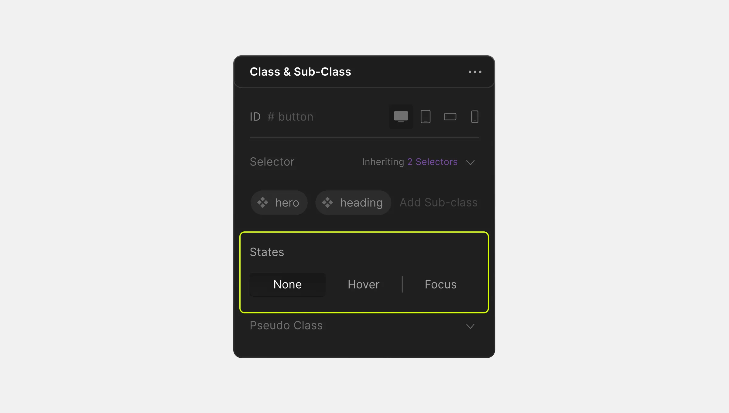
Droip empowers you to enhance interactivity and user experience by adjusting an element’s appearance for various states. These include:
- None: The default state of an element on a web page.
- Hover: When a user places the pointer over an element on a web page but doesn’t select it. Keep in mind that most touch devices do not support this.
- Focus: When a user uses the keyboard to tap into an Interactive Element on a web page, it’s in a Focused state but not Activated. When a user clicks on it, it’s in a Focused and Activated state.
To change how an element looks and behaves in a specific State:
- Navigate to Class & Sub-class > States Menu to select the desired state.
- Style the element according to the chosen state. Changes made will be visible until you switch states.
- To revert to styling the default state, click None.
- To remove state-specific styles, select the state, choose the element, and remove applied styles.
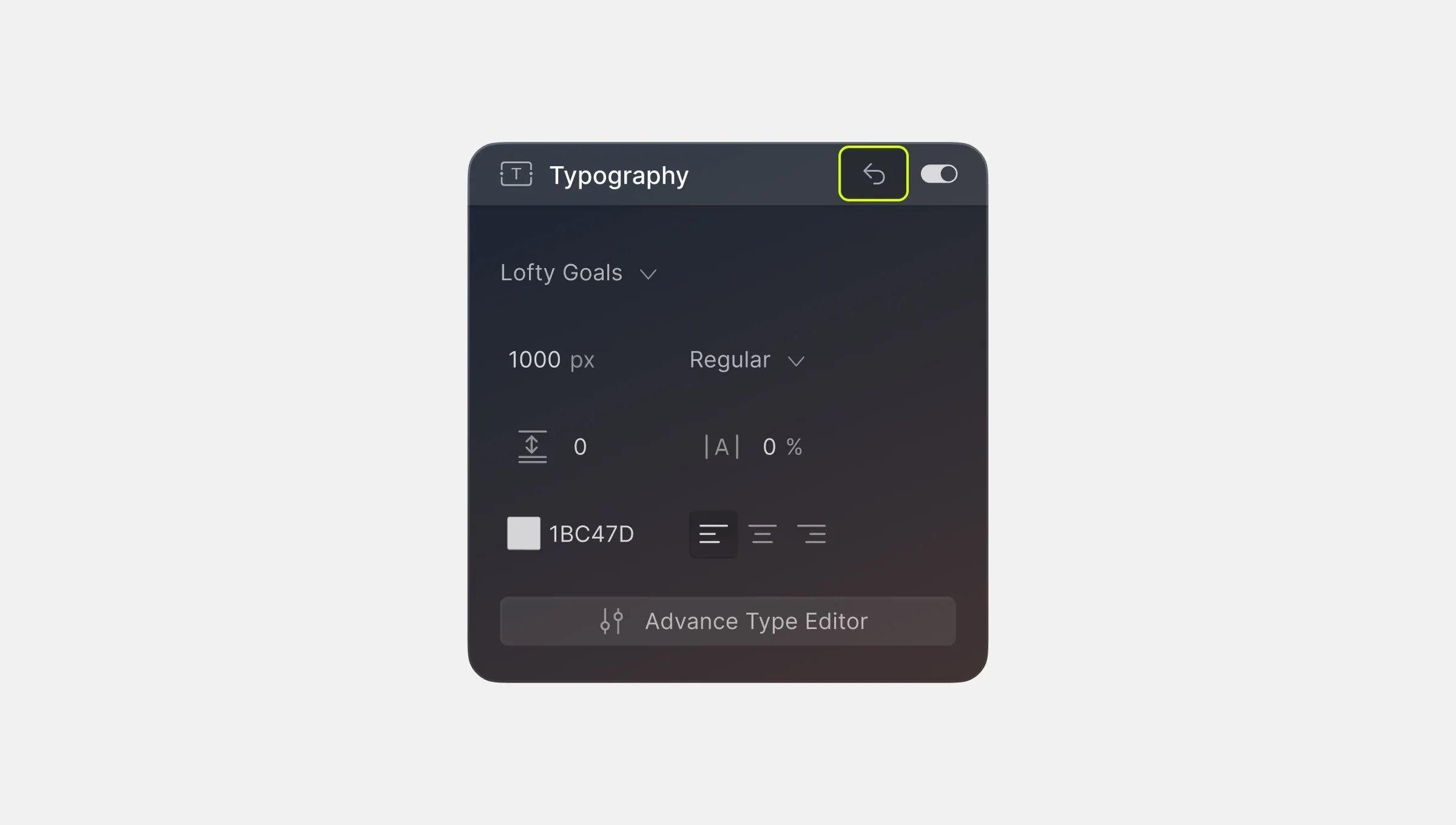
An easy way to reset style settings to default is by clicking on the reverse arrow icon that’s on the top right of each style panel section.
Pseudo Class
Following the above-mentioned States Menu, you will find a dropdown called Pseudo Class. A Pseudo Class is a keyword used to target a specific state of an element and can be used to alter element behavior or characteristics based on this state.
Droip offers a wide range of Pseudo Classes for diverse purposes, such as linguistics, user interaction, timing, and more.
To access and use Pseudo Classes:
- Find the Pseudo Class dropdown below the States Menu.
- Explore various Pseudo Classes by clicking the search bar within this section.
- Benefit from these keywords to refine and customize your styling further.
For detailed explanations of each Pseudo Class, refer to the MDN Web Documentation.
