Shadows are a powerful tool to add depth and emphasis to your elements. You can find the Shadow feature in the Style Panel on the right side of the Droip interface.
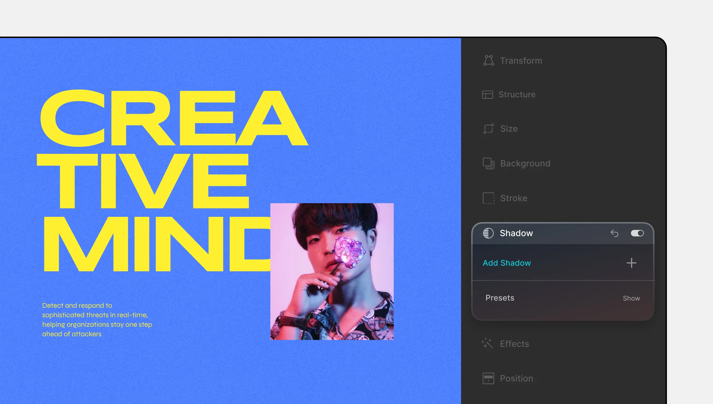
Adding and Managing Shadows
Add Shadow: Click on the + icon to add a new Shadow layer. A new Shadow item will be added to the list.
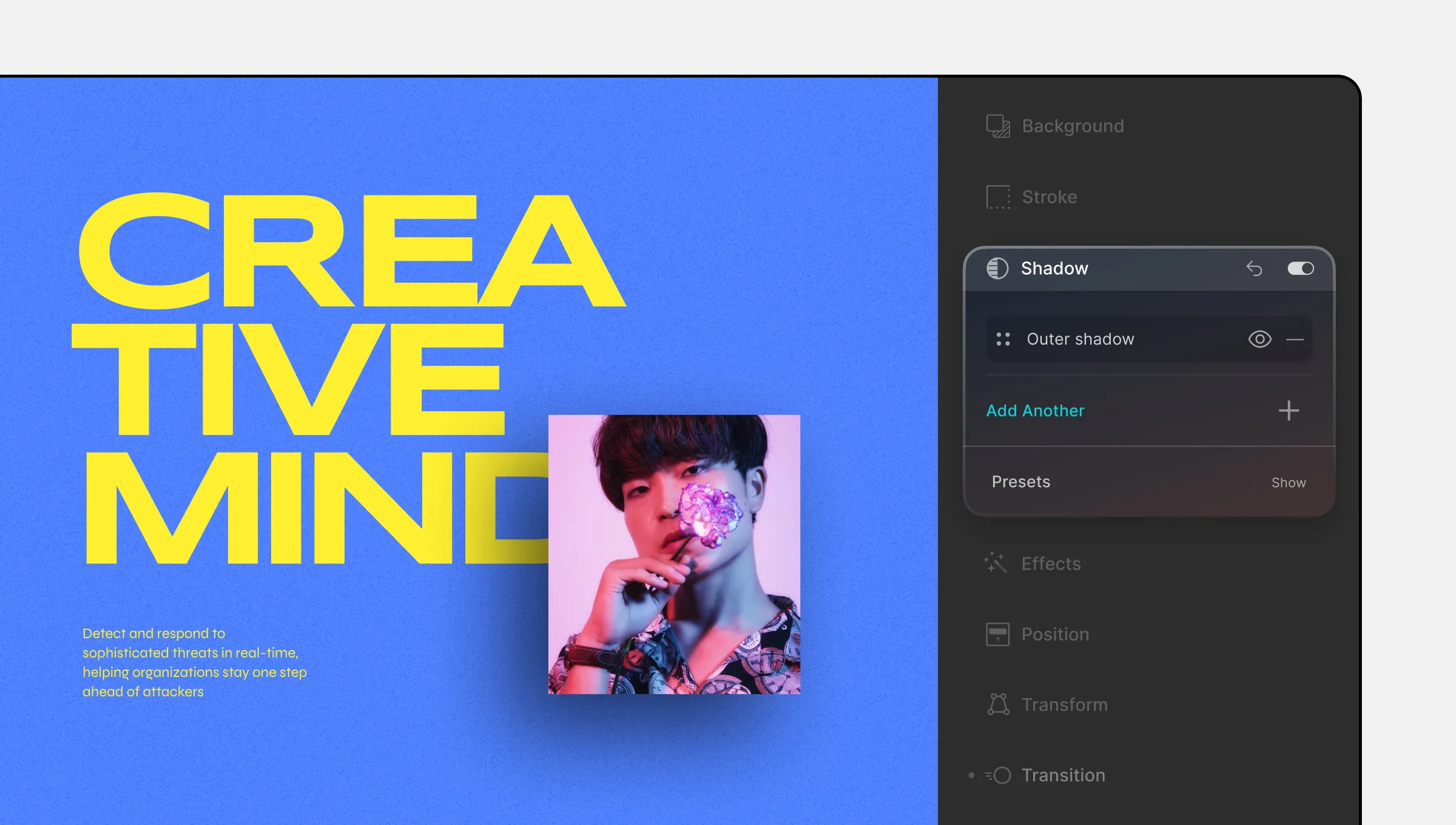
Reorder Shadows: Use the four-dot icon to drag and rearrange the order of Shadow layers.
Visibility: Toggle the visibility of the Outer Shadow by clicking the eye icon on the right.
Remove Shadow: Click on the dash icon to remove the selected Shadow.
Shadow Settings
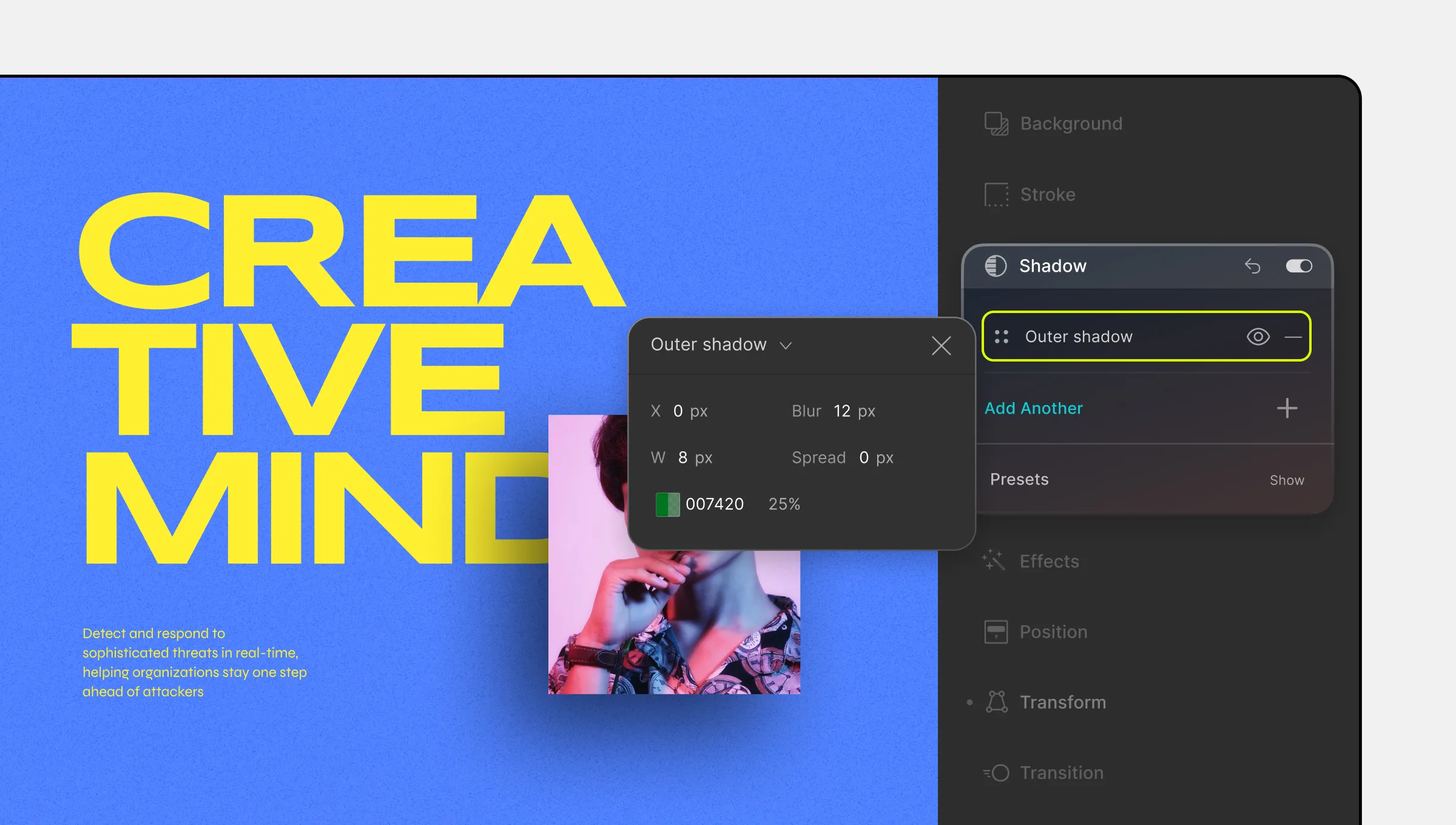
Customize your Shadow settings with the following options:
- Shadow Type: Choose between Inner Shadow (inside the element) and Outer Shadow (outside the element).
- X: Define the shadow’s horizontal offset i.e. how much the shadow will shift to the right compared to the element.
- Y: Define the shadow’s vertical offset i.e. how much the shadow will shift downwards.
- Blur: Define the sharpness or blurriness of the shadow’s edges.
- Spread: Set the extent to which the shadow spreads outward.
- Color: Set your shadow’s Color and Opacity.
Shadow Presets
Instead of customizing your own shadow, you can save time by using a Shadow Preset!
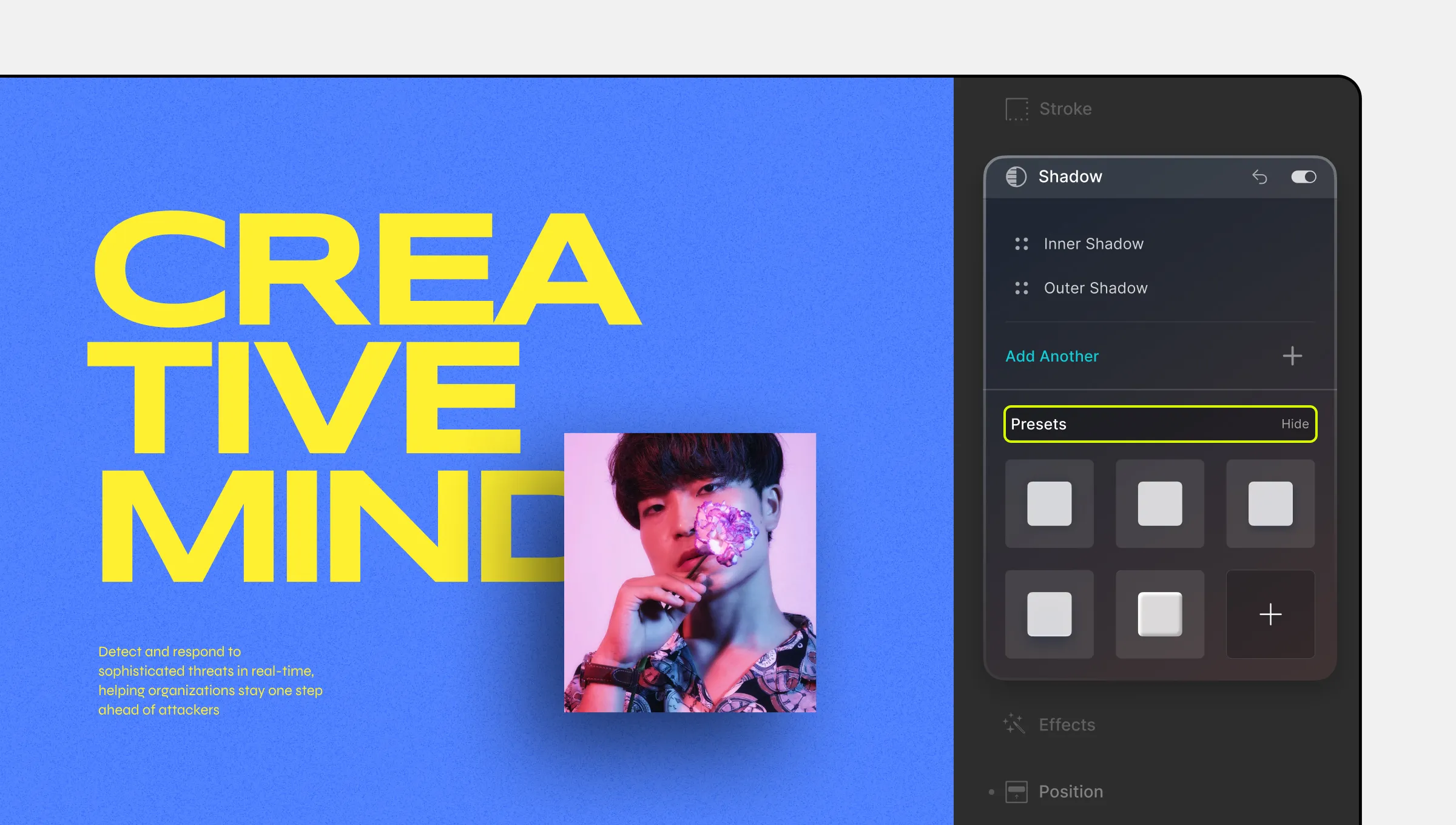
To access Shadow Presets:
- Click the Show button at the bottom of the Shadow section.
- Choose from a range of preset shadows.
- Select a preset to apply it instantly.
Saving Custom Shadows
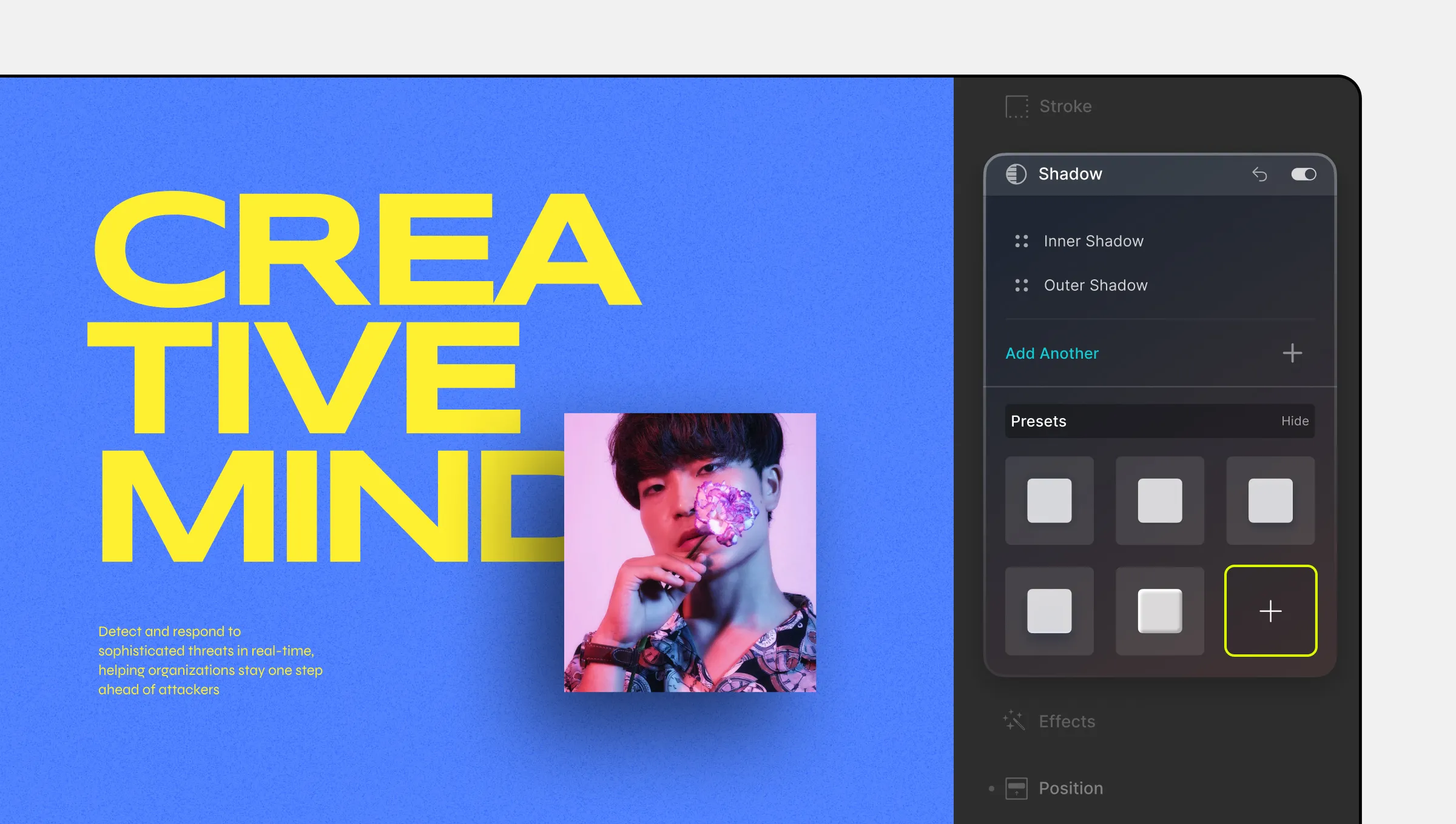
Create and save your own custom Shadow presets:
- Click the + icon beside the last preset option.
- In the new window, name your preset and click Add.
- This saved preset can be reused across different elements.
Using Shadow For Animated Transitions
Leverage shadows to emphasize elements in various states, like Hover mode with transitions:
- Start by adding an Outer Shadow to your element with an opacity of 30% from Style Panel > Shadow.
- Go to Style Panel > Class & Sub-class > States Menu and select the Hover state.
- Increase the opacity of the shadow to 40% for the Hover state.
- While your element is selected, navigate to Style Panel > Transition and add a new Transition.
- Set the transition type as Box Shadow, with a duration of 300 ms and a timing function of Ease.
