Elements are the building blocks of a webpage, and you can configure and customize these to suit your needs using the various options available on the Style Panel.
In this documentation, we will briefly go over the Elements Panel, show you how to add an element, how to style an element, and more!
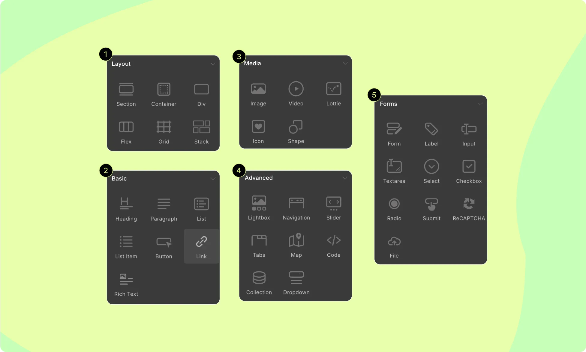
Elements Panel
To access the Elements Panel, click on the Elements tab on the Topbar. You should see this panel on the left side of your screen, containing all of the elements that you can use.
Speaking of, Droip offers 33 different elements covered across the following 5 categories:
- Layout: Consists of elements that you can use to build the structure of your webpage.
- Basic: This section contains elements that you most commonly need.
- Media: Here you’ll find your media elements to add images, videos, SVG, etc.
- Forms: Consists of all form-related elements like form blocks, labels, input fields, etc.
- Advanced: This section contains reusable modular building blocks called components that perform a specific function or display a particular piece of content on a web page. Navigation bars, Lightboxes, Collections, and other similar elements are all examples of components.
How to Add an Element
You can add elements to your canvas in three ways:
- The first method is to select where you want to place your element and click on the element you want to add from Insert > Elements Panel.
- The second method is to click and drag the element from the Elements Panel and place it where you want on the canvas.
- Lastly, you can also drag the elements from the Elements Panel to the Layers Panel and place them where you want from there.
How to Style An Element
You can style these elements using the tools on the Style Panel. From here, you’ll find options to customize the following:
- Typography
- Structure
- Sizing
- Backgrounds
- Borders
- Position
- Effects
- Interactions
- Visibility Conditions
For more info, you can look at our Style Overview documentation and the dedicated documentation for each section.
How to Duplicate the Style of an Element
To maintain consistency and save time, you can duplicate the style settings of an element. Follow these steps:
- Select your element and open the Class Manager section in the Style Panel.
- Click on the field and create a new sub-class by typing a unique name.
- Select a different element of the same type and add the sub-class you created.
- Elements with this sub-class will adopt the same style settings.
- Any changes made to one element with this sub-class will update all instances with the same sub-class.
For more details on this feature, refer to our documentation on Class Manager.
How to Reuse Elements
Using Symbols, you can easily reuse elements or groups of elements with all their customizations intact. To convert an element or group of elements into a Symbol:
- Select the element or wrapper element (if multiple elements) and go to Layers > Symbols.
- Click on Create New Symbol, choose a Category and Name for the Symbol, and hit Create.
- Now, your element(s) become a Symbol that you can repeatedly use on any page.
- Editing the main instance of the Symbol from the Symbols Panel will update all other instances.
Check detailed information on Symbols.
Was this page helpful?