The Section element in Droip allows you to structure your web page effectively by dividing them into distinct sections, each with its own unique purpose and content.
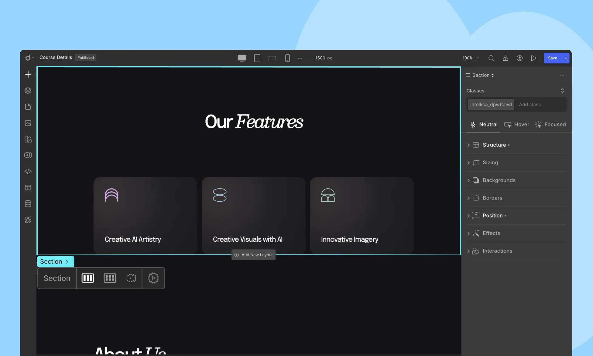
In Droip, a Section represents a self-contained block of content that is thematically related. It is typically used to organize content into logical groupings, each having a specific focus or topic. Each Section can have its own heading, making it easy for visitors to identify and understand the purpose of the content within.
Examples of Section Usage:
- Hero Section: Start your webpage with an impressive Hero Section that grabs visitors’ attention and introduces your core message or product.
- Features Showcase: Create a Features Section to highlight the key features and benefits of your product or service.
- Testimonials: Use a Testimonials Section to showcase reviews and feedback from satisfied customers.
- Contact Information: Include a Contact Section with your address, contact details, and a contact form.
Adding a Section
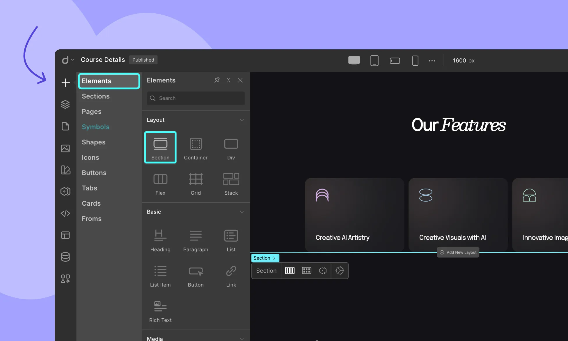
To add a Section element to your Droip web page, follow these simple steps:
- Open the Droip editor and navigate to the Insert > Elements Panel.
- Look for the Section element and drag it onto your page canvas.
- Customize the section’s appearance, such as background color, padding, and alignment, using the built-in Style Panel.
Structuring Your Web Page with Section Elements
To maintain a cohesive and well-organized website structure, follow these best practices:
- Use multiple Section elements to break down your page into meaningful segments.
- Within each Section, add content elements such as text, images, videos, and buttons to convey your message effectively.
- Experiment with different layouts and arrangements to create an engaging user experience.
Style a Section
The Section element in Droip is highly flexible and can be styled according to your preferences. You can:
- Set the background color or add background images to match your website’s theme.
- Adjust padding and margins to control the spacing within the section.
- Define custom heights to make certain sections stand out.
To learn more about styling options in Droip, refer to the Style Panel.
Was this page helpful?