Typography is the technique of arranging type to make words readable and visually pleasing. To adjust the Typography of any element, go to Style Panel > Typography.
Basic Settings
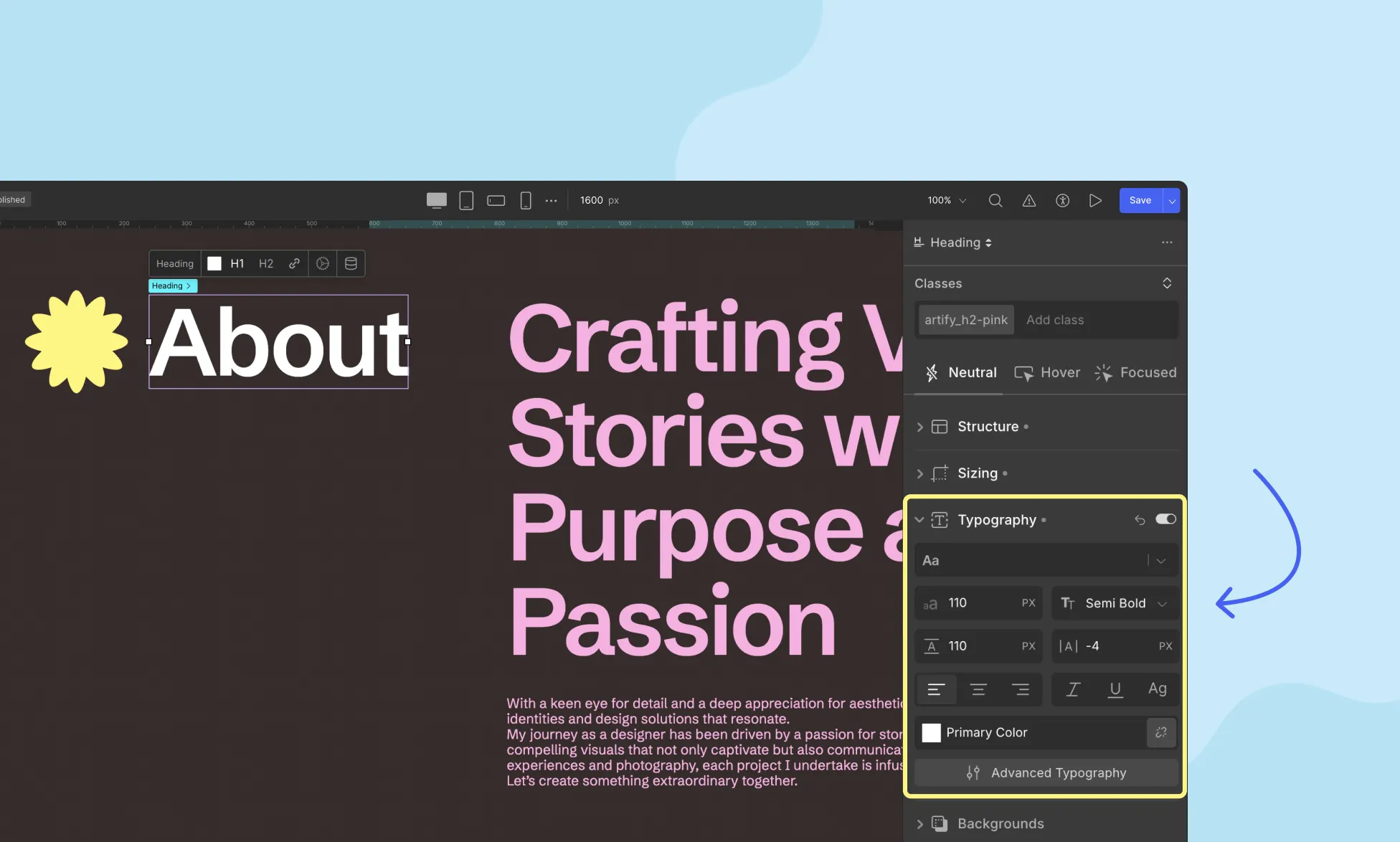
Here, you can change the Font, Font Size, Alignment, and more. So let’s go over each feature one by one.
Font: Choose the font style from the drop-down list to define the visual identity of your text.
Font Size: Adjust the font size to enhance readability and balance within your design.
Font Weight: Select the font-weight or “boldness” of your text. Keep in mind that the weight will depend on the font style selected.
Line Height: Set the line height to determine the spacing between lines of text, contributing to improved readability.
Letter Spacing: Control the horizontal spacing between each letter, optimizing legibility and aesthetic appeal.
Color: Choose the foreground color of your text and text decorations, ensuring cohesive and visually pleasing designs. Learn more on Color Settings.
Text Alignment: Specify text alignment for optimal presentation. Options include left, center, and right alignment.
Advanced Typography
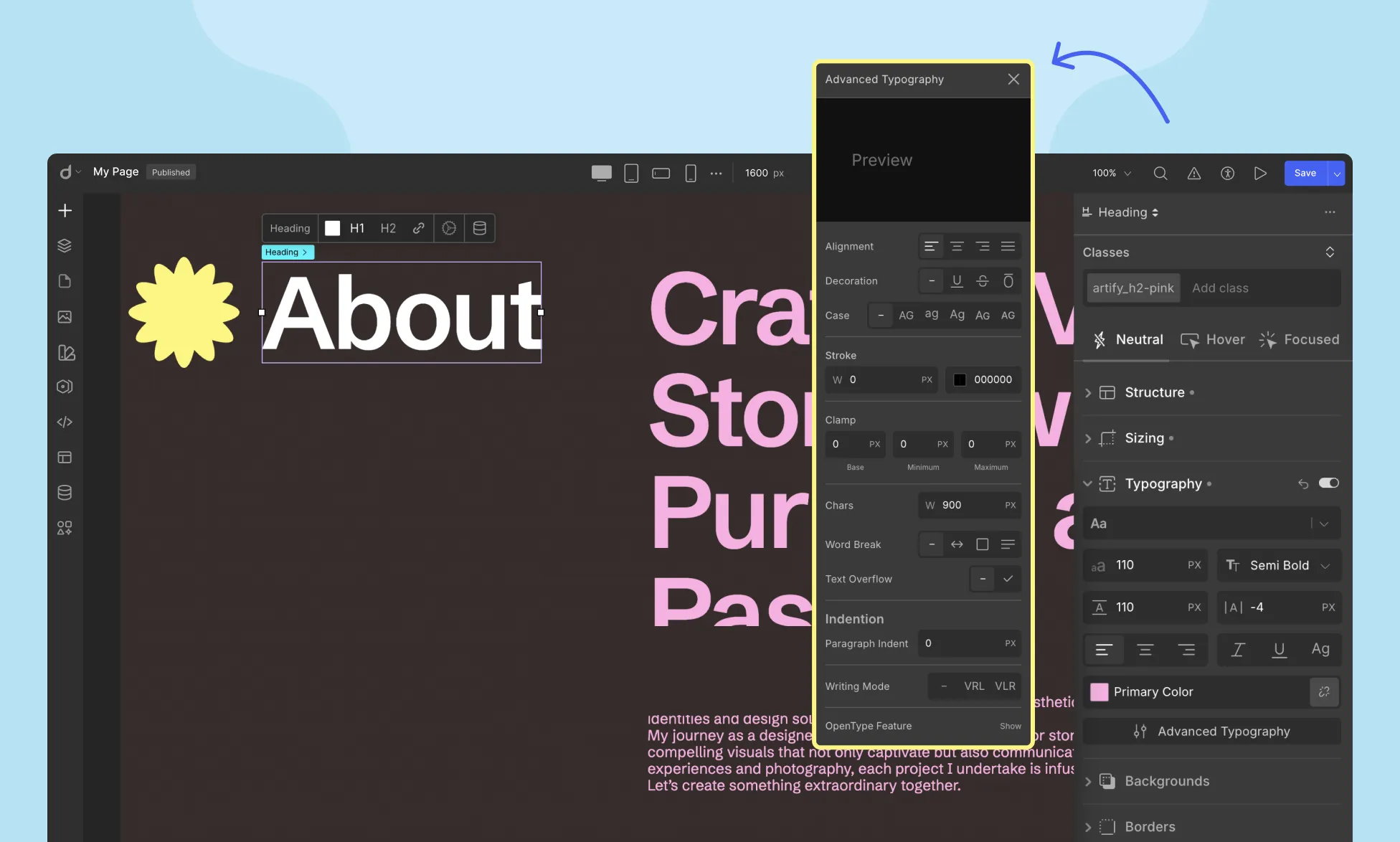
Following the settings mentioned above is a button called Advance Typography. Clicking on this should give you access to more advanced text formatting options.
Alignment: In addition to the standard left, center, and right alignments, the Advanced Font Editor offers the Justify option. This aligns both edges of each line of text with both margins, enhancing visual consistency.
Decoration: Emphasize text using decorations. Options include:
- No Decoration: Opt for simplicity by setting no decoration.
- Bold: Change your text weight to bold for emphasis.
- Italic: Italicize your text.
- Underline: Underline your text.
- Line-through: Strike a line through your text.
- Overline: Overline your text.
Text Stroke
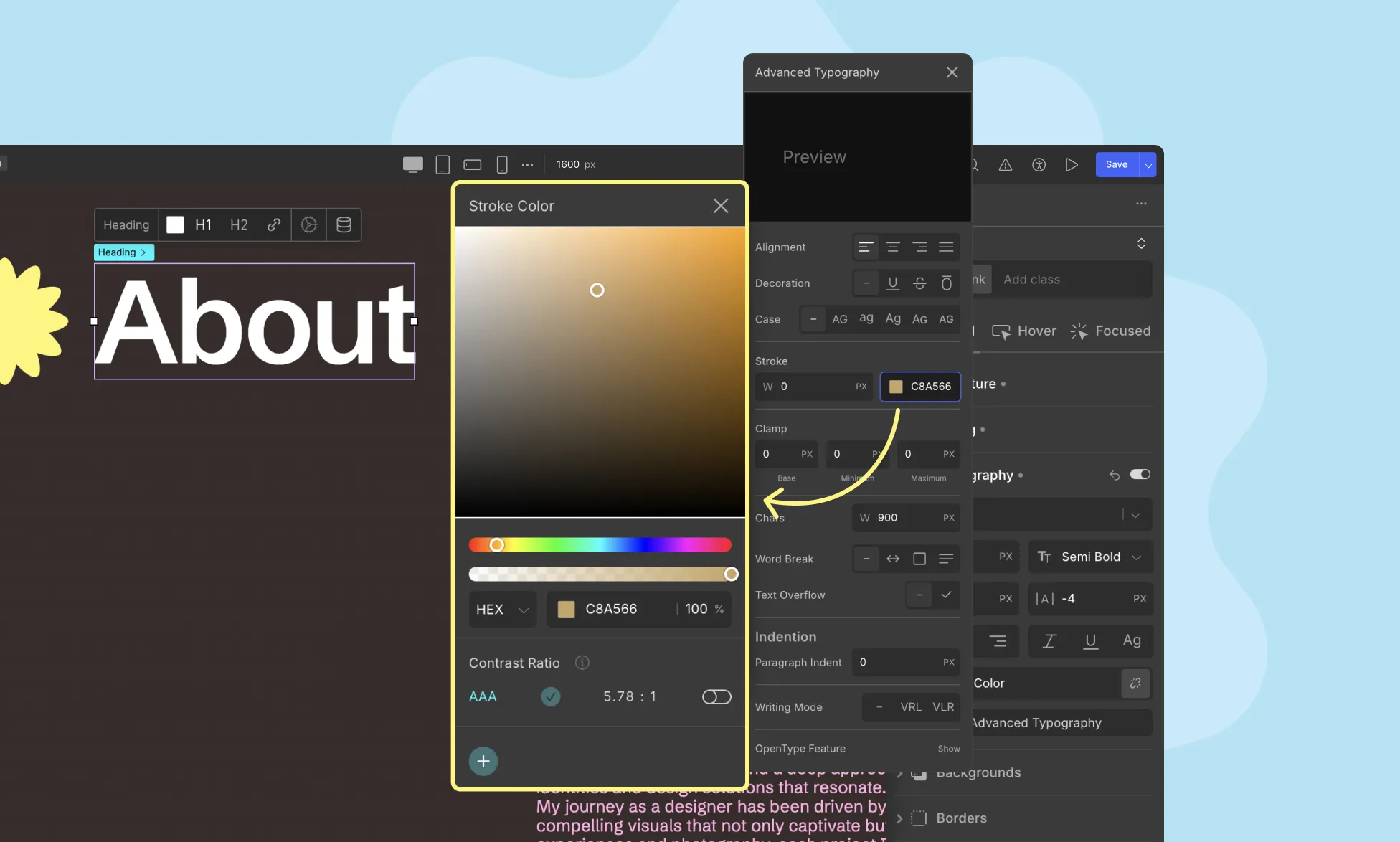
Outline your typography using this option.
Width: Define the Stroke’s width.
Color: Set the Stroke’s color.
Opacity: Set the Stroke color’s opacity.
Paragraph
Clamp
This feature allows you to define the Font Size as a number between an upper and lower bound. It requires the three following parameters. It ensures that the font size remains within a specific range, providing flexibility and responsiveness in your design.
- Base: This is the preferred font size value that will be used when it falls within the specified range.
- Min: This is the minimum font size value. If the base value is smaller than the minimum value, the minimum value will be used.
- Max: This is the maximum font size value. If the base value is larger than the maximum value, the maximum value will be used.
Character Unit
Set a container width value to constrain horizontal text span. This introduces line breaks after reaching the specified limit, enhancing readability.
Word Break
Define where the line breaks appear when the text overflows its content box.
- Normal: Use the default Word Break rule.
- Keep-all: Prevent word breaks for Chinese/Japanese/Korean text. For other languages, Word Break behaves the same as in “Normal”.
- Break-all: Allows word breaks at any character (except for CJK text).
- Break-word: Randomly breaks words to prevent overflow.
Truncation
Define text behavior when it overflows its container:
- Clip: Overflowing text is hidden.
- Ellipsis: Overflowing text is replaced with an ellipsis (“…”).
Indentation
Control text-indent for space before the text:
- Text-Indent: Define how much space you want to add before the first line of text.
- Text-Indent Left: Define how much space you want to add on the left side of each line.
- Text-Indent Right: Define how much space you want to add on the right side of each line.
Orientation
Set text orientation for vertical writing mode:
- Mixed: Default value. Characters of horizontal scripts are rotated 90 degrees, clockwise.
- Upright: Horizontal script characters, as well as vertical script glyphs, both remain upright but in a vertical script.
Writing Mode
Enable vertical mode for your block of text from here. Options include Unset, RTL, and LTR.
- Unset: Click on this to disable vertical mode.
- RTL (Vertical-rl): LTR scripts will flow from top to bottom vertically with the next line positioned from the left of the previous. And RTL scripts will flow top to bottom vertically but the next line starts from the right of the previous.
- LTR (Vertical-lr): LTR scripts will flow from top to bottom vertically with the next line positioned from the right of the previous. And RTL scripts will flow top to bottom vertically but the next line starts from the left of the previous.
OpenType Feature
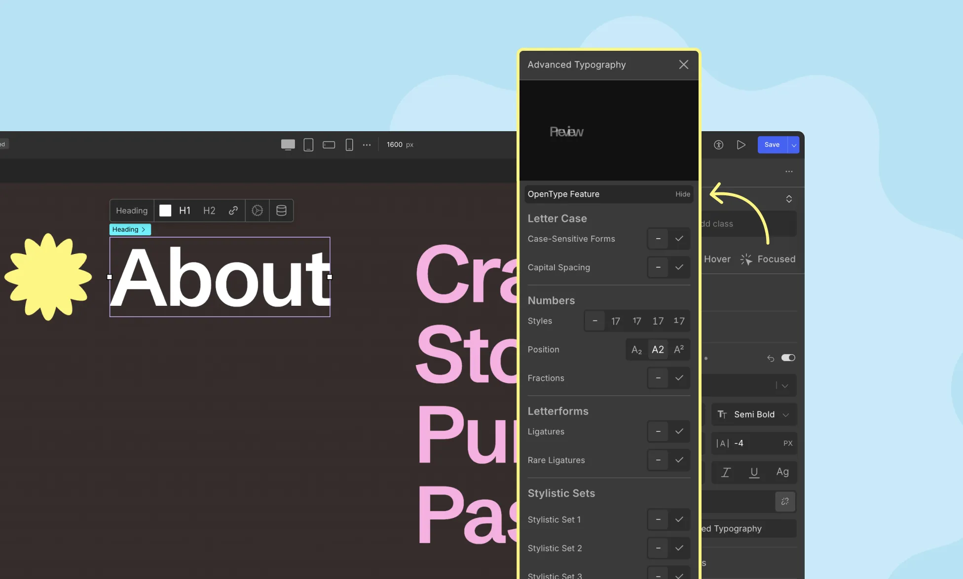
Utilize OpenType font features to enhance character styles:
Letter Case
Case: Select the Letter Case you want your text to be. Options include the following:
- None: Keep default case.
- Uppercase: Transform all letters to uppercase.
- Lowercase: Transform all letters to lowercase.
- Capitalize: Capitalize initial letters.
- Small Caps: Uppercase letters with the height of lowercase letters.
- All Small Caps: All letters are transformed to uppercase but they are all smaller than the usual uppercase letters.
Case-Sensitive Forms: Enable this to allow certain characters to be shifted to better suit the case defined.
Capital Spacing: Enable this to allow spacing adjustments for capital letters.
Numbers
Styles: Define numeral styles, options include:
- None: Default numeral style.
- Uppercase: Numerals are of the same height (Lining).
- Lowercase: Numerals can descend below the baseline (Old Style).
Position: Use Position to define subscript and superscript.
- Subscript: Numbers placed below the baseline.
- Normal: Default value. Numbers appear on the line.
- Superscript: Numbers placed above the baseline.
Fractions: Enable this to allow fractional glyphs to appear in your text.
Letterforms
Control the use of Ligatures in your text block.
- Ligatures: Allow combined letters or glyphs to replace separate ones, enhancing spacing and readability. A common example of a Ligature is “fi”.
- Rare Ligatures: Enable rare ligatures for unique character combinations. Unlike Common Ligatures, Rare Ligatures are an unusual combination of letters, usually for the purpose of being eye-catching.
Stylistic Sets
Stylistic Sets make the use of a font’s alternate glyphs so much easier and remove the need to manually replace each occurrence of a character with the desired alternate.
- Stylistic Set 1: Enable the first Stylistic Set.
- Stylistic Set 2: Enable the second Stylistic Set.
- Stylistic Set 3: Enable the third Stylistic Set.
Horizontal Spacing
Fine-tune letter spacing using kerning data for balanced typography.
- Kerning Pairs: Kerning is a number by which the default spacing should increase or decrease. Enable this feature to apply Kerning.
More Features
The following features are related to Fractions. With these enabled, you can use special fractional glyphs contained in an OpenType font.
- Fractional Denominators: Enable to allow the use of fractional denominator glyphs i.e. glyphs that are stylized according to the size and position of a denominator.
- Fractional Numerators: Enable to allow the use of fractional numerator glyphs i.e. glyphs that are stylized according to the size and position of a numerator.
Units in Typography
Working with typography involves various types of units for length, color, and more. To understand these units, refer to our Values and Units documentation.
Was this page helpful?