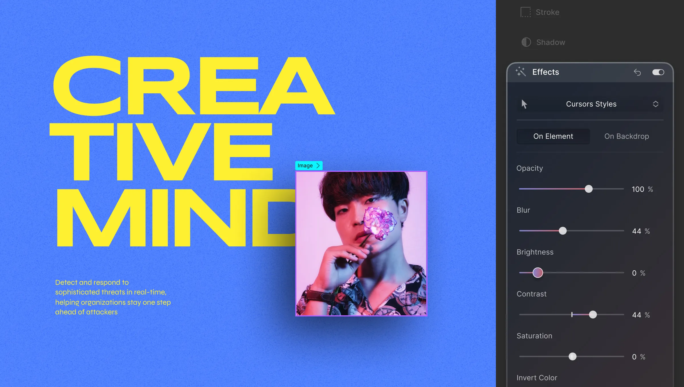
Elevate your elements’ visual impact by applying effects like altering Brightness, Opacity, Hue, and more from the Style Panel > Effects.
Applying Effects
You can apply effects either directly on the element or on the backdrop behind it. Here’s how:
- On Element: Apply effects directly to the element and its children.
- On Backdrop: Apply effects to the backdrop behind the element.
Available Effects
Explore various effects and their settings:
- Opacity: Adjust element transparency using the Opacity property.
- Blur: Apply a blurred effect to your element.
- Brightness: Control the brightness level of your element.
- Contrast: Fine-tune your element’s contrast.
- Saturation: Define the vibrancy of your element’s colors.
- Invert Color: Invert the colors of the element.
- Grayscale: Transform the element into grayscale.
- Hue Rotate: Change the color hue of the element.
- Sepia: Add a sepia-toned effect for a vintage look.
On Element vs On Backdrop
As you may have noticed, Effects can be applied to an element or to the backdrop. Selecting On Element means only the element and its children are affected by the changes.
On the other hand, selecting On Backdrop means that only the backdrop behind the element will be affected. Check out the images below to get a better idea.
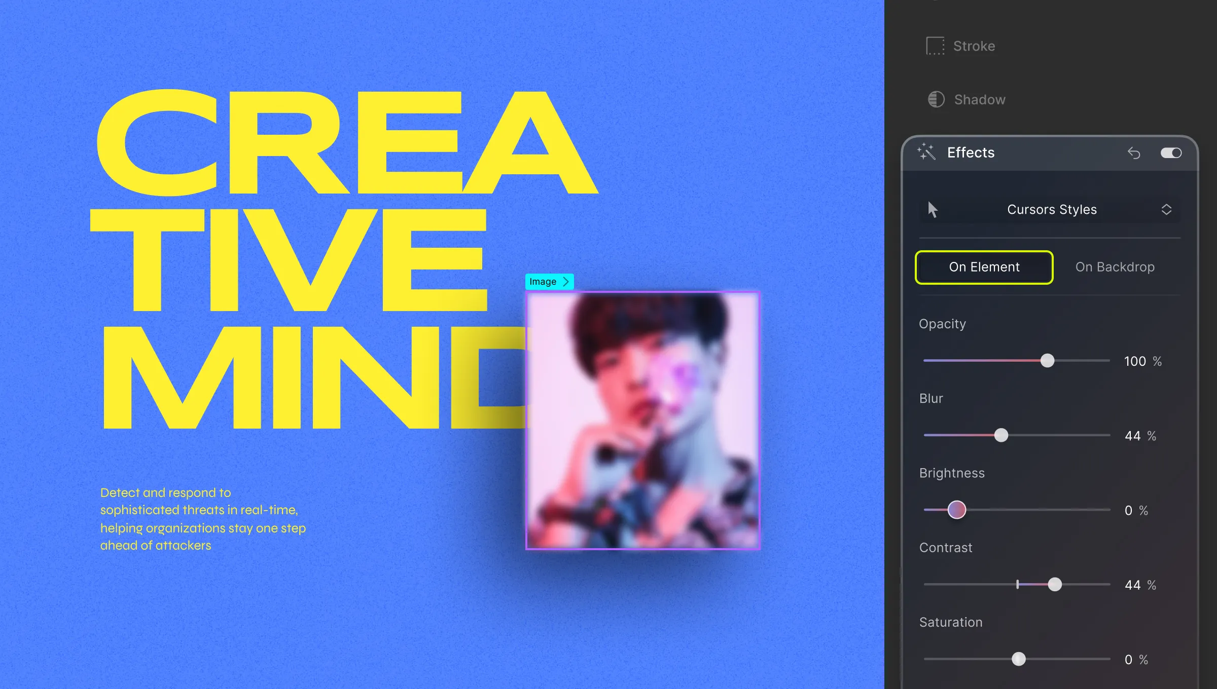
Blur filter effect ‘On Element’ for Heading
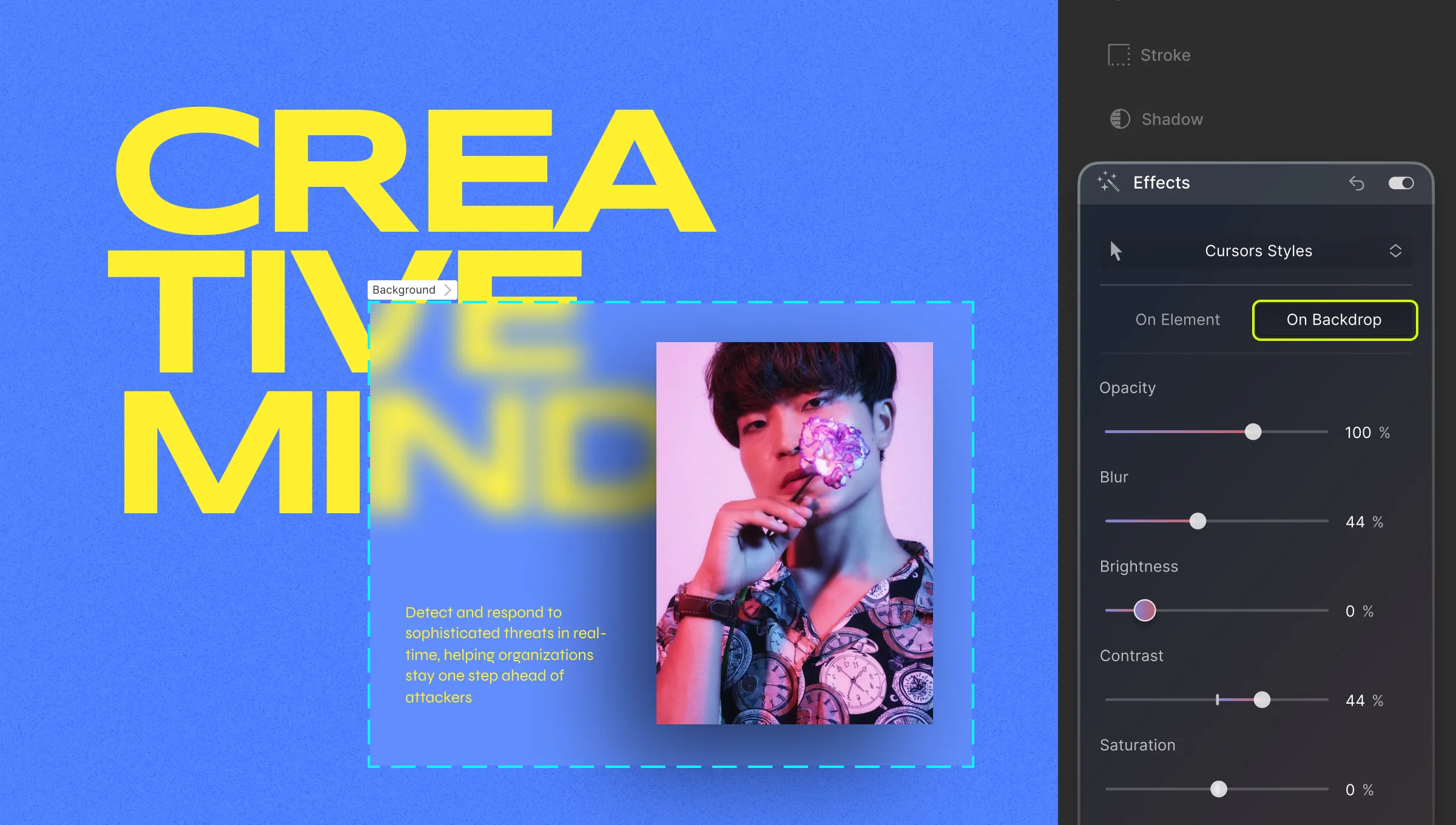
Blur filter effect ‘On Backdrop’ for Heading
In the above images, the first instance is the effect of the blur filter on the Heading element. This adds a blurry effect to the entire text box up to its margins.
On the other hand, the second instance shows the effect of the blur filter on the backdrop of the Heading element. This causes the portion of the backdrop occupied by the Heading element to blur but the text remains sharp.
💡 Tip: Keep in mind that, for the backdrop to be visible, at times you might have to lower the opacity of your element. Of course, this is only in case of elements that are totally opaque or have an opaque background.
Cursor
From the dropdown at the very top, you can change the style of the Cursor for an element. This feature helps improve interactivity since users associate certain pointers with specific types of elements.
For instance, the 
Now let us go over the various Cursor styles and when they can be used.
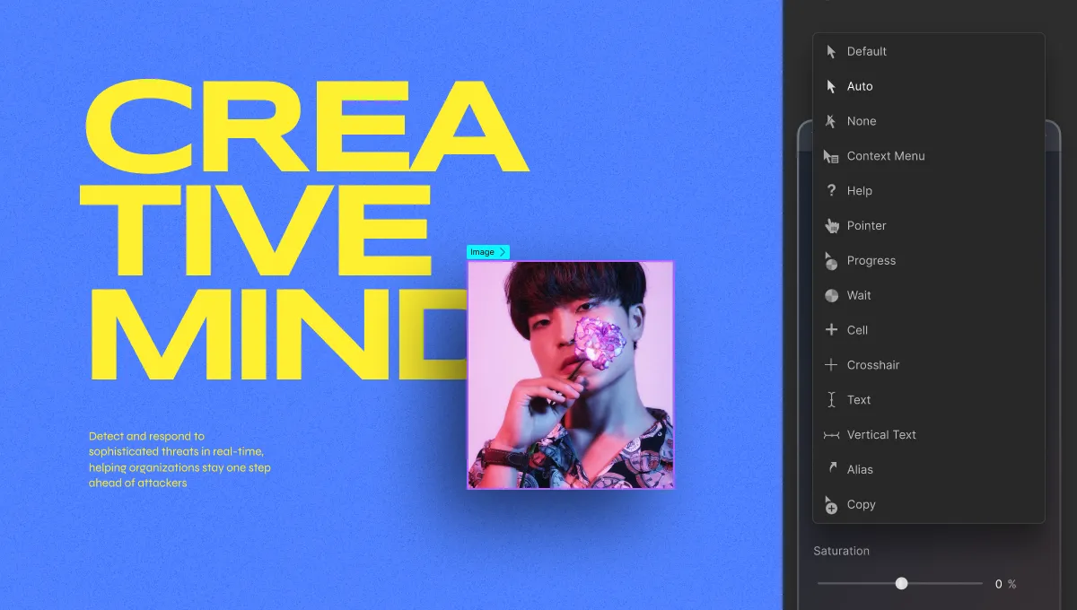
- Default: Classic Arrow Cursor.
- Auto: Cursor style changes automatically based on browser settings.
- None: Invisible cursor (use sparingly).
- Context Menu: Cursor for right-click context menus.
- Help: Cursor indicating help availability.
- Pointer: Cursor for links or buttons.
- Progress: Cursor for indicating webpage loading.
- Wait: Cursor for busy websites.
- Cell: Cursor for selecting tabular cells.
- Crosshair: Cursor for indicating selection or charts.
- Text: Cursor for horizontal text input.
- Vertical Text: Cursor for vertical text input.
- Alias: Cursor indicating alias creation.
- Copy: Cursor for copying.
- Move: Cursor indicating element movement.
- Not Allowed: Cursor for blocked actions.
- Grab: Cursor for draggable elements.
- Grabbed: Cursor indicating a grabbed element (best for Focus state).
- Col Resize: Cursor to show that a column can be resized by dragging horizontally.
- Row Resize: Cursor to show that a row can be resized by dragging vertically.
- N Resize: Cursor used to indicate that an element’s edge is to be moved up (north).
- E Resize: Cursor used to indicate that an element’s edge is to be moved right (east).
- S Resize: Cursor used to indicate that an element’s edge is to be moved down (south).
- W Resize: Cursor used to indicate that an element’s edge is to be moved left (west).
- NE Resize: Cursor used to indicate that an element’s edges are to be moved up and right (northeast).
- NW Resize: Cursor used to indicate that an element’s edges are to be moved up and left (northwest).
- SE Resize: Cursor used to indicate that an element’s edges are to be moved down and right (southeast).
- SW Resize: Cursor used to indicate that an element’s edges are to be moved down and left (southwest).
- EW Resize: Cursor used to indicate that an element’s edges are to be moved right and left (northeast). In short, signifies a bidirectional resize.
- NS Resize: Cursor used to indicate that an element’s edges are to be moved up and down (north-south). In short, signifies a bidirectional resize.
- NESW Resize: Cursor that points to north-east-south-west and that signifies a bidirectional resize.
- NWSE Resize: Cursor that points to north-west-south-east and signifies a bidirectional resize.
- Zoom In: Use this to show that an element/page can be zoomed in.
- Zoom Out: Use this to show that an element/page can be zoomed out.
