Lightbox combines the features of a Modal and a Slideshow. It allows you to embed an Image Gallery into your canvas, creating an engaging and interactive user experience.
Lightbox vs. Slider
While both Lightbox and Slider components can display multiple images and videos on your webpage, there’s a crucial difference. The Slider is an integral part of the main web page, while the Lightbox appears as a popup window triggered by a specific action, with only its thumbnail visible on the main page.
Why Use a Lightbox
Using a Lightbox offers several advantages:
- User-Friendly: Lightboxes are less intrusive, allowing users to easily close them if they’re not interested in the content.
- Attention-Grabbing: When triggered, the main screen dims, drawing focus to the Lightbox, making it the sole interactive element until closed.
- Captions: Lightboxes can display captions, providing valuable context for the images or videos they contain.
How to Add a Lightbox
- Click on the Elements tab on the left side of the Topbar.
- Scroll down to the Components section and drag and drop the Lightbox element onto your canvas.
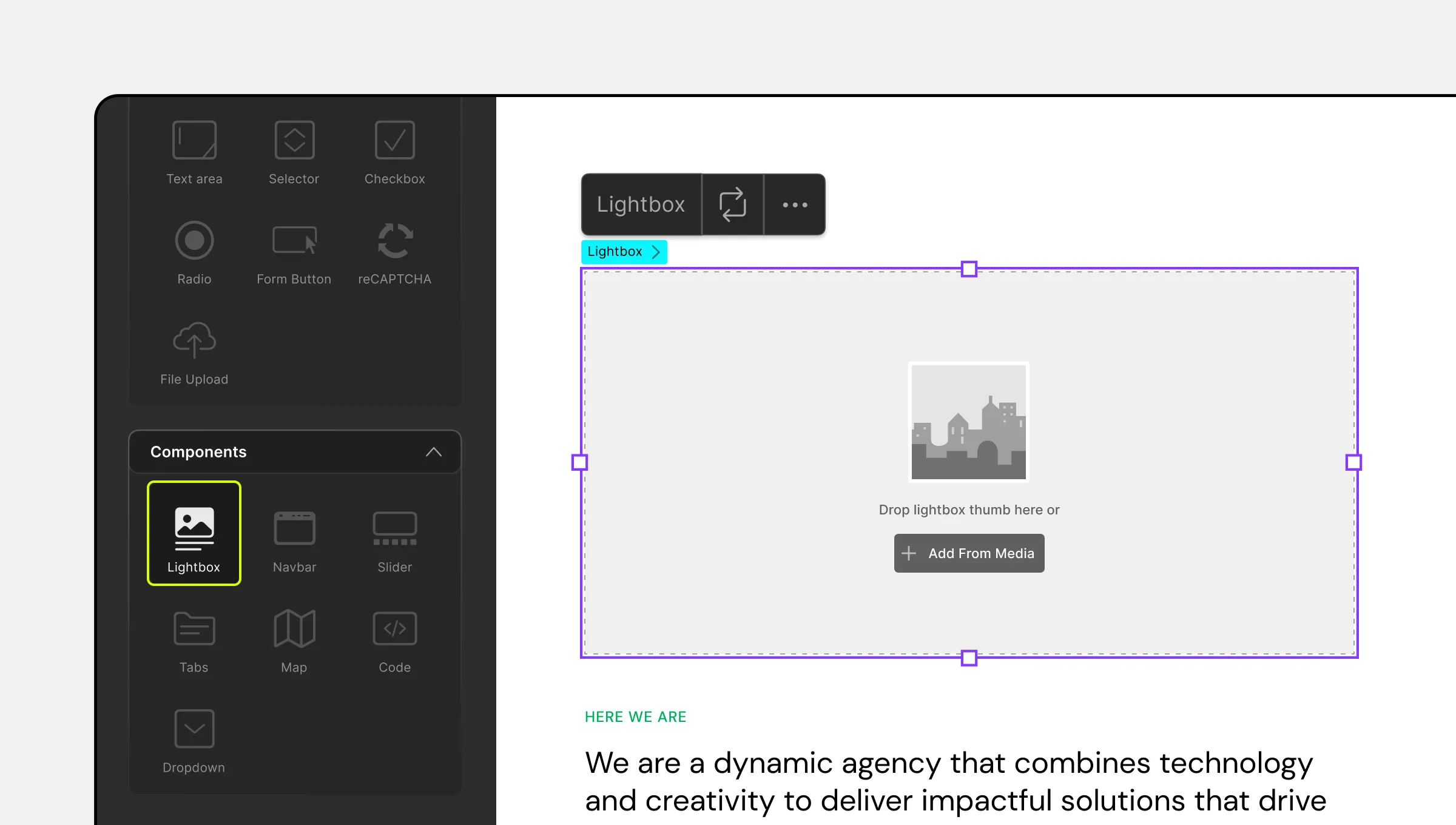
Adding a Lightbox Thumbnail
- Click on the Lightbox element to see the Lightbox icon with a +Add From Media button.
- Click on this button to open the Media Manager.
- Select the image you want to use as the Lightbox’s Thumbnail, representing what users will see on your webpage.
- Click Update to add the image to your Lightbox.
- You can change the thumbnail by clicking the Replace Thumbnail icon (circular arrows) in the Lightbox inline editor.
Lightbox Inline Editor
The Lightbox inline editor appears when you select the Lightbox. It includes two icons:
- Replace Thumbnail: Allows you to change the Lightbox thumbnail using the Media Manager.
- Ellipsis Icon: Opens the Lightbox Settings.
Lightbox Settings
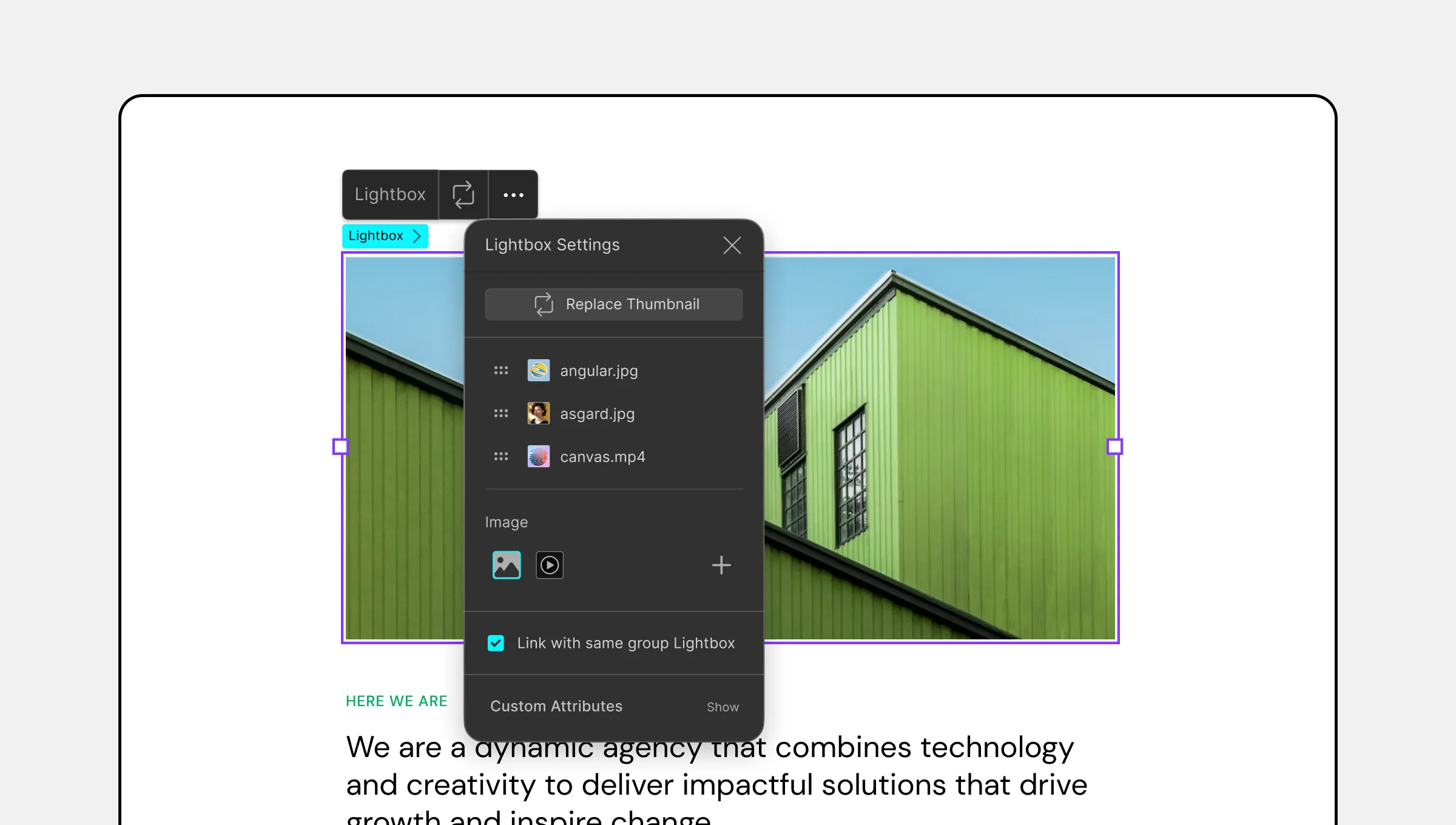
Under Lightbox Settings, you can configure additional Lightbox properties:
- Replace Thumbnail: Use this button to replace the Lightbox thumbnail with a different image from the Media Manager.
- Lightbox Type: Choose the type of media your Lightbox will display (Image or Video).
- Link With Same Group Lightbox: Enable this option to group your Lightbox with others. Enter the group name in the text field.
Adding Items to a Lightbox
- Open the Lightbox Settings by clicking the ellipsis icon in the inline editor.
- Click the + icon next to the Lightbox Type options to open the Media Library.
- Select or upload your Lightbox Item and click Update to add it.
- Repeat these steps to add more items.
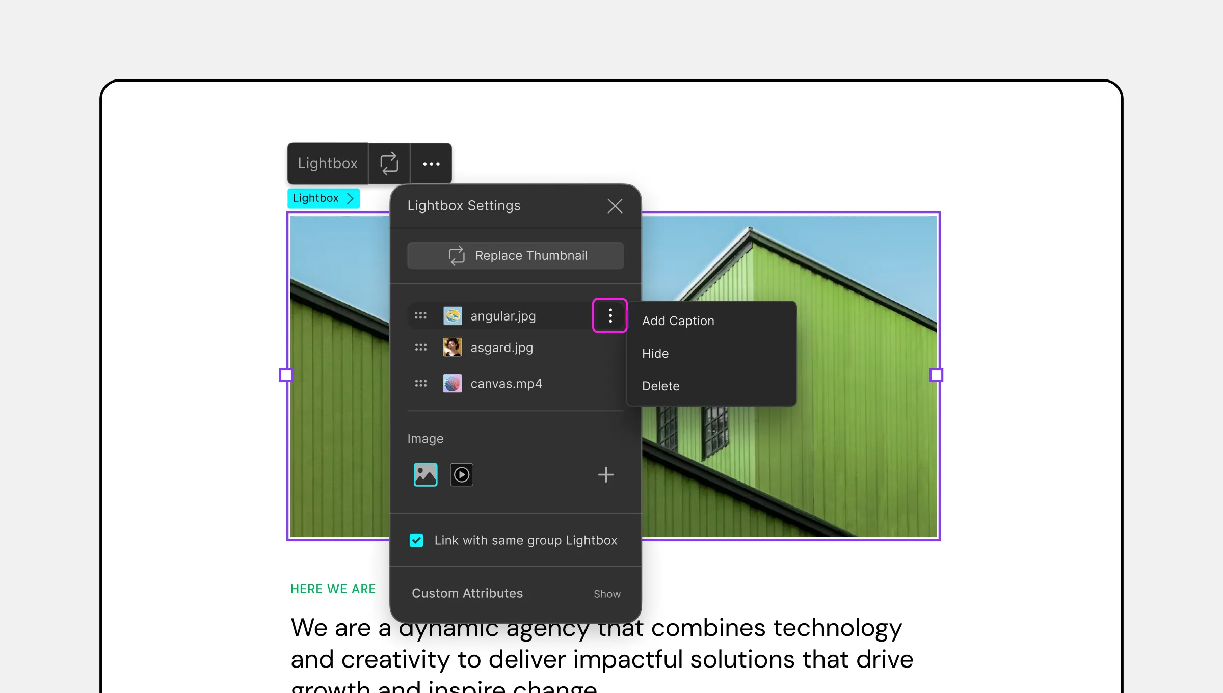
Rearranging and Customizing Items
Rearrange Items: Once the Items have been added, you can rearrange their sequence by clicking and dragging on the four-dotted icon on each Item’s left.
Visibility: On each Item’s right, you will also find an eye-shaped icon using which you can click to hide said Item so that isn’t visible in the Lightbox.
Followed by these is another ellipsis icon and by clicking on this, you’ll find the options:
- Add Caption: Use this option to add text to your image or video to be displayed as an overlay. Clicking on this should bring up a popup field where you can enter this text.
- Hide: Just like the Visibility toggle, this hides the Lightbox Item.
- Delete: Click on this option to remove this item from the Lightbox.
Styling Your Lightbox
Customize your Lightbox using the options on the Style Panel. Adjust its Size, Stroke, Shadow, Position, and more to create a unique and visually appealing Lightbox.
For more detailed information on styling, please refer to the Style Panel Overview documentation.
