From the Style Panel > Structure, you can adjust an element’s Structure. Not only that, but you can also adjust its Padding and Margin from here.
Display
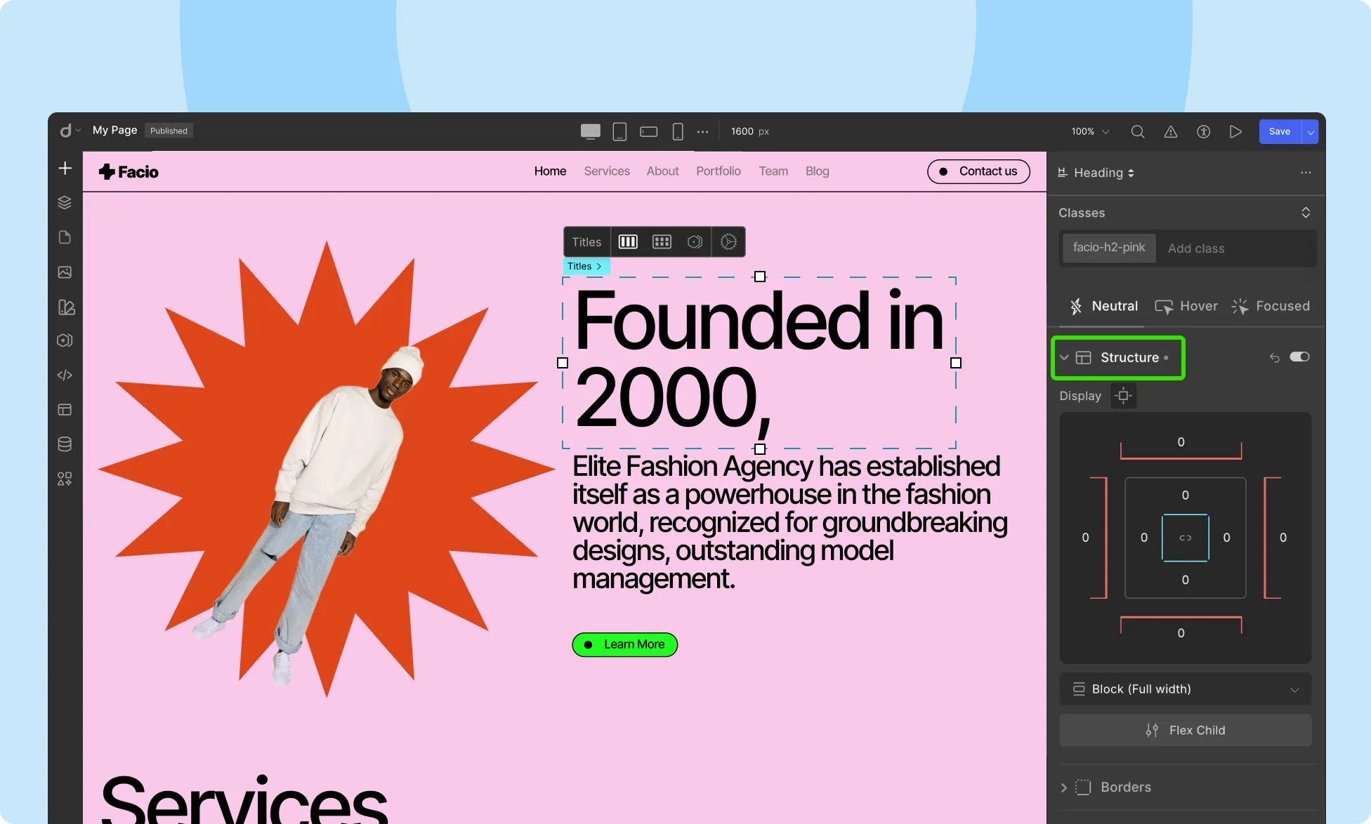
You can adjust the Padding & Margin values for your elements from here.
Padding: Padding is the space between an element’s content and its border.
To adjust this space, drag the borders of the blue square at the center in the Display section. Moving away from the box will increase the Padding while moving toward it will decrease the Padding. Note that this value can never be negative.
💡 Tip: Hover over the inside area of the element to reveal blue-colored padding handles. While pressing Shift, drag any of these inward for consistent padding on all sides.
Margin: Margin is the space between the element’s edge and the canvas’s edge.
To adjust this space, from the Display section, drag any of the red lines that frame the white square. Moving away from the box will increase the Margin while moving toward it will decrease the Margin.
This value can be both positive and negative.
💡 Tip: Hover over the outside area of the element for the red-colored margin handles to appear and while pressing Shift, drag any of these outward to ensure uniform margin space on all sides.
Structure
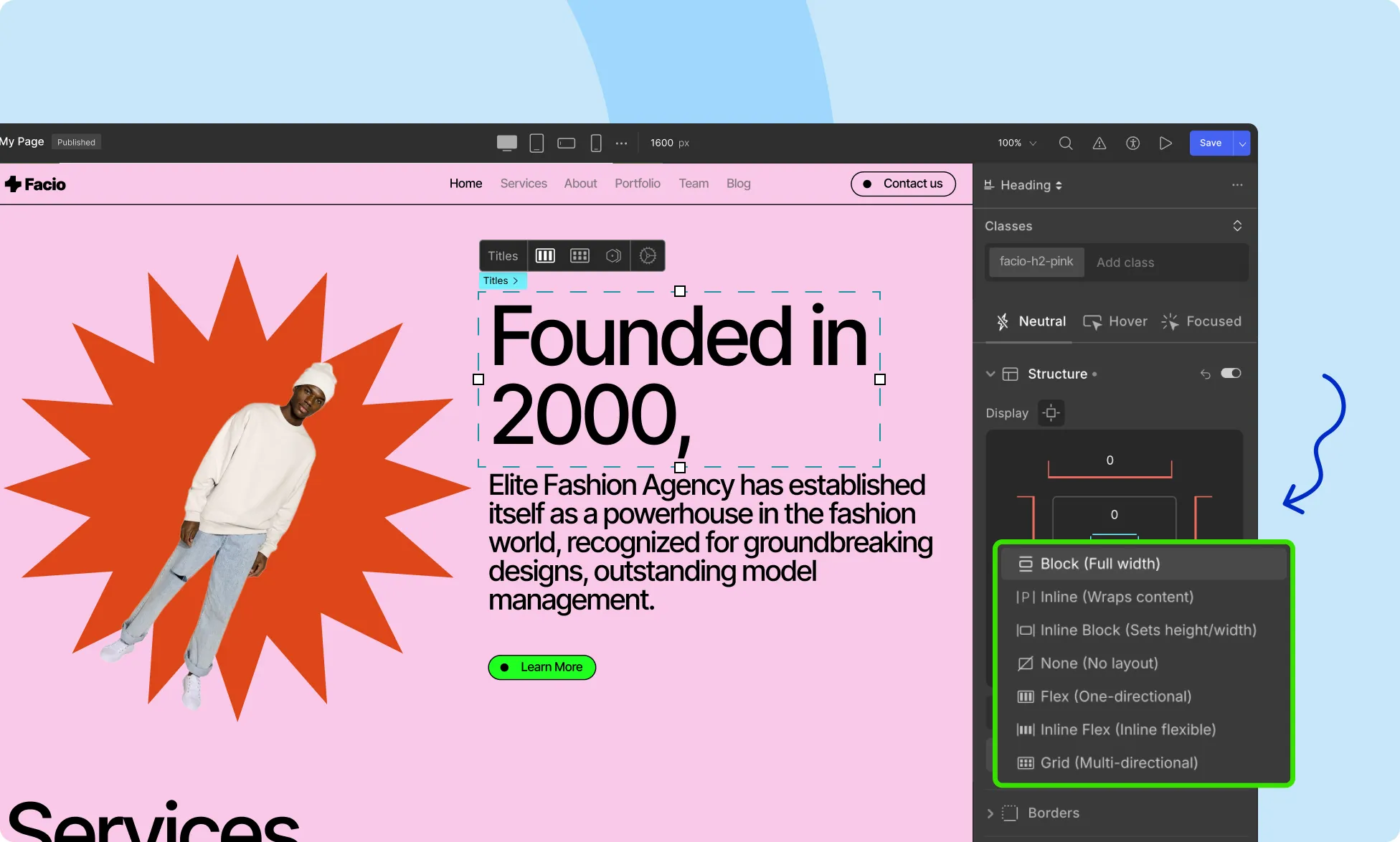
Below the Padding and Margin toggles, you will find a dropdown from where you can change an element’s Structure. Clicking on this will bring up the following options:
- Block (Take full Width): The element takes the entire width of the parent element and generates line breaks before and after itself.
- Inline (Wrap): The element does not generate line breaks after itself and so usually, the next element will be on the same line if there’s space. Defining Height and Width properties will have no effect.
- Inline Block (Have height/width): This allows you to set the width and height of the element, respects top and bottom margins/padding, and does not generate line breaks after itself, so the element can sit beside other elements.
- None (Wrap): The element is completely removed.
- Flex (One directional): The element behaves like a block element and its contents are placed in a flex structure.
- Grid (Multi-directional): The element behaves like a block element and its contents are placed in a grid structure.
Was this page helpful?