Canvas Control
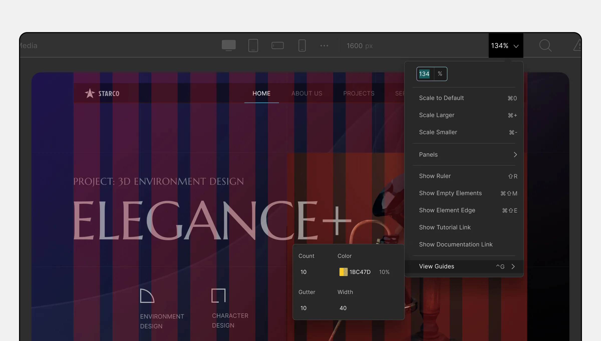
Using Canvas Control, you can customize the display and behavior of the canvas while you are working on your website. On the Topbar, it’s represented by the Scale Percentage which is a dropdown.
Adjust Canvas Size While Editing
You can easily adjust the canvas size using the Scale Percentage dropdown. Here are the available options:
- Scale to Default: Clicking here will set the canvas size to the default setting.
- Scale Larger: Enlarge the canvas size by clicking here.
- Scale Smaller: Reduce the canvas size from here.
Quick Panels Access
The Canvas control also provides quick access to panels. Follow these steps:
- Click on the Scale Percentage dropdown.
- Choose the Panels option.
- Select a specific panel from the list that appears, for example, Open Layers Panel.
Ruler and Element Visualization
- Show Ruler: Click on this option to enable or disable the Ruler. The Ruler tool helps you align elements more accurately on the canvas.
- Show Empty Elements: Enable this option to highlight empty elements on the canvas.
- Show Element Edge: Toggle this option to show the edges of the elements on the canvas.
Tutorial and Documentation Links
- Show Tutorial Link: Enabling this option will display a link to the tutorial when hovering over any Section Tab on the Style Panel.
- Show Documentation Link: Enabling this option will display a link to the documentation when hovering over any Section Tab on the Style Panel.
View Guides
The Canvas control allows you to enable Canvas View Guides. View Guides are multiple bars running from the top to the bottom of the canvas, which can be customized as follows:
- Count: Set the number of vertical bars the View Guides should have.
- Color: Choose the color of the View Guides.
- Gutter: Adjust the space between each vertical bar.
- Width: Set the width of each vertical bar.
View Guides can be handy for precise alignment and layout design.
With Canvas Control, you can tailor your canvas according to your needs and streamline your website development process.
