A Grid layout lets you divide any section into rows and columns, offering a flexible and precise way to structure your page.
It allows for clean, consistent designs without using float or position values.
Understanding Grid Layout
Grid Container vs Grid Items
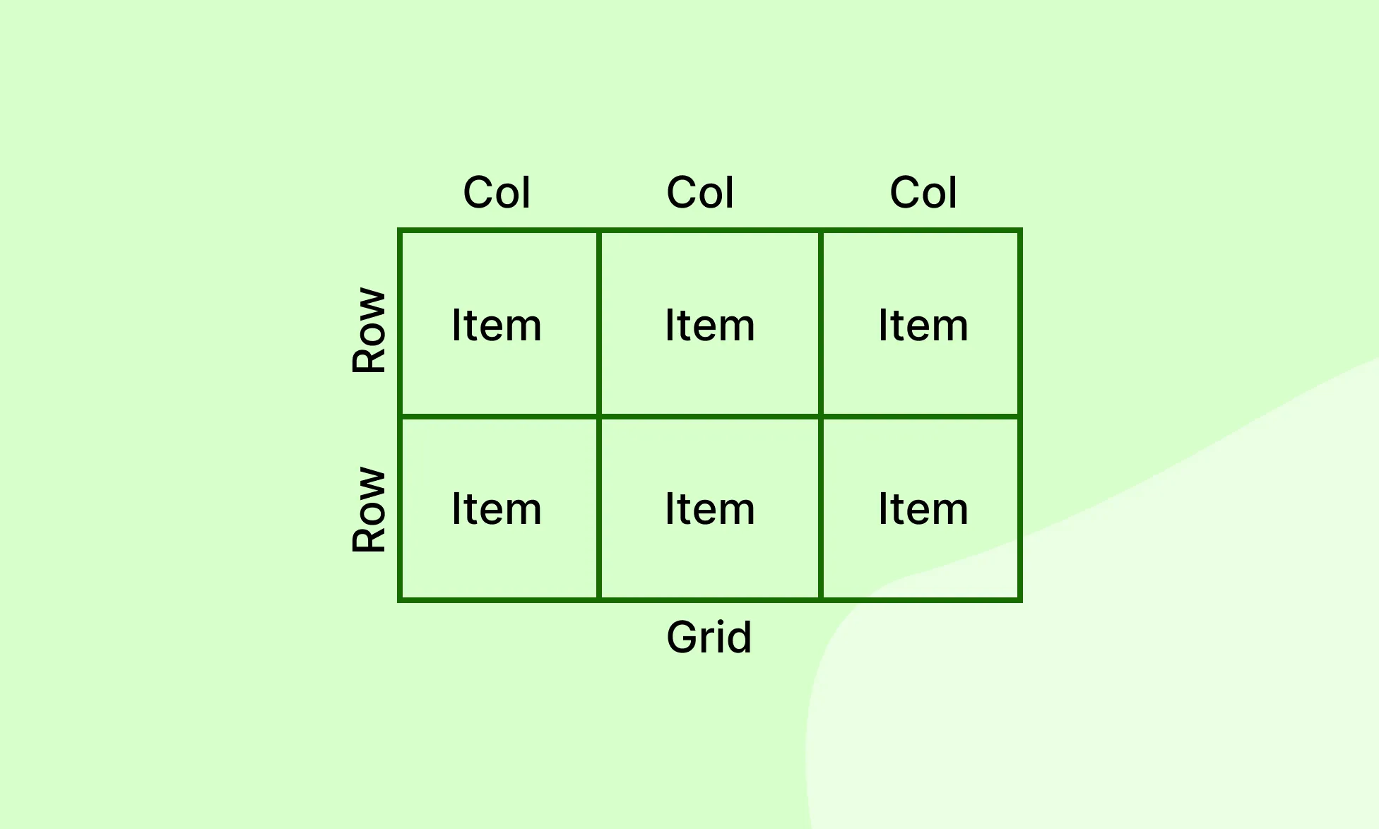
- When you add a Grid, it becomes the Grid Container.
- Any direct child of that container becomes a Grid Item.
Grid vs Flex
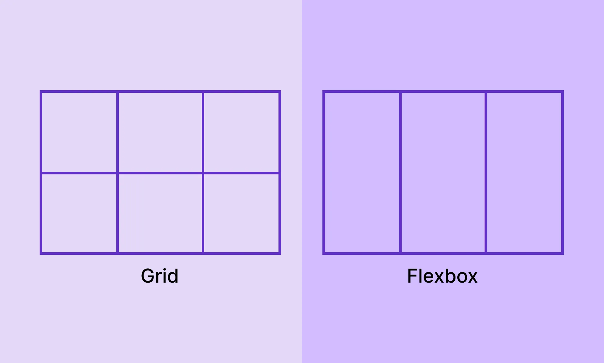
- Grid is two-dimensional — it handles both rows and columns.
- Flex is one-dimensional — it arranges items in a single row or column at a time.
Check out our Flex documentation
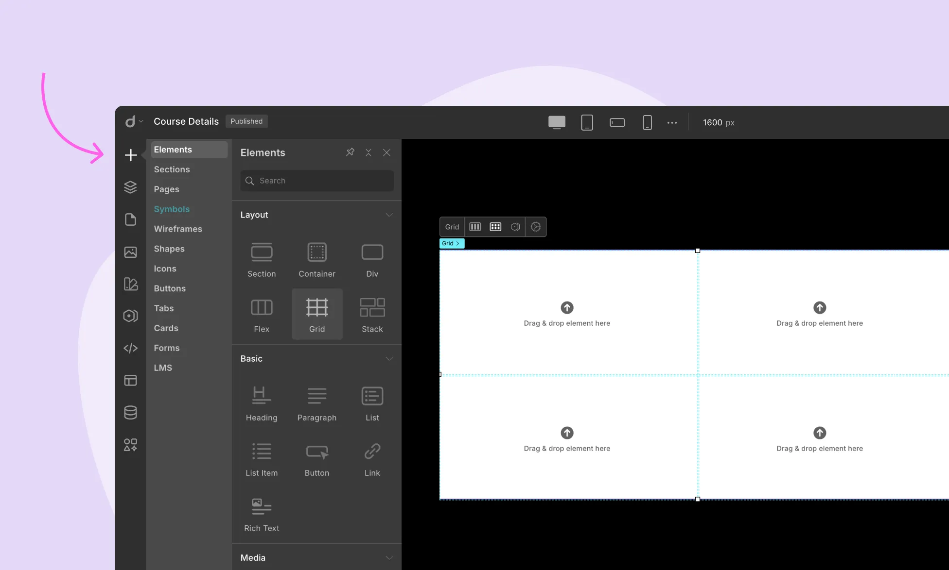
Adding a Grid

Option 1: From the Elements Panel
- Open the Elements Panel (left sidebar).
- Under the Layouts section, drag the Grid element onto the canvas.
Option 2: Convert Existing Element to a Grid
- Select the element on the canvas.
- Go to Style Panel > Structure (right sidebar).
- From the dropdown, select Grid (multi-directional).
Grid Structure
Once your Grid is added, you can customize it via Style Panel > Structure.
Grid Tracks
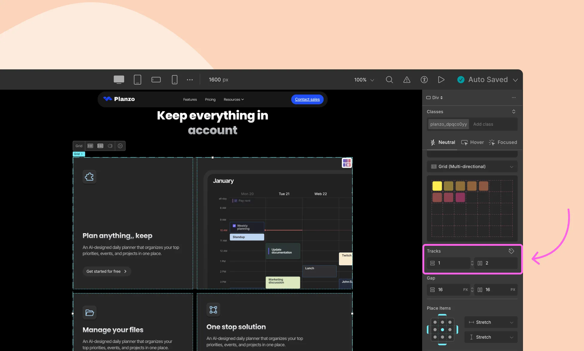
Grid Tracks defines the number of columns and rows in the grid.
- Column Tracks: Right input field – sets number of columns.
- Row Tracks: Left input field – sets number of rows.
- Click the link icon between the inputs to keep row and column counts synced.
Grid Gap
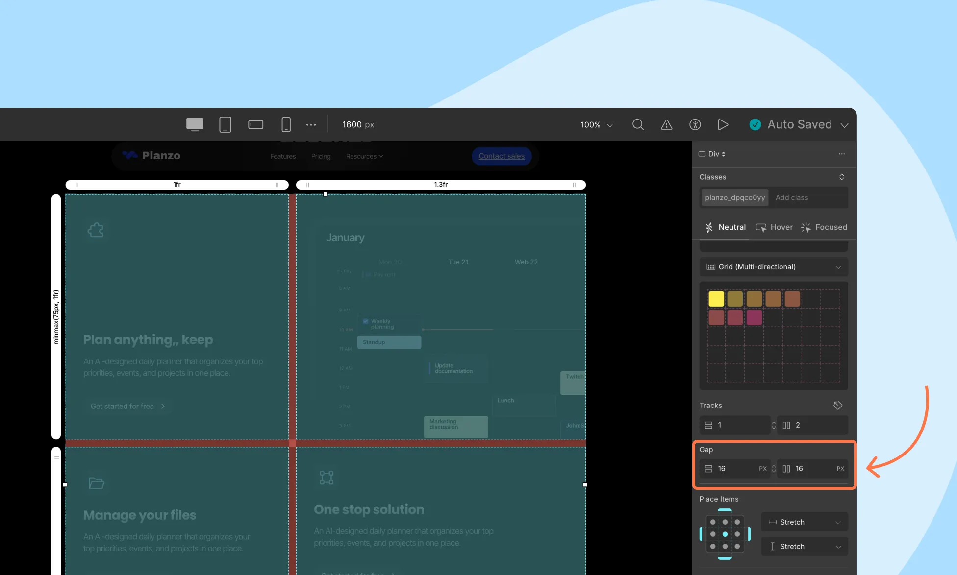
The Grid Gap property defines the space between each column or row.
- Column-gap: Right input field is for the gap between columns.
- Row-gap: Left input field is for the gap between rows.
Keep in mind that the gap is measured in pixels, but that can be changed from the drop-down list of units.
You can use the link icon that’s located between the two gap toggles to ensure all your columns and rows have the same gap.
📝 Note: Alternatively, click the Grid Controller icon at the top-right corner of the Grid. This opens a visual editor where you can drag to adjust the grid spacing (gap).
Aligning Items with Place Items
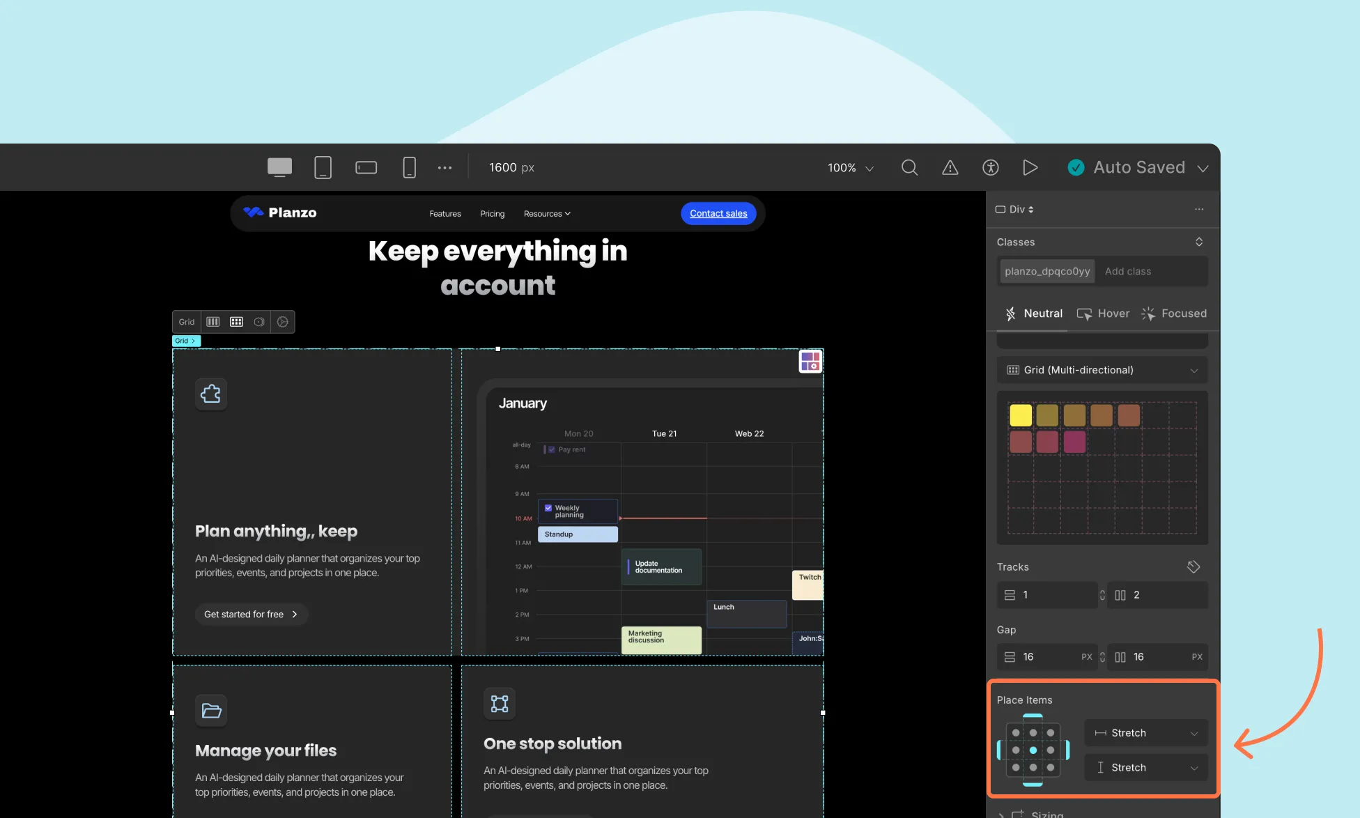
Once you’ve added elements to your Grid, you can control how they are positioned within their individual grid cells using the Place Items settings.
You’ll find this option in the Style Panel > Structure > Place Items section.
You can:
- Use the visual placement grid to quickly set alignment
- Or select from the dropdown menus for fine-tuned control over horizontal and vertical alignment
Horizontal Alignment (X-Axis)
Controls how items are aligned side to side inside their grid cells.
Available options:
- Auto: Inherits alignment from the parent element.
- Start: Aligns items to the left of the cell.
- End: Aligns items to the right of the cell.
- Center: Centers items horizontally in the cell.
- Stretch: Stretches items to fill the cell’s width.
Vertical Alignment (Y-Axis)
Controls how items are aligned top to bottom within their grid cells.
Available options:
- Normal: Behaves like Stretch, except when the container has intrinsic height or aspect ratio—it acts like Start in those cases.
- Start: Aligns items to the top of the cell.
- End: Aligns items to the bottom of the cell.
- Center: Centers items vertically in the cell.
- Stretch: Stretches items to fill the cell’s height.
💡 Tip: Use the grid-based visual selector to apply both alignments at once. Each dot represents a position, just click to set!
Grid Controller Settings
You can control the width of each column and the height of each row individually using the Grid Controller.
To open these settings:
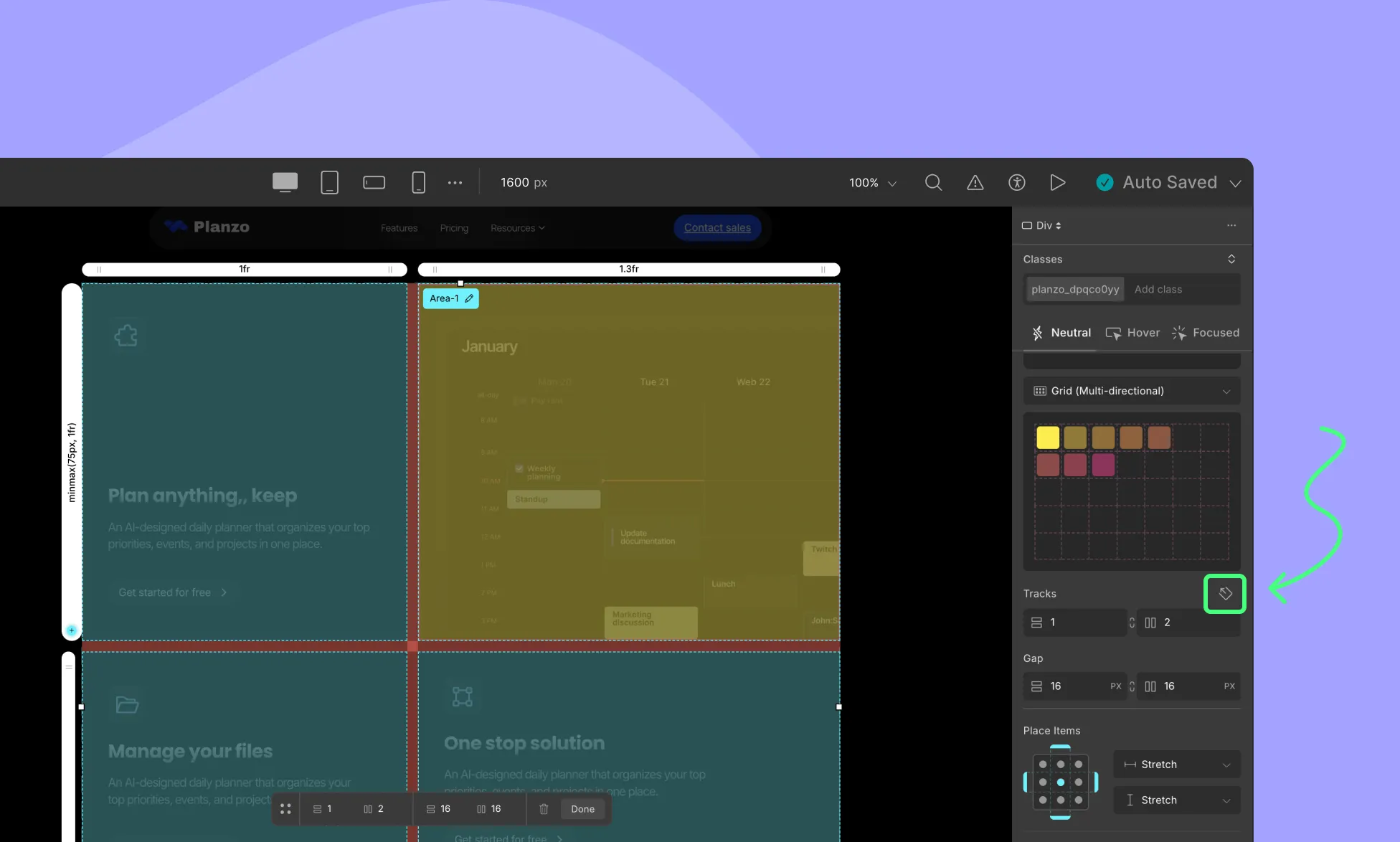
- Click the Grid Controller icon (top-right corner of your grid). Or, click on the icon that’s beside Grid Tracks
- Then, click any of the track handles (white bars on columns or rows) to bring up individual settings.
Column Settings
With the Grid Controller open, you’ll be able to access toggles to define the width of the rows and columns. These settings can be accessed by clicking on any one of the white buttons that’s above every row and column.
The following are the options available to you in Column Settings.
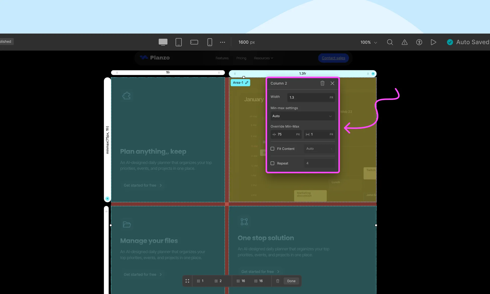
Width: Define how wide you want your column to be from here.
Min-Max Settings: The dimensions of a track (column) are based on the width of the content. Listed below are the options available for this feature:
- Auto: Follows default settings. Track Width is based on the size of the container.
- Min-Content: Track Width is automatically set as the same length as the widest bit of content.
- Max-Content: Track Width is set so that all of its content can fit without it over-flowing the box or being wrapped.
Override Min-Max: Override min-max settings by defining the gap size (left) and the track width (right) from here.
Fit Content: Track Width is equal to the length of its content until it exceeds the given length in which case it will wrap the content to the next line instead.
Repeat: Use this option to duplicate tracks so that they’ll have the same style and width.
Row Settings
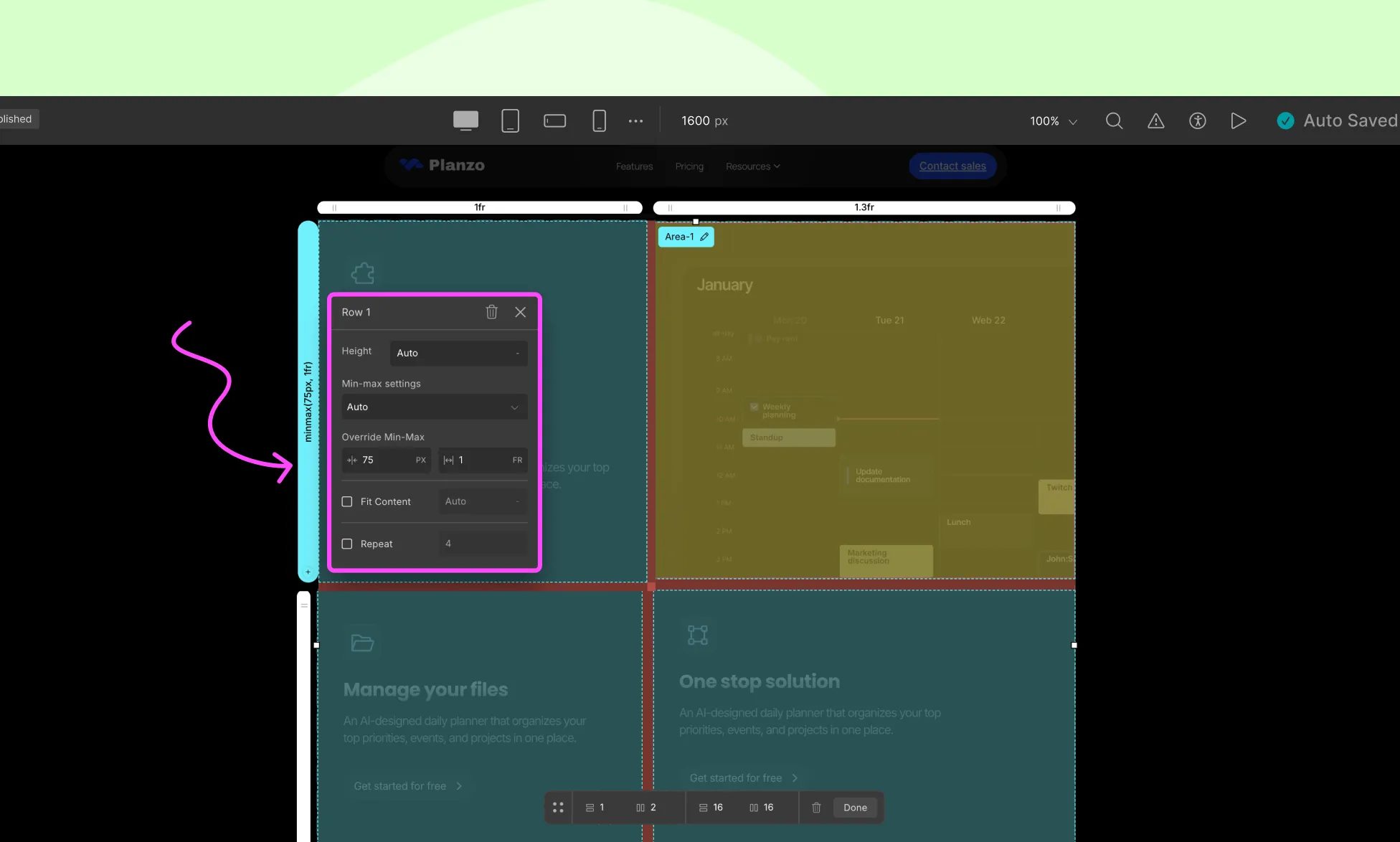
In Row Settings, you’ll find the same options as you did for Column but for the Row Height:
Height: Define how tall you want your row to be from here.
Min-Max Settings: The dimensions of a track (row) are based on the height of the content. Listed below are the options available for this feature:
- Auto: Follows default settings. Track height is based on the size of the container.
- Min-Content: Track height is automatically set as the same length as the widest bit of content.
- Max-Content: Track height is set so that all of its content can fit without it over-flowing the box or being wrapped.
Override Min-Max: Override min-max settings by defining the gap size (left) and the row height (right) from here.
Fit Content: Track height is equal to the length of its content until it exceeds the given length in which case it will wrap the content to the next line instead.
Repeat: Use this option to duplicate tracks so that they’ll have the same style and height.
💡Tip: You can manage all tracks quickly using the bar at the bottom of the Grid Controller, where you can change total row/column count, apply uniform gaps, and delete the grid entirely.
Adding Elements to a Grid
To add elements to a Grid:
- Open the Elements Panel from the left sidebar.
- Drag and drop your desired elements onto the Grid.
- Elements are added from left to right for each row.
- If space runs out in the Grid, dropping an element will automatically create space for it.
Grid Item Settings
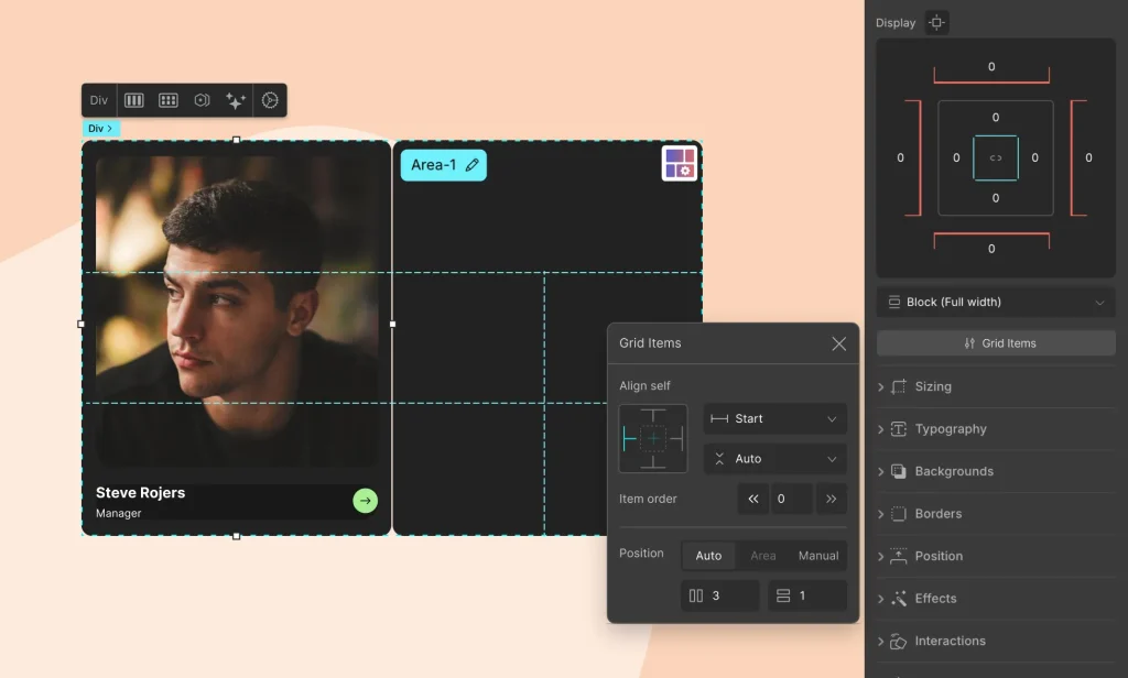
To adjust settings for a specific Grid Item (child element of the Grid), select the Grid Item and go to Style Panel > Structure.
Click the Grid Items button to access the following settings:
Self Align
From Self Align, use the first drop-down to adjust the vertical alignment and the second to adjust the horizontal. These alignment options have already been explained above in the Place Items section.
Item Order
Next, define the order of the item in the sequence of elements using the Item Order option.
Grid Items are counted from left to right for each row. Items with the lowest number are placed first while items with the highest number are placed last.
Spanning Grid Items Across Multiple Cells
You can span individual Grid Items across multiple rows, columns, or both. This is useful for hero sections, cards of different sizes, featured content blocks, and more.
Droip provides three powerful ways to do this:
1. Explicit Placement (Manual)
Use this option when you want precise control over where the Grid Item starts and ends.
How to Use:
- Select the Grid Item.
- Go to Style Panel > Structure > Grid Items > Position.
- Choose Manual.
- Enter the grid line numbers:
- Row Start: The line where the item begins vertically.
- Row End: The line where the item ends vertically.
- Column Start: Where the item begins horizontally.
- Column End: Where it ends horizontally.
- Row Start: The line where the item begins vertically.
Example: In a 3×3 grid (which has 4 column lines and 4 row lines), if you want a card to span the entire third column, set:
- Column Start: 3
- Column End: 4
- Row Start: 1
- Row End: 4

2. Implicit Placement (Auto Start)
This is a quicker way to let Droip auto-place your item but still define how many lines it spans.
How to Use
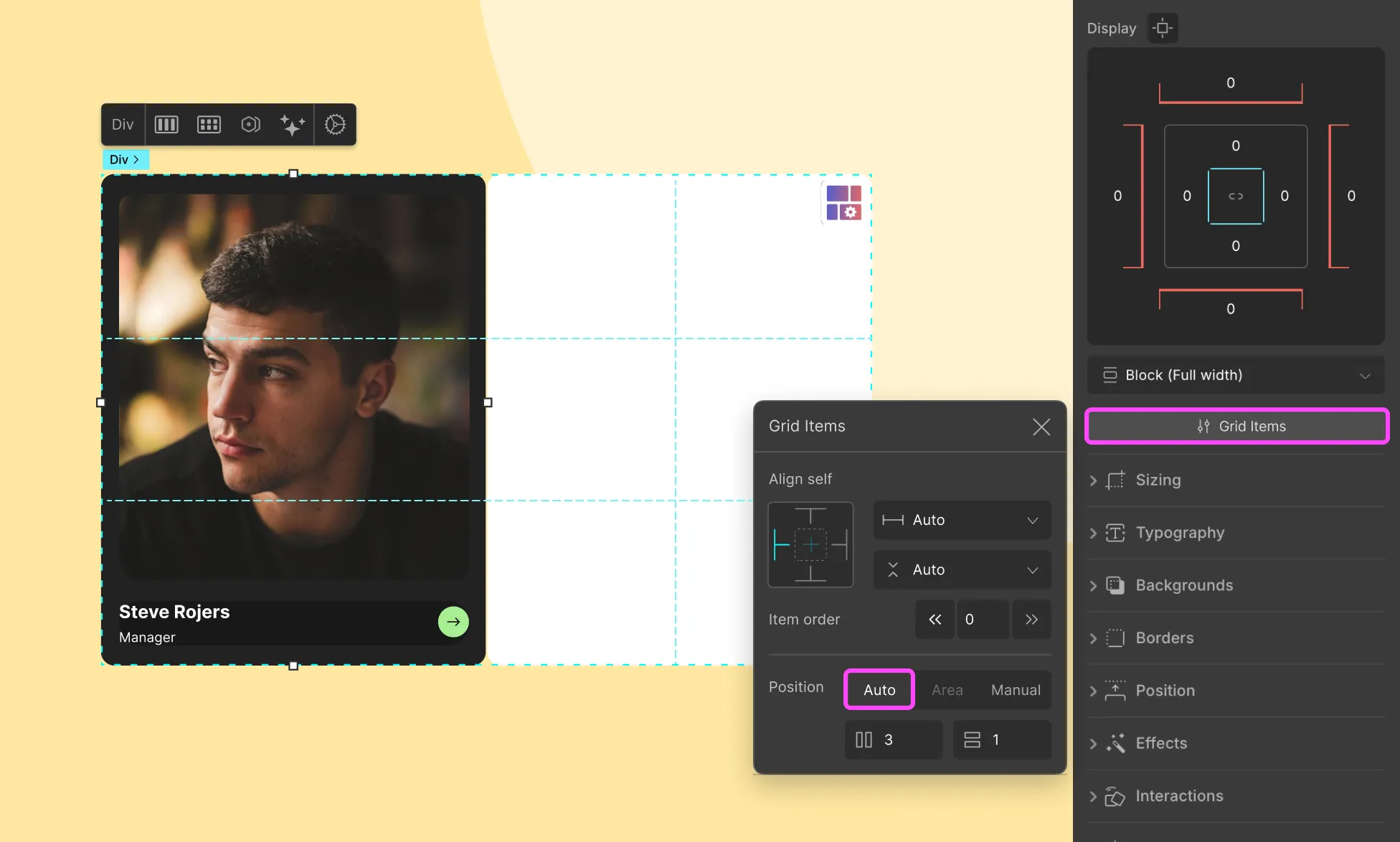
- Select the Grid Item.
- Go to Structure > Grid Items > Position.
- Choose Auto.
- Set:
- Column Span: Number of columns it should cover.
- Row Span: Number of rows it should cover.
- Column Span: Number of columns it should cover.
📝 Note: Start lines are auto-selected by the grid engine, and the item stretches from there.
3. Grid Area (Named Area Spanning)
For a more visual and reusable layout method, use Grid Areas. You define an area using cells and assign items to that area.
How to Use:
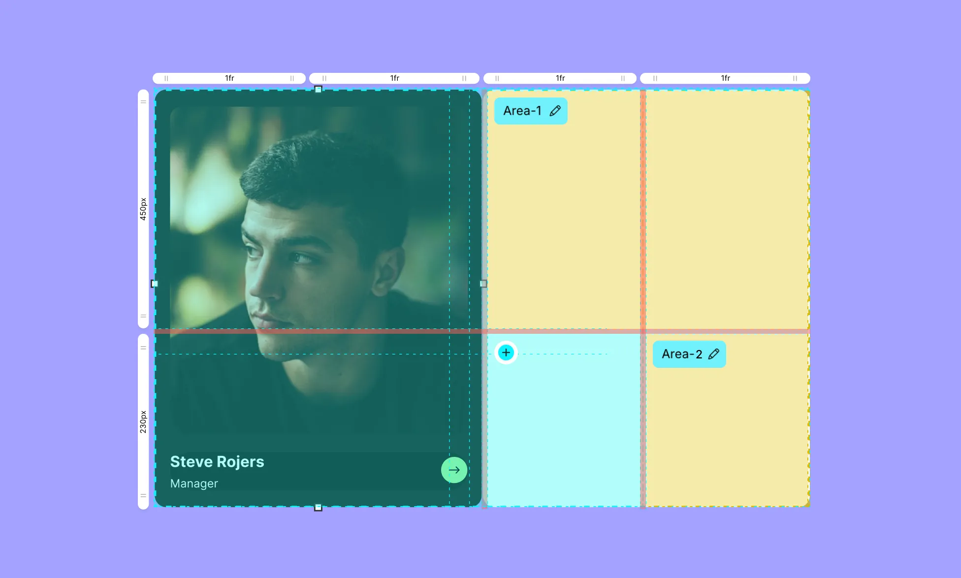
- Open the Grid Controller (click the top-right grid icon).
- Click the ➕ icon inside the cells you want to group together. These must share a common grid line.
- A named area (e.g., Area-1) will be created. You can edit and change the name if you want.
- Select the item you want to span that area.
- Go to Structure > Grid Items > Placement > Area. Choose the named area from the dropdown.
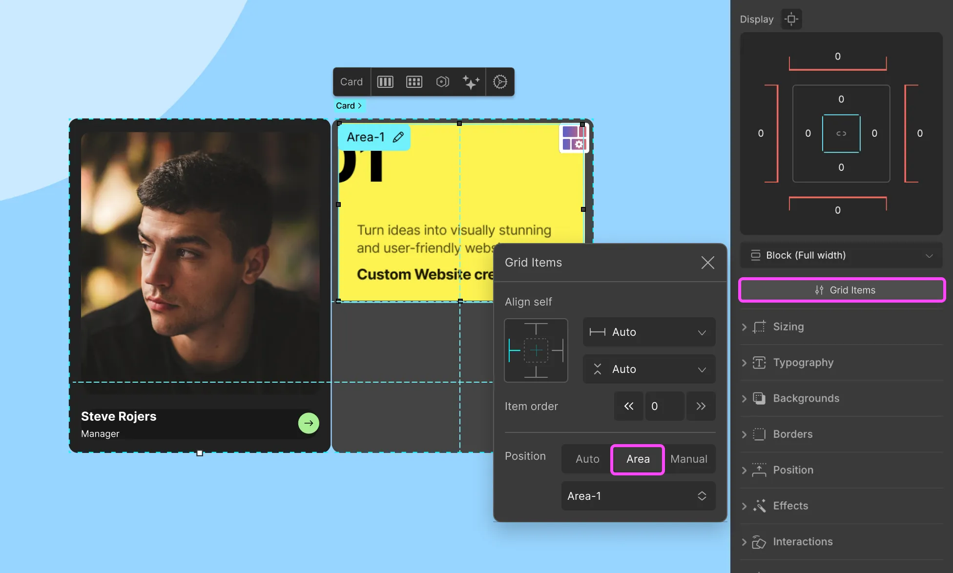
This is ideal for creating magazine-style layouts or dashboard-style interfaces where multiple items are organized in reusable blocks.
Using Layers to Rearrange Grid Elements
You can also easily rearrange your grid elements by going to the Layers tab from the Topbar.
On the Layers Panel, click on the Grid layer to collapse it. Then, click and drag the elements within to shuffle their order in the layer sequence thus altering their placement.
Was this page helpful?