
Wondering why you need a Responsive Website Builder for your site?
Well, as you may know, responsiveness is a crucial factor for websites as it means a more optimized user experience across all of its platforms, increased website visibility on SERPs, lower bounce rates, and more.
However, implementing it can be tedious or even difficult and also time-consuming, especially without a visual tool to help you out.
This is where a responsive website builder can save your day. Built specifically for this purpose, using such tools can transform how you design responsive websites for the better!
Why You Need a Responsive Website Builder
A responsive website builder is a tool that empowers you to effortlessly and efficiently craft websites that look great and function well across various devices and screen sizes.
Listed below are some of the reasons why you need a responsive website builder:
1. Auto-Responsive Nature Minimizes Workload
Many of these tools support auto-responsive design, meaning a lot of the work behind adapting them to various screen sizes is already done for you as soon as you start designing your website using the tool.
Since its auto-responsive nature minimizes workload, you are then free to focus on adapting the finer details of your design.
2. Craft Responsive Websites More Efficiently
Such tools can save you a lot of time partially due to their auto-responsive nature. You’ll also find that many of them have easy-to-use interfaces, allowing you to add breakpoints easily and seamlessly switch between them without the hassle of coding.
You may also get access to various pre-made responsive sections that you can add to your design to speed up the process even further. Ultimately this means you can craft responsive websites more efficiently.
3. Easily Adapt Websites to Any Screen Size
Top-notch responsive website builders also boast a plethora of breakpoint options to choose from. They may even have the capability to define custom breakpoints.
For instance, Droip is a no-code WordPress website builder that lets users add unlimited and custom breakpoints.
Armed with such a tool, you can easily adapt websites to any screen size and device with just a few clicks!
4. Tailor Every Nitty-Gritty Detail of Your Web Design Effortlessly
A responsive website builder gives you full control over your website for any breakpoint, allowing you to easily tailor every nitty-gritty detail of your design through its visual interface.
While seamlessly switching between breakpoints, you can tailor the look of your website design with no limitations, just as you would for any other webpage.
5. Concurrently Test Website Responsiveness
A responsive website builder lets you switch between breakpoints seamlessly and by doing so you can concurrently test website responsiveness while adapting it.
This means you can make the necessary changes more efficiently as you visually pinpoint the areas you need to adapt, leaving fewer gaps in the responsiveness of your website overall.
6. Accessible To Everyone
Compared to developing a website from scratch with code or using some other more convoluted tool, responsive website builders are more accessible and a more viable solution that anyone can use.
With its assistance, you don’t need to know how to code or be a design expert to create responsive websites and this often means a more cost-effective solution.
Responsive Website Builder in Action
Now that you know the reasons why you need a responsive website builder for your site, it’s time to showcase one such tool in action and give you a better idea of how much simpler it can make the web design process.
We’ll use Droip — a no-code WordPress website builder to do this. This builder offers unlimited breakpoints, a user-friendly visual interface, and countless other no-code capabilities, allowing you to create responsive websites effortlessly!
Requirements
- WordPress website
- Droip
Using a Responsive Website Builder
Start by installing Droip, the responsive no-code website builder on your WordPress site. Then, using its visual drag and drop interface start designing your web pages or seamlessly import existing ones using its migration option.
💡 Tip: You can also use the Figma to Droip tool to transfer pre-made Figma designs onto your Droip canvas for development in one click!
Then, to make your design responsive do the following:
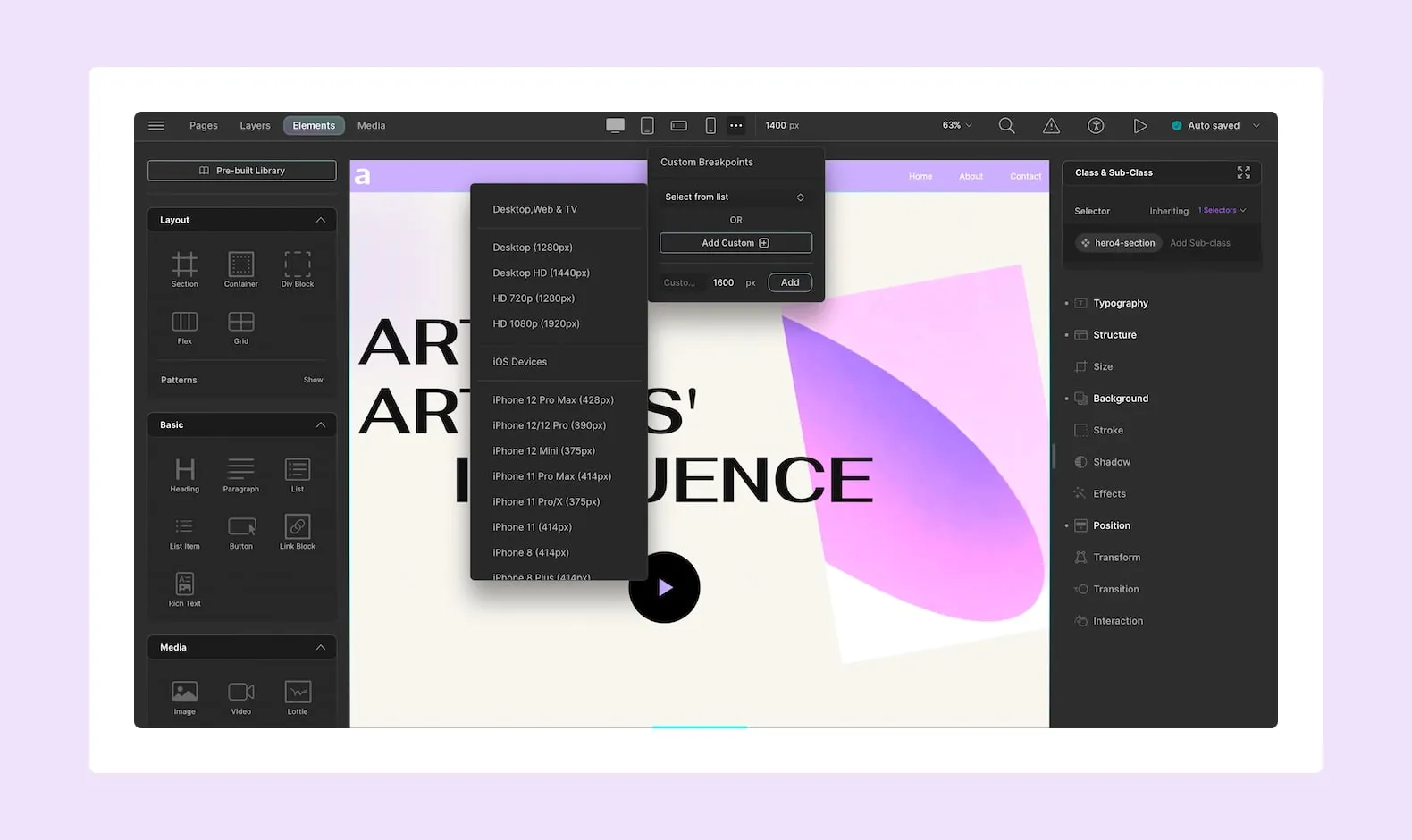
- From the Breakpoints Panel in the Topbar, switch to any viewport option or define a custom breakpoint.
- Then, start tailoring your design for that screen size. You can adjust the settings in the Style Panel, add elements, hide elements, etc.
- Repeat the same steps for other breakpoints. In fact with Droip, you can work with unlimited breakpoints!
- Finally, select the Desktop option again when you want to switch back to default.
💡 Tip: You can drag the toggle on the canvas’ right to switch breakpoints seamlessly and easily test what your design looks like on each of them.
And that’s really all there is to it! See how simple it is? Keep in mind that since designs in Droip adapt automatically, half the work is already complete and all you need to do is tailor the finer details.
Other Ways to Optimize Website Responsiveness
Of course, breakpoints are not the only way you can make your website more responsive!
Listed below are other ways to optimize website responsiveness in Droip and even improve the website experience as a whole.
Responsive Grids: Make Grids responsive using the relative unit percentage for its columns and ensure a flexible page layout.
Scalable Graphics: Use scalable graphics like SVGs in your design which are known to maintain their crisp quality across all screen sizes giving your website a more polished look.
Responsive Typography: Ensure consistent readability across all devices by defining scalable font sizing using relative units, auto-adjusting line height, etc from Typography settings.
Design Responsive Websites Effortlessly
Now that you know why you need a responsive website builder for your site, why wait? Get your hands on the Droip WordPress website builder today and start designing responsively like never before!

Discussion (0)