Pop-ups, also known as modals, are versatile dialog windows used to display information that requires user attention without navigating away from the main content. They are commonly used for confirming actions, providing additional information, or collecting user input.
Creating a Pop-up
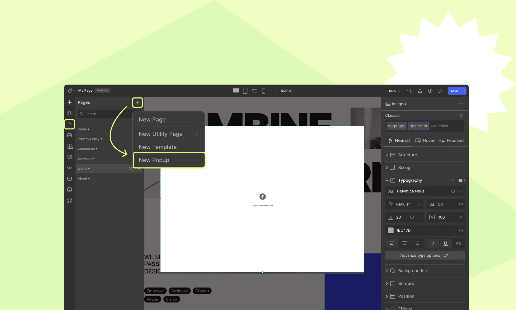
To add a Pop-up to your page:
- Navigate to the Pages panel in the left sidebar.
- Click on the + icon and select Pop-up to create a new one.
- Enter a name for your Pop-up, save it, and start editing.
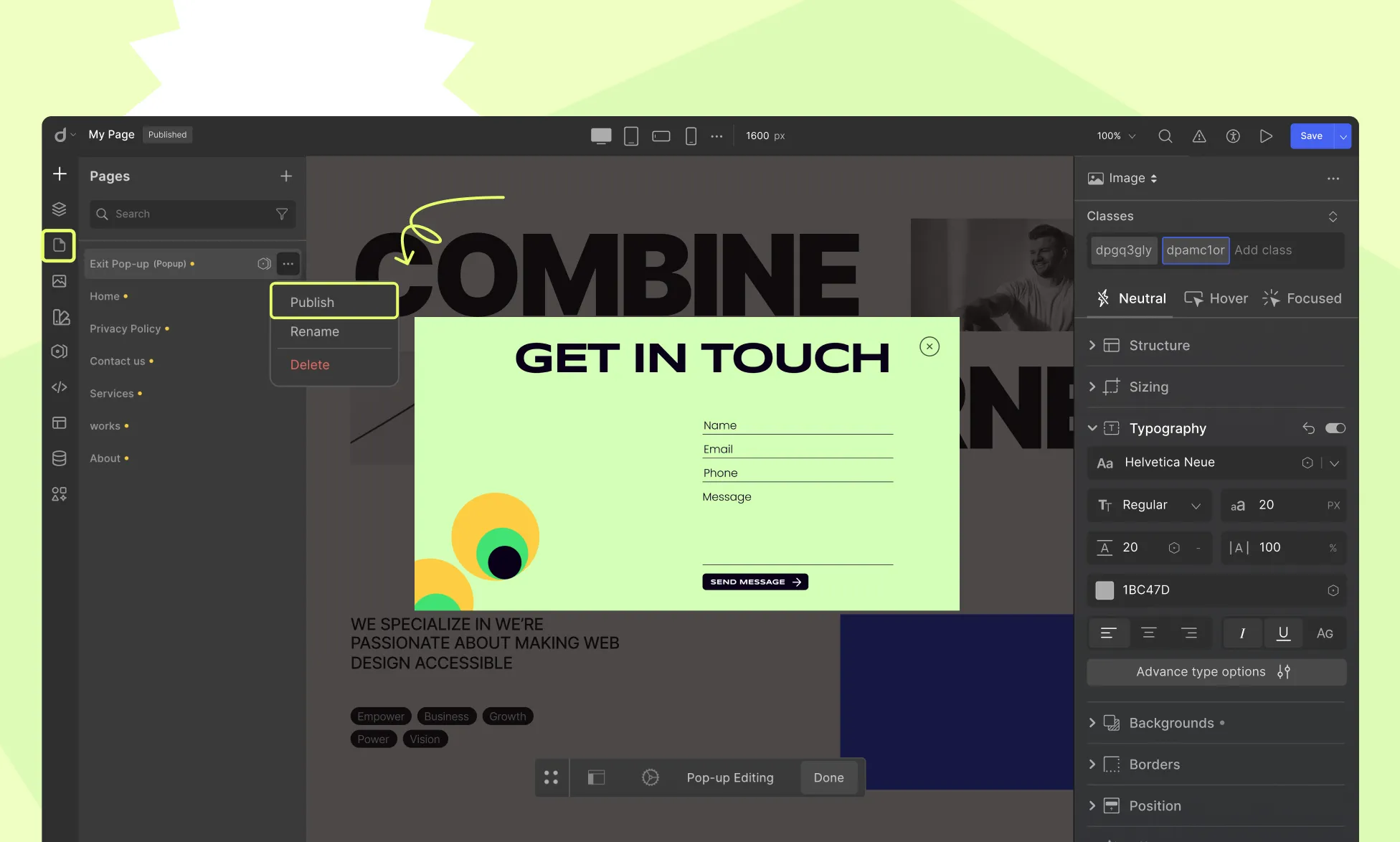
Designing a Pop-up
Using Droip Elements and various customization options, you can create Pop-ups that seamlessly integrate with your website while meeting your specific needs.
Pop-up Settings
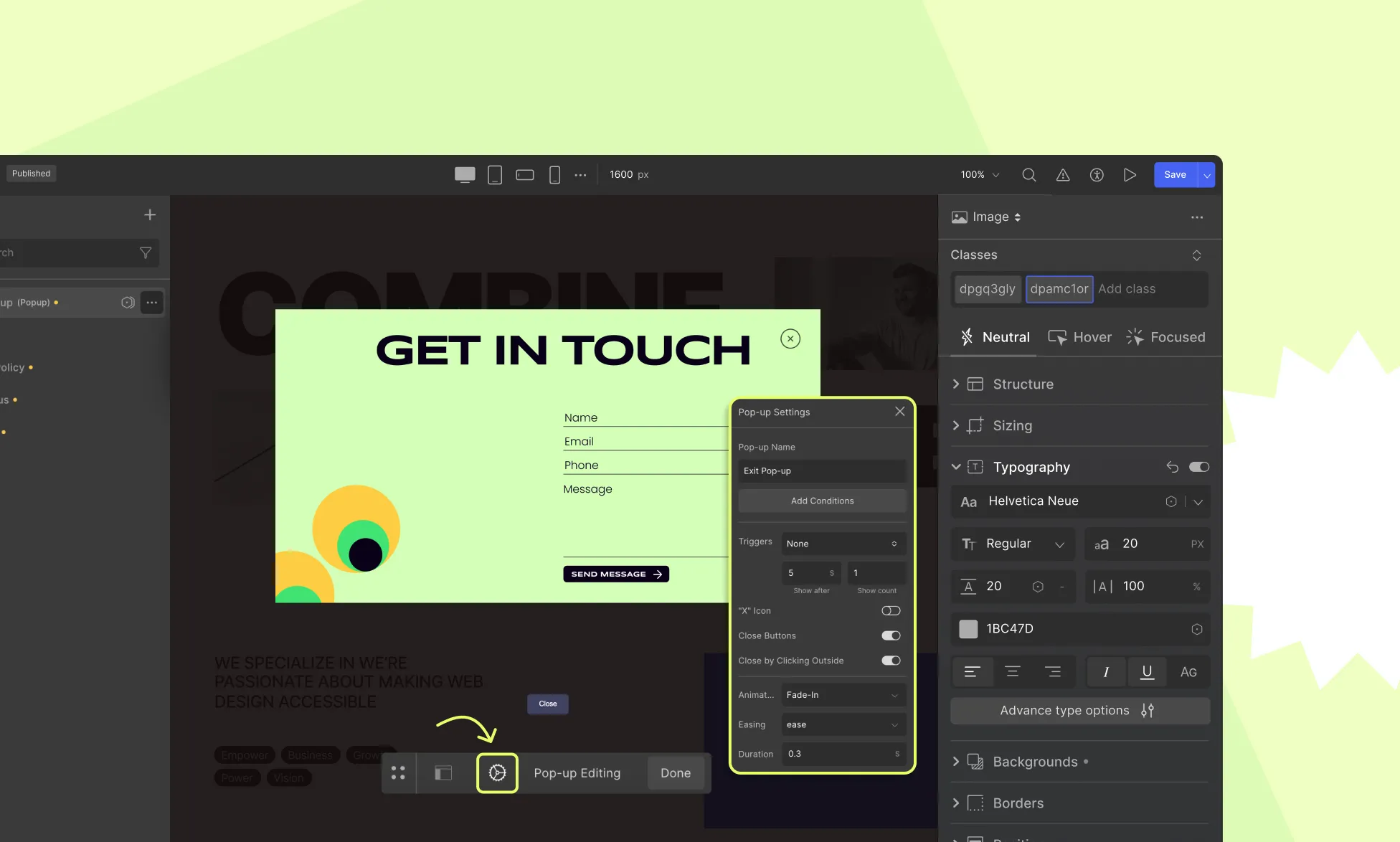
The Pop-up Settings allow you to control various aspects of the Pop-up. Select the pop-up on the canvas and click on the settings icon from the inline editor to access the following:
Pop-up Name
Assign a label to identify the Pop-up in the builder.
Display Conditions
Determine where and for whom the Pop-up will appear:
Set Display Condition to Entire Site
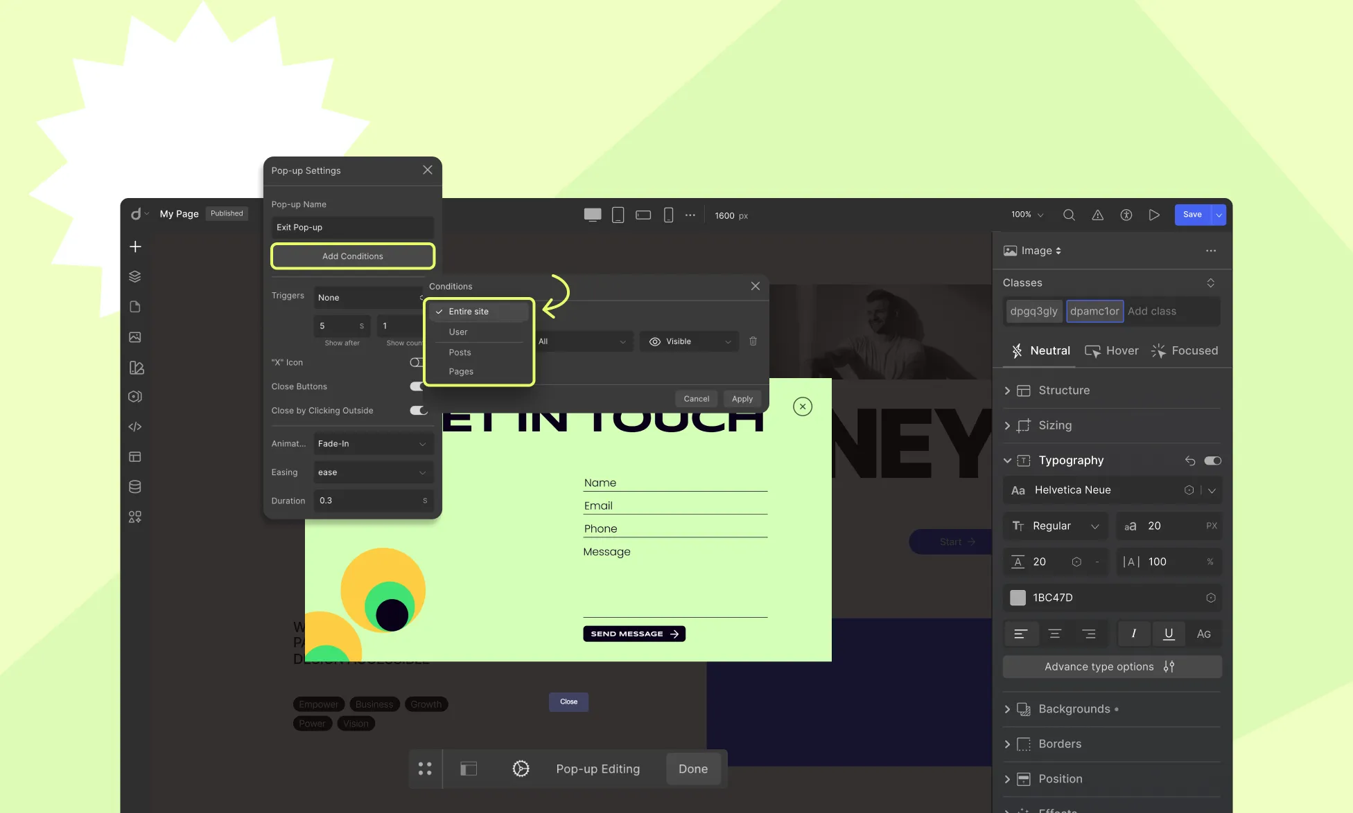
The Pop-up will be displayed across all pages of the website, ensuring it reaches every visitor regardless of their navigation path.
Set Display Condition to User Role
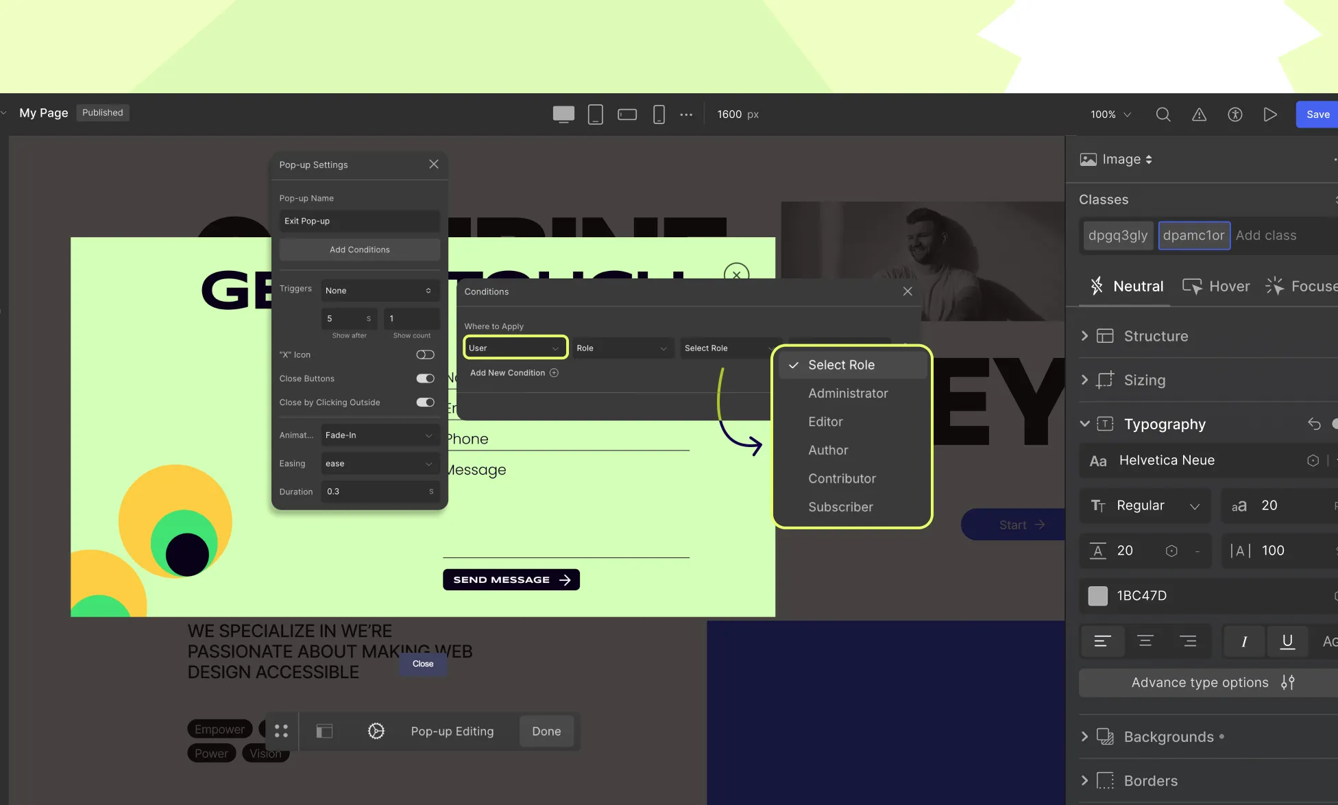
Restrict the Pop-up to specific user roles. You can select roles such as Administrator, Editor, Author, Contributor, Subscriber, or any custom roles available on your website.
Set Display Condition to Posts
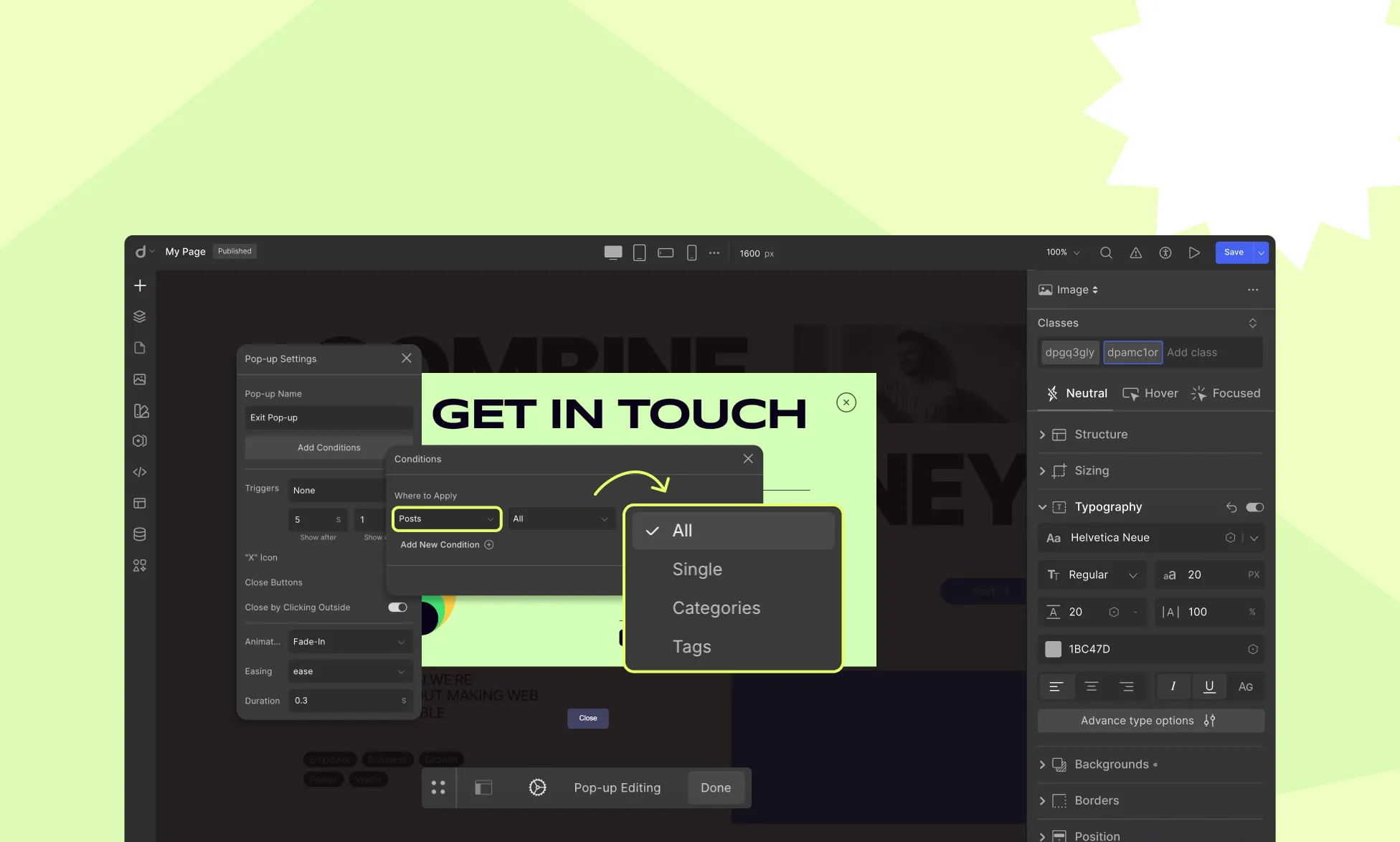
Choose whether to display the Pop-up on specific blog posts. You can:
- Select individual posts where the Pop-up should appear.
- Target entire post categories to ensure the Pop-up is shown on all posts within the chosen category.
- Select tags to ensure the Pop-up is shown on all posts within the chosen tags.
Set Display Condition to Pages
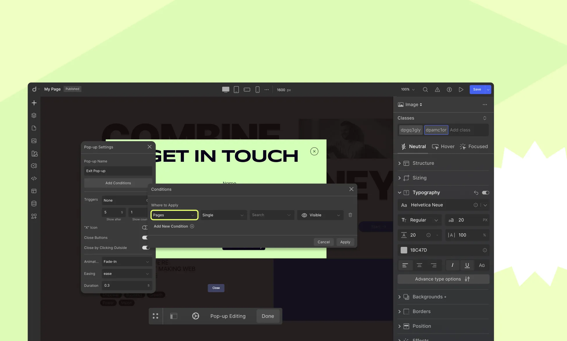
Select specific pages where the Pop-up will be shown. This allows for targeted messaging, such as displaying a subscription offer only on the pricing page or showing an announcement on the homepage.
Set Display Condition to Dynamic Single Pages
Display the Pop-up to all or specific dynamic details pages. This allows you to show pop-ups only on the corresponding dynamic content pages where they are relevant.
Triggers
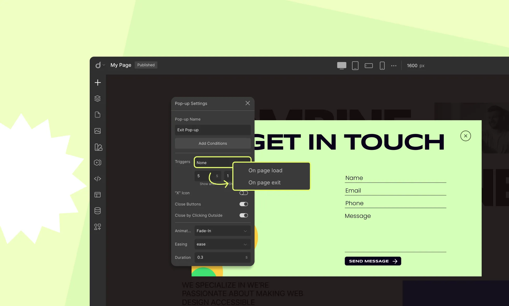
Set conditions for displaying the Pop-up:
- On Page Load: Display the Pop-up immediately when the page loads.
- On Page Exit: Show the Pop-up when the user is about to leave the page.
- Show After: Define a delay (in seconds) before the Pop-up appears.
- Show Count: Set how many times the Pop-up should be shown to the same user.
Close Options
- “X” Icon: Choose whether to display the close icon.
- Close Buttons: Customize the appearance and functionality of close buttons.
- Close by Clicking Outside: Allow or prevent users from closing the Pop-up by clicking outside it.
Animation
From the Animation dropdown, select quick motion effects to add to your Pop-ups for a more dynamic user experience. You can select from a library of pre-defined animations, including:
- Fade In: The Pop-up gradually appears on the screen.
- Slide In: The Pop-up slides into view from the selected direction (top, bottom, left, right).
- Zoom In: The Pop-up starts small and scales up to full size.
- Bounce: The Pop-up animates with a bouncing effect.
- Rotate: The Pop-up rotates into position.
- Many more animation styles are available to enhance the user experience.
You can also adjust:
- Easing: Control the speed curve of the animation.
- Duration: Set how long the animation lasts.
Pop-up Layout
Pop-up Layout allows precise control over the Pop-up’s positioning on the screen.
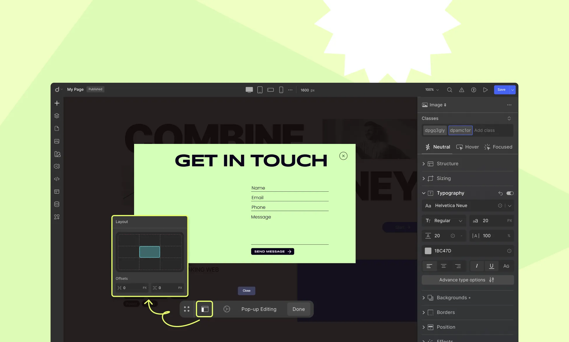
Set Position
- The screen is divided into 9 equal sections (3 columns, 3 rows).
- Assign the Pop-up to a preferred section (e.g., top-left, center, bottom-right, etc.).
Horizontal & Vertical Offset
Fine-tune the Pop-up’s position relative to its assigned section.
Example: To position a Pop-up 50px from the top, set Vertical Offset to 50px. To position it 50px from the left, set the Horizontal Offset to 50px.
By adjusting these settings, you can ensure an optimal, user-friendly experience for visitors.
Was this page helpful?