Transition is another amazing tool that can be used hand-in-hand with features like Stroke, Effects, Transform, and more to help create highly interactive web pages.
Use Transitions to make any animation between different states of an element to be much smoother and more pleasing to the eye.
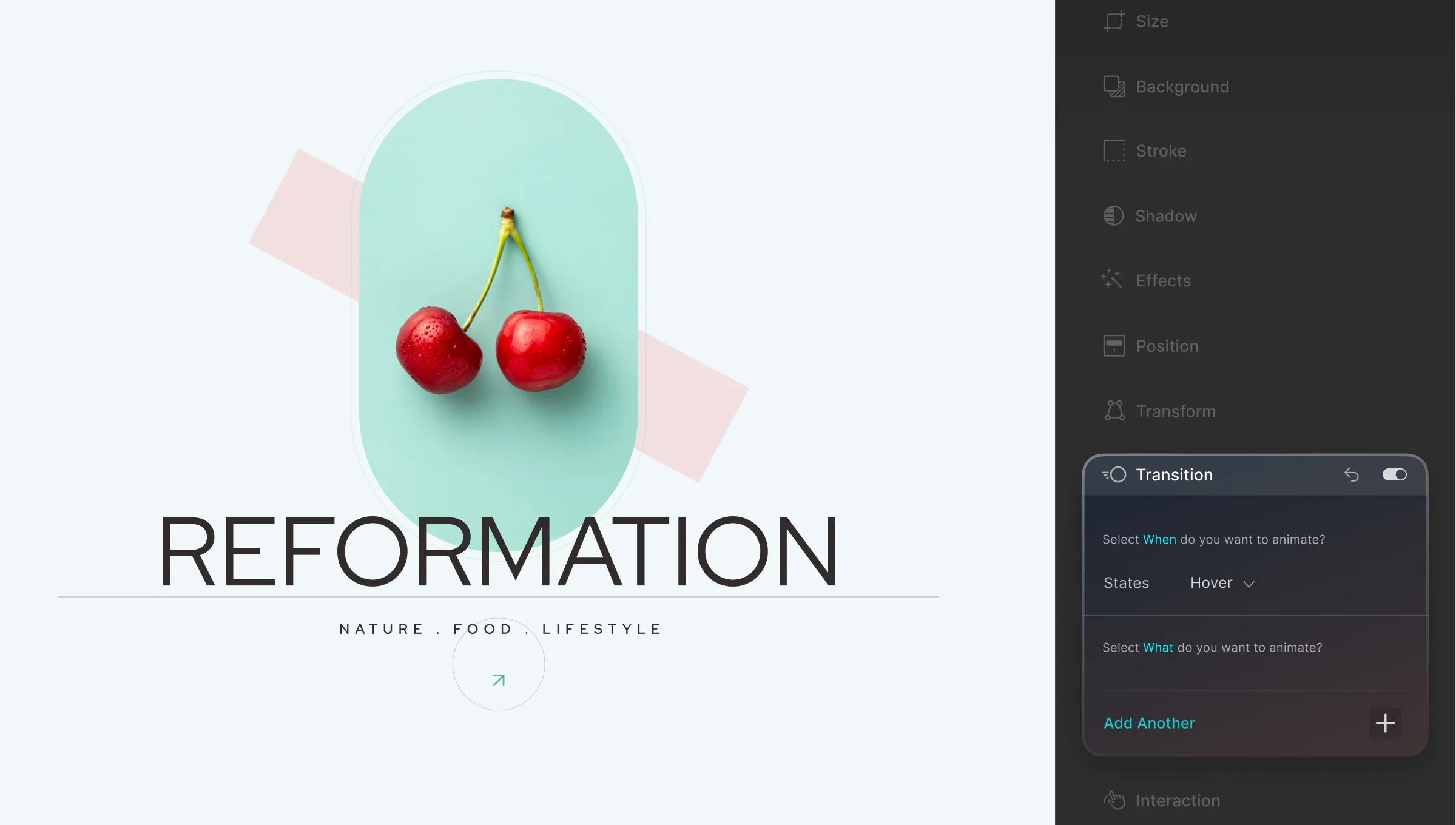
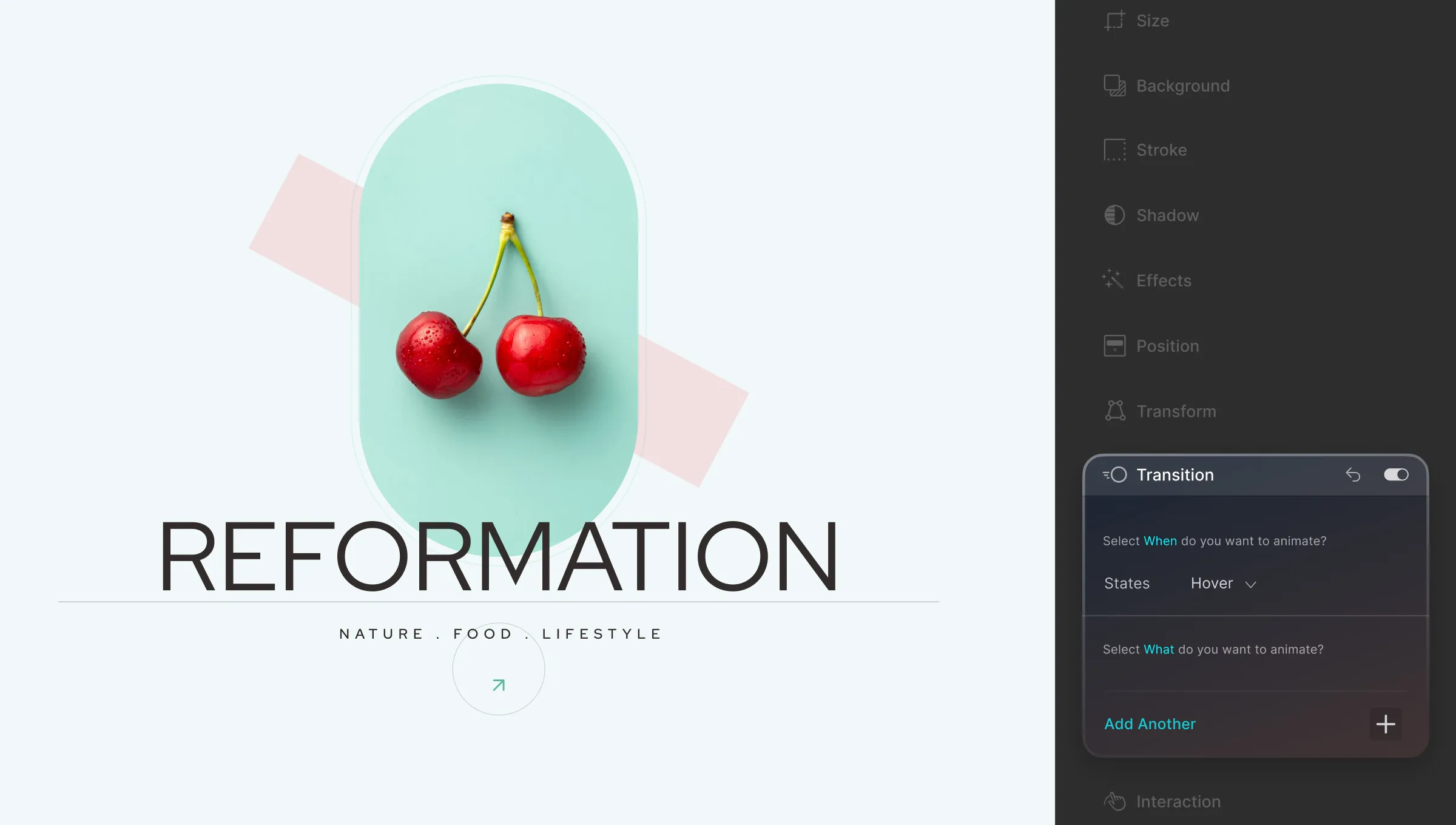
Add Transition
To add a transition, select an element on your canvas that you’ve animated. Then head over to the Transition menu from the Style Panel which you’ll find on the right-hand side of your screen.
States
Then, start by selecting which State you want the Transition to start. Options are the three States None, Hover, and Focus. You can also select this from the States Menu located under Class & Sub-class.
Add New
Next, click on the plus icon to add a new transition. A new window should pop up from where you can customize your Transition settings.
Transition Type: Click on the dropdown situated at the top-left corner to select which type of animation you’re adding the transition for. Options include the following:
- All Properties
- Opacity
- Margin
- Padding
- Border
- Transform
- Filter
- Flex
- Background Color
- Background Position
- Box Shadow
- Text Shadow
- Width
- Height
- Max Width
- Max Height
- Min Width
- Min Height
- Border Width
- Border Color
- Border Radius
- Font Color
- Font Size
- Line Height
- Letter Spacing
- Text Indent
- Word Spacing
- Top
- Right
- Bottom
- Left
- z-Index
- Margin Top
- Margin Right
- Margin Bottom
- Margin Left
- Padding Top
- Padding Right
- Padding Bottom
- Padding Left
Duration: Define how long this transition will take. Click on the unit dropdown to select a different unit. Options include milliseconds (ms) and seconds (s).
Delay: Use this option to set the duration by which the Transition should delay if desired. Just like Duration, you can choose between the units milliseconds (ms) and seconds (s).
Timing Function: Click on the dropdown list from here to select the style of your Transition progression. Below is a list of the options available:
- None: No Timing Function defined.
- Linear: Animation maintains even speed.
- Ease: Animation increases in velocity during the middle and slows down at the end.
- Ease-In: Starts slowly and then animation speed increases until it ends.
- Ease-Out: Starts quickly but slows down as the animation progresses.
- Ease-In-Out: Starts slowly, then speeds up, and finally slows down again at the end.
- Initial: Apply the default value of this property to the element.
- Inherit: Set the same value as the parent element for this property.
- Custom: Set this if you want to use the Timing Editor to define a custom Timing Function.
Once you’re done setting up your transition, simply click on the X icon at the top-right corner to close this window. Then, you can click on the plus icon again to add more Transitions to your element if necessary
Custom Timing Editor
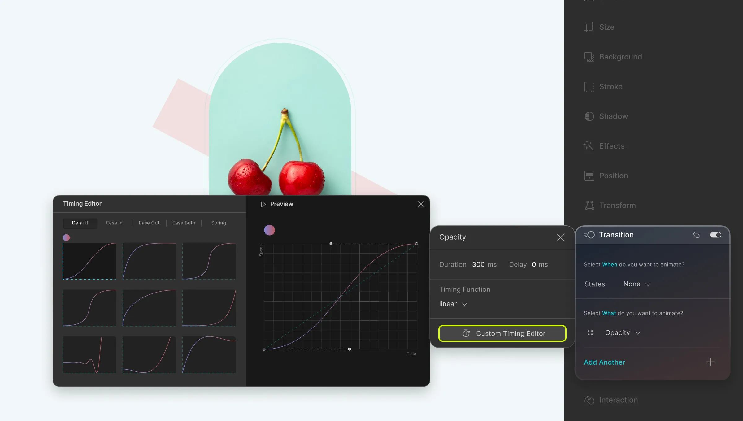
The Custom Timing Editor is a nifty tool that can be used to define a custom progression of your animation transition. To access the Custom Timing Editor, from the Style Panel on the right, go to Transition > Add New > Custom Timing Editor.
On the Timing Editor, on the left, you will find more predefined Timing Function styles. The Default tab shows all of the styles but you can also click on the other tabs to see the styles of each specific category. Categories include:
- Ease In
- Ease Out
- Ease Both
- Spring
After selecting any one of these options, you can watch its Preview on the right by clicking on the play button at the top. Then, to customize it to suit your needs, simply drag the two toggles attached to each end of the graph on the preview.
Using Size Transition For Image Expansion on Hover
In this section, we’re going to show you how you can make your images interactive using the features Size and Transition.
Setting Up
Start by adding a Div to your canvas. Then, place an Image element inside it and go to the Media Manager to select the Media you want to add.
Next, select the Div again and go to Size settings from the Style Panel on the right. Here, set its Width as 400px while keeping the rest of the settings the same.
Expand on Hover
Now it’s time to take the steps needed to expand your image.
- Select the Div and go to Class & Sub-class > States Menu. (Click on the expansion icon in its top-right corner if you don’t see it!)
- Switch to the Hover state from the States Menu and go back to Size settings.
- Here, change the Width to 1200px while once again keeping the rest the same.
Use Transition to Polish in This Animation
Click on the Preview icon at the Topbar to view the current state of things. At this point, the animation should look disjointed as shown in the example below.
However, we can easily fix this using Transition by taking the following steps:
- Select the Div and go to Style Panel > Transition.
- Click on the plus icon to Add a new transition.
- Here, set the Transition type as Width, Duration as 1000px, and Timing Function as Ease In.
Now if you go back to check the Preview, then you’ll see the Image smoothly transitioning to its Hover state unlike before. In this case, we can say Transition is essentially what makes this animation work.
Was this page helpful?