The Topbar in Droip provides a range of powerful tools to streamline your website-building process. Let’s explore each element of the Topbar:
Topbar Menu
Starting from the left side of the Topbar, you will find the Topbar Menu. Click on the dropdown button beside Droip’s logo to access the following options:
View Options
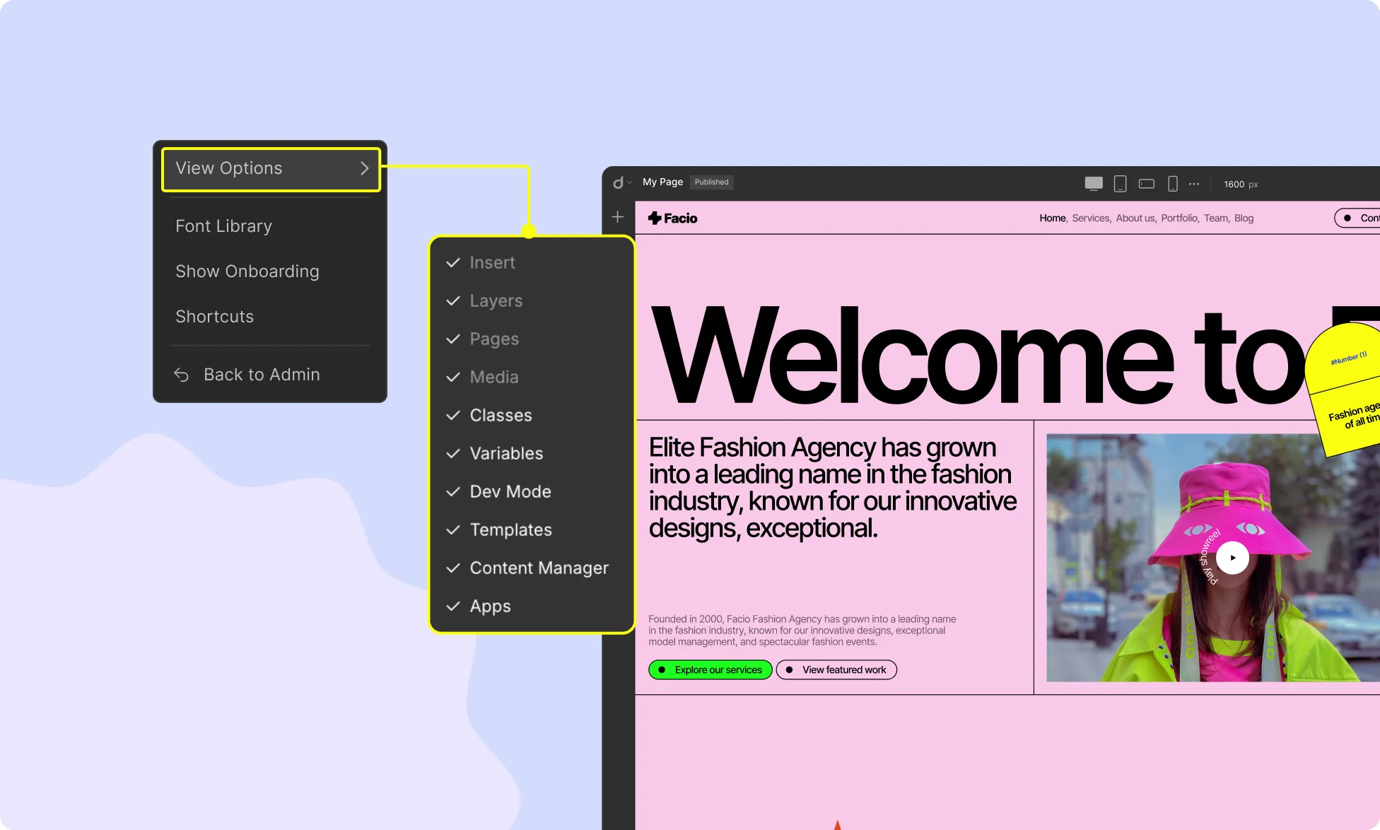
Hover over View Options to access the menu settings. From here, you can choose which menus to keep visible in the editor while working on your website.
Font Library
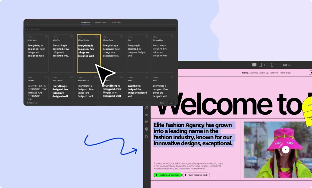
Clicking on Font Library opens a new window with three tabs:
- Google Fonts: Browse and select from a collection of free web fonts provided by Google.
- Installed Fonts: View the fonts already installed in your Droip project.
- Custom Fonts: Upload and use your own fonts on your website. Learn how to upload custom fonts.
Show Onboarding
Click Show Onboarding to start a guided tour of the website builder. This will give you an overview of all features and where to find them.
Shortcuts
Access a comprehensive list of keyboard shortcuts to speed up your design process. Read more about Keyboard Shortcuts.
Back to Admin
Click Back to Admin to return to the WordPress Admin Dashboard.
Breakpoints
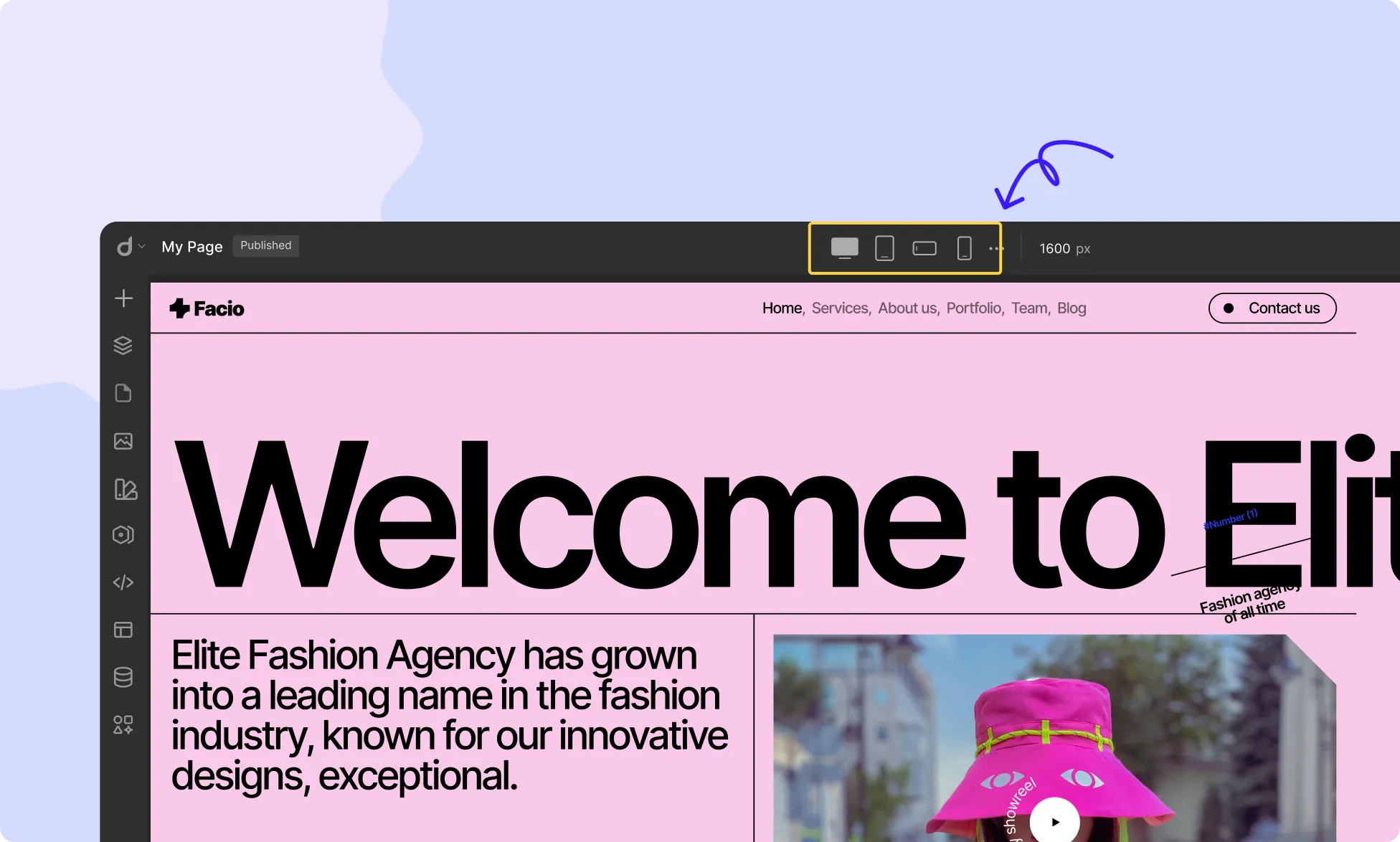
At the center of the Topbar, you’ll find four different device icons. These are known as Breakpoints, allowing you to control webpage responsiveness across different screen sizes. By default, the Topbar includes:
- Desktop
- Tablet
- Mobile Landscape
- Mobile
Additionally, you can set unlimited Custom Breakpoints according to your needs. Learn more about Breakpoints.
Canvas Control
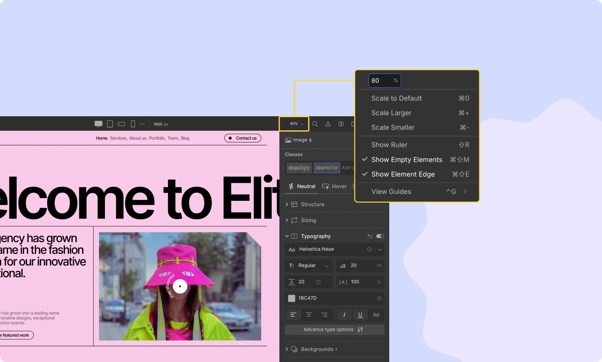
The Canvas Control feature allows you to customize the display and behavior of the canvas while designing. It is represented by the Scale Percentage dropdown on the Topbar.
With Canvas Control, you can:
- Adjust the scale of the canvas.
- Show or hide rulers to align elements precisely.
- Display or hide guides for a structured layout.
Learn more about Canvas Control.
Global Search
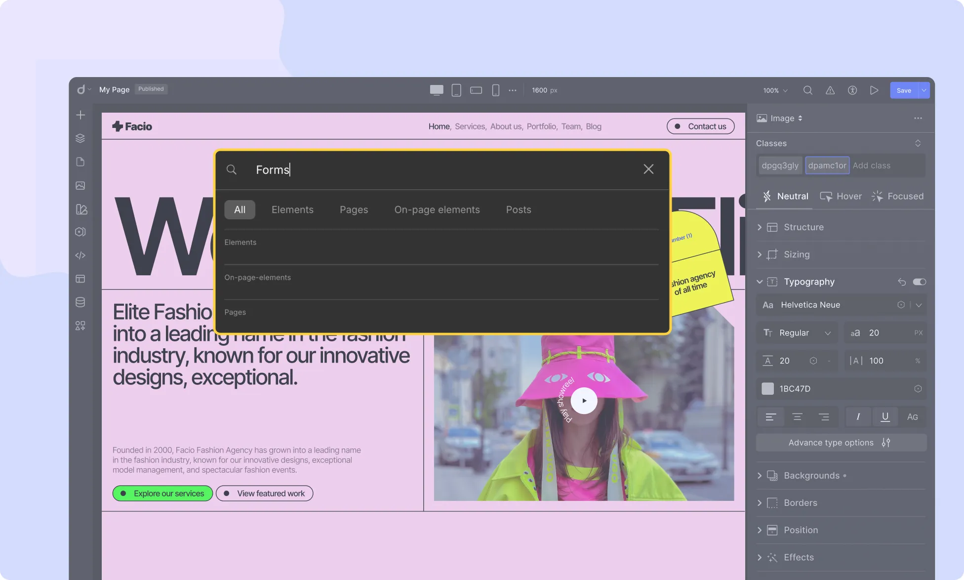
Click the Magnifying Glass icon or press CMD + ? to access Global Search. From here, you can search for Elements, Pages, and On-page Elements quickly and efficiently.
Audit
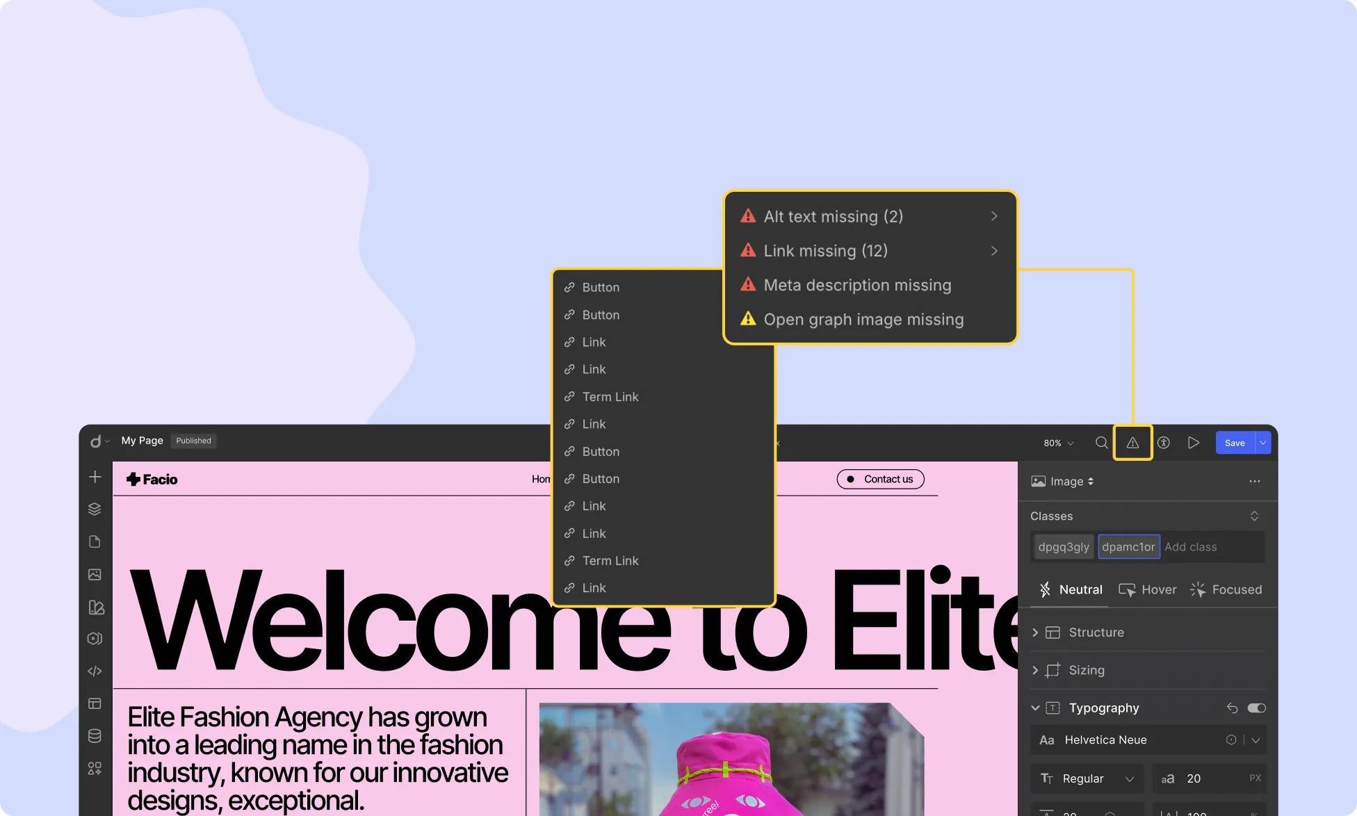
The Audit feature, represented by the Triangle Exclamation icon, performs automatic accessibility checks on the following aspects:
- Alt Text Missing (for images)
- Link Missing (for necessary elements)
- Class Name Missing (for proper structuring)
Learn more about Page Audit.
Accessibility
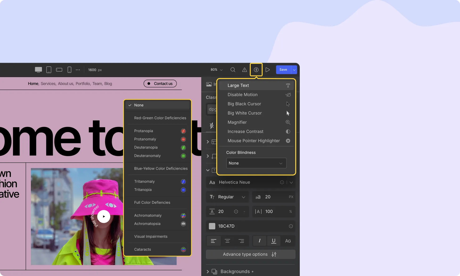
Following the Audit feature, the Accessibility option allows users to customize the interface to suit their needs, particularly for those with disabilities.
Learn more about Accessibility in Droip.
Comments
From the in-canvas Comments panel, represented by the Speech Bubble icon, multiple users can leave comments to share feedback in real-time, directly on the canvas. This makes collaborating on the same page at the same time significantly simpler and more seamless.
Learn more about Comments in Droip.
Preview
Click on the Play icon to view a full preview of your designed webpage, allowing you to see how it will appear to visitors.
Auto Save
Droip features a seamless Auto Save mechanism that continuously saves your work, helping prevent data loss, even if you forget to save manually.
Represented by the Floppy Disk icon, changes being saved are shown with two rotating arrows on its bottom right. Once complete, the arrows shift to a check mark to confirm everything is up to date.
📝 Note: Droip automatically saves your changes within 3 seconds of user inactivity.
Of course, you can still click the Auto Save icon to manually trigger a save, perfect for moments when you want extra confirmation that your latest edits have been securely updated.
Publish
Finally, on the Droip Topbar, you’ll find the Publish button. Clicking it opens a panel that gives you everything you need to manage your page’s live status:
- URL: View and access a clickable page link.
- Status: Quickly switch the page between Draft and Published.
- Last Published: Seen when the page was last published and click to view & manage full Version History.
- Update: Hit the update button to apply and save all your changes.
Was this page helpful?