The Tabs element, analogous to browser tabs, facilitates the organization of multiple “Divs” within a confined space. It is particularly useful for single-page websites or instances with limited available space.
The Tabs element comprises three components: the Tab Menu, Tab Content, and Tab Panes. The Tab Menu allows users to navigate and access the content of each tab.
How to a Add Tab
To add a Tab on your webpage:
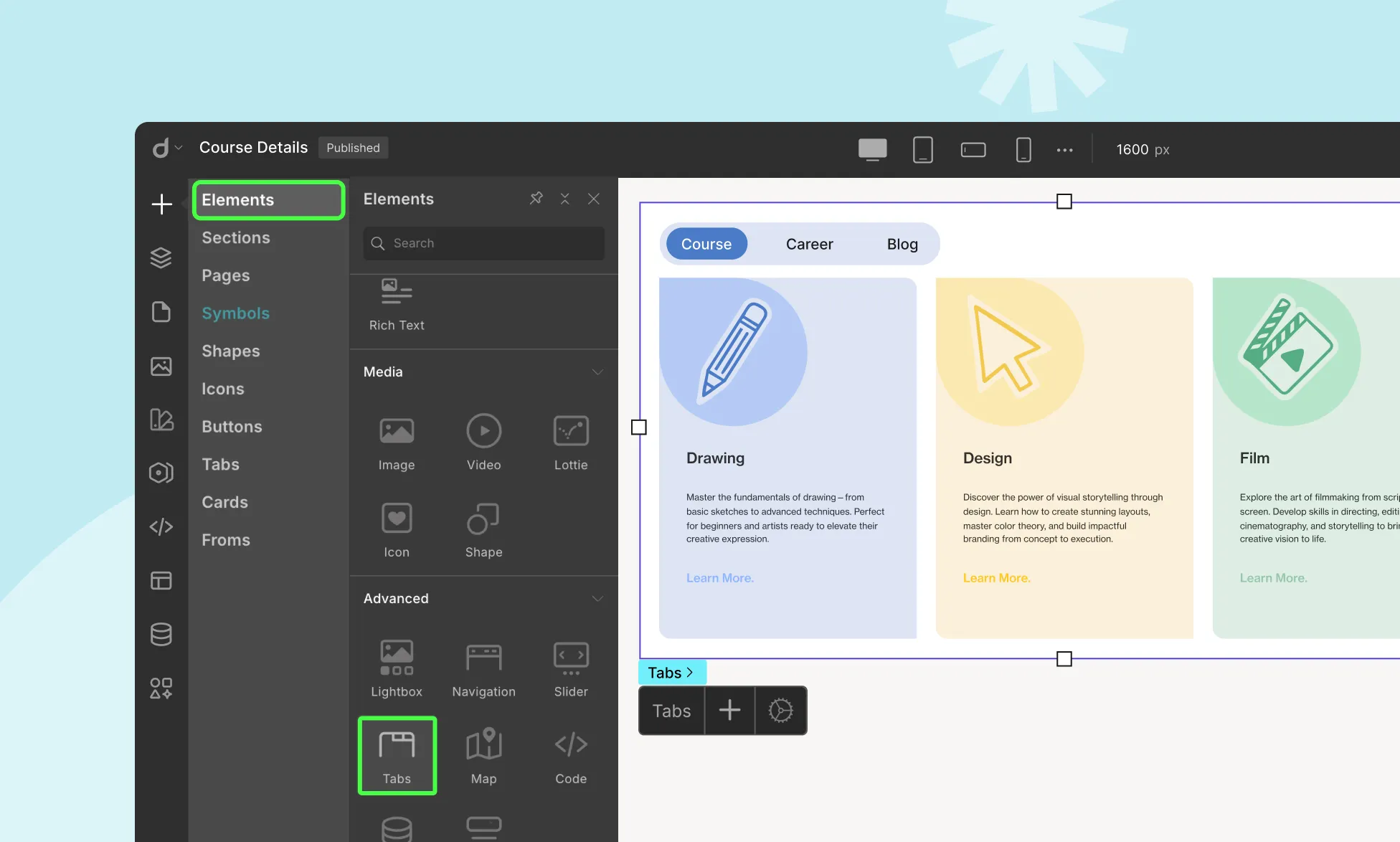
- Go to the Elements Panel from the left sidebar.
- Then, scroll down and drag the Tabs element to your page.
Tab Settings
Now, let’s go over how you can customize your Tabs and also add new Tab items if needed.
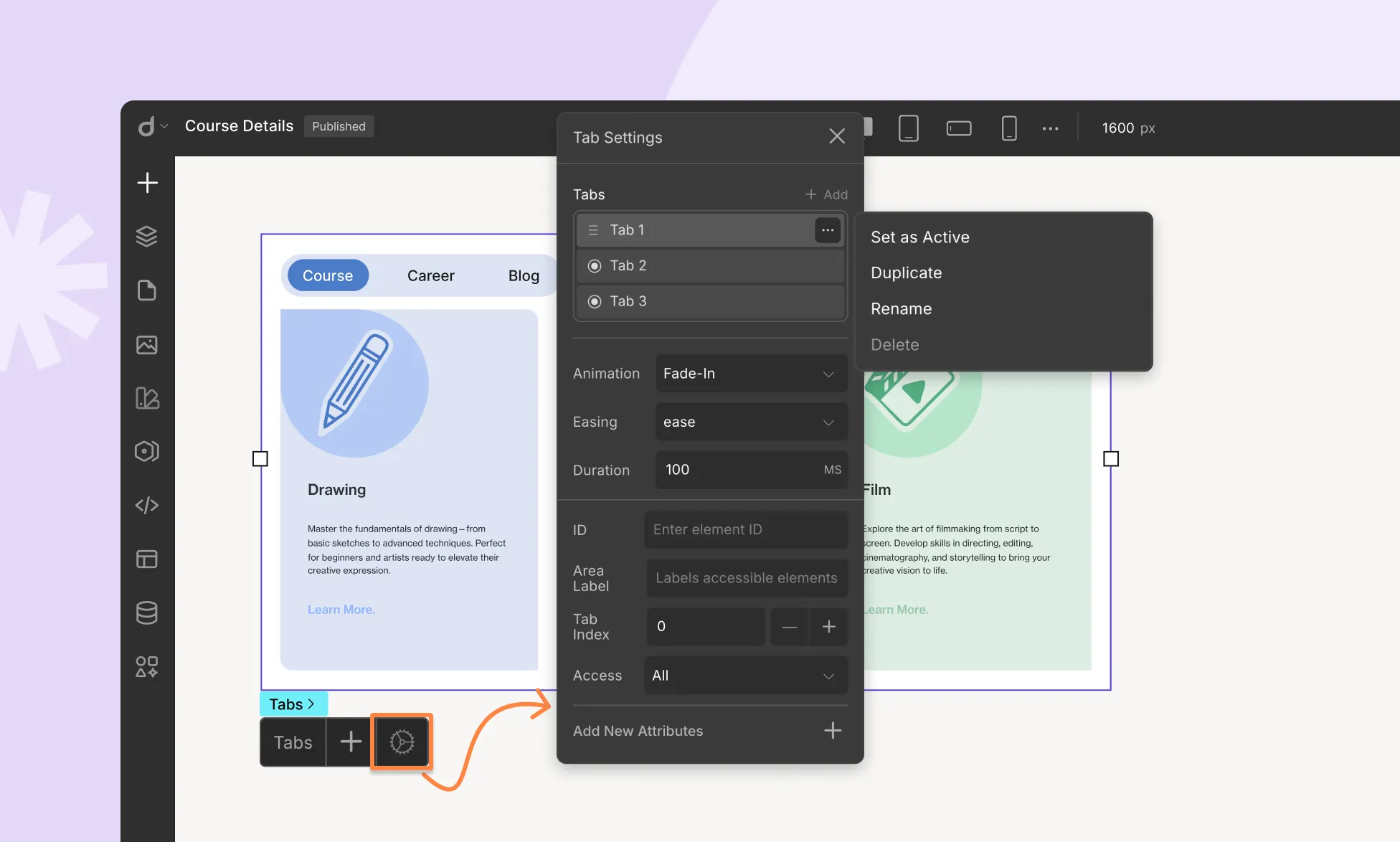
To do this, select the Tabs element and then click on the settings icon to open the Tab Settings.
Add New Tab: Click on the + Add icon to add a New Tab item. You’ll see this New Tab item added to the Tabs element on the Tabs Menu and also find its alias on the Tab Settings window.
Reorder Tabs: To rearrange Tab items, simply drag it to the desired position.
Then, click on the ellipsis icon that’s beside each tab item to open the action menu and access the following options:
- Set As Active: Setting a Tab as Active will make sure this Tab is the one that users see when the page loads. A circular tick mark will appear beside the Tab item to signify this change.
- Duplicate: Use this option to easily clone any of your existing Tab items. Once you’ve selected the Duplicate option for the Tab item you want to clone, an identical copy of this Tab item will appear on the Tab Menu.
- Rename: To rename a Tab, choose the Rename option, enter the new name, and hit save.
- Delete: Click on this option to delete a Tab item.
Animation: Set the entry transition style of the Tab content.
- Easing: Easing refers to the rate of change of an animation’s speed. It controls the acceleration and deceleration of the animation, affecting its overall smoothness. Options typically include linear, ease, ease-in, ease-out, and ease-in-out. Choose the easing function that best complements your animation’s style.
- Duration: Indicate the animation’s length.
Adding Tab Content
The Tabs element remains incomplete without content to display. Adding content to the Tabs is a straightforward process:
- Select the Tab where you wish to add content by opening the Tabs Settings and clicking on the desired Tab item.
- Access the Elements Panel, and choose the element you want to include (e.g., image element, grid element, etc.).
- Drag and drop the selected element into the Tabs Pane. Customize the element as needed using the options available on the Style Panel.
- Repeat the process for other Tabs to add content to each of them.
Was this page helpful?