Symbols in Droip let you turn any element, along with its child elements, into a reusable component.
Perfect for repeating sections like headers, footers, or CTAs, Symbols help maintain consistency across your site while simplifying updates. Edit once, and the changes reflect everywhere.
Creating a Symbol
There are a few easy ways to create a Symbol in Droip:
- Right-click on any section or component and select Create Symbol.
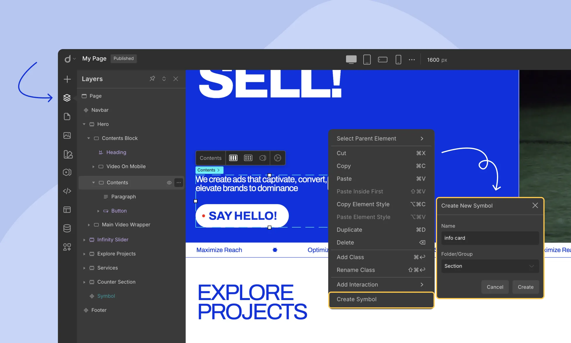
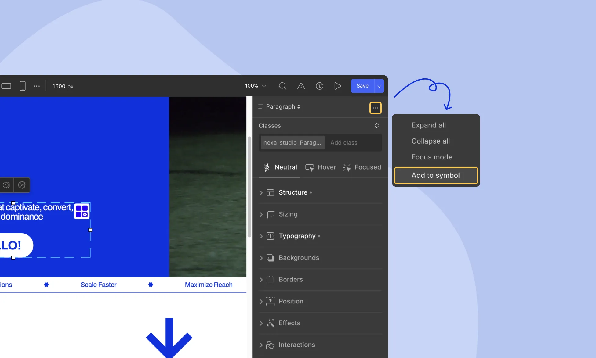
- Or, Select the component, then click the horizontal three-dot menu (⋯) at the top of the right panel, and choose Create Symbol.
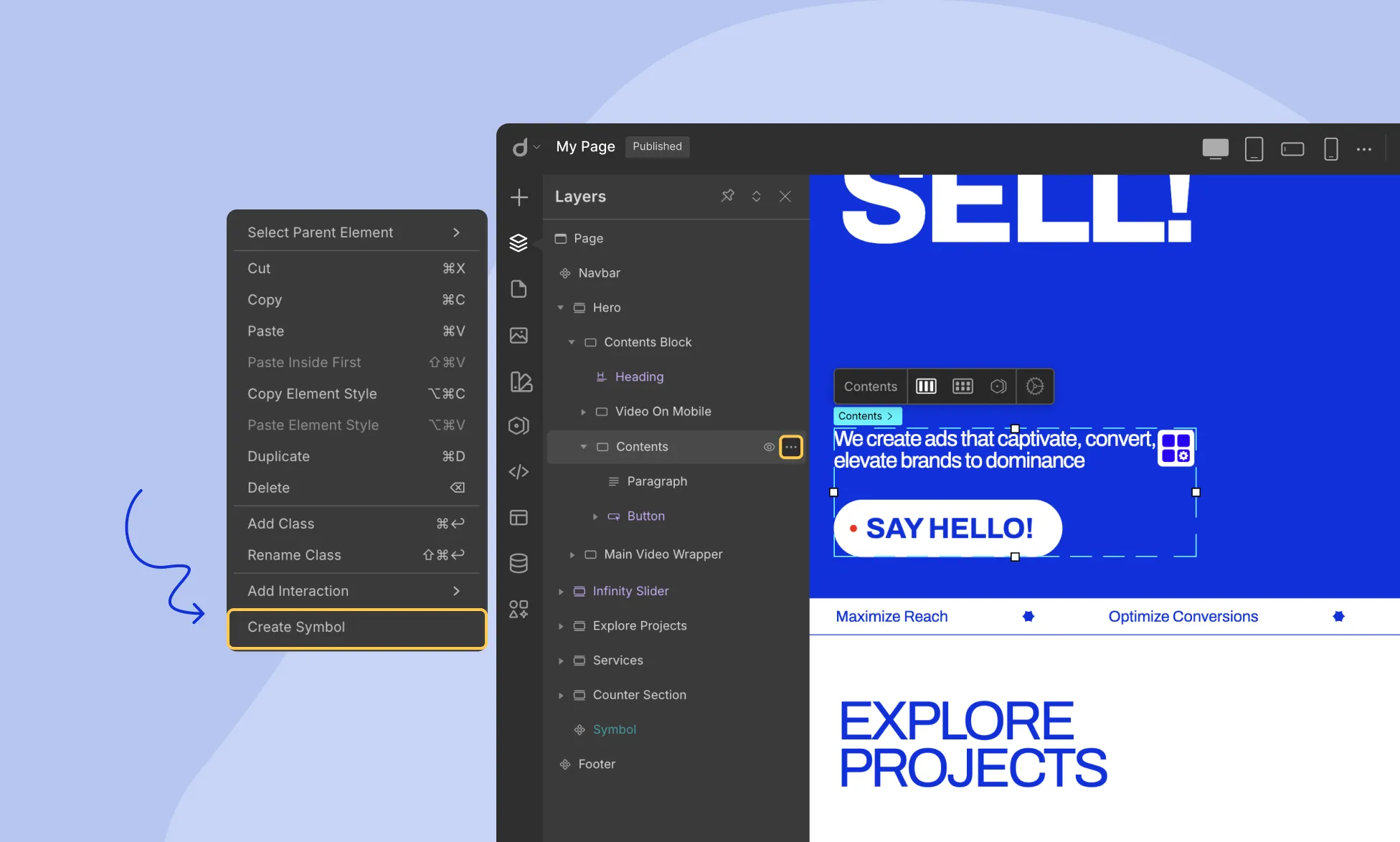
- Or, From the Layers panel, right-click the section or component and select Create Symbol.
Then:
- Name your Symbol.
- Choose a folder to organize it within the Symbols panel.
Your new Symbol will now appear in the Symbols panel, ready for reuse.
Managing Symbols
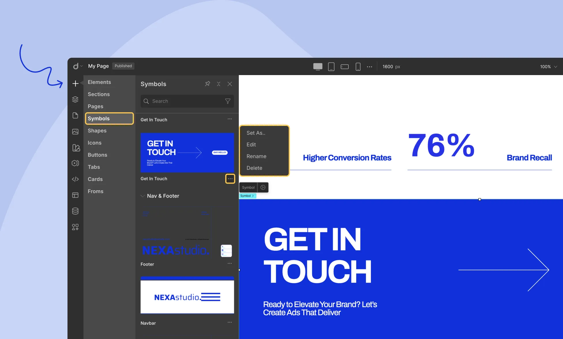
In the Symbols panel, each Symbol includes a horizontal three-dot menu beside its name. Click it to:
- Edit the Symbol
- Rename it
- Delete it
- Set it as a global header or footer
Editing a Symbol
To make changes to the core version of a Symbol:
- Click Edit from the Symbol menu.
- You’ll enter main mode, where edits apply globally.
- All instances of the Symbol across your site will instantly update.
Reusing a Symbol
To reuse a Symbol, simply drag it from the Symbols panel into any section of your page.
That’s it—it stays synced with the original.
Customizing a Symbol Instance
Need a unique version of a Symbol on a page? You have two options:
1. Detach from Symbol
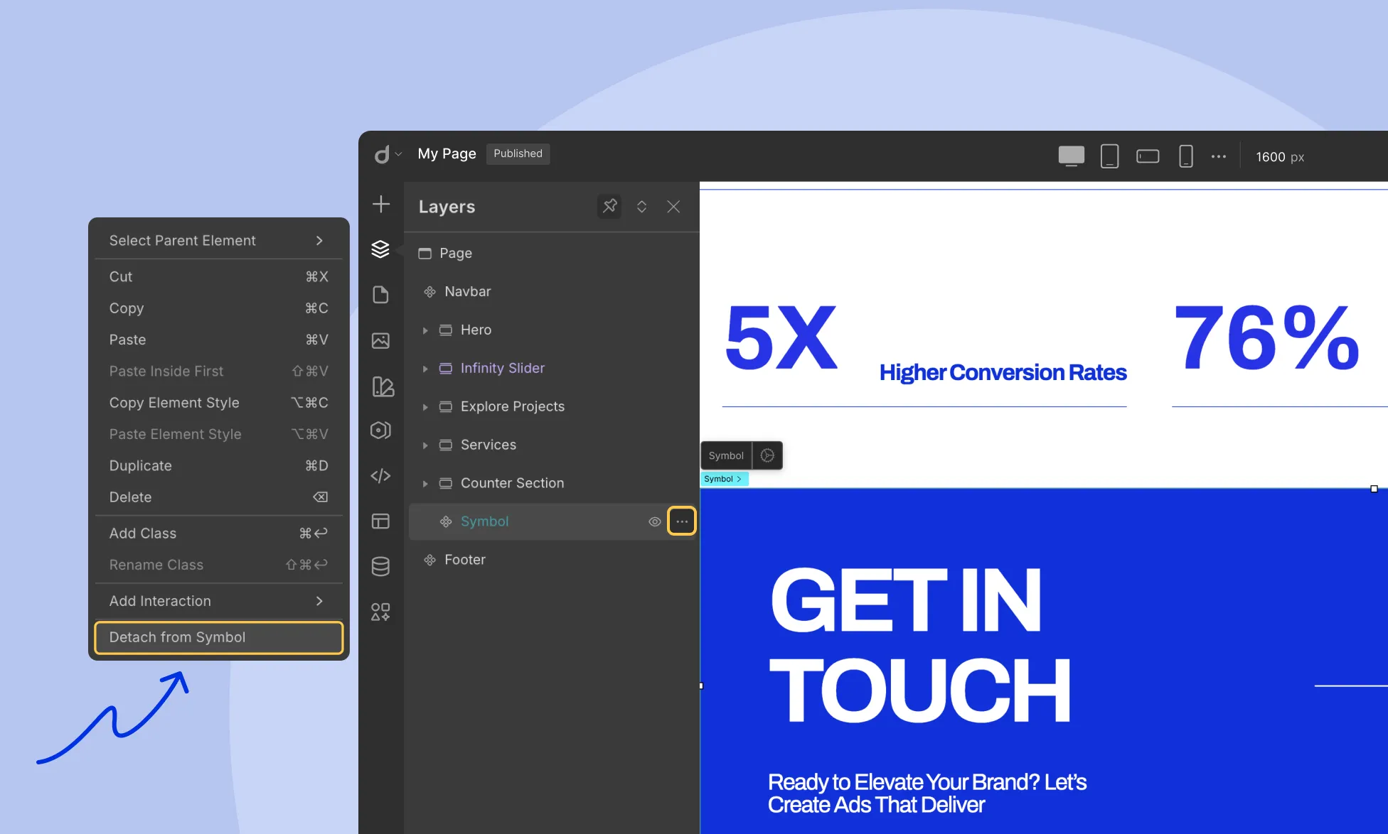
- Right-click the Symbol on your page.
- Select Detach from Symbol.
The instance becomes a standalone element, fully editable.
💡 Note: It will no longer be linked to the main Symbol or other instances.
2. Update content without affecting the parent symbol
- Double click on the symbol and customize the content of the symbol instances like text, color, and font as needed without affecting the parent symbol.
Final Thoughts
You can use Symbols in two powerful ways:
Identical Content
- Edit the main Symbol and automatically update every instance.
Unique Content
- Detach a Symbol to customize it individually including style and content but it will no longer be linked to the main Symbol or other instances.
- Double click on the symbol and customize only the content of the instances like text, color, and font as needed without affecting the parent symbol.
Was this page helpful?