The Slider component is basically a slideshow element that you can use to showcase any kind of content such as paragraphs, images, videos, buttons, and more!
Adding a Slider
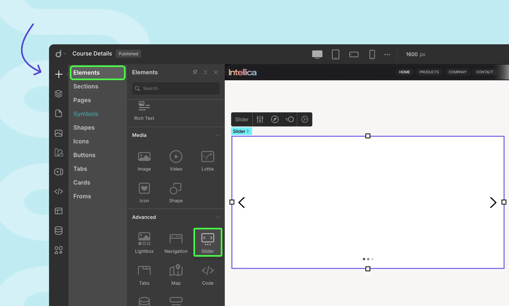
To integrate a Slider into your web page, follow these steps:
- Go to the Elements panel.
- Scroll down to the Advanced section and locate the Slider element.
- Drag and drop the Slider element onto your canvas.
Slider Options

Customize your Slider using the Slider Options window accessible from the Slider’s Inline Editor. The available options are as follows:
- Add New Slide: Click on + Add next to Slides. The new item will appear at the bottom of the list.
- Reorder Slides: Rearrange the order of Slides by simply dragging the slides.
- Set as Default: Click the ellipsis icon next to a slide and select Set as Default. A circular check icon will indicate the default slide.
- Duplicate: Quickly replicate a slide setup by choosing Duplicate from the ellipsis menu.
- Rename: Rename slides for clarity by selecting Rename from the ellipsis menu, entering a new name, and clicking Save.
- Delete: Remove a slide via the Delete option (disabled for the default slide).
Adding Content to Slides
You can drag and drop any element into a slide and design it freely just like any other section in Droip. Build with text, images, buttons, or any component to match your layout needs.
Slide Navigation
From the Slide Navigation window, you can customize a Slider’s Indicators and Navigation Arrows.
Indicators show how many slides are present and highlight the currently active one.
Navigation Arrows let users manually move between slides using left and right arrows displayed over the slider.
Indicators
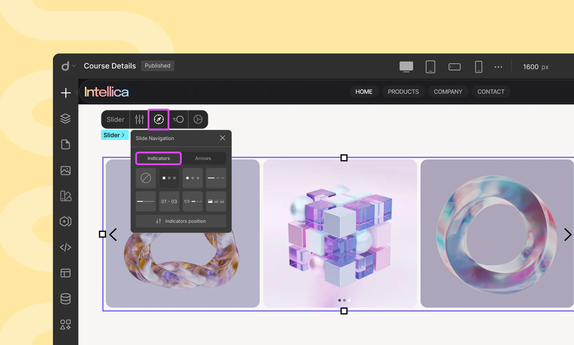
Style: Choose from seven different Indicator styles or select “None” to remove the Indicator.
Set Indicators Position: Access the Indicator Position window by clicking on “Set Indicators Position.”
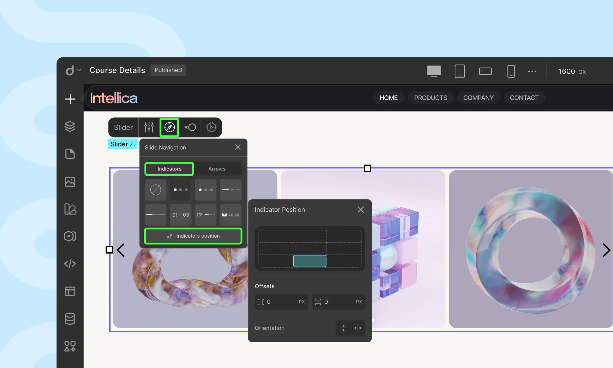
- Position Grid: Select the desired Indicator position from a 3×3 grid.
- Horizontal Offset: Define the Indicator’s horizontal shift.
- Vertical Offset: Define the Indicator’s vertical shift.
- Orientation: Choose between Horizontal or Vertical orientation for the Indicators.
Arrows
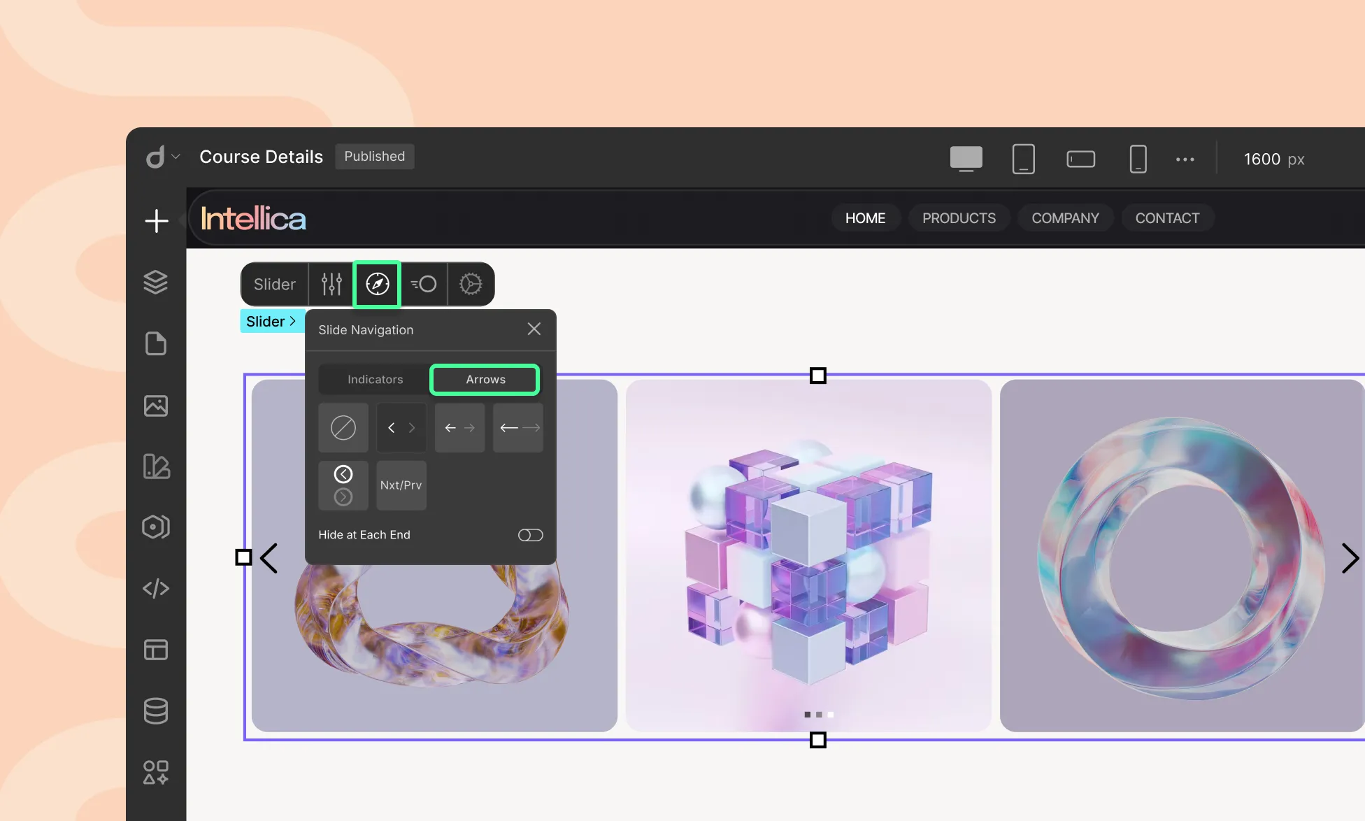
Style: On the Arrows tab, you will find five different Navigation Arrow styles to choose from. You can also click on the None option to remove the arrows entirely.
If you do remove them, you can enable Swipe Gestures from Slider Settings > Slider Transitions so that users can swipe Slides using touch instead. You can also enable Autoplay in this case as well.
Hide at Each End: Enable this option to hide the left arrow on the first slide and the right arrow on the last slide. This helps indicate the first and last slide and prevents slide looping.
Slide Transitions
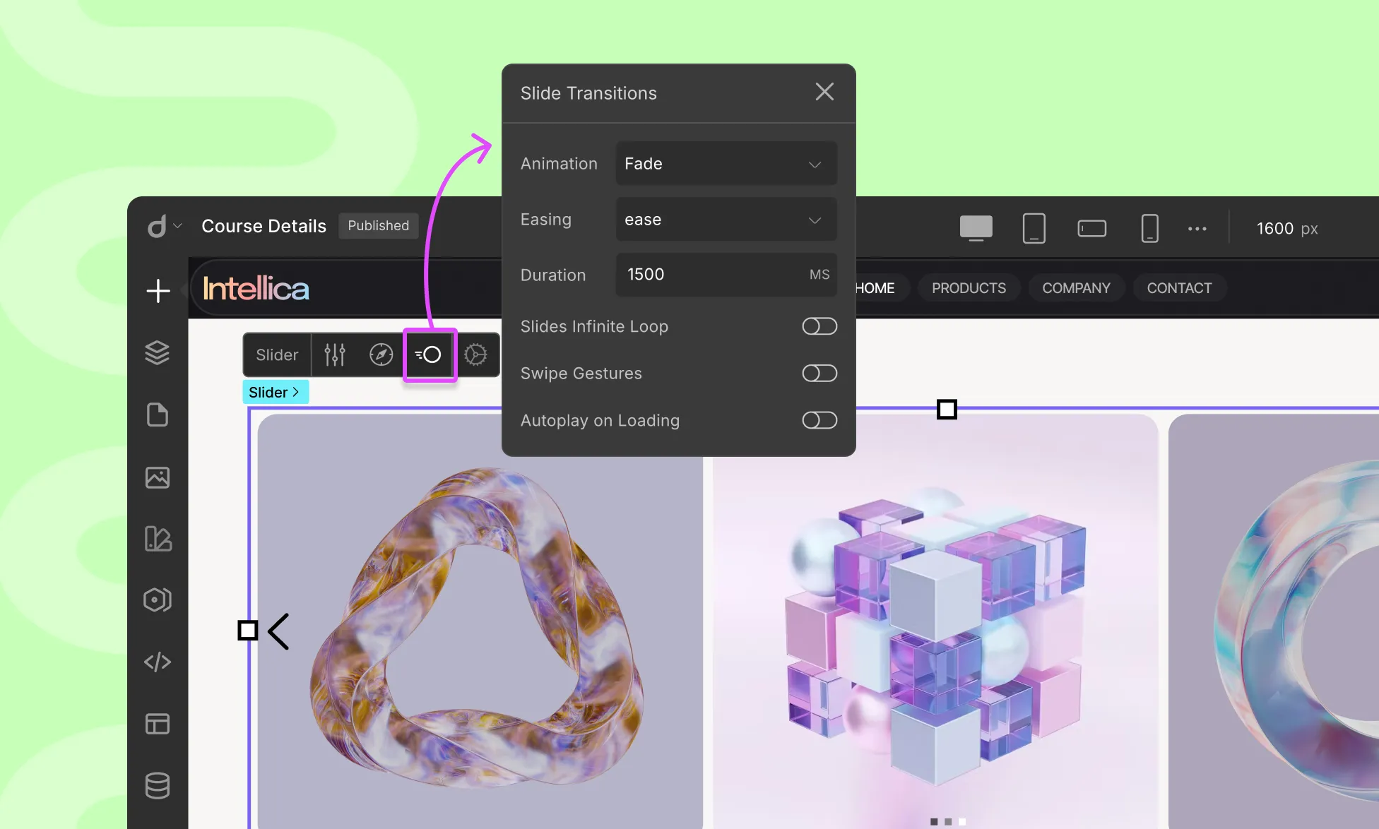
Customize Slide Animation from the Slide Transitions window. Open this panel by clicking on the transition icon.
- Select Slide: Choose the slide for which you want to customize the transition.
- Slide In: Set the entry animation style for the slide.
- Slide Out: Set the exit animation style for the slide.
- Ease: Define the transition effect between slides.
- Duration: Set the transition duration in milliseconds.
- Slides Infinite Loop: Enable this toggle to allow continuous looping of slides.
- Swipe Gestures: Enable this option to enable users to swipe through the slides on touch devices.
- Autoplay on Loading: Automatically change slides as soon as the page loads.
- Delay: Set the time interval before automatically transitioning to the next slide.
- Stop Autoplay on Hover: Enable this option to prevent slides from changing when hovered over.
How to Make Your Slider Work Like a Carousel
By default, a Droip Slider shows one slide at a time. To display multiple slides side-by-side, like a carousel, follow the steps below.
Create a Carousel Layout
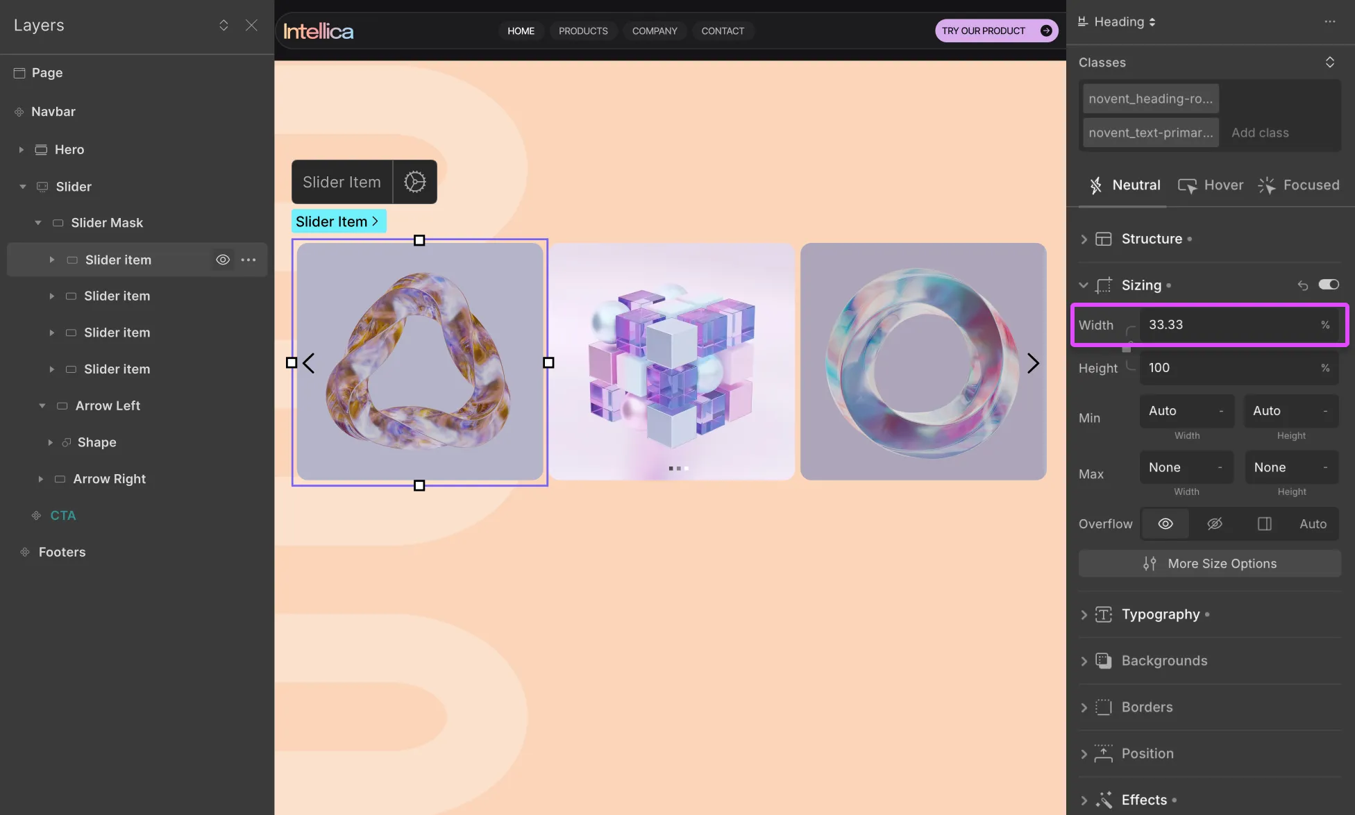
From the Layers panel, select any Slider item inside your slider.
Then adjust the width to show multiple slides, to do that go to the Style Panel → Sizing. Change the Width from 100% to:
- 50% to show 2 slides at once
- 33.33% to show 3 slides at once
- 25% to show 4 slides at once
Or set your preferred width depending on how many items you want visible at once.
Once configured, your slider will now act like a carousel, showing multiple items side-by-side that can scroll or auto-slide depending on your interaction settings.
Was this page helpful?