Apart from the usual elements in the Elements Panel, Droip also has a Pre-Built Library with a collection of more advanced pre-defined Elements and Sections.
To access them, head over to the Pre-built Library which you can access from the Elements tab on the Topbar.
Elements
Below is a list of all of the Pre-Built Elements that you can use and the options available for each category.
Buttons
As you know, buttons play a significant role on a webpage such as letting users submit a form, functioning as CTAs for users to take that last step, helping users maneuver the website, and more.
For that reason, sometimes you may need a bit more functionality from a button that a basic one can’t provide. So, here are a few advanced alternatives for the Button Element. Options include:
- Button Fill: Button filled with a solid background.
- Button Outline: Button with only an outline and no background fill.
- Button Split: Button split into an action button and a dropdown toggle.
- Button Icon: Button with no text and only an icon.
- Button With Icon: Button with text and icon.
- Button Action: Button with text and icon but no background fill or outline.
- Button Link: Button with only link text.
Checkbox
Use Checkboxes to take multiple inputs from a list of options. Do note that you must add this element inside a Form element for it to appear.
Radio
Use Radio buttons to take single input from a list of options. Do note that you must add this element inside a Form element for it to appear.
Ratings
Ratings are a way for users to rank a product or service based on their experience to provide information for others to see. Incorporating a Rating and Review system is a great idea if you need to boost credibility.
Listed below are the variations of the Rating element offered that you can choose from!
- Rating Stars
- Rating Half-Stars
- Rating Octagones
- Rating Half-Octagones
- Rating Emoji
Search Boxes
Search is another must-have element that you may need to include as helps users easily find what they’re looking for. Here we have 3 different styles of Search options:
- Search Box: Simple Search Box.
- Search with Button: Search Box with an icon button.
- Search Underlined: Search Box in an outline style.
Steppers
A Stepper is a nifty input control that can be used to input numbers. This control consists of two parts – one button to increment and one to decrement the value along with its preview. Below is a list of the Stepper styles available:
- Stepper Basic: Value is displayed on the left and increment and decrement buttons are stacked up on the right.
- Stepper Horizontal: Buttons on either side with the value displayed in the middle.
- Stepper Vertical: Buttons on the top and bottom with the value displayed in the middle.
Text Fields
Text Fields are a classic input control that you’ll need for any form. Here you’ll find a few more advanced versions of the element to further enhance your webpage.
- Text Field Basic: A basic Text Field you can use in any form for data input.
- Text Field with Adjusting Height: With this Text Field, if there is more content than there is space for, automatically more space will be added vertically but with a scroll so the real height of the element remains unchanged.
Detail List
The Detail List Element is basically a pre-made data table and is the perfect choice for displaying a lot of information in a neat and simple way. Styles available are the following:
- Detail List One: Simple and neat styled table.
- Detail List Two: Table with grid lines.
- Detail List Three: Table with alternating colored rows.
Tab
The Tab Pre-Built Element offers you a few more variations on your usual Tab element like the following:
- Tab One: Tab with Tab Menu on top of the Tab Pane.
- Tab Two: Tab with Tab Menu on the bottom of the Tab Pane.
- Tab Three: Tab with Tab Menu on the left of the Tab Pane.
- Tab Four: Tab with Tab Menu on the right of the Tab Pane.
Teaching Bubble
A Teaching Bubble is a kind of tooltip element that consists of a button and a speech bubble. Within that speech bubble is a heading, text description, and a pair of Yes and No buttons.
Clicking on the button should make the bubble appear and clicking on the Yes/No buttons should make the bubble disappear.
Options include:
- Teaching Bubble Left: Teaching Bubble with a button on the left and bubble on the right.
- Teaching Bubble Top: Teaching Bubble with button at the top and bubble below.
Callout
Callouts are similar to Teaching Bubbles but the Yes and No buttons are instead replaced with a Link. Clicking on the button will make the bubble appear and clicking on it again should make it disappear.
Dialog
A Dialogue box is a pop-up like element with a message and two CTA options.
Modals
You can create custom Pop-ups using our Pop-up Builder but also use the following templates to speed up the design process. Options include:
- Modal With X Button
- Modal Sign In
- Modal Newsletter
- Modal Success Message
Tooltips
Tooltips are helpful messages for users that should appear on Hover. For this, we have the following variations:
- Tooltip Top
- Tooltip Bottom
- Tooltip Left
- Tooltip Right
Alerts
Alerts are warning message templates and available are the following types:
- Alert: Simple Alert message.
- Alert with CTA: Alert message with Call to Action Buttons.
Avatar Group
An Avatar Group is basically a grouping of User Avatars and you can choose between the following styles:
- Avatar Group Circle: Avatar Group with circular images.
- Avatar Group Square: Avatar Group with square images.
Cards
Cards are a great way to display a group of related content on a page. You can use these on a feature list page, a product archive page, and more.
- Card Basic: Basic Card with a heading and a description text.
- Card Button: Card with a heading, description, and a call to action button.
- Card Icon: Card with a heading, description, icon, and a call to action button.
- Card Image Button: Card with a heading, description, image, and a call to action button.
Notifications
Notifications are small dialog boxes that can be used to notify users about something.
- Notification Inline: Consists of a heading and a button all arranged inline.
- Notification Text: Consists of a heading and some text with an x icon on the top-right.
Sections
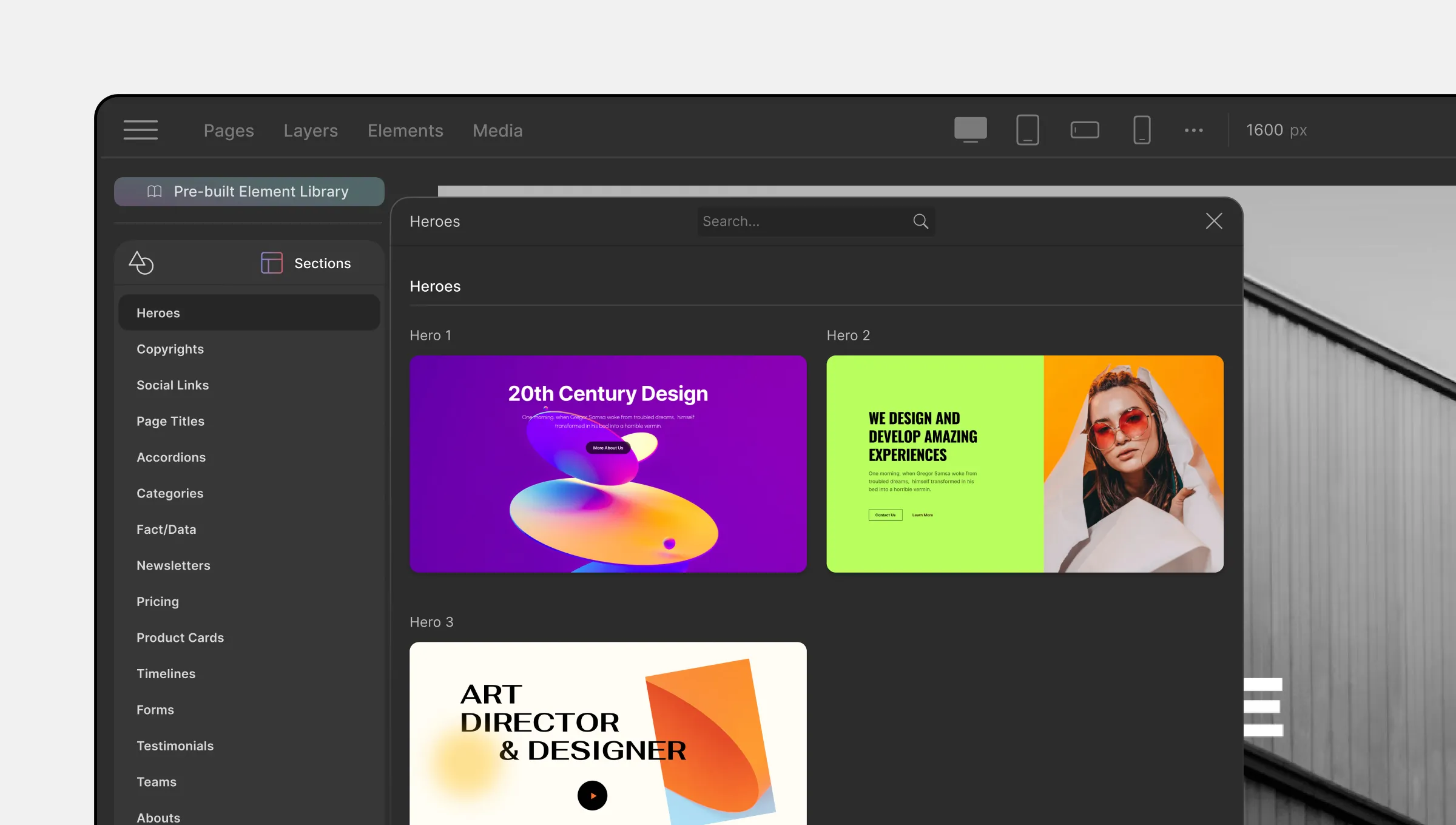
Next up we have Pre-Built Sections which you can access by clicking on its icon on the from the Pre-built Library.
Here, you’ll find a plethora of ready-made sections that you can use to speed up your design process and you can also fully customize them to match your preferences using the settings in the Style Panel.
Was this page helpful?