What Is a Navbar
As its name suggests, a Navbar, short for Navigation Bar, is an element that helps users navigate a website quickly and efficiently. It’s basically a list of links that builds off of a standard HTML list but boasts a better look and functionality.
Navbars come in various forms. They can be implemented vertically or horizontally, and they can even be fixed or dynamic. Some Navbars include not just text but also graphics, videos, etc. Their design all depends on the needs of a website and its users.
Why Use a Navbar
A Navbar helps users find their destination easily on any website. Through links and sub-links listed on the Navbar, they can quickly visit their target page without needing to remember its URL. Of course, for a Navbar to be helpful, it needs to be well-designed.
What Makes a Well-Designed Navbar
A user-friendly Navbar is one of the main factors that lead to a website’s success, so keep that in mind when designing your own. A good Navbar combines many things like choosing the most helpful links, having simple text, keeping a consistent and noticeable style, and more.
In essence, you need to think hard about what would help your users the most and design it with this in mind.
How to Add a Navbar
To add a Navbar, do the following:
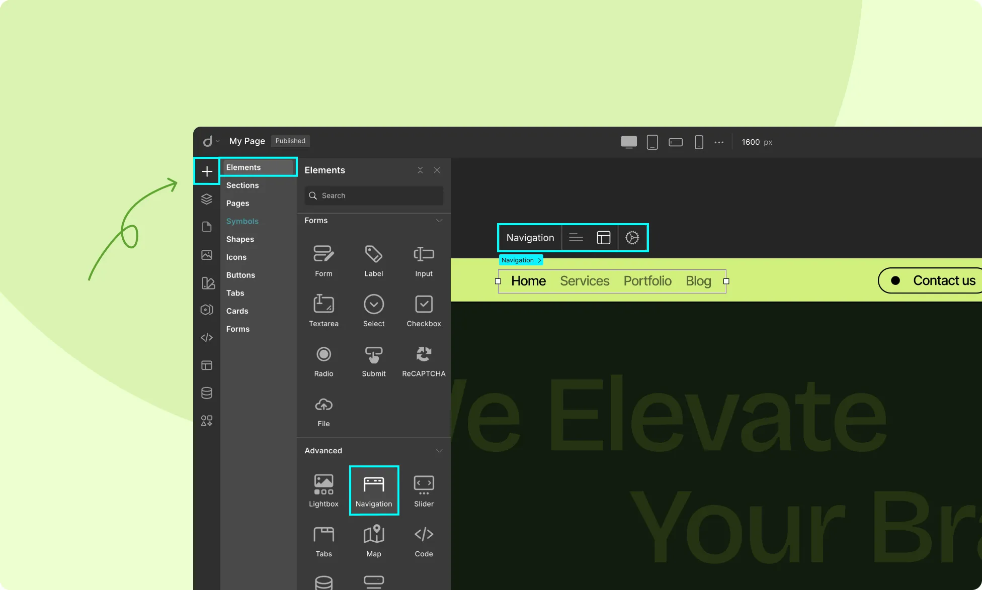
- From the left sidebar, go to Insert > Elements to open the Elements panel.
- Scroll down to the Advanced section and find the Navigation element.
- Click to add it directly to your canvas or drag and drop where you need it.
Once you’ve added the Navbar element, you’ll notice its inline editor has the following options:
- Nav Items
- Nav Options
- More Options
Let’s break down what each of these settings allows you to customize.
Nav Items
First up, we have the Nav Item settings.
Add Item: Click on this option to add new items to your navbar.
Once added, you can easily drag and drop the added items to rearrange their order in the navbar.
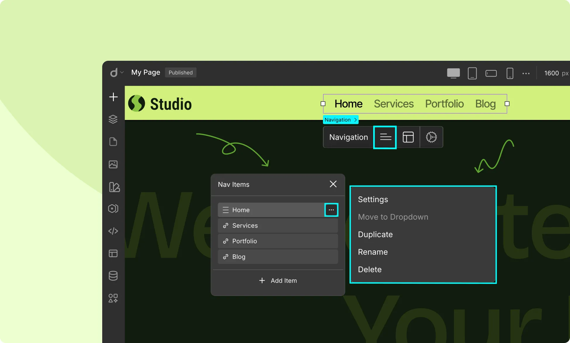
Additionally, you can click on the ellipsis icon beside each of the items to access the following individual item settings:
- Settings: Access the link settings for each item from here. These settings are explained later in this documentation.
- Move to Dropdown: Use this option to add a menu item to another item’s submenu. A submenu is a dropdown list that appears when you hover or click on a menu item. This is further explained later in this documentation.
- Duplicate: Select this option to duplicate this menu item.
- Rename: Select this option to rename this menu item.
- Delete: Select this option to delete this menu item.
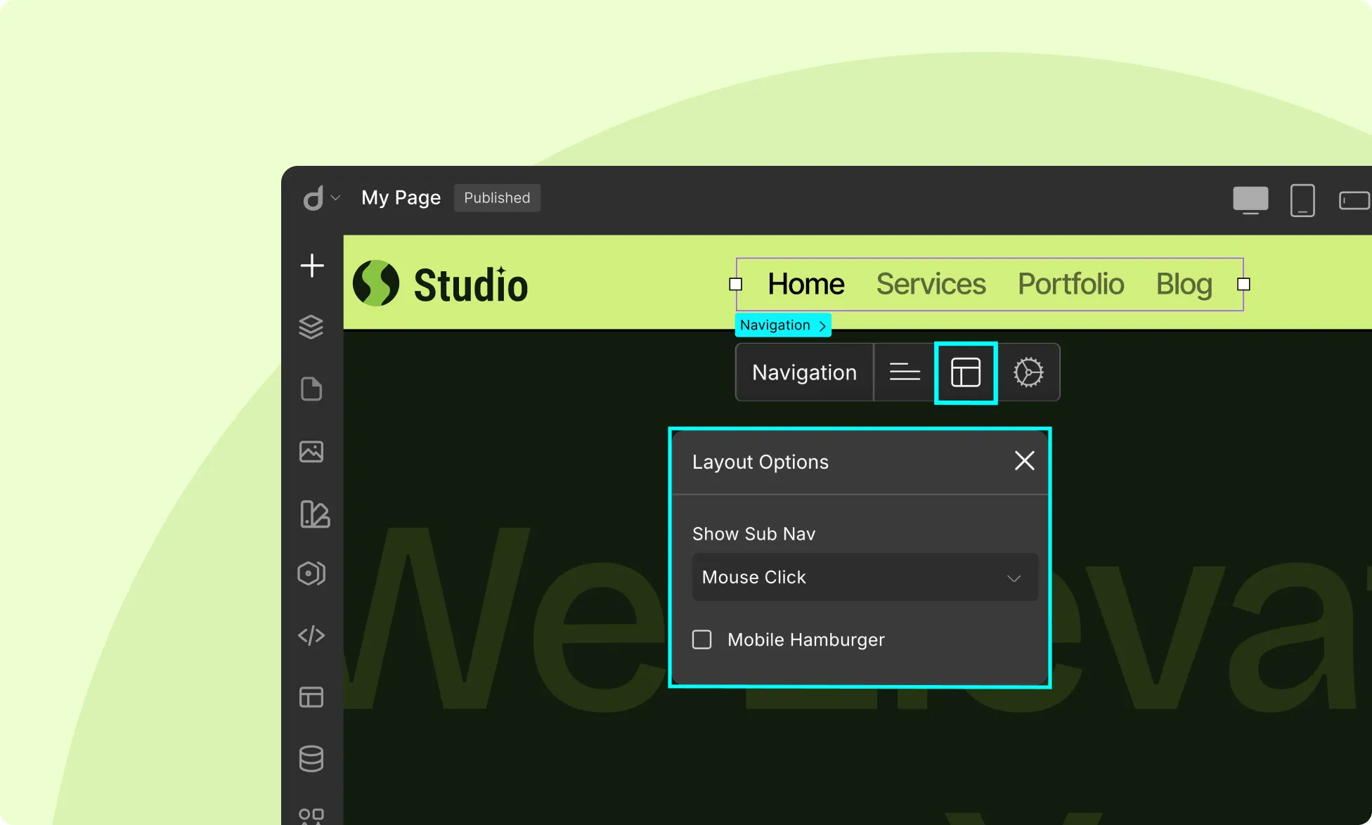
Nav Options
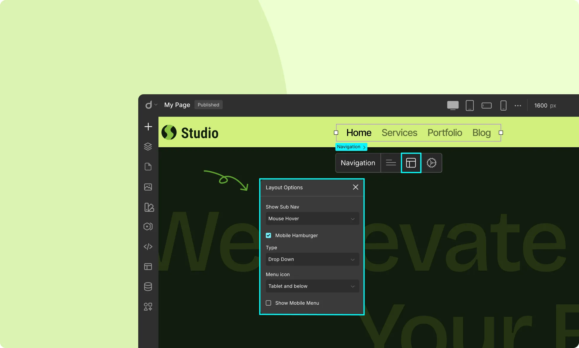
Next, we have the Nav Options or Layout options.
Show Sub Nav: Define the submenu behavior from here.
- Mouse Hover: Dropdown appears when the mouse hovers over a parent menu item.
- Mouse Click: Dropdown appears on clicking a parent menu item.
- Always: Dropdown always remains visible. Select this option if you want the sub-menu to stay open at all times.
Mobile Hamburger: Configure the Navbar responsiveness on mobile devices from here.
When enabled, the navigation menu will collapse into a hamburger menu on smaller screens. This makes for better responsiveness on mobile devices.
Once enabled, you’ll have the following additional settings appear:
Type: Define how the hamburger menu options will appear.
- Drop Down: The menu opens directly below menu bar.
- Drop Down Right: The menu opens on the right of the menu bar.
- Drop Down Left: The menu opens on the left of the menu bar.
Menu Icon: Choose which screen sizes will display the hamburger menu.
- All Device: Hamburger menu enabled for all devices.
- Tablet and below: Hamburger menu displayed on tablets and smaller screens.
- Mobile Landscape and below: Hamburger menu displayed on mobile landscape mode and smaller screens.
- Mobile and below: Hamburger menu displayed on mobile and smaller screens.
Hide Delay: Set how long to wait before the hamburger menu hides after the close icon is clicked.
Show Mobile Menu: Enable this option to force the mobile menu to be visible, useful for previewing how the navbar looks on smaller screens.
More Options
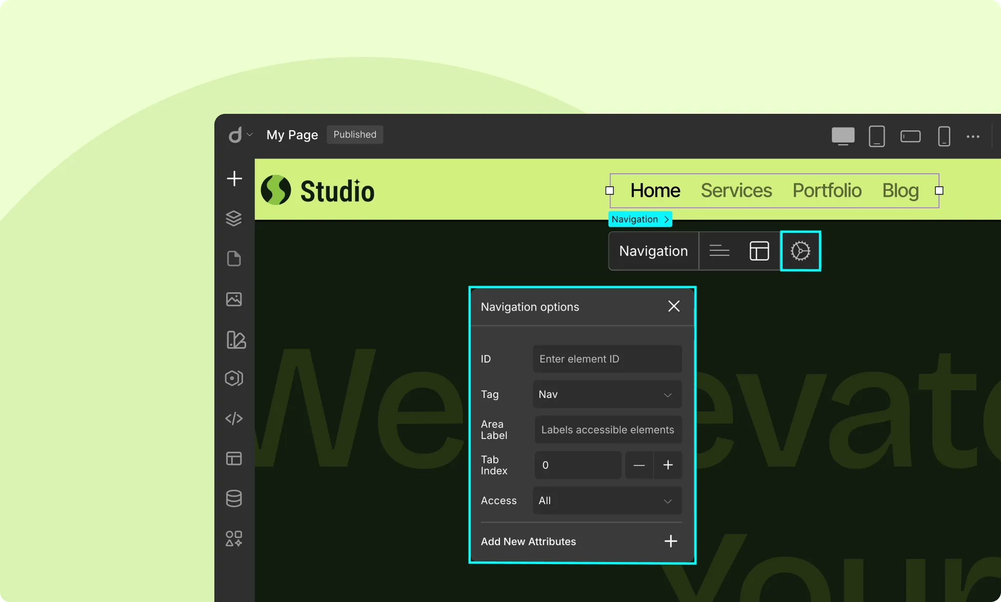
Lastly, we have More Options, which is common for all elements in Droip.
- ID: Set a unique identifier for the navigation element. It can be used in CSS or JavaScript to style or manipulate the element. Make sure to use descriptive IDs for easy identification and styling.
- Tag: Specify the HTML tag for the element. In this case, it’s set to
- Area Label: This is for ARIA (Accessible Rich Internet Applications) labeling. It provides an accessible name for screen readers, helping users with disabilities understand the purpose of the navigation.
- Tab Index: Set the keyboard navigation order. Only use it when you need a custom tab sequence.
- 0 means it follows the natural order of the document.
- A positive number (1, 2, etc.) means it will be focused in a specific order before elements with a lower number.
- -1 makes the element focusable only through JavaScript.
- Access: Set who can access the navigation element. Options include:
- All (default)
- Guest
- Logged In
- Adminitrator
- Editor
- Author
- Subscriber
- Add New Attributes: Manually add custom attributes like data-*, aria-*, or other HTML properties as needed.
How to Make a Navbar Sticky
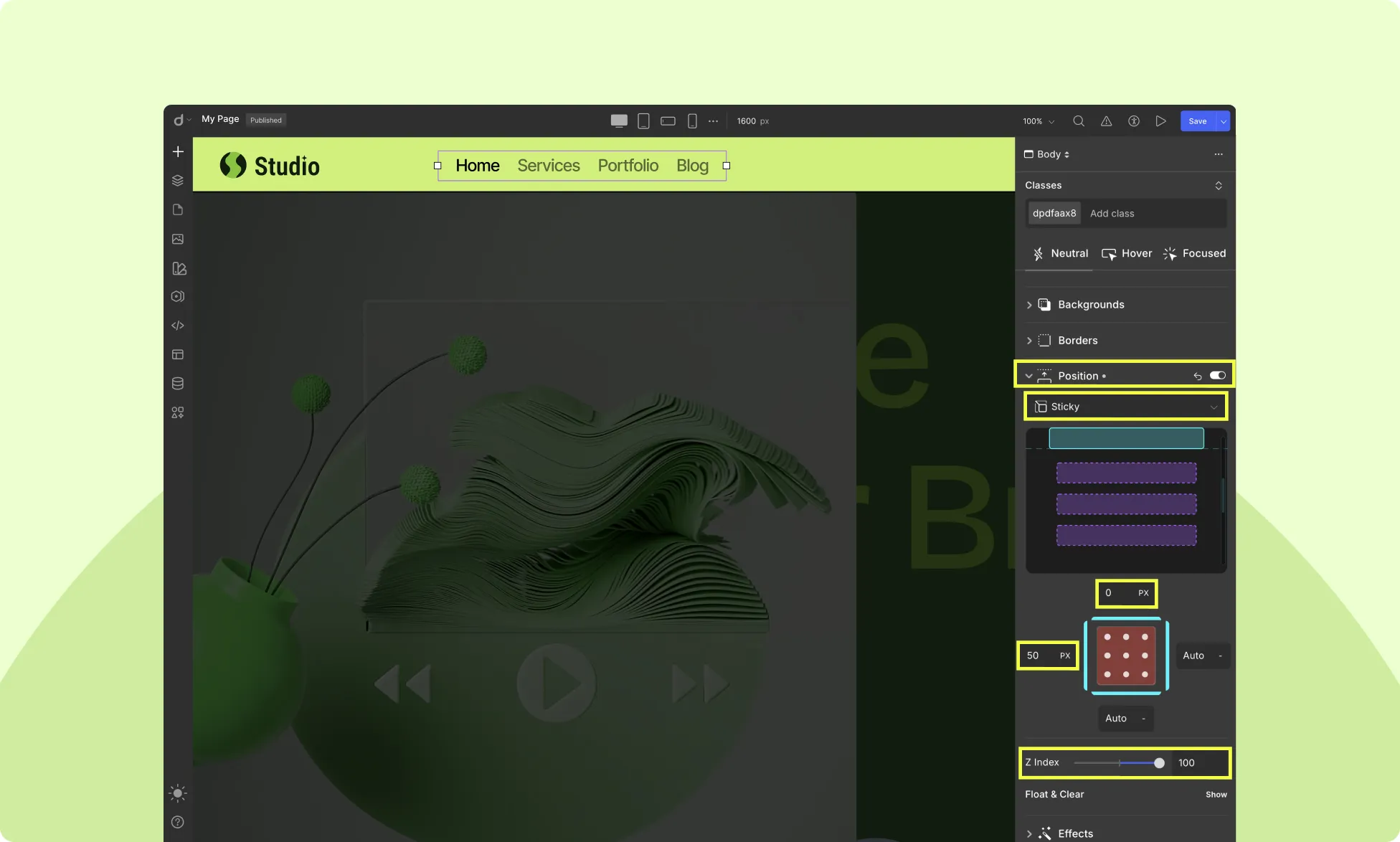
Making a Navbar sticky is always a good choice, especially if your webpage is on the longer side, as it makes it easier for users to navigate your website without having to scroll all the way up to access it.
It also allows them to stay in the same spot on their current page while also opening a different link from the Navbar in a new tab or window.
To make your Navbar sticky, do the following:
- Select the Navbar and head to the Style Panel > Position.
- Set the Position to Sticky, the Top Offset to 0%, and the Left Offset to 50%.
- Set the Z-Index value to 100 to ensure the Navbar is always layered and visible above all the other elements on a page.
📝 Note: For this to work properly, make sure your Navbar is not within any layout element.
Creating a Mega Menu for Navbar
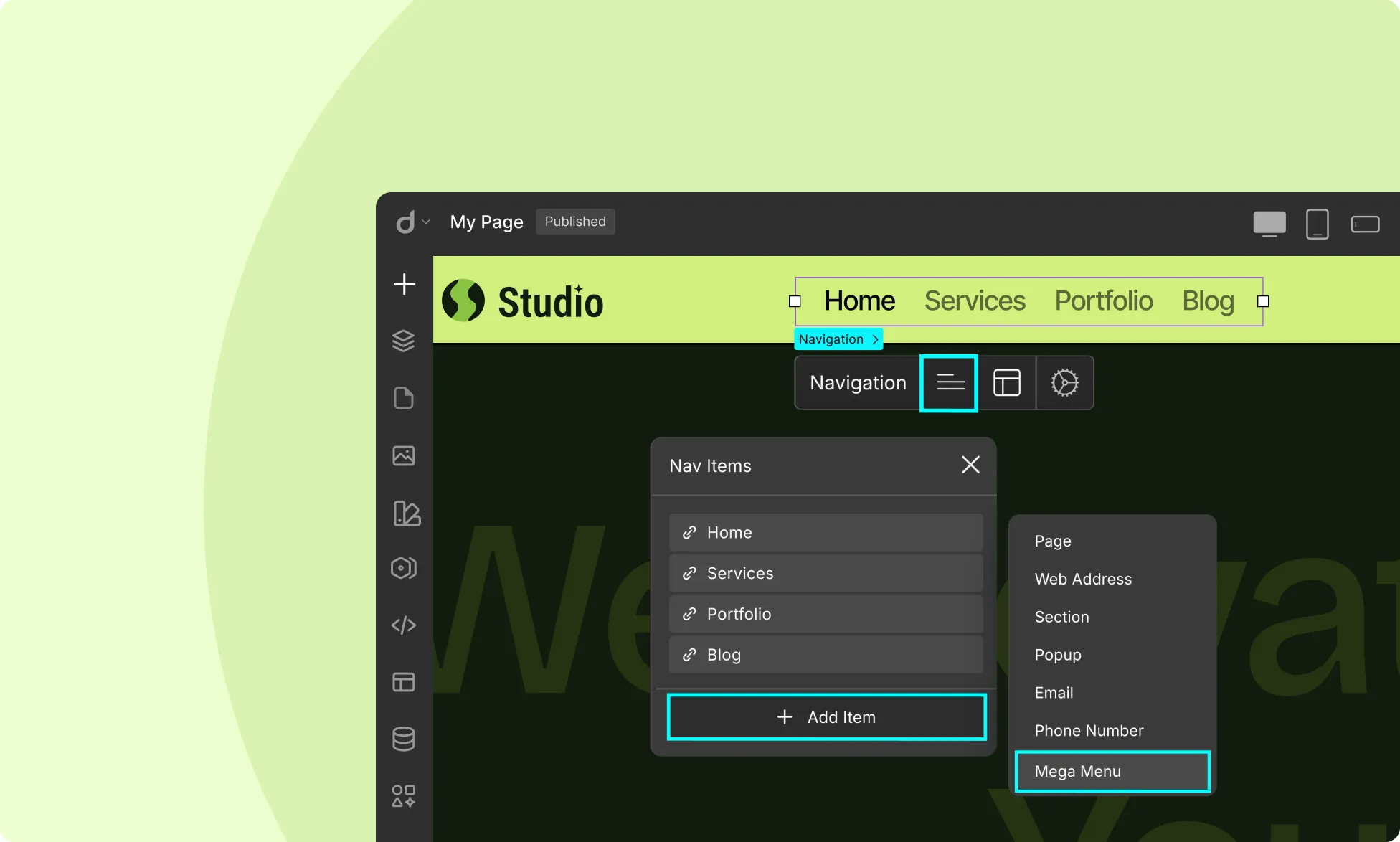
To create a mega menu, follow these steps:
- Select the Navbar element on the canvas
- Open the Nav Items settings and click on Add item
- Select the Mega Menu option
When you add a Mega Menu item, a nested Menu Wrapper is included by default. To add items to the Mega Menu, just drag & drop any of the existing items within this wrapper.
The Mega Menu works just like any other submenu so you can customize how it expands by going to Nav Options > Show Sub Nav and choosing your preferred option.
Linking Nav Items
Now that you’ve added your Nav Menu Items, it is time to link them to their corresponding web pages.
You can access Link Settings for Nav Menu Items in two ways:
- In Nav Items, select an item and click the ellipsis icon to open its Link Settings.
- Or, click directly on a Link Text element to access its Link Settings.
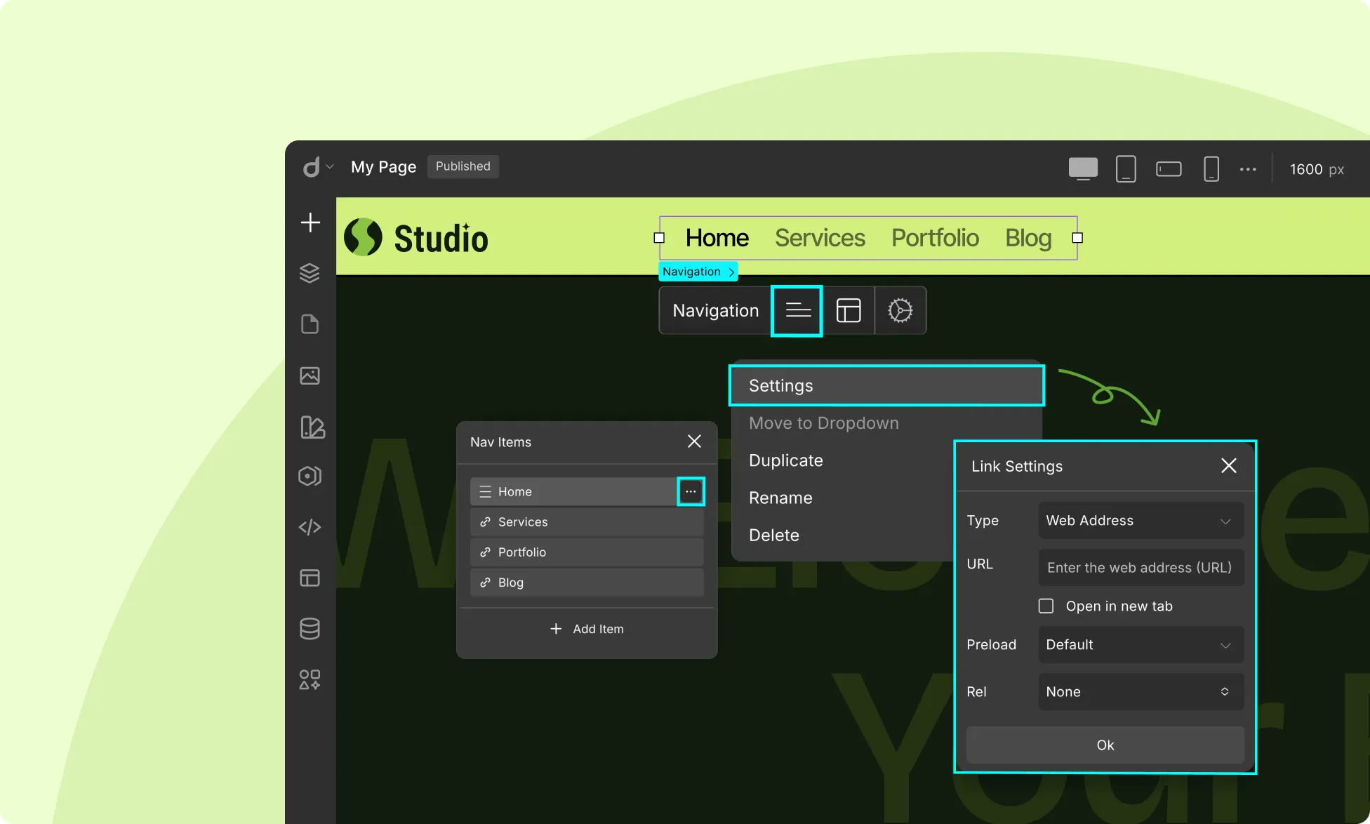
Here, you’ll find the following options:
- Type: Set the link type.
- Link Target: Specify the target destination. For example, choose a specific page for the Page type, enter a URL for Web Address, and so on.
- Open in New Tab: Enable this if you want the link to open in a new tab, though nav menu links typically open in the same tab.
For more details, check out the Link Block documentation.
You can follow the same steps to add links to other items on the Nav Menu.
Was this page helpful?