A web form is an HTML form that lets users enter their information. There’s no “one size fits all” when it comes to web forms.
Depending on your business needs and the type of user data you want to collect, you can craft any web forms that fit your needs with Droip.
How to Add a Form
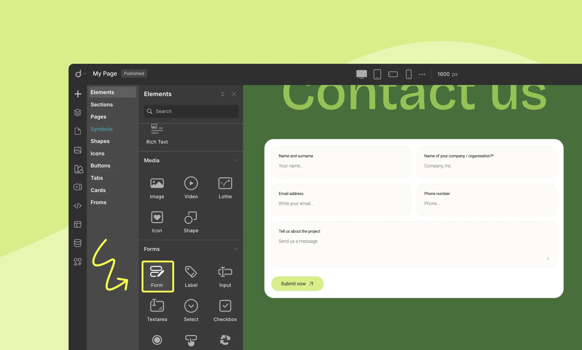
To add a Form to your page, follow these simple steps:
- Open the Insert Panel from the right sidebar.
- Navigate to Elements > Forms.
- Drag and drop the Form element onto your canvas.
Default Form Structure
The Form comes with a set of default form elements, including:
- Heading
- 4 input fields labeled as Name, Email, Subject, Description
- Submit Button
Available Form Elements
Droip offers various elements to help you design functional forms:
- Label: Describes a field’s purpose for users.
- Input: Captures single-line text (e.g., name, email, phone).
- Textarea: For multi-line input (e.g., comments, messages).
- Selector: Provides a dropdown list of options.
- Checkbox: Lets users select one or more options.
- Radio Button: Allows selection of only one option from a list.
- Form Button: Submits the form.
- reCAPTCHA: Protects against spam using Google’s service.
- File Upload: Enables users to attach files.
📝 Note: You can add or remove form elements only within the form block.
Form Settings
Once your form is built, configure its behavior in the Form Settings panel.
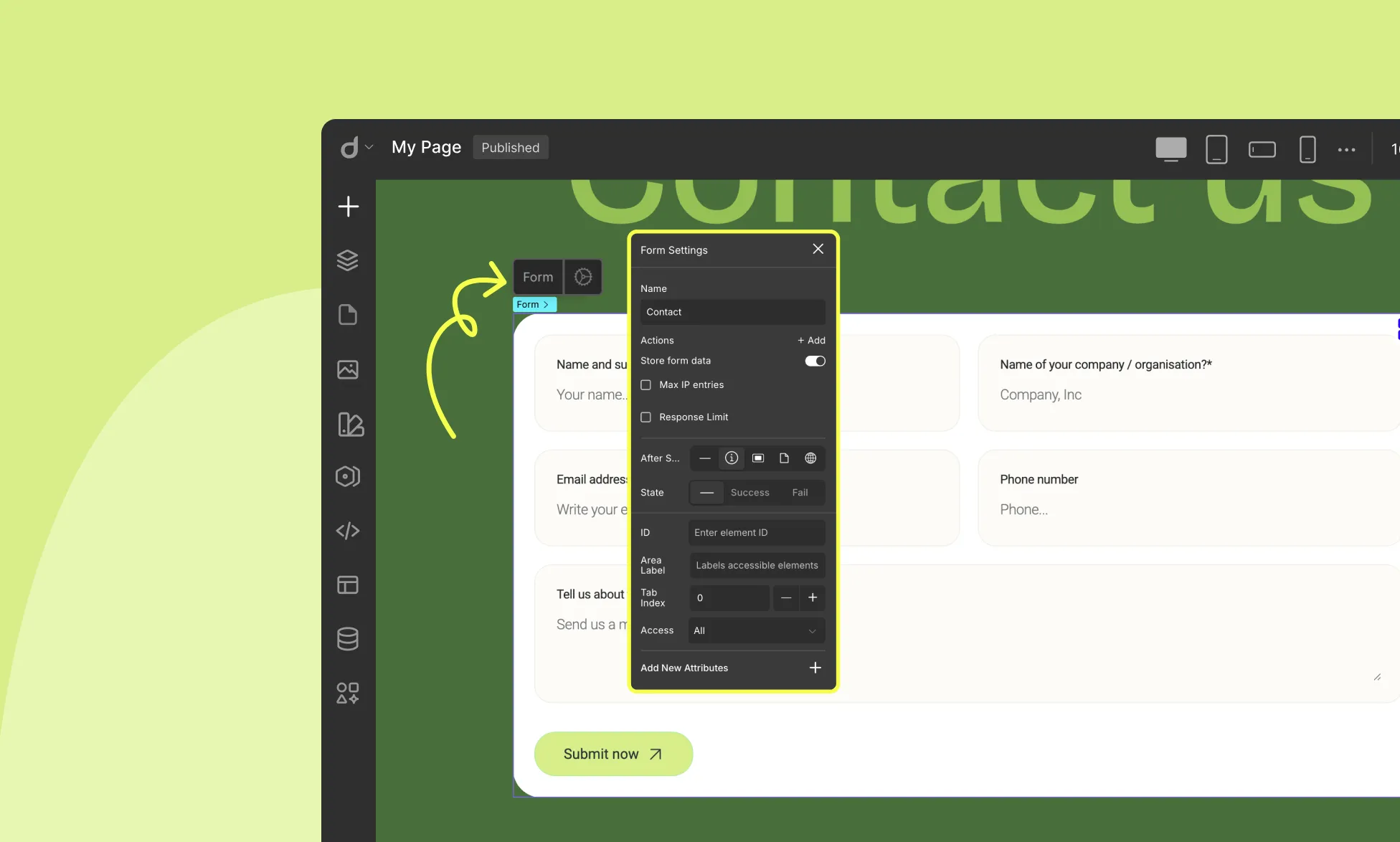
Name: Assign a unique name to identify the form (e.g., “ContactForm”).
Actions: Define what happens on submission:
- Email: Send entries to an email address.
- Webhook: Send data to an endpoint (for integrations like Zapier or CRMs).
Learn more about Form Actions.
Store Form Data: Enable to save submissions directly in Droip’s Form Data Manager.
Max IP Entries: Limit how many times a single IP can submit the form (e.g., set to “1” for one-time entry).
Response Limit: Set a maximum number of total submissions (useful for limited offers or registrations).
After Submit: Choose post-submission behavior:
- None: No extra action
- Show Notification: Display a success or failure message
- Popup: Trigger a popup (you can set different popups for success and failure)
- Page: Redirect to another page
- External URL: Redirect to an external website
Each “After Submit” action, Droip lets you define different experiences based on the form’s submission result:
Default (None): The form’s normal state before submission.
Success: Shown if the form is submitted successfully (e.g., showing a success notification or popup).
Fail: Shown if the form submission fails (e.g., showing an error notification or popup).
You can customize the message, design, or triggered action for each state depending on the “After Submit” option you’ve selected, letting you control both what happens and how it looks for each scenario.
Customizing Form Elements
Input Field
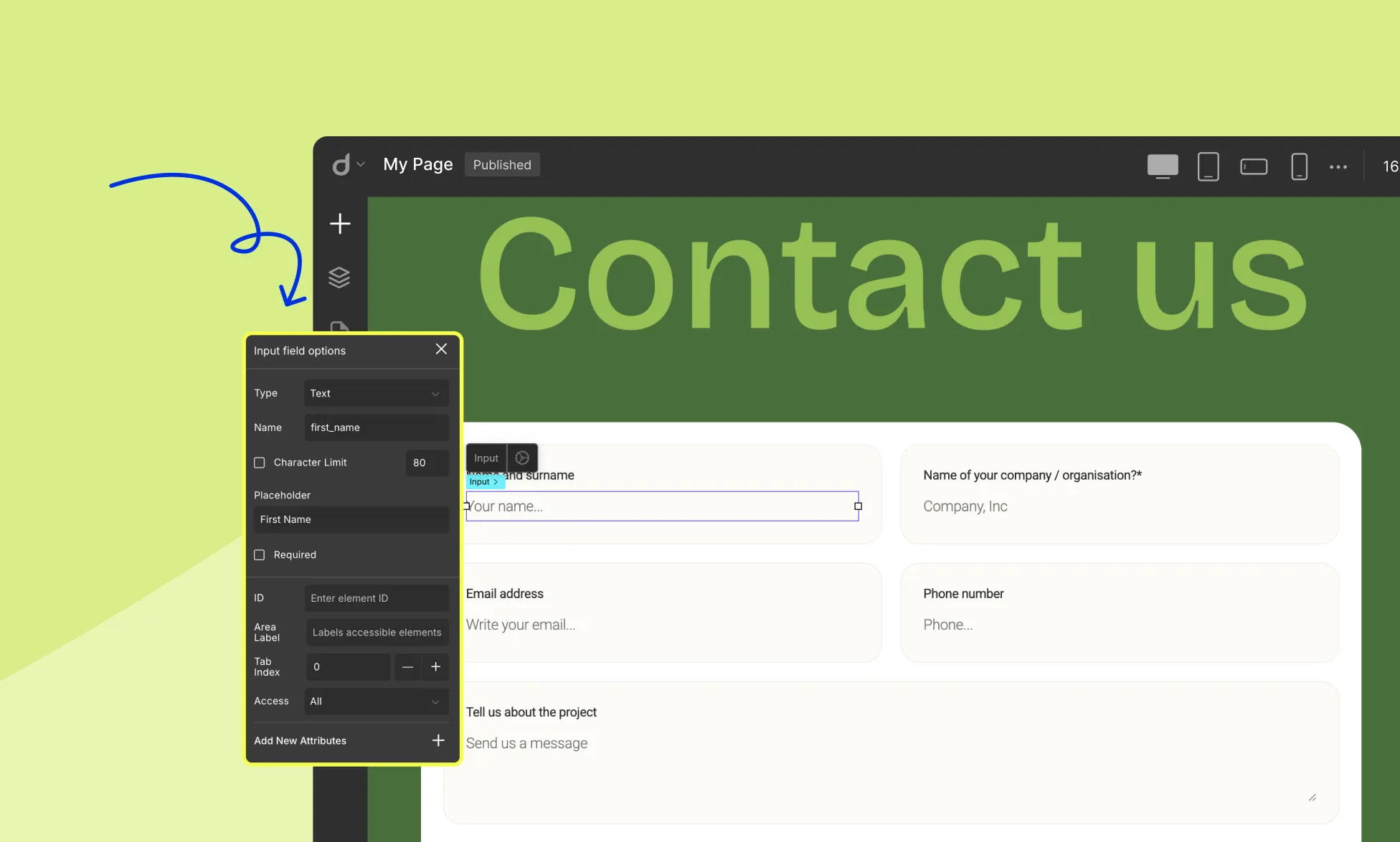
Click an input field to access the Input Field Options:
Type: Specify input type (text, email, password, number, date, etc.)
Name: Assign an internal name for data tracking
Character Limit: Set a max number of characters (text inputs only)
Placeholder: Add guidance text inside the field
Required: Mark the field as mandatory
Text Area
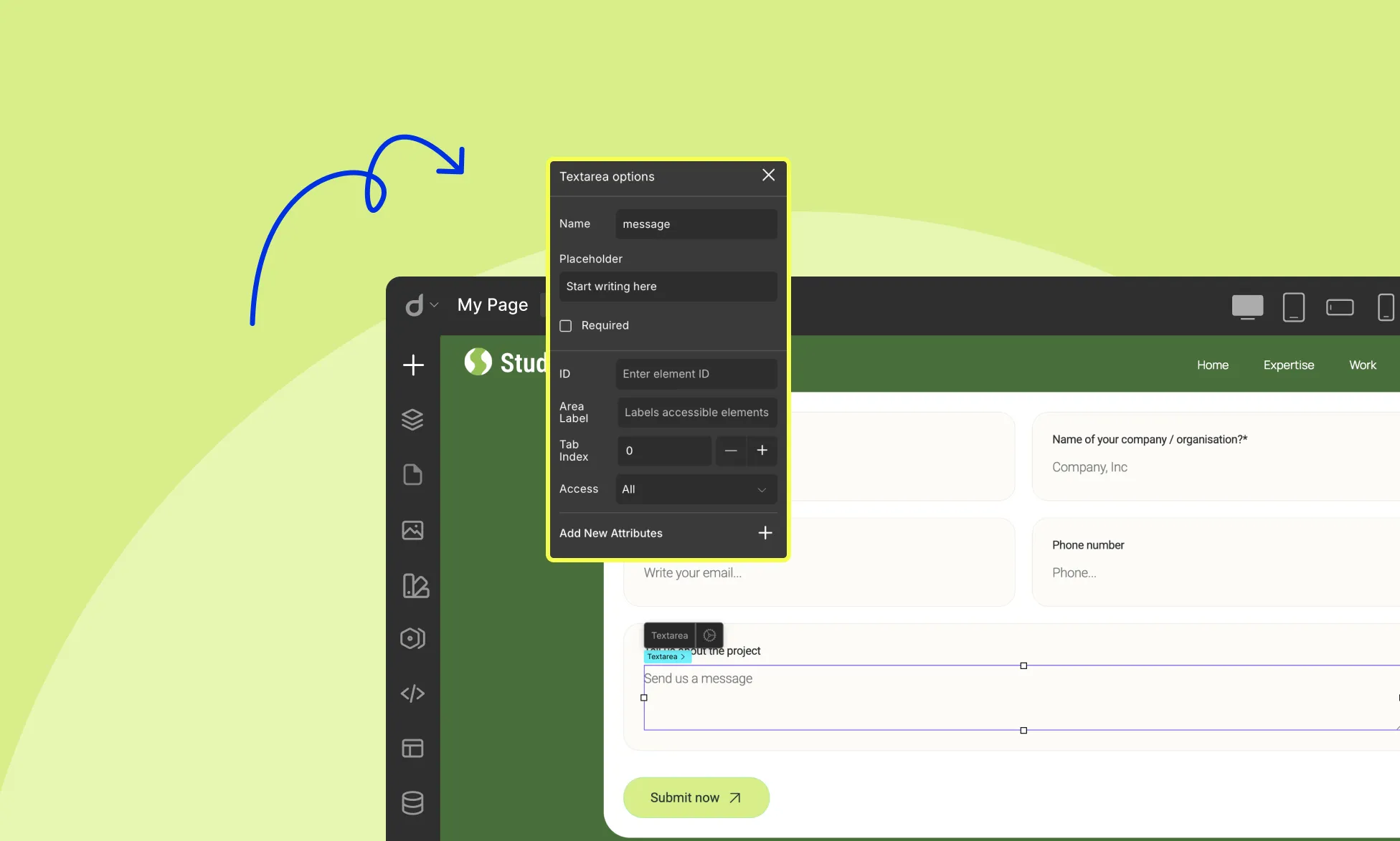
Click a textarea to access its options:
Name: Assign a unique name
Placeholder: Add guidance text
Required: Mark the field as mandatory
Select
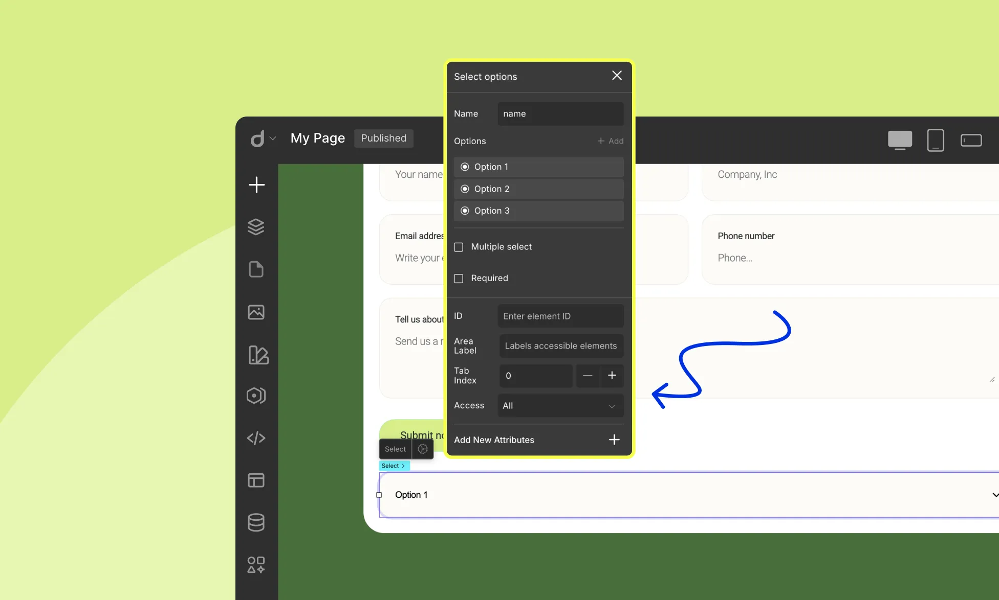
Click the select element on the form to access its options:
Name: Assign an internal name. This name is used when processing form submissions (e.g., mapping the selected value).
Options: Add the choices that users can select. Click + Add to add new options. Reorder options easily by dragging them.
Multiple Select: Allow users to select multiple options (or disable for single selection)
Required: Make selection mandatory
Checkbox Input
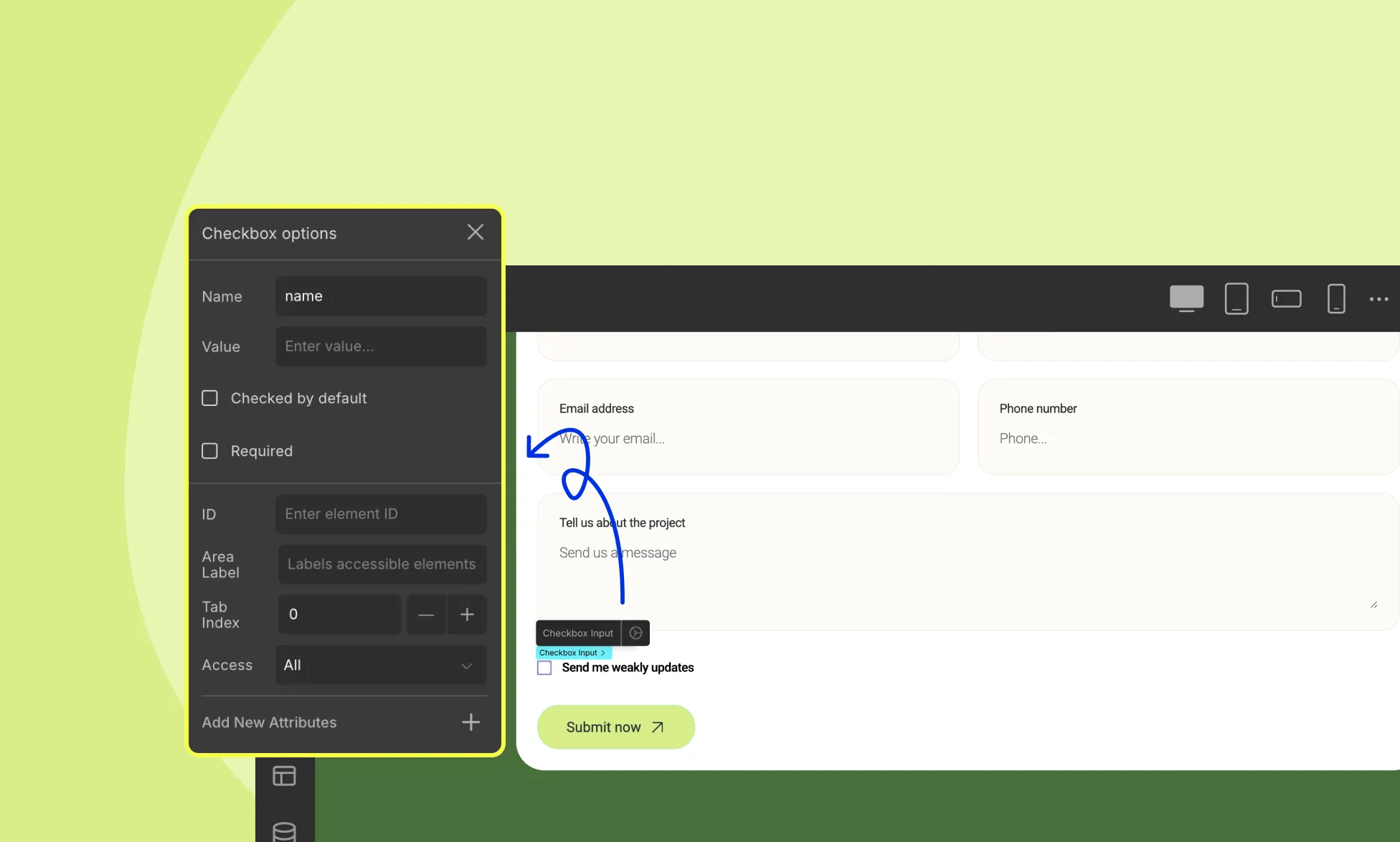
Inside the checkbox element, you’ll find:
- Checkbox Input element
- Text element
When you click the Checkbox Input, the Checkbox Options panel appears:
Here you can configure:
Name: Assign an internal name to track the checkbox.
Value: Set the value that will be submitted when the checkbox is checked.
Checked by Default: Enable this to have the checkbox pre-selected.
Required: Mark the field as mandatory (users must check it to submit).
Radio Button
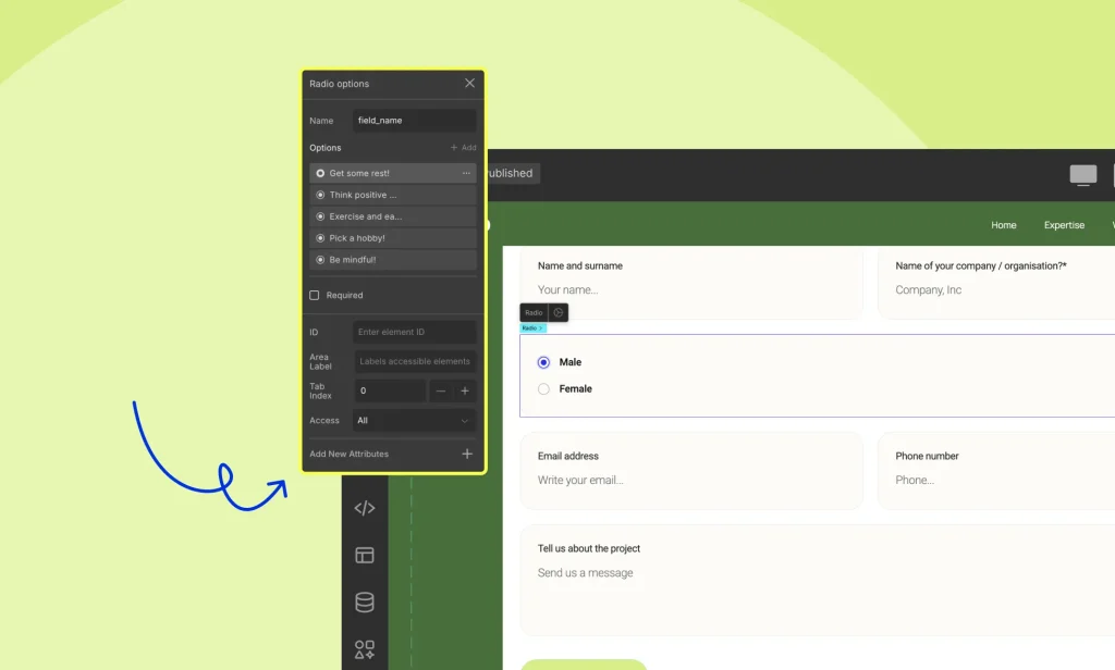
Click the Radio Button element to configure:
Name: Assign a name; this is used during form submission to collect the selected value.
Options: Add, edit, duplicate, delete, or reorder choices
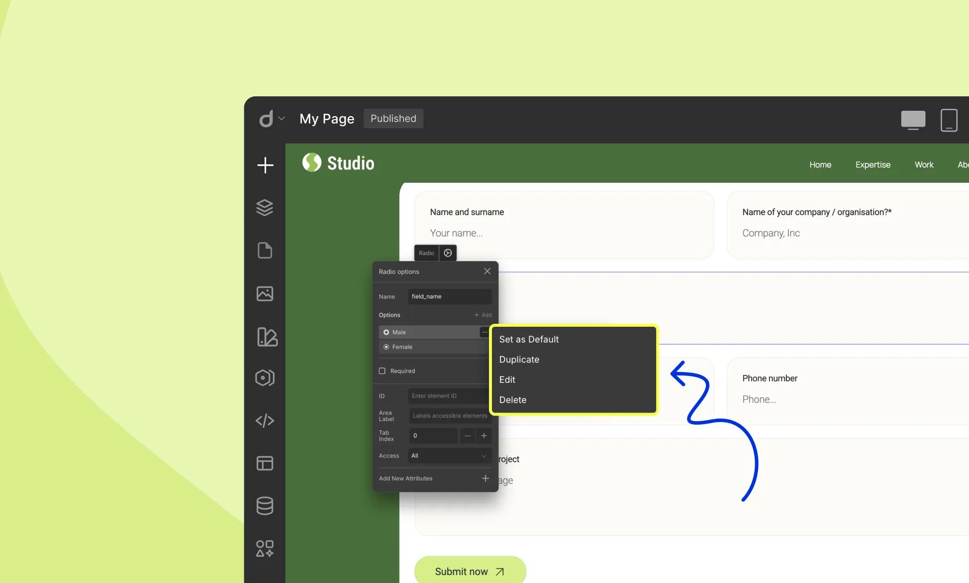
Each option lets you specify:
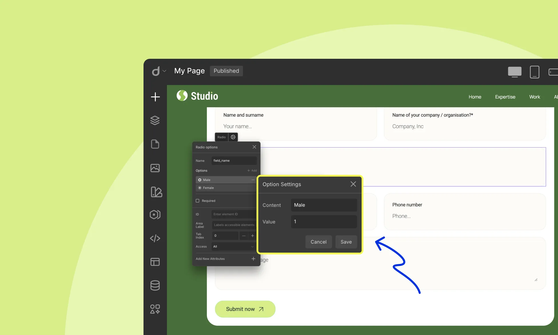
- Content: The visible label, what users will see (e.g., “Option A”)
- Value: The actual data on form submission (e.g., “A1”)
Required: Make selection mandatory
Form Button
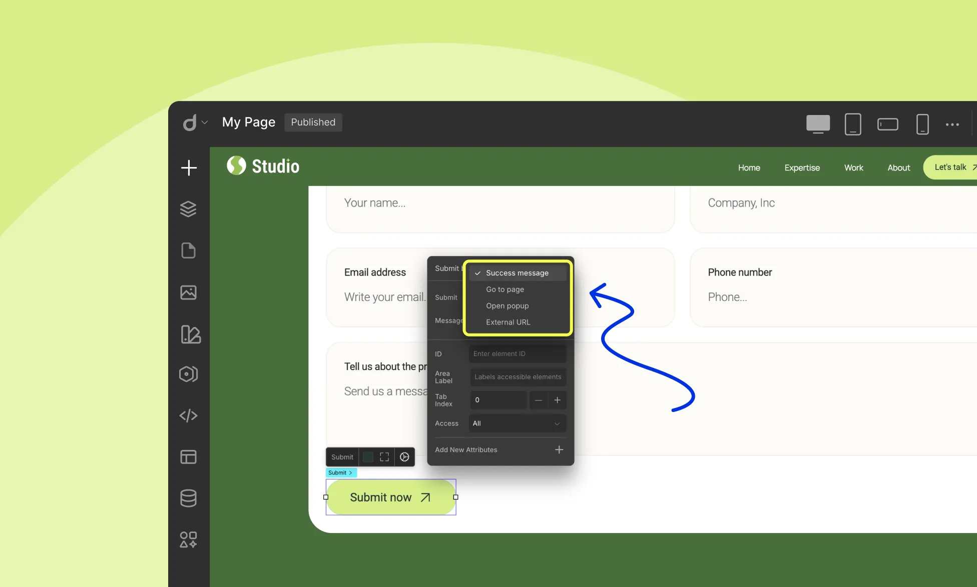
When you select the Submit Button in your form, the Submit Button Options panel opens. This panel lets you define what happens after someone submits the form.
Under the Submit dropdown, you can choose one of four actions:
Success Message – Shows a success message on the page after submission. You can enter the message in the Message field.
Go to Page – Redirects users to another page in your project once the form is submitted.
Open Popup – Opens a popup window after submission. Make sure you’ve already created the popup and linked it properly.
External URL – Redirects users to an external website after submitting the form.
reCAPTCHA
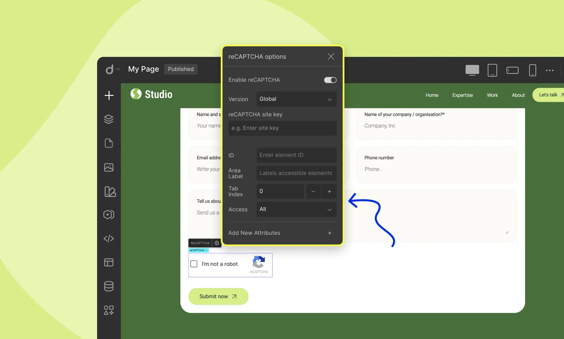
Click on the reCAPTCHA element on the form to configure:
Enable reCAPTCHA: Toggle on/off
Version: Choose reCAPTCHA version
Site Key: Enter your reCAPTCHA site key
File Upload
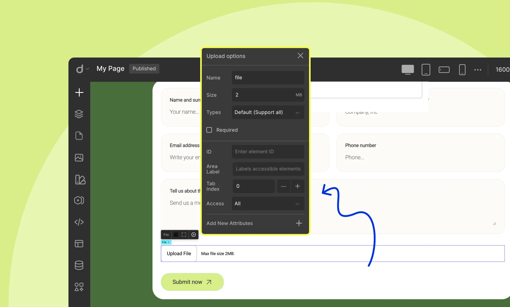
Click on the File Upload element on the form to configure:
Name: Give your file upload field a name for identification.
Size: Define the max file size.
Select File Types: From this dropdown, select which file types the user will be allowed to upload:
- Default: Supports all
- Document: .doc, .pdf, .txt
- Image: .jpg, .png, .gif
- Video: .mp4, .mov
Style Form Field Focus State
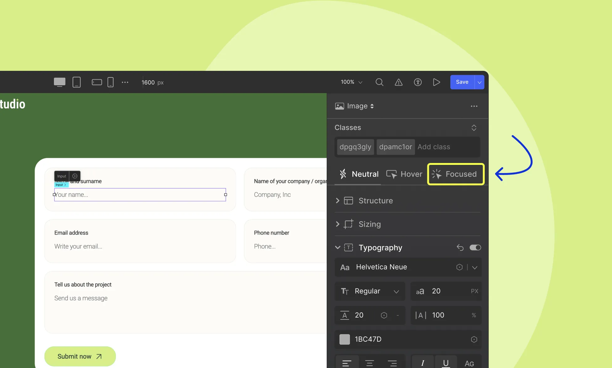
Highlight the focused state of input fields when users click on them or use the keyboard to fill them in. To access the focused state:
- Select the input field.
- Go to the Style Panel on the right sidebar.
- Select Focused from the States.
Now, you can add a border, change the background color, and style as you wish. This styling will be visible when the input form field is in the focus state only.
Droip also provides a dedicated WordPress dashboard to manage your form data efficiently. To learn how to manage your form data in Droip, refer to Form Data documentation.
Was this page helpful?