The Flex Element in Droip allows you to create flexible and responsive layouts using CSS Flexbox, all through a visual interface.
What Is Flex?
The Flex Element is a layout container in Droip that uses the power of CSS Flexbox to arrange its direct children (child elements) in 1 dimension, either row or column.
It’s perfect for building horizontal menus, vertical stacks, split layouts, sidebars, and more.
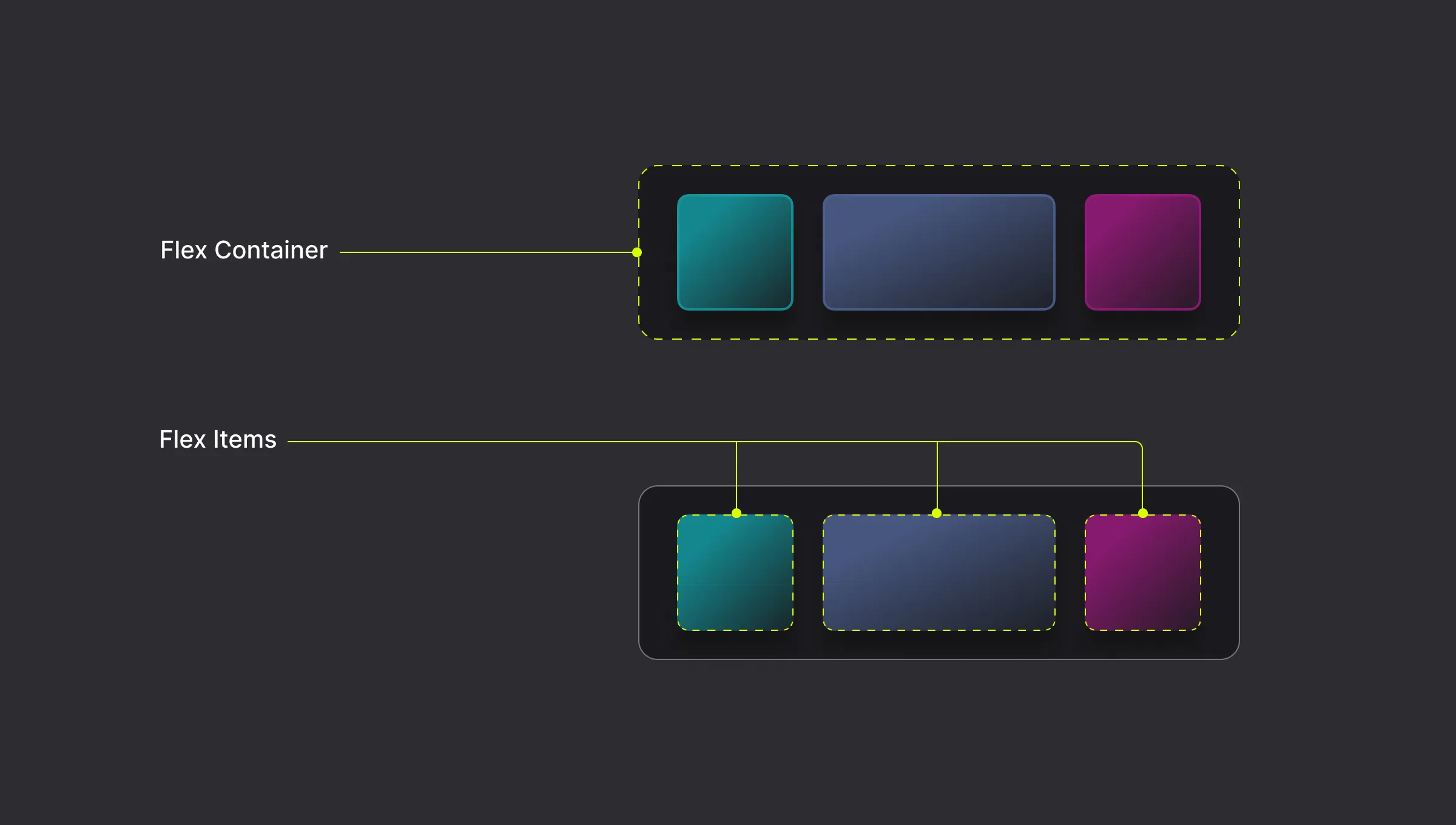
Flex Container and Flex Items
A Flex Container is the parent element and the direct children of that element become Flex Items.
How to Add a Flex
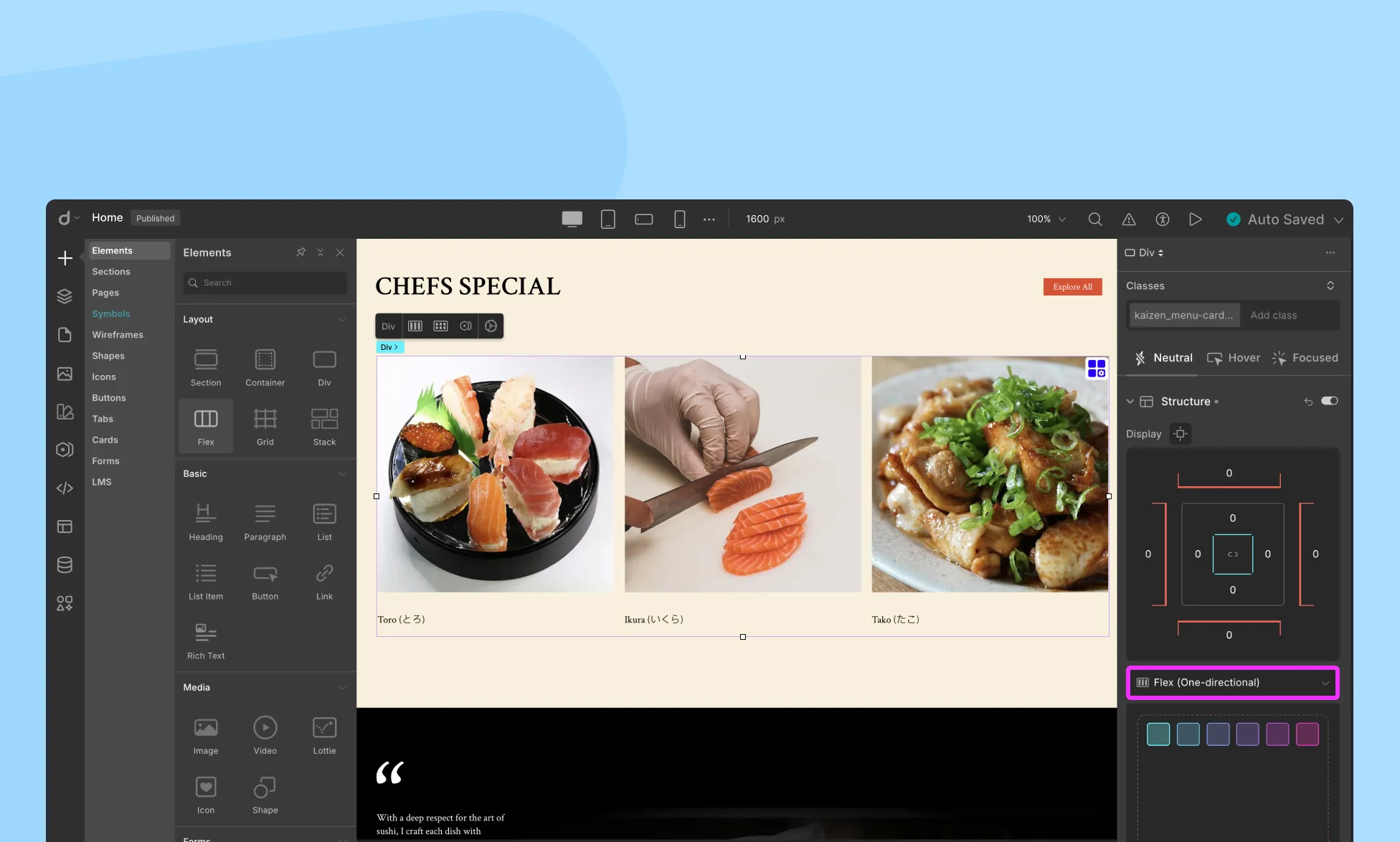
To enable the Flex display for any element that contains other elements inside it:
- From the right-side panel, go to the Structure section.
- Select Flex (one-directional) from the drop-down menu.
Alternatively, you can add a Flex element to your page from the Elements Panel to start from scratch.
- Open the Insert > Elements Panel from the left sidebar.
- Drag the Flex element onto your canvas.
Place your desired elements inside the Flex container (these will be Flex Items).
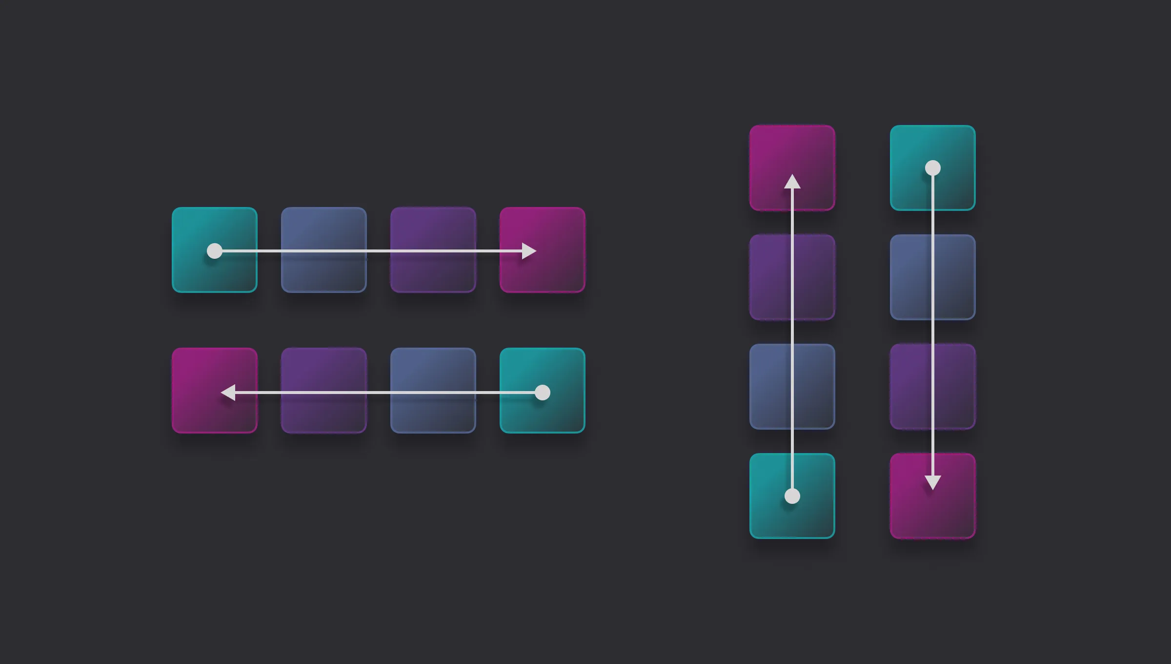
Flexbox Direction
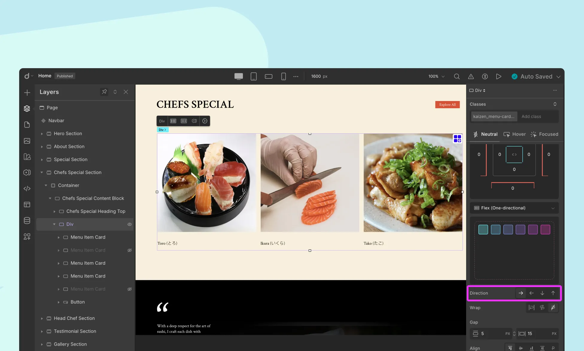
The flex-direction property determines the direction in which the flex items are laid out.
- Row (Default): Items are laid out horizontally, from left to right.
- Row Reverse: Items are laid out horizontally, from right to left.
- Column: Items are laid out vertically, from top to bottom.
- Column Reverse: Items are laid out vertically, from bottom to top.
Use Case: Choose row for horizontal navigation bars and column for stacked content like cards or list items.
Cross-Axis
The cross-axis is the perpendicular axis to the main axis within a flex container. The main axis is defined by the flex-direction property, which can be set to a row or column.
For example, if the flex-direction is set to row, then the main axis will be horizontal, and the cross-axis will be vertical.
Flex Wrapping
The flex-wrap property sets whether flex items are forced onto one line or can wrap onto multiple lines. By default, Flex items stay on a single line.
Nowrap
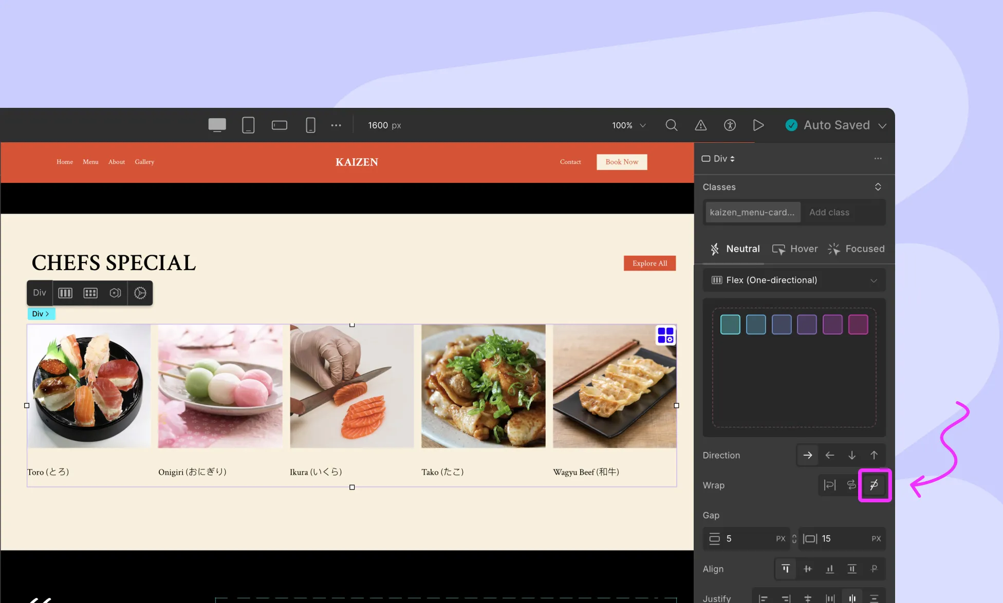
The flex items are laid out in a single line, which may cause the flex container to overflow.
Wrap
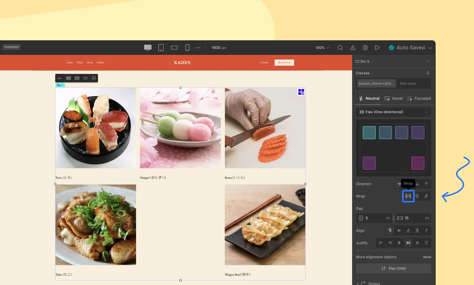
Items wrap onto multiple lines from top to bottom (or left to right).
Wrap-reverse
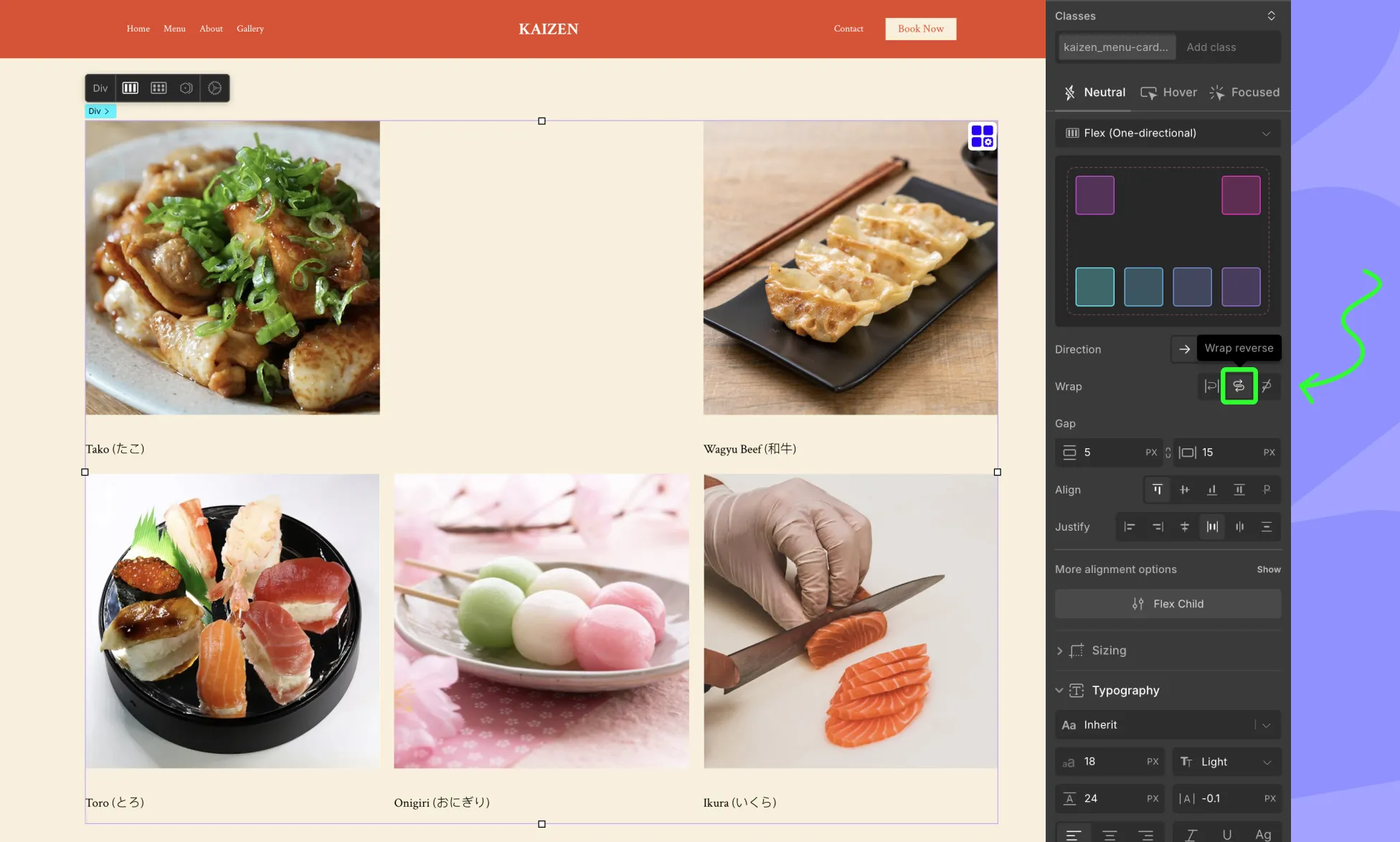
Behaves the same as wrap, but in reverse order.
Flex Gap
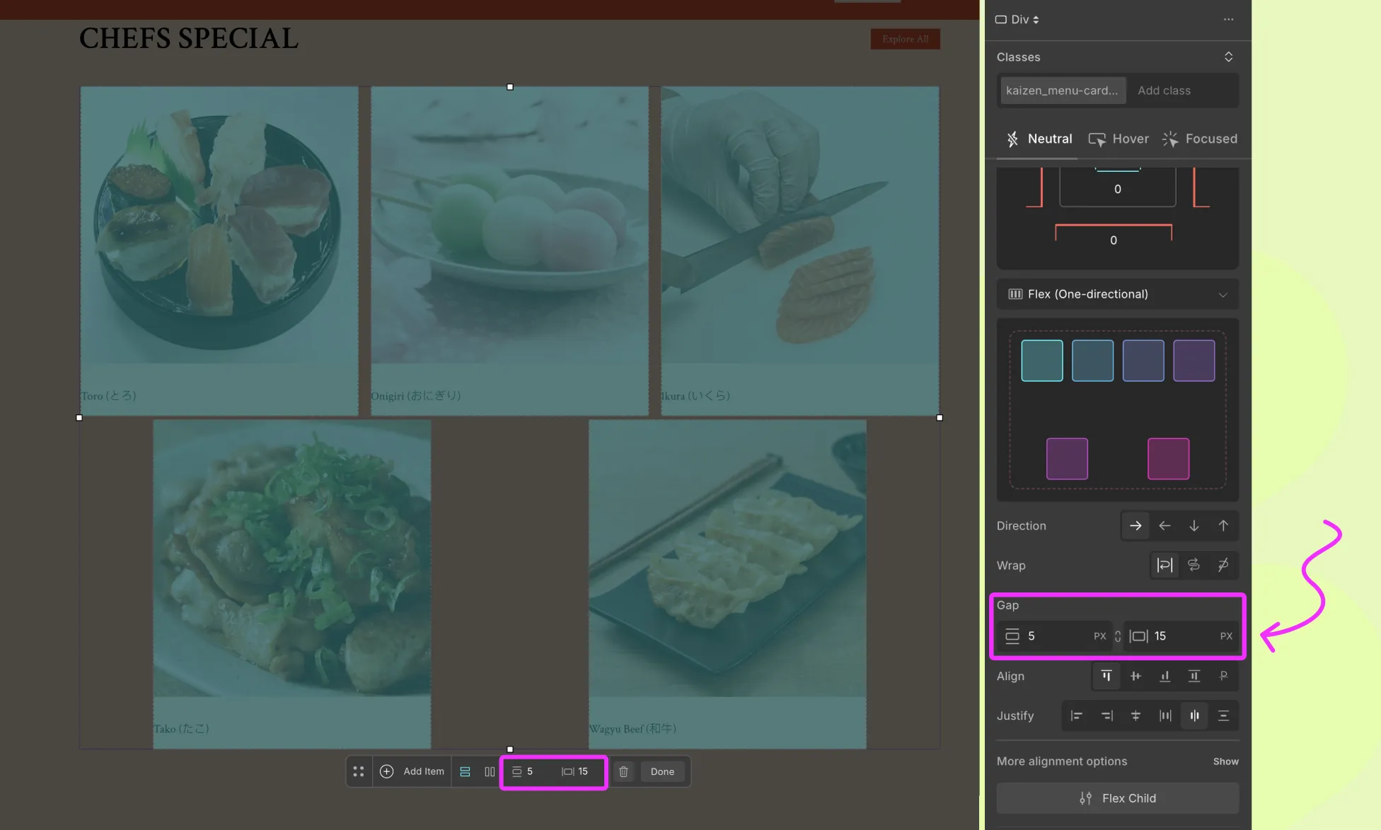
The Gap setting lets you control the spacing between flex items, both row gap and column gap.
- Row Gap – space between items in the same row.
- Column Gap – space between items in different columns.
With Flex Gap, you can easily create consistent spacing between cards, icons, or buttons without adding padding/margin manually.
Align Content
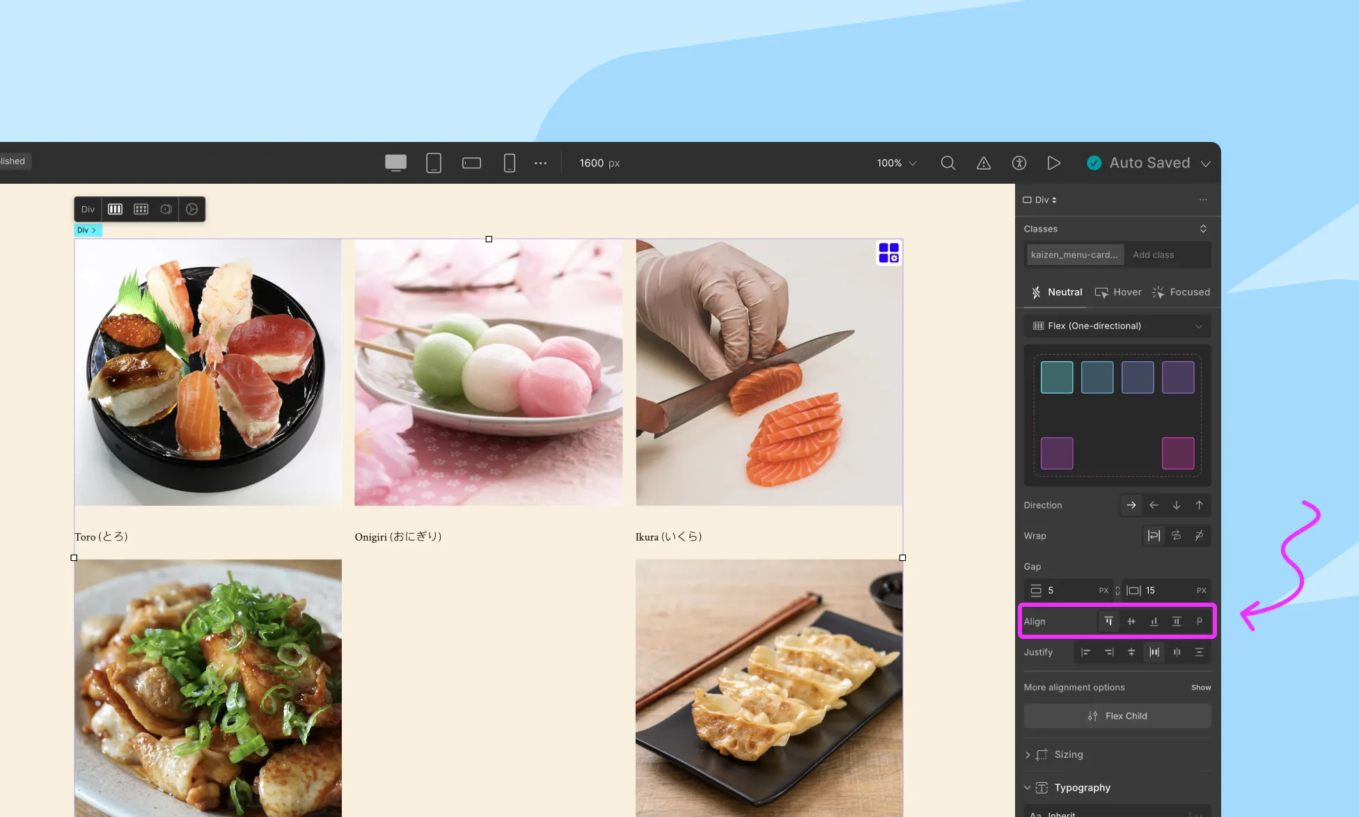
Controls the alignment of items along the cross axis (perpendicular to the main axis).
- Flex Start: Align items to the start of the cross-axis
- Center: Center items along the cross-axis
- Flex End: Align items to the end of the cross-axis
- Baseline: Align items based on their text baseline
Alignment for Multi-line flex
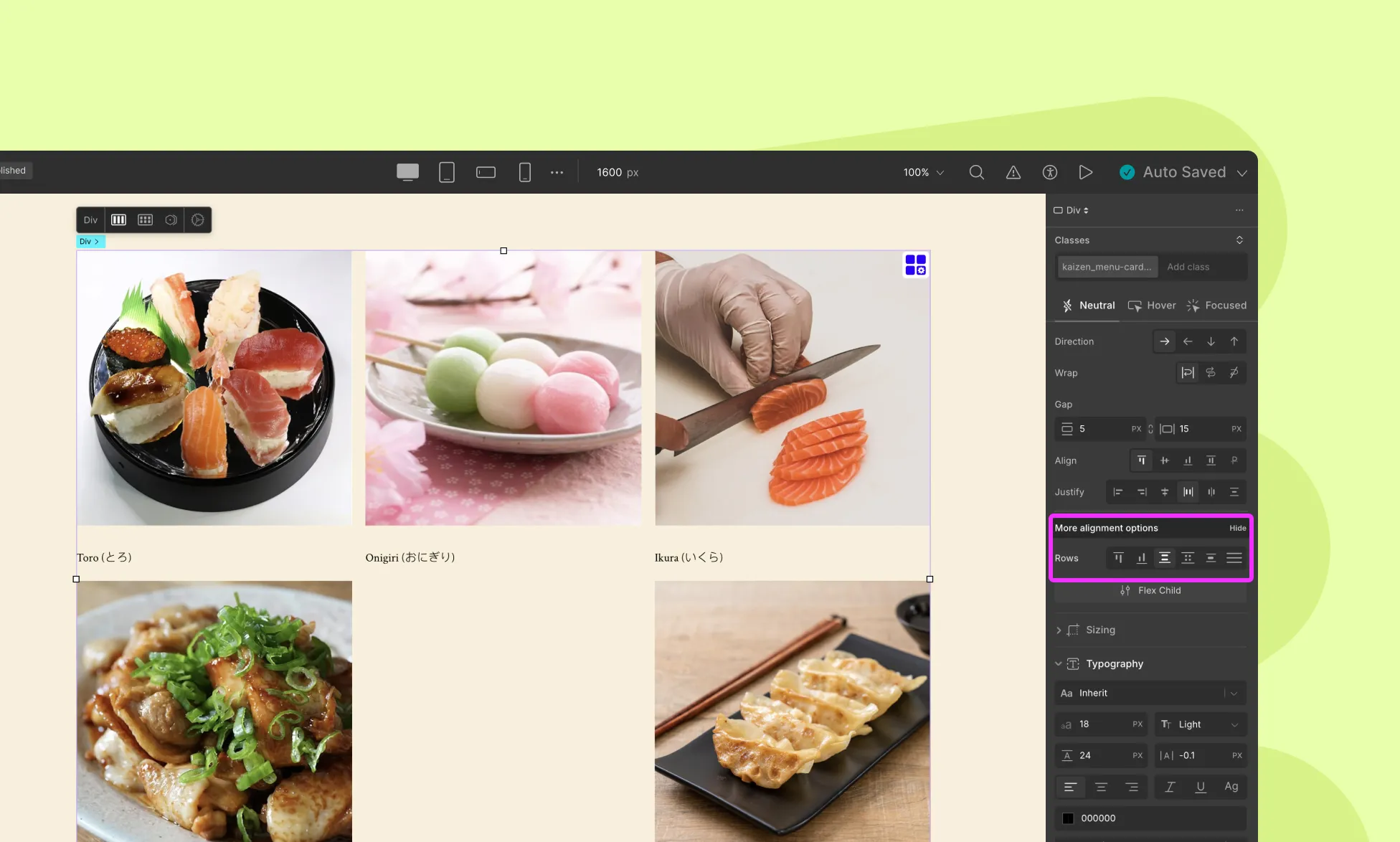
When there are multiple lines of flex items (e.g., wrapping is enabled), you get additional alignment options. It controls the space between rows on the cross-axis.
- Flex Start / End: Align lines to start, or end of cross-axis
- Space Between / Around / Evenly: Apply spacing between multiple rows
- Stretch: Rows stretch to fill the container
Justify Content
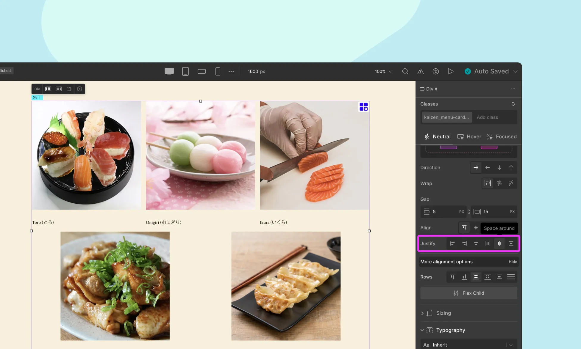
The justify property controls the alignment of items along the main axis (the direction defined by flex-direction).
- Flex-start: Items are aligned to the left (start) of the container.
- Flex-end: Items are aligned to the right (end) of the container.
- Center: Items are centered horizontally within the container.
- Space-between: Items are evenly distributed in the container, with space between each item.
- Space-around: Items are evenly distributed in the container, with space around them.
Use Case: Use space-between for equal distribution (e.g., navigation links), or center for symmetrical designs.
📝 Note: Many of these options can also be found on the Flex Controller. To access this controller, simply click on the blue settings icon on the flex element’s top-right corner.
Flex Child
A flex child is also referred to as a flex item. In Droip, each child inside the Flex container also have its own flex-specific settings for more granular control.
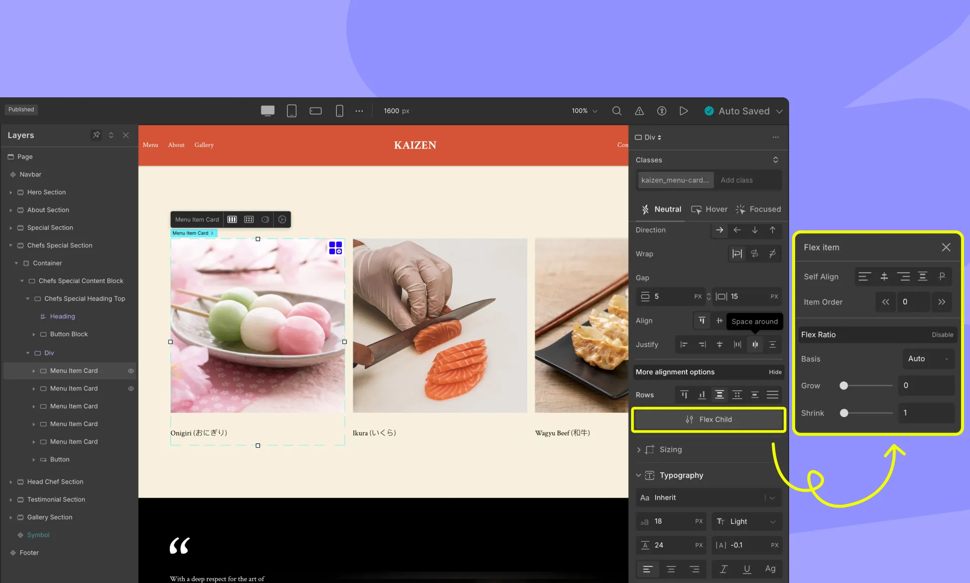
Self Align
The align-self property controls the alignment of individual flex items along the cross-axis of the flex container. It applies only to individual flex items, whereas align-items applies to all flex items within the container.
Available Values for align-self:
- flex-start: Aligns the item to the start (top) of the cross-axis.
- center: Centers the item along the cross-axis.
- flex-end: Aligns the item to the end (bottom) of the cross-axis.
- stretch: Stretches the item to fill the entire cross-axis of the container.
- baseline: Aligns the item’s baseline with the baseline of other flex items in the container. This option is typically used for aligning text within a line of text.
Order
The Order property controls the order in which flex items appear within the flex container.
By default, all flex items have an order value of 0, but you can change it to reorder items based on different screen sizes, create a responsive layout, or for accessibility reasons.
The order property accepts integer values, and you can assign a different order value to each flex item within the container. Flex items with lower order values appear first, followed by items with higher order values.
For example, if you set the order value of one flex item to -1 and another to 1, the flex item with the order value of -1 will appear first, followed by the flex item with an order value of 0, and then the flex item with an order value of 1.
Flex Ratio
In Flex Ratio, you can set the flex-basis, flex-grow, and flex-shrink properties to create flexible and responsive layouts.
flex-basis
This property sets the initial size of a flex item along the main axis of the flex container. It specifies the default size of the flex item before any remaining space is distributed according to the flex-grow and flex-shrink properties.
The flex-basis property can be set to a length value, such as pixels or percentages, or it can be set to the auto keyword, which means the initial size of the item will be based on its content.
flex-grow
This property determines how much a flex item will grow when there is extra space available along the main axis. It accepts a unitless value that represents the proportion of available space that the flex item should take up relative to other flex items within the same flex container.
flex-shrink
This property controls how much a flex item will shrink when there is not enough space to accommodate all the items within the flex container. It also accepts a unitless value that represents the proportion of space that should be taken away from the item when
Was this page helpful?