Each field type can be configured in the Content Manager interface, allowing you to tailor the data entry process to your specific needs.
Basic Fields
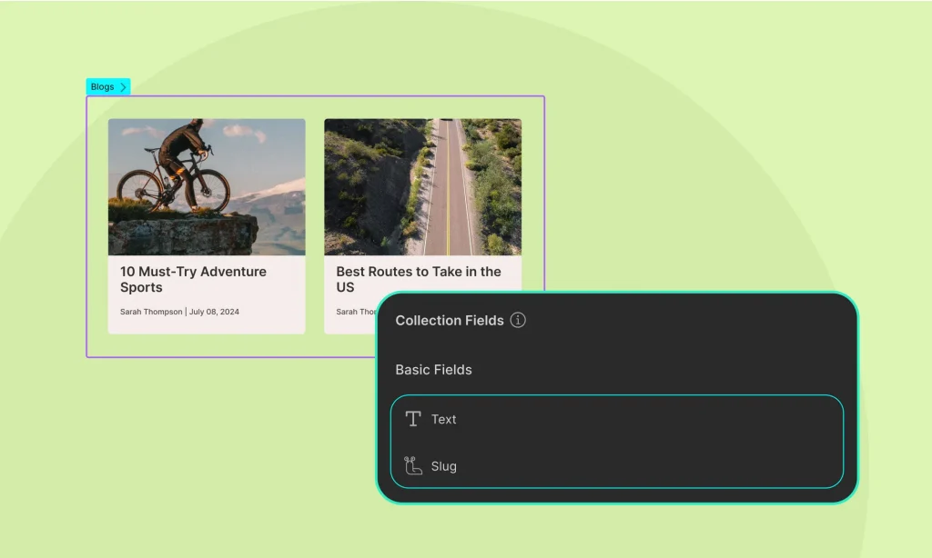
Basic fields in the Content Manager are essential for defining the structure of your content. The two mandatory basic fields are:
- Name: This field is used to specify the title or name of the entry.
- Slug: This field is used to define a URL-friendly version of the name, which helps in creating clean URLs for your content.
These fields are automatically included when you create a new collection item and are essential for organizing and referencing your content.
Custom Fields
Custom fields allow you to extend the functionality of your collections by adding specific types of data that suit your needs.
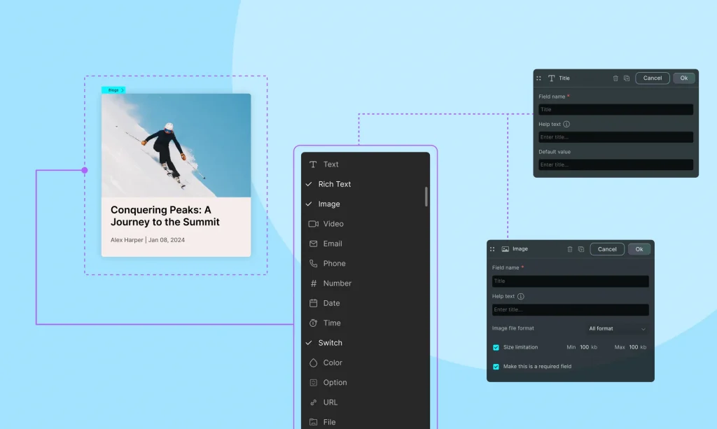
Text Field
Purpose: For adding short pieces of text.
Configuration: Specify the field label, help text, and validation rules such as required or maximum length.
- Required: Tick to set the field as mandatory.
- Character Limit: Specify the maximum number of characters allowed.
- Required: Tick to set the field as mandatory.
- How to display: Connect the text field to a heading, paragraph, or any text element.
Rich Text Field
Purpose: For adding formatted text with various styling options.
Configuration:
- Formatting Tools: Enable options like bold, italic, lists, links, and more.
- Word Count: Set a word limit for the content.
- Required: Tick to set the field as mandatory.
- How to display: Connect the text field to a heading, paragraph, or any text element.
Image Field
Purpose: For uploading and displaying images.
Configuration:
- Image Formats: You can accept all formats or choose JPG, PNG, or GIF.
- Size Limitations: You can set the minimum and maximum file size allowed.
- Required: Tick to set the field as mandatory.
- How to display: Connect the image field to an image element.
Video Field
Purpose: For embedding video content.
Configuration:
- Video Formats: You can choose to accept from MP4, MOV, AVI, or all.
- Video Type: You can set it to upload a file or insert a URL
- Size Limitations: You can set the minimum and maximum file size allowed.
- Required: Tick to set the field as mandatory.
- How to display: Connect the video field to a video element.
Email Field
Purpose: For storing email addresses.
Configuration:
- Required: Tick to set the field as mandatory.
- How to display: Connect the email field to any text or link element.
Phone Field
Purpose: For storing phone numbers.
Configuration:
- Required: Tick to set the field as mandatory.
- How to display: Connect the phone field to any text or link element.
Number Field
Purpose: For storing numerical values.
Configuration:
- Number format: Select decimal or integer format or both
- Allow negative number: Tick to allow negative number
- Required: Tick to set the field as mandatory.
- How to display: Connect the to any text or link element.
Date Field
Purpose: For selecting dates.
Configuration:
- Default Date: Specify a default date if needed.
- Required: Tick to set the field as mandatory.
- How to Display: Connect the date field to text element on your site.
Time Field
Purpose: For selecting times.
Configuration:
- Default Date: Specify a default time if needed.
- Required: Tick to set the field as mandatory.
- How to Display: Connect the date field to text element on your site.
Switch Field
Purpose: To add a toggle or switch option (e.g., on/off).
Configuration:
- Default State: Set the default state (e.g., on or off).
- Required: Tick to set the field as mandatory.
Option Field
Purpose: To select from predefined options.
Configuration:
- Define the options list and default selected option.
- How to Display: Connect the option field to any text element on your site.
URL Field
Purpose: For storing web addresses.
Configuration:
- Default Value: Specify a default URL if needed.
- Help Text: Add help text to guide users on the expected input.
- Required: Check to set the field as mandatory.
- How to Display: Connect the URL field to any text or link element, enabling dynamic linking to web pages directly from your content manager.
Reference Field
A Reference Field lets you connect a single item from one collection to another. It’s perfect for one-to-one relationships — like assigning an Instructor to a Course, or a Contributor to a Project.
Multi-Reference Field
A Multi-Reference field forms a one-to-many relationship, where one item can link to multiple items in another collection.
This enables advanced relational setups like one course to multiple tags or multi-instructors, etc.
Learn more about Collection References.
Gallery Field
Purpose: The Gallery field in Droip allows you to upload and manage multiple images for a single collection item, ideal for showcasing media-rich content like project galleries, product photos, etc.
Configurations:
- Name: Name your field (e.g., Project Gallery).
- File Format: Select file format as you want: JPG, PNG, GIF, or All Format.
Uploading Gallery Images
When you’re adding or editing a project in your Projects collection:
- Scroll to the Gallery field.
- Click Add Image.
- Add as many files as you want.
- Rearrange them if needed (just drag and drop).
Note: All uploaded images are automatically optimized for performance.
How to Display
You can dynamically show your image galleries on any page either as part of a list (e.g., all projects) or a template (e.g., a single project page).
On a Template Page (e.g., Single Project Page)
- Drag a Collection Element onto the canvas.
- Set the Collection Element:
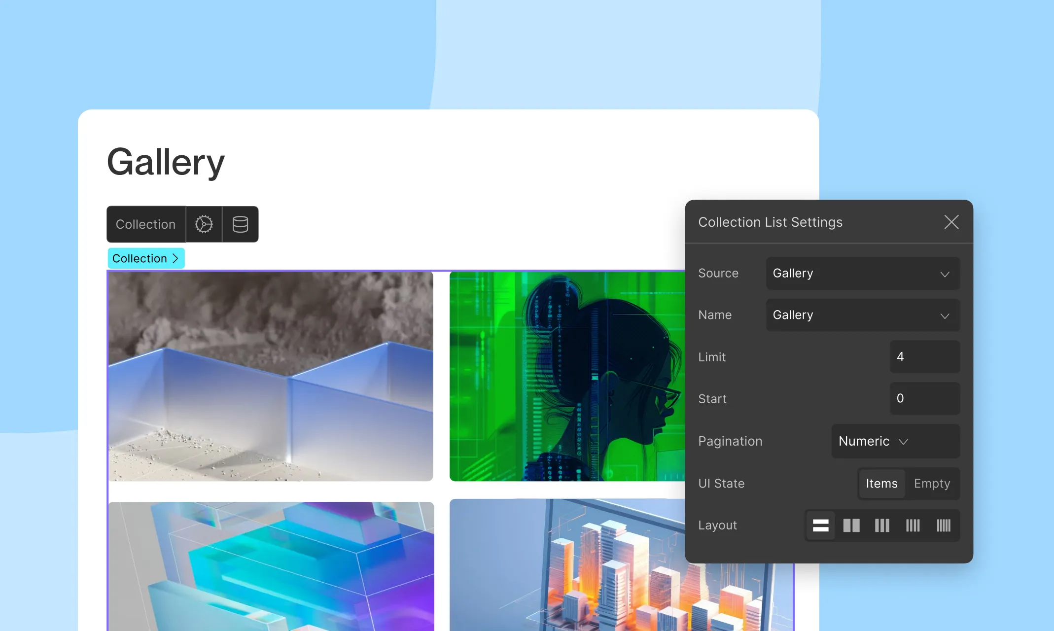
- Source: Gallery
- Name: Your Gallery field’s name
- Inside the Collection Element:
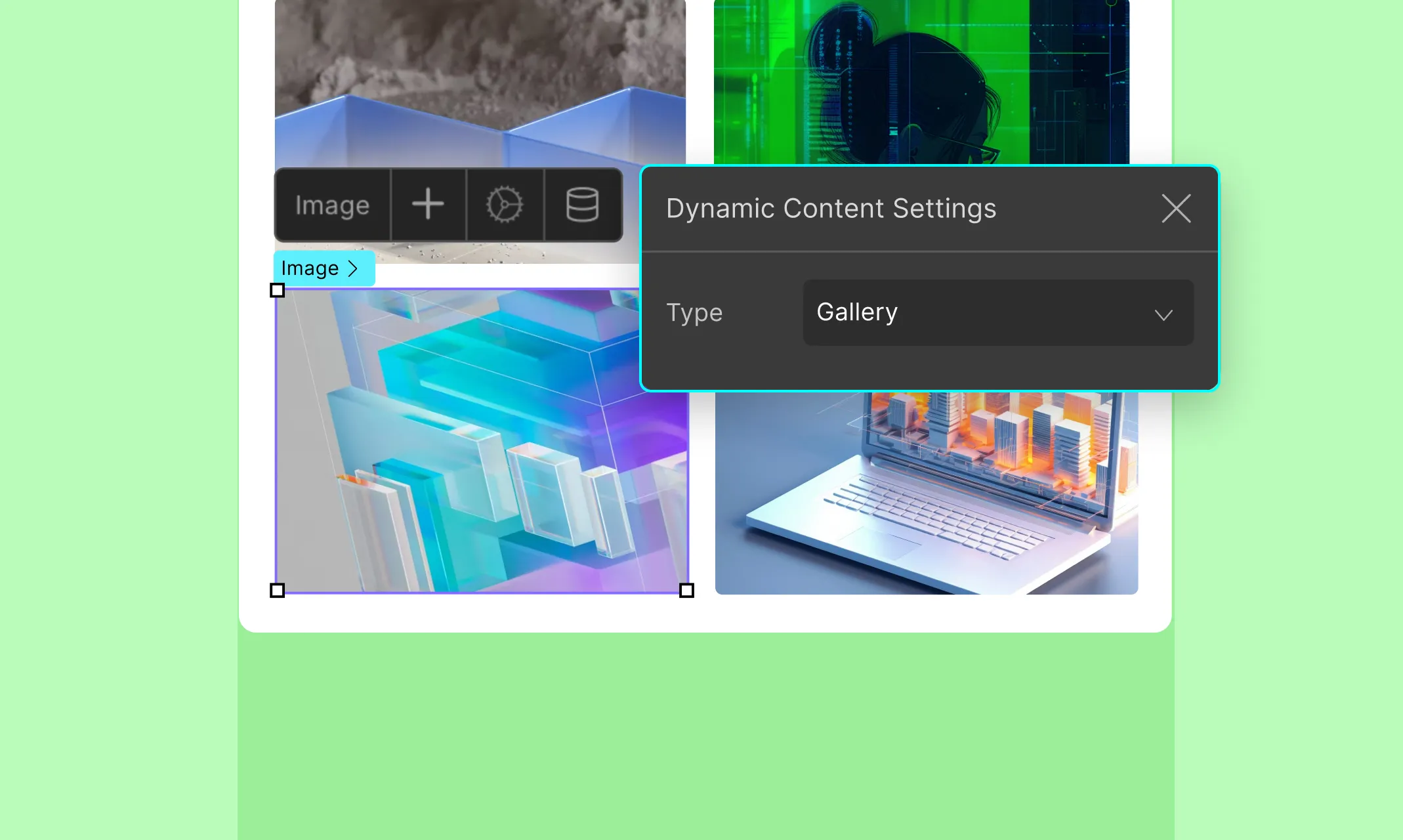
- Add an Image element.
- Click the Dynamic Content icon and set Type as Gallery
Since you’re on a template page, Droip already knows which project you’re working with. It’ll pull and display all the images from that item’s gallery field.
On a List Page (e.g., All Projects)
This is where you need to be intentional. Only use it when each list item benefits from visual storytelling or you want to show multiple images at a glance (e.g., portfolios, properties, etc.).
- Add a Collection Element to the page.
- Set the Source as Posts and Type as Projects (or your collection name).
- Inside that Collection Element, add another Collection Element. This nested element will display the gallery images.
- Set the nested Collection Element:
- Type: Gallery
- Name: Your Gallery field’s name
- Inside the nested element:
- Add an Image element.
- Click the Dynamic Content icon.
- Set Type to Gallery
This will show each image in the gallery field for each project.
You can dynamically limit the number of images displayed from the Gallery field on the list page using Limit from Collection List Settings.
Was this page helpful?