In Droip, a Class serves as a blueprint for creating objects, defining their structure, and initial style attributes.
On the other hand, a Sub-class is a child class that inherits the attributes of its parent class while also having the ability to possess its own unique characteristics.
Classes and Sub-classes
In Droip, using classes and sub-classes helps you manage and reuse styles efficiently across your website.
Whenever you customize the style of an element, Droip automatically creates a class to hold those style rules, eliminating the need to define them from scratch manually.
Creating Classes
A class is a reusable style group applied to one or more elements. To create a class:
- Select an element.
- Make your styling changes (e.g., color, padding, typography).
- Droip will automatically assign a class to that element based on your changes.
You can also rename the class to something meaningful for easier identification and reuse.
Creating Sub-classes
A sub-class builds upon an existing class with additional or overridden styles. It’s ideal for cases where you want to slightly tweak a base design without affecting all instances of the main class.
To create a sub-class:
- Select an element that already has a base class applied.
- Click on the Classes selector field and create a sub-class to preserve the base class while applying unique styles to this variation.
- Add or adjust styles as needed
This layered styling approach gives you granular control while maintaining consistency across your site.
Editing a Class or Sub-class

To edit a class in Droip:
- Simply click on the class label attached to the element.
- The selected class will be highlighted, and the background will blur, helping you focus on the active style scope.
- As you customize the element, any changes will be automatically saved to that class.
- These updates will instantly apply across all elements using the same class, ensuring consistency throughout your design.
Duplicating Style Settings Using Classes
Droip’s class system allows you to efficiently duplicate and manage styles across multiple elements. Instead of manually recreating styles, you can simply apply existing classes or sub-classes to new elements.
How It Works
To make another element adopt the same style, just apply the same class or sub-class used in the original element. However, keep in mind that sub-classes must be applied after their parent class—this ensures proper inheritance and styling accuracy.
Example Scenario
Let’s walk through a practical example:
- You add a Heading element to the canvas and begin customizing its style without creating a class manually.
- Droip automatically generates a class to store those style changes (e.g., Heading_1).
- Droip automatically generates a class to store those style changes (e.g., Heading_1).
- You add a second Heading and want it to look the same.
- Go to the Classes panel and apply the class used in the first heading.
- Now, both headings share the same style. Any updates to one will reflect in the other.
- Go to the Classes panel and apply the class used in the first heading.
- You want the second Heading to look slightly different (e.g., different color or font weight).
- Create a sub-class for the second heading (e.g., Heading_1.bold).
- This sub-class will override specific styles without affecting the original class or the first heading.
- Create a sub-class for the second heading (e.g., Heading_1.bold).
- You add a third Heading and want it to match the second one (with both the base and modified styles).
- First, apply the base class (Heading_1).
- Then, apply the sub-class (Heading_1.bold).
- The third heading now shares both the foundational and modified styles.
- First, apply the base class (Heading_1).
Managing Classes and Sub-classes

You can easily rename, detach, or remove a class:
- Just click the three-dot (…) icon next to the class name in the Classes panel.
- From there, you can:
- Rename the class for better organization.
- Detach the class to remove styling from the selected element without deleting it.
- Remove the class entirely if it’s no longer needed in your project.
- Rename the class for better organization.
This lets you keep your styling system clean, consistent, and easy to manage.
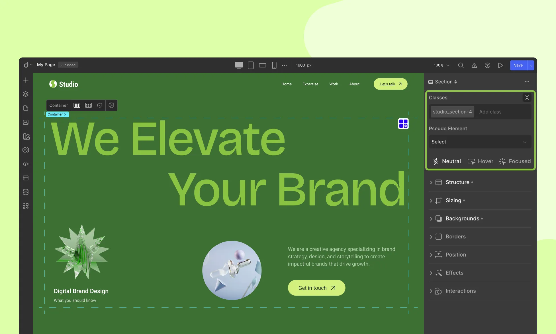
Element States in Droip

Droip lets you fine-tune how elements look and behave in different interaction states—allowing you to create more dynamic, user-friendly experiences.
Here are the supported states:
Neutral
This is the default appearance of an element when no interaction is taking place. It’s how the element looks when the page first loads.
Hover
Triggered when a user places their cursor over an element without clicking. This is commonly used for buttons, links, and interactive components.
Focused
This state is activated when a user navigates to an interactive element (like a button or input field) using the keyboard. It helps with accessibility and keyboard navigation.
These states can be styled individually in Droip, giving you control over how elements respond to different user interactions.
Using Pseudo Elements in Droip
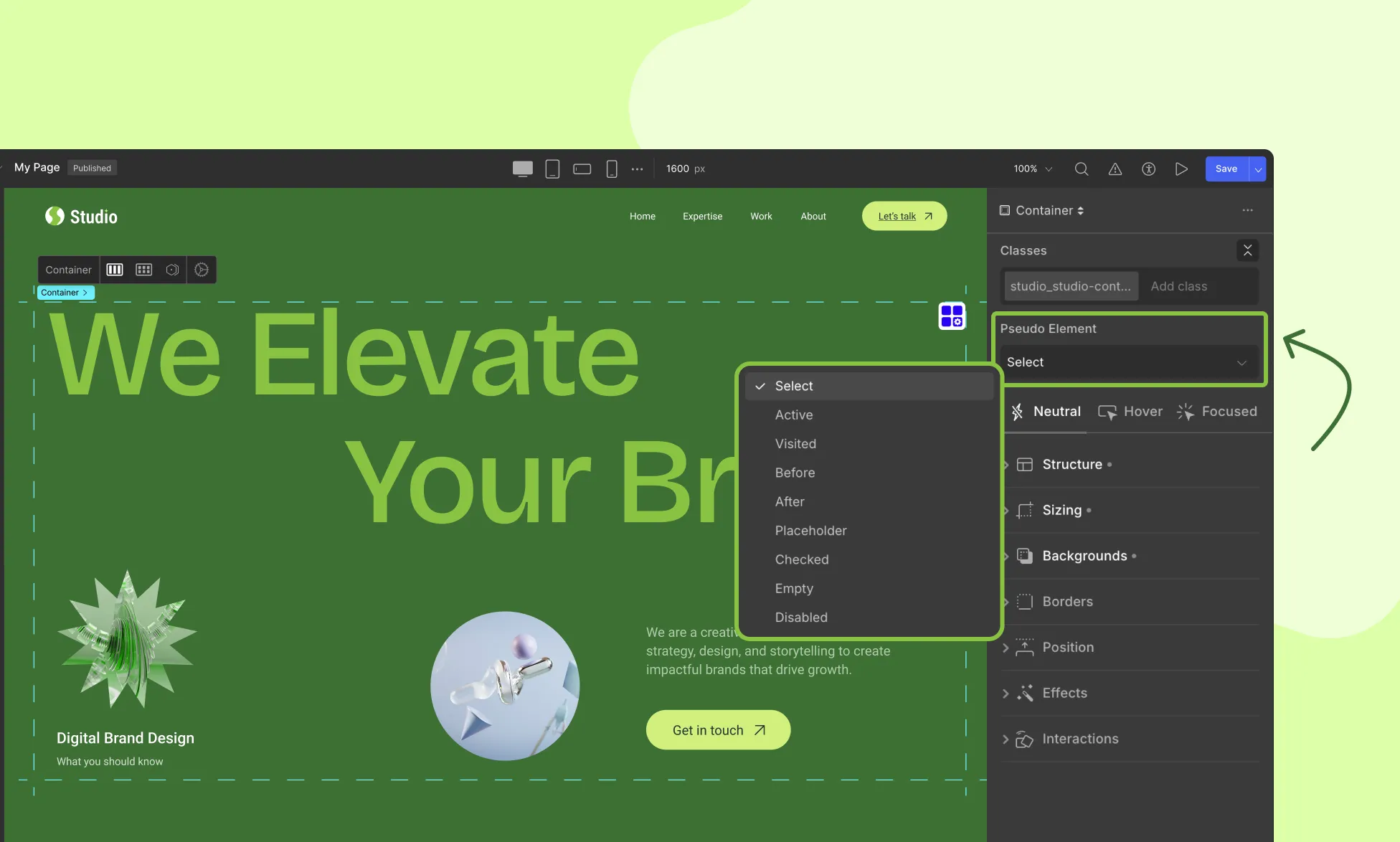
Just below the States Menu, you’ll find the Pseudo Element dropdown. Droip supports Pseudo Elements, which let you style specific parts of an element that aren’t explicitly defined in the HTML.
These are especially useful for adding visual effects or enhancing form elements without extra markup.
What Are Pseudo Elements?
Pseudo elements let you style:
- Generated content (before, after)
- Specific element states (placeholder, checked, disabled, etc.)
- Structural conditions (empty)
- User interactions (active, visited)
How to Use Pseudo Elements in Droip:
- Select the element you want to customize.
- Go to the States Menu, then open the Pseudo Element dropdown.
- Choose from the list of pseudo elements.
- Apply your desired styles—these will only affect the element in the selected pseudo context.
Need more context? Refer to the MDN Web Docs on Pseudo Elements for deeper explanations.
Was this page helpful?