Breakpoints in Droip give you complete control over your website’s design and layout across different screen sizes. With breakpoints, you can customize content, test responsiveness, and create custom breakpoints to ensure your site looks and functions flawlessly on any device.
Canvas Breakpoints
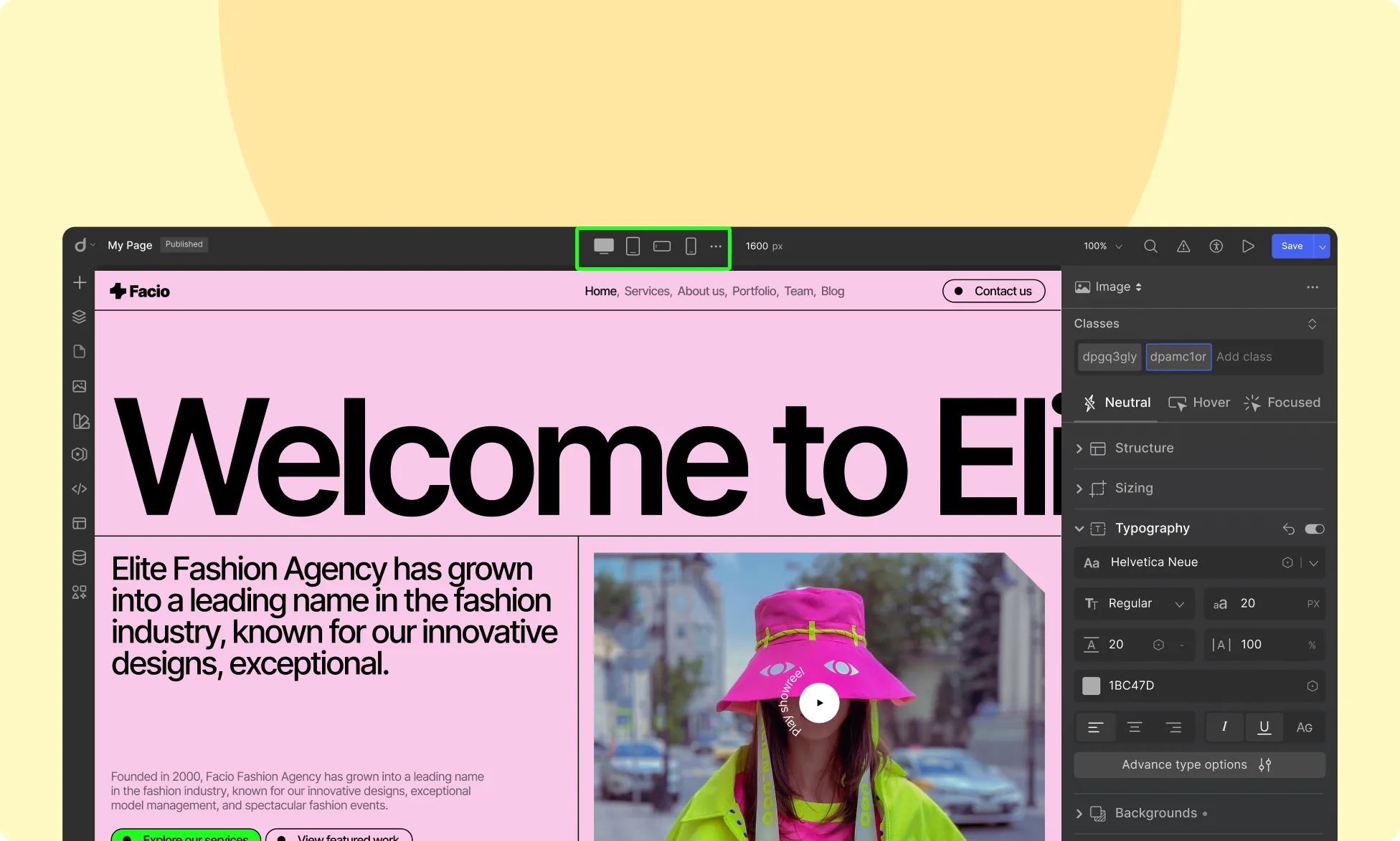
Located in the center of the Topbar, the breakpoint icons allow you to seamlessly switch between different device views. Droip provides four default breakpoints:
- Desktop (Default value 1400px):
Design for larger screens such as desktops and laptops. This is the default breakpoint, and any styles applied here will cascade down to all smaller breakpoints unless overridden. - Tablet (Default value 991px):
Optimize your design for tablet-sized screens, such as iPads. Styles applied at this breakpoint will apply to screens 991px wide and below. - Mobile Landscape (Default value 767px):
Tailor your website for phones held in landscape mode. Any changes made here will apply to screens 767px wide and smaller. - Mobile (Default 575px):
Ensure an optimal viewing experience on smaller smartphone screens. Styles applied at this breakpoint will only affect devices 575px wide and below.
Custom Breakpoints
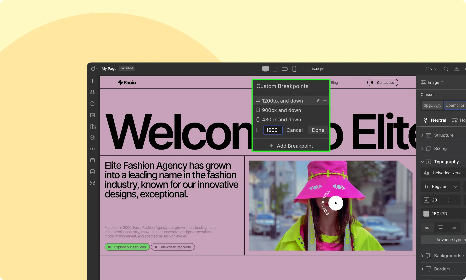
Need more flexibility? Droip lets you add as many custom breakpoints as needed. Simply click the ellipsis icon beside the default breakpoints and set your own custom width to fine-tune your design for specific screen sizes.
How Breakpoints Work in Droip
- The Desktop breakpoint acts as the global viewport, meaning all styles applied here will cascade down to smaller breakpoints.
- Any changes made in Tablet view will apply to tablet screens and smaller breakpoints unless overridden.
- The same applies to Mobile Landscape and Mobile views, with styles cascading downward unless explicitly changed.
- This hierarchical approach streamlines your design workflow, ensuring consistency across all devices.
Hiding Elements for Specific Breakpoints
Droip allows you to control the visibility of elements across different screen sizes, ensuring a responsive and optimized layout for every device.
With Droip, you can selectively hide or show elements based on the active breakpoint.
How to Hide Elements for Specific Breakpoints
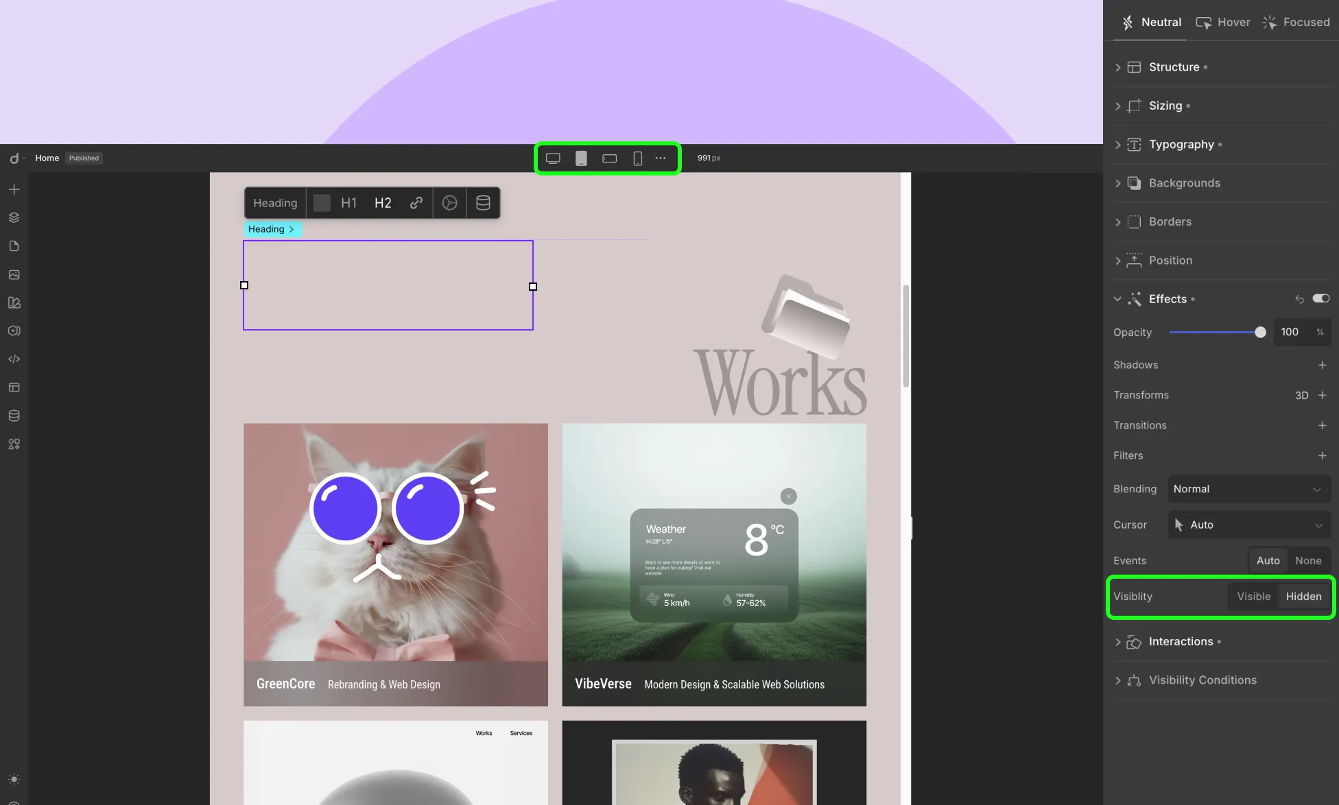
- Select the Element: Click on the element you want to hide from the canvas.
- Switch to Your Desired Breakpoint: Use the top-center device switcher to choose the screen size (e.g., desktop, tablet, mobile).
- Go to the Effects Panel: On the right-hand sidebar, scroll down to the Effects section.
- Set Visibility: Under the Visibility settings:
- Click on the “Hidden” button to hide the element for the currently selected breakpoint.
- The element will be visually dimmed in the canvas to indicate it’s hidden.
- Click on the “Hidden” button to hide the element for the currently selected breakpoint.
- Repeat for Other Breakpoints (if needed): Switch between other breakpoints and adjust visibility as needed.
Testing Responsiveness & Fluidity
Use the Preview button to test your design’s responsiveness across different screen sizes. This helps ensure that your layout, typography, images, and other elements adjust smoothly across devices.
Was this page helpful?