The Container element is used for organizing content neatly toward the center of your web page. By placing content inside a container, it automatically becomes responsive, adapting to different screen sizes, unless you set a fixed width. Containers are often used within Sections (which are, by default, full-width) to align the content towards the center.
How to Add a Container
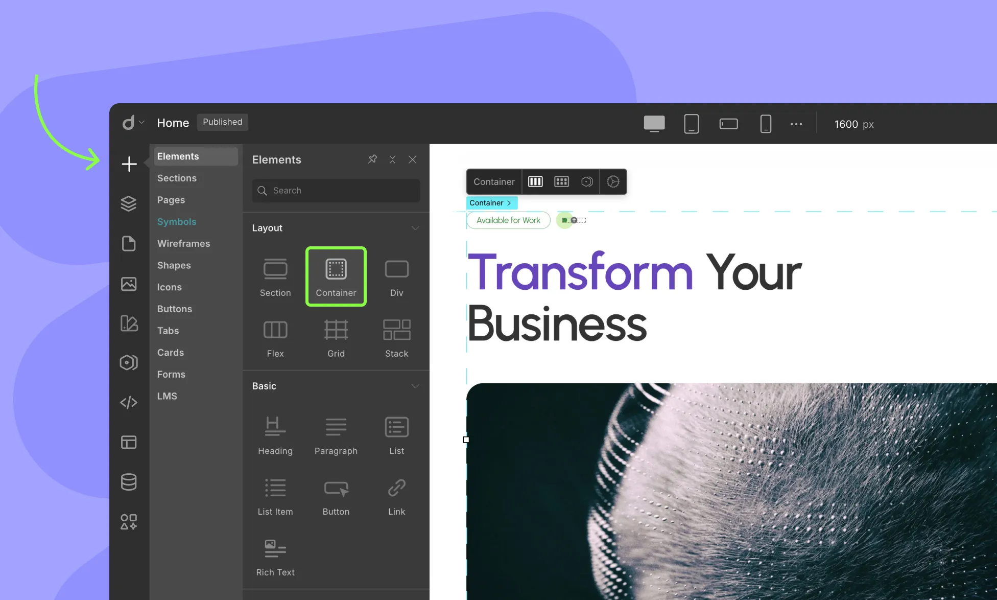
To add a Container element to your web page, follow these simple steps:
- Open the Insert > Elements panel in Droip.
- Drag the Container element from the Elements panel and drop it onto your page canvas.
- By default, the Container will organize the content inside it towards the center.
Change Container Width
If you want to change the default container width and make it wider, you can do that in simply two steps:
- Add a class to the container
- Change the Max Width
Add Breathing Space
Containers are full-width for mobile devices. So if you want to add some breathing space at the edge, you can add padding to the left and right.
To do this:
- Select the Container element on the canvas
- In the Style panel, add left and right padding (e.g. 20 pixels)
Reuse Container
To reuse a container with the same styling, add a class to the container and apply that class to other containers within your project:
- Select an element on the canvas
- Type in the class name in the Selector field
- Press Return to apply the class
Style Container For Different Breakpoints
You can also style the Container for breakpoints larger than the default. If you want your Container width to be more appropriately sized for larger displays – you can do that in 4 steps:
- Click on the ellipsis icon (the three dots next to the default breakpoints) to open the Custom Breakpoints window
- Select any larger breakpoint option from the list or define your own
- Ensure the Container element is selected
- Adjust the max-width style to fit the selected breakpoint
📝 Note: Make sure to switch back to the base breakpoint when you continue to design your project.
Difference Between Div, Container, and Section
By default, Containers and Sections are Divs with special properties.
- Sections: Sections are used to group a webpage into parts, with content inside usually related to a single theme.
- Divs: Divs are basically blocks to hold content and convey no special meaning.
- Containers: Containers are primarily used to keep content centered on larger displays. Unlike Containers, Sections and Divs span the entire width of the screen.
Was this page helpful?