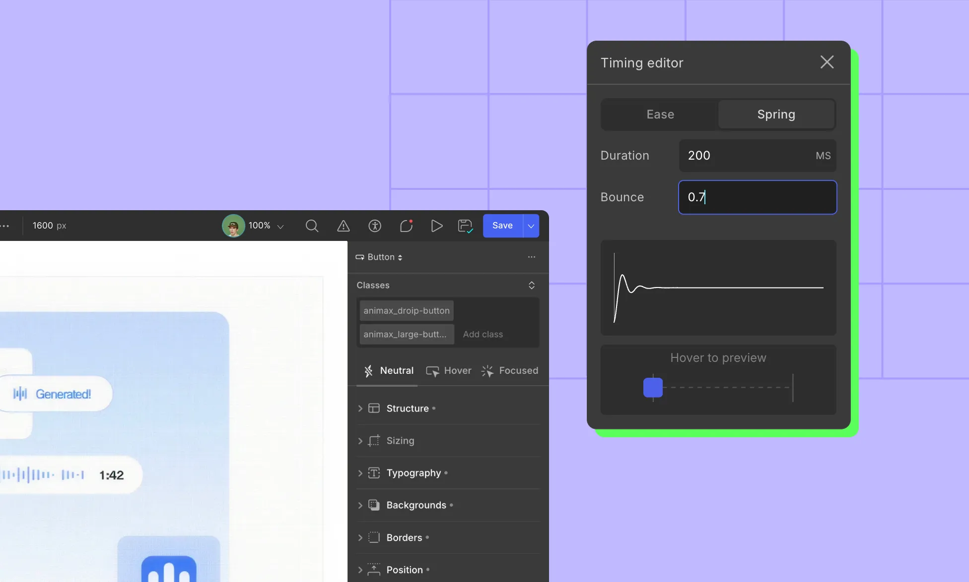
The Spring timing function in Droip adds life to your animations by simulating real-world physics.
Instead of moving in a linear way, elements can bounce, overshoot, and settle naturally. This makes interactions feel more responsive and human.
When applying a spring transition, you only need to adjust two properties:
Duration (Time): Controls how long the animation takes to complete. Short duration means fast and snappy. Long duration means slow and smooth.
Bounce: Defines how much the element overshoots and oscillates before settling. Low values mean subtle bounce. High values mean playful, elastic bounce.
You can find the Spring timing function in Transitions and Interactions.
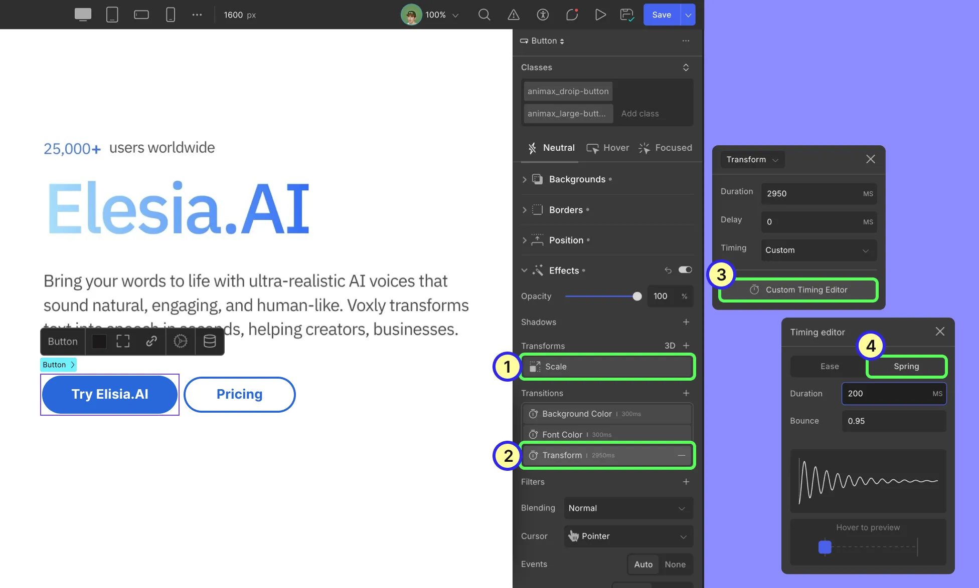
Example: Scale a button on hover with a spring transition
When users hover the button, it will scale up with a springy motion and settle back when the cursor leaves.
Step 1: Select the button:
Click the button on the canvas to select it.
Step 2: Switch to the Hover state:
In the element state controls (Neutral / Hover / Focused), choose Hover. This lets you set styles that only apply while hovering.)
Step 3: Add the transform scale:
In the right-side style panel, find Transforms > Scale. Add a scale transform and set the value to something subtle: 1.08 on both X and Y.
Step 4: Add the transition for the transform:
With the button still selected, open Transitions in the Effects area and select Transform. Click the Timing dropdown for your Transform transition and choose Custom. Then switch the curve/type to Spring.
Step 5: Tune spring parameters:
Duration: 150–350 ms is a good starting window.
Bounce: 0.8–0.95 to make it lively, bouncy (use sparingly)
Preview and customize the value until it feels right.
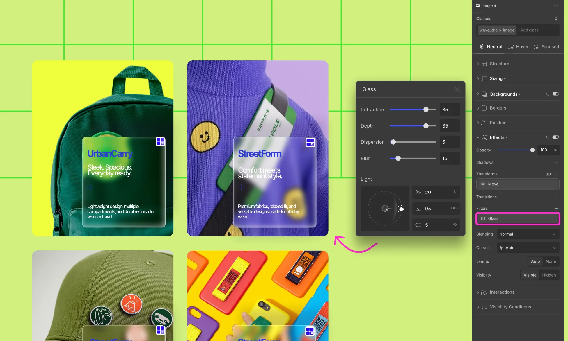
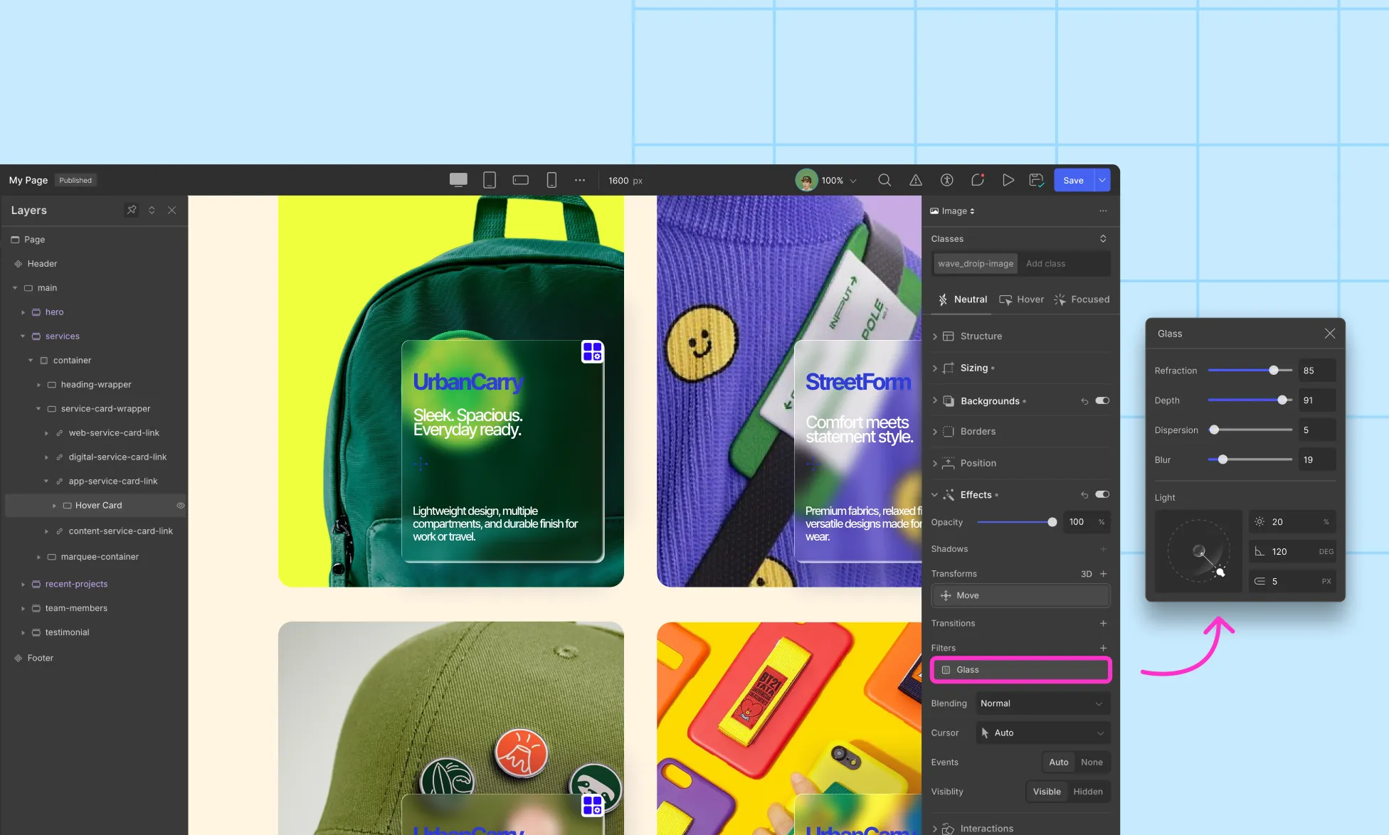
The Glass Effect in Droip allows you to create a translucent and depth-rich glass-like look for your design.
This effect is perfect for designing sleek interfaces, adding depth to cards and navigation, or giving your site an Apple-style premium touch.
Where to Use Glass Effect
Cards: Glass product/feature cards in a grid.
Navigation Bars / Headers: Frosted navigation bar that blurs background content on scroll.
Modals & Popups: Keep focus on content while still revealing context behind.
Hero Sections: Add depth and sophistication to landing page highlights.
Background Overlays: Semi-transparent overlays that keep the background visible.
How to Apply Glass Effect
Select the Element: Choose the component on your canvas on which you want the glass effect
Remove or Soften Background: Set the background to none or lower the opacity.
Enable Glass: Go to Right Sidebar > Effects > Filters > Glass.
Adjust Glass Settings:
Refraction: Controls how much the background behind the glass bends or distorts. Higher values create a more liquid-like feel.
Depth: Defines how “thick” the glass appears, adding dimensionality.
Dispersion: Adjusts color splitting, giving a subtle prism effect.
Blur: Controls background blur intensity, from sharp to heavily frosted.
Light, Angle, Depth (lighting controls): Fine-tune how light interacts with the glass surface, adding realism.
Preview & Fine-Tune: Adjust sliders while checking against your background image, gradient, or texture.
Example Use Case: Frosted Cards
Goal: Create elegant translucent cards that blur content behind them.
Steps:
Prepare the background: Ensure the section behind the card has visual detail (image, gradient, video). Avoid flat, solid colors behind the card.
Add the card: Insert a Div inside your section/grid and resize the div. Add text/icons inside the card as needed.
💡 Note: Keep the card above the background you want to blur. To do that, set the position to absolute and adjust the z-index value.
Remove Card background: Remove the background of the card or set the opacity to 0.
Enable Glass: Select the card > Right Sidebar > Effects > Filters > Glass.
Adjust the values until you get the desired effect.
Tips for Best Results
To make the glass actually look like glass:
Element Background: Use no or low-opacity background. Solid fills block the glass effect.
Content Behind Glass: Use textured or detailed backgrounds. Pure white/black or fully opaque overlays weaken the effect.
Layering: Glass elements should sit above the content you want to blur (position absolute, high z-index).
Performance: Large or full-bleed glass sections may impact scroll performance. Prefer glass on cards/components instead of entire sections.
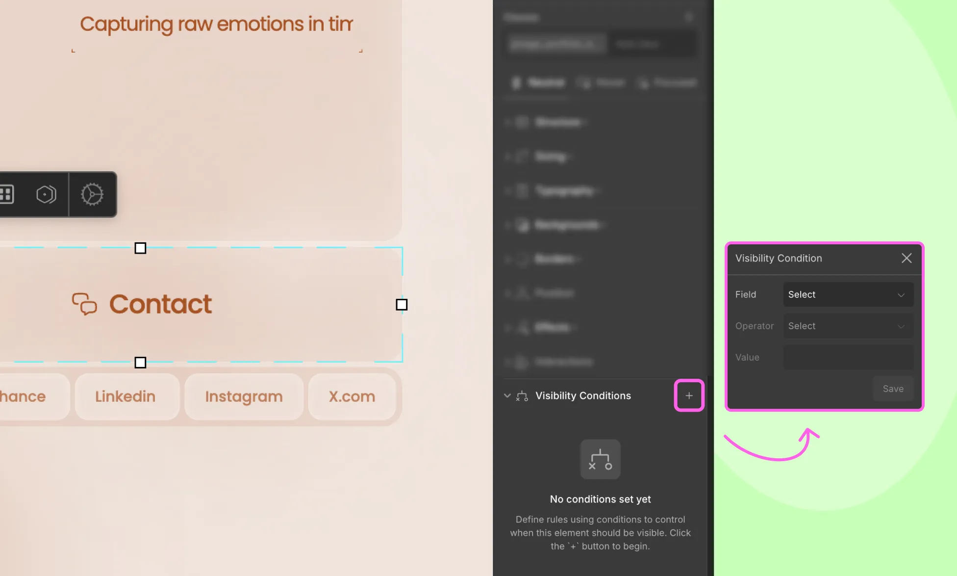
Visibility Conditions in Droip is a handy feature that lets you control which elements are visible on your website based on specific user criteria.
For instance:
You can display a menu item in the navbar only for users with admin access.
Or show an exclusive deal for users who signed up during a special promotional campaign.
These are just a few of the many ways Visibility Conditions can help you create personalized, user-focused experiences.
Why Use Visibility Conditions
Not all users should see the same content, and Visibility Conditions in Droip help you manage this effortlessly.
Whether you’re restricting content based on user roles for added security, showing specific content to users who registered during a certain time, or personalizing content based on any other user-specific criteria, Visibility Conditions help you control exactly who sees what on your website.
This makes for a personalized, more relevant experience for users and a more secure website on your end.
Applying Visibility Conditions to Elements
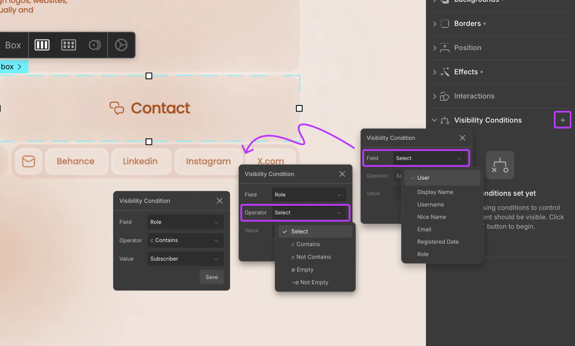
From the Droip editor, head to the Style Panel to access Visibility Conditions.
Adding a Visibility Condition
To add a Visibility Condtion, follow these steps:
Step 1: Click on the + icon to add a new condition.
Step 2: From the Field dropdown, select User, then choose the data field you want to base your condition on.
Step 3: Then, from the Operator dropdown choose the comparison type and from the Value dropdown select the value to compare against.
Step 4: Click Save to apply the condition.
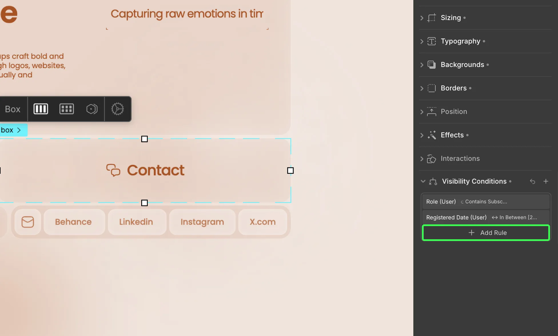
Adding Multiple Conditions
You can also stack multiple conditions using AND (where all conditions must be true) or OR (where any condition can be true) to further fine-tune when elements should be shown.
Adding ‘AND’ Conditions
To stack multiple AND conditions, do the following:
Step 1: After adding your first condition, click on the + Add Rule option.
Step 2: Set the next condition as usual and hit save.
Repeat these steps to add more AND conditions.
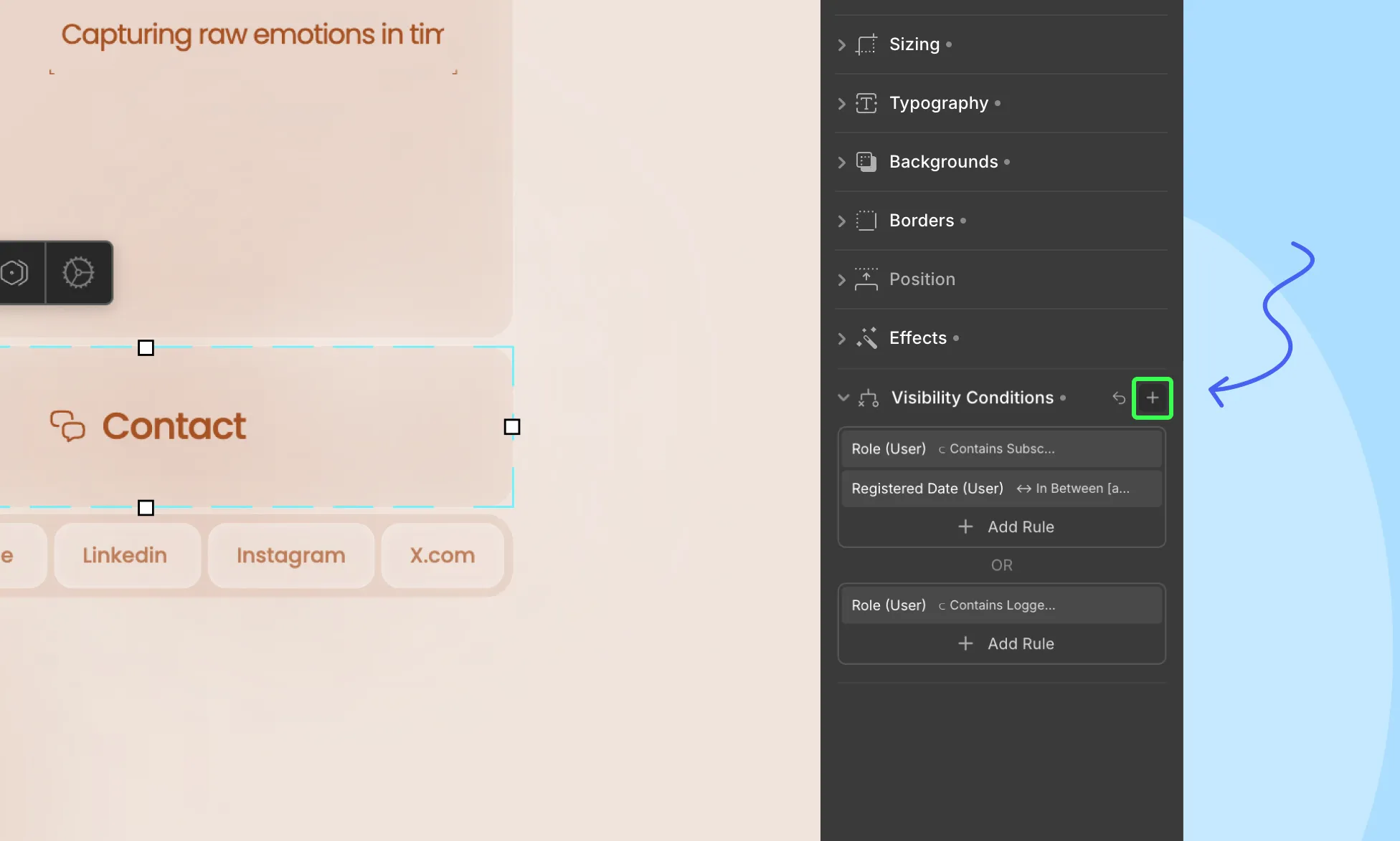
Adding ‘OR’ Conditions
To stack multiple OR conditions, do the following:
Step 1: After adding your first condition, click on the + icon on the top right.
Step 2: Set the next condition as usual and hit save.
Repeat these steps to add more OR conditions.
Editing a Visibility Condition
You can, of course, edit your conditions at any time.
To edit a condition, follow these steps:
Step 1: Click on the condition you want to edit. This will reopen the Visibility Conditions settings.
Step 2: Make your changes and hit save.
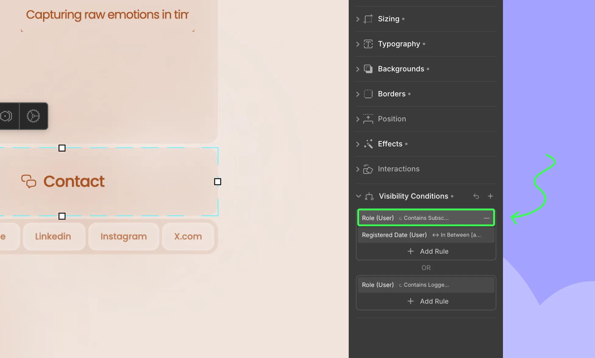
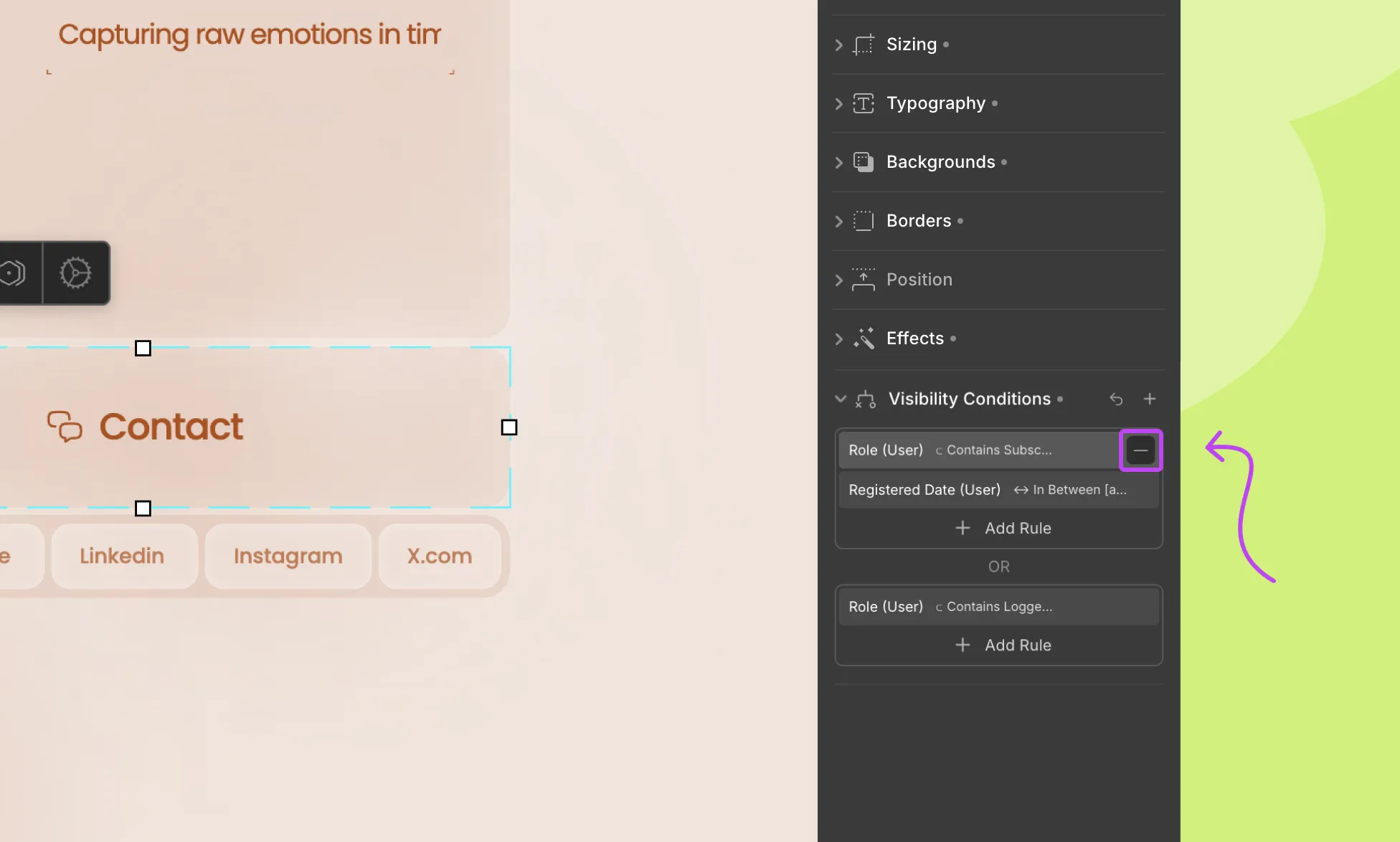
Removing a Visibility Condition
Lastly, to remove a condition, do the following:
Step 1: In the Visibility Conditions panel, find the condition you want to remove and click the – icon next to it.
And you’re good to go!
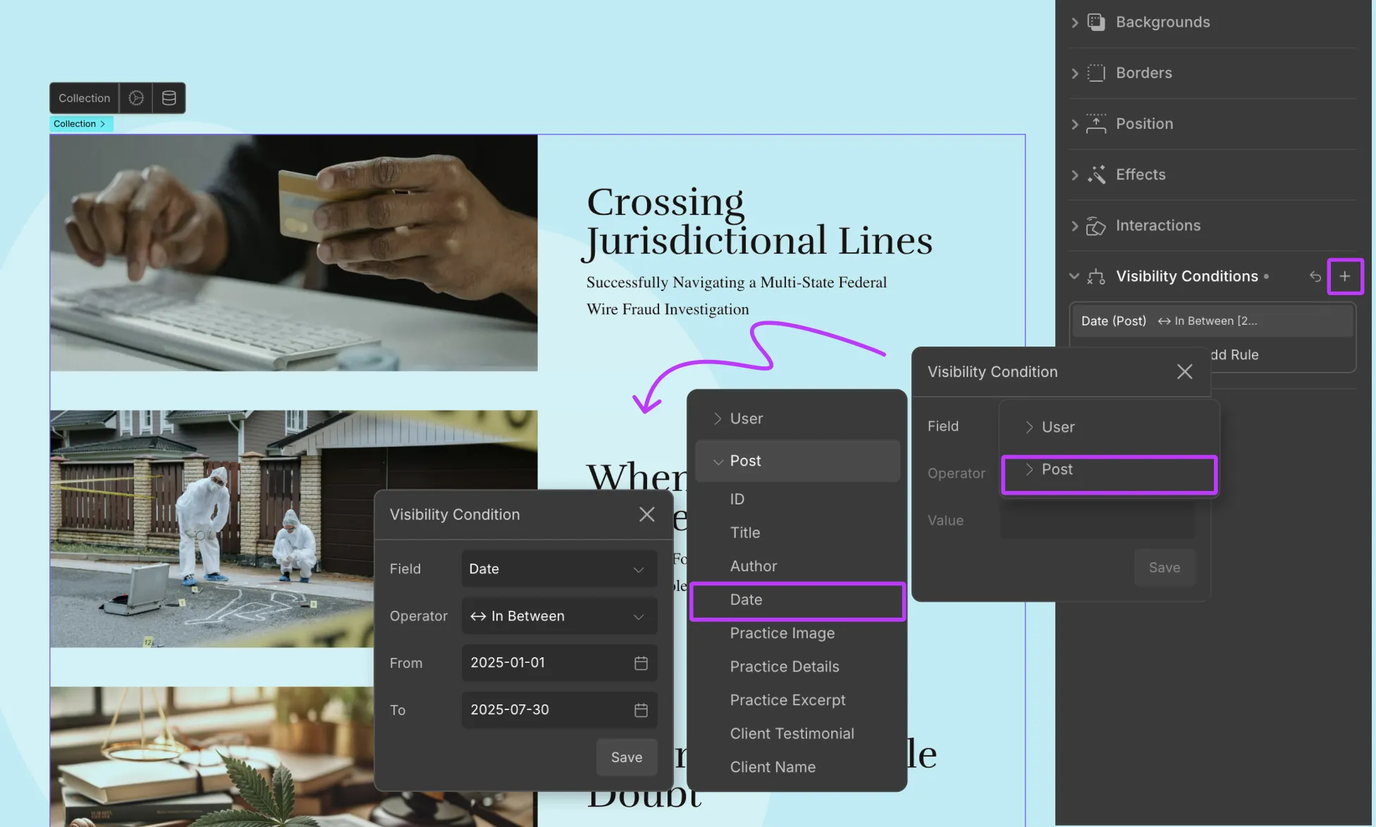
Applying Visibility Conditions To Dynamic Content
You can also apply visibility conditions to dynamic content, whether it’s part of a collection list or a single-page template based on Post fields.
Here’s what you have to do to implement it:
Step 1: Select the element you want to show or hide.
This could be:
The entire collection element
A specific element within the collection
Or an element within a single-page template
Step 2: Once selected, add a new visibility condition from the style panel.
Step 3: From the Field dropdown, now you’ll see an option called Post. Choose this to access the collection fields you want to base your condition on.
Step 4: Then, as usual, from the Operator dropdown, choose the comparison type, and from the Value dropdown, set the value to compare against.
Step 5: Click Save to apply the condition.
And just like that, you can create visibility conditions based on dynamic post collection fields!
This comes in handy in various ways, such as to show a “Featured” ribbon if the post item’s featured field is toggled “On”, hide limited-time offers based on the date once it expires, and so on.
Throughout the design process, you’ll have to work with various values and units available in Droip.
This document will give you a complete overview of these units and how or where to apply them.
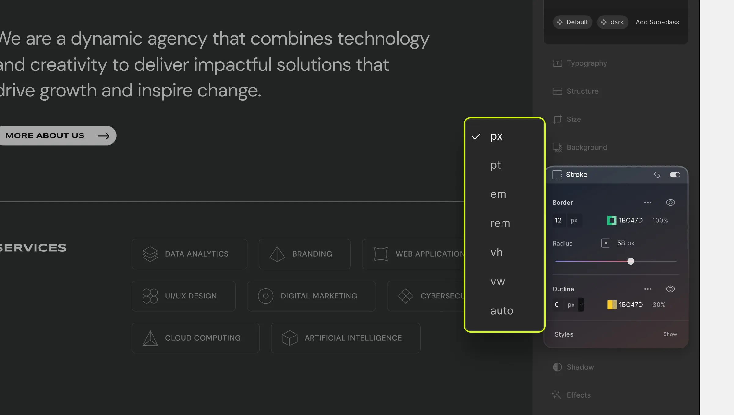
Length Units
Below is the list of the Length Units available on Droip. These can fall under two categories: Absolute Length and Relative Length.
Absolute Lengths
Absolute Lengths are fixed lengths that do not depend on any other factor. Hence, these will appear exactly as defined. Below is a list of the options available for this type:
Px (Pixel)
1 Pixel = 1/96th of 1 Inch
Pt (Point)
1 Point = 1/72th of 1 Inch
Relative Lengths:
Relative Lengths are lengths that vary depending on some other property. These help in designing responsive websites as it implements relative sizing.
Relative Sizing is when elements increase or decrease automatically based on other factors.
Below you’ll find all of the Relative Lengths available on Droip:
Em
Relative to the font size of the element for other properties like width and relative to the font size of the parent for typographical properties like font size.
Rem (Root Em)
Relative to the font size of the root element.
VH (Viewport Height)
Relative to 1% of the height of the Viewport. A viewport is the window’s visible area that displays the web content.
VW (Viewport Width)
Relative to 1% of the width of the viewport. A viewport is the window’s visible area that displays the web content.
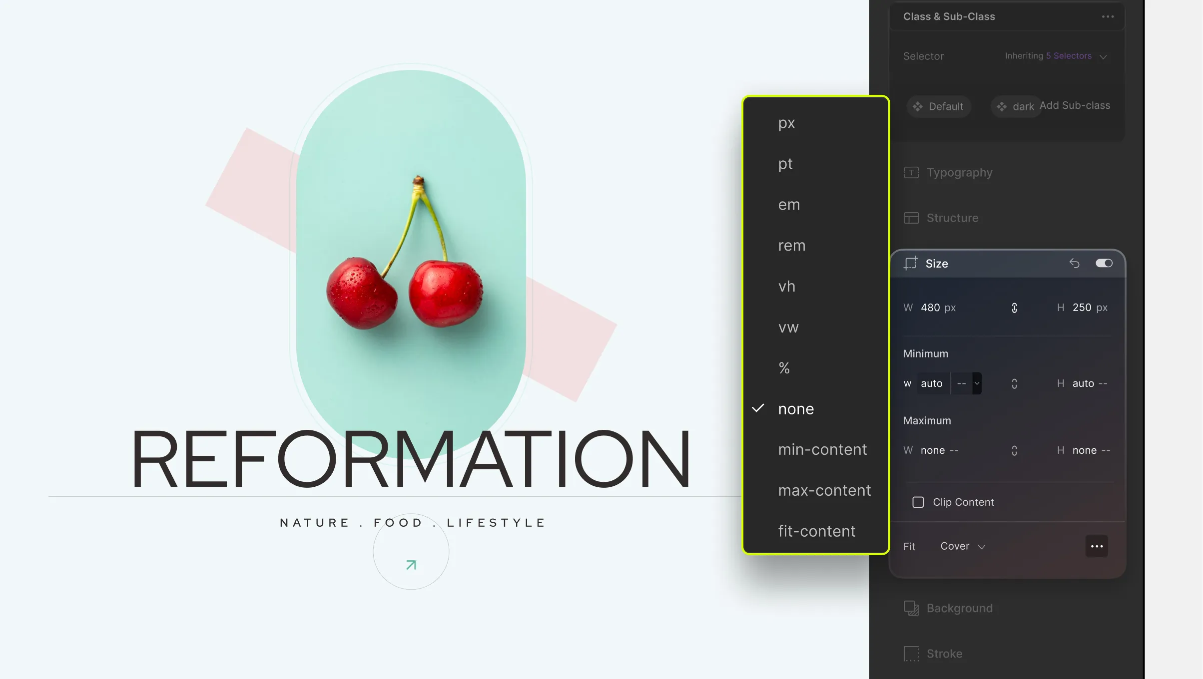
% (Percentage)
Relative to the parent element. Basically, it’s the fraction of its parent element’s value.
For instance, if you set the Width of an element using the Percentage unit, then it’ll be based on the Width of its parent element.
Auto
Relative to the width of the content.
Fr (Fraction)
1 Fraction is one part of the whole. 1 fraction is 100% of the available space, 2 fractions are 50% each, and so on.
Color Units
Next up are Color Units. Colors are used everywhere from Typography Color to the color of the Background and more.
Below are the units available on Droip that you can use to define these colors on Droip:
RGB
The RGB Color Model is an additive model in which the three primary colors of light — Red, Green, and Blue are added in various ways to form a range of other colors.
In an RGB value, each number is basically an indication of how intense the red, green, and blue are in the particular color it’s representing. These values range from 0 to 255.
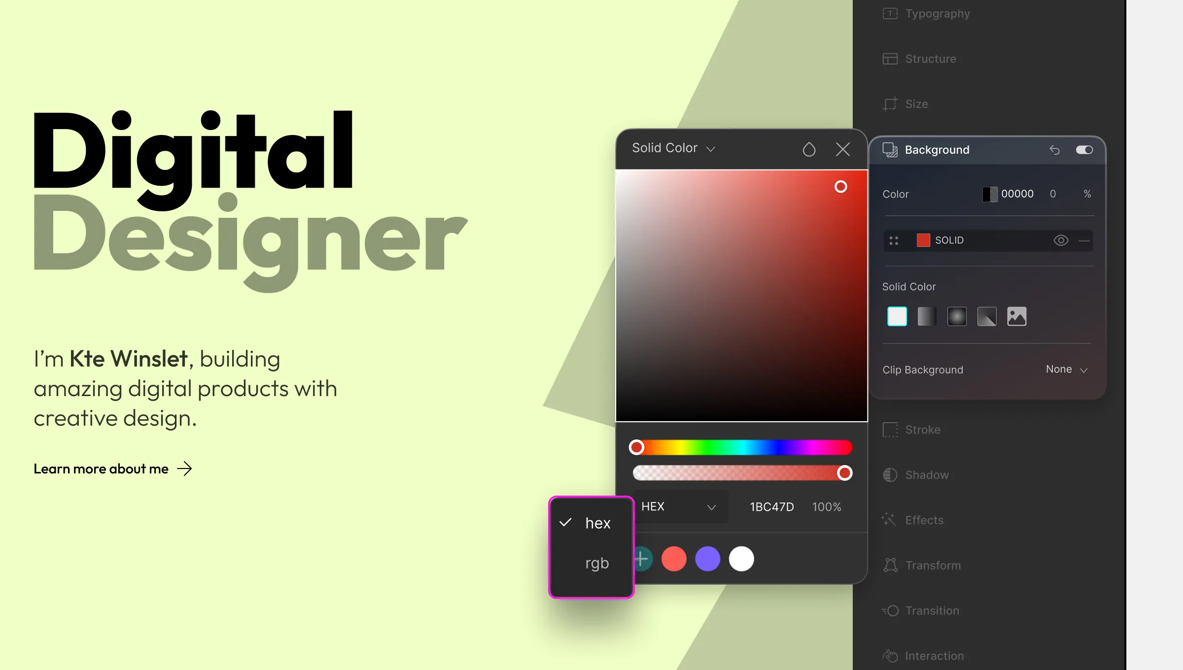
HEX
A Hex Code is a Hexadecimal RGB Value that starts with a # character followed by 6 symbols each of which can range from one of 16 values between 0 to F (which represents 15).
Each of the 2 symbols after the hash is used to represent a color value from 0 to 255 used in RGB. So the first two are for Red, the next two are for Green, and the last two are for Blue.
RGB Value to Hex Conversion:
The ‘R’ value is divided by 16. If the quotient (integer) of this result is below 10, then it’s written down directly after the hash. If not then its corresponding alphabet is written.
Then we have the remainder (If this is in decimal, it’s multiplied by 16). If this result is below 10, it’s written down next. If not, then its corresponding alphabet is what’s written.
The same is done for the ‘G’ and ‘B’ values until you have 6 alpha-numeric symbols following the hash.
Example:
RGB: 204, 102, 153
204/16 = 12.75 | 12 > 10 => C | 0.75*16 = 12 > 10 => C
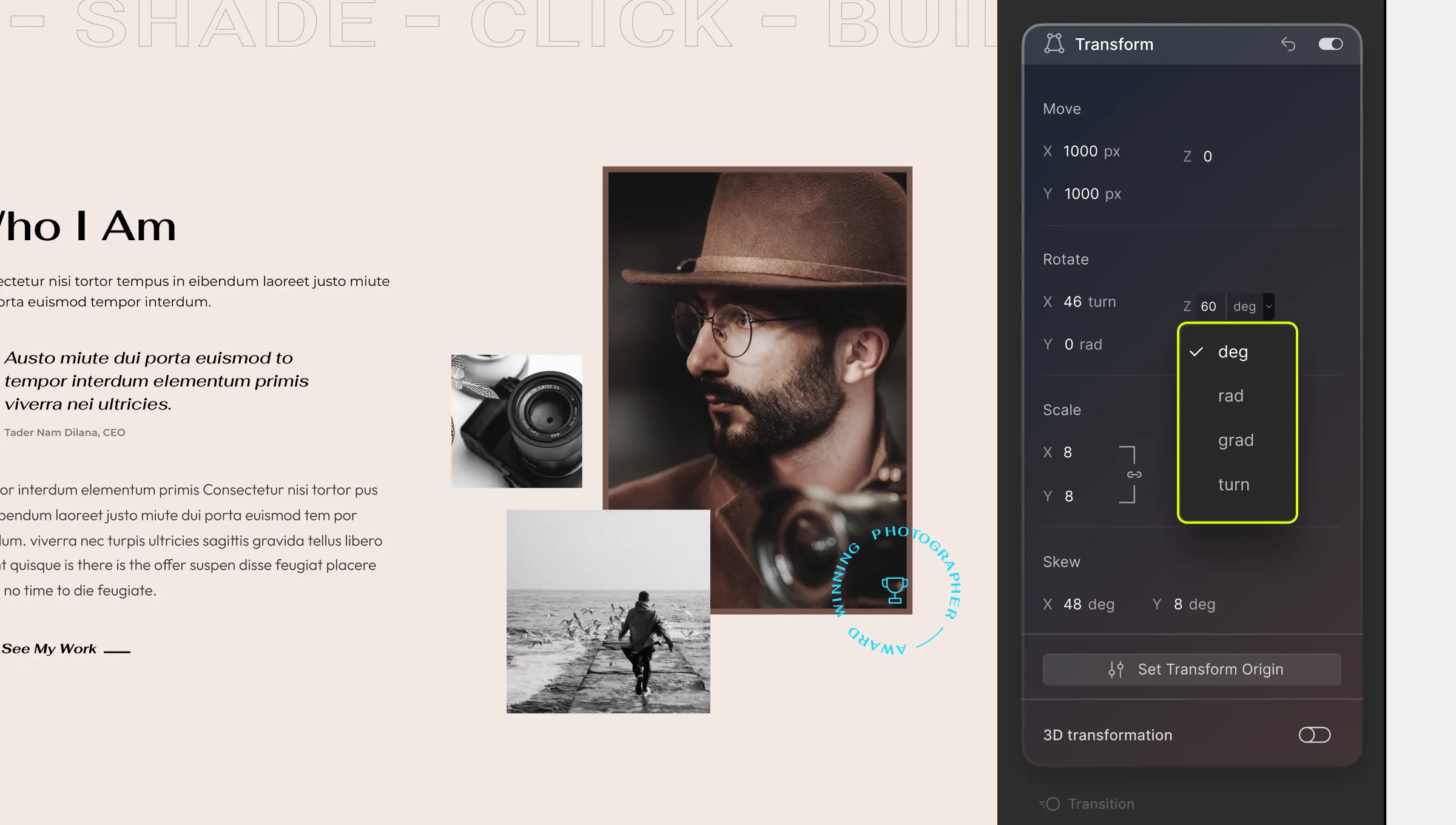
Define the angle for options like Rotate Transform, Hue Rotate Effect, etc using the following units:
Deg (Degree)
Ranges from 1 to 360 degrees where 0 and 360 are the same.
Rad (Radian)
1 Rad is equal to 180/π degrees or approx 57.3 Deg.
Grad (Gradian)
1 Grad is 1/400 of a full circle.
Turn
1 Turn is equal to 360 Deg i.e. 1 entire rotation.
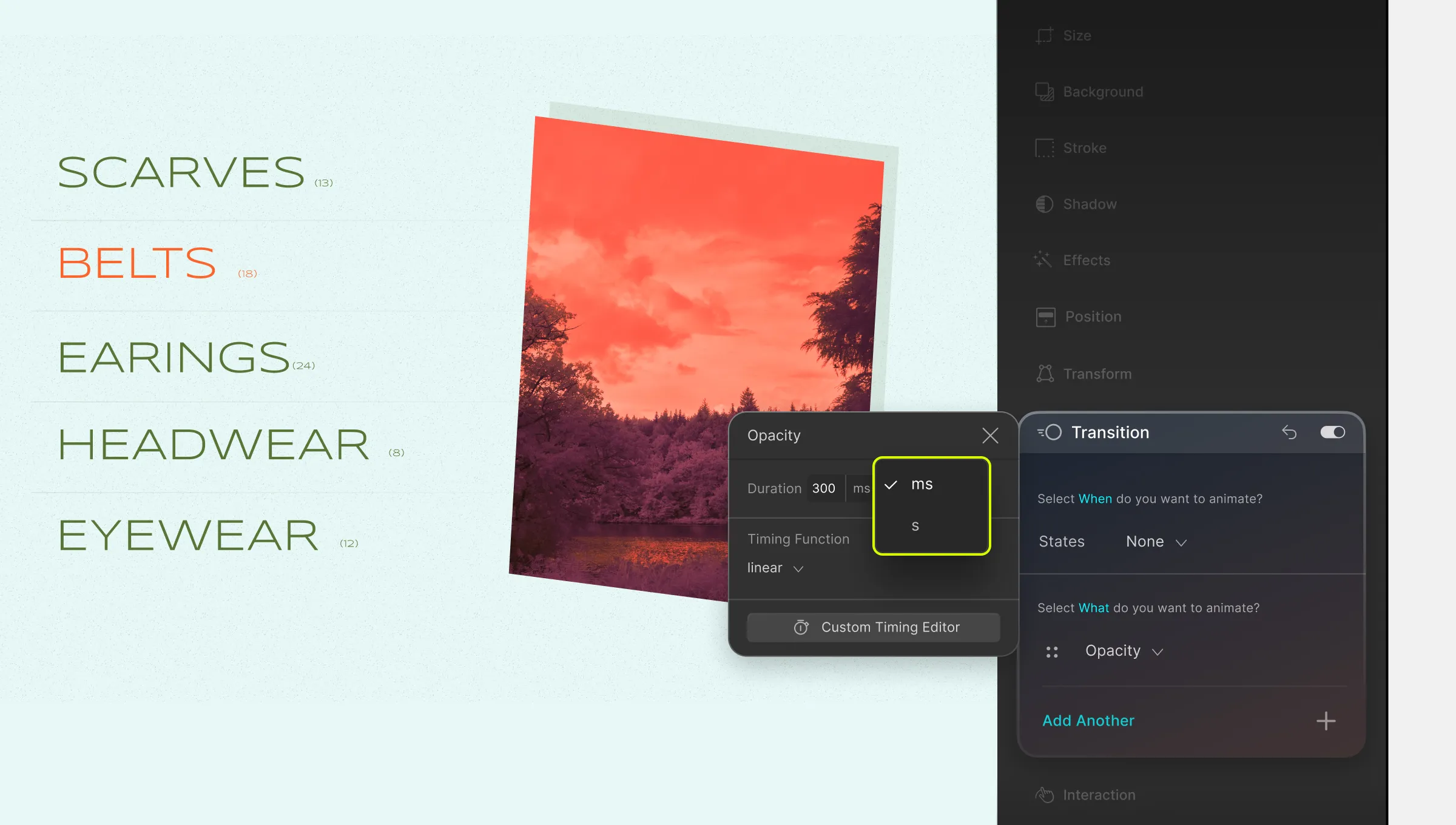
Time Units
Use the following Time Units to define the Time Duration & Delay in Transitions and Interactions.
S (Second)
1 Second is 1/60th of a Minute.
Ms (Millisecond)
1 Millisecond is 1/1000th of a Second.
Numbers
Certain values in Droip have no unit and are simply numerical values. Some examples are Scale Transform, Repeat Count in Interaction, Pagination in Collection, etc.
The Style Panel of Droip is basically where all of the magic happens. From here, you can customize every aspect of your element’s style.
Located on the right side of the screen, you’ll notice that the Style Panel is made up of the following sections:
Class Manager
Structure
Sizing
Typography
Backgrounds
Position
Effects
Interaction
Visibility Conditions
As you can tell from this list, you can customize your element’s typography, structure, background, and more from here. Not only that but you can also duplicate your style settings with the help of sub-classes and reuse them throughout your design process!
Class Manager
The Class Manager is where you can define Classes to duplicate and reuse the style settings of an element. This means you don’t need to manually customize each and every instance, saving your time and effort.
This is also where the States Menu is located and from here you can switch between the various States of an element and define its behavior and style for that state. With the help of this feature, you can design a highly responsive and interactive website.
The default States include None, Hover & Focus. However, you also get a range of other states known as Pseudo Classes to choose from.
You can also access the Inheritance Menu from here by clicking on the dropdown above the Selector field. This menu will show all of the parent and ancestor classes of this element and you can click on one to edit that class from here.
For more information about this section, check out the Class Manager documentation.
Typography
Using Typography settings, you can ensure that your content is legible and visually appealing. From here you can adjust your text’s font, font size, font weight, alignment, and more.
Not just that but from the Advance Font Editor, you can access even more customization options. Take a look at the Typography documentation to learn more.
Structure
From Structure, you can define how your element and the elements around it will be displayed on the canvas.
To change your element’s Structure, click on the dropdown that’s located here. You’ll find the following Structure types to choose from:
Block
Inline
Inline Block
None
Flex
Grid
You can also adjust your element’s Padding and Margin values from here. Simply click and drag any one of the sides to adjust them. You can match the values for all sides, or just some of them, or even define each one differently.
To learn more, check out our documentation on Structure.
Sizing
As the name implies, using the settings from the Sizing section you can define the height, width, and Overflow of an element.
You can also set the Minimum and Maximum values for size as well as enable Clip Content from here. Please visit the dedicated documentation on Size to learn more.
Backgrounds
Next up we have Background settings and from here you can add Solid, Gradient, and Image type Backgrounds.
When it comes to Gradients, you can also choose between Linear, Radial, or Conic Gradient types.
You’ll also be able to Clip Backgrounds from here and this includes the Text option which is a nifty way to have Image Backgrounds adopt any text content’s shape!
To learn more, visit the Background documentation.
Stroke
From the Stroke section, you can add a Border around any element. You can set this border’s size, color, and style.
You can also adjust any element’s Radius from here. This will curve the edges of your element to give it a more rounded look.
Similar to borders, you can add an Outline around your element too. Outlines are different from borders because they’re drawn outside the element’s edges instead of over them.
Then we have the Shadow section and as the name suggests, from here you can add Shadows to your elements.
You can choose from two types of Shadows: Outer Shadow and Inner Shadow. For both, you can adjust the Horizontal Offset, Vertical Offset, Color, Blur, and Spread.
You can also use one of the preset shadows instead of creating one from scratch. Similarly, you can save your current shadow settings as a preset for later use.
More information on this can be found in the dedicated documentation for Shadow.
Effects
Apply various Effects on your elements from this section. Effects include Opacity, Blur, Brightness, Contrast, Saturation, Invert Color, Grayscale, Hue Rotate, and Sepia.
You’ll also be able to change the Cursor style from here with a range of options to choose from.
Also, applying these effects based on specific states can help you improve the interactiveness of your website.
To find out more about this section, take a look at the documentation on Effects.
Position
Define the placement of your elements using the settings in the Position section. You can set the Position type as Static, Relative, Absolute, Fixed, or Sticky. You can also access the Float and Clear settings from here.
For more details, check out the Position documentation.
Transform
Using the options in the Transform section, you can manipulate an element’s appearance and placement. This feature is usually used in tandem with a specific state to add animative interactions.
Transformation options include Move, Rotate, Scale, and Skew. Use Move to shift an element’s position, Rotate to change its angle, Scale to increase or decrease its size, and Skew to change its shape.
You can also enable 3D Transformation from here to transform elements from a 3D perspective instead.
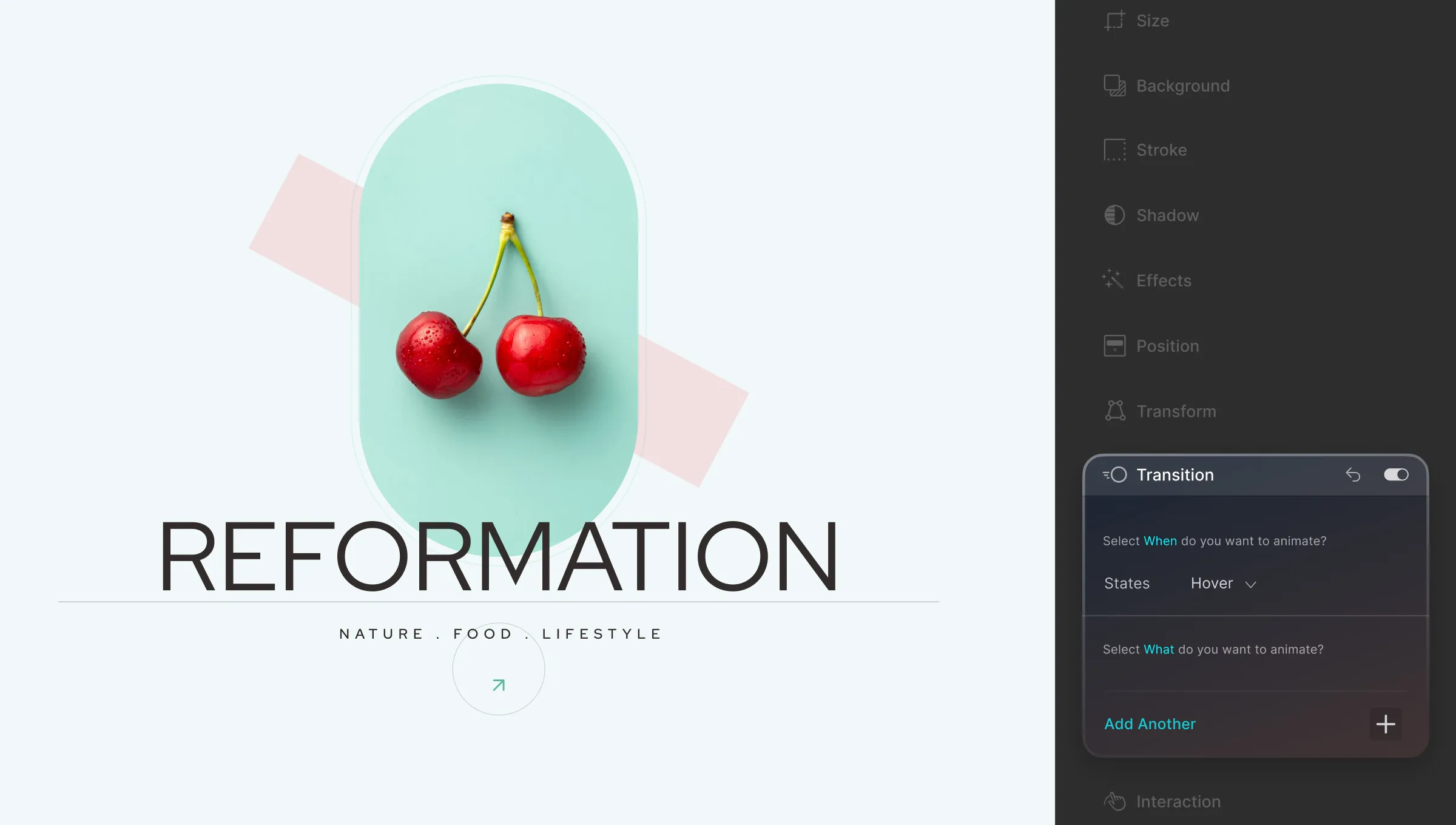
Transitions are where you can add fluid animations to an element when it switches from one state to another. This helps make the switch less jarring and results in a better user experience.
To add a Transition, all you have to do is select the State you’ll be switching to and choose which aspect to animate. Then you can set its Duration, Delay, and Timing Function.
For more info, check out Transition’s dedication documentation.
Interaction
Interaction is where all the fun really happens. You can use this feature to make your website more engaging and user-friendly.
Using Interaction, there are tons you can achieve like making a dropdown menu appear and disappear on hover, animating a group of elements when you scroll down a page, expanding an image when clicked on, and so much more.
You can apply Interactions to both Elements and your Page. If you select Elements, your Trigger options will be the following:
Mouse Click
Mouse Hover
Mouse Move Over Elements
and Scroll Into View
If you select Page instead, your Trigger options will be:
Mouse Move on Viewport
While Page is Scrolling
Page Load
Scroll Into View
Page Scrolled
Once you select your Object and Trigger, you can either select one of the preset responses and adjust that or create your own Custom Response. Since Droip offers a fully visual Interaction Builder, this is a pretty straightforward process.
For more in-depth information, please take a look at the Interaction documentation where we go over the entire process step by step.
Color your Typography, Backgrounds, Stroke, and more in any way you desire using Droip’s highly sophisticated Color options!
Use these settings to give your elements’ text or background a simple solid color. Or, go all out by using any one of three gradient styles to add an extra flair to your element!
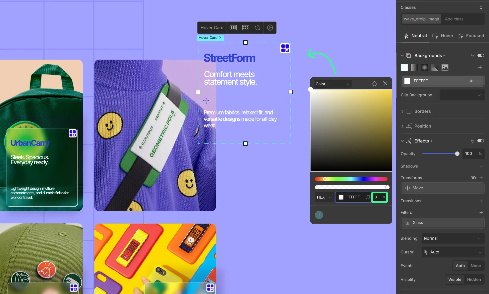
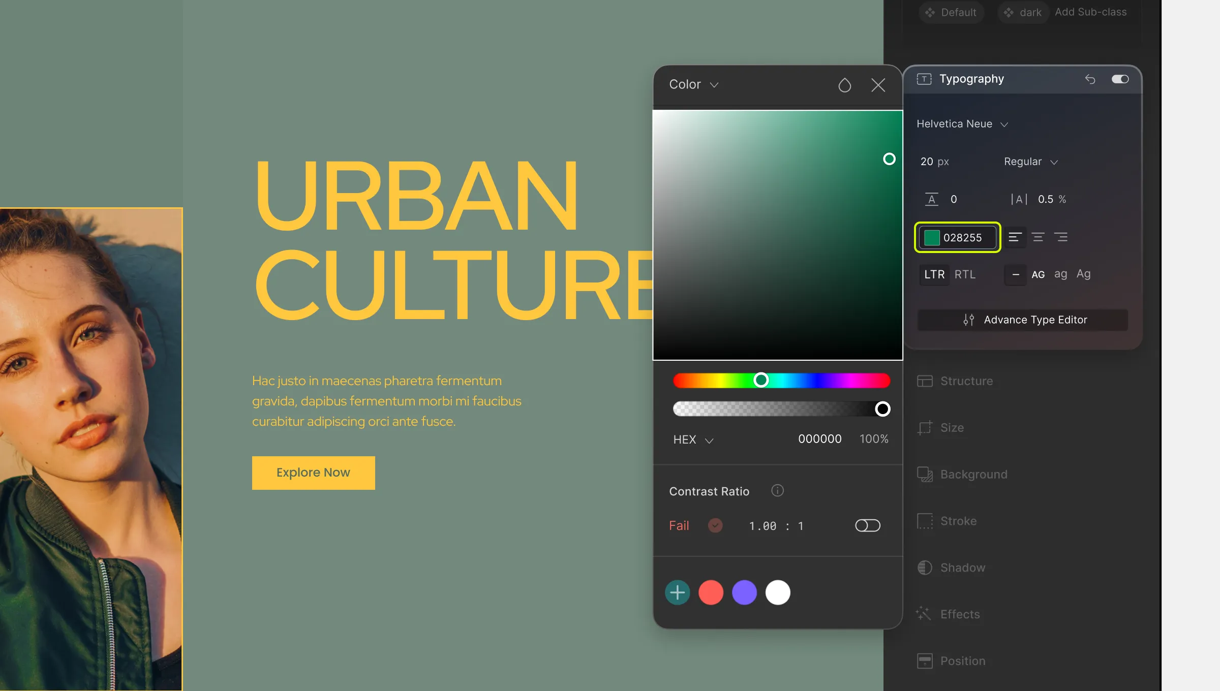
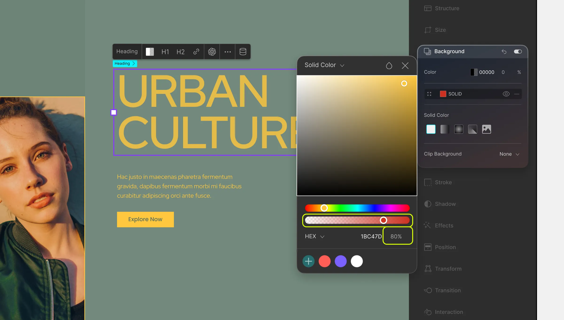
Color Picker
Using Color Picker, you can choose a solid color for your element’s style. To open, simply select the element and go to the relevant section on the Style Panel that you want to customize (Typography, Background, etc), and click on the Color option.
Pick a Color
To pick a color, do one of the following:
Drag the rainbow color slider to a hue of your choice and select a shade from the color canvas.
Or simply enter the color value in the field below. Use the dropdown to select HEX or RGB format.
Set Opacity
You can also use the second color slider to adjust your color’s opacity. You should be able to see its percentage value displayed on the right of the color value input field.
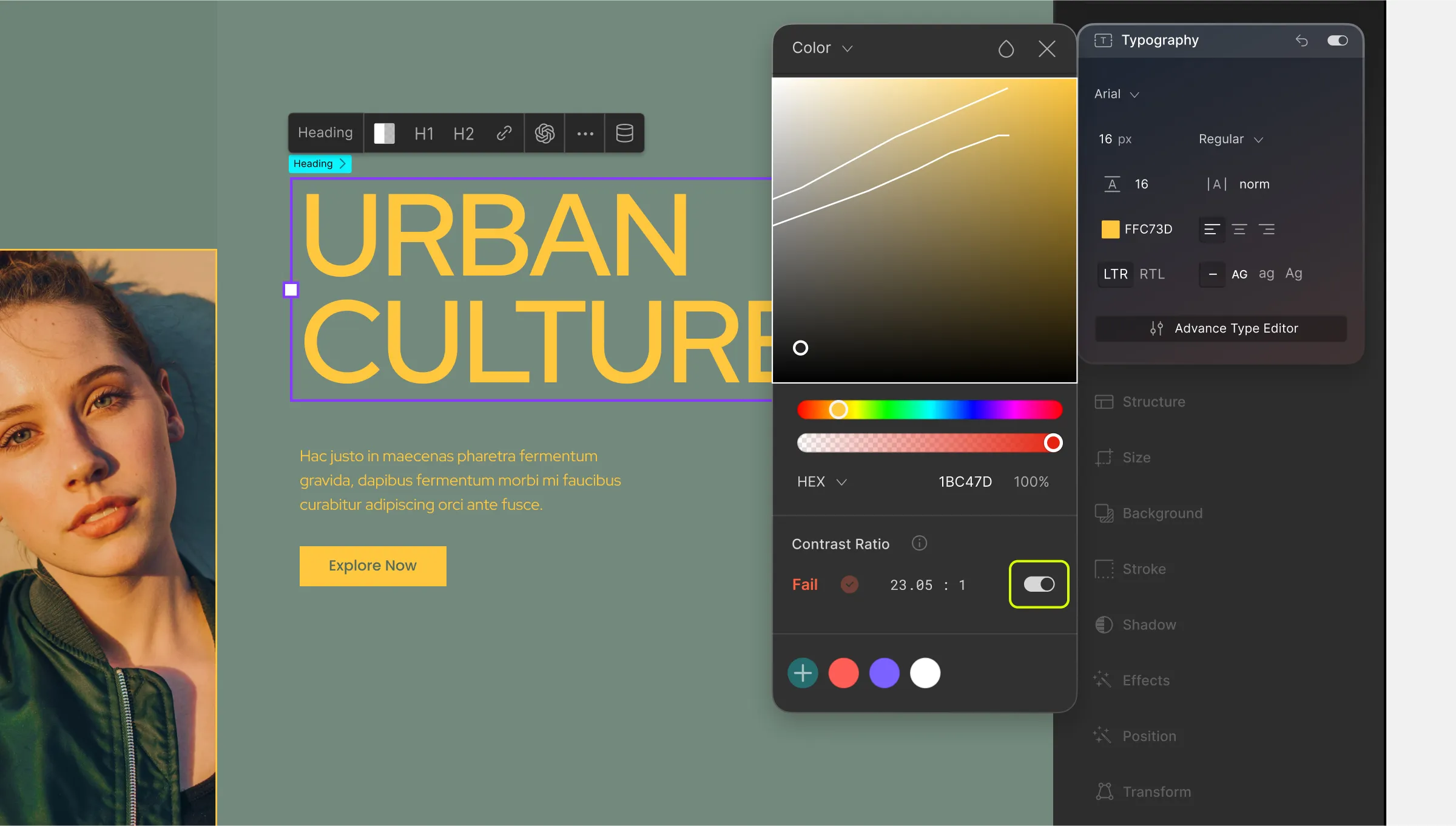
Contrast Ratio
When you choose any color, you’ll also be able to see the color Contrast Ratio and the WCAG (Web Content Accessibility Guidelines) rating from the Color Picker.
This will make it easier to ensure that your page’s design is accessible and user-friendly.
You can also use the toggle on the right to see the contrast ratio division lines. These can help you easily identify the low-contrast, mid-contrast, and high-contrast colors.
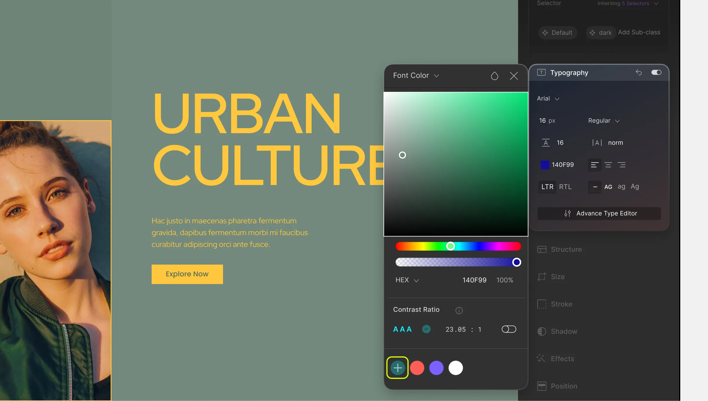
Color Swatch
Lastly, we have the Color Swatch where you can add colors to create your own Color Palette. This will make it easier for you to access the colors that you frequently need throughout the design process.
To add one, select your color and then click on the + icon at the bottom. The swatch works like a queue where you’ll be able to add up to seven colors and once you cross this limit, the oldest saved color will be removed from the swatch to make space for a new one.
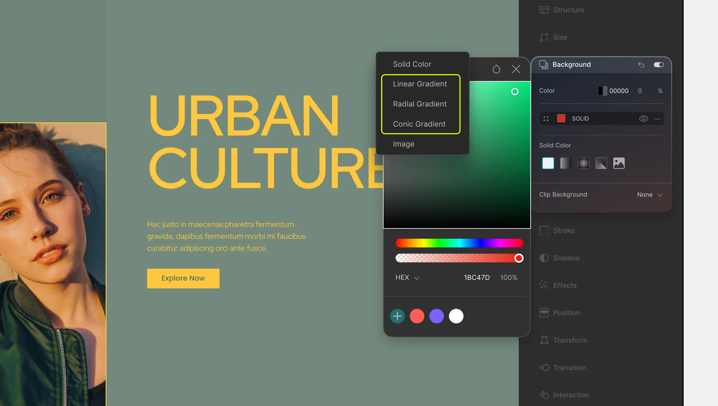
Gradients
Now let’s go over the three Gradient variations we have available:
Linear: Gradient with color transition in one direction based on a defined angle.
Radial: Gradient with color transition in the shape of a circle i.e. radiating from the center.
Conic: Gradient with color transitions rotated around a center point.
To access the Gradient panels, open the dropdown in the top left corner and select any one of the three gradient styles.
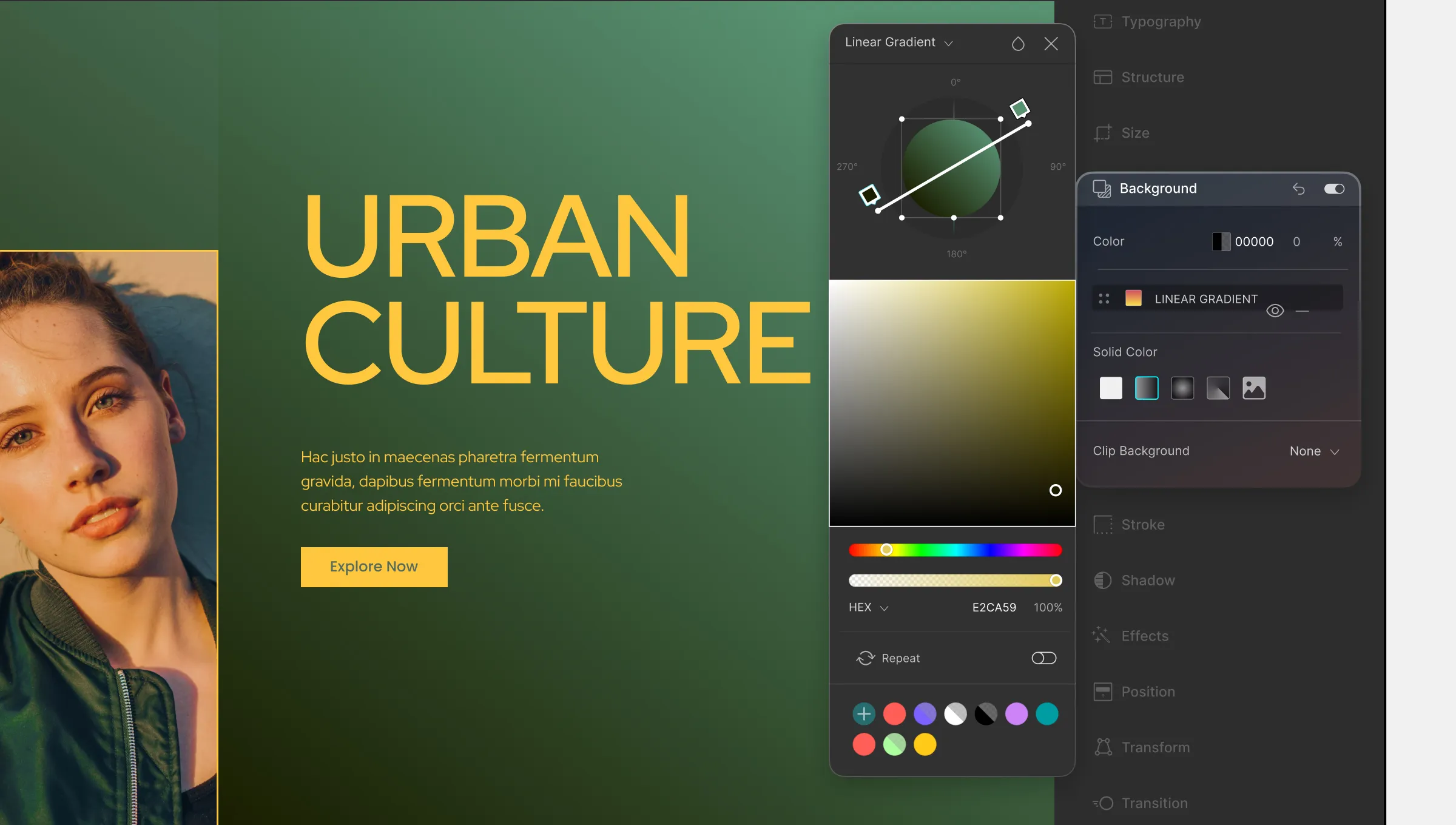
Linear Gradient
On the Linear Gradient window, you’ll see the usual features like the color canvas, color sliders, etc. What’s new here is the Gradient Ramp.
Picking a Color for a Color Stop:
To pick a color, click on any color stop to select it, and then choose your color using either color sliders and the color canvas or by directly defining the color code.
Repeat the same process to pick colors for all the other color stops.
Adding a Color Stop:
By default, you should have two color stops (start & end) to work with but you can add more by clicking anywhere on the gradient ramp.
You can remove these extra stops by selecting them and pressing the delete button.
You can also drag the color stops along the ramp to adjust the location from where they’ll start or end.
Setting the Angle:
You should notice that the gradient ramp overlays a circular shape marked with the angles 0, 90, 180, and 270 degrees. By default, the angle is zero i.e. the gradient is horizontal. To change it, simply grab any one of the ends of the gradient ramp and drag it up or down.
The circle shape will reflect all of these customizations you apply to your gradient so you’ll be able to see what it will look like.
Repeat:
Right below the color sliders, you should notice a new toggle called Repeat.
When the “Repeat” option is enabled, the gradient pattern will repeat itself seamlessly, creating a continuous effect.
This means that for a Linear Gradient, suppose you have two color stops at the start and end points, enabling “Repeat” will cause the gradient to repeat in a seamless manner as it progresses beyond the endpoint, creating a repeating pattern.
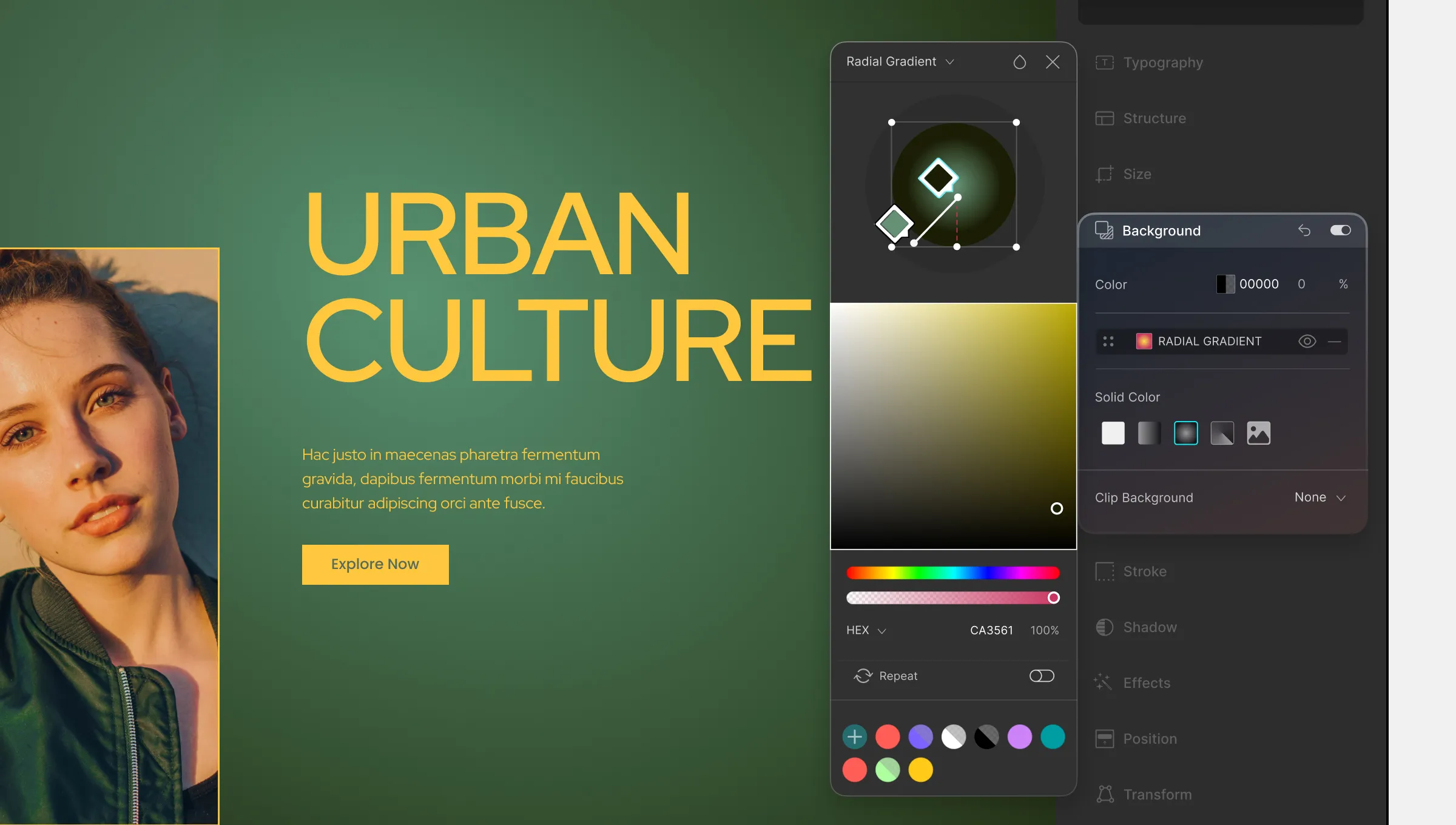
Radial Gradient
Next, we have Radial Gradient. Here, you’ll once again see familiar tools as well as the Radial Gradient tool. This tool, while looking very different, works similarly to the Linear Gradient tool.
Picking a Color for a Color Stop:
To pick a color, simply click on any color stop to select it. Then choose your color using the usual methods. Repeat the same process to pick colors for all the other color stops.
Adding a Color Stop:
By default, you should have two color stops (start & end) to work with. To add more, simply click anywhere on the gradient ramp.
And to remove a color stop, just select it and press the delete button.
Adjusting the Centerpoint & Spread:
To change the position of the gradient’s center point (starting point), click on the center handle and drag it as shown above.
And to adjust how much the gradient should spread outwards, click & drag the two end-points. Dragging the vertical handle will adjust the vertical spread and dragging the horizontal handle will adjust the horizontal spread.
Repeat:
Right below the color sliders, you should notice a new toggle called Repeat.
When the “Repeat” option is enabled, the gradient pattern will repeat itself seamlessly, creating a continuous effect.
Similar to Linear Gradient Repeat, for Radial Gradient, enabling “Repeat” will cause the same set of color stops to repeat in a seamless manner as it progresses beyond the endpoint, creating a repeating pattern but radiating from the center instead.
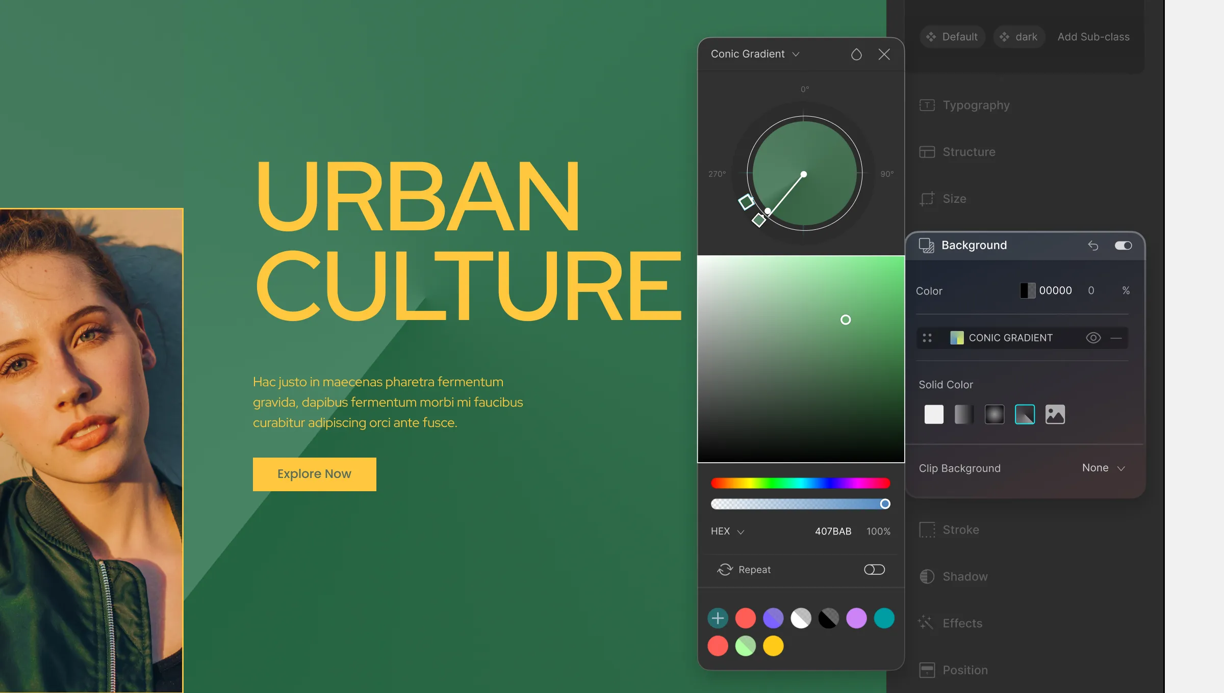
Conic Gradient
Finally, we have the Conic Gradient and this time the gradient ramp is circular with the preview modal at its center instead of along the gradient bar.
Picking a Color for the Color Stop:
Select any one of the color stops and then pick a color of your choice using any of the methods discussed here. Do the same to pick colors for the other color stops.
Adding a Color Stop:
By default, you should have two color stops (start & end) to work with. So to add more color stops, simply click anywhere on the gradient ramp circumference.
📝 Note: For Conic Gradient, the ending color stop may not be visible at first as the starting color stop usually overlaps it. To adjust the ending color stop’s position, click and drag over the starting color stop to separate the two and place it at an angle of your choice.
Adjusting Color Stop Position:
To adjust the color stop position, simply click and drag the color stop in question and place it at an angle of your choice around the gradient ramp’s circumference.
Off-Centered Conic Gradient:
To make your conic gradient off-centered, click and drag the center point handle to reposition it where you want it.
Reposition All Color Sops:
To reposition the angle of all of the color stops, simply click and drag the end-point of the gradient bar around the gradient ramp’s circumference.
Repeat:
Right below the color sliders, you should notice a new toggle called Repeat.
When the “Repeat” option is enabled, the gradient pattern will repeat itself seamlessly, creating a continuous effect.
Unlike Radial Gradient, enabling “Repeat” for Conic Gradient will cause the gradient to repeat with the color transitions rotated around a center point.
Transition is another amazing tool that can be used hand-in-hand with features like Stroke, Effects, Transform, and more to help create highly interactive web pages.
Use Transitions to make any animation between different states of an element to be much smoother and more pleasing to the eye.
Add Transition
To add a transition, select an element on your canvas that you’ve animated. Then head over to the Transition menu from the Style Panel which you’ll find on the right-hand side of your screen.
States
Then, start by selecting which State you want the Transition to start. Options are the three States None, Hover, and Focus. You can also select this from the States Menu located under Class & Sub-class.
Add New
Next, click on the plus icon to add a new transition. A new window should pop up from where you can customize your Transition settings.
Transition Type: Click on the dropdown situated at the top-left corner to select which type of animation you’re adding the transition for. Options include the following:
All Properties
Opacity
Margin
Padding
Border
Transform
Filter
Flex
Background Color
Background Position
Box Shadow
Text Shadow
Width
Height
Max Width
Max Height
Min Width
Min Height
Border Width
Border Color
Border Radius
Font Color
Font Size
Line Height
Letter Spacing
Text Indent
Word Spacing
Top
Right
Bottom
Left
z-Index
Margin Top
Margin Right
Margin Bottom
Margin Left
Padding Top
Padding Right
Padding Bottom
Padding Left
Duration: Define how long this transition will take. Click on the unit dropdown to select a different unit. Options include milliseconds (ms) and seconds (s).
Delay: Use this option to set the duration by which the Transition should delay if desired. Just like Duration, you can choose between the units milliseconds (ms) and seconds (s).
Timing Function: Click on the dropdown list from here to select the style of your Transition progression. Below is a list of the options available:
None: No Timing Function defined.
Linear: Animation maintains even speed.
Ease: Animation increases in velocity during the middle and slows down at the end.
Ease-In: Starts slowly and then animation speed increases until it ends.
Ease-Out: Starts quickly but slows down as the animation progresses.
Ease-In-Out: Starts slowly, then speeds up, and finally slows down again at the end.
Initial: Apply the default value of this property to the element.
Inherit: Set the same value as the parent element for this property.
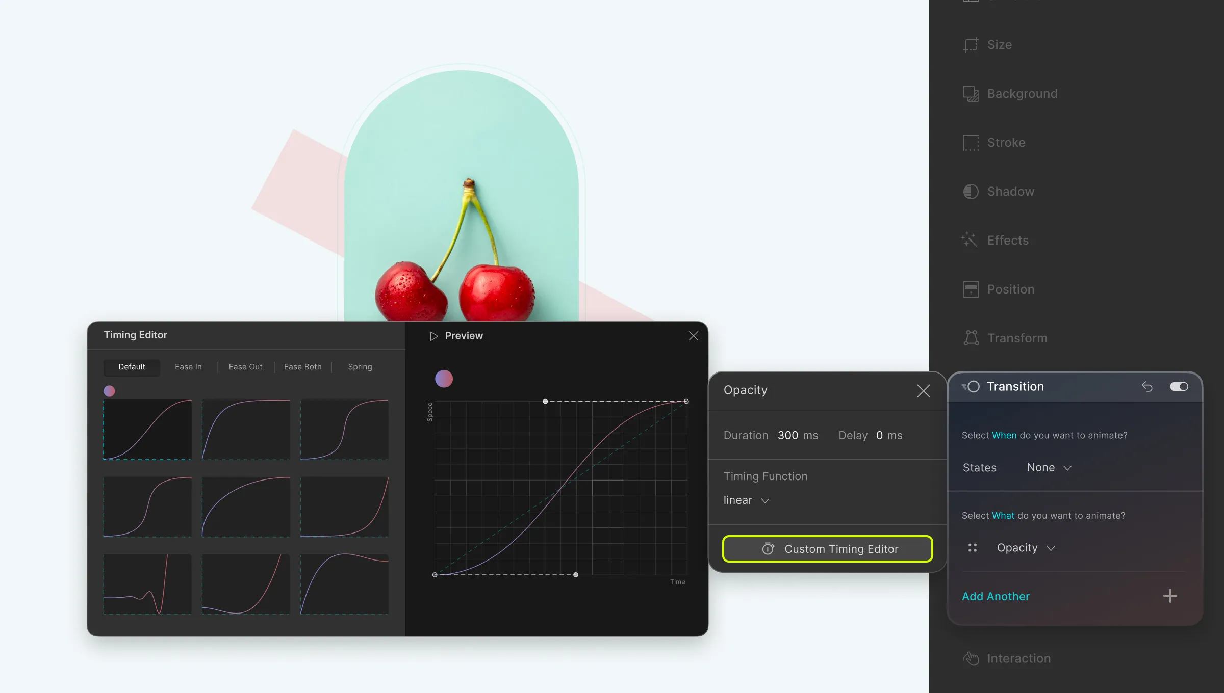
Custom: Set this if you want to use the Timing Editor to define a custom Timing Function.
Once you’re done setting up your transition, simply click on the X icon at the top-right corner to close this window. Then, you can click on the plus icon again to add more Transitions to your element if necessary
Custom Timing Editor
The Custom Timing Editor is a nifty tool that can be used to define a custom progression of your animation transition. To access the Custom Timing Editor, from the Style Panel on the right, go to Transition > Add New > Custom Timing Editor.
On the Timing Editor, on the left, you will find more predefined Timing Function styles. The Default tab shows all of the styles but you can also click on the other tabs to see the styles of each specific category. Categories include:
Ease In
Ease Out
Ease Both
Spring
After selecting any one of these options, you can watch its Preview on the right by clicking on the play button at the top. Then, to customize it to suit your needs, simply drag the two toggles attached to each end of the graph on the preview.
Using Size Transition For Image Expansion on Hover
In this section, we’re going to show you how you can make your images interactive using the features Size and Transition.
Setting Up
Start by adding a Div to your canvas. Then, place an Image element inside it and go to the Media Manager to select the Media you want to add.
Next, select the Div again and go to Size settings from the Style Panel on the right. Here, set its Width as 400px while keeping the rest of the settings the same.
Expand on Hover
Now it’s time to take the steps needed to expand your image.
Select the Div and go to Class & Sub-class > States Menu. (Click on the expansion icon in its top-right corner if you don’t see it!)
Switch to the Hover state from the States Menu and go back to Size settings.
Here, change the Width to 1200px while once again keeping the rest the same.
Use Transition to Polish in This Animation
Click on the Preview icon at the Topbar to view the current state of things. At this point, the animation should look disjointed as shown in the example below.
However, we can easily fix this using Transition by taking the following steps:
Select the Div and go to Style Panel > Transition.
Click on the plus icon to Add a new transition.
Here, set the Transition type as Width, Duration as 1000px, and Timing Function as Ease In.
Now if you go back to check the Preview, then you’ll see the Image smoothly transitioning to its Hover state unlike before. In this case, we can say Transition is essentially what makes this animation work.
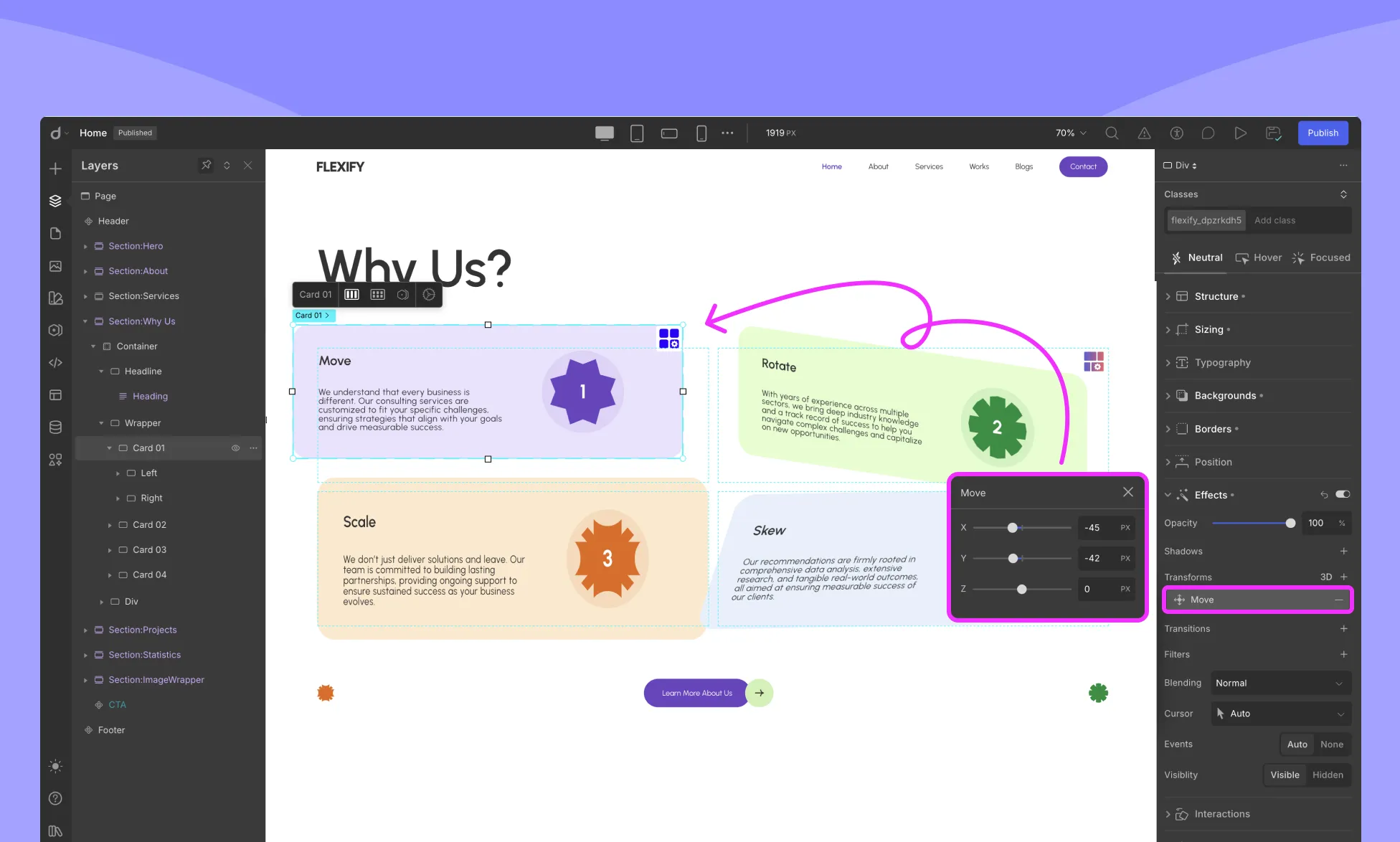
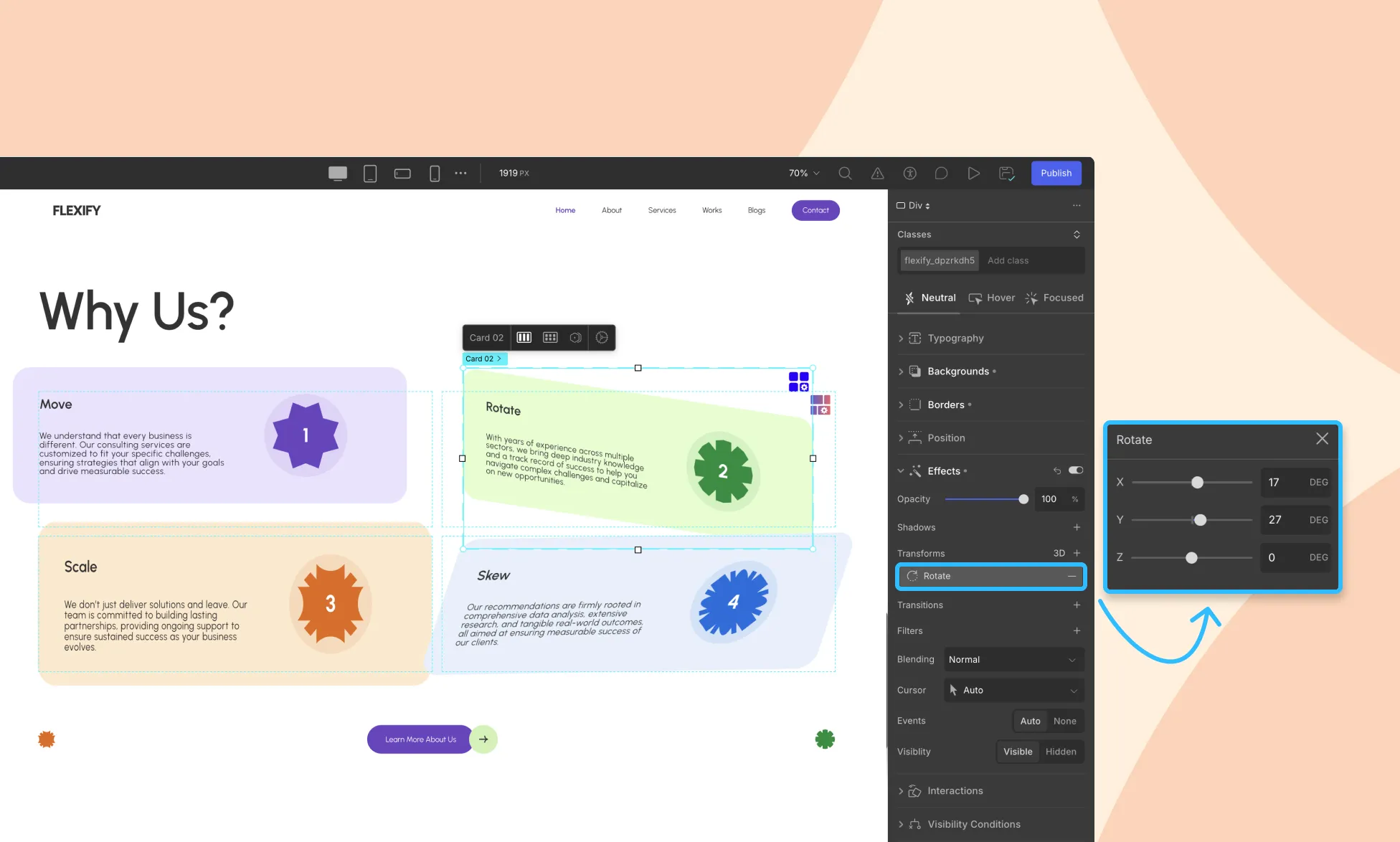
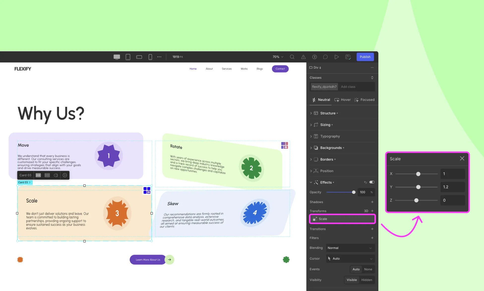
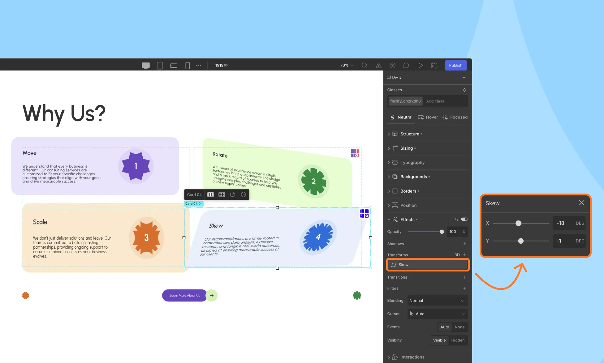
The Transform feature in Droip lets you move, scale, rotate, skew, and apply 3D effects to elements, all visually, without altering the element’s actual layout structure.
This gives you powerful creative control while keeping your design flexible and responsive.
Applying a Transform
Select an element on the canvas.
In the Right Sidebar, open the Effects > Transform section.
Click on the + icon to add a new transform.
Transform Options
Droip offers the following transform properties:
Move
Rotate
Scale
Skew
Move
As the name suggests, the Move Transform lets you shift your element across the page without affecting any of the other elements.
X: Move the element horizontally to the right.
Y: Move the element vertically downwards.
Z: Move the element forward or backward i.e. into or out of the page.
Similar to Rotate, you must apply 3D Transformation and set the Perspective for Move Z to have any effect.
Rotate
Using Rotate Transform, you can tilt your element by any given angle.
X: Rotate the element along the X axis or in other words horizontally.
Y: Rotate the element along the Y axis or in other words vertically.
Z: Rotate the element along the Z axis.
On its own, rotating along the X or Y axes will result in a flat, 2D Effect, and rotating along the Z axis will have no effect at all. To get a 3D effect, you’ll have to do the following:
Select the parent element which may be a div, section, etc.
Go to Transform and enable 3D Transformation.
Set the Child Perspective to 1000.
Doing this should switch the Move effect to a 3D perspective instead of simply 2D.
Scale
The Scale Transformation lets you increase or decrease the size of an element.
X: Transform your element to have greater width.
Y: Transform your element to have greater height.
Z: Scale your element along the Z-axis. This effect works well when a parent element has children with varying Z values for either Move or Rotate.
Skew
Using the Skew feature you can stretch your element.
X: Stretch your element along the x-axis.
Y: Stretch your element along the y-axis.
Fun Fact, know that for Skew, 3D Perspective doesn’t affect any change.
3D Transformation Options
If you click on 3D, additional controls become available to create advanced depth effects:
Set Transformation Origin
You can define the point from which the transformation originates. By default, this point is at the element’s center. You can set the origin using the grid model or the input fields on the right.
Right: Set the Origin’s distance from the left edge.
Top: Set the Origin’s distance from the top edge.
Backface Visibility
Controls whether the back side of an element is visible when rotated in 3D space.
Visible: The back side is shown when rotated.
Hidden: The back side is not displayed (ideal for card-flip effects).
3D Transformation
Enabling 3D Transformation in Droip allows you to apply depth and perspective to your elements, turning flat designs into dynamic 3D visuals.
Here’s how it works and how to configure it.
1. Style (Flat / Preserve-3D)
Determines how child elements are rendered in 3D space:
Flat: Child elements are flattened into a 2D plane.
Preserve-3D: Child elements maintain their 3D depth relative to the parent.
Preserve-3D is useful when you want to create layered 3D effects.
2. Perspective
Perspective defines the 3D view on a 2D plane, giving depth to 3D-compatible transformations. You can apply perspective in two ways: Self and Child.
Self Perspective
Applies the perspective to the element itself and its children. Distortion is relative to the element. It is best for transforming a single element.
Select the element you want to transform and set the value for Self.
Child Perspective
Applies perspective to all child elements. Distortion is relative to the viewport.
Ideal for transforming multiple elements. The parent acts like a camera through which the elements are viewed, producing a more realistic 3D effect.
Select the parent element containing the child elements and set the value for Child.
3. Perspective Origin
The Perspective Origin defines the position from which the user is viewing the element, similar to setting a camera angle.
You can set it using the grid model or by entering specific values:
Left: Distance from the left edge of the element.
Top: Distance from the top edge of the element.
Adjusting the origin changes how the 3D effect appears, making it appear as though the viewer is looking from a specific angle.
Scale Z
Using the Scale Transformation, you scale an element along the X, Y, and Z Axes. But unlike Scale X and Y, the true effect of Scale Z is not as obvious on its own. But in the right setting, Scale Z is a highly powerful feature.
As mentioned earlier, you will notice its true effect when applied to a parent element that contains a group of child elements with varying Z values (for Move or Rotate).
Scale Z Explained In Action
Let’s now go over exactly how you can make this feature work.
Consider a scenario where you have a Section containing a Container, which, in turn, holds three SVG Icons.
To grasp the concept, follow these steps:
Child Perspective: Begin by selecting the Section. Set its Child Perspective to 1000px.
Container Rotation: Proceed to select the Container. To better visualize the Scale Z effect, rotate the Container horizontally using a 50px Rotate X setting.
Icon Z-Move: Apply the following settings to the three Icons within the Container:
Icon 1: Move Z by 10px
Icon 2: Move Z by 20px
Icon 3: Move Z by 30px
Container Scale Z: Return to the Container and set its Scale Z value to 2. Observe how the effect appears to double the three Move Z values.
Basically, increasing or decreasing the Scale Z of a parent element will increase or decrease all varying Z values of the child elements be it Move Z or Rotate Z.
Adding 3D Animation Effect on Hover
Transform offers exciting possibilities for interactive animations. Let’s create a turning effect on images when hovered over:
Setup Your Page
Design your page by starting with a Section element.
Inside the Section, insert a Flex element with 3 Flex Tracks.
Add an Image element to each Flex Track and choose the media you want to use for each Image. Use the Add From Media button for this purpose.
Set the Flex’s alignment to Center and justify it to Space Evenly.
Transform Your Elements
Now, let’s turn our images so that they face away from the user. Do the following to achieve this:
Select the Section and go to Transform.
Enable 3D Transformation and set the Child Perspective to 1000px.
Select the first Flex Track and rotate it vertically by 60 degrees. You can do this by going to Transform > Rotate and setting the Y value to 60.
Repeat the same for the other two as well.
Animate on Hover
Your images should now appear turned to one side. Let’s add the animation:
Select the first Flex Track again.
From the elements state options from the right panel, switch to the Hover state.
Within the Transform settings, set Rotate Y to 0.
Repeat these steps for the other two Flex Tracks.
Get a Smoother Transition
The images should now turn towards you when hovered over. However, the animation might look abrupt. Here’s how to fix it:
Once more, select the first flex track.
Then, from the Style Panel, go to Effects > Transition.
Click on the + icon to add a new Transition and from the new pop-up window set the type as Transform, Duration to 300ms, and Timing Function as Ease.
Now repeat the same for the other two as well.
And this is just one example of 3D Animation and you can apply the same concept to add any kind of animation to any elements of your choice.
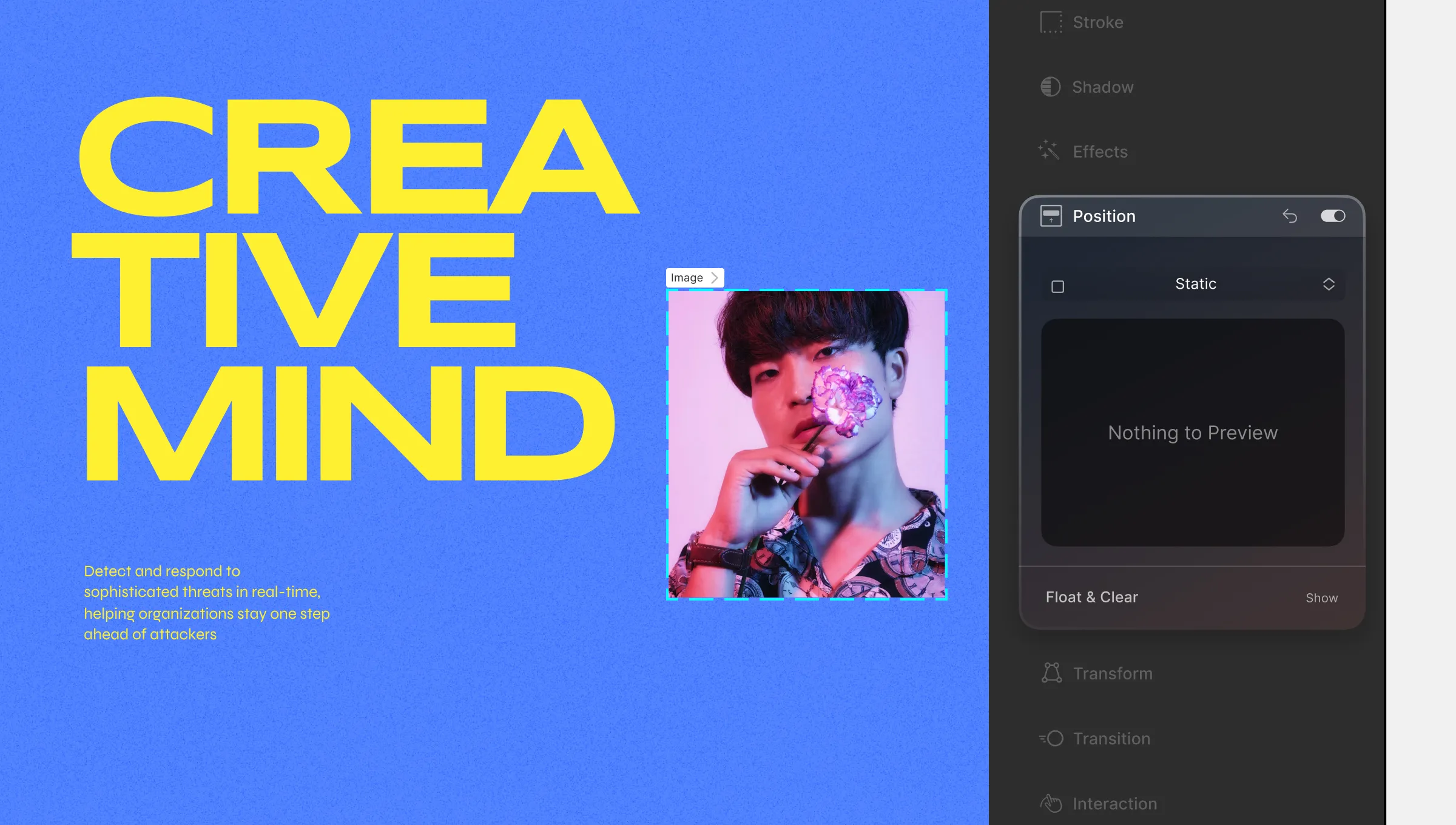
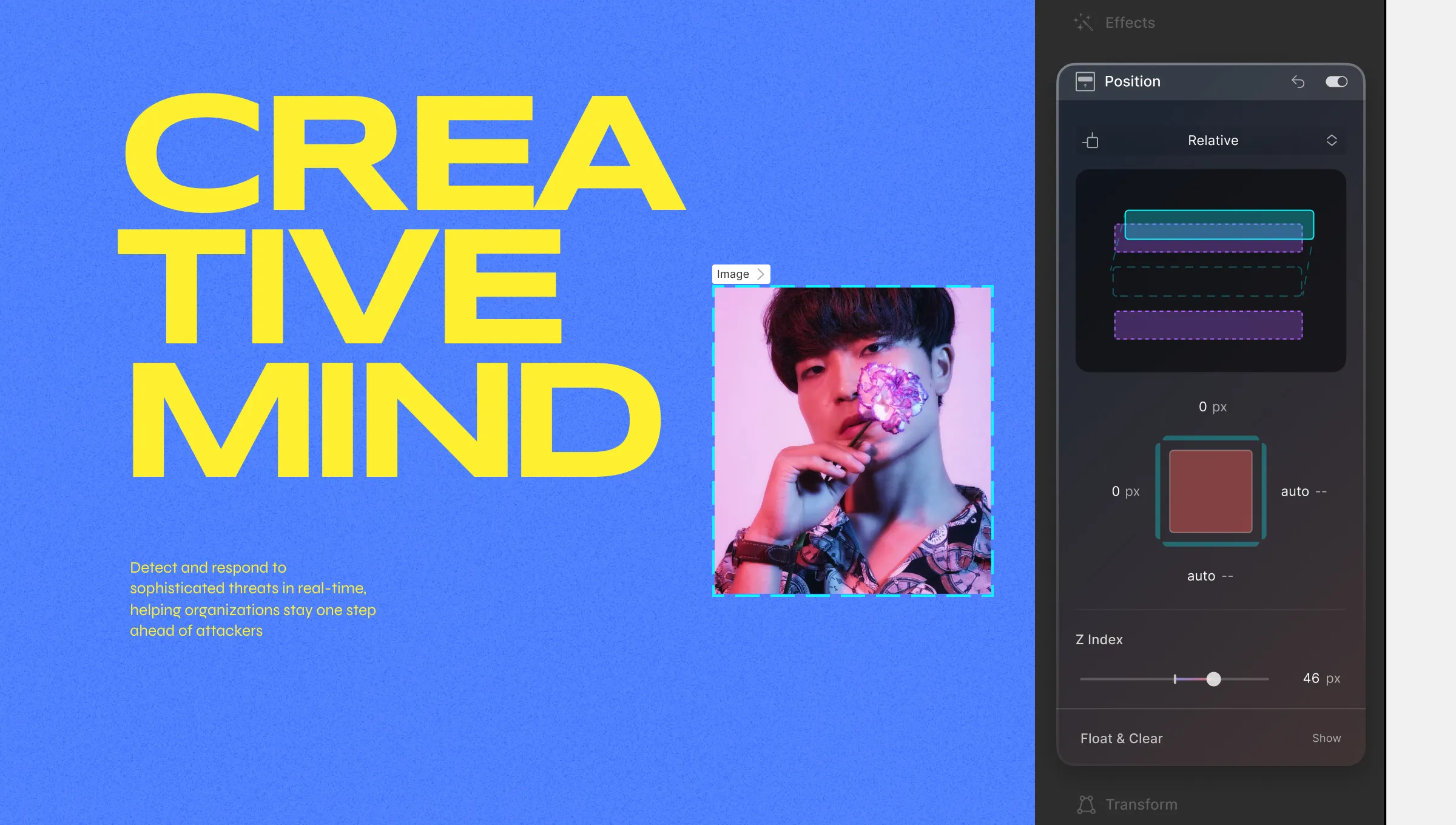
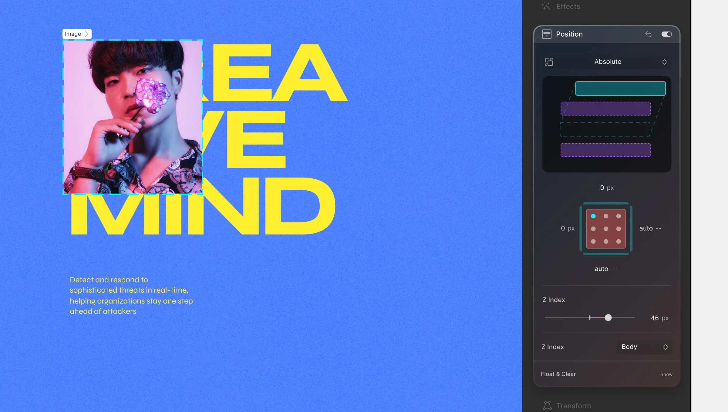
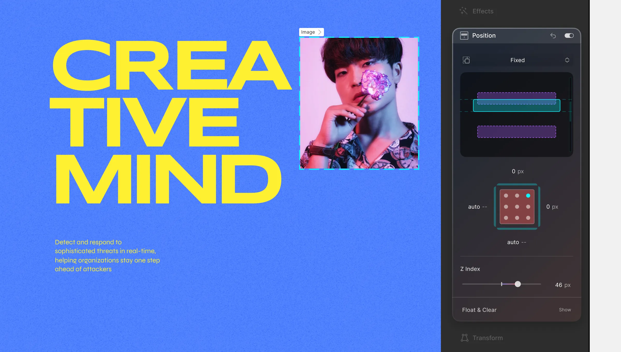
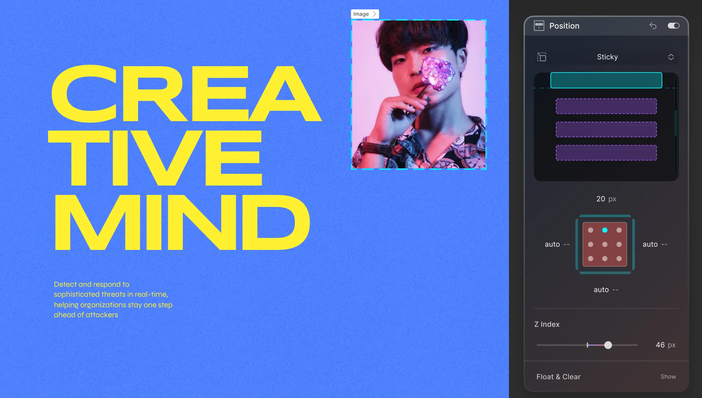
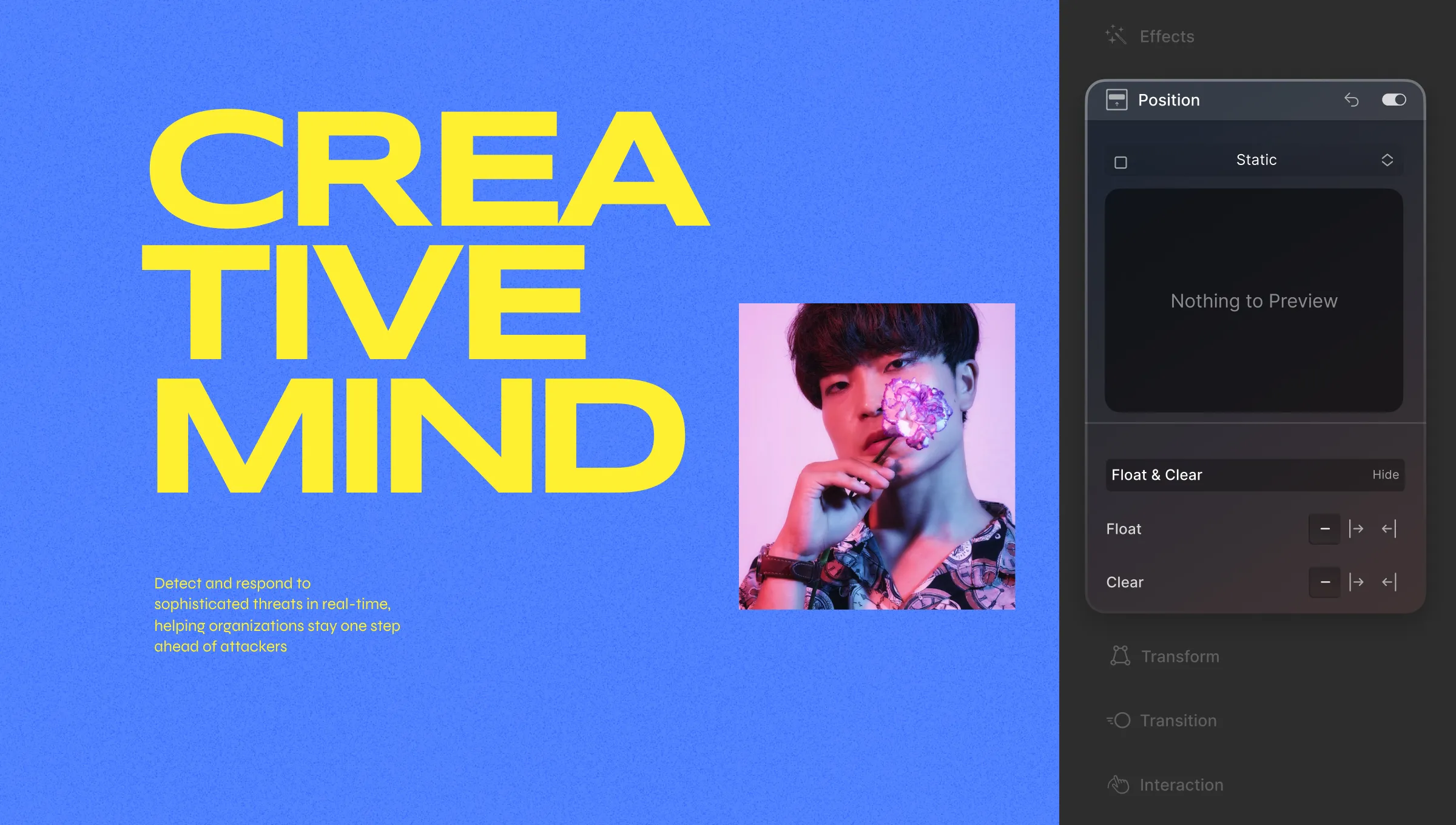
In Droip, you have the flexibility to adjust the placement of elements using Position. This property is accessible in the Style Panel on the right-hand side.
Types of Position
Click on the dropdown at the top of this section to select the Position Type. Below is the list of the 5 different values the Position property has to offer:
Static
Elements are positioned based on the usual flow of the document. Other values have no effect. This is set as the default value for Position.
Relative
Elements flow normally but can be offset using top, right, bottom, and left values. This means that other elements will behave as if it is taking their usual position even when its offset.
Absolute
Elements are removed from the usual flow of the document and positioned relative to their closest ancestor if any or placed relative to the initial containing block.
The final Position is based on the top, right, bottom, and left values.
Fixed
Fixed positioning removes an element from the normal document flow and positions it relative to the viewport, which means it remains fixed in its position even when the page is scrolled. This is true regardless of the ancestor elements’ properties like transform, perspective, filter, or will-change.
The element’s final position is determined solely by the values specified for top, right, bottom, and left, without considering the properties of their ancestor elements.
Sticky
Elements are positioned based on the usual flow of the document and then offset relative to the nearest scrolling ancestor and containing block based on top, right, bottom, and left values. Other elements’ Position is not affected by this offset.
Adjust Position Using Offset Values
You can adjust an element’s position using the following offset values:
Top: Click on the top edge of the box model and drag upwards to increase its value and downwards to decrease it. You can also directly enter the value in its input field.
Right: Click on the right edge of the box model and drag to the right to increase its value and to the left to decrease it. You can also directly enter the value in its input field.
Bottom: Click on the bottom edge of the box model and drag it downwards to increase its value and upwards to decrease it. You can also directly enter the value in its input field.
Left: Click on the left edge of the box model and drag to the left to increase its value and to the right to decrease it. You can also directly enter the value in its input field.
Z Index: Drag the slider range to set the Z Index or enter the value into its input field.
Float & Clear
Click on the Float & Clear button to open its settings. From here you can set the value for Float and Clear.
Float
Choose how elements should align within their container:
None: Element follows its natural position.
Right: Element floats to the right.
Left: Element floats to the left.
Clear
Set whether an element should be moved below floating elements that precede it. In other words, this defines what will happen to an element that’s next to a floating element. Also, this property applies to both floating and non-floating elements.
For this property, you can set any one of the following three:
Both: Element is pushed below both left and right floating elements.
Left: Element is pushed below left floating elements.
Right: Element is pushed below right floating elements.
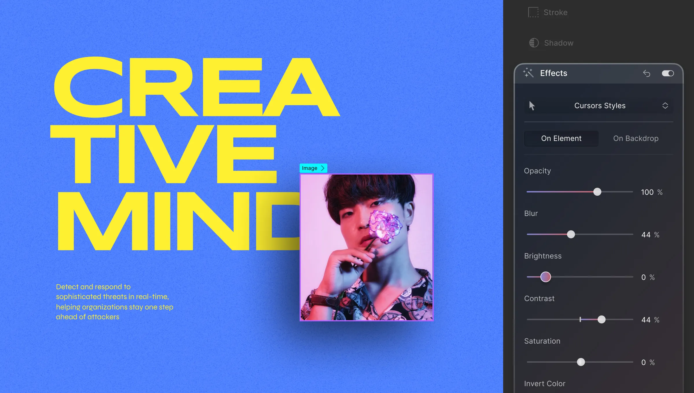
Elevate your elements’ visual impact by applying effects like altering Brightness, Opacity, Hue, and more from the Style Panel > Effects.
Applying Effects
You can apply effects either directly on the element or on the backdrop behind it. Here’s how:
On Element: Apply effects directly to the element and its children.
On Backdrop: Apply effects to the backdrop behind the element.
Available Effects
Explore various effects and their settings:
Opacity: Adjust element transparency using the Opacity property.
Blur: Apply a blurred effect to your element.
Brightness: Control the brightness level of your element.
Contrast: Fine-tune your element’s contrast.
Saturation: Define the vibrancy of your element’s colors.
Invert Color: Invert the colors of the element.
Grayscale: Transform the element into grayscale.
Hue Rotate: Change the color hue of the element.
Sepia: Add a sepia-toned effect for a vintage look.
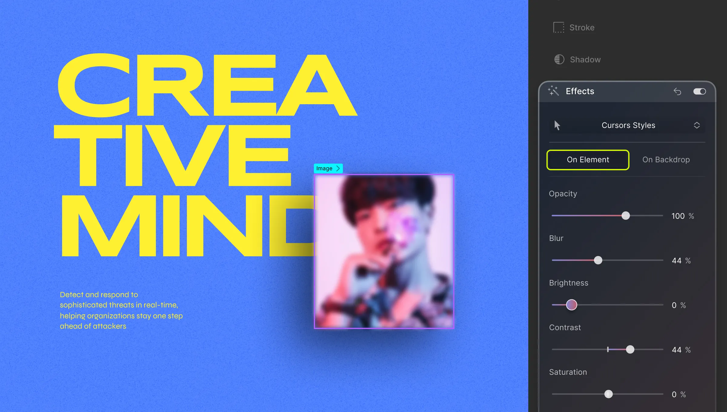
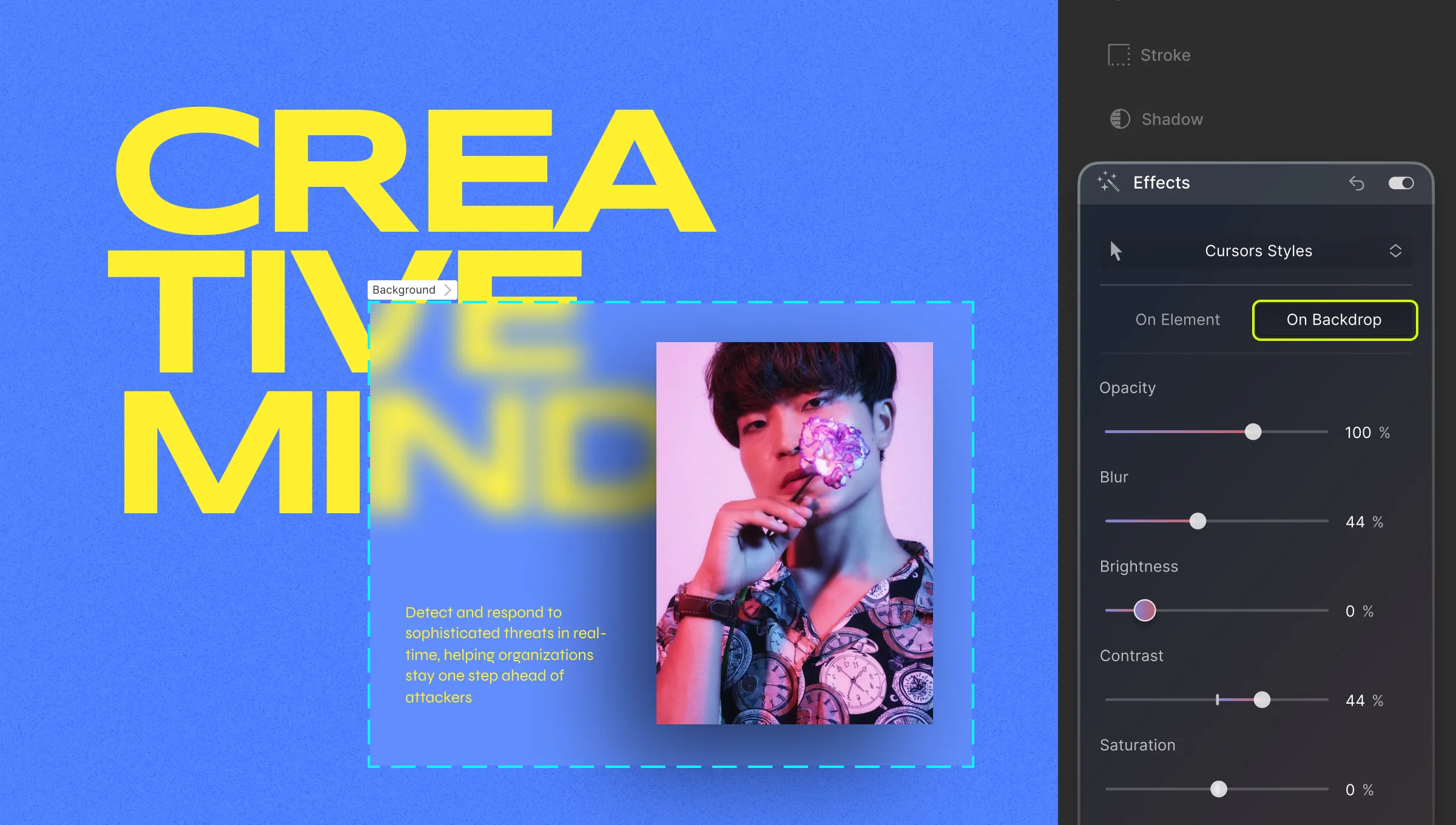
On Element vs On Backdrop
As you may have noticed, Effects can be applied to an element or to the backdrop. Selecting On Element means only the element and its children are affected by the changes.
On the other hand, selecting On Backdrop means that only the backdrop behind the element will be affected. Check out the images below to get a better idea.
Blur filter effect ‘On Element’ for Heading
Blur filter effect ‘On Backdrop’ for Heading
In the above images, the first instance is the effect of the blur filter on the Heading element. This adds a blurry effect to the entire text box up to its margins.
On the other hand, the second instance shows the effect of the blur filter on the backdrop of the Heading element. This causes the portion of the backdrop occupied by the Heading element to blur but the text remains sharp.
💡 Tip: Keep in mind that, for the backdrop to be visible, at times you might have to lower the opacity of your element. Of course, this is only in case of elements that are totally opaque or have an opaque background.
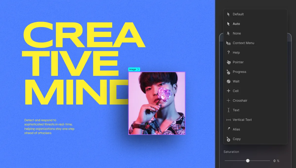
Cursor
From the dropdown at the very top, you can change the style of the Cursor for an element. This feature helps improve interactivity since users associate certain pointers with specific types of elements.
For instance, the (Text) Cursor is associated with blocks of text while the (Grab) Cursor lets the user know that the element can be dragged.
Now let us go over the various Cursor styles and when they can be used.
Default: Classic Arrow Cursor.
Auto: Cursor style changes automatically based on browser settings.
None: Invisible cursor (use sparingly).
Context Menu: Cursor for right-click context menus.
Help: Cursor indicating help availability.
Pointer: Cursor for links or buttons.
Progress: Cursor for indicating webpage loading.
Wait: Cursor for busy websites.
Cell: Cursor for selecting tabular cells.
Crosshair: Cursor for indicating selection or charts.
Text: Cursor for horizontal text input.
Vertical Text: Cursor for vertical text input.
Alias: Cursor indicating alias creation.
Copy: Cursor for copying.
Move: Cursor indicating element movement.
Not Allowed: Cursor for blocked actions.
Grab: Cursor for draggable elements.
Grabbed: Cursor indicating a grabbed element (best for Focus state).
Col Resize: Cursor to show that a column can be resized by dragging horizontally.
Row Resize: Cursor to show that a row can be resized by dragging vertically.
N Resize: Cursor used to indicate that an element’s edge is to be moved up (north).
E Resize: Cursor used to indicate that an element’s edge is to be moved right (east).
S Resize: Cursor used to indicate that an element’s edge is to be moved down (south).
W Resize: Cursor used to indicate that an element’s edge is to be moved left (west).
NE Resize: Cursor used to indicate that an element’s edges are to be moved up and right (northeast).
NW Resize: Cursor used to indicate that an element’s edges are to be moved up and left (northwest).
SE Resize: Cursor used to indicate that an element’s edges are to be moved down and right (southeast).
SW Resize: Cursor used to indicate that an element’s edges are to be moved down and left (southwest).
EW Resize: Cursor used to indicate that an element’s edges are to be moved right and left (northeast). In short, signifies a bidirectional resize.
NS Resize: Cursor used to indicate that an element’s edges are to be moved up and down (north-south). In short, signifies a bidirectional resize.
NESW Resize: Cursor that points to north-east-south-west and that signifies a bidirectional resize.
NWSE Resize: Cursor that points to north-west-south-east and signifies a bidirectional resize.
Zoom In: Use this to show that an element/page can be zoomed in.
Zoom Out: Use this to show that an element/page can be zoomed out.
Our website uses cookies to improve your browsing experience on our website. By continuing to use this website, you
agree to
their use. For details, please check our Privacy Policy.
Get started for free!
Start 90 days free trial!
Get Droip
Experience the power of Droip. Create stunning, responsive sites with pure creative freedom.
 (Text) Cursor is associated with blocks of text while the
  (Grab) Cursor lets the user know that the element can be dragged.