Wondering how you can elevate your website experience to be smoother and more intuitive? Well, say hello to micro interactions, the one true solution to all your clunky website woes!
Check out our list of top 5 micro interactions to craft visually for WordPress sites below!
Crafting Micro Interactions With No Code
Micro interactions are subtle animations that provide visual feedback to users either triggered by their actions or by some pre-defined conditions being met.
With the right tool to assist you, crafting them can be a matter of only a few clicks — and not a single line of code.
So tag along with us as we show you the ropes to creating five micro interactions with no code using Droip!
1. Animated CTA
Animated CTA is one of the most popular and essential micro interaction a website can have. Triggered by the user clicking on a button, it helps communicate the success or failure of such an action.
📝 Note: Animated CTAs will differ based on the situation and your requirements. In this example, we’ll be animating an Add to Cart button to show the item has been successfully added to the cart!
Step 1: Design Your Feedback
Start by duplicating your button text element and changing its content to your feedback message.
Next, set the original button text element’s width to auto if it isn’t already, enable clip content, and set the overflow to hidden from the size settings.
Finally, detach the feedback text’s class, change its width to 0%, and enable clip content with the overflow set to hidden for this as well.
📝 Note: Make sure your button’s structure is set to flex and the direction set to row with alignment and justification centered.
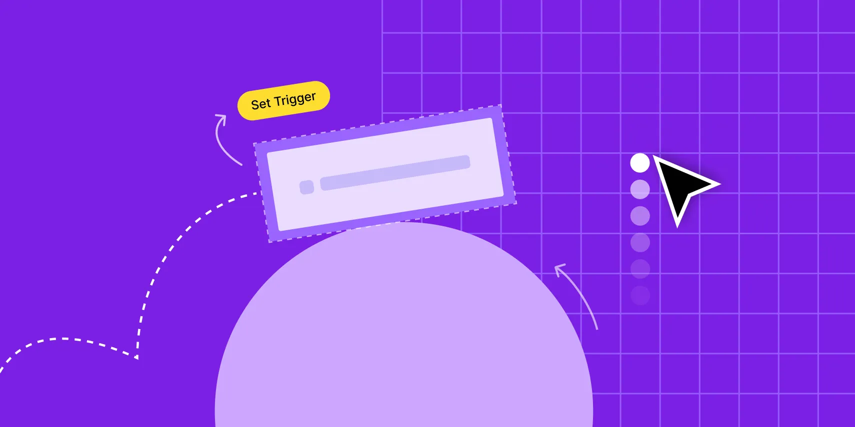
Step 2: Set Trigger
Select the button and set the trigger to mouse click from the interactions panel.
Step 3: Define Rules
Now, add a custom response and select the button text element to set it as your target.
Then, add the size action and set the width as 0% to hide it.
Next, select the feedback text from the layers panel and set its size to auto to make it visible.
Finally, select the icon, add the rotate action, and set its ‘Y’ value to 180 degrees so it flips on click.
Step 4: Reset to the Original State
Start by duplicating your custom response under the 1st click.
For this duplicate, reset the feedback text’s width to 0%, the text element’s width to auto, and the icon’s vertical rotation to 0 degrees.
Next, add a 3000s delay to each action so this response is triggered after the first one.
To finish off, duplicate both responses for the 2nd click to ensure it behaves the same for every click!
2. Page Scroll Progress Bar
Users can often lose track of their position on web pages as they scroll. To avoid confusion, you can add a page scroll progress bar that shrinks and expands as the user scrolls up and down a page, handily marking their position!
Step 1: Design Your Progress Bar
Take a section and then set its width to 0% and height to 5px. Lastly, give it a solid color background.
Step 2: Set Trigger
Select your page and from interactions, set the trigger to while page is scrolling.
Step 3: Define Rules
Add a custom response and from the layers panel, select the progress bar to make it your target.
Then, add the size action, set the width as 100%, and drag this action so it spans from the start to end.
Finally, disable the viewport only option.
Step 4: Fix Position
Now, for your progress bar to remain visible as you scroll your page, its position needs to be fixed.
To achieve this, simply set its position to sticky with the origin set to the top left corner.
Lastly, make its z-index maximum to ensure it’s always on top of all other elements on the page.
And voila — now the progress bar will expand and contract as users scroll the page, easily keeping track of their position!
3. Content Reveal on Scroll
This next microinteraction is one of the simplest ways of effortlessly guiding user focus where you desire on the page while also adding interest to the overall page design.
As the name suggests, this feat ‘reveals’ your content as it’s scrolled into view, thus automatically driving the users’ attention to that section.
Step 1: Hide Your Content
Select the element you want to hide and reduce its opacity to 25% from the effects panel.
Step 2: Set Trigger
Select the element again and from interactions set the trigger to scroll into view.
Step 3: Define Rules
Add a custom response and select the same element as the target.
Then add a filter action, select its type as opacity, and set the value to 100%. To make it even more eye-catching, add a move action and set it to shift vertically by -25px.
From the edit transition settings, set both actions’ duration to 1000s and add a delay of 100s.
Step 4: Reset to the Original State
Lastly, duplicate your custom response to scroll out and reset the opacity to 0% and the vertical move to 0px. You’ll also need to reset the delay to 0s.
Now, repeat these steps for the other elements on your page if desired and you’re all set!
4. Parallax Effect
Speaking of adding interest, another nifty way of captivating your audience is by adding a parallax effect to your page!
A parallax effect occurs when the background stays fixed in place while the foreground content moves as the page is scrolled.
Step 1: Setup Up Parallax Effect
Select your page and add an image background from the style panel. Upload your image and select it from the media manager.
Then, set its attachment to fixed — this is the setting that creates the parallax illusion!
Finish off by setting the background’s position to center and the size to contain.
The end! One step is all you need to create a simple parallax effect! Not only is it one of the coolest microinteractions on our list but it’s also the simplest!
💡 Tip: You can make the parallax effect even more dynamic by adding interaction to the elements on your page so they shift and rotate while you scroll!
5. Tooltips
Last but not least, we have Tooltips! Taking the form of small messages that are displayed on hover, this microinteraction is the most direct method of relaying feedback to users.
Step 1: Create Your Tooltip
Start by taking a div element and adding another div inside it. Rename the parent div Tooltip Wrap and the child div Tooltip Target. Now, add a paragraph element to the tooltip target.
Then, place the tooltip wrap where your trigger element is and move the trigger element inside it.
Next, change the tooltip wrap’s structure to flex and direction to column. Then, set the tooltip wrap’s position to relative and its z-index to 2.
Now, it’s time to style your tooltip target by adding background, stroke, etc, and update the tooltip text.
You then need to set the tooltip target’s position to absolute. Here, can use the offset toggles to reposition your tooltip how you like.
Step 2: Set Trigger
Select the tooltip wrap and from interactions set the trigger to mouse hover.
Step 3: Define Rules
Add a custom response and click on the tooltip target to select it. Then, add the filter action and set the opacity to 100%.
Step 4: Reset to the Original State
Duplicate this response to hover out and reset the opacity to 0%.
Then to finish off, set the actual tooltip target’s opacity to 0%.
Wrapping Up
So those were the top 5 micro interactions you can craft visually for WordPress sites with Droip. But it’s important to note that this is just the tip of the iceberg — get Droip today and enjoy endless website design possibilities and a code-free website-building experience to boot!

