Ever see a website effect and think, “I want that on my site!”, but then realize you don’t know how to code that, or maybe that your no-code tool can’t handle it?
Here’s the good news: You don’t need complex coding or extra plugins to create striking web design elements anymore. In this article, we’ll show you cool website effects in WordPress you can add without code and complex setups, effortlessly.
So let’s dive right in!
Sleek & Modern Glass Effect
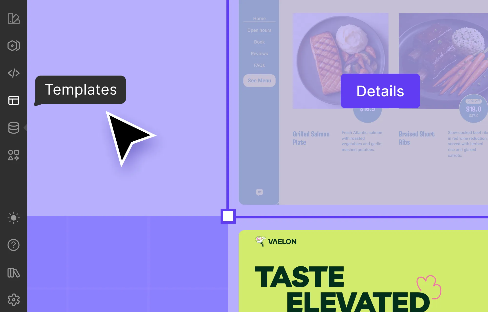
First up on our list is one of the most talked-about UI trends in modern web design, the Glass Effect, or often referred to as Glassmorphism.
By mimicking the look of frosted or translucent glass, this effect adds depth and a premium, futuristic feel while still keeping designs clean and minimal. It’s commonly used in cards, navigation menus, buttons, and more, as its versatility makes it easy to fit into almost any layout.
Now, at first glance, you might assume pulling this off in WordPress would require tons of back-breaking code and CSS. Traditionally, that would be true.
But with the right tools, it’s quite simple.
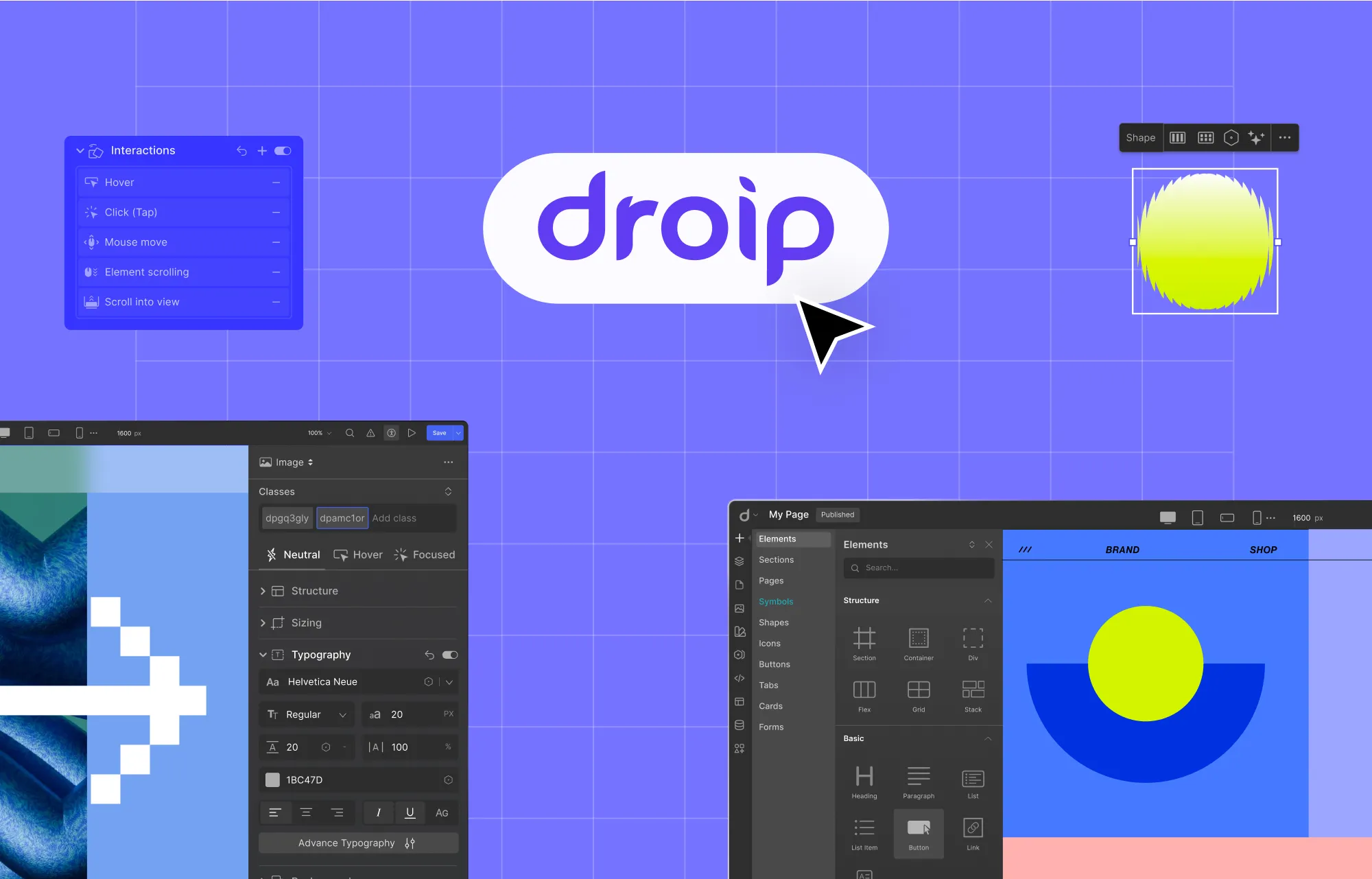
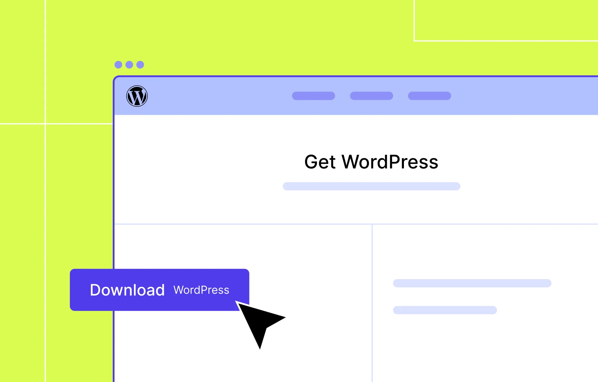
Take the Droip WordPress website builder, for instance. It’s a modern no-code platform designed to make building websites more intuitive and flexible than ever. With its built-in glass effect feature, you can create the sleek, frosted look in just a few clicks, visually and completely free of code.
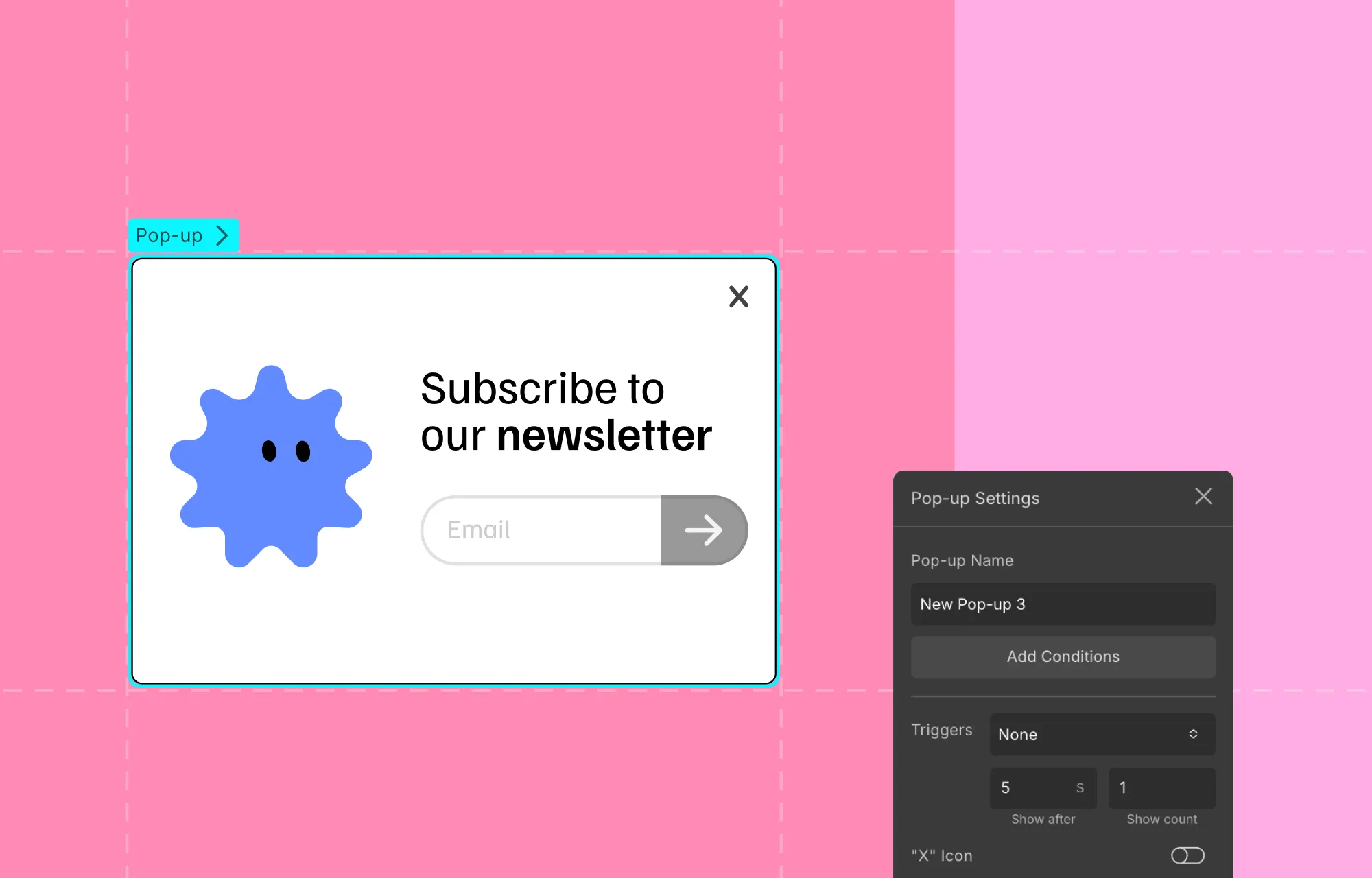
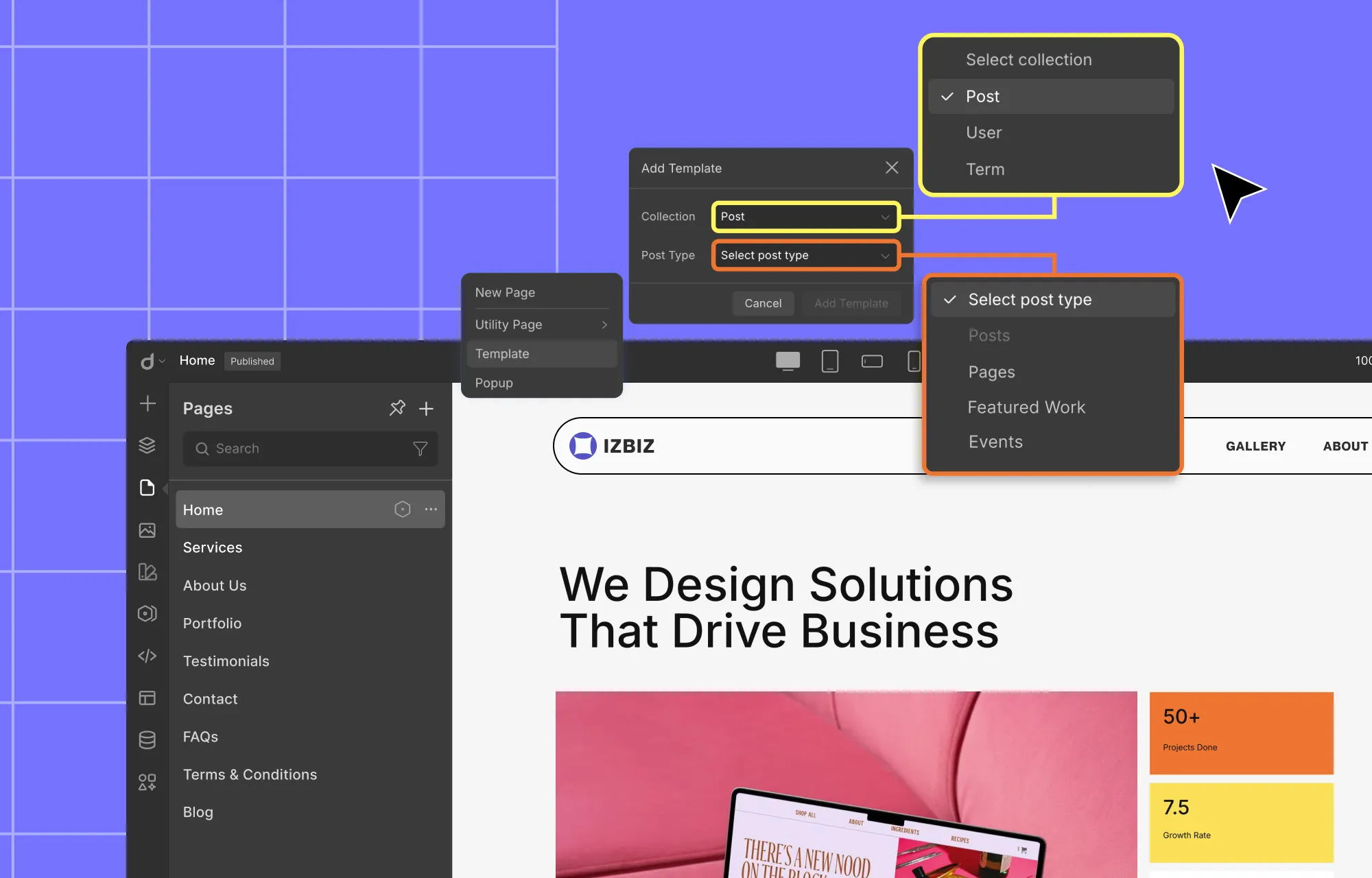
How to Create the Glass Effect in WordPress With Droip:
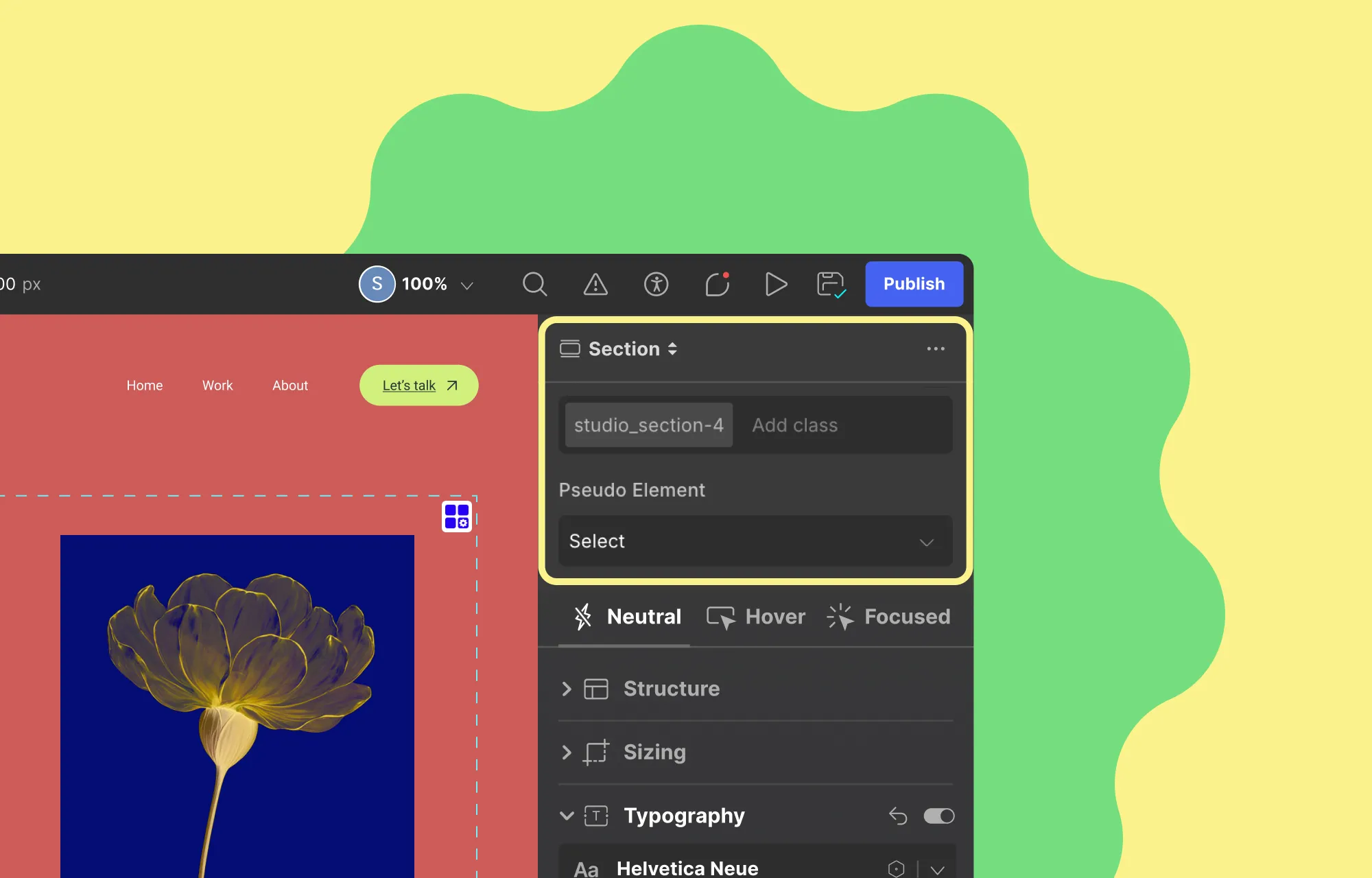
Step 1: Select the element you want to apply the glass effect to. Make sure it doesn’t have a background (or you can also reduce its opacity as a stylistic choice).
Step 2: Then, from the Style Panel, navigate to Effects > Filters, and select Glass.
Step 3: Adjust the glass effect settings, such as Refraction, Blur, Angle, etc, to fine-tune the look.
And voila, adding a sleek glass effect is just that easy with Droip!
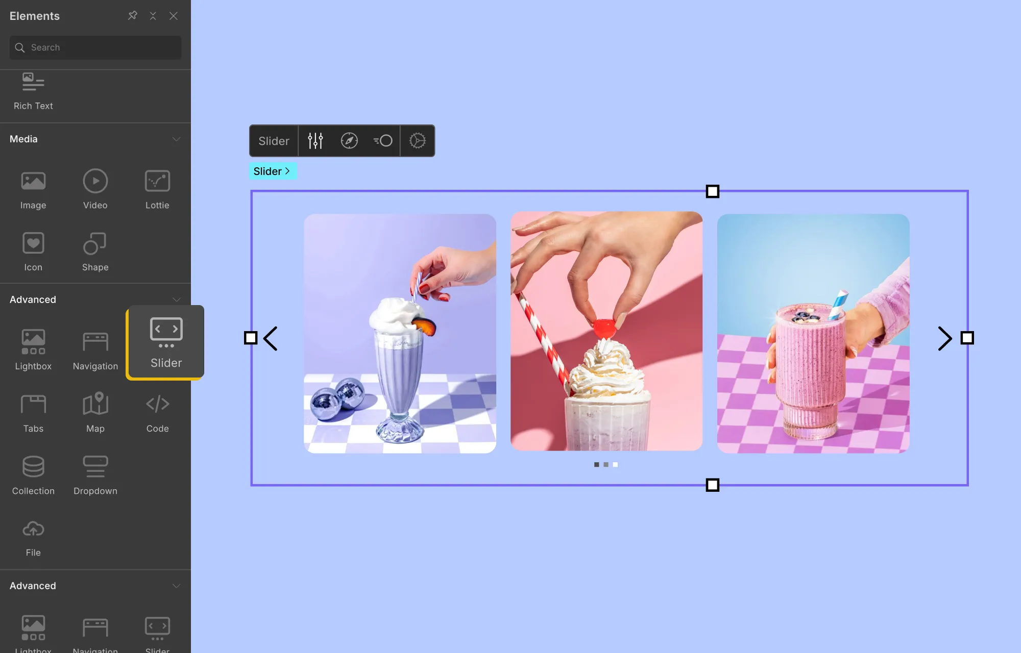
Interactive Cursor Trail Animation
Next up is an effect that instantly makes your website feel more interactive and playful: the Cursor Trail Animation.
This effect causes an element to follow the user’s cursor as they move across the screen or within a specific section, much like a visual trail.
Again, you don’t need to do any complex coding to implement this effect if you have a tool like Droip, which offers this feature also built in.
How to Add an Interactive Cursor Trail Animation:
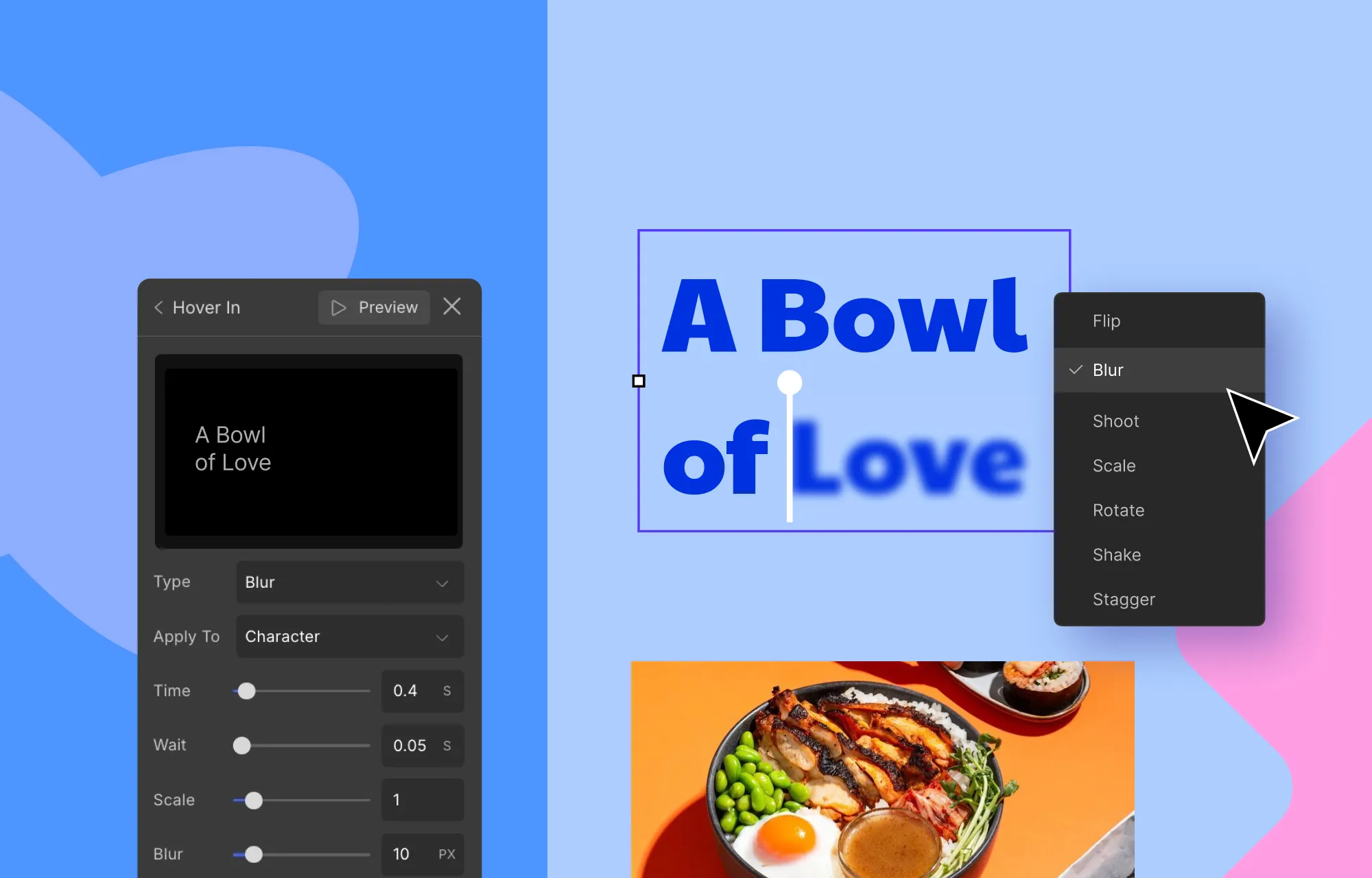
Step 1: Select your element and open Style Panel > Interaction, then click the plus (+) icon to add an animation.
Step 2: Set the trigger to Scroll Into View, click the plus (+) icon beside the Scrolled Into option, and choose Cursor Trail.
Step 3: Finally, choose whether the trail stays within the element’s Parent container or spans the Viewport, then adjust Smoothing to control how fluid the movement is.
Just like that, you’ve added an interactive cursor trail animation that brings subtle motion and personality to your site with no code required.
Playful Spring-Based Transition
Spring-based Transition is another effect that can add a natural, playful motion to your website.
Instead of moving an element from position A to B in a linear way, this effect mimics real-world physics to add a spring-like motion that feels smooth and eye-catching.
These transitions work especially well for hover interactions, button clicks, modal reveals, section animations, and more. When used thoughtfully, they add personality and create a memorable user experience.
You could create them visually by playing around with an element’s trajectory from A to B by stacking multiple interactions. But in Droip, achieving it is as easy as a few clicks.
How to Add Spring-Based Transitions in WordPress:
Step 1: Start by selecting your trigger element. In this case, it’ll be the card. Then, navigate to the Style Panel > Interaction to create your custom animation.
Now select your desired trigger and create any custom interaction.
Step 2: For this tutorial, we’ve gone for Mouse Hover. Under Hover In, choose Set New and select the target element you want to animate, which in this instance, is the content wrapper.
Step 3: With the content wrapper selected, add a Move action and set its Y-Axis value to 0 px. This allows the content to slide upward and reveal itself on hover.
At this stage, the animation will work but may feel a bit abrupt. This is where a Spring Transition can help smooth and spruce up the effect.
Step 4: For the Spring effect, go to Edit Transition > Timing and choose Custom. This will open the Custom Timing Editor from where you access the Spring tab. You can play around with the settings to get the desired effect.
Adding a Spring Transition to your design is really just that simple. But to enhance the interaction even further, let’s stack another action.
Step 5: This time, select the card element as the target and add the Radius action. Then, set all four corner values to 48px and once again apply the Spring Transition.
Step 6: Finally, duplicate your custom response for Hover Out and reverse the values. Reset the content wrapper’s Y-Axis back to 120px and return the card’s corner radius to 24px.
Now, when the cursor leaves, the animation will reverse smoothly with the same satisfying spring effect.
Advanced Text Effects: Shadows, Gradients & Clip Masks
Text does more than just fill space on a website. It highlights key messages, communicates your brand value, and drives action.
But often, important messages blend into the surrounding design and fail to stand out.
This is where advanced text effects can make a difference. A subtle shadow can improve readability and add depth. Gradients can make important headings stand out. And Clip Masks can create bold, high-impact visuals that instantly grab attention.
And with Droip, applying these effects is completely visual and straightforward, with no CSS tricks or complex code required.
How to Add Text Shadow:
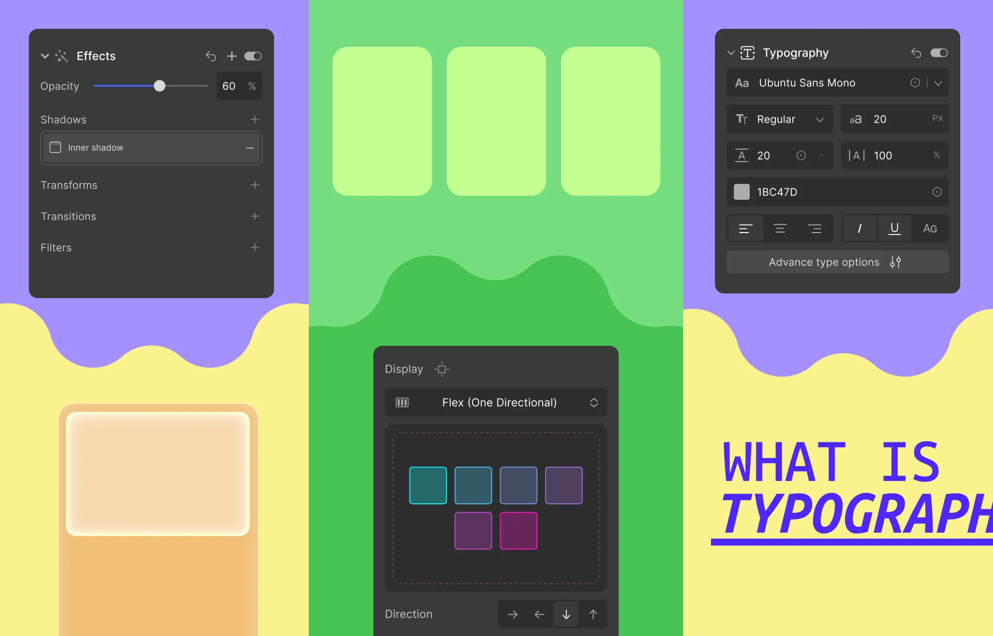
Step 1: Select your text element and go to Style Panel > Typography.
Step 2: From here, open Advanced Typography settings, and click on the plus (+) icon next to Text Shadow to enable it.
Step 3: Customize the shadow by adjusting the color, opacity, offset, and blur to get the preferred depth and contrast.
How to Create Gradient Text:
Step 1: Select your text element and go to Style Panel > Backgrounds.
Step 2: Add a linear, radial, or conic gradient. Then, use the available controls to choose colors, position the color stops, adjust the angle, etc., to fine-tune the look.
Step 3: Finally, set the Clip Background to Text to have the gradient apply only to the lettering.
How to Add a Text Clip Mask Effect:
Step 1: Similar to Gradient Text Effect, select your text element and head to Style Panel > Backgrounds.
Step 2: This time, add an Image Background and choose the image you want to use.
Step 3: Again, set Clip Background to Text to mask the image within the text.
Like this, with just a few clicks, you can turn plain text into a bold focal point.
With that said, do make use of these effects sparingly and strategically. You don’t want to create visual chaos and overwhelm the design, and reduce readability.
And apart from these effects, you can also animate text effortlessly in Droip. If you’d like to dive deeper, check out our full guide on How to Instantly Animate Text With No Code.
Level Up Your WordPress Website Game With Droip
From sleek glass effects to playful spring transitions and interactive cursor trails, these are just a few of the cool website effects in WordPress you can add without code, if only you have the right tools.
And Droip, implementing these effects (and many more) visually, is quick, effortless, and requires no extra plugins or costs.
So go ahead, level up your WordPress website game today, and bring it to life with Droip.
Wondering what splash pages are and why you might need one?
Well, splash pages aren’t for the faint of heart; they’re bold, attention-grabbing, and yes, often controversial.
But when used the right way, they’re more than just a flashy screen, serving a clear purpose while smoothly kicking off the user experience.
What Is a Splash Page
A splash page is an introductory screen that appears before visitors can access the main content of a website.
Typically bold and visually striking, splash pages were hugely popular from the late ‘90s through the mid-2000s. Back then, they were everywhere, packed with elaborate graphics, animations, and even background music, all designed to wow users the moment they landed on a site.
Over time, however, splash pages began to fall out of favor. They became overused and were often poorly executed, creating friction, slowing users down, and discouraging them from exploring the rest of the website.
With that said, splash pages never truly disappeared. Instead, they evolved.
Today’s splash pages are far more purposeful, used strategically to highlight important messages, guide visitors, or create focused entry points or tailored experiences.
Splash Pages VS Homepages VS Landing Pages
Splash pages might appear at the beginning of a user’s journey, but differ quite a lot from homepages or landing pages.
To start, splash pages are usually contextually minimal. They often just feature:
An eye-catching visual element
A concise message
A single, focused goal
Their primary purpose is to capture attention and direct visitors toward one specific action.
Homepages, in contrast, are content-rich. They offer multiple navigation pathways and serve several objectives at once, encouraging users to learn, explore, browse, or convert in various ways.
And while Landing Pages share the singular focus of splash pages, they are also content-rich. They provide context, persuasive elements, and even some navigation, all designed to drive users towards that specific goal.
Splash Pages VS Squeeze Pages
Splash pages are also often confused with squeeze pages, another popular page type in the web design and marketing industry.
While they may seem similar at first glance, their intent and execution are worlds apart.
A squeeze page is built around one clear objective: capturing visitor information, most commonly their email address, to grow a brand’s mailing list. It strips away distractions and focuses entirely on persuading visitors to submit their details, often in exchange for exclusive deals.
A splash page, on the other hand, isn’t necessarily about collecting information. Its primary role is to greet visitors and tailor their experience before they enter the main site.
In short, squeeze pages are conversion-first while splash pages are experience-first, setting the stage for what comes next.
Why & When To Add Splash Pages to Your Site
Splash pages went out of style because, more often than not, they interrupted visitors, disrupting browsing flow and contributing to higher bounce rates.
So why are they still in use? And when does it actually make sense to add one to your site?
It all comes down to intent and purpose. Modern splash pages often fulfill a specific job before visitors enter the main site.
Below are a few examples:
Direct Users to the Right Experience
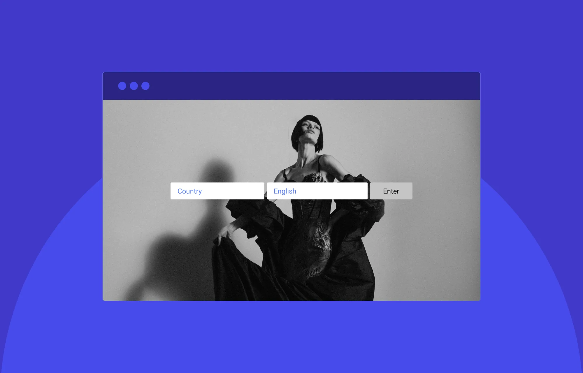
A popular use case, splash pages can be used to route visitors to the most relevant version of your site based on their preference, helping them start in the right place instead of having to hunt for it.
A great example of this is Dior, which lets users choose whether they want to explore their fashion & accessories line or their fragrance & beauty range.
Deliver Region-Specific Experiences
Similarly, splash pages also let visitors choose their preferred region or language upfront. This avoids disruptions after they enter the main site and ensures a more relevant, tailored experience from the start.
Handle Compliance or Access Restrictions
For age-restricted or gated sites or sites that require compliance agreement from visitors, splash pages offer a simple way to collect that information before entry.
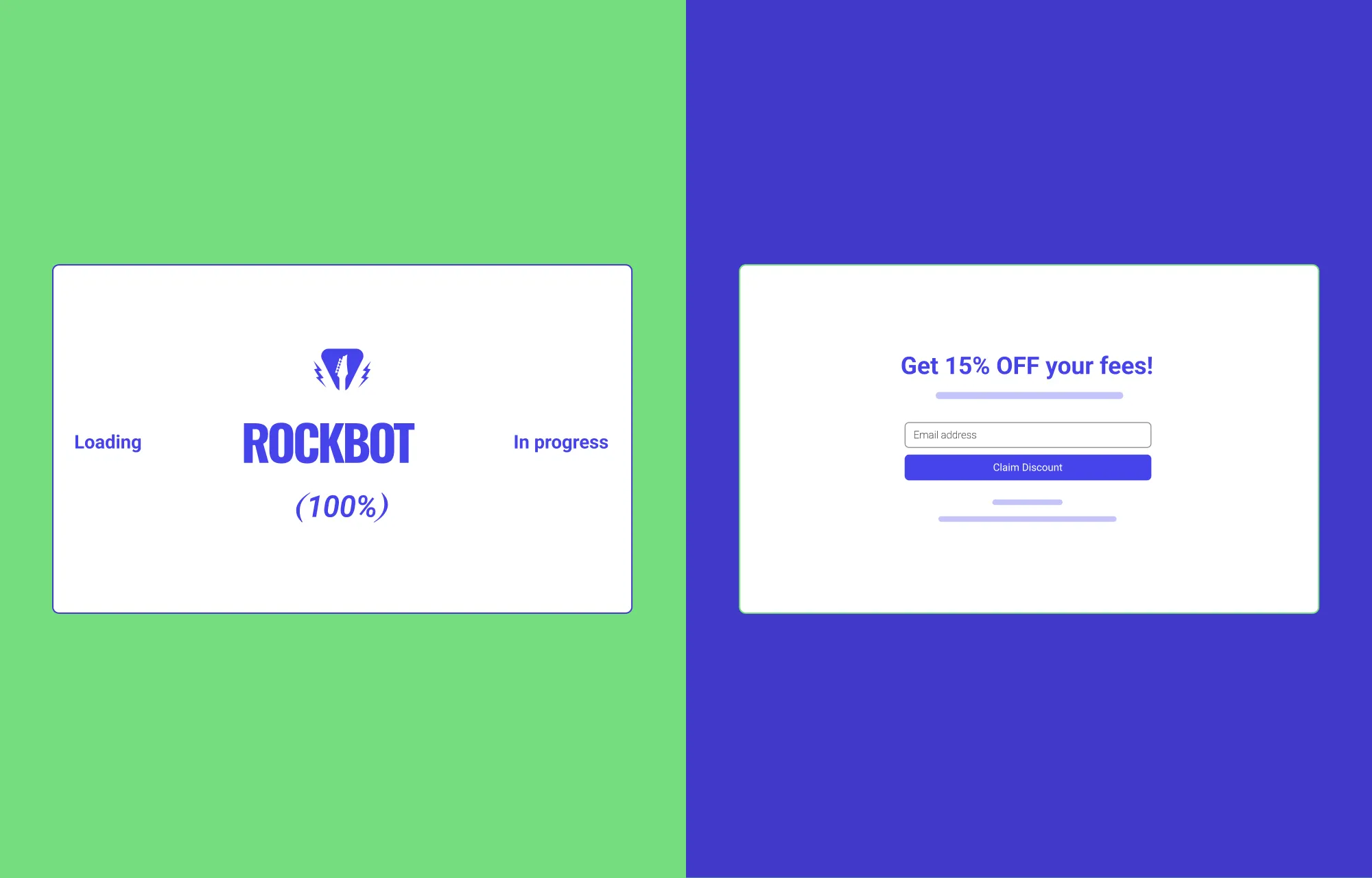
Improve Perceived Load Times on Content-Heavy Sites
Splash pages can also act as a brief welcome mat, appearing for a few seconds while content-heavy sites load, often paired with subtle loading animations. This helps improve perceived load times and reassures visitors that the site is working, reducing impatience, frustration, and bounce rates.
And beyond pure necessity, when executed right, it honestly just looks cool, building anticipation and sparkling intrigue.
A great example of this is STR8FIRE, which features a 90s-inspired booting screen.
Creating Exclusivity or Hype
Last but not least, a well-designed splash page can also set the tone for your brand, giving visitors a premium first impression and creating hype. This works especially well for product launches, new campaigns, and high-end brands.
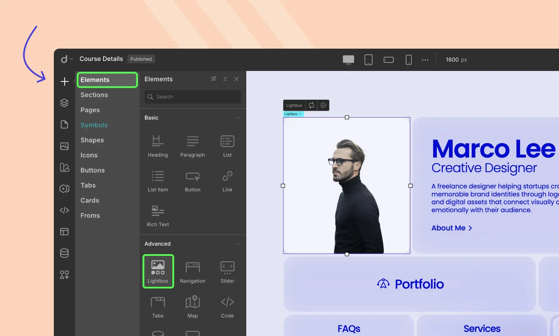
Creating Splash Pages in WordPress
The easiest way to create splash pages in WordPress is by choosing the right modern website builder.
A good no-code tool should give you the creative freedom and intuitiveness you need to design splash pages effectively and effortlessly.
And while WordPress offers plenty of options, when it comes to flexibility and intuitiveness, the Droip WordPress website builder stands out.
Not only does it deliver webflow-style creative freedom and advanced functionality, but it also comes with pre-made sections, pages, templates, and tools that make building splash pages faster and easier.
On top of that, features like Dynamic Content Manager, Real-time Collaboration & Coediting, Figma to WordPress handoff, and more, make Droip a true one-stop, cost-effective solution, designed to make building not just splash pages but entire websites accessible to everyone.
Step 1: Install & Set Up Droip
To build splash pages in WordPress with Droip, the first step is to install and set up the no-code tool.
This is super easy. Just do the following:
Create an account on the Droip website and purchase the plan that fits your needs.
From the Droip Account > Downloads, save the latest version of Droip.
Visit your WordPress Site’s Backend Dashboard, go to Plugins > Add New, and click on the Upload Plugin button.
Then, click on the Choose File button and select your plugin zip file. Once the file is uploaded, hit Install Now.
After it’s successfully installed, activate your plugin.
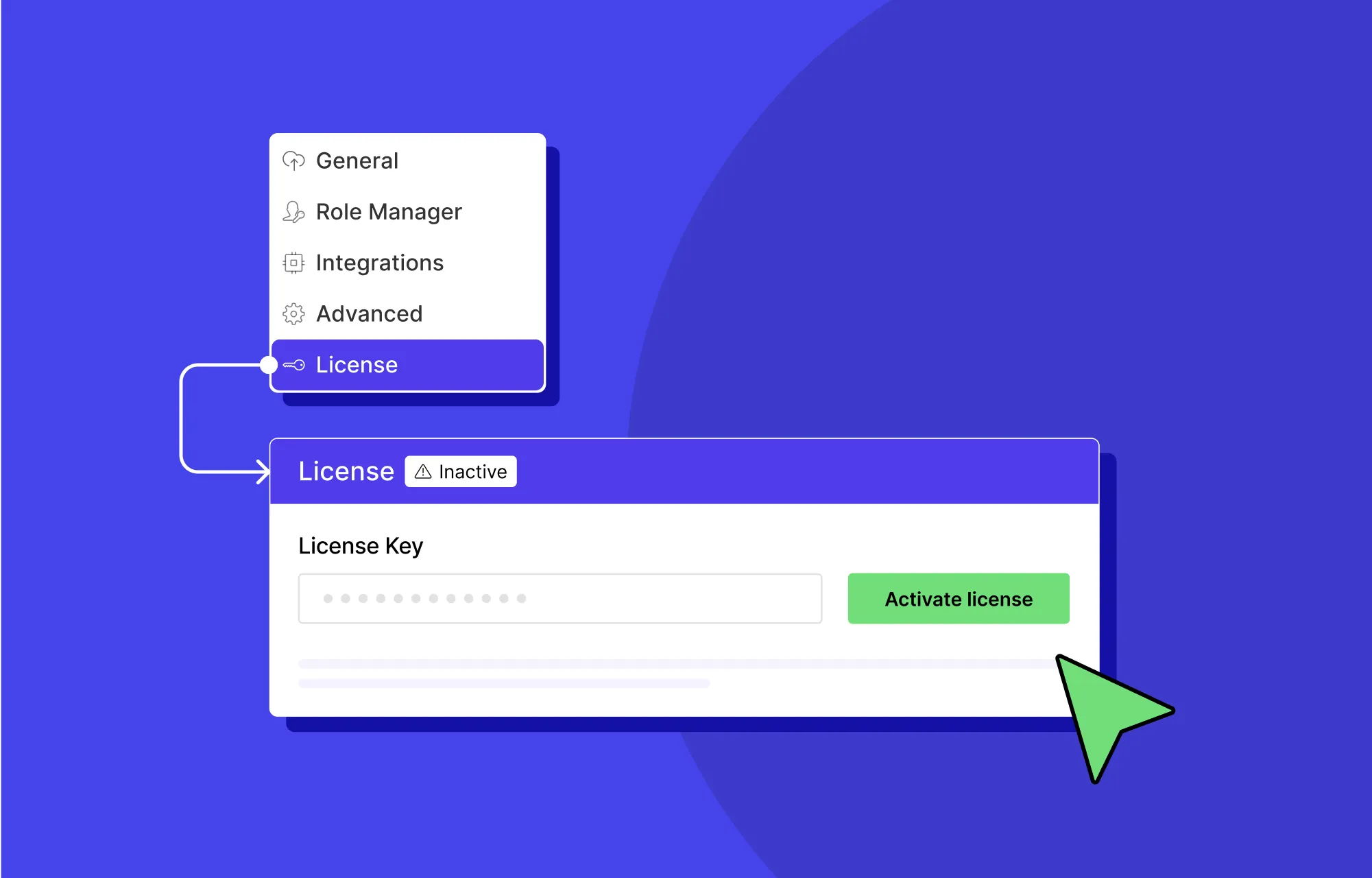
License Activation
Next, it’s time to activate your license:
First, log in to your Droip account and go to Subscriptions > Licenses.
Click on Add Website, enter your site URL, and hit Submit to generate a license key.
Finally, copy your license key and paste it into WordPress Dashboard > Droip > Settings > License, then click Activate.
And that’s it! Now you’re all set to start building websites with splash pages using Droip.
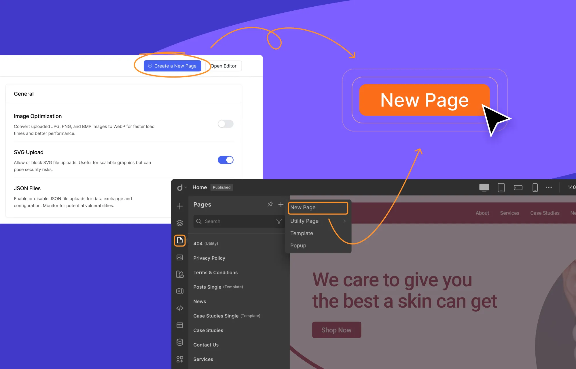
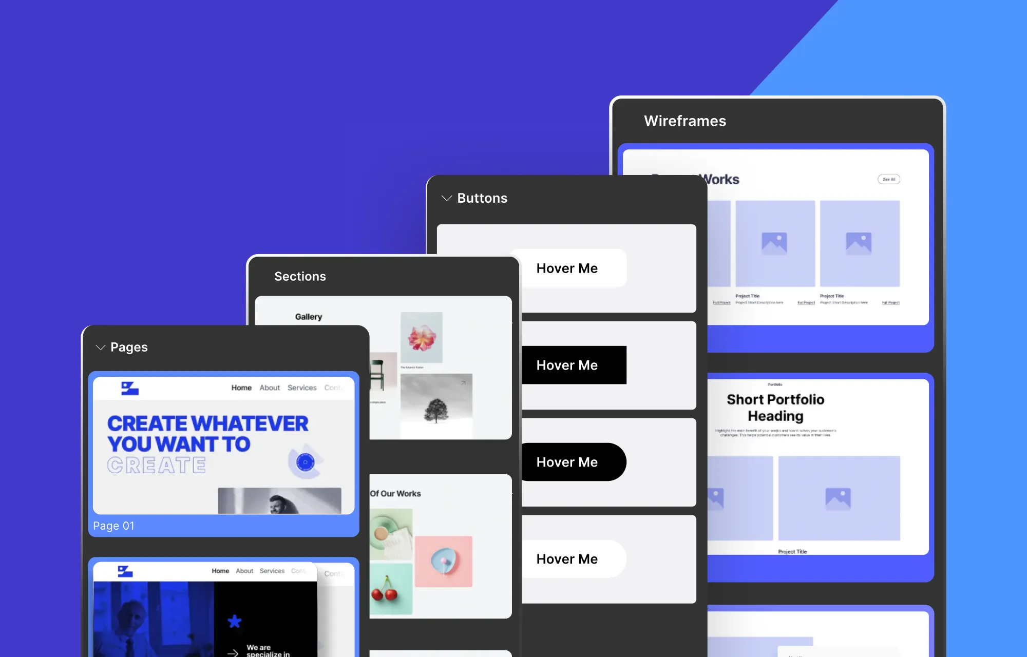
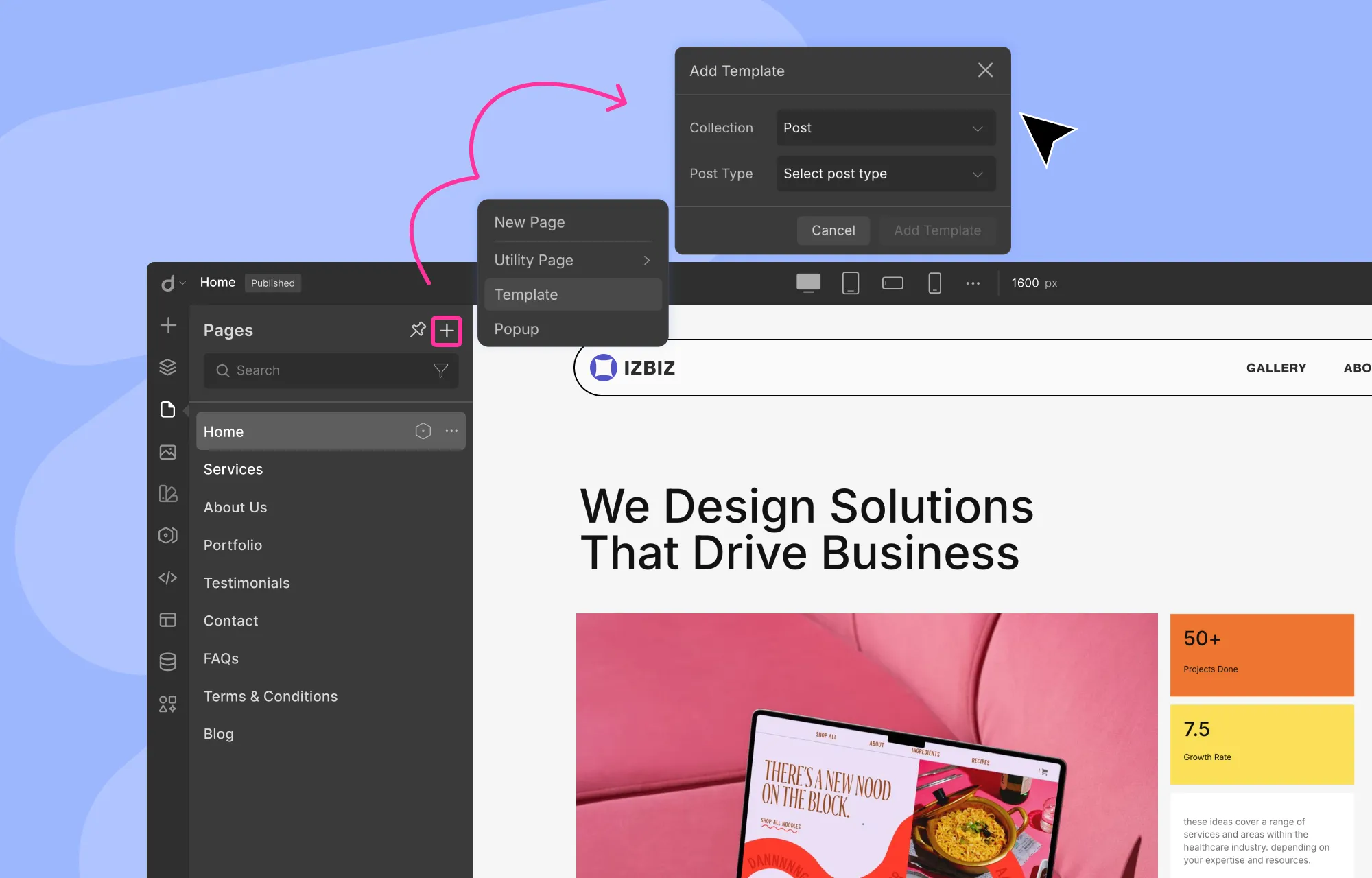
Step 2: Create a Page in Droip
Once Droip is set up, the next step is to create a new page. You can do this in two ways.
You can either do this from the WordPress Dashboard > Droip > Settings and clicking on the Create a New Page button.
Or, if you’re already inside the editor, you can go to the left side panel, navigate to pages, click on the plus (+) icon, and select the New Page option.
And just like that, you’ll have a fresh, blank canvas ready to build on.
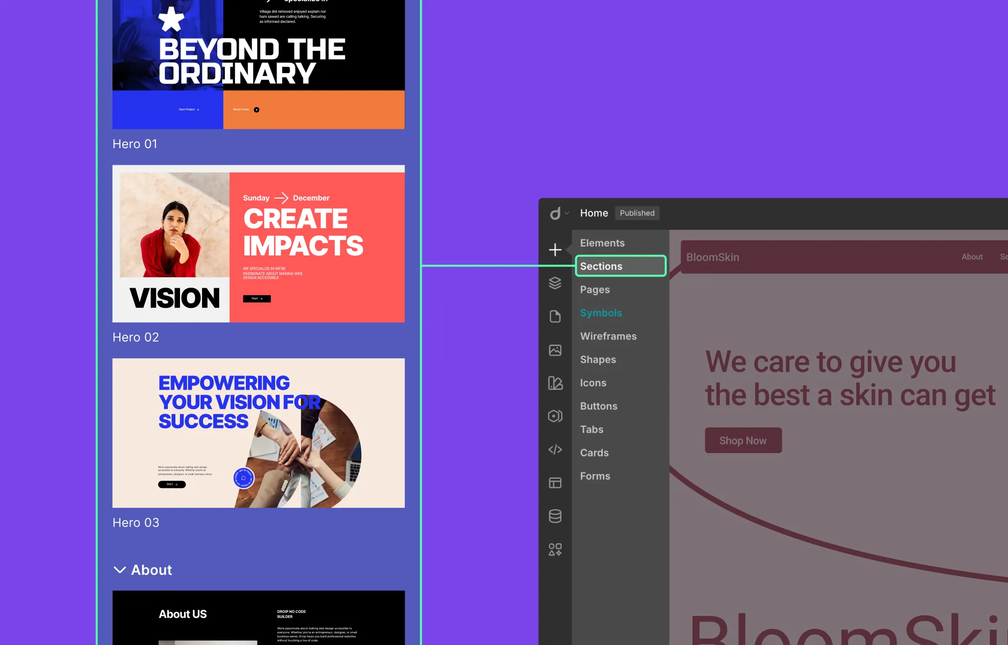
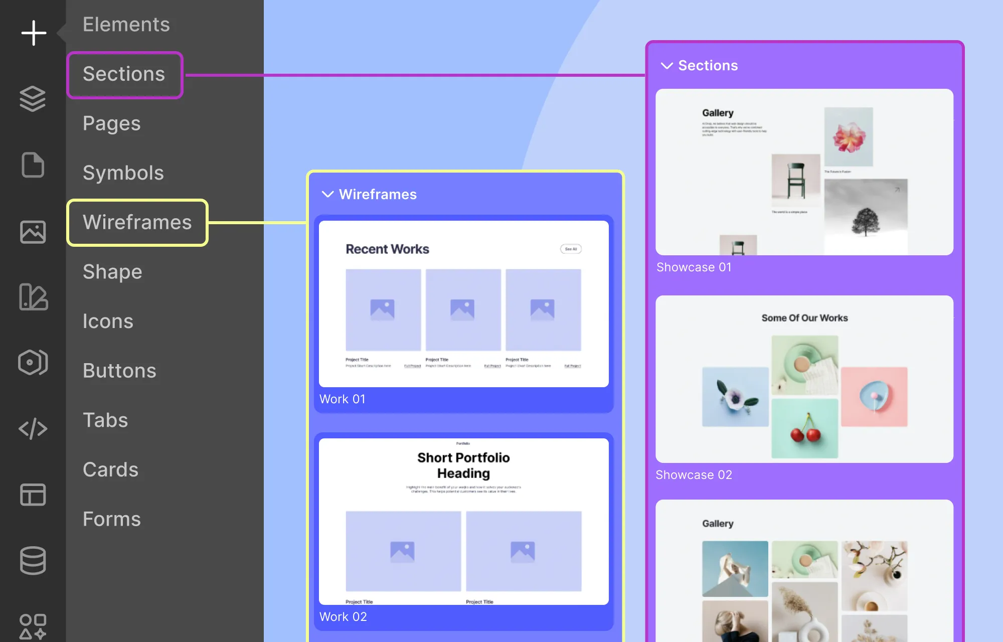
Step 3: Pick a Pre-Made Section in Droip
Droip gives you plenty of options when it comes to building your splash page.
You can design it entirely from scratch using Droip’s wide range of elements. Or, if you want to move faster, Droip’s pre-made sections let you get started quickly without sacrificing flexibility.
To add a section in Droip:
From the left side panel in the Droip editor, click on the plus (+) icon, and select Sections.
Scroll through the available options and click on the section that fits your purpose.
Once added, the section will appear instantly on the canvas, ready to be customized to match your purpose.
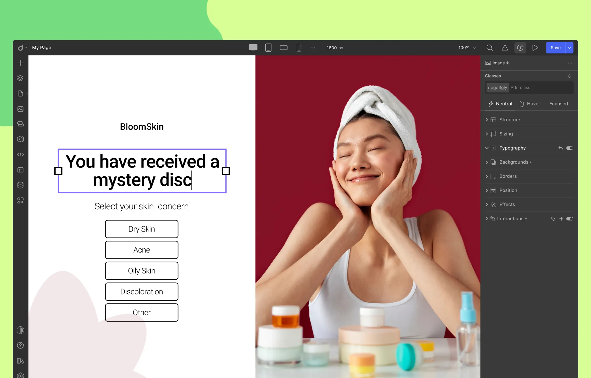
Step 4: Add Content to Your Splash Page
Once you’ve added a section, it’s time to replace the placeholder content with your own:
Update Text: Double-click any text element and start typing.
Replace Media: Select the media element, then click on the Replace Image icon in the inline editor.
Edit Buttons: Double-click the button text to change it, and to update the link, select the button, click on the link icon in the inline editor, and paste your URL.
And voila, just a few clicks, and your content is showcased exactly how you want it!
Like this, you can visually update all your content with ease. However, if the premade section you’ve chosen doesn’t quite fit your content, no problem.
You can easily fine-tune the layout by adding new elements from Droip’s Element Library or removing existing ones to better align with the content and purpose of your splash page.
Play around with Droip’s layout elements and Structure settings in the Style Panel to get the desired look.
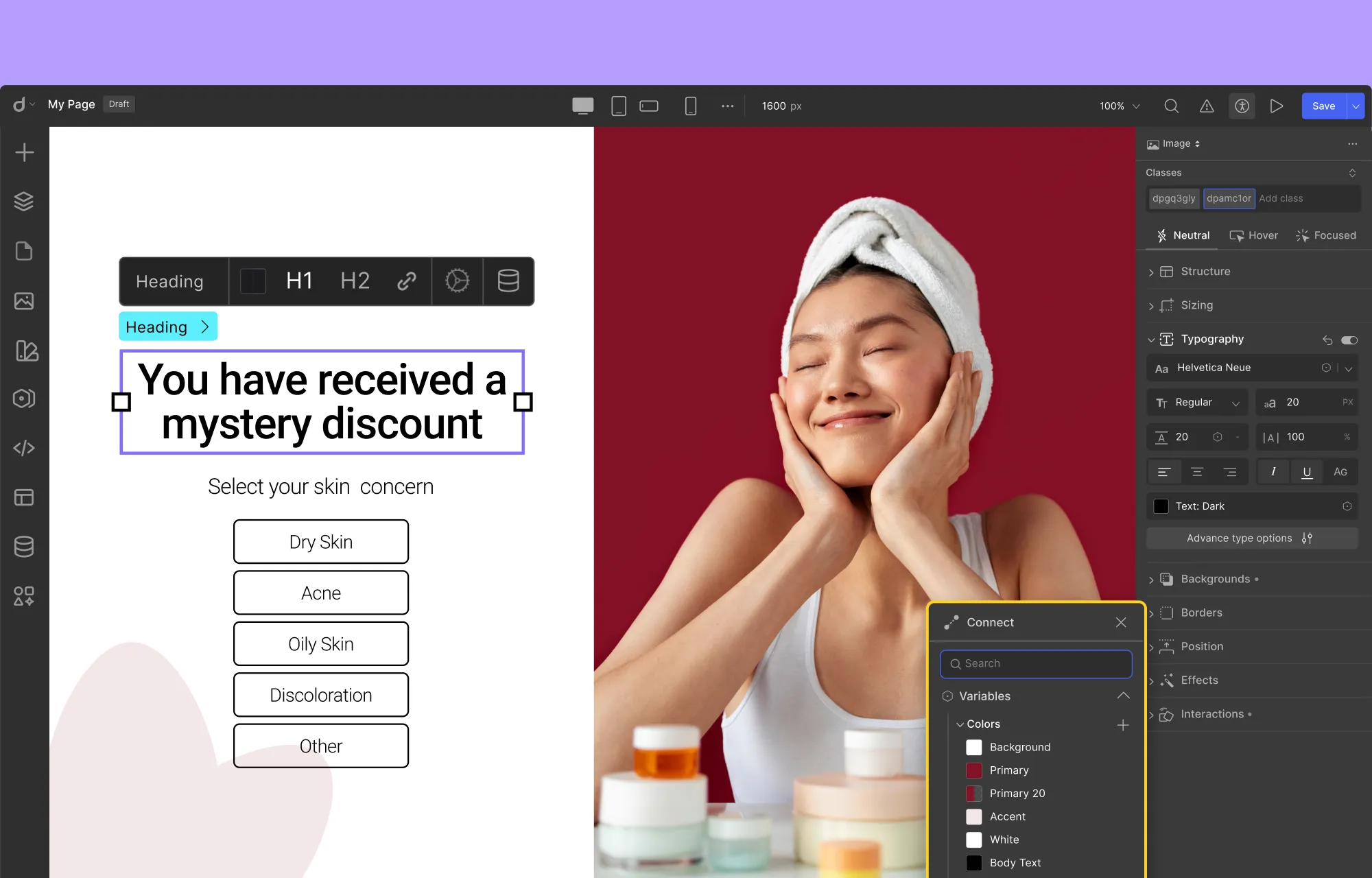
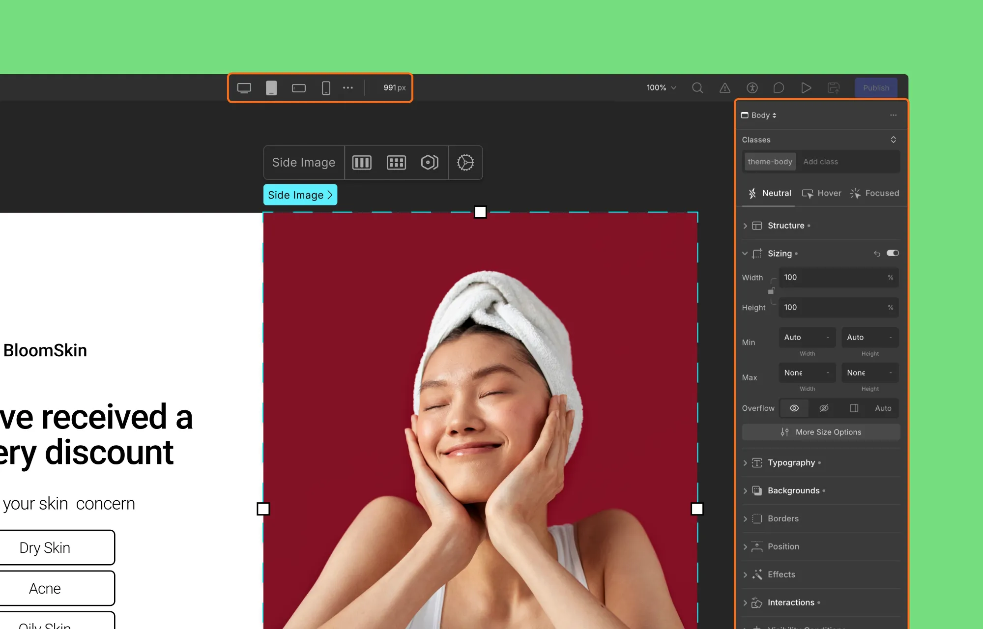
Step 5: Customize Your Splash Page
Your splash page is coming together nicely!
The next step is to customize it so it reflects your brand identity and stays cohesive with the rest of your site’s design.
This is easy with the Style Panel. Simply:
Select the element you want to edit,
Head over to the Style Panel,
and adjust Structure, Typography, Sizing, Background, and more.
You can also use tools like Variables in Droip to save your style choices for reuse and maintain a cohesive design across your site.
And features like Class Manager and Symbols can further help you stay consistent and speed up your workflow.
Step 6: Make Your Splash Page Responsive
Just like any good website page, your splash page, being the visitor’s first impression, needs to look great on every device.
Luckily, Droip makes this easy. With unlimited custom Breakpoints, you can ensure your splash page displays seamlessly across desktops, tablets, mobile devices, and more.
To make your splash page responsive, do the following:
In the Droip editor, from the top bar, switch between the default breakpoints like tablet, phone, etc.
If your desired screen size isn’t part of this, click the ellipsis icon, select Add Breakpoint, and define your custom breakpoint.
After switching to a different breakpoint, look for any design discrepancies on that screen size.
To fix them, select the element and adjust it using the Style Panel options. Also, these adjustments will automatically apply to smaller screens, reducing repeated changes and speeding up the process.
When you’re done, switch back to the Desktop breakpoint to return to the original view.
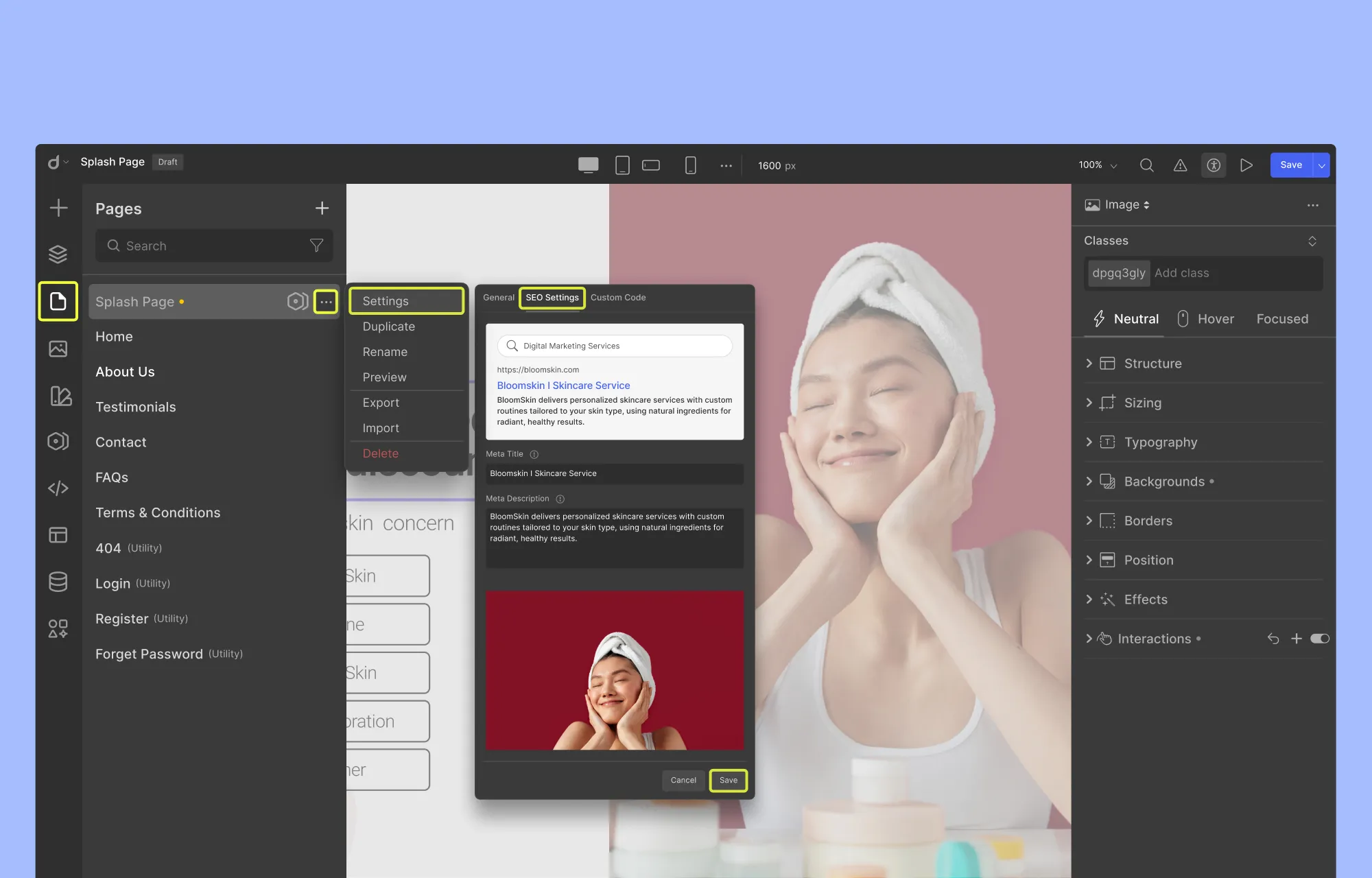
Step 7: Set Your Splash Page SEO
Your splash page should be nearly ready, but there are still a few behind-the-scenes details to configure, starting with optimizing for SEO.
Since Droip is an all-in-one solution, you can manage your splash page’s SEO directly within the editor.
This includes setting the meta title and description, uploading an OpenGraph image, and more.
To configure your splash page SEO:
From the left side panel, click Pages and locate your Splash page.
Then, click on the ellipsis icon and select Settings.
Here, open the SEO Settings tab, and fill in the required fields as instructed.
Click Save, and you’re done.
With that done, your splash page is now search-ready and properly optimized before it goes live.
Step 8: Configure Your Splash Page and Publish
Before publishing, take a moment to configure and test your splash page to ensure everything works as intended.
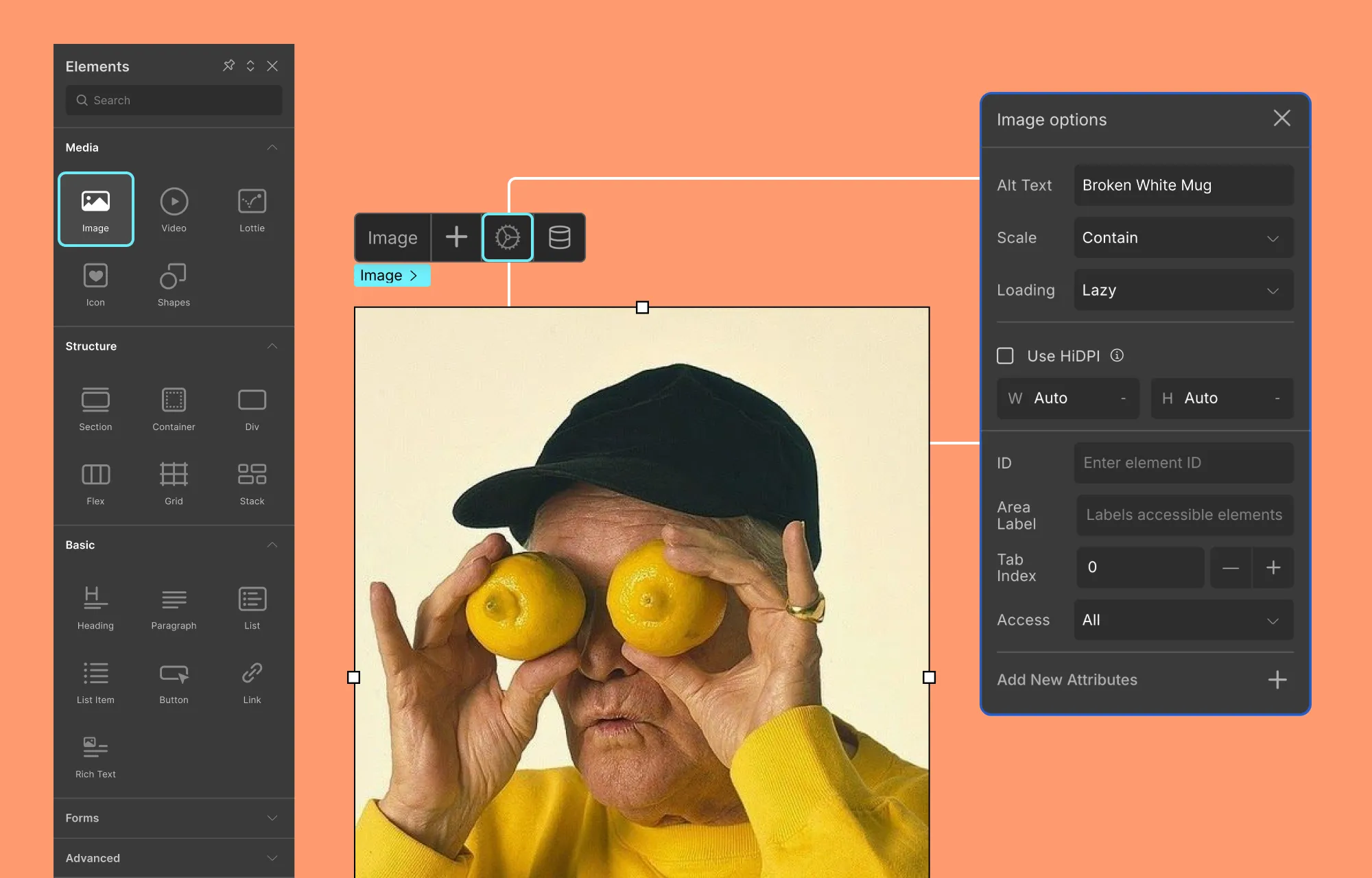
Start by setting your splash page as the first page visitors see when they land on your site. Next, review all essential details like link and button destinations, image alt text, etc.
Droip makes this easy with its built-in Audit tool, which automatically scans your page for issues like missing links, alt text, and other oversights.
Once that’s done, run a quick performance check. Also, make sure features like Image Compression and Video Lazy Loading are enabled to keep load times fast.
When everything looks good and works smoothly across all devices, go ahead and hit publish.
Wrapping Up
Splash pages may have had a rocky history, but when used with clear intent, they’re still a powerful tool in modern web design.
Whether it’s confirming visitors’ language or region, guiding them toward a tailored experience, or simply making a bold first impression, a well-designed splash page sets the stage for everything that follows.
With Droip, creating splash pages in WordPress is both flexible and fast. From pre-made sections to built-in accessibility, SEO, performance, and other tools, everything you need exists right inside the editor.
So, are you ready to build your own splash pages in WordPress? Start your journey with Droip today.
With so many beauty studios, spas, and wellness spaces crowding the internet, how do you stand out?
It starts with a website that doesn’t just look good, but is flexible, scalable, and built to convert.
That’s why WordPress remains a go-to platform for most brands. It gives you the freedom to customize, evolve, and grow without limits.
And when it comes to standing out, what you need is a WordPress theme that’s more than just pretty.
So here are some handpicked top health and beauty WordPress themes designed to convert visitors into bookings.
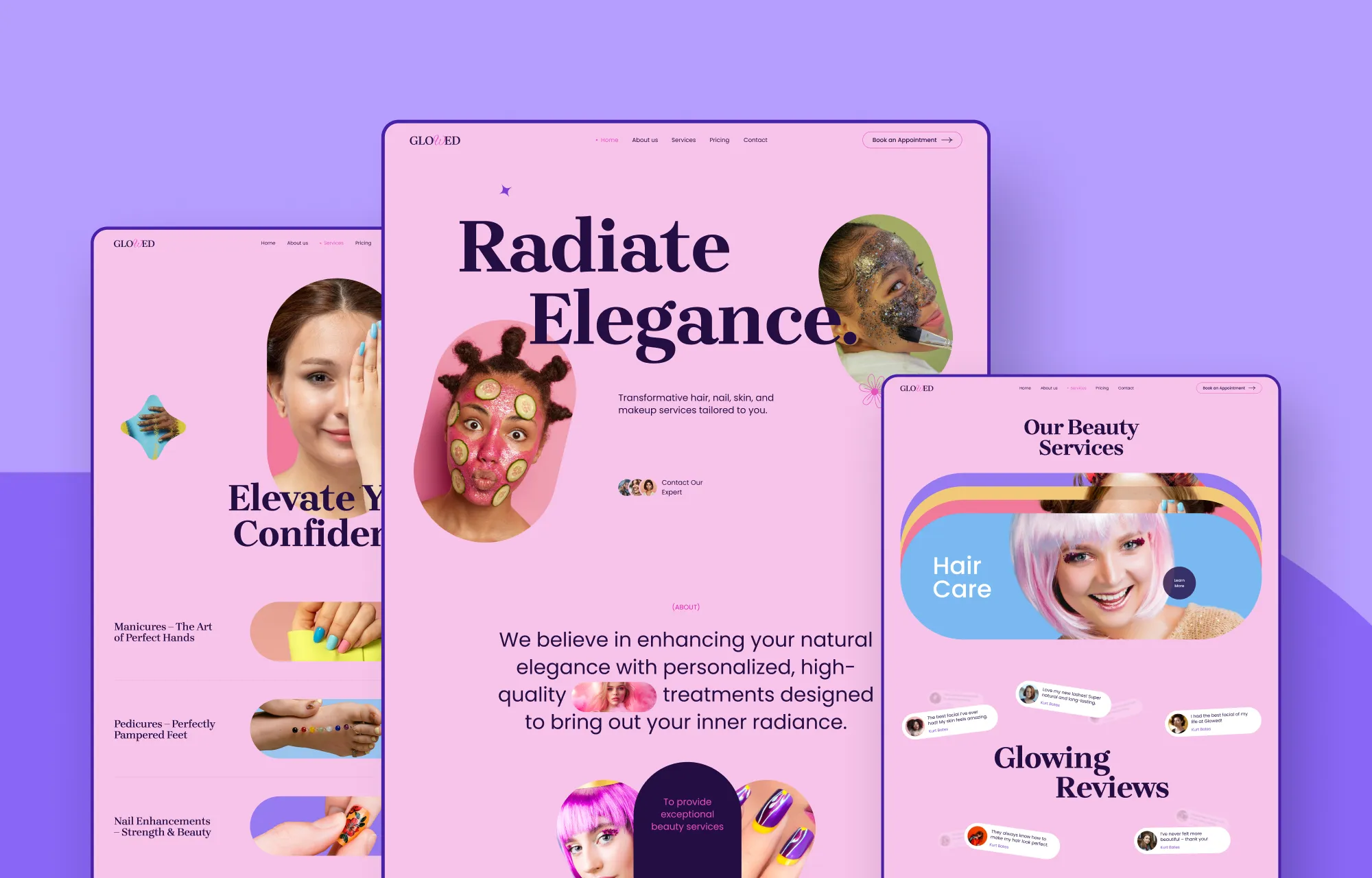
1. Glowed
Kicking off the list is Glowed, a beauty and spa WordPress theme that’s built to make a lasting impression.
With its bold, vibrant aesthetic, Glowed grabs attention instantly. The landing page is built for conversion, featuring animated image slideshows to showcase your work, interactive service sections, and standout testimonial layouts that build trust at a glance.
You’ll also get all the essential pages like About, Services, Pricing, and most importantly, Booking, so you have everything you need to go live and start turning visitors into clients right away!
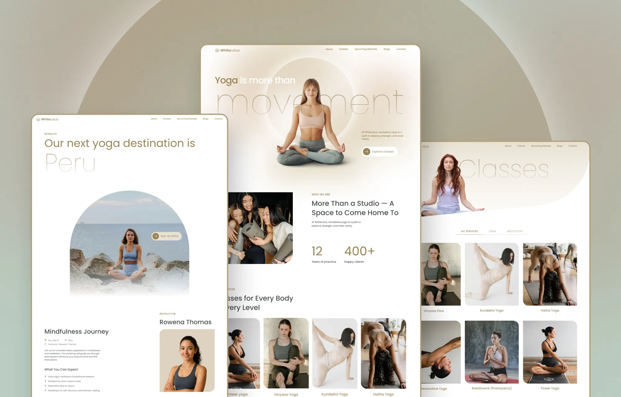
2. White Lotus
Next up is White Lotus, a beautifully crafted yoga studio WordPress theme that’s just as perfect for fitness centers, personal trainers, pilates instructors, and more.
Featuring a warm, clean aesthetic, eye-catching text animations, and strategically placed visuals, White Lotus is designed to captivate.
And packed with other fully functional essential pages, like a Class listing, Upcoming Retreats page, Blog, and a Contact page with built-in forms, showcasing your offerings online is made effortless.
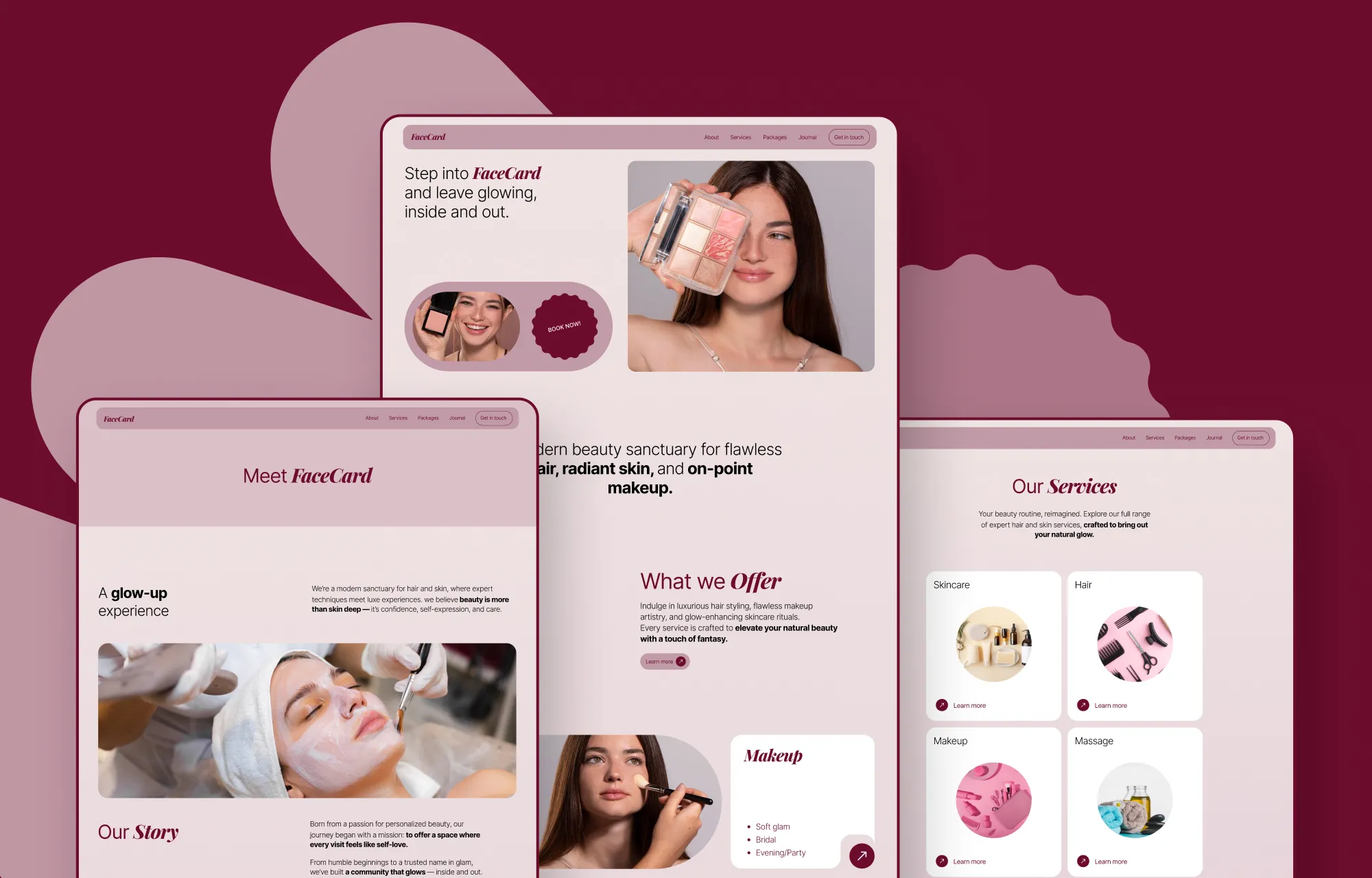
3. Facecard
Facecard is another stunning beauty and spa WordPress theme built with salons, makeup artists, nail studios, spas, and other beauty professionals in mind.
Through its elegant pages, you can captivate your audience, clearly showcase your services and pricing, and connect with potential clients through the built-in booking form on the contact page effortlessly!
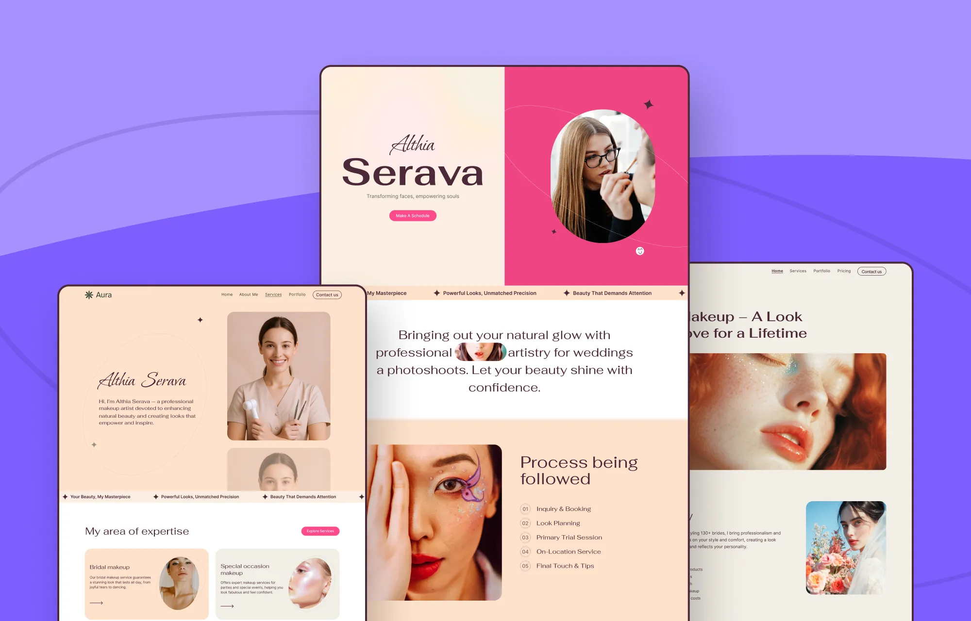
4. Aura
Then we have Aura, a makeup and beauty WordPress theme specifically designed for makeup artists who want to showcase their creativity in the best possible light.
From a visually driven landing page to a filterable portfolio that lets visitors browse your looks with ease, along with a clean, informative Services page, everything is designed to guide users smoothly from admiration to action.
Paired with a dedicated Blog section to help you share tips, trends, and updates, Aura makes it easy to connect with your audience and grow your brand online.
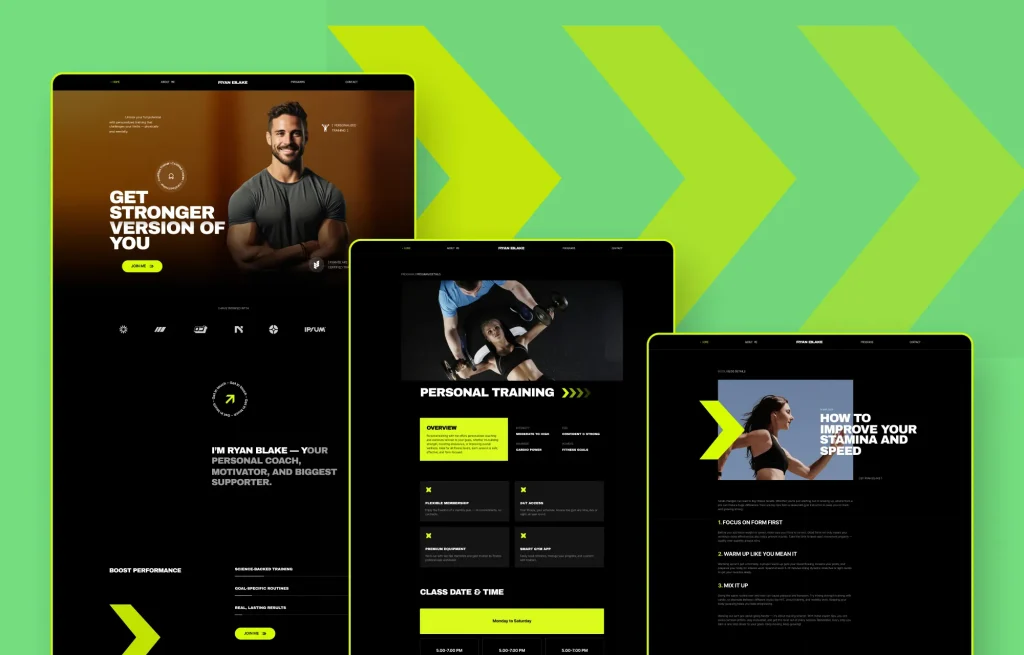
5. Bison
Last but definitely not least is Bison, a fitness and gym WordPress theme built for brands that thrive on results.
Perfect for personal trainers, gyms, pilates instructors, wellness studios, and beyond, Bison delivers a bold, high-impact design that instantly motivates visitors to take action.
With powerful visuals, structured layouts, and clear CTAs, it’s designed to push users from interest to commitment, whether that’s becoming a member or getting in touch to learn more.
What to Look for in a Beauty Theme
When it comes to building a successful beauty, wellness, or fitness website, good looks are just the starting point.
Your beauty WordPress theme should do more than impress at first glance. It should also showcase your services clearly, highlight your work, build trust, and guide visitors toward booking, signing up, or getting in touch.
So here’s what really matters when choosing the right beauty theme:
Responsive, Scroll-Stopping Design
In the beauty industry, good visuals are a no-brainer. So look for themes with striking layouts, smooth animations, and responsive designs to ensure your site looks modern and flawless on every screen.
Clear and Conversion-Ready Service Listings
From facials and makeovers to pilates classes and skin treatments, your services should be easy to browse and even easier to understand.
So, find the right theme that presents everything clearly in a way that lets visitors know exactly what you offer and how to take the next step.
Portfolio and Work Showcases
Your work is your biggest selling point. Choose a theme that puts your looks, transformations, sessions, etc, front and center through beautiful galleries and layouts designed to make them shine.
Flexible Customization With No Code
Every brand has its own style, and a website should reflect that. A great beauty theme should be easily and fully customizable without the need for any coding.
Optimized Performance and Speed
A slow website can ruin even the most beautiful design, instead frustrating visitors and hurting your SEO. So choose a beauty WordPress theme that’s optimized for fast loading and smooth performance across all devices.
Smart Pricing
Finally, a good beauty theme is one that also fits within your budget while still giving you the features and flexibility you need to grow your business.
Free WordPress Themes Powered By Droip
Now that you’ve seen what to look for in a beauty theme, you might notice a pattern across the ones we’ve listed.
Naturally, we’ve picked ones that are visually polished, easy to navigate, packed with the right pages, and built to convert.
Through the builder’s intuitive visual editor and freeform canvas, you can easily tweak layouts, adjust styling, add entirely new sections and pages, and more.
You also get access to all of these themes completely free, with no extra cost, no matter how many you try or switch between.
And if you need more advanced workflows, Droip supports things like instant Figma to WordPress handoff, dynamic content, real-time collaboration & co-editing, and more, so your site can evolve without relying on extra plugins or added costs.
On top of that, Droip outputs clean, bloat-free code with auto-compressed CSS and JS, so your site loads quickly and performs flawlessly.
All of this means you’re not just getting a theme but a flexible foundation that can grow effortlessly with your brand.
Getting Started With Droip WordPress Themes
Building a beauty website with Droip is quick and easy. In just a few steps, you can have a fully functional, stunning website ready for launch.
Install and Set Up Droip
The first step is, of course, installing Droip, and it’s fast and straightforward. Here’s how:
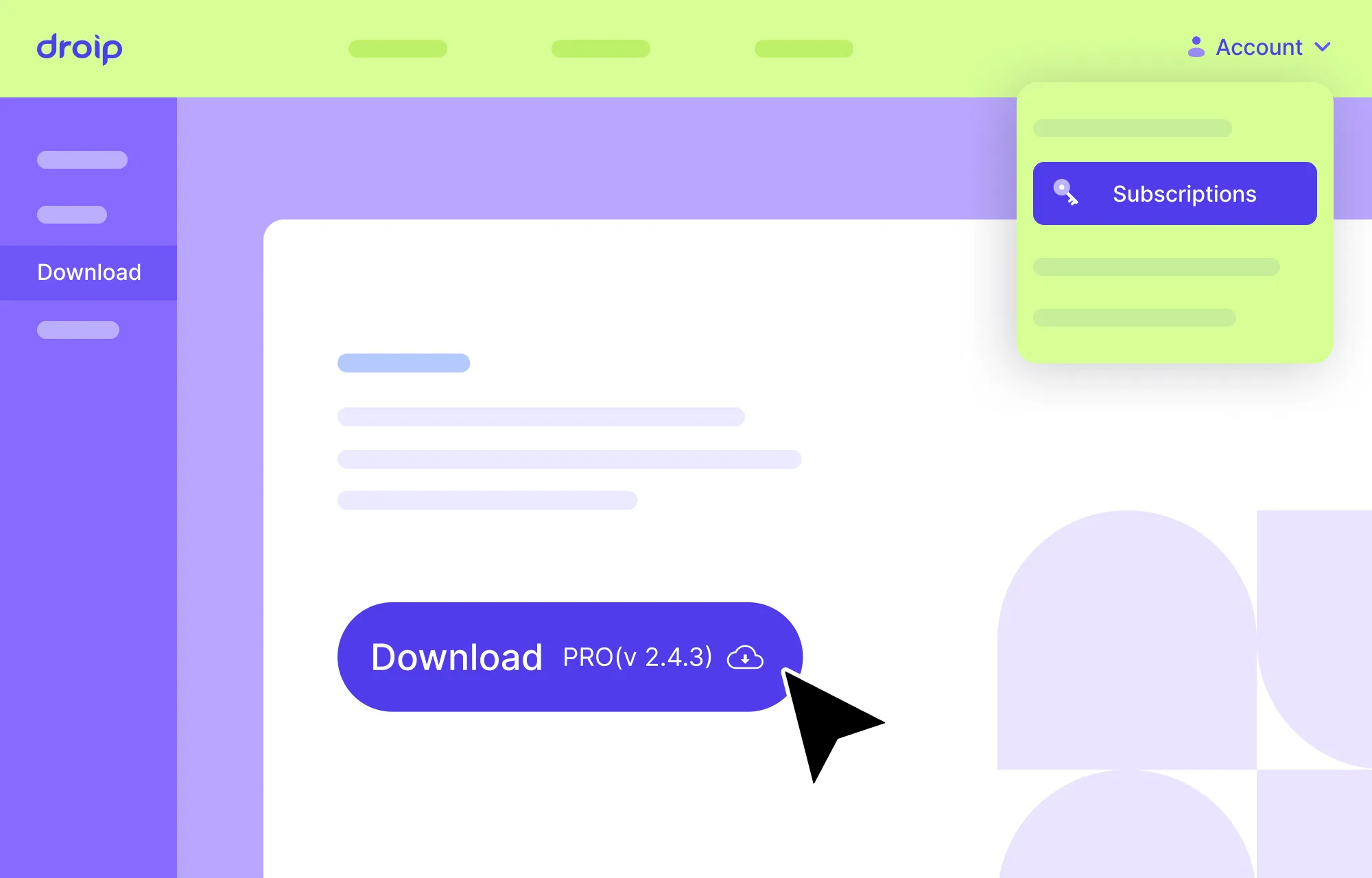
Step 1: Create an account on the Droip website and purchase the plan that fits your needs.
Step 2: From your Droip account, go to Downloads, and save the latest version of Droip.
Step 3: Now go to your site’s WordPress dashboard, navigate to Plugins > Add New > Upload Plugin, and upload the file you just downloaded.
Step 4: Click Install and then Activate.
Step 5: Finally, go to the Droip Account > Subscriptions > Licenses, add your site, copy the license key, paste it under WP Admin > Droip Settings > License, and click Activate.
Install Your Free WordPress Theme
Once Droip is active, installing any of Droip’s free WordPress themes is just as easy:
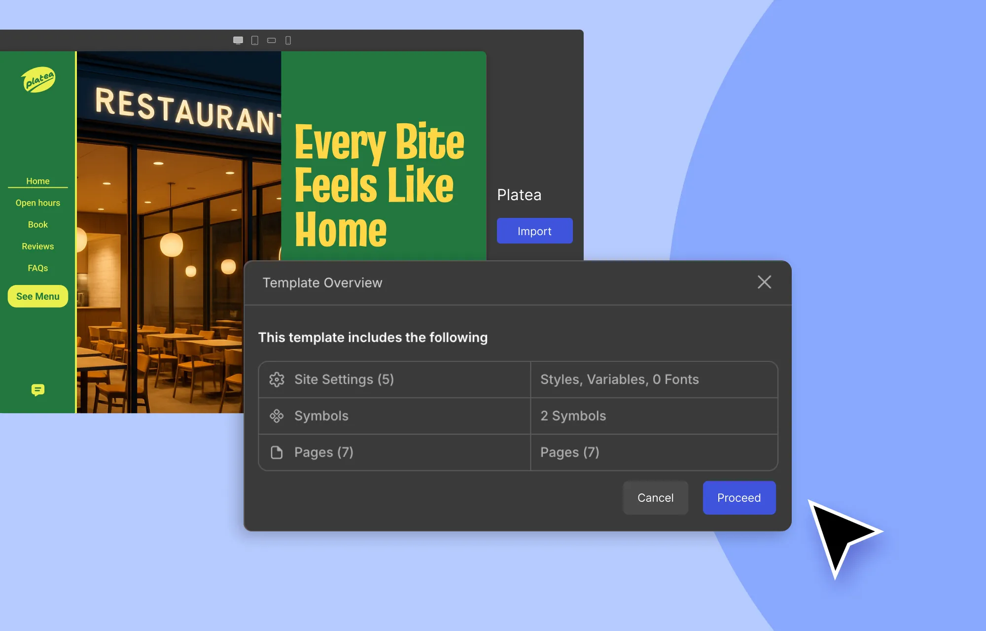
Step 1: In the Droip editor, click on the Templates icon in the left sidebar.
Step 2: Browse the Template Library to find a beauty, spa, or wellness template that matches your brand.
Step 3: Click on a template to view its details, then hit Import and Proceed to add it to your site.
That’s it, your essential pages, their content, and site settings are now in place!
From here, you can:
Swap in your own content and images.
Create custom content types and display content dynamically.
Visually fine-tune the design to make it your own.
Add any extra functionality.
…All without the need for any extra plugins or code.
💡 Note: We recommend using the Droip Base Theme with these templates. Download it from your Droip account (Account > Downloads), then upload, install, and activate it via WP Admin > Appearance > Themes.
Build Websites That Convert Visitors Into Bookings
So those were our picks of the top beauty WordPress themes!
With Droip’s collection of free WordPress themes, you’re not just getting a beautiful website design but an entire web stack needed to build, launch, and grow a modern website, all in one solution.
So what are you waiting for? Launch your dream beauty website today and start converting visitors into bookings in no time!
As 2025 draws to a close, it’s time to roll the ending credits to another action-packed year with Droip.
Join us as we revisit the innovations we built, the content we broadcast, and look to the exciting things brewing on the horizon.
The Built: What We Shipped in Droip This Year
2025 was all about turning big ideas into reality.
So here’s everything we shipped in Droip 2.0 and beyond, packed with transformative new features and enhancements!
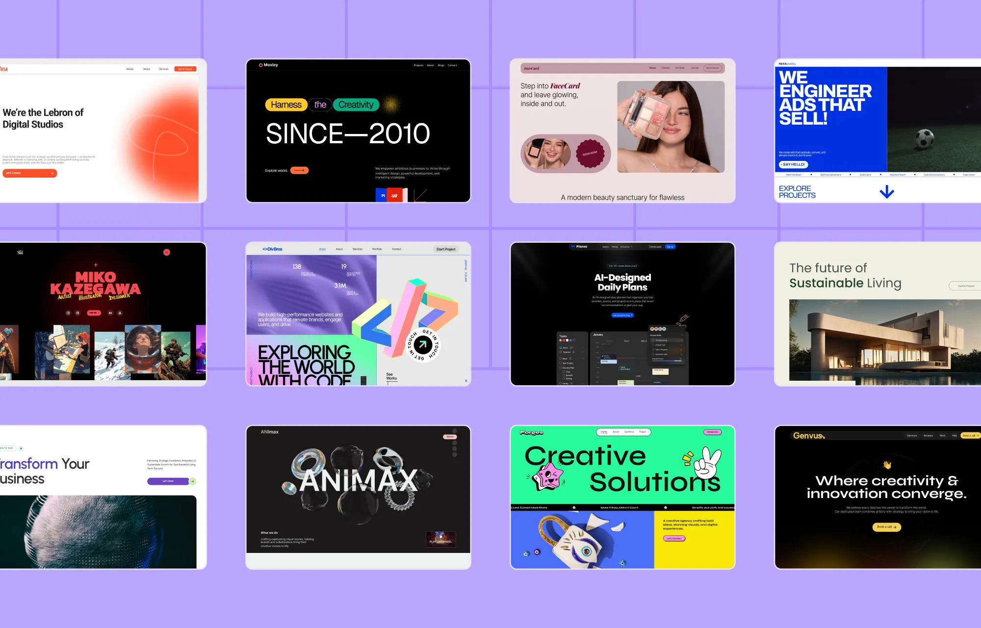
Released 75+ Free WordPress Themes, Ready For Launch
This year, we launched and expanded the Droip Template Library, releasing over 75 free WordPress themes, giving creators a fast and easy starting point for any type of website.
From portfolios and agencies to restaurants, spas, fitness centers, and everything in between, there’s something for every brand or service.
We also worked towards giving consistency a serious upgrade with the introduction of Global CSS Variables, helping users achieve truly synchronous web design while streamlining their entire workflow.
Variable Modes took it even further, allowing users to switch between different style variations instantly, making cohesive design even more flexible!
Throughout the year, this quickly became an essential part of the toolkit for creators working across multiple pages, layouts, and scalable projects.
Droip Apps: Expand Site Functionality Right From the Builder
We know how much time gets wasted hunting for the right tools instead of actually building, launching, and scaling websites.
But, as you know, Droip isn’t just a website builder.
It’s a full-fledged website-building ecosystem.
To push that vision even further, we focused on making it easier to expand site functionality without ever leaving the builder.
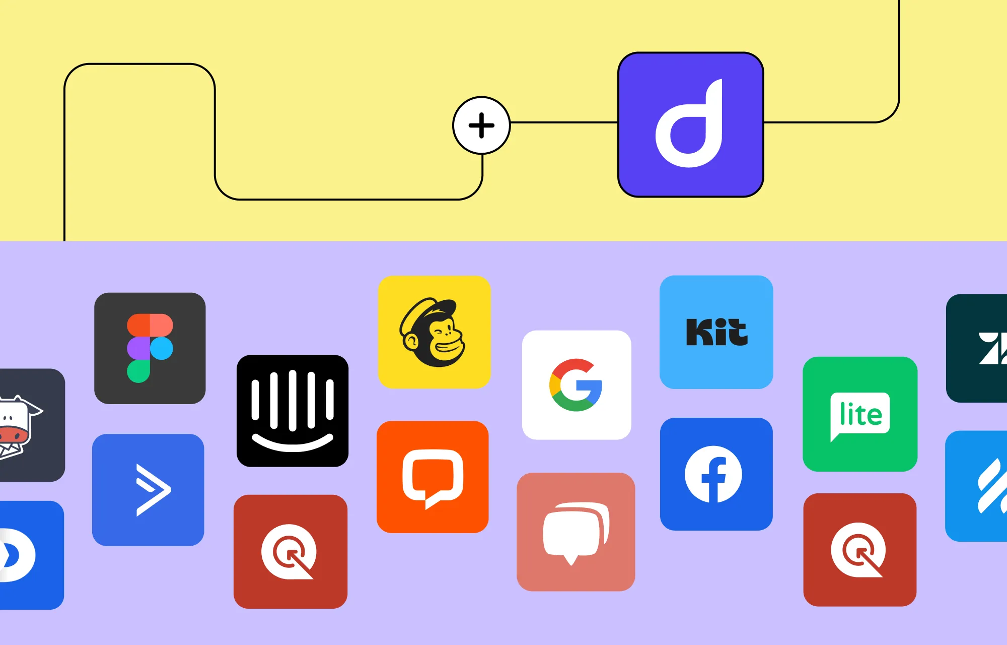
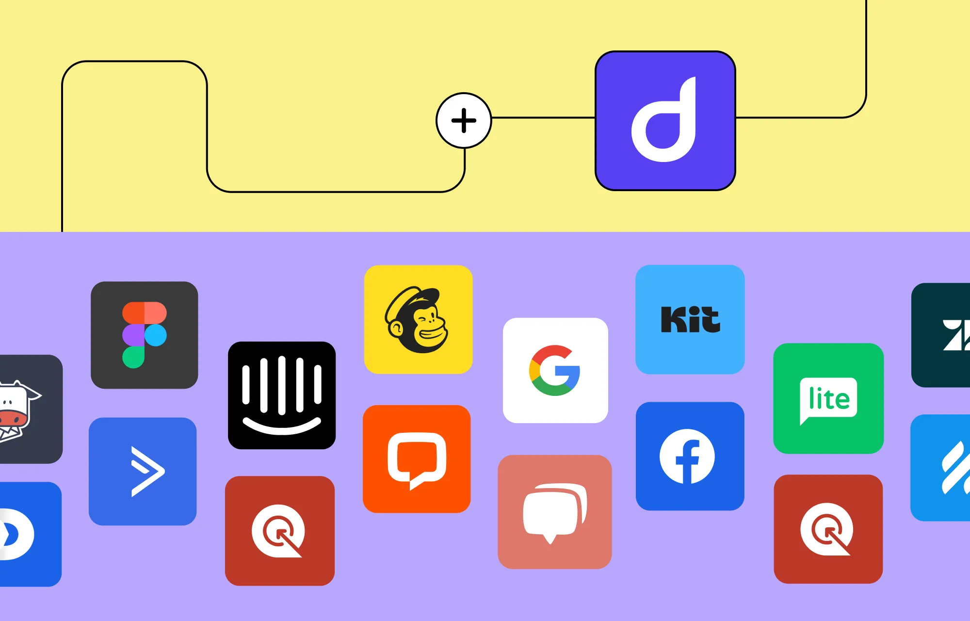
And so we rolled out Droip Apps, a one-stop integration hub that lets users seamlessly connect with 20+ popular tools like Facebook Login, Google Login, MailerLite, Mailchimp, Zendesk, and more.
Brought in Features to Build More Modern, High-Impact Websites
Smarter Dynamic Content Management
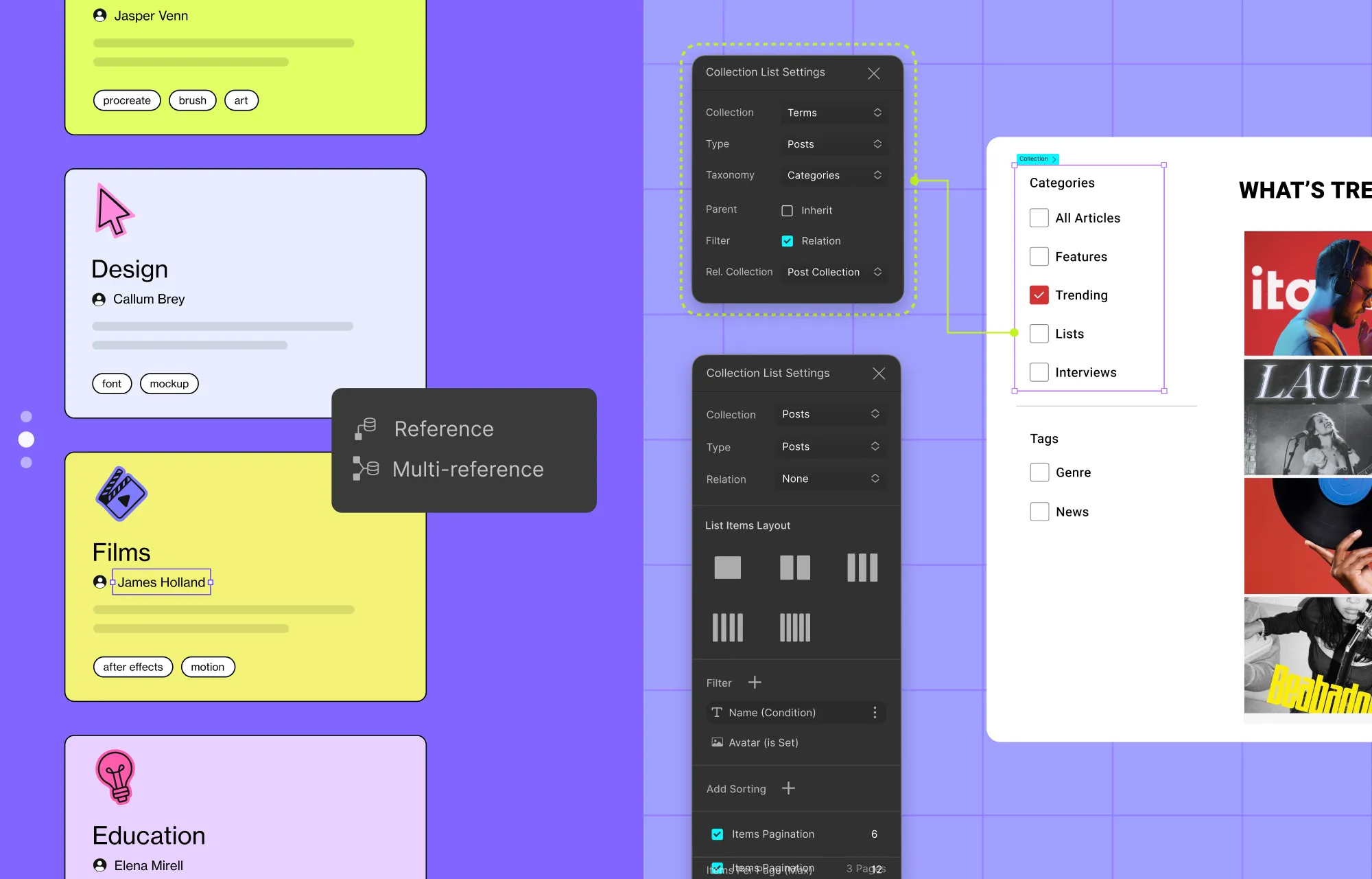
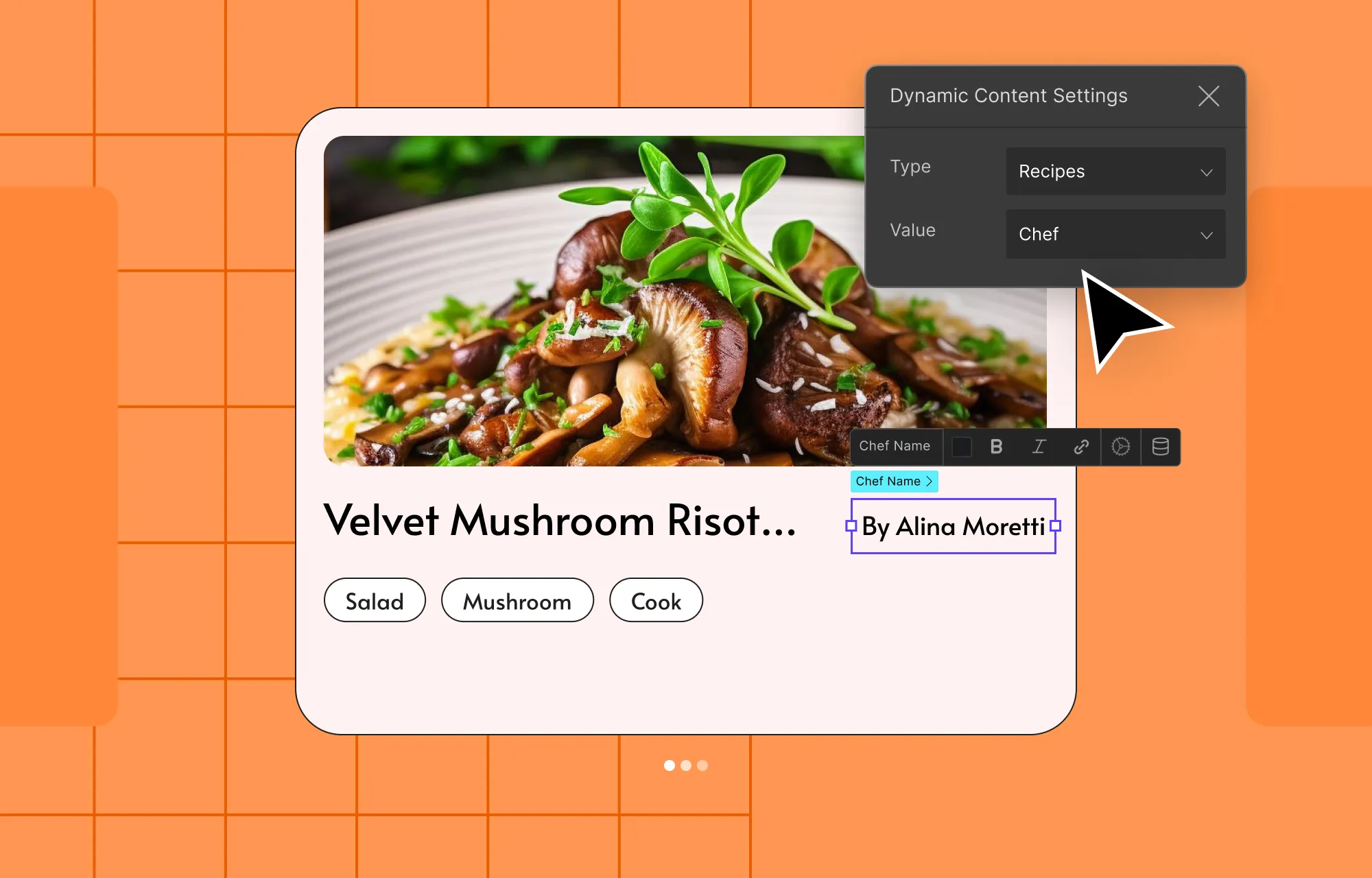
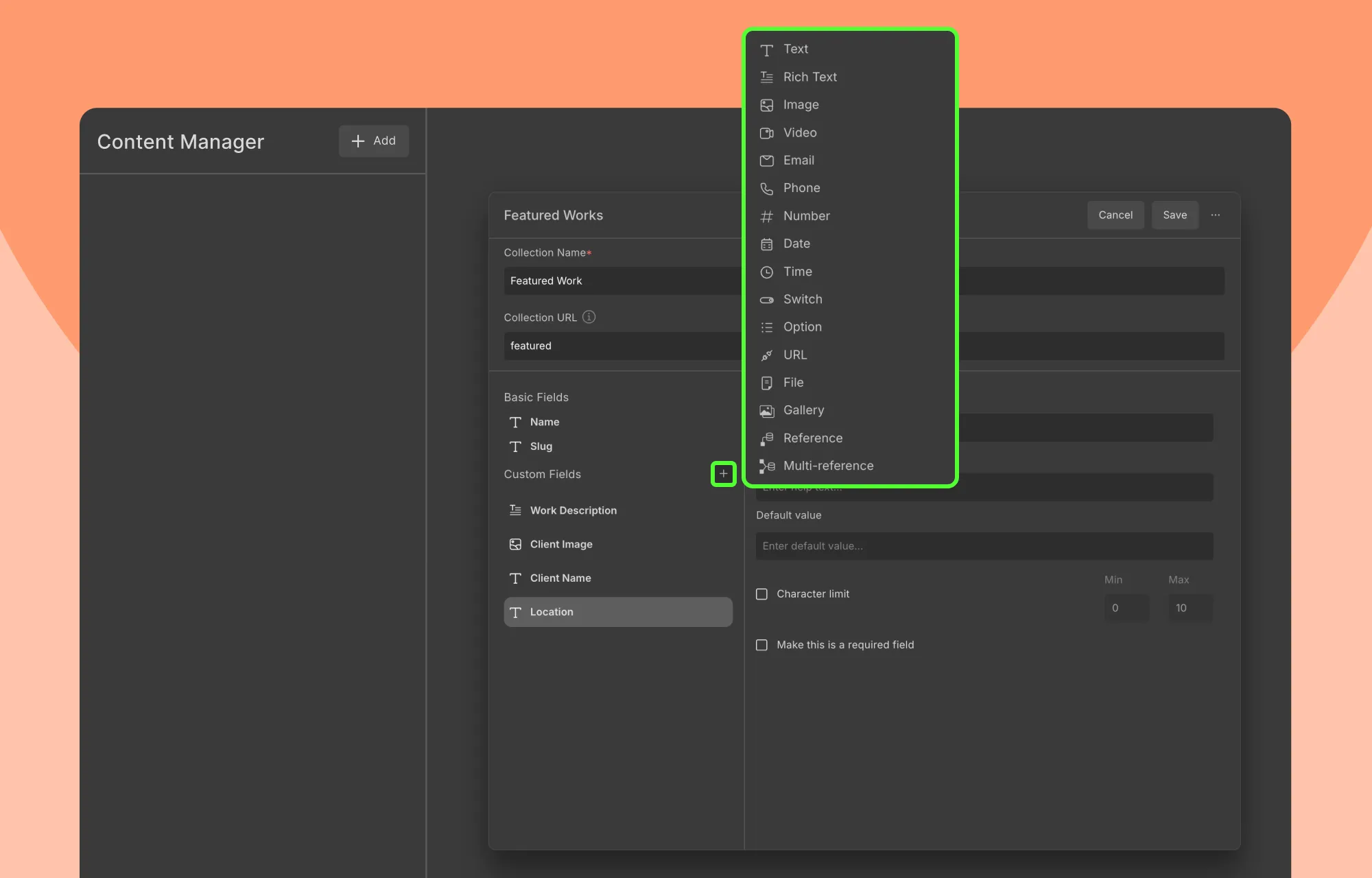
With all the exciting additions to Droip, we of course couldn’t overlook one of its biggest highlights — the built-in Dynamic Content Manager.
So in 2025, we made it even smarter, flexible, and powerful, unlocking truly dynamic and scalable websites with the inclusion of:
Reference, Multi-Reference, and Gallery Fields
Post Scheduling in Content Manager
Frontend Collection Filtering Based on References
Dynamic Sliders
For users building highly dynamic, CMS-driven sites, this marked a major leap in what could be done visually in Droip, without plugins.
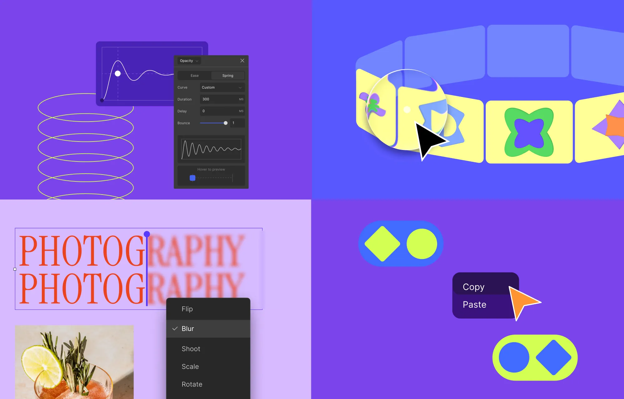
Leveling up Droip Interaction and Animation
Just like the Dynamic Content Manager, Interaction in Droip has always been a crowd-favorite.
But we stopped and thought, “Hey… there’s so much more users can do with the right tools.”
The result? Expanded interaction and animation capabilities, including:
Text Animation
Marquee Animation Preset
Cursor Trail Effect
Spring-Based Timing Function
Full-Site Interaction Copy-Paste
Together, these updates made expressive, interactive websites far more approachable for no-code creators in 2025.
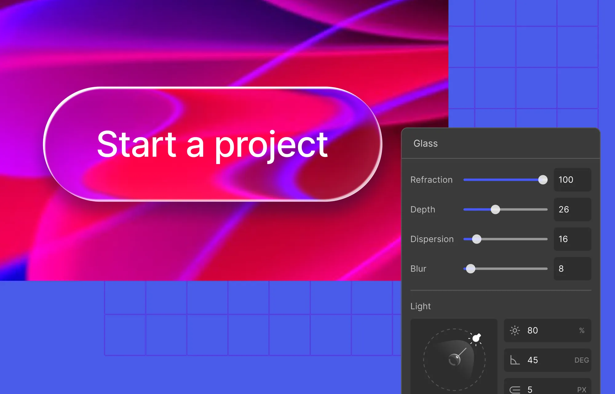
Tapping Into the Trend: Apple Style Sleek Glass Effects in Droip
Naturally, we jumped right in and brought the trend to Droip, making it effortless to create modern, premium-looking websites in just a few clicks with no code.
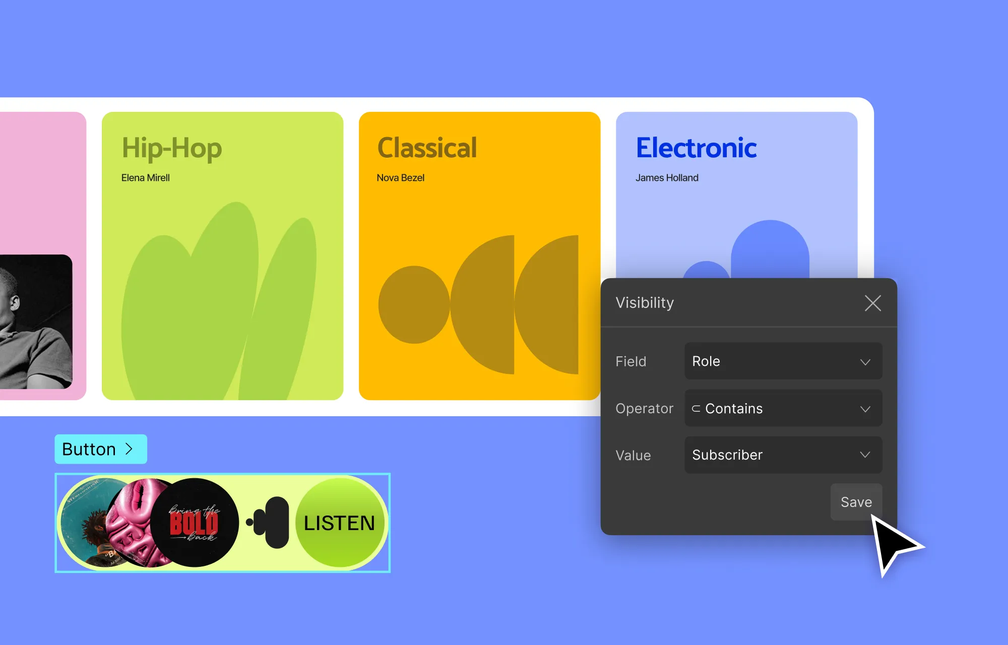
Truly modern websites are increasingly multifaceted and personalized.
So, as personalization became a clear expectation in modern websites, the addition of Visibility Conditions gave creators a way to deliver tailored experiences in Droip with ease, without the added complexity of code or extra plugins.
Revamped The Droip Experience: UI & Website Improvements
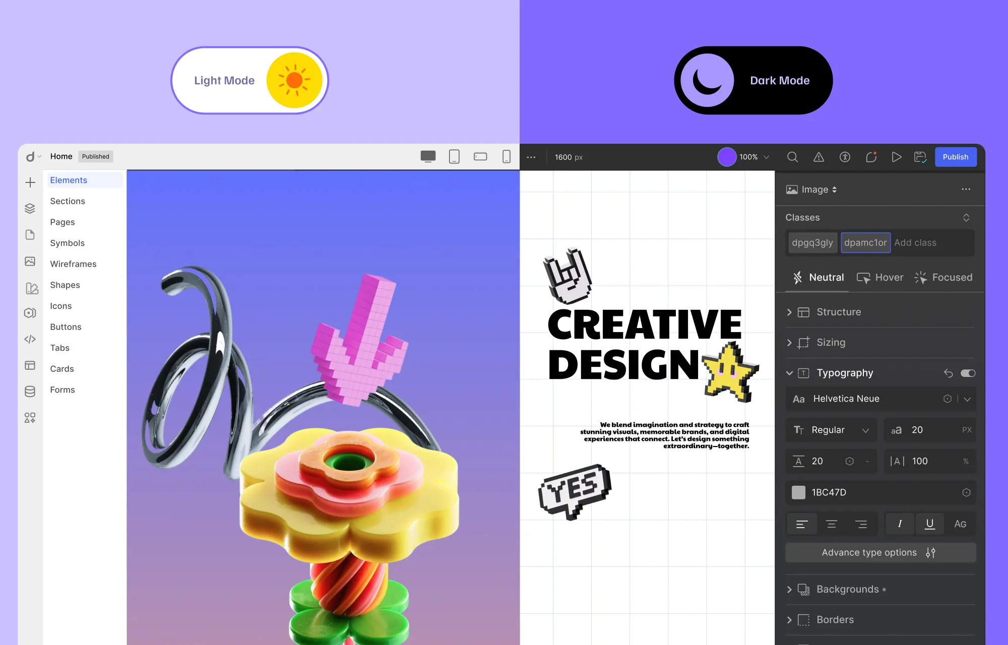
Smarter UI and Introduction of Flexible Light and Dark Mode
This year, Droip’s interface got a major revamp to make building websites even smoother and more intuitive.
We also introduced Light Mode alongside the existing Dark Mode, giving users the flexibility to work comfortably anytime, anywhere.
A Fresh Look: Revamped Droip Website Experience
The Droip website also got a major glow-up!
With a sleek, modern redesign and a more streamlined content structure, the updated website made it easier than ever for users to explore everything Droip has to offer.
Whether you’re discovering Droip for the first time or diving into advanced features, the refreshed site helps users find what they need, get inspired, and start building websites straight away.
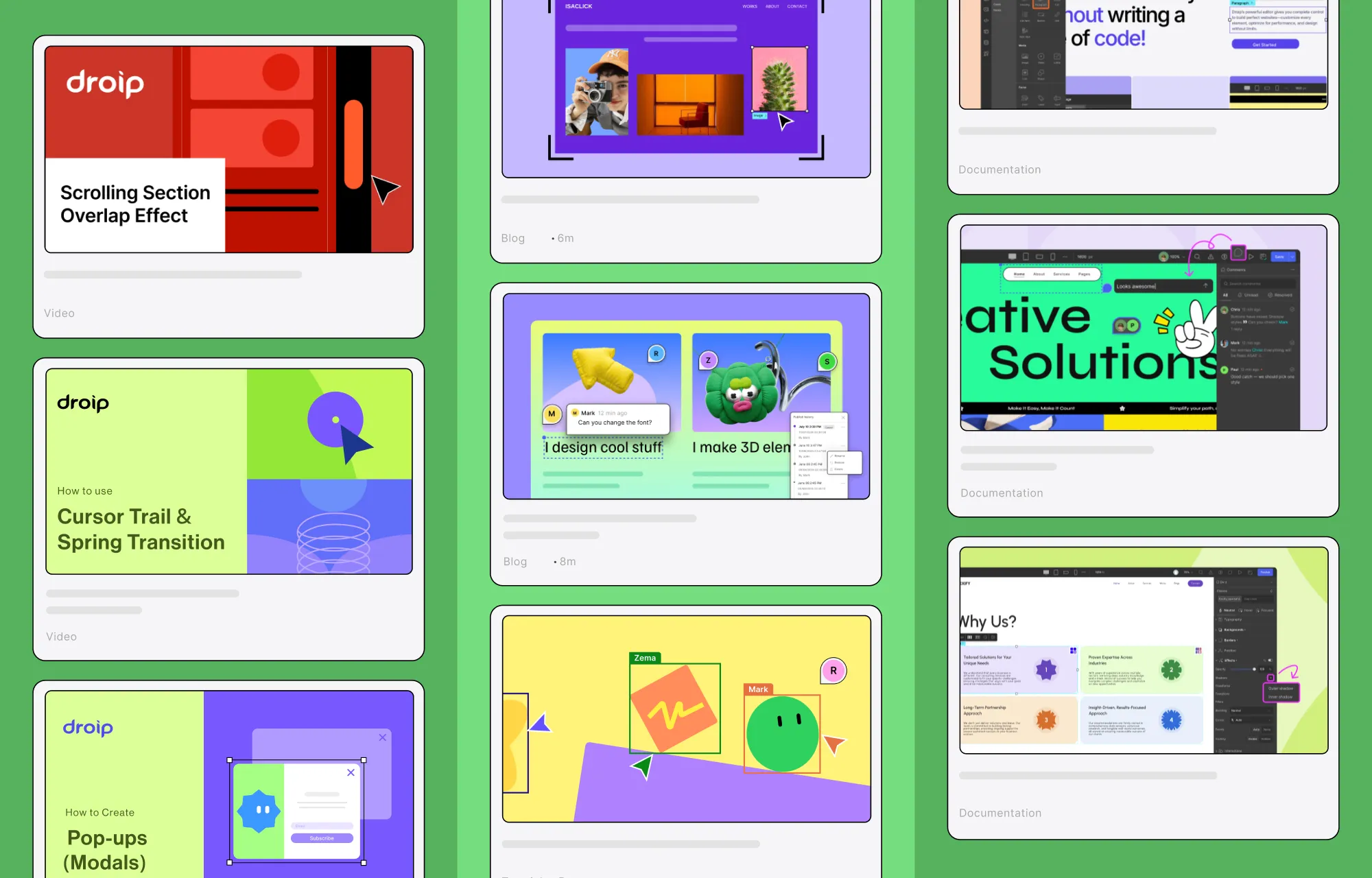
The Broadcasted: Tutorials, Videos, and Resources
In 2025, Droip didn’t just grow in features; it also grew as a knowledge hub for creators.
We made it a mission to share as many useful insights, tutorials, and resources as possible to get users to make the most out of the platform, no matter their experience level.
Throughout the year, we released a range of helpful videos, walking users through new functionalities, tips, and tutorials.
To make Droip even more accessible, we published many informative blog posts, covering everything from beginner guides to the latest web design trends.
Droip was also featured in countless articles, reaching audiences far and wide, inspiring them to create limitlessly with no code.
And of course, our documentation is continuously being refined to be a comprehensive resource.
Together, these videos, blogs, and resources ensure Droip users or even any website creator in general can stay informed, inspired, and equipped to build like a pro.
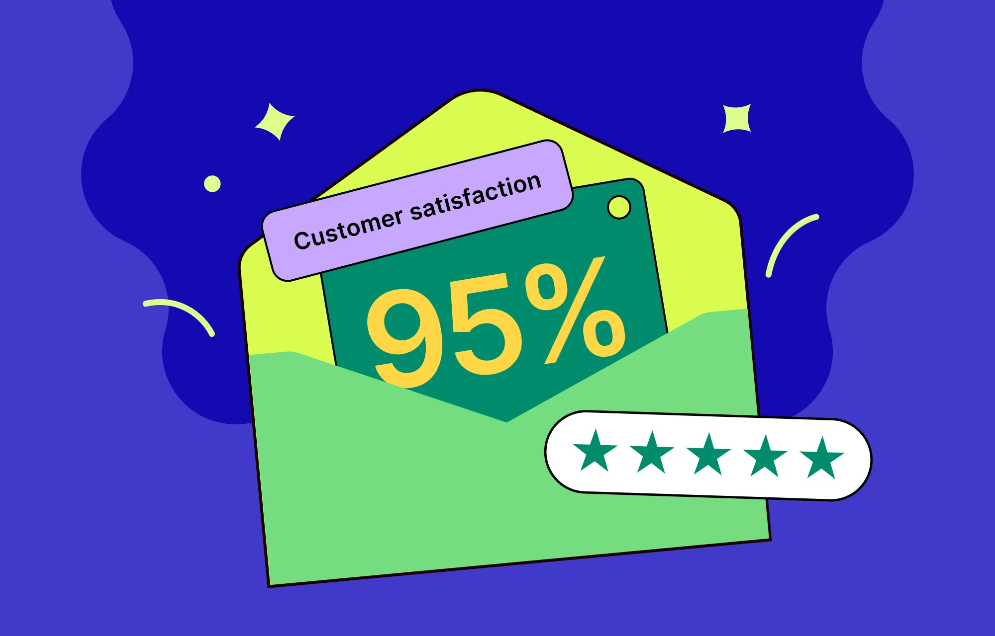
Support Highlights: Our Year in Numbers
No platform is complete without great support to back it up.
In 2025, we resolved 95% of all support tickets; quickly, reliably, and always with our users in mind.
So go ahead and build your websites with confidence, knowing there’s a team making sure your journey is smooth, stress-free, and enjoyable.
The Brewing: What’s Next for Droip
2025 may be coming to a close, but we’re not slowing down — there’s plenty brewing for Droip in the year ahead.
And one of the biggest things on the horizon? Droip eCommerce, arriving at the end of February 2026!
Soon, you’ll be able to visually build your store, manage products and orders, and scale, all seamlessly within Droip.
It’s another big step toward making Droip a more complete ecosystem for creators, and we can’t wait for you to try it.
Wrapping Up: 2025 in Review
2025 was quite the ride for Droip, full of powerful new features, expanded theme libraries, and countless ways to help creators build better, faster, and smarter.
From bringing built-in real-time collaboration and co-editing to WordPress to supercharging the Dynamic Content Manager and beyond, we leveled up no-code website-building like never before.
And with Droip eCommerce and more brewing on the horizon, 2026 is shaping up to be another blockbuster year.
So here’s to drawing the curtains on an amazing year and hitting play on the next, transforming WordPress website building, and crafting stunning sites with no code!
Using Webflow to build and host your website, but starting to feel boxed in? Or maybe you love its design freedom but aren’t thrilled about the hosting limitations or the price tag that comes with it?
If you’re looking for more control, flexibility, and scalability, WordPress opens the door to all of that and more. The only catch is the complexity behind switching platforms.
That’s why this guide exists! Below, you’ll find a clear, step-by-step breakdown on how to migrate from Webflow to WordPress without the stress or the mishaps.
Why Move From Webflow to WordPress
Webflow is undeniably powerful, but even with its strengths, there are plenty of reasons you might start looking beyond it, such as:
Needing greater functionality: Webflow gives you great visual control, but falls short when you need to extend your website’s functionality, as its app and widget selection is limited compared to WordPress’s massive plugin ecosystem.
Avoiding platform lock-in: Webflow also makes it hard to fully “own” your website. Self-hosting isn’t straightforward, and if you rely on its built-in CMS, moving your site elsewhere means losing your dynamic features, effectively locking you into Webflow’s ecosystem or leaving you with a static website. And even after exporting, any update (no matter how small) has to be made inside Webflow first, then manually re-exported and reuploaded.
Outgrowing Webflow’s pricing model: Webflow can start as an affordable option, but as your site grows, so does your bill. Expanding becomes less and less feasible as advanced features, CMS items, and increased traffic, among other things, are gated behind a paywall.
So, while Webflow is a strong platform, its limitations can become more noticeable as you expand. And although migrating from Webflow to WordPress may seem like extra work, making the switch when your site is still manageable can be the right call in the long run.
Pre-Migration Steps
Now that you know why you should move from Webflow to WordPress, let’s walk through the key pre-migration steps you need to take:
[Optional] Backup Your Webflow Site
Migrating from Webflow to WordPress won’t affect the version of your site inside Webflow, as you’re only exporting a copy. Still, it’s always wise to be cautious; backing up your Webflow site beforehand gives you a safety net to fall back on, just in case.
Make an Inventory
It’s also a good idea to make an inventory of your site and all the content it contains. It may feel like a hassle, but it will make things much easier when you’re double-checking that everything has been successfully migrated.
Get Hosting & Install WordPress
Next, it’s time to set up your WordPress website.
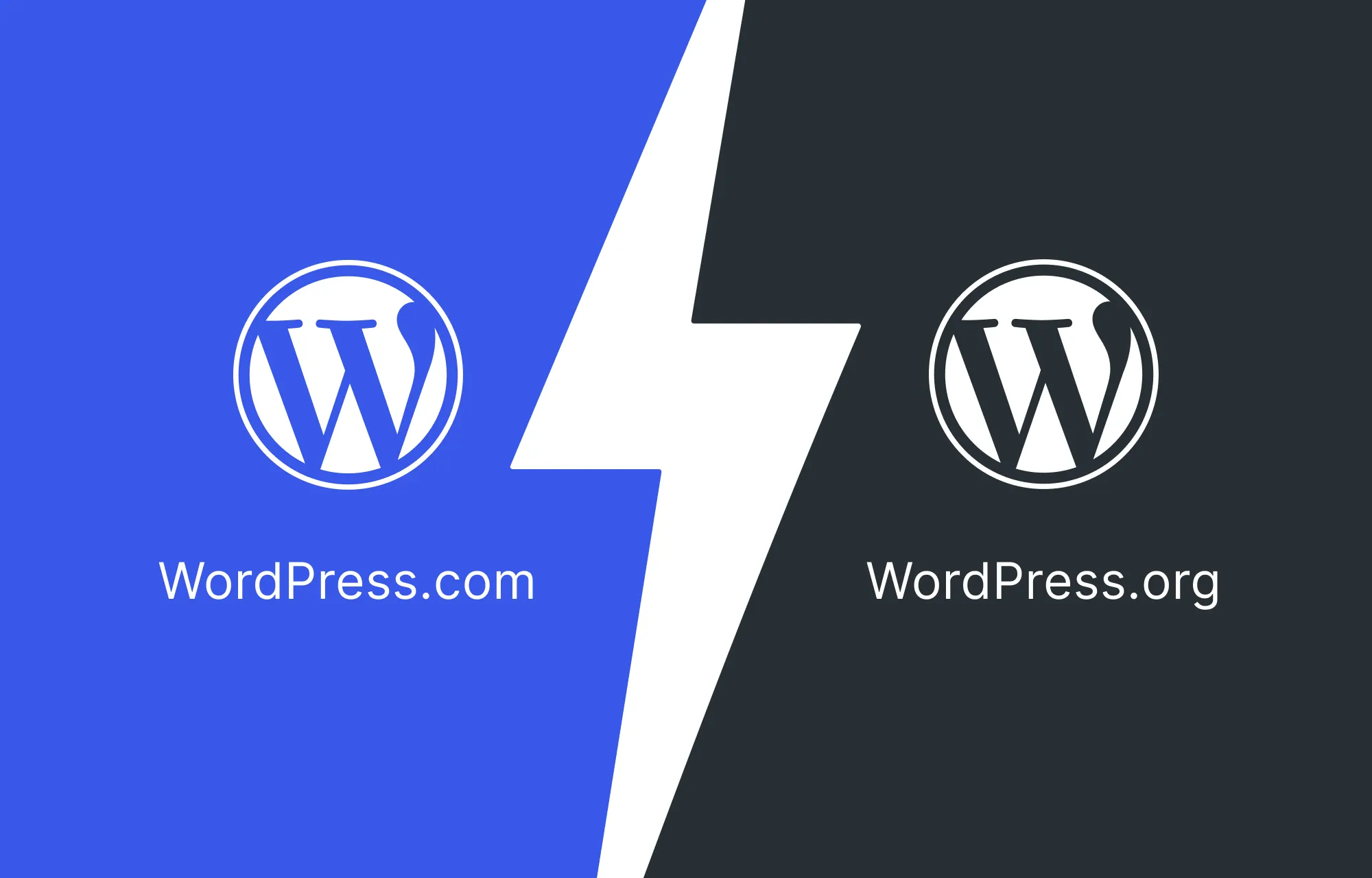
When choosing WordPress, you have two options: WordPress.com and WordPress.org.
If you choose WordPress.com, hosting, domain, and site maintenance are all handled for you. However, it can be quite restrictive when it comes to custom domains, access to all themes, etc, unless you upgrade to higher-tiered paid plans, which can get quite expensive.
This can be especially limiting if your goal is to migrate a Webflow site to WordPress as seamlessly and cost-effectively as possible.
On the flip side, if you choose WordPress.org, you’ll need to set up your own domain and hosting, but you’ll also gain greater flexibility and control, which is ideal when migrating from a more restrictive platform like Webflow.
To get your hosting, there are numerous providers to choose from, such as Bluehost, Hostinger, and more. But no matter which option you choose, be sure to select it wisely, as hosting can directly impact the success and longevity of your website.
Pick the Right Website Builder as Your Webflow Alternative
As mentioned earlier, migrating from Webflow to WordPress involves creating a copy of your Webflow site and bringing it to a WordPress environment.
But what happens after you import it?
Usually, if you export a Webflow site and self-host it, every single update (even tiny text changes) has to be done inside Webflow, exported again, and reuploaded manually. That’s slow, tedious, and completely defeats the purpose of moving to WordPress.
To avoid that cycle, you need a WordPress website builder that replaces the Webflow editor entirely, so that you can run, maintain, and grow your site from one place.
So what tool can give you WordPress flexibility while still keeping the same visual design freedom you’re used to in Webglow?
Droip is the ideal Webflow alternative for WordPress.
It’s a powerful drag and drop builder with an intuitive visual editor, unlimited creative freedom, granular control, and all the modern design capabilities you can expect, including:
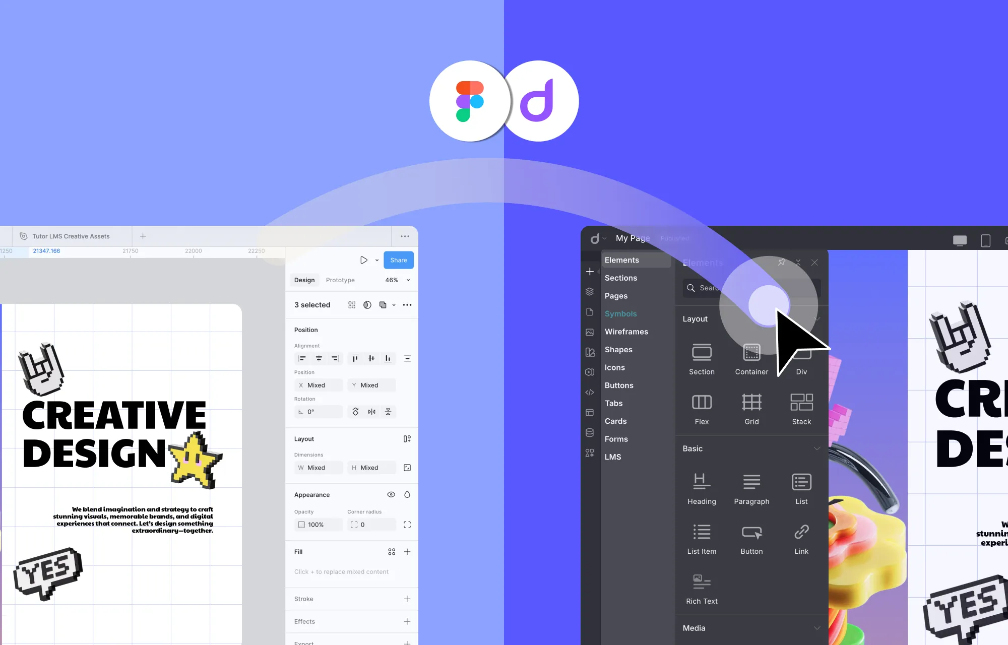
Instant Figma to WordPress Handoff
Dynamic Content Management
Real-time Collaboration & Co-editing
Extensive Free WordPress Theme Library
Form Builder & Form Data Manager
Popup Builder
Interaction and Animation Builder
And more
With an all-in-one solution like Droip, you get the full flexibility of WordPress and the seamless, familiar visual workflow of Webflow, but without its limitations.
And unlike many tools out there, Droip gives you access to its full set of capabilities across every plan. There are no hidden costs or paywalls after the initial purchase. So no matter which plan you choose or how much your site grows, you always have everything you need to build, customize, and scale your website.
Once your WordPress website and website builder are all set up, it’s finally time for you to migrate your site from Webflow to WordPress.
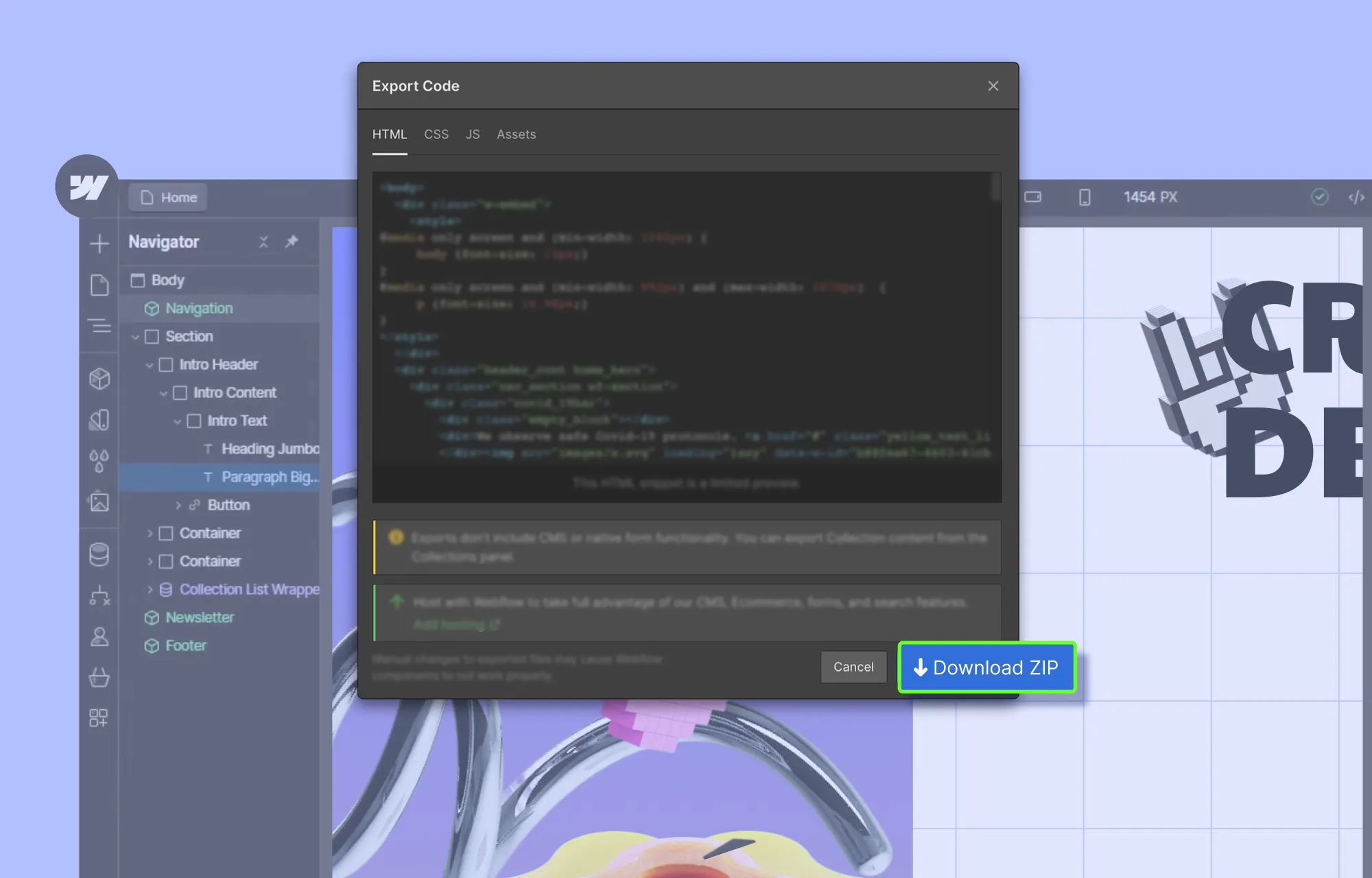
Export Your Content From Webflow
The first step in migrating from Webflow to WordPress is exporting your content:
Step 1: Open your Webflow project and make sure you’re in Design Mode.
Step 2: Click on the Webflow icon in the top-right corner to access the Export Code panel.
Step 3: Hit the Download Zip button to save your exported content to your local device.
Note: This Webflow export will not include CMS or native form functionality. It only provides a fully static version of your site’s pages, styles, and assets.
Import Your Content to WordPress Using Droip
Next, it’s time to bring your Webflow content to the WordPress environment:
Step 1: Open the Droip editor on your WordPress website.
Step 2: From the Pages panel on the left sidebar, click on the plus (+) icon to create a new page. Then, open the Insert panel (plus (+) icon), go to Elements, and add the Code element.
💡 Tip: To avoid theme conflicts and start with a completely blank page, download Droip’s Base theme from Account Settings > Downloads on the Droip website, then install and activate it via WP Admin > Appearance > Themes.
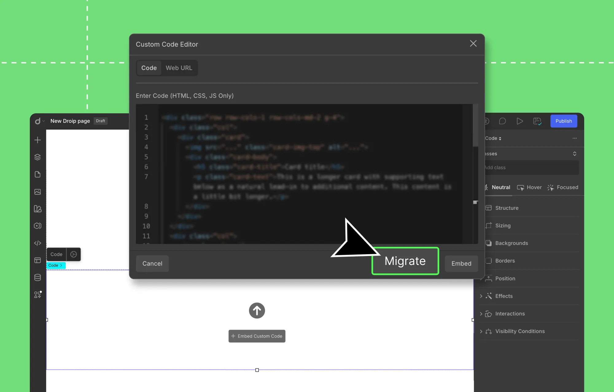
Step 3: Unzip your exported Webflow files, open the HTML file of the page you want to import, copy its content, and paste it into the Custom Code Editor.
Step 4: Next, bring over your styles and scripts. From your exported files, find the relevant CSS and JS code for that page, and paste them into the Custom Code Editor as well. Also, make sure to:
Wrap your CSS code with HTML Style tags.
Wrap your JS code with HTML Script tags.
💡 Tip: To simplify things and save time, feed the HTML, CSS, and JS files into an AI generator and have it sort and organize everything page by page.
Step 5: Once you’ve pasted all of the relevant code for that page in the Custom Code Editor, hit Migrate.
And that’s it! Using this method, you can easily migrate all your pages, complete with their content, styling, and animations.
All that’s missing is the dynamic content, since Webflow exports don’t include it. But don’t worry, because we have a solution for that too, which we’ll cover shortly!
Visually Tweak Your Imported Pages
Now, normally, once you export a Webflow site, any changes, no matter how big or small, require editing in Webflow, then manual re-exporting and re-importing.
But with Droip in WordPress, that’s no longer the case.
By clicking the Migrate button (instead of Embed) in the Custom Code editor, your Webflow content is converted into fully editable Droip elements.
Now you can visually customize everything in Droip. Tweak layouts instantly, update content, adjust styling, and more, all without the need for Webflow and manual re-export & re-import.
To update text content:
Simply double-click on any text element and type.
To adjust the style:
Select the element in question and use the Style Panel options.
To completely redesign your website:
Use Droip’s extensive library of free WordPress themes for quick & effortless results,
Migrate design directly from Figma to WordPress,
Or build from scratch using Wireframes, Pre-built options, and Elements.
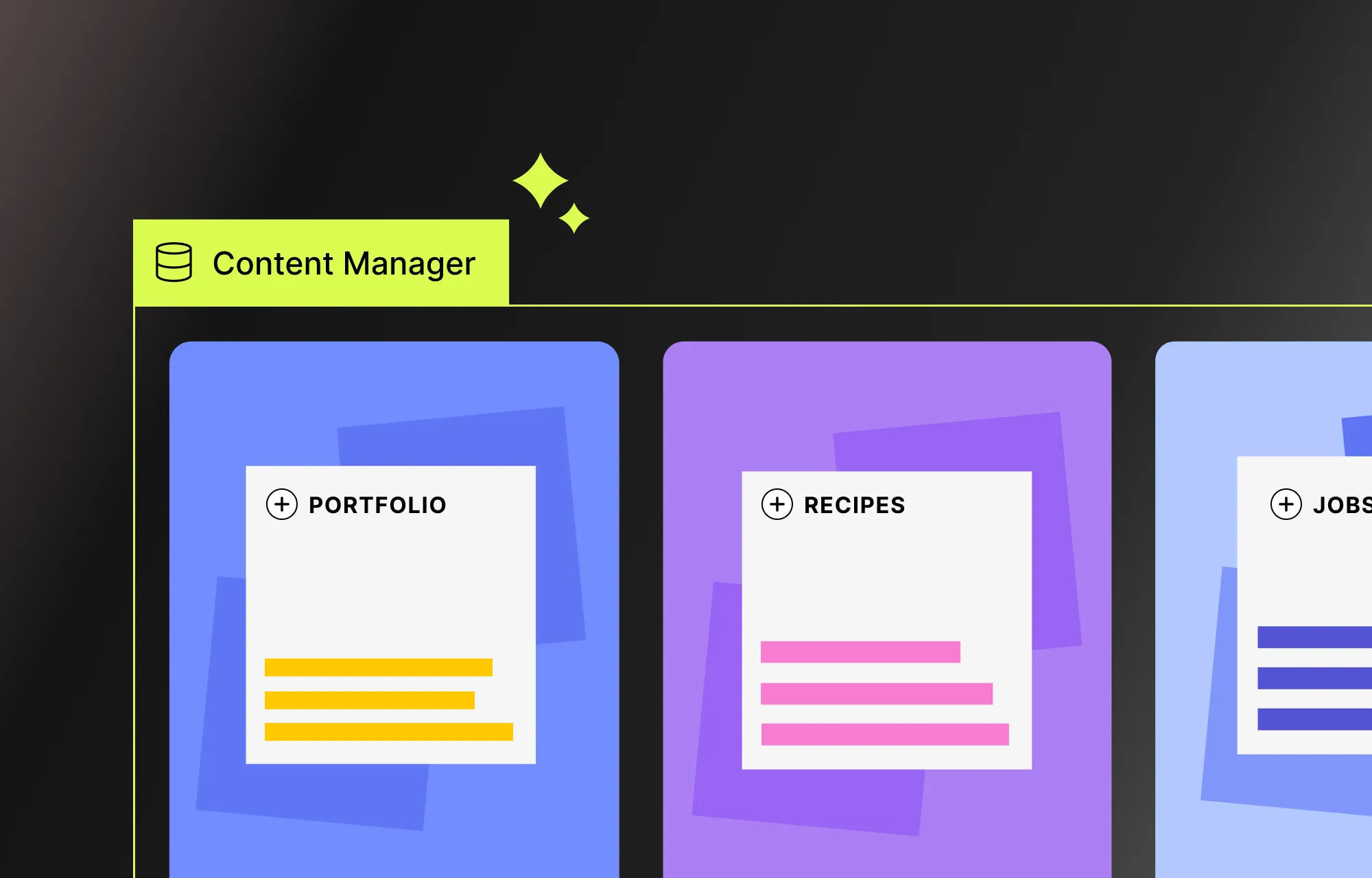
Create & Display Dynamic Custom Content
One of the biggest setbacks when migrating from Webflow (and one of the major ways the platform keeps users locked in) is losing its built-in Dynamic Content capabilities.
But with Droip and WordPress, all is not lost.
WordPress already offers a variety of Dynamic Content handling options, but with a one-stop solution like Droip, you don’t need to rely on third-party plugins.
Using Droip’s native Dynamic Content Manager, you can visually create custom content types, add your content, define relationships, and display everything dynamically with ease.
Check out our Dynamic Content playlist to get started and learn how to build powerful dynamic websites in Droip.
Configure Your WordPress Site
Before making your site live, you need to configure some essential WordPress website settings, such as:
Site Title & Tagline: From the WordPress website’s backend settings, set your title and tagline to make it more understandable for users and search engines.
Time Zone & Language: From the same settings, set basic things like your Time Zone, Language, Date Format, etc, for your website.
Membership: Enable this option if you want users to be able to register on your website.
Permalinks: Set SEO-friendly URLs from Settings > Permalinks. The “post name” option is a recommended choice.
Finally, secure your website by using strong passwords for all accounts, enabling SSL to encrypt data and authentication, and performing regular backups.
Point Your Domain to WordPress
You’ve successfully migrated your content from Webflow to WordPress and configured all your settings! Now the final step is to take your original domain (the one pointing to your Webflow site) and point it to your WordPress site instead.
This will allow visitors to use the same address to visit your website and avoid the hassle of updating links, broken redirects, or losing traffic along the way.
To point your domain to your WordPress website:
Step 1: Log in to your domain registrar and locate your DNS settings.
Step 2: Update either the:
Name Servers: Replace the original name server with the one provided by your new WordPress hosting.
IP: Or, you can update the record, i.e, point your domain directly to your WordPress host’s IP address.
💡 Note: Keep in mind that DNS changes can take anywhere from a few minutes to 24–48 hours to take effect worldwide.
Step 3: Next, update the WordPress site URL from WP Admin > Settings.
Step 4: Finally, visit your domain to test whether it’s pointing to your WordPress website.
Start Fresh With WordPress Today!
That’s our guide on how to migrate from Webflow to WordPress done!
Keeping your website modern, dynamic, and fully under your control and out of Webflow’s isn’t rocket science.
You just need the right tools, like Droip, to not only efficiently recreate your site but also unlock greater capabilities, control, and scalability.
So why wait? Start fresh with WordPress and Droip today!
Building your first WordPress website can feel daunting — but we’re here to help.
You may have seen this title before, but if you want a clear, step-by-step guide on how to build a WordPress website from scratch, this is it.
By the end of this guide, you’ll know exactly which tools to go for, how to customize your design, how to add functionality, and how to launch your website, all without breaking a sweat.
So let’s dive in!
Step 1: Plan Your Website
A little planning goes a long way.
Before diving into building a website, take the time to figure out some key aspects, such as:
Purpose of This Website: What is your website for? A blog, portfolio, business site, or something else?
Target Audience: Who is this site for, and what do they need from it?
Website Pages: Decide what pages you need — Home, About, Services, Contact, Blog, etc.
What Actions Visitors Should Be Able to Do: What do you want visitors to do? Read blogs, sign up for a newsletter, or fill out forms?
Functionality to Be Added: Identify the features your site needs based on the desired actions of your visitors.
Types of Content Needed: Identify the types of content you need, like text, images, videos, etc.
Defining these details first will make the actual website-building process smoother and more efficient.
Step 2: Choose Your WordPress Plan
Once you’ve nailed down the basics, it’s time to choose the right WordPress plan for your website.
There are mainly two types: WordPress.com or WordPress.org.
WordPress.com is a fully-managed service that provides both the free WordPress software and hosting in one convenient package.
It does have a free plan, but customization is very limited. You’ll need to upgrade to higher-tiered, paid plans to install plugins and get access to all themes, which can get quite expensive.
So, it’s not the best choice if you want more control, need advanced functionality, or are working within a tight budget.
WordPress.org, on the other hand, provides the same free WordPress software, but you’ll need to arrange your own hosting and domain.
In return, you get complete control over your website, the freedom to install any plugins or themes, and full ownership of your content.
In short:
WordPress.com is simple and beginner-friendly, perfect if you want an easy, secure setup with built-in maintenance and don’t need to dive into deep customization or advanced features.
WordPress.org, which powers over 43% of all websites worldwide, is ideal if you want flexibility, scalability, and total control over your site’s design and functionality.
Step 3: Get Your Domain & Hosting Ready
If you went with WordPress.com, you can skip this step, as your hosting and domain name are already taken care of.
However, if you choose WordPress.org, you’ll need to set up your own domain name and hosting.
These are key to your website’s success, so it’s worth knowing how to choose them wisely.
Choose a Domain Name:
Find and purchase your domain through providers like GoDaddy, Namecheap, Bluehost, and others.
When choosing a domain name:
Keep it short, easy to spell, and memorable.
Make sure it’s relevant to your brand or niche.
Avoid using numbers and symbols if possible.
Choose the right domain extension (like .com, .net, .org, .edu, etc.)
Pick a Secure & Flexible Hosting:
Your hosting will determine how fast and reliable your website will be, so go for a plan that offers strong performance, reliable support, and good security at a good value.
💡 Tip: You can also simplify things by looking for bundled solutions that offer both domain and hosting in one combined package to make things easier and more feasible!
Step 4: Install WordPress
For WordPress.org users, now that your hosting and domain are all figured out, it’s time to install WordPress and set up your website.
Install WordPress
Installing the WordPress software is quick and easy. You can either install it automatically through your hosting provider or run a manual installation:
Step 3: Upload, unzip, and save the downloaded WordPress files to your server’s root directory.
Step 4: Finally, access your domain on a browser to run the WordPress installation script.
Step 5: Follow the on-screen prompts to set your language, database details, site title, username, password, etc, and complete the process.
Initial Setup
Once you’ve installed WordPress, it’s important to configure a few key settings, such as:
Site Title & Tagline: From your domain, go to WP Admin > Settings > General and set your title and tagline to make it more understandable for users and search engines alike.
Time Zone & Language: Also set basic things like your time zone, language, date format, etc.
Membership: Enable this option if you want users to be able to register on your website.
Permalinks: Set SEO-friendly URLs from Settings > Permalinks. The “post name” option is a recommended choice.
Finally, secure your website by using strong passwords for all accounts, enabling SSL to encrypt data and authentication, and performing regular backups.
Step 5: Choose a Website Builder
After your WordPress website is set up, it’s time to start actually designing it.
Now, while the WordPress platform comes with a default editor and a wide array of website-building plugins, many of them are limited in capability.
To build modern websites, you need a modern website builder that lets you:
Visually design your website with ease
Customize every granular detail
Adapt seamlessly to any screen size
Work with dynamic content
Collaborate in real-time with your team
And more
Most traditional WordPress builders fall short here, often relying on add-ons or extra plugins just to get things done.
Built as a one-stop solution, the Droip WordPress website builder lets you craft contemporary WordPress websites with no code and no extra plugins.
With Droip, you can:
Choose from an extensive WordPress theme library at no extra charge
Visually design your site with full control
Collaborate, co-edit, and communicate with your team in real-time
Display and manage dynamic content
Craft complex interactions and animations effortlessly
And more, with a level of control never before seen in WordPress.
And the best part?
All of this comes at a fraction of the cost of traditional website builders that are bogged down with limited functionality and add-on dependency.
What’s more, no matter which Droip plan you go for, you get access to the full Droip toolkit and template library; the only differences are the number of sites you can create and the plan duration.
So with Droip, you basically get everything you need to build a WordPress website, hassle-free and budget-friendly.
How to Install Droip
Installing Droip is also super quick and straightforward. All you need to do is:
Step 1: Create an account on the Droip website and purchase the plan that best fits your needs.
Step 2: From your Droip account, go to Downloads, and save the latest version of Droip.
Step 3: In your WordPress dashboard, navigate to Plugins > Add New > Upload Plugin and upload the file you just downloaded.
Step 4: Click Install and then Activate.
Step 5: Finally, go to the Droip Account > Subscriptions > Licenses, add your site, copy the license key, paste it under WP Admin > Droip Settings > License, and click Activate.
And that’s it — Droip is ready to use with no additional setup needed, giving you all the tools you need to build your website right away!
Step 6: Choose Your WordPress Theme
You’ve chosen and installed your website builder. Now it’s time to think about your WordPress theme.
Themes are a game-changer. They let you build professional-looking websites quickly without starting from scratch.
And like plugins, WordPress offers a huge variety of themes to choose from, but these can be very hit or miss and often come with a price tag.
If you want to avoid the hassle or don’t have the budget, Droip has you covered with its free and extensive WordPress theme library.
Covering a wide range of niches, every template comes complete with all the essential pages, is fully customizable, and endlessly scalable with Droip.
From portfolios and agencies to apps, restaurants, and more, you’ll find an option for almost any type of website, ready to launch in just a few clicks.
How to Install a Droip WordPress Theme
Installing templates in Droip is a breeze. Here’s how it’s done:
Step 1: Download the Droip Base Theme from your Droip account > Downloads, then upload, install, and activate it from WP Admin > Appearance > Themes.
Step 2: In the Droip editor, click on the Templates icon located on the left sidebar and browse the library to find a template that fits your needs.
Step 3: Click on a template to view its details, then hit Import to install, and click on Proceed to confirm.
And that’s it! Your template pages, their content, site settings, and more are now all in place.
From here, you can easily replace content, connect & display dynamic collections, customize the design, and put on the finishing touches, without having to start from scratch!
Step 7: Design Your WordPress Website
Next, it’s time to design your website.
Whether you’ve started with a template or are building from scratch, Droip offers some nifty design tools you’ll want to get familiar with to make the whole process a lot smoother. Let’s explore them.
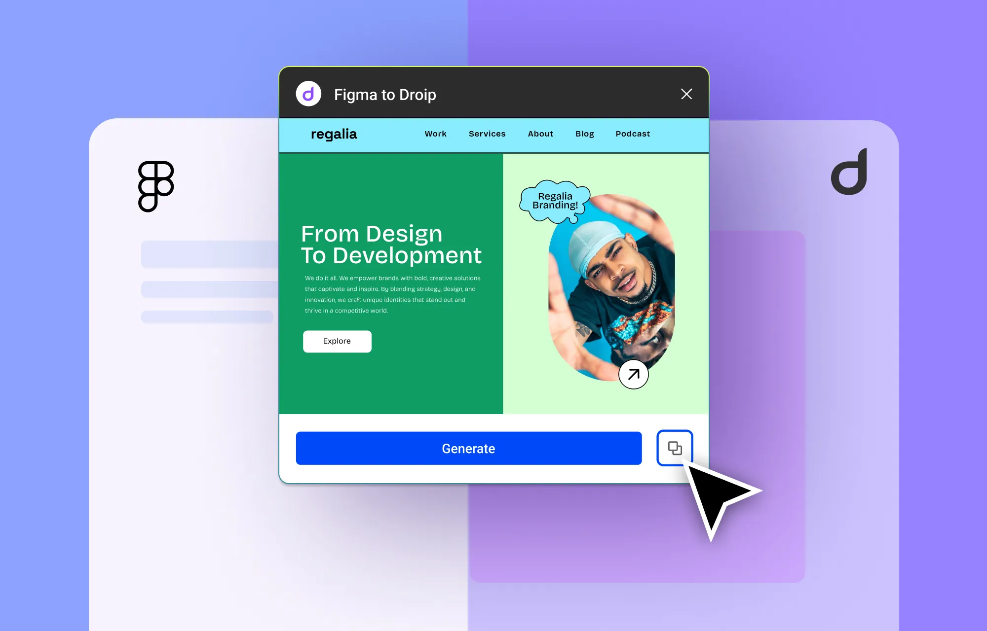
Convert Instantly From Figma to WordPress
Already have a design in Figma that you want to incorporate into your WordPress website?
No problem!
With the Figma to Droip tool, you can import sections or even fully designed pages directly from Figma with pixel-perfect accuracy and auto-responsiveness, ready for publishing with just a few final touches.
No more developer dependency. No more manually converting designs to code. No more waiting days or weeks for results.
With Droip’s Figma to WordPress tool, you can go from design to development instantly!
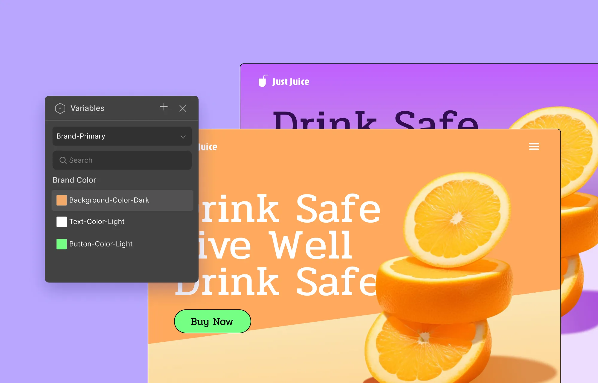
Save & Reuse Styles Globally With Variables
When it comes to website design, consistency is key.
Instead of manually applying and reapplying colors, fonts, or sizes across every page, you can save them as Variables and reuse them across your site!
Need to make a change? Just update the variable once and watch it take effect everywhere it was assigned, in true global synchronous fashion.
Want to refresh your entire site’s look for a seasonal campaign, festival, or dark mode but without breaking your default design?
You can simply define Variable Modes, i.e., alternate values for every Variable.
This will let you switch between themes at the section or page level, or you can even let visitors do so on the front end using Interactions!
Design Cohesively Using Class Manager
If you love consistency and efficiency, you’ll also be glad to know that Droip also supports CSS Classes!
If you’re new to the concept, think of classes as style cheatsheets.
Basically, Droip’s native Class Manager lets you visually create, organize, and apply CSS classes to elements across your website without having to recreate the same style over and over.
This again allows for synchronous styling, where changing the style of one element automatically changes the style of all other elements using the same class, instantly.
Droip lets you take it even further with Child Classes, which let you build on an existing CSS style on an element without altering the original CSS or changing the other instances.
Get Full Creative Freedom With the Extensive Style Panel
We’ve talked a lot about tools that make your web design more cohesive and efficient. But how do you actually design your pages?
Did you know 95% of CSS can be handled visually using this Style Panel without any custom code required?
That’s right.
With Droip, you get granular control over every aspect of design. From Typography and Backgrounds to Effects, Interactions, and more, you can customize every detail visually, precisely, and efficiently.
And it’s not just the usual options, either. From gradient backgrounds to glass effects, cursor trails, and more, the Style Panel lets you add unique, eye-catching touches that make your website truly stand out.
Step 8: Add Functionality
Once your website design is ready, it’s time to make it truly functional.
With Droip, this is effortless thanks to its built-in features. Here’s what you can do:
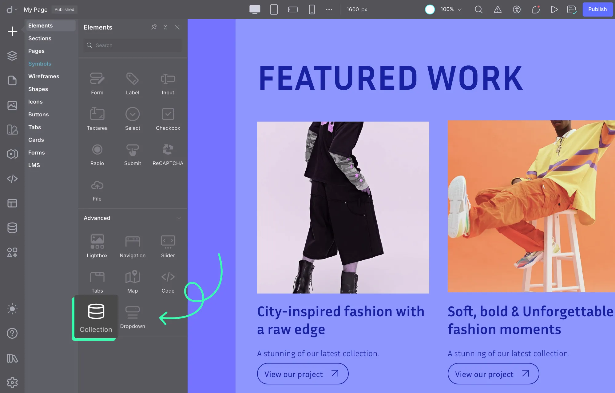
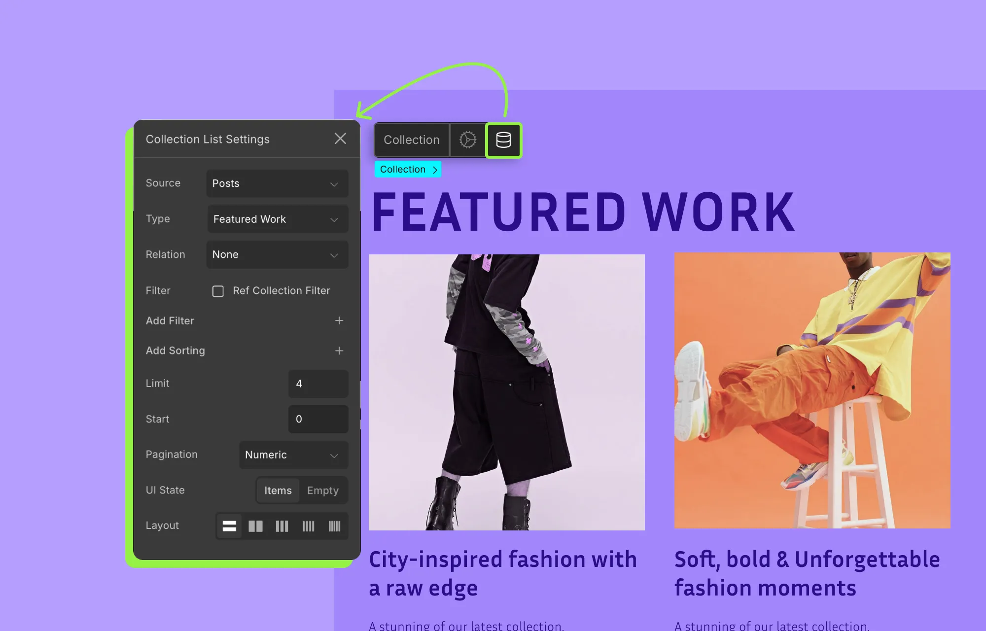
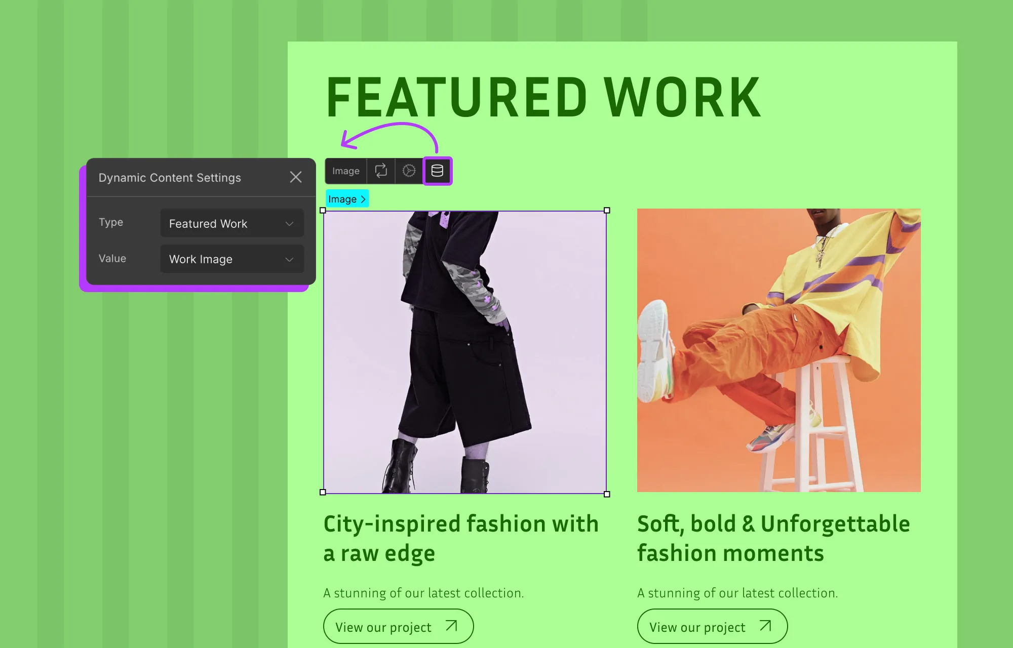
Display Dynamic Content in WordPress
Not all content can, or should, be displayed statically.
Take items like works, services, blogs, testimonials, teams, etc, for instance. These follow a pattern and evolve constantly, making static display impossible to manage.
Fortunately, with Droip’s built-in Dynamic Content Manager, you can define custom content types in WordPress without the need for external tools like ACF.
Then you can simply add your data and display it dynamically through collection lists or dynamic templates.
This lets you update content directly from the Content Manager once and have it reflected automatically wherever that content is used without any repeated manual changes!
It also means you can expand your content effortlessly without worrying about changing the design, giving your website true scalability as it grows.
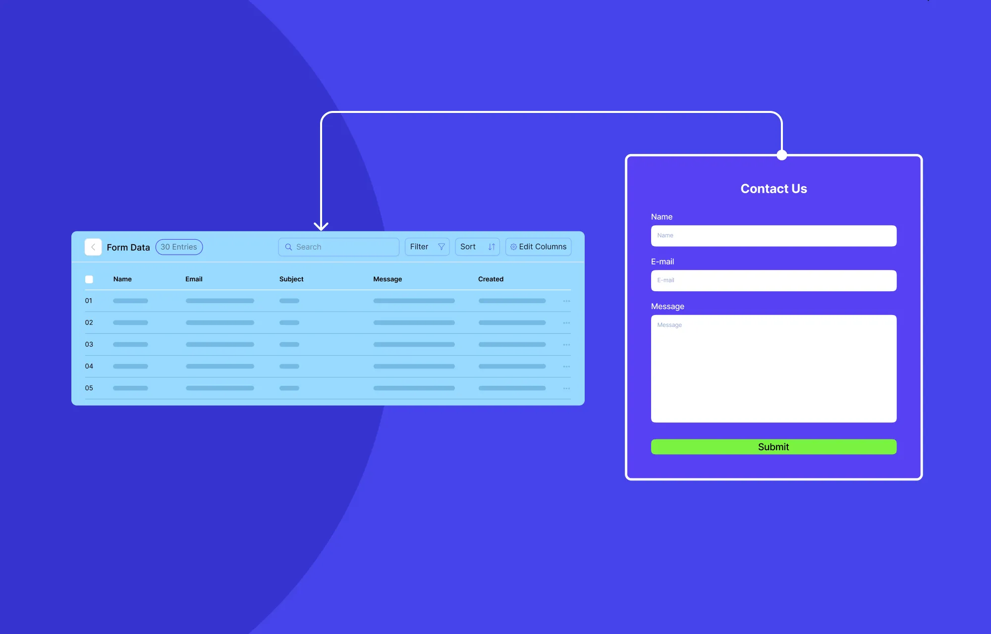
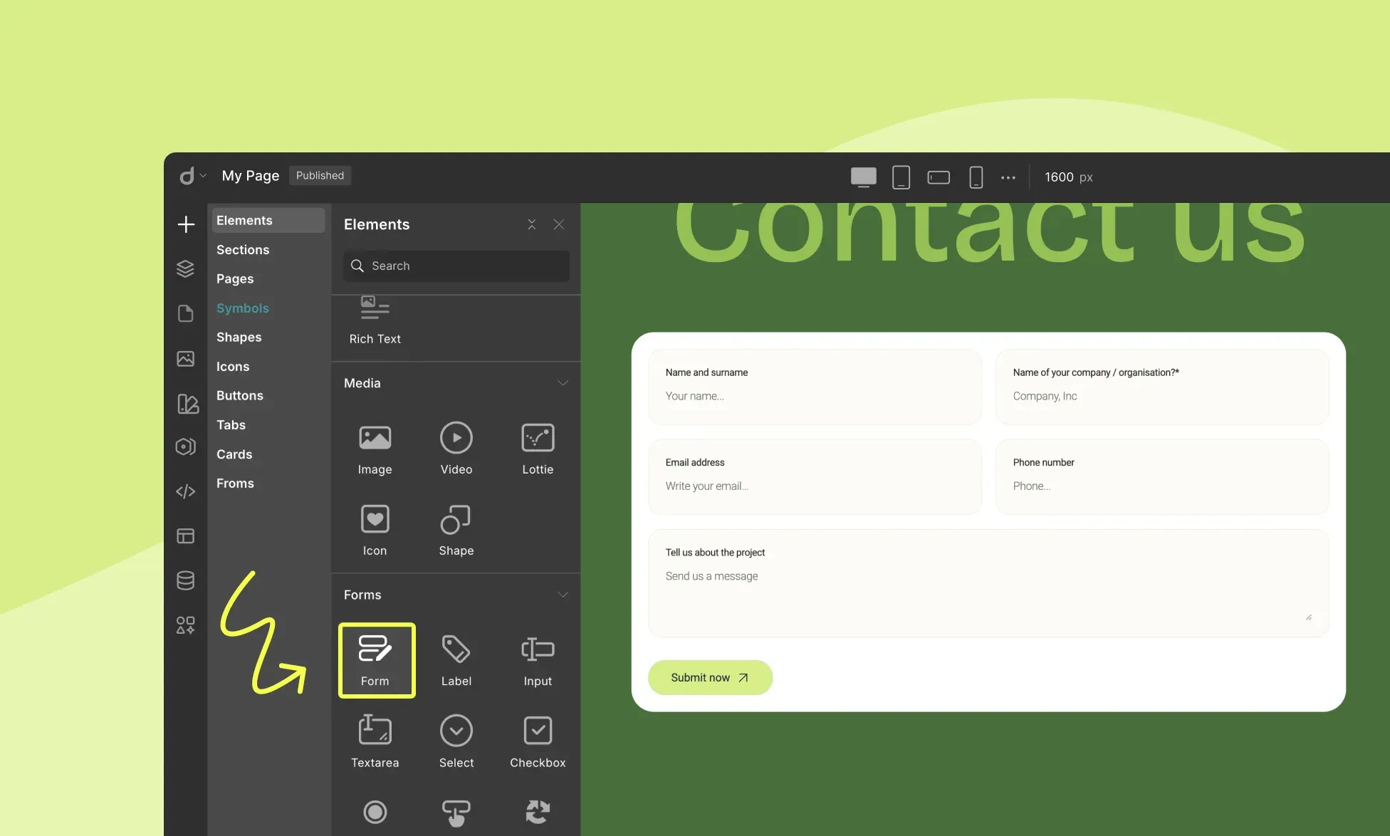
Visually Build Forms & Manage Form Data Natively
Forms are one of the most powerful features of any website, whether it’s for collecting data, capturing leads, or engaging visitors.
With Droip, you can build forms visually with ease, using either individual form elements or getting a head start through pre-built Form sections.
Depending on your website needs, you can create:
Contact forms
Newsletter subscription forms
Booking forms
Feedback forms
And more
To secure your forms, Droip lets you limit submissions, restrict IPs, and even integrate easily with reCAPTCHA for spam protection.
Speaking of integrations, you can also connect with popular automated email marketing tools right from within Droip through Droip Apps, helping you grow your audience seamlessly.
And once your website is live and you can collect data through your forms, you can view, manage, and export submissions directly from the built-in Form Data Manager in Droip for easy tracking and analysis.
Create and Utilize Powerful Popups
Popups are another tried-and-true way to grab attention, capture leads, and boost engagement.
But it needs to be done right — because there’s a thin line between engaging your audience and driving people away.
But they can be quite handy as you can use them to:
Promote exclusive campaigns
Grow your email list using a newsletter sign-up form
Share important notices, ask for cookie consent, etc
And more!
With Droip’s built-in Popup Builder, you can visually craft eye-catching modals with the same level of control you get in pages.
You can also choose when, where, and how your popups will appear, whether it’s after page load or before page exit, and more, giving you the control needed to maximize their impact.
Craft Complex Animations & Interactions
Ever gotten major design-envy after browsing a highly interactive website with eye-catching, complex animations and wondered how they pulled it off?
Think staggered animations, parallax scrolling, cursor trail, hover effects, all those impactful interactions that bring a website to life.
Lucky for you, in Droip, you too can create all of that once again, visually, with no code, using the:
Animation Library: Apply quick, preset animations to elements for instant motion and visual flair without having to build them from scratch.
Custom Response Editor: Visually craft intricate, multi-layered interactions entirely from the ground up with ease. For instance, you can:
Trigger multiple actions with a single event
Connect different triggers to different target elements
Design staggered or sequential animations
And much more
Text Animation: Bring your text to life instantly! Animate them by character, word, or entire element, then customize the style by adjusting the timing, delay, and more to create the perfect effect.
Whether subtle or complex, with Droip, achieve professional-grade interaction and animations with no CSS, no coding, simply pure visual control.
Integrate With Droip Apps To Extend Capabilities
Don’t see a specific feature you need? Explore Droip Apps, the built-in hub that makes it easy to extend your website’s capabilities even further.
With a variety of tools for social logins, automated email marketing, and live chats, it lets you connect seamlessly with popular platforms, all without leaving the editor or manually installing plugins.
Some of the integrations available include:
Google Login
X (formerly Twitter) Login
MailerLite
Mailchimp
Zendesk
LiveChat
And many more
Through Droip Apps and its seamless integrations, you can elevate the user experience and make your website truly powerful.
Step 9 (For Teams): Collaborate in Real-Time
In Droip, multiple users can also collaborate in real-time, making teamwork seamless and efficient.
With the complete collaboration suite built in, team members can:
Co-edit the same page from anywhere, seeing changes live and labeled so no one overwrites another’s work.
Communicate directly on the canvas, reducing miscommunication and forgotten tasks.
Backup multiple versions of a page that can be restored at any time.
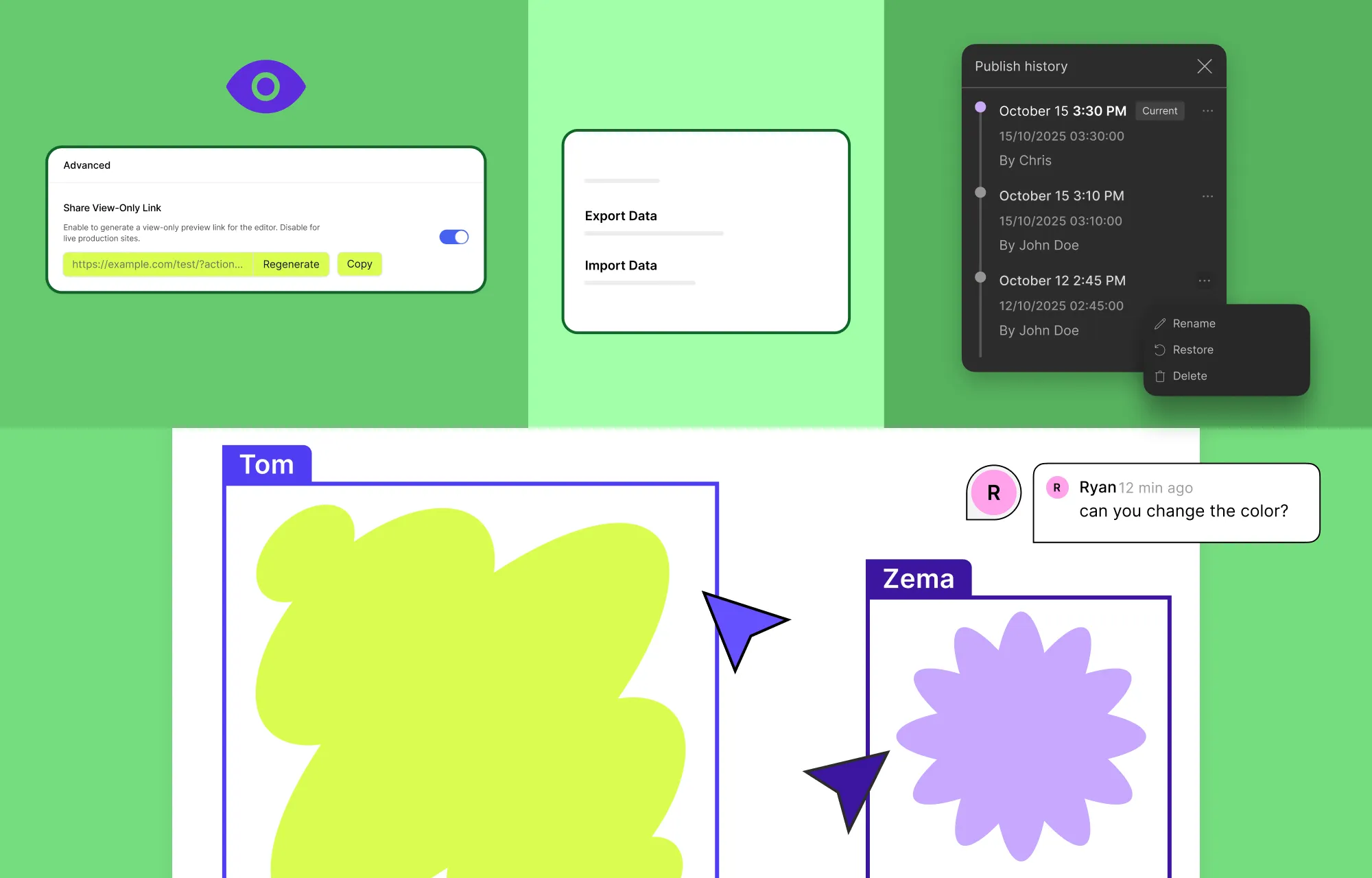
Keep clients in the loop using a shareable view-only link of the design within the editor.
With everyone connected directly on the workspace, collaboration is faster, smoother, and far more streamlined.
Best of all, you don’t even have to do any special setup in Droip to access real-time collaboration, nor do you have to juggle multiple external tools or third-party plugins.
Step 10: Optimize Your SEO
Your website is designed, and all the features are in place. The next crucial step is making sure people can find it, which means optimizing for SEO.
Here’s how you can do that:
Use relevant keywords throughout your copy. Make sure to keep it natural and impactful — avoid keyword-stuffing.
Further optimize page visibility using Droip’s built-in SEO tools. For meta titles and descriptions, you can use Droip AI for suggestions or to refine text directly in the editor. And for single-page templates, you can even define dynamic SEO using tags so each item has unique metadata.
Add alt text for images to improve accessibility and help search engines understand your content. Enable lazy-loading for media to enhance performance.
By following these little steps, you can improve the website experience, the search engine’s understanding, and consequently boost visibility on SERPs and organic traffic.
Step 11: Audit Your Website
We’ve almost reached the finish line! But before you go live, make sure to test and optimize every aspect to ensure a flawless experience for visitors.
In Droip, this is easier than ever using the built-in Audit tool, which automatically detects missing links, metadata, alt text, and other issues that could impact performance or SEO.
Next, run user testing and cross-browser testing to confirm your website looks and functions perfectly across all devices and browsers.
You can also use popular speed and performance testing tools online to analyze your site’s loading times and overall efficiency.
Doing this will help you catch any design inconsistencies, usability issues, or performance hiccups and ensure your website is at its best when launched.
Step 12: Launch Your WordPress Website
Huzza, you’ve finally built your WordPress website!
Now comes the most exciting part — going live.
If you’ve been building on a staging site, there’s no need to stress about the transition.
With Droip’s Project Export & Import feature, moving your WordPress website from staging to live is smoother than ever. You can carry over your entire design, content, and settings in just a few clicks.
Once your site is live, celebrate your launch! Share the news on socials, start promoting your content, and grow your audience.
And remember to keep it thriving by running regular maintenance checks, updating your content to keep things fresh, and scaling as your brand grows.
Wrapping Up
And there you have it, everything you need to know on how to build a WordPress website from scratch!
From sketching your website blueprint and choosing the right WordPress setup to building your WordPress website with Droip, you now have a complete roadmap to get started.
And the right tools, like Droip, make the journey a whole lot easier, letting you design, customize, add functionality, launch, and grow without limits.
So what are you waiting for? Start building your dream website today!
Working in a team to build a website, but the coordinated effort is lacking in…coordination?
We get it.
Changes can overlap, feedbacks vanish in endless message threads, and team members are often stuck waiting for their turn to edit.
What your team really needs is real-time collaboration in WordPress. And we’re going to show you how that’s possible!
What Is Real-Time Collaboration
Ever collaborated with multiple people on a Google Doc or Figma design?
That’s real-time collaboration.
It’s when multiple people can work together on the same page, see each other’s changes as they happen, share feedback instantly, and stay completely in sync.
Why WordPress Needs Real-Time Collaboration
Now that you know what real-time collaboration is and how it simplifies any team project, imagine bringing the same seamless experience to no-code website building in WordPress.
Your team would be able to design, develop, and publish webpages together in minutes, each doing their part without stepping on anyone’s toes.
Real-time collaboration keeps everyone on the same page — quite literally, eliminating common roadblocks such as:
Delays in Access: Nothing kills momentum faster than waiting for your turn to edit. It breaks flow, reduces efficiency, and pushes deadlines back.
Accidental Overwriting: When multiple people work on the same webpage separately, changes often clash and get overwritten, causing mistakes and wasting time.
Feedback Lost in Communication: Ever had a feedback or two disappear into a sea of chats and to-do lists? That’s how great ideas and crucial fixes slip through the cracks.
Irreversible Mistakes: In a team setting, one accidental change can undo someone else’s hard work. With no rewind button, small slip-ups can lead to big delays.
So no matter how many tools you use, nothing will beat seeing your team work on the design as it happens and being on top of every change with real-time collaboration in WordPress.
Droip: The Ultimate Real-Time Collaboration Tool
You know the what and why, so let’s get to know the how.
So, how do you bring real-time collaboration to WordPress?
Since collaboration needs to happen in your workspace, the key is to find a solution that combines no-code design capabilities with real-time collaboration.
In other words, look for the ultimate collaborative website builder in WordPress!
Now, there are collaboration plugins for WordPress, but most are designed for the default editor. They aren’t built for modern design tools, where teams can design, manage, and launch pages visually.
Enter Droip, a no-code, collaborative website builder that combines the power of WordPress with modern web design tools like:
Dynamic Content Manager
Figma to WordPress import
Visual Interaction Builder
Form Builder & Data Manager
And more
All while offering a full collaborative suite built right in, allowing your team to design, edit, and iterate together in real time:
Stay On the Same Page With Real-Time Co-Editing
This is how the magic happens.
With real-time co-editing in Droip, your team can work together simultaneously, on the same page, where every change unfolds live.
You can see cursors glide across the canvas, watch the edits happen live, follow color-coded highlights that show exactly who is changing what, and experience a level of collaboration that’s just as if you were all working side by side in the same room.
No more stepping on anyone’s toes or wondering “Who did this?”. Everything is streamlined, transparent, and efficient, letting your team focus on what matters most, which is creating beautiful websites faster than ever.
Share Feedback Directly Using In-Canvas Comments
While watching your web page take shape, imagine spotting an issue that needs fixing.
Normally, you’d have to ping a teammate through a third-party chat or project management tool.
But as the saying goes, ‘out of sight, out of mind’.
Without a native, central place for feedback, suggestions can easily get lost in endless message threads, leading to delay. It can also create miscommunication and often leaves team members out of the loop.
But with Droip’s in-canvas comments, you can leave feedback right there on the canvas, exactly where the change needs to happen. You can even tag teammates using their usernames to notify them instantly.
Since comments stay visible on the canvas until resolved and are accessible for everyone, no issue slips through the cracks. Misunderstandings are also minimized, and your team remains fully aligned, all without leaving the workspace.
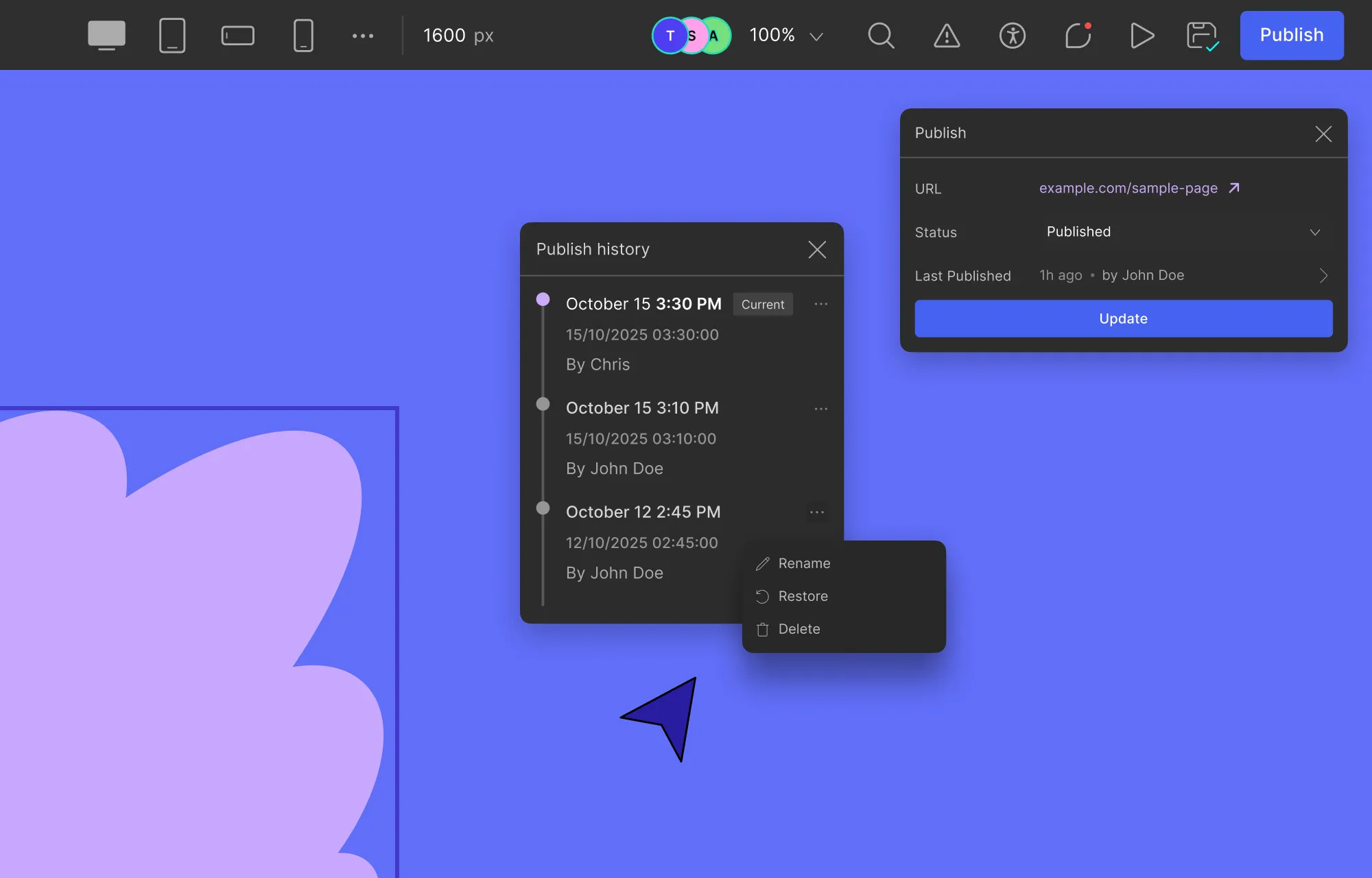
Restore Your Website Instantly With Smart Versioning
Website building is never a one-and-done process. It takes multiple iterations of building, reviewing, and refining to get it just right.
Along the way, some changes may no longer fit, or a small mistake can slip through, and hitting undo isn’t always enough to fix it.
That’s where Droip’s Smart Versioning comes in. Every published update creates a new instance, letting you easily go back to previous versions and restore your projects at any time.
Plus, with custom version names, timestamps, and clear attribution of who published each version, identifying and reverting to the exact version you need is effortless.
So whether you’re rethinking aspects of your website or trying to undo a mix-up, Smart Versioning ensures that doing so is quick and effortless.
Move Projects in Seconds Using Project Export & Import
Move your project anywhere, anytime, instantly.
Whether you’re handing off the project to another department, moving from staging to live site, or simply creating backups, Droip’s Project Export & Import feature makes it effortless.
The entire website, including all your layouts, assets, settings, and all, transfers perfectly intact without anything getting lost in transition.
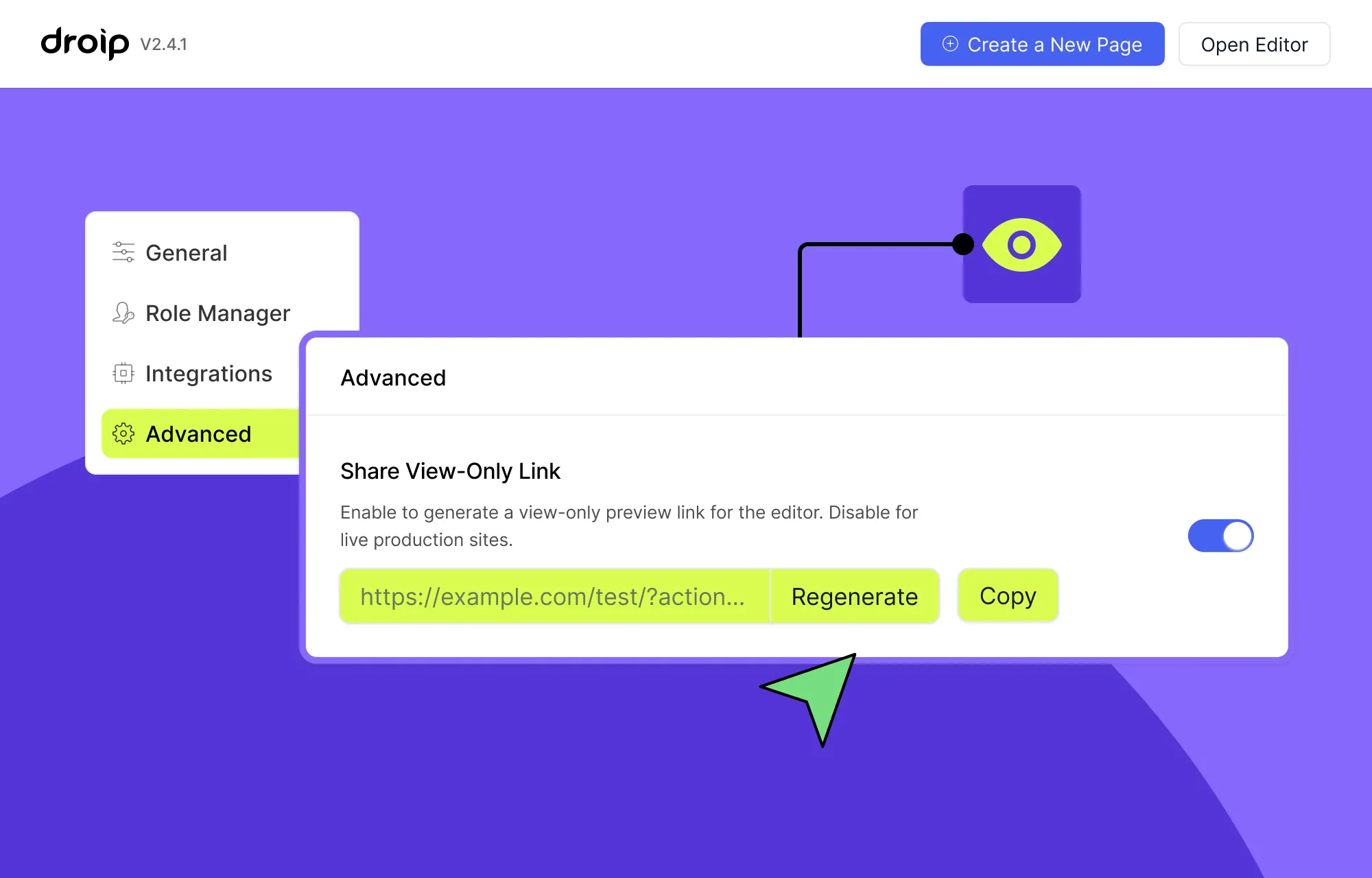
Keep Clients in the Loop With Shareable View-Only Link
Collaboration doesn’t stop at just the team — your clients are part of the process too.
But showing them the website every few weeks through screen shares, recordings, in-person demos, etc, is far from ideal.
These methods create barriers, limit hands-on experience, and often delay valuable feedback.
Instead, use Droip’s Shareable View-Only Link to give clients access to a view-only instance of your website from anywhere without any special setup or hassle.
They can then explore the project within the Droip editor, experiment with temporary adjustments to fine-tune any changes they want, and use the built-in preview mode to experience the website just like it’s live.
This way, clients don’t just see the work done but experience it first-hand, making the collaboration more interactive, transparent, and streamlined.
How to Start Collaborative Web Design With Droip
Collaborative web design in Droip is quick and effortless, requiring simple steps and no extra plugins. Here’s how:
Step 1: Set Up Your Staging WordPress Site
Start by hosting a private staging WordPress site on a server. This will be your team’s shared workspace that they can access from anywhere.
Step 2: Add Your Team Members
Next, create user accounts in WordPress for each team member. Then share the staging site link and each member’s login credentials so they can join the workspace.
Step 3: Set Up the Droip WordPress Website Builder
Get Droip, install it on your site, and activate its license. Once that’s done, use Droip’s Role Manager to define the access levels of your team members to secure your site and data.
Step 4: Start Designing Together, Instantly
The moment your team logs in, you all can start co-editing your website instantly with no special setups, extra plugins, or hassle.
Then, access the In-canvas Comment tab in the editor to easily share feedback, view active discussion threads on the canvas, add your own replies, tag teammates, and resolve completed issues.
Step 5: Share Project With Client
Once your design is ready for review (or whenever you want to keep your client in the loop), enable and copy the Shareable View-Only Link from the Advanced tab in Droip settings, then share it with your client.
Step 6: Move From Staging to Live Site
Once the website is perfected after multiple rounds of designing, reviewing, and refining, move your website from the staging site to the live site using Droip Export & Import, which you can access from the Advanced tab in Droip settings.
Best Practices For Team Collaboration
So now you can collaborate in real-time, which means everything should go perfectly, right?
Not quite!
To get the best results, reduce mistakes, meet deadlines, and maintain team harmony, here are some essential best practices:
Use a Powerful Collaboration Tool: Ironically, one of the most important best practices is to use a robust collaboration tool. Luckily, that’s already taken care of with Droip and its real-time collaboration capabilities.
Define a Comprehensive Style Guide: Before the team dives into building, establish your website’s branding, including style, color palettes, typography, and more. This ensures the team is aligned and equipped to create a cohesive website from the get-go.
Provide Constructive Feedback: Feedback is only valuable if it’s clear, actionable, and centralized. Encourage team members to use in-canvas comments, tag relevant teammates, and use proper feedback structure to save time and prevent miscommunication.
Use Version Control: Mistakes happen, sometimes big ones that you can’t just “undo”. So use Droip’s version control capabilities to create a new version at every key stage, giving your team a safe backup that you can instantly revert to without losing progress and causing delays.
Delegate Strategically and Prioritize Tasks: Assign responsibilities based on each member’s strengths and set clear priorities for tasks. This ensures everyone knows what they’re doing, keeping your project running smoothly from start to finish.
Involve Clients Early and Often: Keep clients in the loop throughout the project. This will accelerate feedback, avoid last-minute changes, and deliver a website that meets client expectations to the T.
Design on the Same Page — Literally
Droip gives building websites together in WordPress a whole new meaning.
Now you can build as a team with real-time collaboration in WordPress without any extra plugins or hassle, quite literally keeping everyone on the same page.
So get Droip and collaborate in WordPress like never before.
Great artists deserve the best stage — and for photographers, that stage is a stunning website that puts their work in the spotlight.
That’s why in this guide, we’ll show you how to create a photography website in WordPress with no code, hassle-free, and ready in no time.
So let’s dive right in!
Step 1: Find the Right Platform & Website Builder
To build a photography WordPress website without code, the first step is finding the right platform and website builder.
There’s no shortage of options, from WordPress builders to SaaS solutions and more. But SaaS platforms can often lock you into their ecosystem, offer limited flexibility & customization, and have high or recurring costs.
That’s why, if you’re looking for flexibility at an affordable price point, WordPress is your best bet.
However, with numerous website builders on the platform to choose from, it can get overwhelming.
To make things easier, here’s a breakdown of what an ideal WordPress website builder should let you do:
Work easily with images: It’s a photography portfolio website, so handling images should be a breeze! This means easily adding, viewing, and managing images. Bonus points if the editor lets you tweak images directly within the editor.
Freely customize your design: Photography websites rely on visuals. Find a tool with a real-time visual editor and granular control, which gives you the freedom needed to create a website that reflects you perfectly.
Make it responsive across any device: Stunning visuals lose their impact if they break on a different device. Avoid this by choosing a responsive website builder to adapt your design with ease.
Organize and display content dynamically: Another must-have for future-proofing your website is dynamic content! Then, you can update and add content from one place — making alterations and expansion hassle-free.
Optimize for speed and performance: A photography portfolio with all its high-quality images can slow down your site. Look for a website builder that generates fast and smooth pages with clean-code output and optimized media.
Avoid extra plugins and expenses: Don’t fall into the extra plugin black hole as it’ll slow down your site and break the bank. Instead, choose a one-stop website builder that offers everything built in.
Now, not all website builders on WordPress are truly no-code, nor do most offer a real-time visual editor and other necessary capabilities.
But one notable exception to this is the Droip WordPress website builder.
The all-in-one super-solution ticks all of the right boxes, giving you everything you need to build a professional photography portfolio website with no code required.
Like for starters, it comes with a growing library of WordPress themes, many of which are perfect for professional online photography portfolios. Best of all, you can use any of them without extra costs and get complete freedom to customize everything to fit your style and needs!
Beyond its real-time editor and free WordPress themes, Droip is genuinely a one-stop solution with powerful built-in features such as:
Figma to WordPress Handoff
Dynamic Content Manager
Synchronous Global Styling Using Variables
Real-time Collaboration & Co-editing
Interaction and Animation
And more!
Plus, Droip’s clean code output, lack of reliance on third-party JavaScript libraries, and automatic CSS and JS compression ensure flawless performance — making it the best choice for photography portfolio websites with heavy media.
Step 2: Install and Set Up Your WordPress Website
After choosing your website platform and builder, it’s time to go ahead and set it up.
For WordPress, this is super easy to do:
Step 1: Go to the WordPress website and download its latest version.
Step 2: Next, create a database for your site.
Step 3: Upload the WordPress files to your hosting server or local device if it’s a staging site.
Step 4: Navigate to your domain on a browser to run the WordPress installation.
Once your WordPress website is all set up, you can then install the website builder, which in our case is Droip:
Step 1: Create an account on the Droip website and choose a Droip plan that best fits your needs.
Step 2: Make your purchase and from your Account > Subscriptions > Downloads, save the latest version.
Step 3: Upload this file by going to your WordPress website > WP Admin > Plugins > Add New > Upload Plugin.
Finally, it’s time to get started on designing your website. Droip makes this really simple with four different ways to kick things off:
Import from Figma to WordPress: Already designing on Figma? Instantly bring your work into WordPress for development with the help of Droip.
Install any one of Droip’s free WordPress themes: Perfect if you’re a beginner, running short on time, or just want the simplicity of a pre-designed website that’s fully customizable.
Use Pre-built Wireframes, Sections, Pages, and Components: Alternatively, if you want more creative freedom or feel overwhelmed by complete templates, Droip’s pre-built options work great to give you that flexibility while still keeping the process fast and simple.
Start from scratch on a blank canvas: For ultimate creative freedom, you can start from scratch on a blank canvas using Droip’s built-in elements and create a completely unique website.
Method 1: Import From Figma to WordPress
If you have a design ready on Figma or prefer it, no need to fret. With Droip, you can import your designs from Figma to WordPress instantly.
No more waiting weeks or even months for developers to recreate your design. Instead, with just a few steps, you can have a fully-functional, pixel-perfect, and responsive website ready to go.
Droip also offers tons of ready-made, free WordPress themes with all the essential pages, making them the easiest and fastest way to get your website up and running!
Here are some creative portfolio WordPress themes that you can try at no extra cost, like:
To install a Droip WordPress theme, do the following:
Step 1: In the Droip editor, click on the Templates icon on the left sidebar.
Step 2: Browse the Template Library to find an option that fits your photography website.
Step 3: Click the template’s Details button to view more information, hit Import to install, and click Proceed to confirm.
That’s it! Your portfolio WordPress theme is now installed — complete with pages, site settings, and more.
💡 Note: For best results, use the Droip Base Theme with these templates. Download it from your Droip Account > Downloads, then upload, install, and activate it via WP Admin > Appearance > Themes.
Once your free WordPress theme is imported, you need to:
Replace placeholder content with your own
Swap images and other media
Tweak layouts and design to match your brand
Update navigation and links
Optimize for performance and SEO
Method 3: Use Pre-Built Wireframes, Sections, Pages, and Components
Droip also offers a library of Wireframes, Pre-built Sections, Pages, and Components that you can mix and match to quickly build your portfolio.
Wireframes: Think of these as web design blueprints — unstyled structures with content placeholders that give you a head start while leaving plenty of room for your creativity. There are options for every need, including Portfolio and Image Gallery Wireframes.
Pre-built Sections: Fully styled blocks that you use by simply swapping the demo content with your own. Showcase sections are perfect for presenting your photography in a unique, eye-catching way.
Pre-made Pages: Ready-to-use pages for landing, portfolio, pricing, and more — ideal for quickly creating companion pages for your website.
Pre-designed Components: Choose from a range of fully designed buttons, cards, etc that you drop anywhere on your site to boost both functionality and style without extra setup.
Method 4: Start From Scratch on a Blank Canvas
Last but not least, you can start entirely from scratch on a blank canvas by using Droip’s built-in elements:
Step 1: In the Droip editor, click on the plus icon on the left sidebar and go to Elements.
Step 2: Drag and drop elements to add layout, content, etc.
Step 3: Use the Style Panel to customize these elements.
With this approach, you get complete freedom to design every part of your website exactly the way you envisioned it.
Speaking of elements, here are some key media options in Droip that can take the way you showcase images to the next level:
The Image Element
Droip’s basic Image element is quite powerful on its own. It lets you add images from the Media Manager, upload new ones, and even pull directly from third-party image libraries like Unsplash & Pexels after integrating.
Then, from the Image element’s settings, you can set things like:
Image Alt Text
Loading Style (Auto, Eager, or Lazy)
HiDPI
And more
Grid, Flex & Stack Structures
Droip also includes several layout elements to showcase your photography portfolio images easily and effectively:
Grid & Flex: Showcase your images in a clean, structured layout using Grid or Flex. Grids are two-dimensional with rows and columns, while flex is one-dimensional, either horizontal or vertical.
Stack: Easily craft striking image masonry layouts, adding visual uniqueness to your design.
Slider, Carousel, & Lightbox
If you want your portfolio to feel more immersive, then Droip’s more advanced elements are the way to go.
Instead of just displaying the photos, they encourage viewers to engage with your work and experience it more fully. From Sliders and Carousels to Lightbox, you have plenty of options to showcase your photography in style.
Slider:Basically an interactive slideshow, a Slider is perfect for putting your best shots front and center, one at a time.
Carousel:Another type of interactive slideshow, but where Sliders show single items at a time, Carousels display multiple. This makes them ideal for showcasing your creative range or the variety of projects you can deliver.
You can convert your Slider into a Carousel like this:
Step 1: In the Droip editor, click on the plus icon on the left sidebar, go to Elements, and drag the Slider element onto your page.
Step 2: Set the width of each slider item from the size panel. For example, use 50% to display two images at once, 33% for three, and so on. (You can also play around with uneven widths to give a sneak peek of the next item in the carousel.)
Step 3: Finally, add an image element to every slider item, wrapped in its own div, and add your photos.
Just like that, you’ve got your Image Carousel!
Lightbox:A combination of a modal and a slider, the Lightbox element takes the immersive viewing experience to another level. Works great if you want your audience’s focus to be solely on your featured projects with no distractions.
Step 4: Go Beyond Design and Add Functionality
Whatever method you start with, once your design takes shape, it’s time to refine the finer details and then add functionality. With Droip, you can edit images to better fit your website, display dynamic content, capture leads with forms, add interactive effects, and more.
Edit Images Using Built-in Image Editor
You’ll also find that Droip comes with a built-in Image Editor. This is great if you have some last-minute adjustments to make or want your images to match your design better.
To access it, select the image on the canvas you want to edit and click on Adjust.
You’ll then find the image adjustment toggles here as well as the tabs for Crop & Edit and Filters.
Alternatively, you can go to the Media Manager directly, select your image, and access the Image Editor options from there.
Display Dynamic Content
Static placeholder content is easy to swap with what’s relevant, but listings like Portfolio, Services, etc, are constantly evolving alongside your website. So manually adding and managing these to a page can quickly get messy and tough to scale — especially as your brand expands.
This is where Droip’s Dynamic Content Manager comes in.
While replacing template content, use the Content Manager to create custom content types for Portfolio, Services, and more. Then, you can add your data just once and display it dynamically anywhere on your website through lists and single-page templates.
This approach makes updating your content effortless and allows your portfolio website to scale seamlessly as your brand expands.
Forms are a vital part of any website as they let you capture leads, collect important data, and connect with your audience directly from your website.
For instance, most photography portfolio websites use contact forms so potential clients can easily get in touch.
With Droip’s built-in Form builder, you can create forms for any purpose from simple contact and inquiry forms to newsletter sign-ups and more.
You can also strengthen form security by connecting with reCAPTCHA and automate email marketing campaigns by integrating with the MailChimp API.
Plus, with a native Form Data Manager, you can access, organize, and manage your responses with ease.
To learn more, check out the Form Builder documentation.
Add Interaction & Animation
Finally, bring your website to life by adding engaging interactions and animations. In Droip, this is easily done through the:
Animation Library: Use the preset animations for quick effects.
Custom Response Editor: Visually build advanced, layered interactions in WordPress without code.
Text Animation: Instantly animate your text elements.
We’re almost at the finish line, but before you go live, take a moment to run a final audit.
Here’s where Droip’s built-in Audit tool comes in handy. It can quickly catch missing links, alt text, and other issues for you to fix.
Next, you should also use any reliable online tool to check your website’s performance and find what areas, if any, you need to improve.
Once everything looks good, you’re ready to go live!
If you’ve been working on a staging site, Droip makes it effortless to switch from staging to live in no time. Otherwise, you can publish directly.
Launch Your Photography Website Today
And that’s our guide on how to create a photography website in WordPress with no code, all wrapped up!
Launching an online photography portfolio on WordPress has never been easier or more flexible. With Droip, it can just be a matter of picking a free WordPress theme, swapping in your content, customizing the style, adding functionality, and bam — you’ve got your website.
So why wait? Get Droip and start building your dream website visually today!
Looking for the best free WordPress themes to make your restaurant business shine online? Well, you’ve come to the right place!
Today, we’ve got you a list of the most tasteful restaurant WordPress themes that not only look stunning but also elevate the overall website experience.
Kaizen
First up, we have Kaizen, a gorgeous WordPress theme designed to serve fine-dining restaurants, sushi bars, and other eateries.
Featuring structured and minimalist layouts, bold color-blocking design, and seamless interactions, it has a landing page that sets the vibe just right.
Plus, with essential pages like Menu and Gallery to showcase your mouth-watering dishes and an easy-to-use Booking Form for online reservations, it’s a theme designed to convert!
Vaelon
Want your website to mirror the explosion of flavors on the menu? Go for Vaelon, a restaurant WordPress theme bursting with vivid colors, playful animations, and fun, media-rich layouts that showcase your dishes at their best.
From a bold hero section to a signature dishes showcase, strategically placed reservation CTAs, customer reviews, and more, the landing page has it all.
And that’s not to mention the other essential, equally interactive and engaging pages like Menu, Events, Reservation, etc.
Platea
Next up, we have Platea bringing the coziness of your restaurant online! Designed with a fresh yet nostalgic feel, it’s ideal for any kind of casual food spot, from fast-food joints to juice & smoothie bars, and more.
Featuring unique layouts, eye-catching interactions, and retro design elements, Platea delivers a fun and memorable website experience.
And it’s not just a treat for the eyes, visitors get all the essential info too through pages like Menu, Reviews, About, etc.
Frosty
Have a juice bar or food spot to show off? Get Frosty, a delightful WordPress theme designed for healthy eats, beverage brands, health drinks, and more.
With sections to showcase your menu and nutritional facts, promo videos, customer reviews, and more, Frosty’s landing page serves up a perfect mix of tasty treats, healthy vibes, and a fun experience!
And if you thought that was all, think again, as it also comes with a full Menu page that includes nutritional facts, plus all the other essential pages your site needs, like Reviews, Contact, etc.
Free WordPress Themes Powered by Droip
That wraps up our round-up of the best restaurant WordPress themes!
But these themes are more than just stunning visuals.
Powered by the Droip WordPress website builder, every template is fully customizable visually, and with no code required. That means anyone can tailor any theme to match their brand perfectly and launch their website with ease.
These themes are also endlessly scalable thanks to Droip’s unlimited breakpoints, ensuring a seamless website experience for your audience across any device.
And that’s not all — Droip comes loaded with native features that you’d normally need extra plugins for, saving you from the cost and hassle, with powerful tools like:
Dynamic Content Manager
Real-Time Collaboration and Co-editing
Global Styling Using Variables
Visual Interaction Builder
Form Builder & Data Manager
And more
Plus, all of these are free WordPress themes that come with Droip with no extra costs. So if you can’t decide, you can try as many as you like until you land on the right one!
How to Install Droip WordPress Themes
Installing Droip WordPress themes is a breeze. Just follow these simple steps:
Step 1: In the Droip editor, click on the Templates icon located on the left sidebar.
Step 2: Browse the Template Library to find a template that fits your needs.
Step 3: Click on a template to view its details, then hit Import to install it, and click on Proceed to confirm.
And that’s it! Your template pages, their content, site settings, and more are now in place.
From here, you can easily replace content, connect & display dynamic collections, customize the design, and put on the finishing touches, without having to start from scratch.
💡 Note: We recommend using the Droip Base Theme with these templates. Simply download it from your Droip account (Account > Downloads), then upload, install, and activate it from WP Admin > Appearance > Themes.
Dish Your Restaurant WordPress Website in No Time
So why wait? Choose any one of these free WordPress themes powered by Droip and build stunning restaurant websites in no time!
And if you’re looking beyond restaurant WordPress themes, Droip’s library of free WordPress themes has you covered with a wide range of niches to explore.
Struggling to effectively organize and display your website content with the limited default WordPress post types? You’re not alone because Posts and Pages can only go so far. What you need to do is define Custom Content Types.
The best part is that you won’t require external tools or complex code to achieve it! In this article, we’ll show you how to create custom content types in WordPress without extra plugins.
What is Custom Content Type
Not sure what custom content types are or why you need them?
It all starts with understanding WordPress Post Types, which are a way to organize different kinds of content in WordPress, the most common being Posts and Pages.
The problem is that these default post types don’t work well for various other types of content, such as portfolios, services, projects, events, teams, etc.
This is why you need to define a new custom content type, tailored to your specific needs, to organize and display content properly.
How to Create a Custom Content Type in WordPress
Now that you know what custom content types are and why you need them, let’s finally explore how to create custom content types in WordPress!
Pick a Builder With Built‑in Content Manager
So, how do you create custom content types in WordPress without extra plugins?
Using a WordPress website builder with a built-in Dynamic Content Manager, like Droip, of course!
The Droip WordPress builder is a one-stop tool that lets you visually create, manage, and display custom content types without any extra tools or hassle.
Plus, with other built-in capabilities like premade templates, unlimited breakpoints, Figma to WordPress handoff, visual interaction builder, form builder & manager, and more — you’ve got an all-in-one website building solution at a fraction of the price of other, more limited options and with no extra costs!
Create Custom Content Types Using Droip
Now, let’s come to the meat of the matter, i.e., how to create custom content types using the Droip website builder.
In Droip’s Content Manager, custom content types are defined through Collections. To create one, follow these steps:
Step 1: Click on the Content Manager icon on the left sidebar.
Step 2: On the Content Manager dashboard, click on Add or Add New Collection.
Step 3: Choose one of the preset collections or start from scratch.
Step 4: Name your new collection so it clearly describes its content, e.g., Works, Recipes, Team Members, etc.
Step 5: Next, add fields to store relevant information. Click on the plus icon and choose your desired field type. The Droip Content Manager offers a variety of field types to suit your needs.
Step 6: Finally, configure field settings and hit Create Collection.
And just like that, your custom content type is defined!
But Droip’s Content Manager doesn’t stop there — it lets you add, manage, and display data dynamically and with ease.
Add Data to Your Custom Content Type
Your collection is ready to store entries and organize your custom content. In Droip, this is easily done in just a few steps:
Step 1: Select the collection you just created, then click on +Add New Item if it’s empty or +Add New in the top right corner.
Step 2: Next, fill in the fields of your collection.
Step 3: Lastly, click Save to store your data. This saves it as a draft by default, but you can use the dropdown arrow to choose Publish or Schedule instead.
Repeat these steps until all your items are added.
You’ll see your items listed within the collection, where you can select multiple items at once and perform bulk actions like duplicate, delete, etc. You can also use search and filter the list to quickly find exactly what you need.
Display Custom Content Dynamically on Website
You’ve got your custom content organized. Now, it’s time to display it dynamically on your WordPress website.
In Droip, you can show dynamic content as:
Listings through the Collection element
Single-Page Templates for each individual item
To display dynamic content as listings:
Step 1: Click on the plus icon on the left sidebar and open Elements.
Step 2: Drag and drop the Collection element onto your page.
Step 3: From the Collection element’s inline editor, open its settings, set its Source to Posts, and Type as the collection you want to connect to.
From here, you can also apply filters, sorting, and other customizations to tailor your dynamic listing.
Step 4: Finally, select an element inside the Collection Item element.
From its dynamic content settings, set Type to the collection you want to connect, and Value to the field you want to display.
Similarly, add or select other elements within the Collection Item and connect them to the fields you want to showcase.
To create single-page templates that display each item’s details:
Step 1: Click on the Pages icon on the left sidebar.
Step 2: Click on the plus icon on the top-right corner of this side panel, then select the Template option.
Step 3: Set Collection as Post and Post Type as the collection you want the template to connect with.
Step 4: Design your single-page template as you would any page in Droip.
Step 5: Then, select an element and from its dynamic content settings, set the Type to the appropriate collection and value to the relevant field.
To preview the details page template for each item, use the dropdown at the top of the canvas to switch between items.
💡 Tip: For single-page templates, you can also use dynamic tags to set SEO so it is unique for every item’s page.
Connect Related Custom Content Types
When showcasing related content in one place, it seems harmless to simply repeat the related data across different content types.
But this approach is inefficient and prone to inconsistencies, as every change means manually updating in multiple places.
Luckily, with Droip’s Single & Multi-Reference Fields, you can easily link separate but related collections without duplicating data, eliminating repetition, inconsistencies, and wasted effort.
Here’s how to connect related content using Single Reference Field:
Using single reference fields, you can pair an item in a collection with another item in another collection.
Step 1: Create your collections and add their data in the Dynamic Content Manager.
Step 2: In your main collection, add a Reference field, set Ref. Collection to the collection you want to link, and hit Save.
Step 3: Finally, for each item in this main collection, choose a value for the reference field (pulled from the referenced collection), and save.
Here’s how to connect related content using Multi-Reference Field:
Using multi-reference fields, you can link an item in a collection to multiple items in another collection.
Step 1: Create your collections and add their data in the Dynamic Content Manager.
Step 2: In your main collection, add a Multi-Reference field, set Ref. Collection to the collection you want to link, and hit Save.
Step 3: Finally, for each item in this main collection, select one or more values for the multi-reference field (pulled from the referenced collection), and save.
And that’s a wrap on how to create custom content types in WordPress without extra plugins!
With the Droip WordPress website builder, you can not only create custom content types, but also insert, manage, and dynamically display custom content effortlessly with no code.
So what are you waiting for? Get Droip to build stunning, dynamic websites with custom content types tailored to your needs today!
Our website uses cookies to improve your browsing experience on our website. By continuing to use this website, you
agree to
their use. For details, please check our Privacy Policy.
Get started for free!
Start 90 days free trial!
Get Droip
Experience the power of Droip. Create stunning, responsive sites with pure creative freedom.