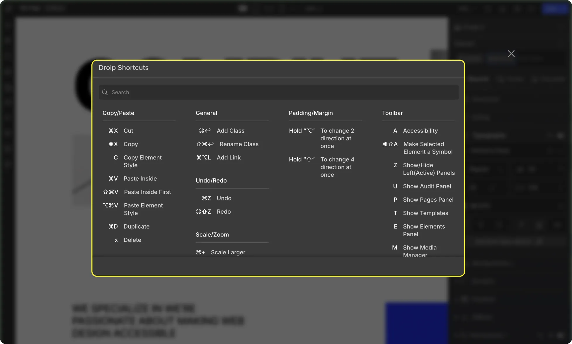
Droip offers quite a selection of Keyboard Shortcuts for various actions to make your website-building experience even smoother. Below is a list of all of the shortcuts that are available.
Copy/Paste
Cut: Cmd + X – Remove the selected content and place it in the clipboard.
Copy: Cmd + C – Copy the selected content to the clipboard.
Copy Element Style: Opt + Cmd + C – Copy the style properties of the selected element to the clipboard.
Paste Inside: Cmd + V – Paste the content from the clipboard at the bottom of the currently selected section.
Paste Inside First: Shift + Cmd + V – Paste the content from the clipboard inside the currently selected section as the first element.
Paste Element Style: Opt + Cmd + V – Apply the style properties from the clipboard to the selected element.
Duplicate: Cmd + D – Create a duplicate of the selected element.
Delete: Delete – Remove the selected element from the canvas.
View
Show Ruler: Shift + R – Display a ruler to align your elements more accurately on the canvas.
Show Empty Elements: Shift + Cmd + M – Show hidden empty elements on the canvas.
View Guides: Ctrl + G – Enable canvas View Guides.
Preview Mode: Cmd + Shift + P – Switch to preview mode to see how the website will look to visitors.
Guide Overlay: Cmd + Shift + G – Display guides on top of the website content to aid in alignment.
General
Add Class: Cmd + Return – Add a new class to the selected element.
Rename Class: Shift + Cmd + Return – Rename the class of the selected element.
Add Link: Cmd + Opt + L – Create a hyperlink for the selected element.
Undo/Redo
Undo: Cmd + Z – Reverse the last action.
Redo: Cmd + Shift + Z – Redo the last undone action.
Rotate & Flip
Rotate Left: Shift + Cmd + R – Rotate the selected element counterclockwise.
Rotate Right: Cmd + R – Rotate the selected element clockwise.
Flip Vertically: Shift + V – Flip the selected element vertically.
Flip Horizontally: Shift + H – Flip the selected element horizontally.
Scale/Zoom
Scale Larger: Cmd + Plus (+) – Increase the size of the selected element.
Scale Smaller: Cmd + Minus (-) – Decrease the size of the selected element.
Scale to Default: Cmd + 0 – Reset the size of the selected element to its default.
Global Search
Quick Find: Cmd + / – Search for elements, pages, posts, etc.
Arrangement
Move Forward: Cmd + Right Bracket (]) – Move the selected element one step forward in the layering order.
Bring to Front: Cmd + Opt + Right Brace (}) – Bring the selected element to the topmost layer.
Move Backward: Cmd + Up Arrow + Left Bracket ([) – Move the selected element one step backward in the layering order.
Send Backward: Cmd + Opt + Left Bracket ([) – Send the selected element to the bottommost layer.
Left Align: Opt + A – Align the selected element to the left.
Horizontal Center Align: Opt + H – Center the selected element horizontally.
Right Align: Opt + D – Align the selected element to the right.
Top Align: Opt + W – Align the selected element to the top.
Vertical Center Align: Opt + V – Center the selected element vertically.
Bottom Align: Opt + S – Align the selected element to the bottom.
Padding/Margin
To change 2 directions at once: Hold Opt – Adjust padding or margin on two sides simultaneously.
To change 4 directions at once: Hold Shift – Adjust padding or margin on all four sides simultaneously.
Toolbar
Accessibility: A – Access the accessibility features.
Make Selected Element a Symbol: Cmd + Shift + A – Convert the selected element into a reusable symbol.
Show/Hide Left (Active) Panels: Z – Toggle the display of left panels that are currently active.
Show Audit Panel: U – Display the audit panel for website analysis.
Show Pages Panel: P – Show the pages panel for managing website pages.
Show Elements Panel: E – Show the elements panel.
Show Media Manager: M – Access the media manager for managing website assets.
Show Component: D – Display the components panel.
Show Layers: L – Show the layers panel for managing website layers.
Show Symbols Panel: B – Display the symbols panel for managing website symbols.
Create Component Modal: Opt + Cmd + K – Open the component creation modal window.
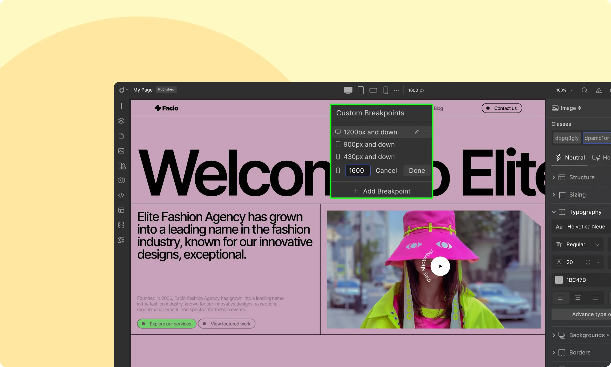
Breakpoints in Droip give you complete control over your website’s design and layout across different screen sizes. With breakpoints, you can customize content, test responsiveness, and create custom breakpoints to ensure your site looks and functions flawlessly on any device.
Canvas Breakpoints
Located in the center of the Topbar, the breakpoint icons allow you to seamlessly switch between different device views. Droip provides four default breakpoints:
Desktop (Default value 1400px): Design for larger screens such as desktops and laptops. This is the default breakpoint, and any styles applied here will cascade down to all smaller breakpoints unless overridden.
Tablet (Default value 991px): Optimize your design for tablet-sized screens, such as iPads. Styles applied at this breakpoint will apply to screens 991px wide and below.
Mobile Landscape (Default value 767px): Tailor your website for phones held in landscape mode. Any changes made here will apply to screens 767px wide and smaller.
Mobile (Default 575px): Ensure an optimal viewing experience on smaller smartphone screens. Styles applied at this breakpoint will only affect devices 575px wide and below.
Custom Breakpoints
Need more flexibility? Droip lets you add as many custom breakpoints as needed. Simply click the ellipsis icon beside the default breakpoints and set your own custom width to fine-tune your design for specific screen sizes.
How Breakpoints Work in Droip
The Desktop breakpoint acts as the global viewport, meaning all styles applied here will cascade down to smaller breakpoints.
Any changes made in Tablet view will apply to tablet screens and smaller breakpoints unless overridden.
The same applies to Mobile Landscape and Mobile views, with styles cascading downward unless explicitly changed.
This hierarchical approach streamlines your design workflow, ensuring consistency across all devices.
Testing Responsiveness & Fluidity
Use the Preview button to test your design’s responsiveness across different screen sizes. This helps ensure that your layout, typography, images, and other elements adjust smoothly across devices.
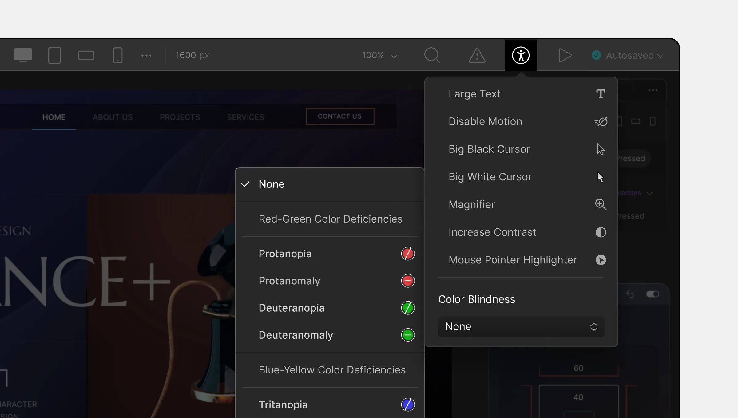
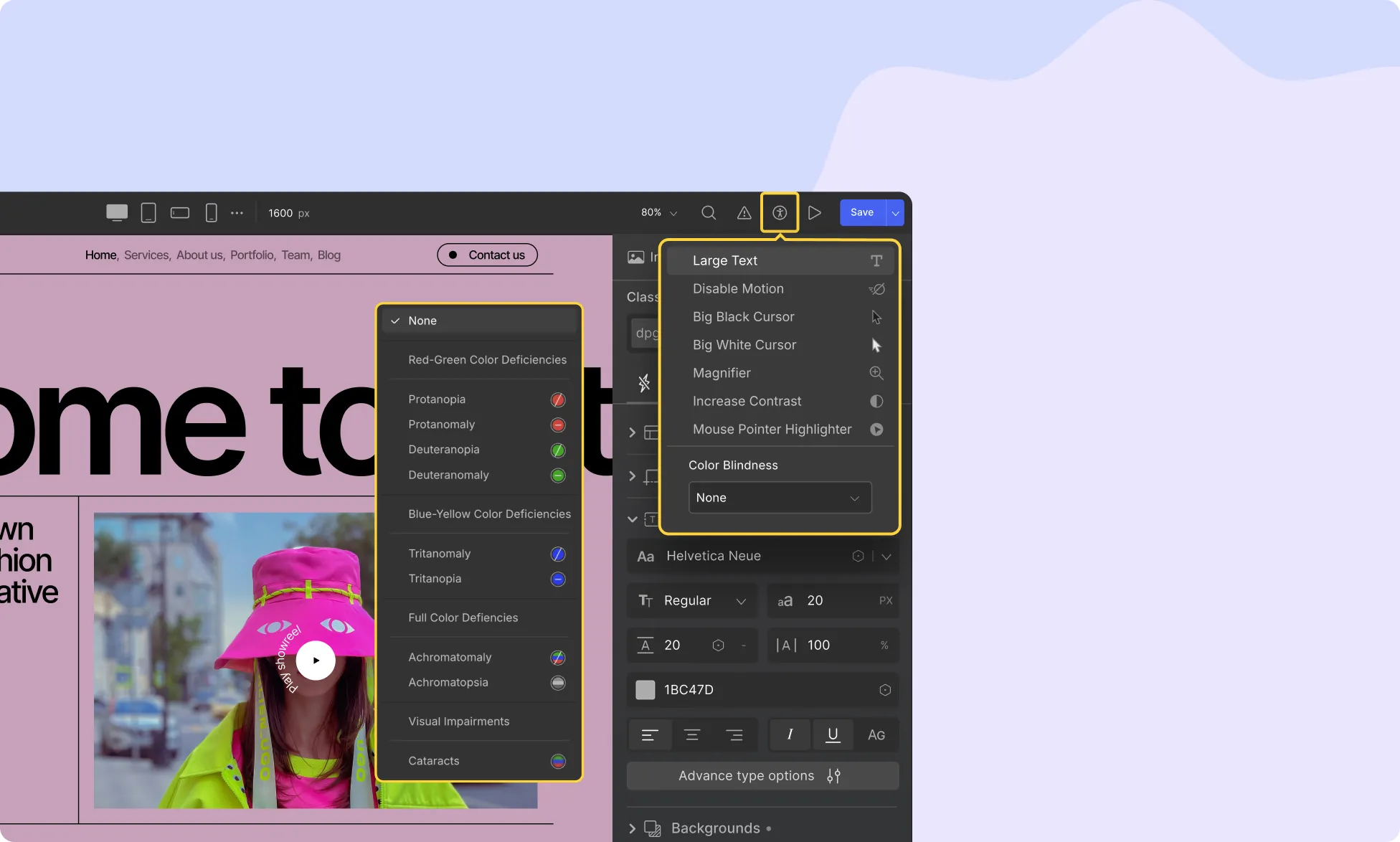
Accessibility ensures that websites and software tools are usable by a broader range of users, including those with disabilities. Droip’s Accessibility settings help improve the UI experience to ensure that the pages you design are flawless and user-friendly.
Accessibility Settings
The Accessibility settings are found on the right side of the Topbar, represented by the Accessibility icon. Clicking on it reveals the following options:
Large Text: Increases text size for better readability, especially for users with visual impairments.
Disable Motion: Turns off motion effects that might cause accessibility issues.
Big Black Cursor: Replaces the default cursor with a larger, high-contrast black cursor.
Big White Cursor: Replaces the default cursor with a larger, high-contrast white cursor.
Magnifier: Adds a magnifying effect to the cursor, assisting users with low vision.
Increase Contrast: Enhances overall color contrast to improve visibility.
Mouse Pointer Highlighter: Highlights the mouse pointer, making it easier to locate on the screen.
Color Blindness Support
The Color Blindness tool allows users to adjust the display based on their specific color vision deficiency. Clicking on the dropdown provides the following options:
Red-Green Color Deficiencies:
Protanopia: Red-blindness (absence of red cones).
Protanomaly: Red-weakness (some shades of red are visible).
Deuteranopia: Green-blindness (absence of green cones).
Deuteranomaly: Green-weakness (some shades of green are visible).
Blue-Yellow Color Deficiencies:
Tritanopia: Blue-blindness (absence of blue cones).
Tritanomaly: Blue-weakness (some shades of blue are visible).
Full-Color Deficiencies:
Achromatomaly: Partial color blindness (cones function poorly, vision relies on rods that do not process color well).
Achromatopsia: Total color blindness (only shades of gray are visible).
Other Visual Impairments:
Cataracts: Simulates blurred vision caused by clouding of the eye’s lens.
By prioritizing accessibility, Droip ensures an inclusive and user-friendly environment, allowing all users to interact with the platform seamlessly, regardless of their visual abilities.
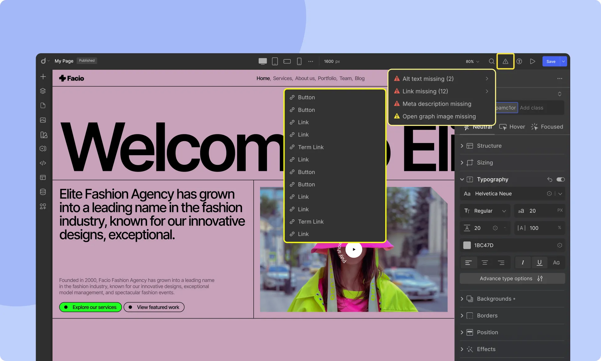
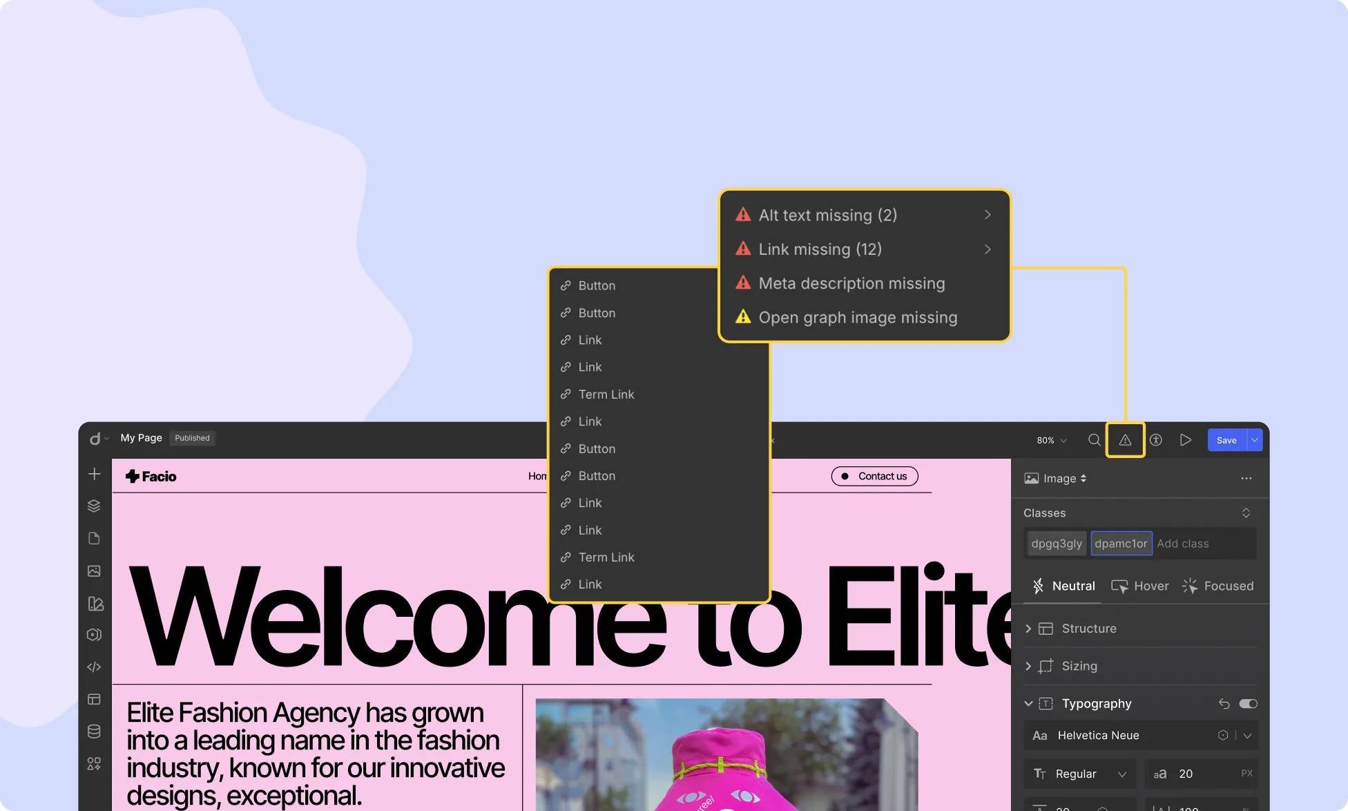
The Audit feature in Droip, represented by a triangle exclamation icon, is a powerful tool designed to automatically assess your website’s accessibility. It helps ensure your site adheres to key accessibility standards, improving usability and SEO.
Audit Checks
The Audit feature evaluates the following aspects:
1. Alt Text Missing
This check identifies media elements (images, videos, etc.) that lack alternative text (alt text). When you hover over this feature, it highlights the affected media elements.
Why it matters:
Alt text is crucial for visually impaired users, allowing screen readers to describe image content.
It ensures accessibility compliance.
Helps improve SEO by providing search engines with relevant content descriptions.
2. Link Missing
This check detects link blocks that do not have valid URLs assigned. Hovering over this feature will highlight the affected links.
Why it matters:
Ensures smooth navigation for users.
Prevents broken or incomplete links that could disrupt user experience.
3. Class Name Missing
This check counts how many elements are missing class names. Hovering over this feature will show the elements without class names.
Why it matters:
Organizes your website elements efficiently.
Simplifies styling and customization.
Enhances maintainability and consistency across your project.
By using the Audit feature in Droip, you can proactively improve your website’s accessibility, usability, and SEO, making it more user-friendly for all visitors.
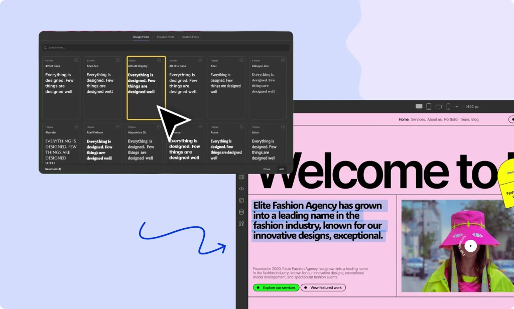
Using a variety of fonts is essential for web design, and the ability to upload custom fonts adds even more flexibility.
To access the Font Library, click on the dropdown icon next to Droip’s logo in the Topbar.
Font Library Tabs
The Font Library consists of three main tabs:
1. Google Fonts
This tab provides access to a wide range of open-source fonts from Google Fonts. You can select and incorporate these fonts into your project for use in website text, branding elements (including logos), and more.
2. Installed Fonts
The Installed Fonts tab displays a list of all fonts that are already installed in your project. If you need to remove any fonts, simply click the Remove button located at the bottom-right corner.
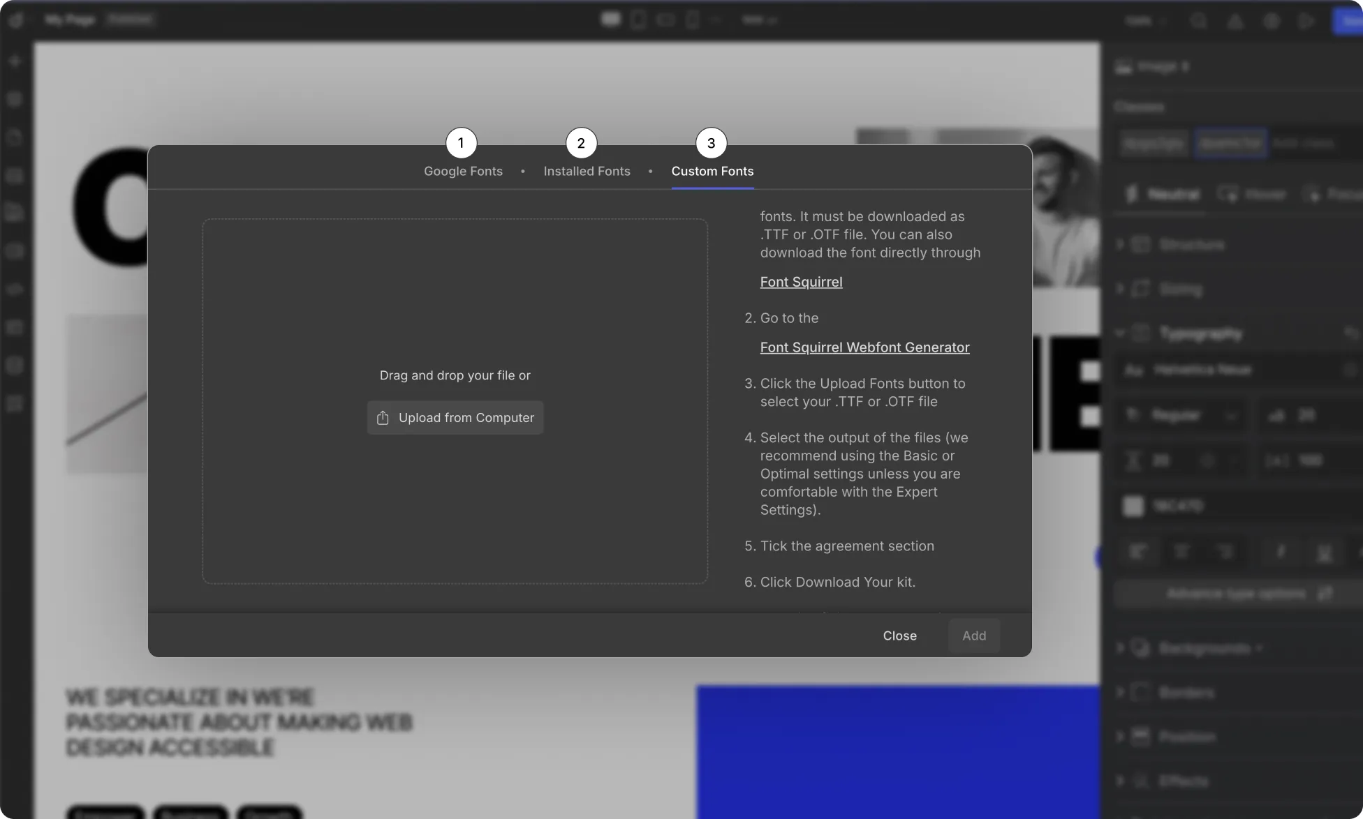
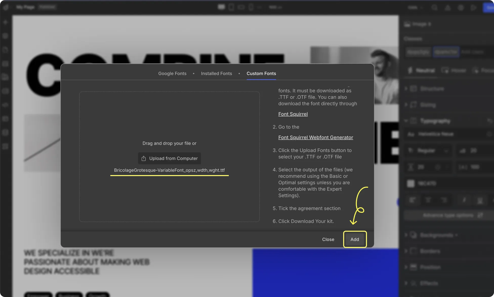
3. Custom Fonts
This tab allows you to upload and use your own custom fonts in your Droip projects, giving you full creative control over typography.
📝 Note: You can also access the Font Library from the Typography panel under the Font dropdown.
How to Upload Custom Fonts
Follow the steps below to upload and integrate custom fonts into your webpage.
From the Font Library and select Custom Fonts.
On the right-hand side, you’ll find a link to the Font Squirrel Webfont Generator. Click on it.
Upload your .OTF or .TTF file to the Font Squirrel Webfont Generator.
Choose between Basic or Optimal settings. Advanced users can explore Expert settings.
Confirm your legal rights to use the font for web embedding by checking the eligibility box.
Download the Webfont Kit zip file.
Return to Droip and click Upload From Computer to upload the Webfont Kit.
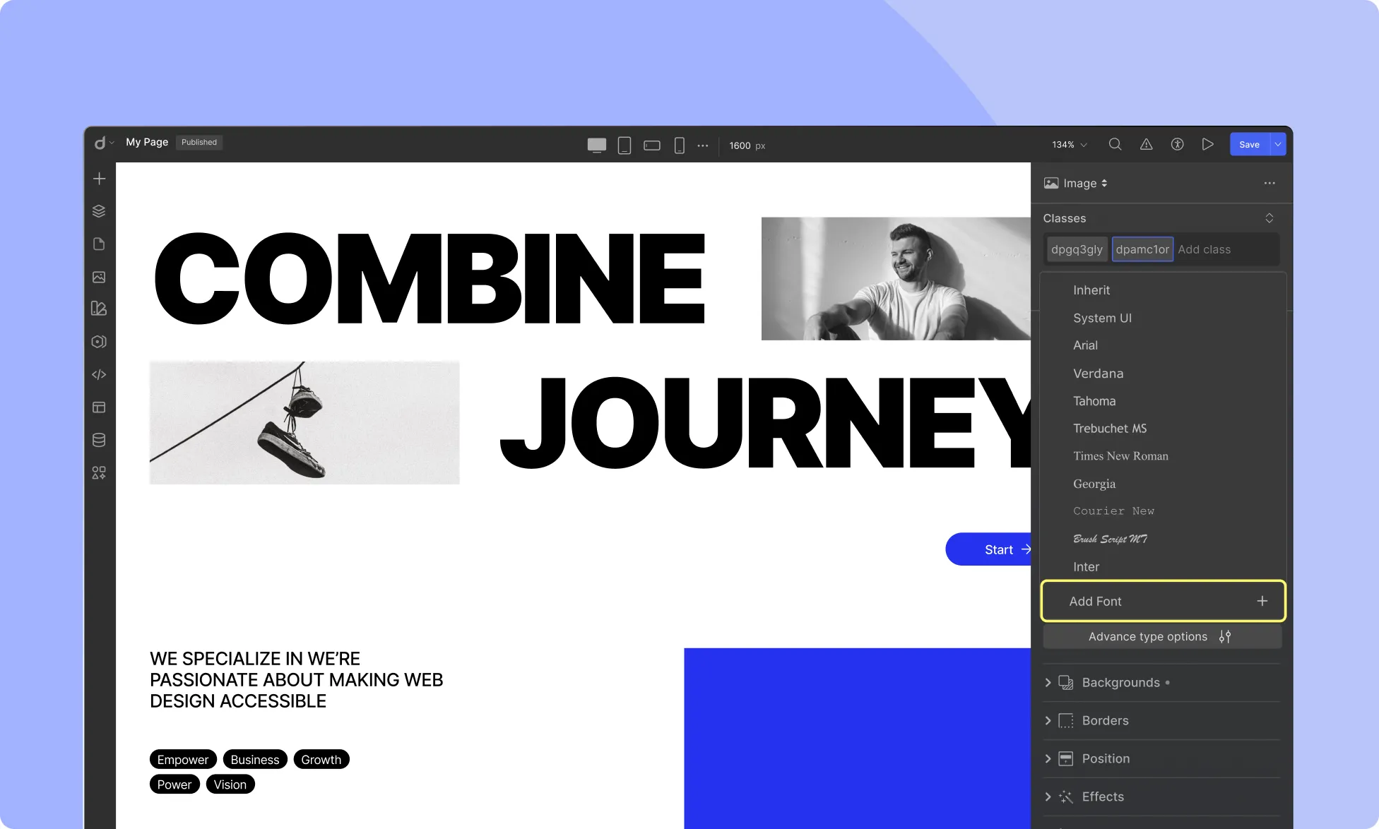
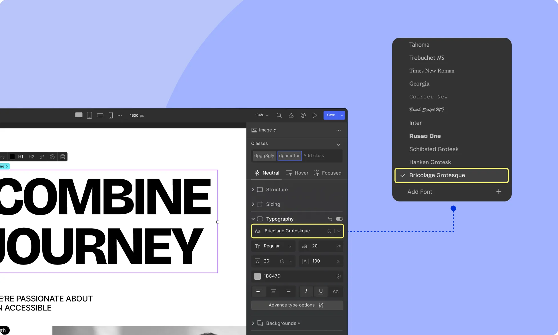
Using Your Custom Fonts
To apply your uploaded custom fonts in your project:
Select the text element where you want to use the custom font.
Go to Style Panel > Typography.
Under the Font dropdown, your custom fonts will appear alongside the available fonts.
With the Font Library, you can easily enhance your design with a wide selection of fonts or upload your own for a truly unique look.
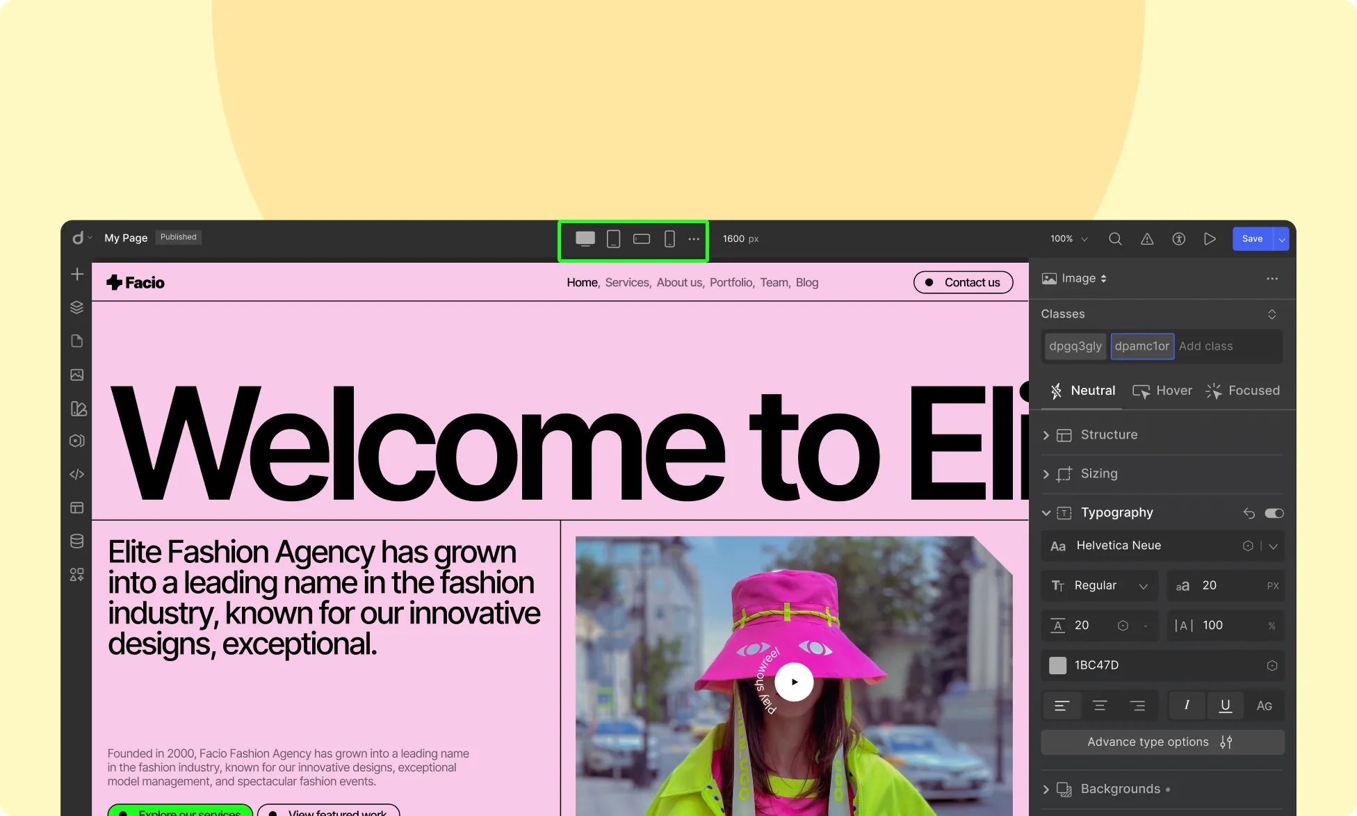
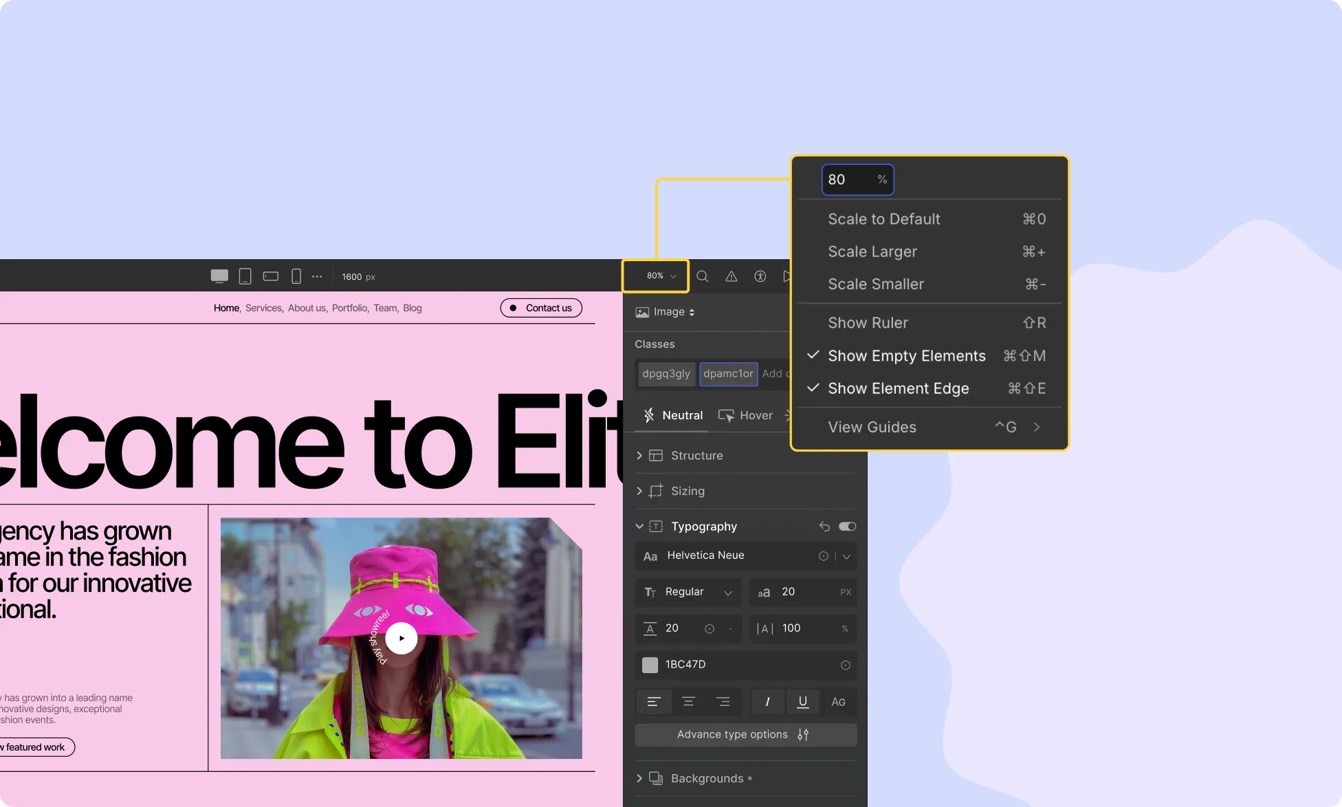
Canvas Control allows you to customize the display and behavior of the canvas while designing your website. It is represented by the Scale Percentage dropdown on the Topbar.
Adjust Canvas Size While Editing
You can easily modify the canvas size using the Scale Percentage dropdown. Available options include:
Scale to Default: Resets the canvas to its default size.
Scale Larger: Enlarges the canvas size.
Scale Smaller: Reduces the canvas size.
Ruler and Element Visualization
Enhance element alignment and visibility with these options:
Show Ruler: Enable or disable rulers for accurate alignment.
Show Empty Elements: Highlight empty elements on the canvas.
Show Element Edge: Toggle visibility of element edges for better structure visualization.
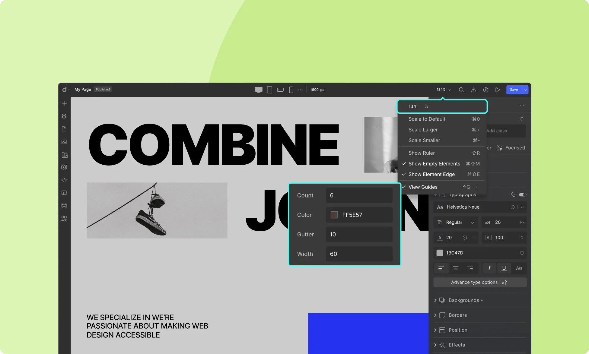
View Guides
Canvas Control allows you to enable Canvas View Guides, which are vertical bars spanning from top to bottom for precise alignment. Customize them with:
Count: Set the number of vertical bars.
Color: Choose the color of the guides.
Gutter: Adjust spacing between the guides.
Width: Set the width of each guide.
View Guides are particularly useful for ensuring a structured and well-aligned layout.
With Canvas Control, you can tailor your workspace for a seamless and efficient website development experience.
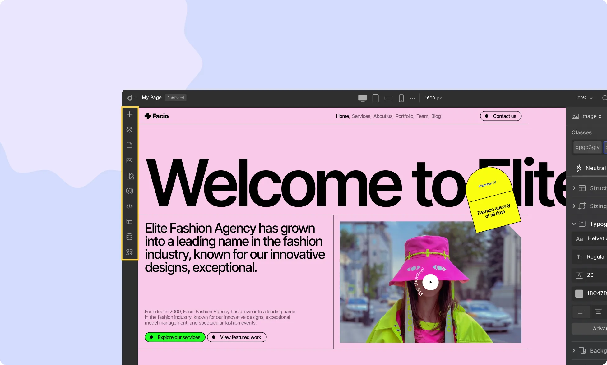
The Topbar in Droip provides a range of powerful tools to streamline your website-building process. Let’s explore each element of the Topbar:
Topbar Menu
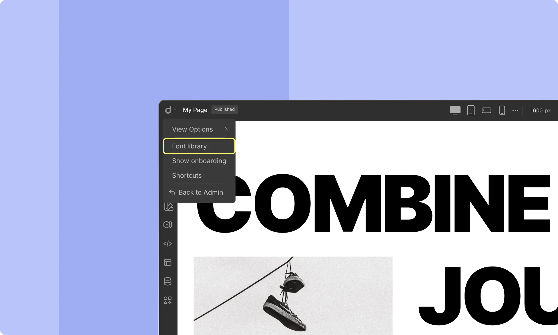
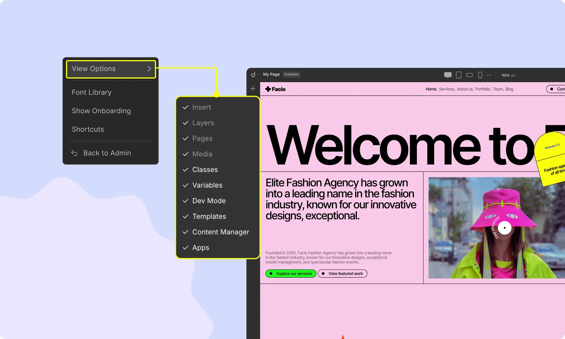
Starting from the left side of the Topbar, you will find the Topbar Menu. Click on the dropdown button beside Droip’s logo to access the following options:
View Options
Hover over View Options to access the menu settings. From here, you can choose which menus to keep visible in the editor while working on your website.
Font Library
Clicking on Font Library opens a new window with three tabs:
Google Fonts: Browse and select from a collection of free web fonts provided by Google.
Installed Fonts: View the fonts already installed in your Droip project.
Custom Fonts: Upload and use your own fonts on your website. Learn how to upload custom fonts.
Show Onboarding
Click Show Onboarding to start a guided tour of the website builder. This will give you an overview of all features and where to find them.
Shortcuts
Access a comprehensive list of keyboard shortcuts to speed up your design process. Read more about Keyboard Shortcuts.
Back to Admin
Click Back to Admin to return to the WordPress Admin Dashboard.
Breakpoints
At the center of the Topbar, you’ll find four different device icons. These are known as Breakpoints, allowing you to control webpage responsiveness across different screen sizes. By default, the Topbar includes:
Desktop
Tablet
Mobile Landscape
Mobile
Additionally, you can set unlimited Custom Breakpoints according to your needs. Learn more about Breakpoints.
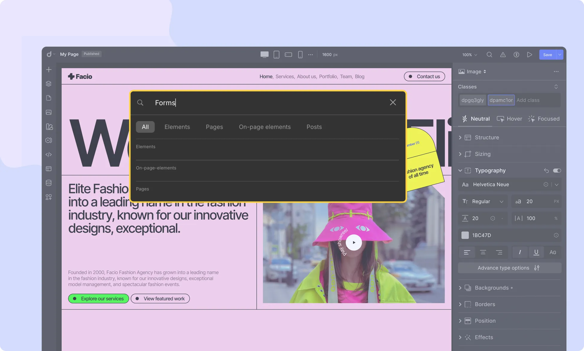
Global Search
Click the Magnifying Glass icon or press CMD + ? to access Global Search. From here, you can search for Elements, Pages, and On-page Elements quickly and efficiently.
Canvas Control
The Canvas Control feature allows you to customize the display and behavior of the canvas while designing. It is represented by the Scale Percentage dropdown on the Topbar.
Following the Audit feature, the Accessibility option allows users to customize the interface to suit their needs, particularly for those with disabilities.
Click on the Play icon to view a full preview of your designed webpage, allowing you to see how it will appear to visitors.
Auto Save
Droip features a seamless Auto Save mechanism to ensure continuous saving of your work. This prevents data loss, even if you forget to manually save.
The Status Label at the top-right corner indicates saving progress. “Saving” appears when changes are in progress. “Auto Saved” confirms the save is complete.
You can disable Autosave by clicking the dropdown arrow and unchecking Enable Autosave.
📝 Note: Droip automatically saves your page content within 3 seconds of user inactivity.
Our website uses cookies to improve your browsing experience on our website. By continuing to use this website, you
agree to
their use. For details, please check our Privacy Policy.
Get started for free!
Get Droip demo
Try live preview
Experience Droip in Action – Explore a live-built page and see the power of our builder in action.