A dropdown lets you display toggle-able, contextual menus for showing lists of links or any other additional content. In Droip, you can use the Dropdown element to easily add clean, interactive dropdown menus anywhere on your page.
Adding a Dropdown
To add a Dropdown element, do the following:
Open the Elements panel.
Scroll down to the Advanced section.
Drag & drop the Dropdown element onto your canvas.
Configuring the Dropdown
The Dropdown element comprises two fundamental components: the Dropdown Trigger and the Dropdown Target.
Dropdown Trigger
The Dropdown Trigger serves as the interactive element that users engage with to activate or open the dropdown menu. Upon clicking or hovering over the Dropdown Trigger, the dropdown menu appears, showcasing available options for users to select.
By default, the Dropdown Trigger includes both text and an icon element. Nevertheless, you can add any preferred element as the dropdown trigger.
Dropdown Target
The Dropdown Target refers to the area or container responsible for containing the content of the open dropdown menu. This region showcases the list of choices or supplementary content after the Dropdown Trigger’s activation.
To access the Dropdown Target, configure the State option to Show within the Dropdown Settings, elaborated on in the next section.
Dropdown Settings
Open On: Set whether the dropdown content will show on Hover or Click.
Animation: Select the animation for when the dropdown content appears on the screen. Options include fade, flip, zoom, and more.
Easing: Control the acceleration, deceleration, and overall smoothness of the animation with Easing. Options include linear, ease-in, ease-out, and ease-in-out. Choose the easing function that best complements your animation’s style.
Delay: Set the duration before the animation commences, measured in seconds or milliseconds.
Duration: Define the animation’s length.
State: Toggle the State to Show to render the Dropdown Target visible, and Hide to conceal it.
Once you’re done creating your dropdown you can add style customization using the Style Panel located on the right.
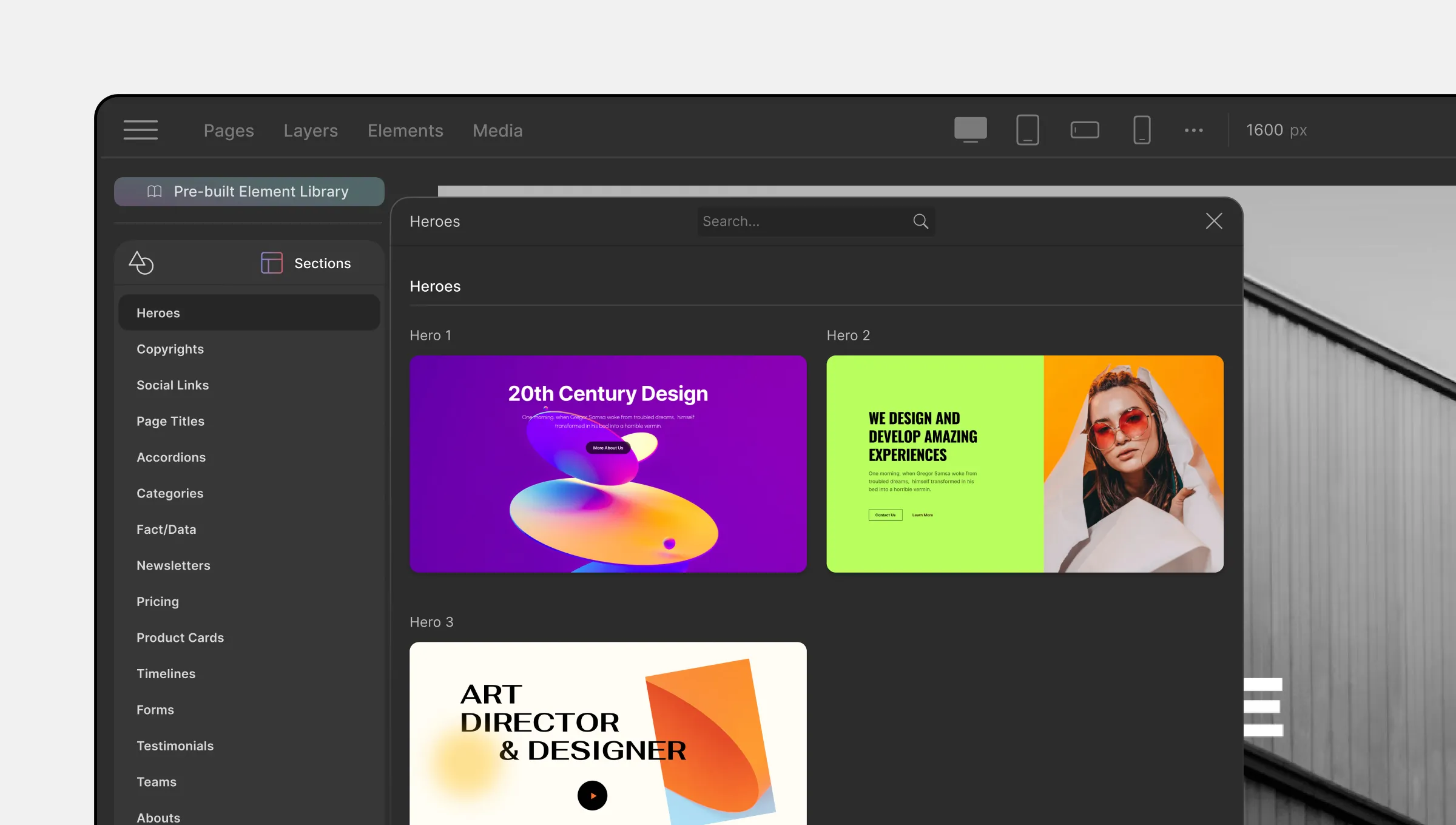
Apart from the usual elements in the Elements Panel, Droip also has a Pre-Built Library with a collection of more advanced pre-defined Elements and Sections.
To access them, head over to the Pre-built Library which you can access from the Elements tab on the Topbar.
Elements
Below is a list of all of the Pre-Built Elements that you can use and the options available for each category.
Buttons
As you know, buttons play a significant role on a webpage such as letting users submit a form, functioning as CTAs for users to take that last step, helping users maneuver the website, and more.
For that reason, sometimes you may need a bit more functionality from a button that a basic one can’t provide. So, here are a few advanced alternatives for the Button Element. Options include:
Button Fill: Button filled with a solid background.
Button Outline: Button with only an outline and no background fill.
Button Split: Button split into an action button and a dropdown toggle.
Button Icon: Button with no text and only an icon.
Button With Icon: Button with text and icon.
Button Action: Button with text and icon but no background fill or outline.
Button Link: Button with only link text.
Checkbox
Use Checkboxes to take multiple inputs from a list of options. Do note that you must add this element inside a Form element for it to appear.
Radio
Use Radio buttons to take single input from a list of options. Do note that you must add this element inside a Form element for it to appear.
Ratings
Ratings are a way for users to rank a product or service based on their experience to provide information for others to see. Incorporating a Rating and Review system is a great idea if you need to boost credibility.
Listed below are the variations of the Rating element offered that you can choose from!
Rating Stars
Rating Half-Stars
Rating Octagones
Rating Half-Octagones
Rating Emoji
Search Boxes
Search is another must-have element that you may need to include as helps users easily find what they’re looking for. Here we have 3 different styles of Search options:
Search Box: Simple Search Box.
Search with Button: Search Box with an icon button.
Search Underlined: Search Box in an outline style.
Steppers
A Stepper is a nifty input control that can be used to input numbers. This control consists of two parts – one button to increment and one to decrement the value along with its preview. Below is a list of the Stepper styles available:
Stepper Basic: Value is displayed on the left and increment and decrement buttons are stacked up on the right.
Stepper Horizontal: Buttons on either side with the value displayed in the middle.
Stepper Vertical: Buttons on the top and bottom with the value displayed in the middle.
Text Fields
Text Fields are a classic input control that you’ll need for any form. Here you’ll find a few more advanced versions of the element to further enhance your webpage.
Text Field Basic: A basic Text Field you can use in any form for data input.
Text Field with Adjusting Height: With this Text Field, if there is more content than there is space for, automatically more space will be added vertically but with a scroll so the real height of the element remains unchanged.
Detail List
The Detail List Element is basically a pre-made data table and is the perfect choice for displaying a lot of information in a neat and simple way. Styles available are the following:
Detail List One: Simple and neat styled table.
Detail List Two: Table with grid lines.
Detail List Three: Table with alternating colored rows.
Tab
The Tab Pre-Built Element offers you a few more variations on your usual Tab element like the following:
Tab One: Tab with Tab Menu on top of the Tab Pane.
Tab Two: Tab with Tab Menu on the bottom of the Tab Pane.
Tab Three: Tab with Tab Menu on the left of the Tab Pane.
Tab Four: Tab with Tab Menu on the right of the Tab Pane.
Teaching Bubble
A Teaching Bubble is a kind of tooltip element that consists of a button and a speech bubble. Within that speech bubble is a heading, text description, and a pair of Yes and No buttons.
Clicking on the button should make the bubble appear and clicking on the Yes/No buttons should make the bubble disappear.
Options include:
Teaching Bubble Left: Teaching Bubble with a button on the left and bubble on the right.
Teaching Bubble Top: Teaching Bubble with button at the top and bubble below.
Callout
Callouts are similar to Teaching Bubbles but the Yes and No buttons are instead replaced with a Link. Clicking on the button will make the bubble appear and clicking on it again should make it disappear.
Dialog
A Dialogue box is a pop-up like element with a message and two CTA options.
Modals
You can create custom Pop-ups using our Pop-up Builder but also use the following templates to speed up the design process. Options include:
Modal With X Button
Modal Sign In
Modal Newsletter
Modal Success Message
Tooltips
Tooltips are helpful messages for users that should appear on Hover. For this, we have the following variations:
Tooltip Top
Tooltip Bottom
Tooltip Left
Tooltip Right
Alerts
Alerts are warning message templates and available are the following types:
Alert: Simple Alert message.
Alert with CTA: Alert message with Call to Action Buttons.
Avatar Group
An Avatar Group is basically a grouping of User Avatars and you can choose between the following styles:
Avatar Group Circle: Avatar Group with circular images.
Avatar Group Square: Avatar Group with square images.
Cards
Cards are a great way to display a group of related content on a page. You can use these on a feature list page, a product archive page, and more.
Card Basic: Basic Card with a heading and a description text.
Card Button: Card with a heading, description, and a call to action button.
Card Icon: Card with a heading, description, icon, and a call to action button.
Card Image Button: Card with a heading, description, image, and a call to action button.
Notifications
Notifications are small dialog boxes that can be used to notify users about something.
Notification Inline: Consists of a heading and a button all arranged inline.
Notification Text: Consists of a heading and some text with an x icon on the top-right.
Sections
Next up we have Pre-Built Sections which you can access by clicking on its icon on the from the Pre-built Library.
Here, you’ll find a plethora of ready-made sections that you can use to speed up your design process and you can also fully customize them to match your preferences using the settings in the Style Panel.
Elements are the building blocks of a webpage, and you can configure and customize these to suit your needs using the various options available on the Style Panel.
In this documentation, we will briefly go over the Elements Panel, show you how to add an element, how to style an element, and more!
Elements Panel
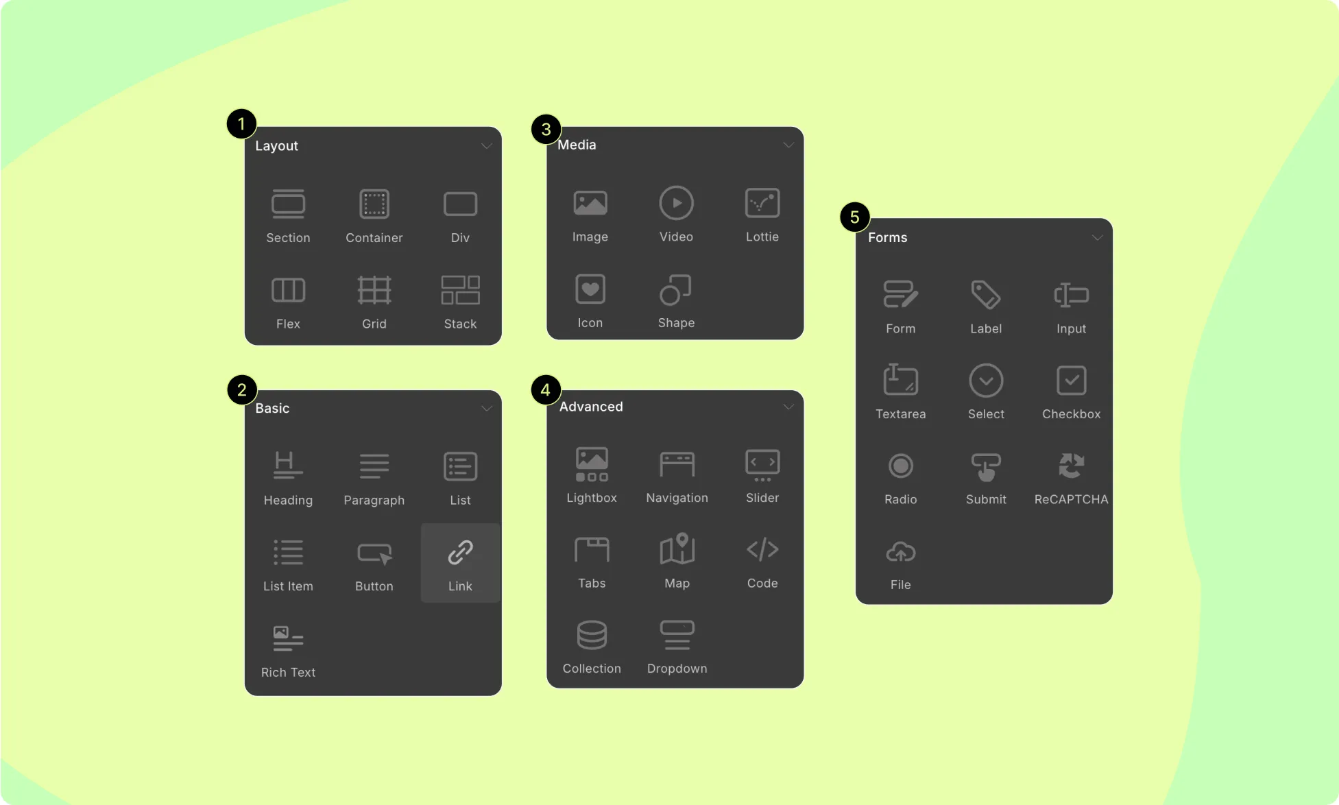
To access the Elements Panel, click on the Elements tab on the Topbar. You should see this panel on the left side of your screen, containing all of the elements that you can use.
Speaking of, Droip offers 33 different elements covered across the following 5 categories:
Layout: Consists of elements that you can use to build the structure of your webpage.
Basic: This section contains elements that you most commonly need.
Media: Here you’ll find your media elements to add images, videos, SVG, etc.
Forms: Consists of all form-related elements like form blocks, labels, input fields, etc.
Advanced: This section contains reusable modular building blocks called components that perform a specific function or display a particular piece of content on a web page. Navigation bars, Lightboxes, Collections, and other similar elements are all examples of components.
How to Add an Element
You can add elements to your canvas in three ways:
The first method is to select where you want to place your element and click on the element you want to add from Insert > Elements Panel.
The second method is to click and drag the element from the Elements Panel and place it where you want on the canvas.
Lastly, you can also drag the elements from the Elements Panel to the Layers Panel and place them where you want from there.
How to Style An Element
You can style these elements using the tools on the Style Panel. From here, you’ll find options to customize the following:
Typography
Structure
Sizing
Backgrounds
Borders
Position
Effects
Interactions
Visibility Conditions
For more info, you can look at our Style Overview documentation and the dedicated documentation for each section.
How to Duplicate the Style of an Element
To maintain consistency and save time, you can duplicate the style settings of an element. Follow these steps:
Select your element and open the Class Manager section in the Style Panel.
Click on the field and create a new sub-class by typing a unique name.
Select a different element of the same type and add the sub-class you created.
Elements with this sub-class will adopt the same style settings.
Any changes made to one element with this sub-class will update all instances with the same sub-class.
For more details on this feature, refer to our documentation on Class Manager.
How to Reuse Elements
Using Symbols, you can easily reuse elements or groups of elements with all their customizations intact. To convert an element or group of elements into a Symbol:
Select the element or wrapper element (if multiple elements) and go to Layers > Symbols.
Click on Create New Symbol, choose a Category and Name for the Symbol, and hit Create.
Now, your element(s) become a Symbol that you can repeatedly use on any page.
Editing the main instance of the Symbol from the Symbols Panel will update all other instances.
Scalable Vector Graphics (SVG) is an XML-based vector image format for 2D graphics with support for interactivity and animation.
Why Use SVG Shapes?
There are several reasons why you might want to use SVG shapes on your website:
Scalability: SVG shapes are vector-based, which means they can be scaled to any size without losing quality. This is especially useful when creating graphics that need to be displayed on different devices with different screen sizes.
Interactivity and Animation: SVG shapes can be animated and made interactive, making them a great choice for creating dynamic graphics and user interfaces.
Small File Size: SVG shapes are usually smaller in file size than bitmap images, which can improve your website’s loading speed.
Accessibility: SVG shapes can be made accessible for users with disabilities, for example, by adding descriptive text for screen readers.
Style Control: You can easily control the appearance of SVG shapes making it easy to match your website’s style and brand.
Reusability: You can reuse SVG shapes across multiple website pages, saving time and resources compared to creating multiple images.
These are just a few of the benefits of using SVG shapes on your website. By using SVGs, you can create visually appealing, fast-loading, and interactive graphics that enhance the user experience on your website.
SVG Elements
In Droip, we have two elements that are in the SVG file format. They are:
Icon element
SVG element
So let us go over how you can add and use these for your website.
How to Add Icons
Add the Icon element to your canvas.
Click on +Add From Media to open the Icon Library in the Media Manager
Choose from a wide selection of icons provided by Droip.
📝 Note: Keep in mind that these Icons are fetched from a local pool and not from an external library that’s been called. This means that your Icon load time will be that much faster.
To learn more about the Icon Library, check out its section on the Media Manager documentation.
How to Add SVG Shapes From Media
Place the SVG element on your canvas.
Click on +Add From Media to open the Clip-Path & Shape editor, which is also accessible from the Media Manager.
Under SVG Shapes, select a shape that suits your needs.
Customize the shape by dragging its control points (vertices) to adjust or add more vertices as required.
Use the right side panel to modify attributes such as Fill, Stroke Color, and Stroke Weight.
On the right side panel you’ll find the following options:
Fill: Set the color & the opacity of your shape from here.
Stroke Color: Set the color & the opacity of your shape’s outline from here.
Stroke Weight: Set the weight of the stroke by entering into the field below the Stroke Color toggle.
How to Add SVG Shapes Using Paste SVG
Open your SVG file using your preferred IDE and copy its code.
Then, select the SVG element and click on the Paste SVG option from the inline editor.
Finally, paste the code and click on Update.
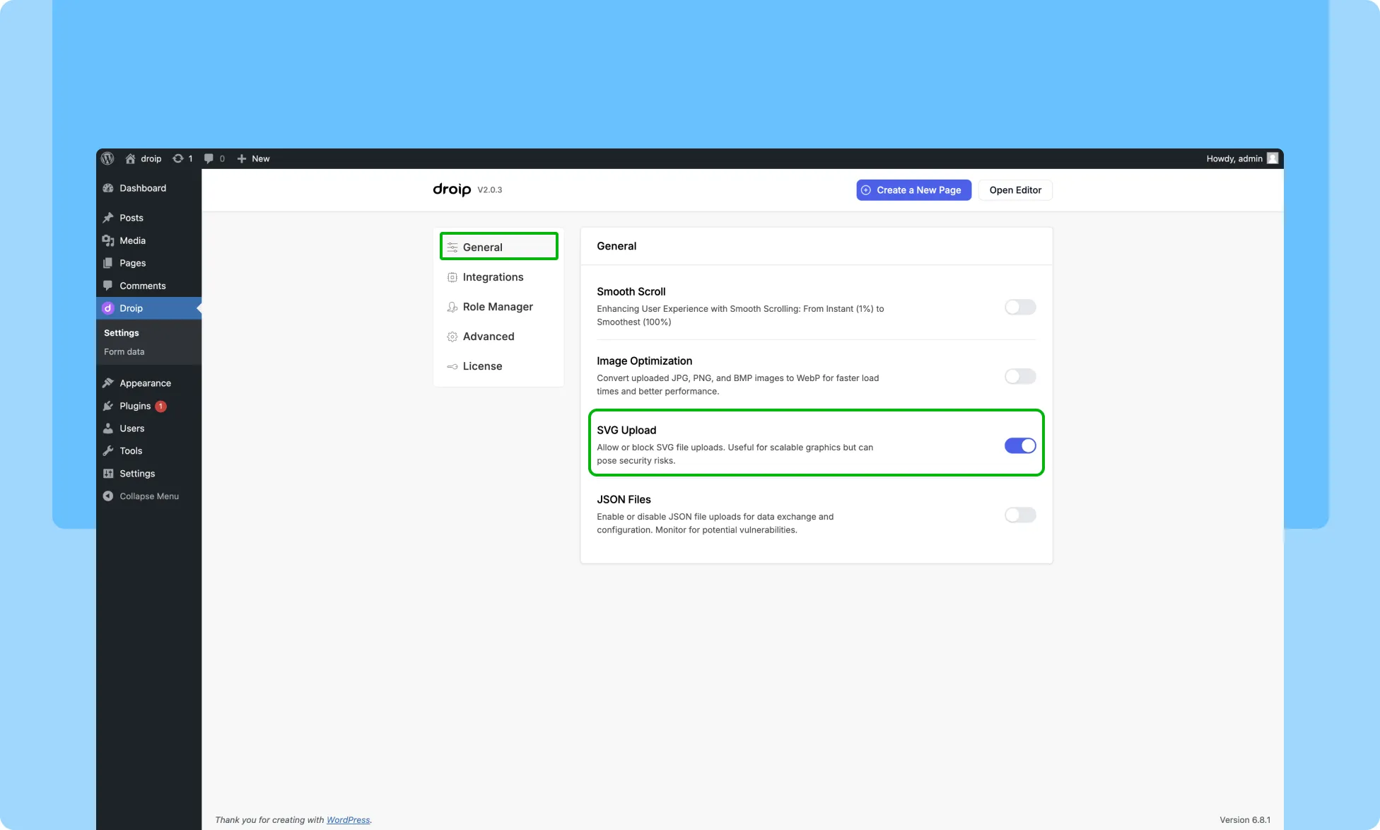
Uploading SVG Files
If you want to upload and use your own SVG files in your designs and layouts, you can do that as well.
To do that, you have to first enable the SVG Upload option from Droip WordPress dashboard > Settings > General.
Lottie animations can be used to add interactivity, enhance visual appeal, and improve user engagement.
Uploading a Lottie File
To access free Lottie animations, you can explore various sources like LottieFiles, UI8, and Iconscout. These websites provide an extensive collection of both free and premium Lottie animations that you can download and integrate into your projects.
To upload a Lottie JSON File in Droip, follow these steps:
Upload the desired Lottie JSON file and use it in your page design.
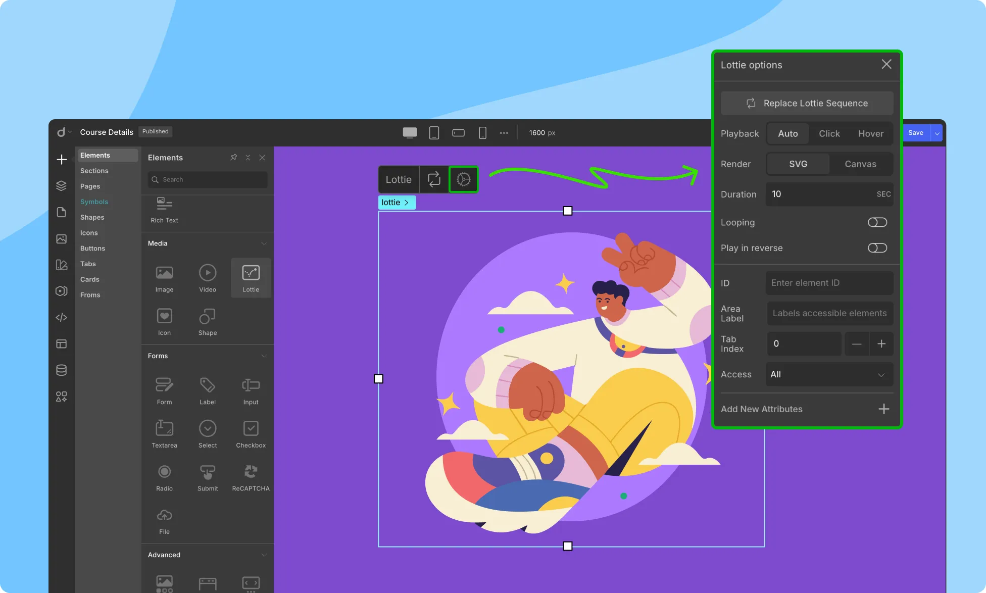
Lottie Settings
Lottie settings allow you to configure various options related to Lottie animation for optimal performance and file size.
Looping: Choose whether the Lottie animation should loop continuously or play only once. Enabling “Looping” allows the animation to play repeatedly until the user leaves the page.
Play in Reverse: Reverse the Lottie animation to create a “rewind” effect, where the animation plays backward.
Play: Set if the Lottie animation will play on Auto, on Hover, or on Click.
Change Lottie Sequence: Replace the Lottie animation with a new Lottie file or pre-existing files from the media library.
Set Duration: Specify the duration of the Lottie animation in seconds. This option helps control the animation speed or synchronize it with other elements on the page.
Render in SVG: Choose whether to render the Lottie animation as an SVG image. SVG (Scalable Vector Graphics) format maintains animation quality even when scaled.
Render in Canvas: Choose whether to render the Lottie animation as a Canvas image. Canvas, an HTML5 element, allows for programmatically drawing graphics and animations.
Videos are a great way to capture visitors’ attention and keep them engaged with your website.
By using the Video element in Droip, you can quickly and easily add videos to your website and customize how they are displayed.
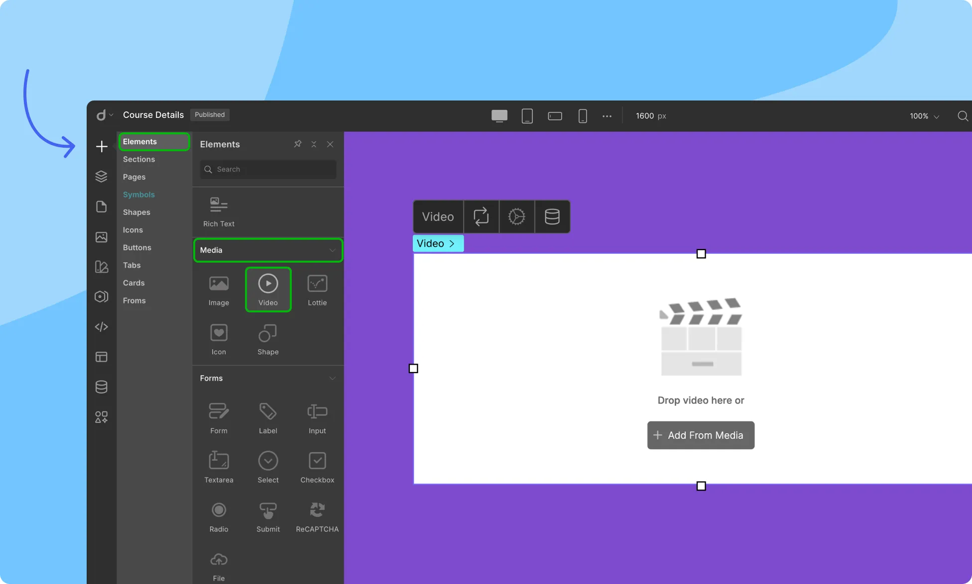
Adding Videos
To add a Video element to your page, follow these steps:
Access the Insert > Elements panel.
Drag and drop the Video element on the canvas.
Next, effortlessly insert your video file:
Drag and drop the video file into the specified area.
Alternatively, use the + Add From Media button to upload an existing video from your media library.
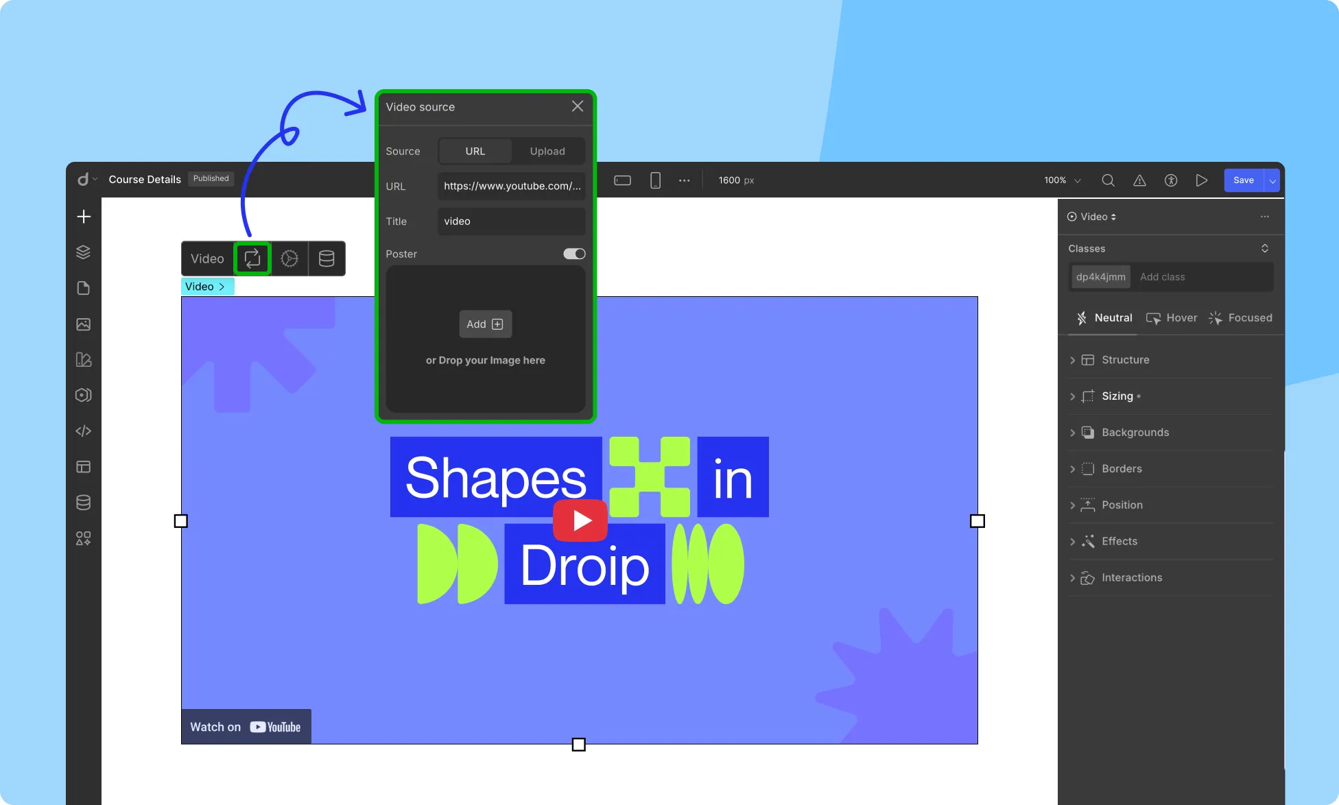
Embedding Videos
Embed Video is a quick and convenient way to add video content to your website, allowing you to host the video on a third-party platform while seamlessly integrating it into your site.
To embed a video, simply paste the video’s share link into the URL field.
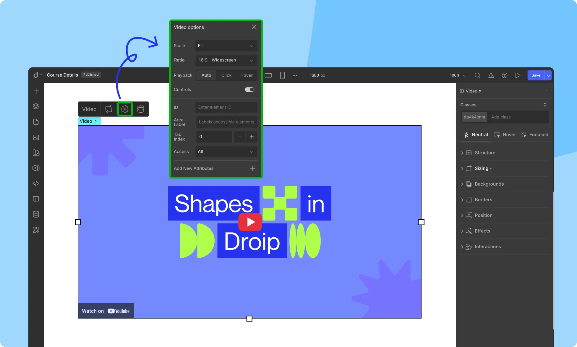
After embedding a video in Droip, you can fine-tune its behavior and appearance.
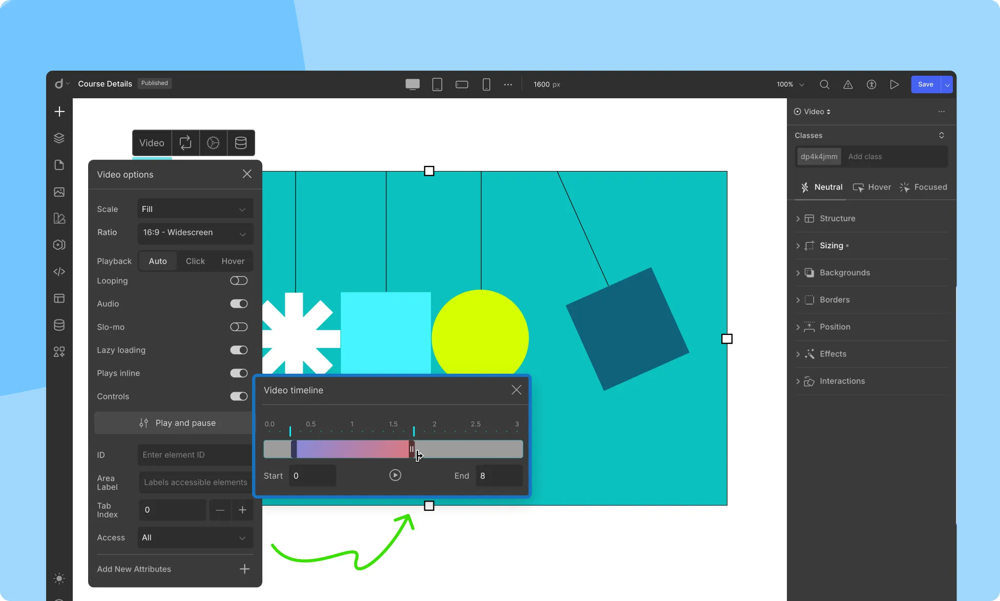
Click the gear icon on the video element toolbar to open the Video Options panel. Here’s what each setting allows you to control:
Scale: Determines how the video scales within its container.
Fill: Stretches the video to fill the entire space.
Contain: Ensures the entire video is visible without cropping.
Cover: Fills the container by cropping the video, maintaining the aspect ratio.
Ratio: Sets the aspect ratio of the video frame. Ideal for maintaining visual consistency.
Playback: Defines how and when the video starts playing:
Auto: Plays automatically when visible.
Click: Plays when clicked.
Hover: Plays when hovered.
Controls: Show or hide native video player controls like play/pause, volume, and scrub bar.
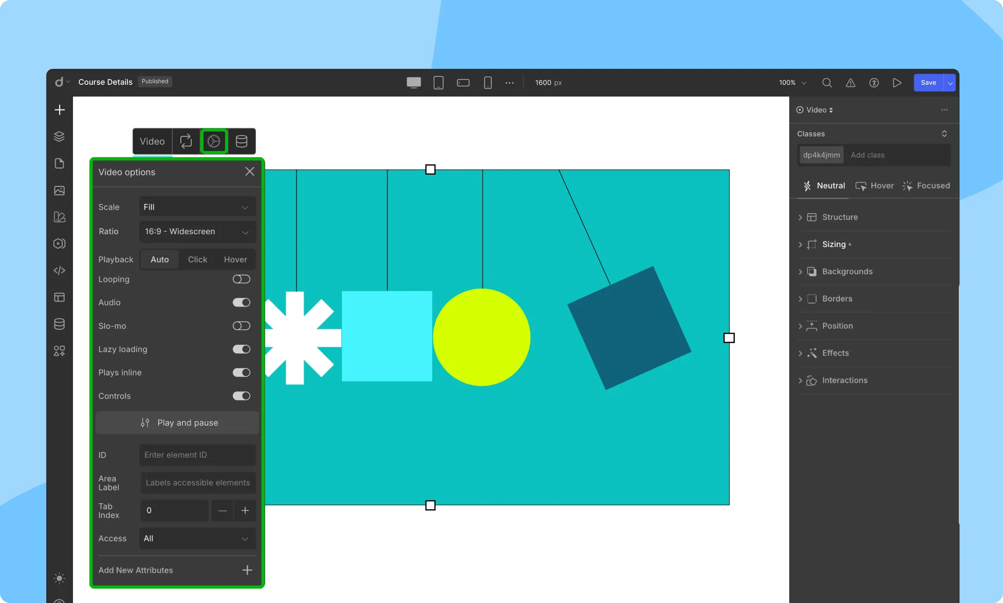
Video Settings
You get a slightly different set of options that give you more control over how the video is rendered and played when you upload a video:
Replace Video
To replace the existing video with a new one:
Click on the Replace Video option.
Select the new video file from your computer or from the media library.
Video Display Controls
Tailor how your video is presented on your website using the Video Display Controls. These options adjust the size and position of the video within the designated space:
Fill: Resizes the video to fill the available space while maintaining the aspect ratio of the original video.
Contain: Resizes the video to fit within the available space without cropping, ensuring the entire video is visible.
Cover: Resizes the video to completely cover the available space, even if it means stretching or distorting the video.
Initial: Displays the video at its original size, unaffected by available space.
Rotate Video
The rotate option allows you to rotate the video by 15 degrees per rotation.
Attachment
The attachment option determines the video’s position relative to the content as the user scrolls the page:
Scroll: The video scrolls along with the content as the user navigates the page.
Fixed: The video remains fixed in its position on the page, regardless of user scrolling.
Looping
Enable looping to have the video play continuously, or disable it for the video to play only once.
Audio
Enabling audio allows the video to play with sound while disabling it mutes the video.
Slo-Mo
Enable Slo-Mo for the video to play at a slower speed, or disable it to play at its original speed.
Controls
Enable Controls to display video player controls (play/pause, volume, full-screen), or disable it to hide these controls.
Set Custom Thumbnail
Use this option to add an image as a custom thumbnail for your video.
Play and Pause
The Play & Pause option in video settings allows you to control how the video starts and stops playing.
Start and End Time
Set specific start and end times to show only the desired portion of the video on your webpage.
Play Options
Customize how the video is triggered to play:
Auto: The video automatically starts playing as soon as the webpage loads.
Click: Requires the user to click on the video player to initiate playback.
Hover: Starts playing the video when the user hovers their mouse over the video player.
By using these play options, you can curate the video experience for your users, providing a better user experience on your webpage.
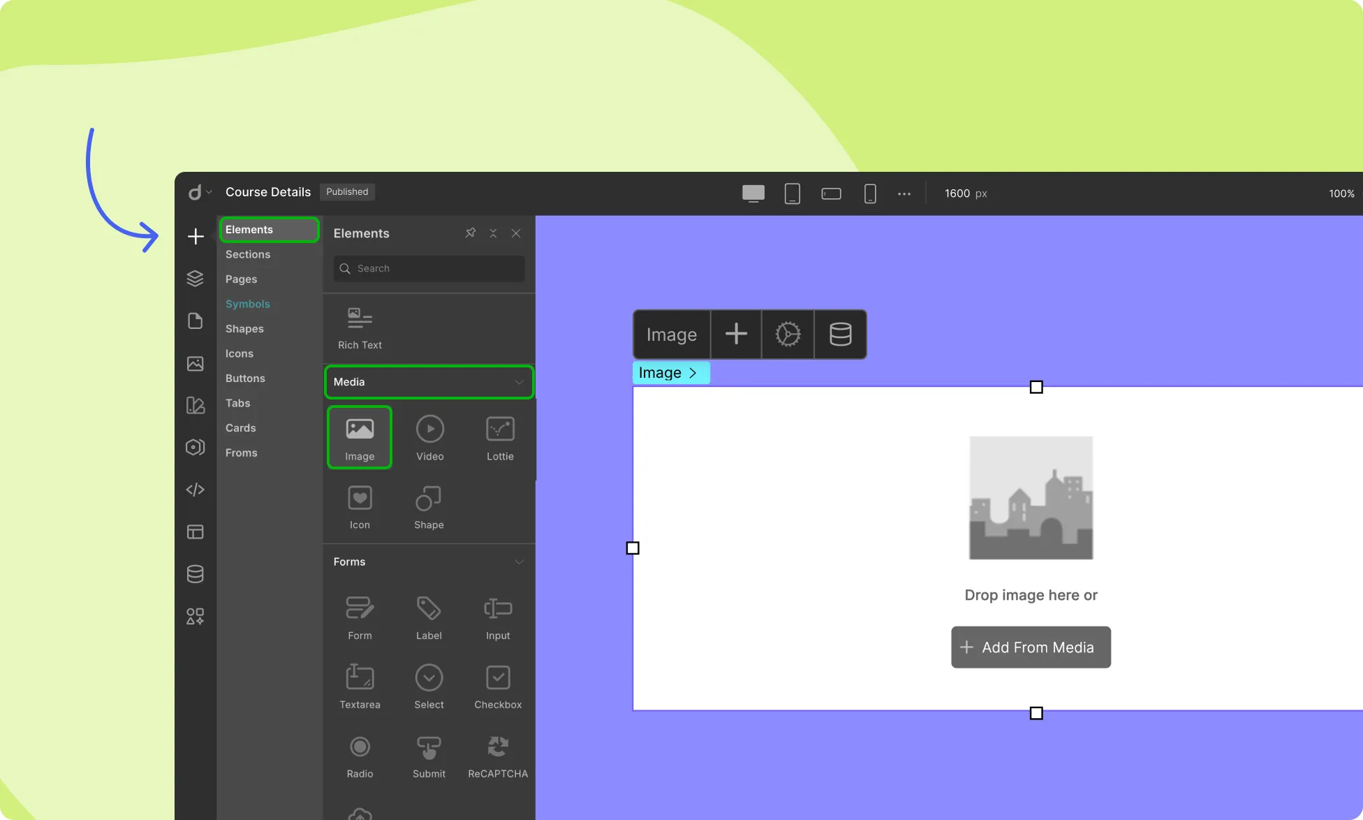
Adding images to your webpage makes your content more engaging and visually appealing for your visitors.
Use the Image element of Droip to add images to your webpage. This element allows you to upload an image file from your computer or choose a pre-existing image from the media library. You can also adjust the size, position, and other properties of the image.
How to Add an Image
To add an Image element to your page, follow these simple steps:
Access the Insert > Elements panel and locate the Image element.
Drag and drop the Image element to the desired location on your canvas.
You can then either drag and drop your image file into this element or click on the + Add From Media button to upload or choose an existing image from the media library.
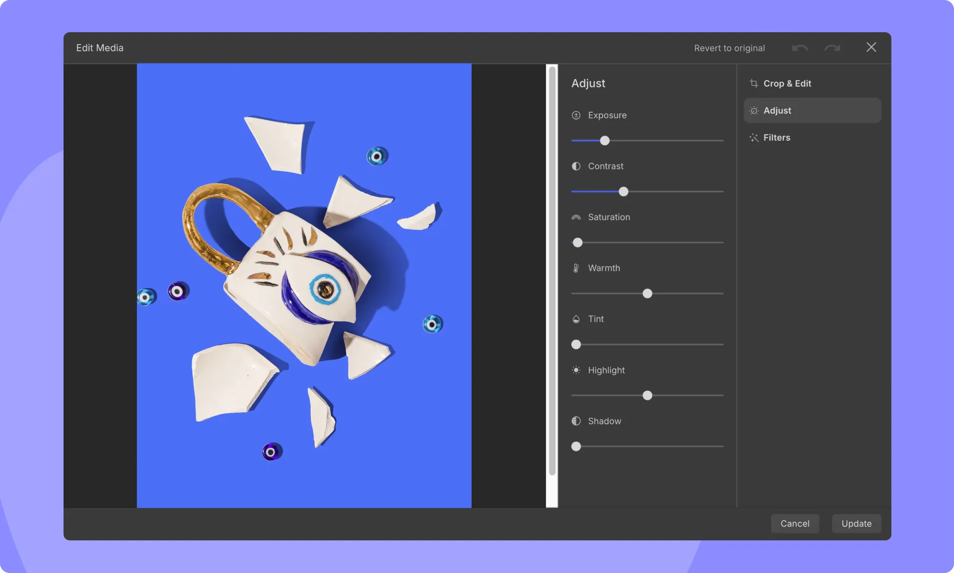
Use Built-in Image Editor to Enhance Images
Droip comes with built-in image editing capabilities to optimize images for your website. You can crop the image to the desired size, adjust the brightness, contrast, and saturation levels, apply various filters to enhance the overall look of the image, and more!
Effects can be utilized to enhance an image or create a specific mood or aesthetic. Here’s a brief overview of each effect that you can apply to your image:
Opacity: The opacity property controls how transparent or opaque an element is.
Blur: The blur property applies a blur effect to the element, making it appear out of focus.
Brightness: The brightness property adjusts the brightness of the element.
Contrast: The contrast property adjusts the contrast of the element.
Saturation: The saturation property adjusts the intensity of the element’s colors.
Invert Color: The invert property inverts the colors of the element, making it black & white, and vice versa.
Grayscale: The grayscale property removes all color from the element, leaving a grayscale image.
Hue Rotate: The hue-rotate property rotates the hue of the element’s colors, giving it a different color effect.
Sepia: The sepia property applies a sepia tone to the element, giving it a vintage, yellowed effect.
Adding Links to Images
Adding links to images can be a useful way to provide additional information to users or direct them to other parts of your website or external sites. To add a link to an image:
Click on the Link icon on the image inline editor.
Link the image to a webpage, website, pop-up, etc.
Choose how the link opens, such as from the same page or in a new tab.
Optionally, specify the Rel attribute to define the relationship between the image and the linked resource.
Replacing Images
The “Replace Image” option allows you to swap an existing image with a new one:
Click on the Replace Image button.
Select the new image file from your computer or the media library.
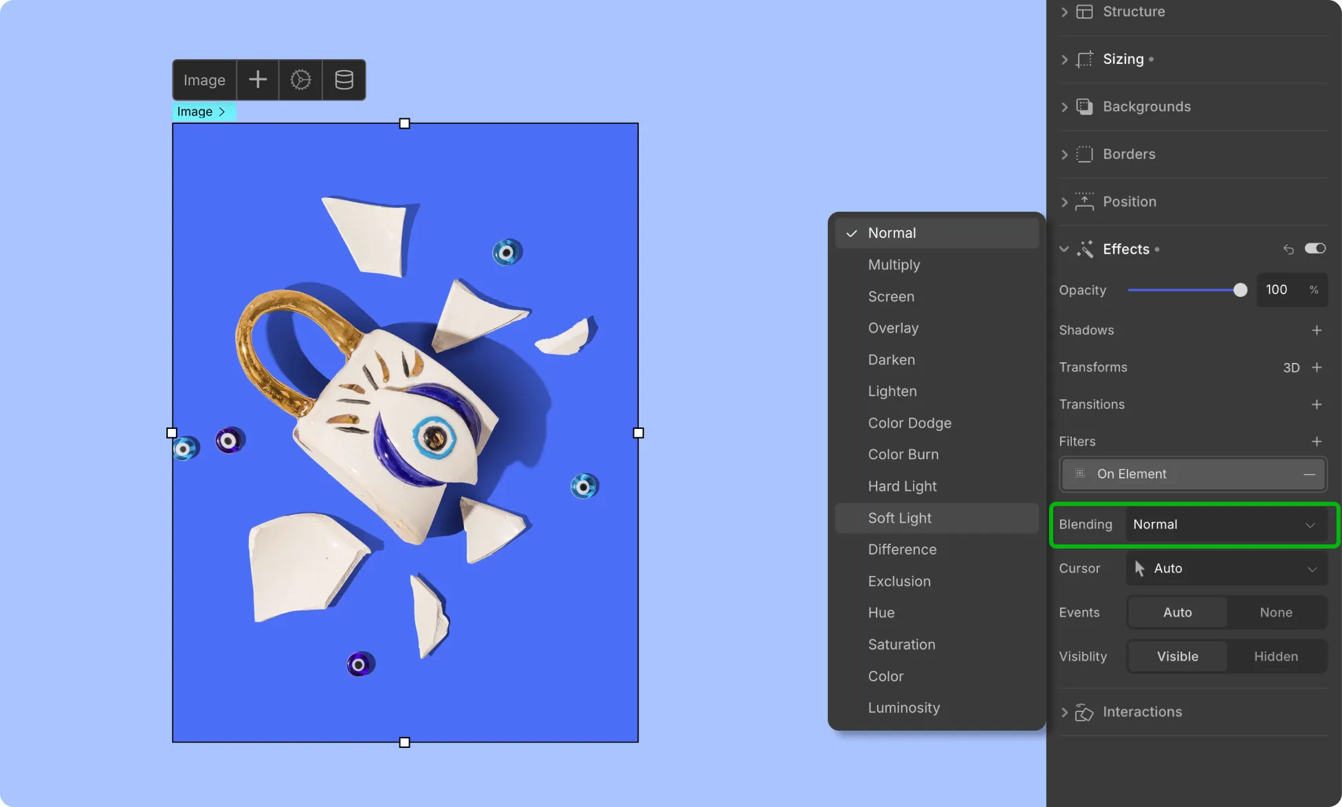
Blending Modes
Blending Modes enable you to adjust the appearance of an image by applying different blending techniques. Each blending mode has unique properties that achieve various effects.
The available blending modes are:
Normal: This is the default blending mode, which means that the layer’s pixels are displayed without any blending with underlying layers.
Multiply: Multiplies the base color with the blend color, resulting in a darker color.
Screen: Multiplies the inverse of the base color with the inverse of the blend color, resulting in a lighter color.
Overlay: Combines Multiply and Screen blending modes, depending on the brightness of the underlying layers.
Darken: Compares the colors of the base and the blend layers and selects the darker of the two.
Lighten: Compares the colors of the base and the blend layers and selects the lighter of the two.
Color Dodge: Lightens the base color by decreasing the contrast between the base and blend colors.
Color Burn: Darkens the base color by increasing the contrast between the base and blend colors.
Hard Light: Lightens or darkens the underlying pixels depending on the brightness of the blend color.
Soft Light: Similar to Overlay, but with a softer and more subtle effect.
Difference: Subtracts the blend color from the base color, resulting in an image that highlights the differences between the two.
Exclusion: Creates an effect similar to the Difference mode, but with lower contrast and less color intensity.
Hue: Applies the hue of the blend color to the base color, while using the saturation and luminosity of the base color.
Saturation: Applies the saturation of the blend color to the base color, while using the hue and luminosity of the base color.
Color: Applies the hue and saturation of the blend color to the base color, while using the luminosity of the base color.
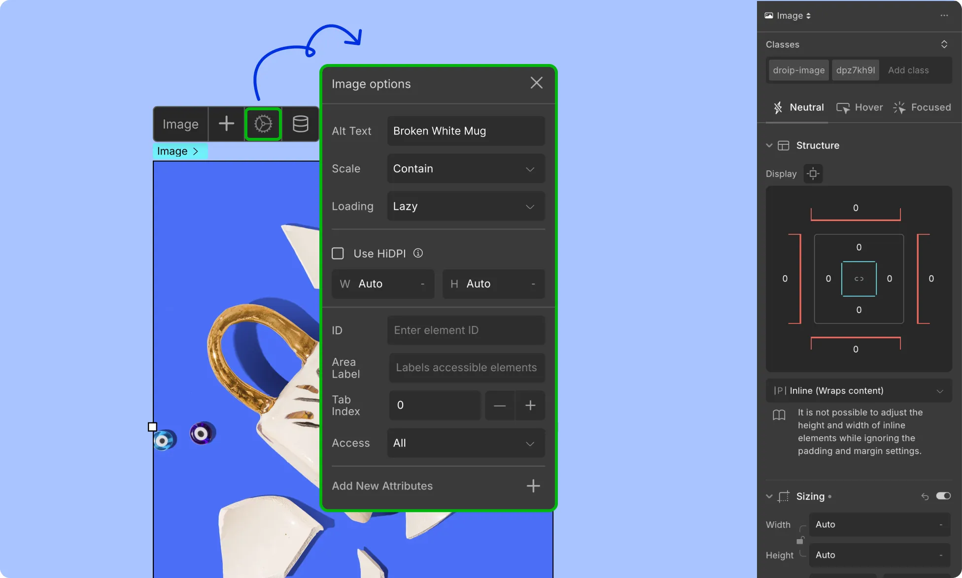
Image Settings
First up in the Image Settings, you get a drop-down to choose how you want to display the image. These options allow you to control how an image is displayed on a website by adjusting its size and position within a designated space.
Fill: This option resizes the image to fill the available space maintaining the aspect ratio of the image. Potentially cropping the image if its aspect ratio does not match the available space.
Contain: This option resizes the image so that it fits within the available space without cropping the image. It always shows the whole image, even if that leaves a little space to the sides or bottom.
Cover: This option resizes the image to completely cover the available space even if this means stretching or distorting the image to cover the entire space.
Initial: This option sets the image to its original size, without resizing it. This means that the image will be displayed at its original dimensions, regardless of the available space.
Rotate button: The “rotate” option in image settings allows you to rotate an image by 15 degrees per rotation.
Load: Set how you want your images to load when a user visits this web page using this option.
Auto: Auto set the method to load the images.
Eager: Load images without delay as per usual. This is the default option.
Lazy: Put off loading images until they’re nearly within viewport distance.
Width: Define the width of your image.
Height: Define the height of your image.
Add ALT Text: This option allows you to add alternative text that describes the content or purpose of the image. Adding alt text to images is important for accessibility and SEO.
Attachment: The Attachment option controls how the image is positioned relative to the surrounding content as the user scrolls the page.
It offers two values:
Scroll: With this option, the image will scroll along with the content as the user scrolls the page.
Fixed: With this option, the image will remain fixed in position on the page, even as the user scrolls.
The Attachment option can be useful for creating certain visual effects or layouts, depending on the specific design and content of the website.
For example, using the “fixed” option for a header or background image can create a parallax scrolling effect, where the background image appears to move more slowly than the rest of the content as the user scrolls, creating a sense of depth and motion. On the other hand, using the “scroll” option for an image within a block of text can help ensure that the image remains in the correct position relative to the text as the user scrolls.
For every element, you’ll find the following Custom Properties options which you can access by clicking on the ellipsis icon from their inline editor.
Visibility
Visibility: Use this option to show or hide your elements on the canvas. To show it, select Visible and to hide it, select Hidden.
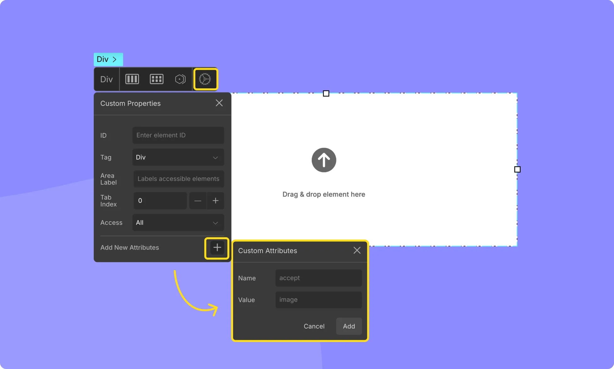
Custom Attributes
Custom Attributes allow you to enhance your standard HTML elements by adding additional information to define more characteristics. This comes in handy when you need to achieve specific functionalities that are not readily available through built-in options.
How to Add a Custom Attribute
To add a Custom Attribute to any element on your canvas, follow these steps:
Select the element you wish to modify.
Access the inline editor and click on the settings icon to open its settings.
Click on Add New Attributes to add a new attribute and specify its Name and Value.
The Name field should contain the name of the desired attribute (pre-defined in the system), while the Value field should contain any parameters associated with this attribute.
Press Add to save the custom attribute, and it will be listed in the settings window.
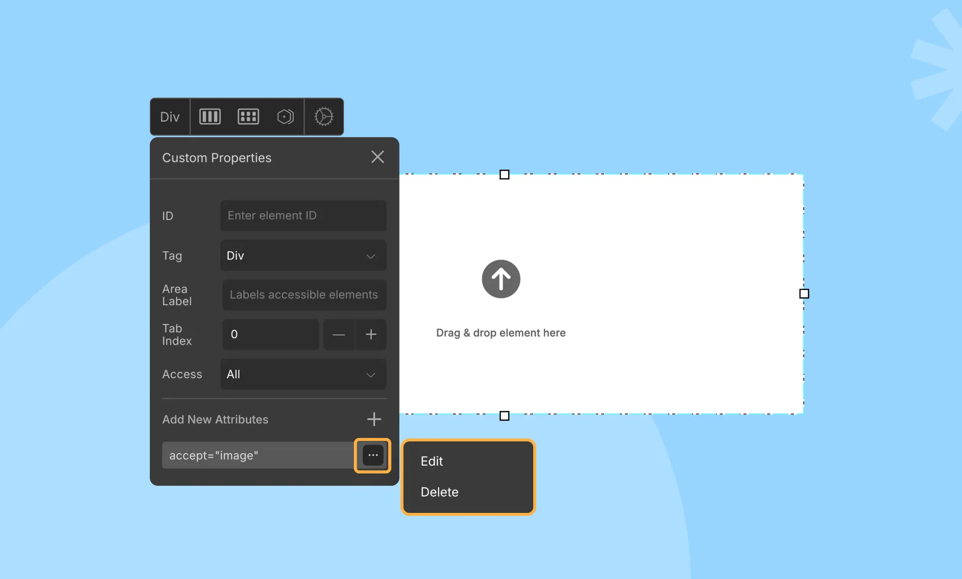
Managing Custom Attributes
Click on the ellipsis icon beside any of the attributes on the settings window to access the Edit and Delete options.
Custom Attribute Use Cases
There are many Custom Attributes available out there, and while we can’t cover them all, we’ve tried our best to highlight some useful ones that may come in handy in various situations.
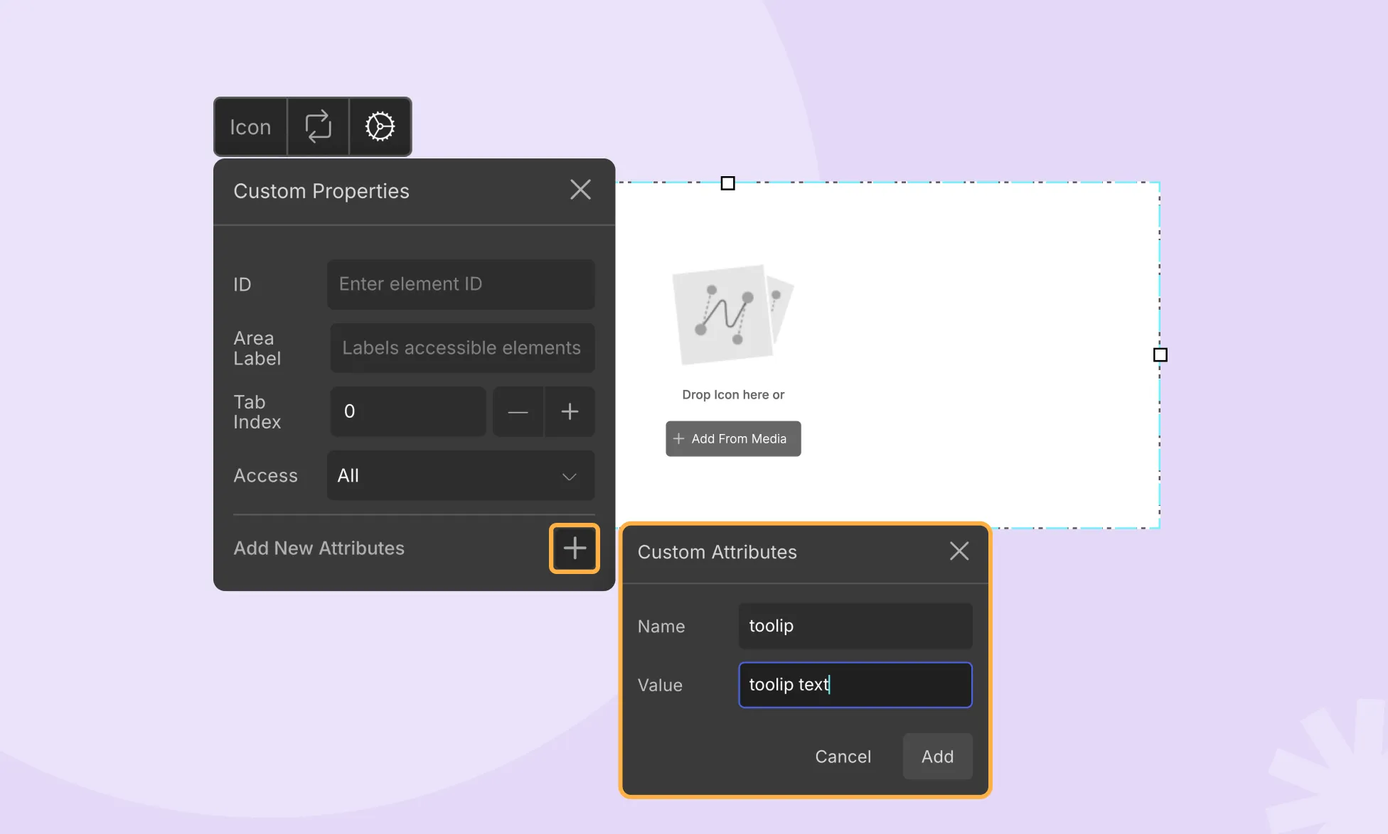
Adding Tooltips
Tooltips provide context and purpose when users hover over elements. You can add a Tooltip to any element using Custom Attributes.
Select the element and access its settings. Open Custom Attributes and click on Add New Attribute.
Set the Name of the attribute as title and the Value as your Tooltip text, providing a brief definition or purpose. Hit Add, and the tooltip text will appear when users hover over the element
Now when you hover over your element, this tooltip text should appear.
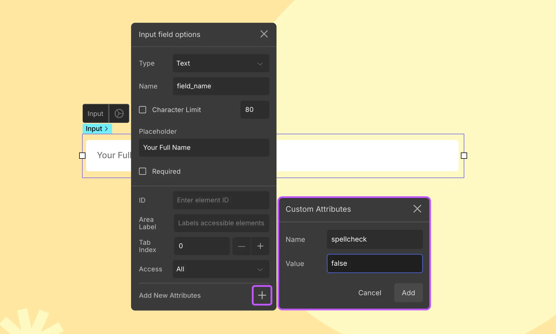
Turn Off Spellcheck
You can also turn off spellcheck for any Input Field using the Custom Attribute feature.
Select the text field element and open the Input Field Options.
Click on Add New Attributes.
Set the Name as spellcheck and the Value as false.
Hit Add to save this attribute, and the spellcheck will be turned off for the input field.
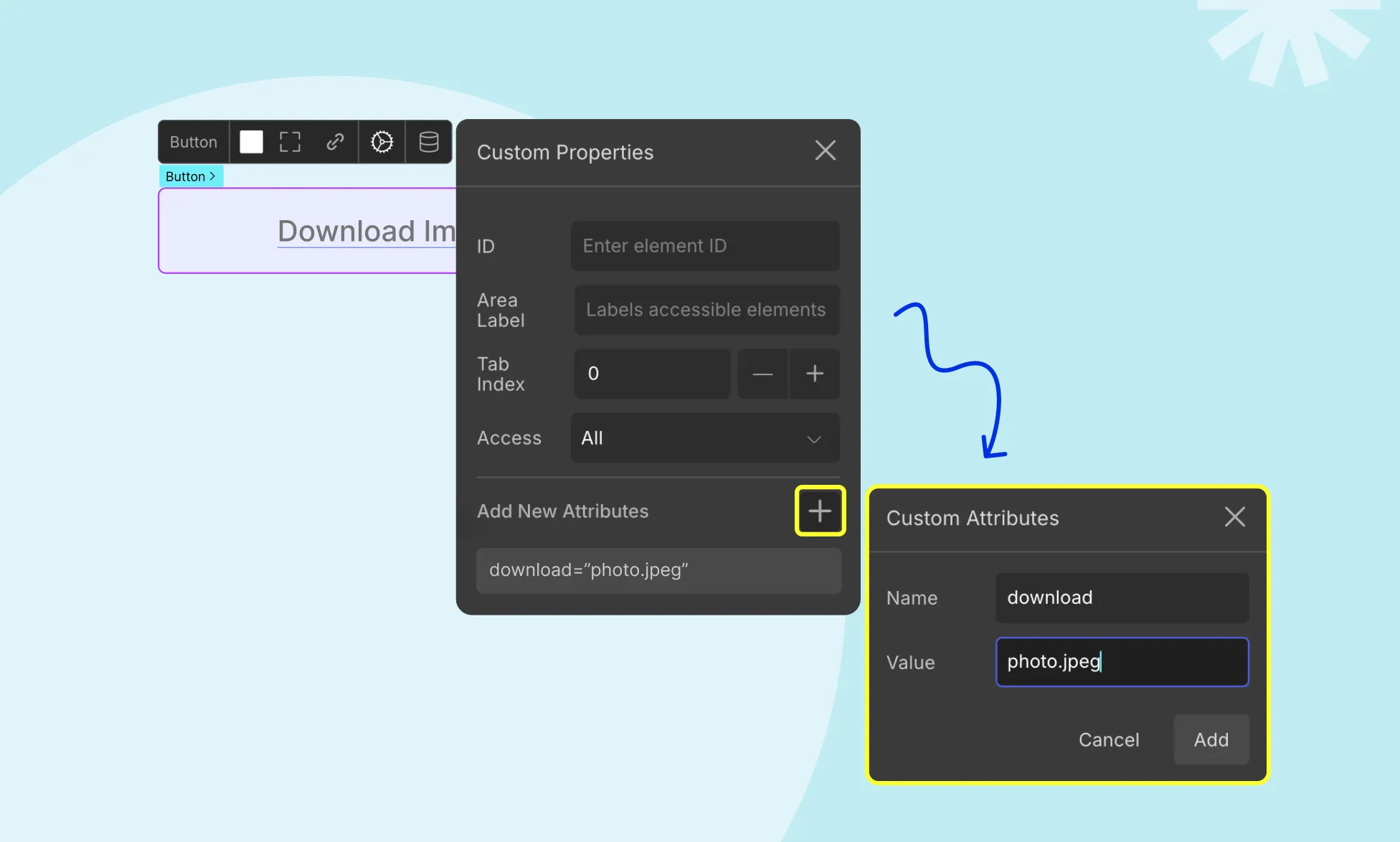
Renaming A Download File
Custom Attributes can also be used to rename files when users download them by clicking on a button or link:
Select the button or link element and access its settings.
Click on Add New Attributes.
Set the Name of the attribute as download and the Value to the desired filename.
Hit Add, and the file will be renamed accordingly upon download.
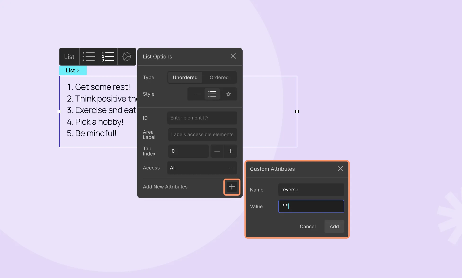
Creating a Descending Ordered List
To display Ordered Lists in reverse order, follow these steps:
Select your Ordered List element.
Click on the ellipsis icon to open List Options and add a new attribute.
Set the Name of the attribute as reversed (parameter not needed) and click Add to save your attribute.
Your list will now be resorted in descending order.
Summary
Custom Attributes offer vast possibilities for enhancing your website’s functionality and user experience. To explore even more ways to customize your elements, refer to the list of All HTML Attributes that you can use.
📝 Note: Do keep in mind that some of these attributes may already be in use for the built-in Droip features so do double-check in case that option is already available.
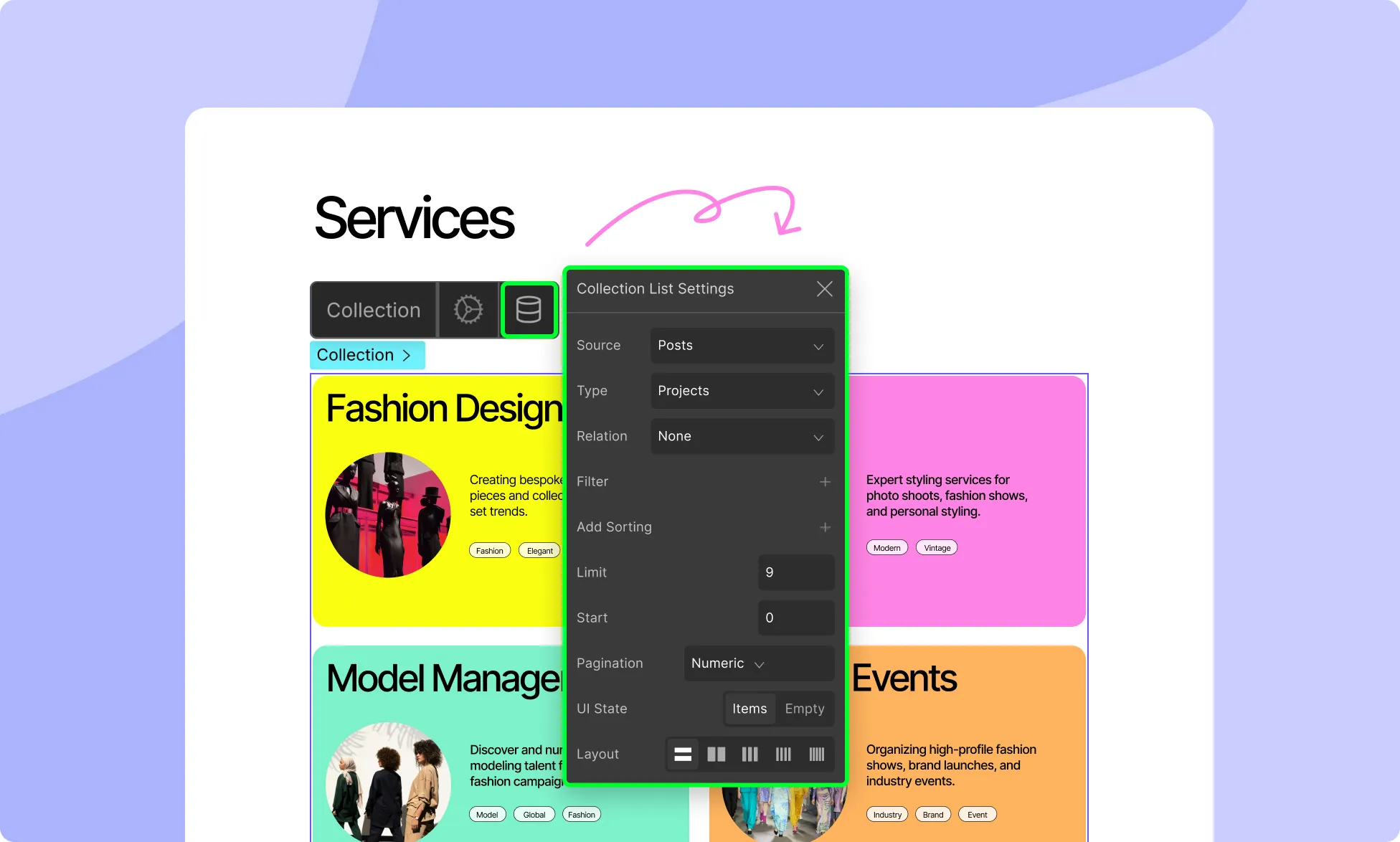
Collections are a powerful way to fetch dynamic data to showcase on your website. Popular website pages that you can create using this element are Blog Archive Pages, Author List Pages, Documentation Archive Pages, and more!
Using Droip’s Collection element, you can easily narrow down the exact scope of the data you want to fetch through various criteria like Collection Type, Post Type, and Taxonomy! Depending on the structure of your website, the options listed within these types differ as they are also fetched dynamically.
How to Add a Collection
To add a Collection to your website, follow these steps:
From the Left Sidebar, go to Insert > Elements.
Scroll down to the Advanced section.
Drag & drop the Collection element onto your canvas.
Collection Types
From the Collection Settings, you can define the scope of the data you want fetched and apply filtering, sorting, and other customizations. To access this, click on the Collection icon on the inline editor.
The first criterion you can set is the Collection Source. Here you’ll find the following options:
Post: Choose Post Collection if you want to fetch content from various Post Types such as Blog Posts, Pages, Custom CSS, etc.
Terms: Choose Terms Collection if you want to fetch the Categories, Tags, etc that your website content is organized by.
Users: Choose User Collection to fetch user data saved on your website.
Once you’ve selected your Collection Type, you can then configure the specific settings for that type.
Post Collection Settings
The first Collection option is Post. The Post Collection option extends beyond typical Blog Posts. In WordPress, various content types fall under the Post umbrella, including Pages, Attachments, and Custom CSS, among others.
Post Type
Once you set your Collection as Post, you can then go on to choose these specific Post Types. These options will vary based on the structure of your website.
Inheritance
Posts can be inherited. You can do so by ticking the Parent checkbox.
List Items Layout
Select the number of columns you want the Collection to consist of, ranging from 1 to 5 Columns.
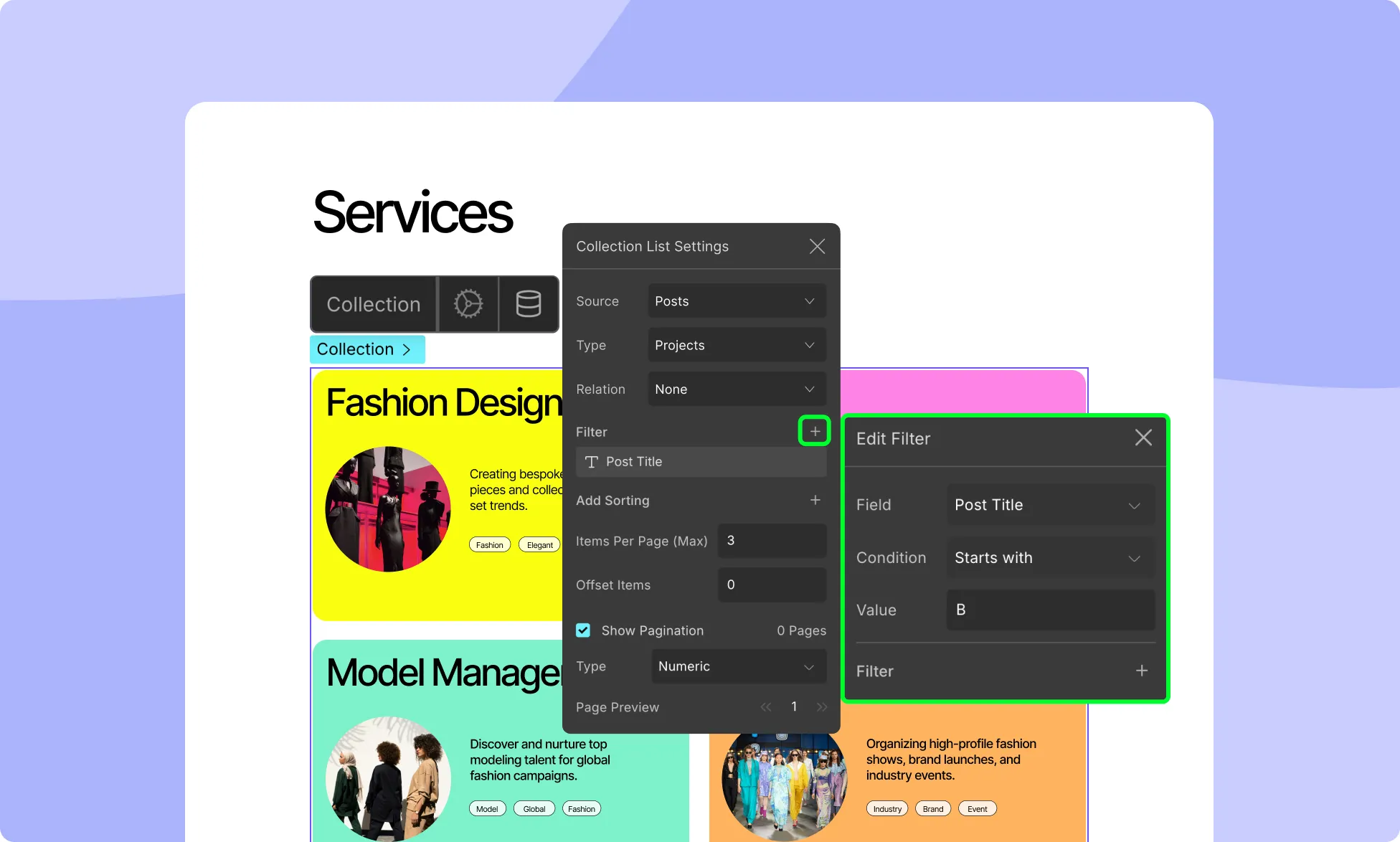
Filter
Set the filter method and criteria for the data. You can filter by:
Date: Define a specific period of time using start and end dates.
Category: Display data from a specific category or filter out data from a specific category.
Author: Show data from a specific author or exclude data from that specific author.
To add a filter, click on the + icon that’s in this section’s top right corner. A new window called Add Filter should appear from where you can select the Method and other conditions. You can add multiple filters like this.
To edit or delete a filter, use the ellipsis icon next to each filter.
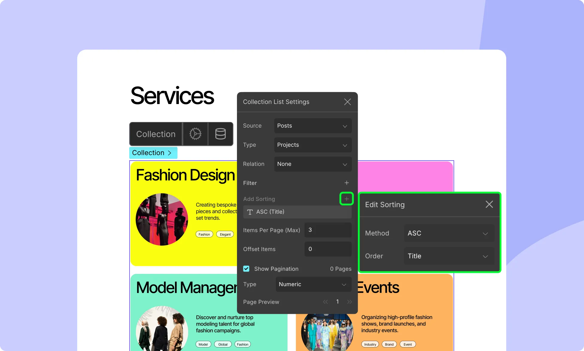
Sorting
Specify the conditions to sort the Items by setting the Method and Order. From Method, you can select either Ascending or Descending. And for Order, you can choose which Attribute to sort according to.
To sort, click on the + icon that’s in the top right corner. A new window called Add Sorting will appear from where you can set the Method and Order.
To edit a Sorting, click on the three-dot icon that is beside each of them and choose the Edit option. You can also delete the Sorting by clicking on the three-dot icon again and selecting the delete option.
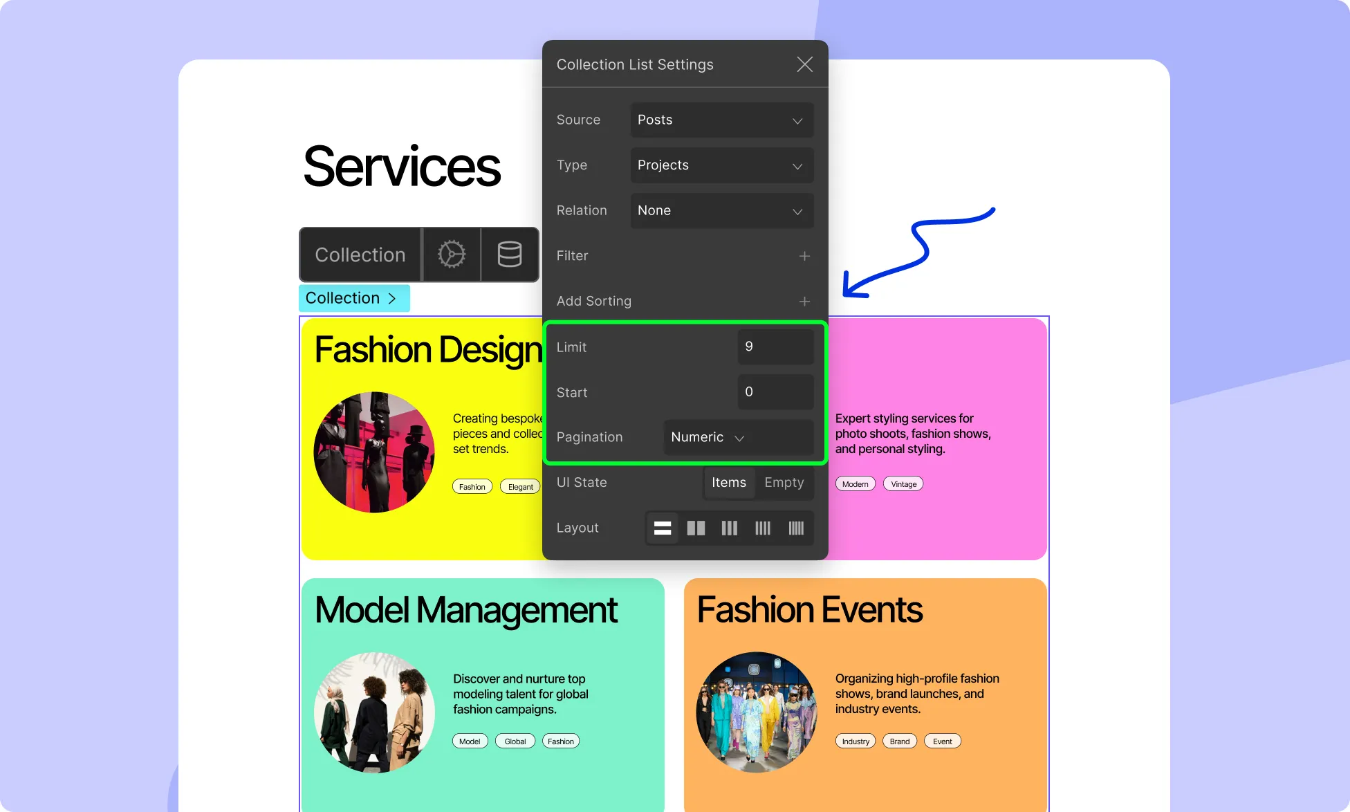
Items Pagination
Enable Items Pagination to limit the number of items displayed on each page. Once enabled, you will be able to set the following:
Items Per Page: Set the maximum number of items to display on each page.
Page Preview: Set the default page to preview.
These settings will be automatically reflected inside the previously empty Pagination Wrapper.
Comment Collection Settings
Similarly, ‘Comments’ are another type of content that you’ll often find on websites.
Comment Type
If you’ve selected Comment as your Collection, you can then go on to choose the Comment Type i.e. which set of comments you want to fetch.
Depending on your website’s structure and what’s installed on it, there can also be more than one Comment Type! Examples include Blog Post Comments, Product Reviews, etc.
Inheritance
Since comments are automatically inherited, nested comments can also be showcased easily.
Filter
Set the filter method and criteria for the Comments. You can filter by:
Date: Define a specific period of time using start and end dates.
Status: Show or filter out comments with a specific status.
Author: Display comments from a specific author or exclude ones from that specific author.
To add a filter, click on the + icon that’s in this section’s top right corner. A new window called Add Filter should appear from where you can select the Method and other conditions. You can add multiple filters like this.
To edit or delete a filter, use the ellipsis icon next to each filter.
Sort
Specify the conditions to sort the Comments by setting the Method and Order. From Method, you can select either Ascending or Descending. And for Order, you can choose which Attribute to sort according to.
To sort, click on the + icon that’s in the top right corner. A new window called Add Sorting will appear from where you can set the Method and Order.
To edit a Sorting, click on the three-dot icon that is beside each of them and choose the Edit option. You can also delete the Sorting by clicking on the three-dot icon again and selecting the delete option.
Items Pagination
Enable Items Pagination to limit the number of items displayed on each page. Once enabled, you will be able to set the following:
Items Per Page: Set the maximum number of items to display on each page.
Page Preview: Set the default page to preview.
These settings will be automatically reflected inside the previously empty Pagination Wrapper.
Term Collection Settings
Lastly, we have Terms. Terms can be anything from Categories to Tags. For this, you can select the following:
Post Type
As mentioned previously, a Post Type encompasses many forms of content in WordPress. Here, you’ll find the options for Posts, Pages, and more.
Taxonomy
In WordPress, Taxonomy is a grouping mechanism used to organize content. Examples include Categories, Tags, etc. You can also create custom Taxonomies for every Post Type.
The options in Taxonomy will differ based on the Post Type selected as each Post Type has a different set of Terms.
Inheritance
Terms can also be inherited. You can do so by ticking the Parent checkbox.
Collection List Content
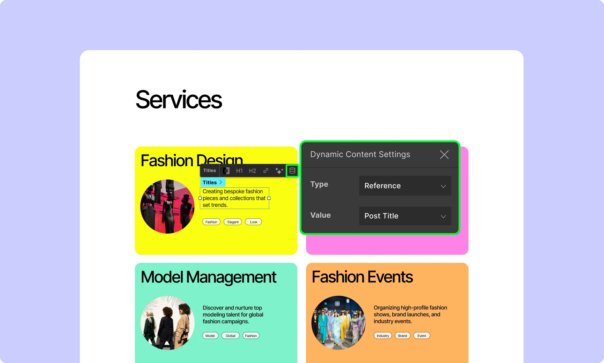
After you’ve configured the Collection element settings, your Collection List will be populated by this content dynamically. This is because the elements that make up a Collection Item have been set up by default to dynamically retrieve the information from the CMS itself.
You can edit these settings by clicking on any one of these elements and opening its Dynamic Content Settings from their inline editor as shown in the image above. Here, you can choose the Type of Content in your data set you want to retrieve as well as specify its Value.
Static and Dynamic Elements in Collection
You can have both static and dynamic elements in your Collection List:
Static Elements
Static elements remain the same for all Collection Items. Simply drag and drop them from the Elements Panel into the collection, and they will be static by default.
Dynamic Elements
Certain Static Elements can be set up to fetch and show Dynamic Data. All you have to do is select it and click on the Data Collection icon to configure it.
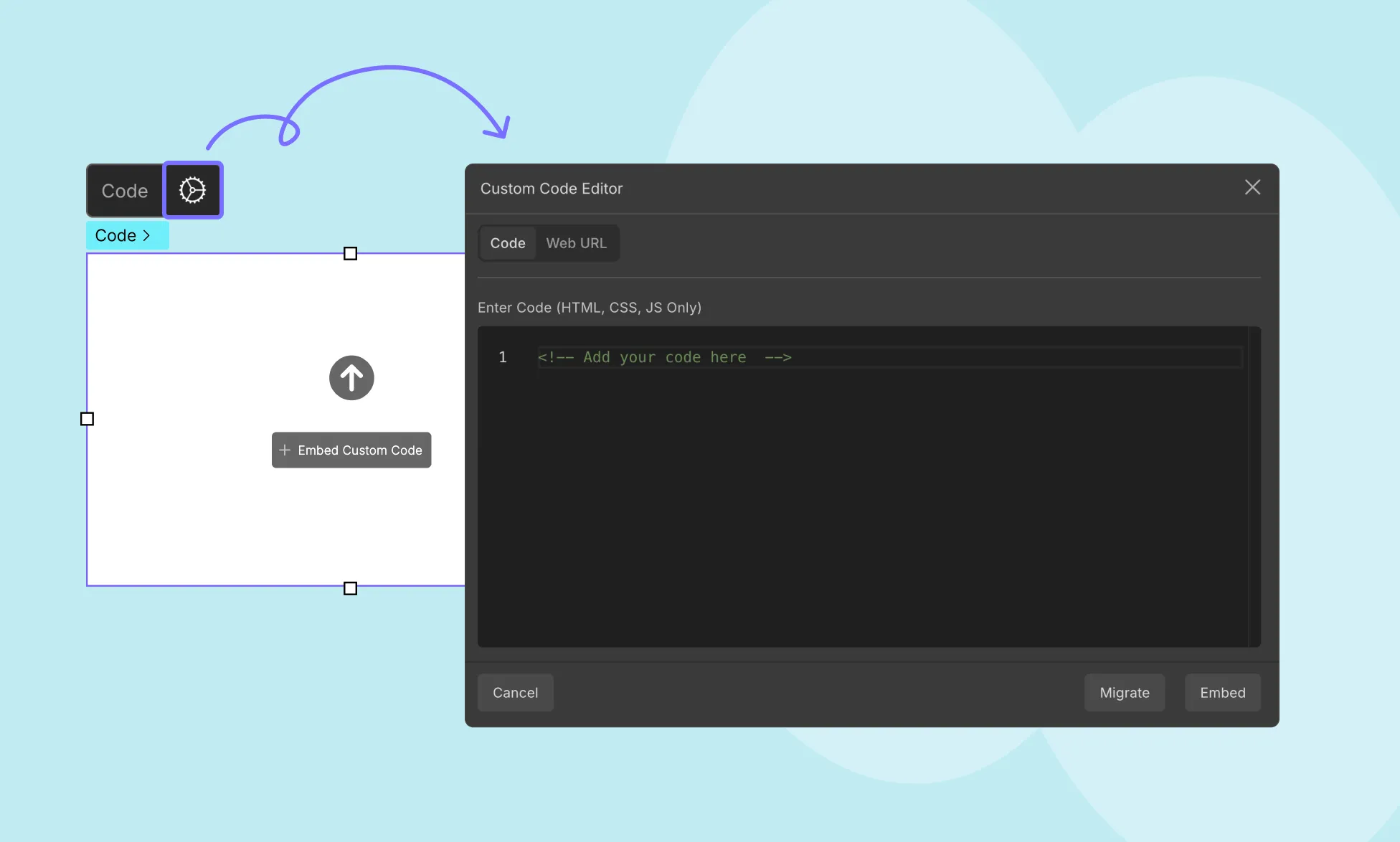
Droip offers extensive customization options, but there are times when you may require additional custom blocks of code. That’s where the Code element comes in handy.
Using this element, you can easily add code in the form of HTML, CSS, and Javascript to your page. And not only can you use this to add custom code but also to embed third-party elements like Bootstrap Components, Social Buttons, Maps, and more.
Adding the Code Element
To add the Code element, follow these steps:
Open the Elements panel.
Scroll down to the Advanced section.
Drag & drop the Code element onto your canvas.
Custom Code Editor
To open the custom code editor, click on the button at its center or the ellipsis icon on its inline editor. On the resulting pop-up window, you’ll find two tabs — Code and Web URL.
Code Tab
This is the custom code editor. Here, you can directly paste your HTML, CSS, and JS code and then simply click on the Embed button to save.
Web URL Tab
Here, instead of typing in the full code, you can instead paste the URL where the block of code you want to add is written. To do that:
In the same pop-up window, switch to the Web URL tab.
Instead of typing the full code, paste the URL where the desired code is hosted. Please ensure the code is publicly accessible on the web.
How to Embed Custom Code
Follow these steps to embed custom code:
Step 1: Copy the Custom Code
Start by copying the custom code you want to embed, either from your own code editor or a third-party resource. For example, consider the following HTML table:
Finally, click the Embed button to save the custom code.
Bonus: Adding Style
You can also Style this element by copying the Style code and going to the Pages Panel. Then, click on the ellipsis icon that’s beside the current page’s label. Select Settings and navigate to Custom Code. Paste the copied style code into the Inside Tag section.
To apply styles to the Code element, follow these additional steps:
Copy the style code.
Go to the Pages Panel.
Click on the ellipsis icon beside the current page’s label.
Paste the copied style code into the Inside Tag section.
Save your changes.
Once it’s saved, you’ll be able to see the end result by clicking on the preview button on the top right.
Remember to exclude , , or tags in your custom code, as they may interfere with the native code of the page and cause issues.
💡Tip: You can easily reuse custom code blocks by converting them into reusable elements using Symbols.
Our website uses cookies to improve your browsing experience on our website. By continuing to use this website, you
agree to
their use. For details, please check our Privacy Policy.
Get started for free!
Start 90 days free trial!
Get Droip
Experience the power of Droip. Create stunning, responsive sites with pure creative freedom.