In Droip, Form Actions let you control exactly how submissions are handled, whether you want to notify your team, confirm submissions to users, or send data to other apps in real-time.
This guide will walk you through:
Configuring SMTP to ensure reliable email delivery
Setting up Email Actions to send notifications and automated responses
Using Webhooks to integrate your forms with CRMs or automation tools
Email Actions in Droip Forms
In Droip, Email Actions let you define how form submissions are sent and handled. You can:
Send Admin Notifications — receive a copy of every form submission.
Send Automated User Emails — confirm to users that their submission has been received.
Before setting up, it’s important to understand the basics:
SMTP (Simple Mail Transfer Protocol) ensures emails are sent through a proper mail server instead of PHP mail, reducing the chances of messages being marked as spam.
Email Action in Droip determines where submissions go, how they appear, and who receives replies.
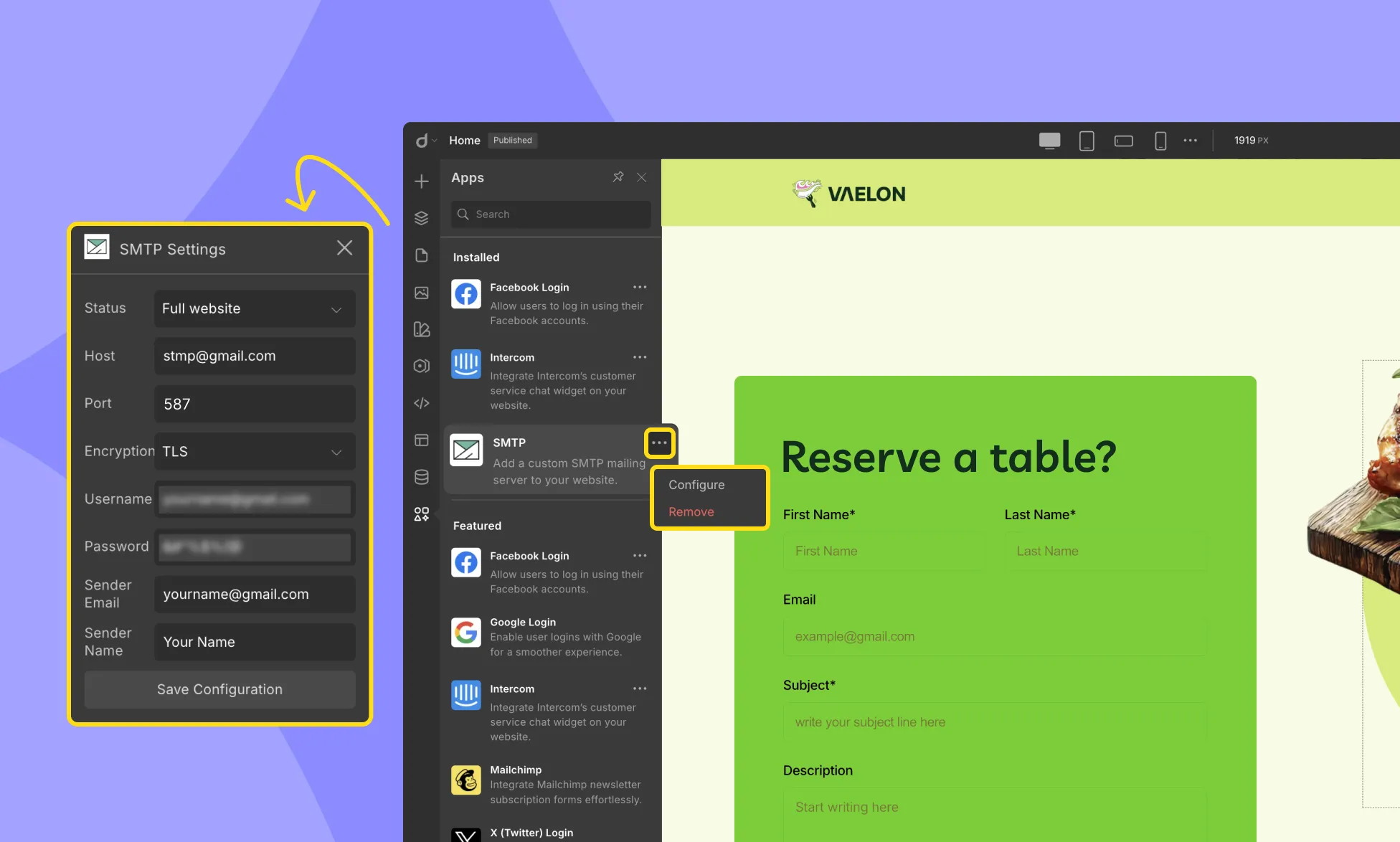
Setting Up SMTP for Gmail
If you plan to use Gmail to send emails from your form:
Sender Name: Enter your name or company name. This is the name that will appear as the sender in the email.
Configuring Droip Form Email Action
Once SMTP is set up, you need to configure your form to send emails properly.
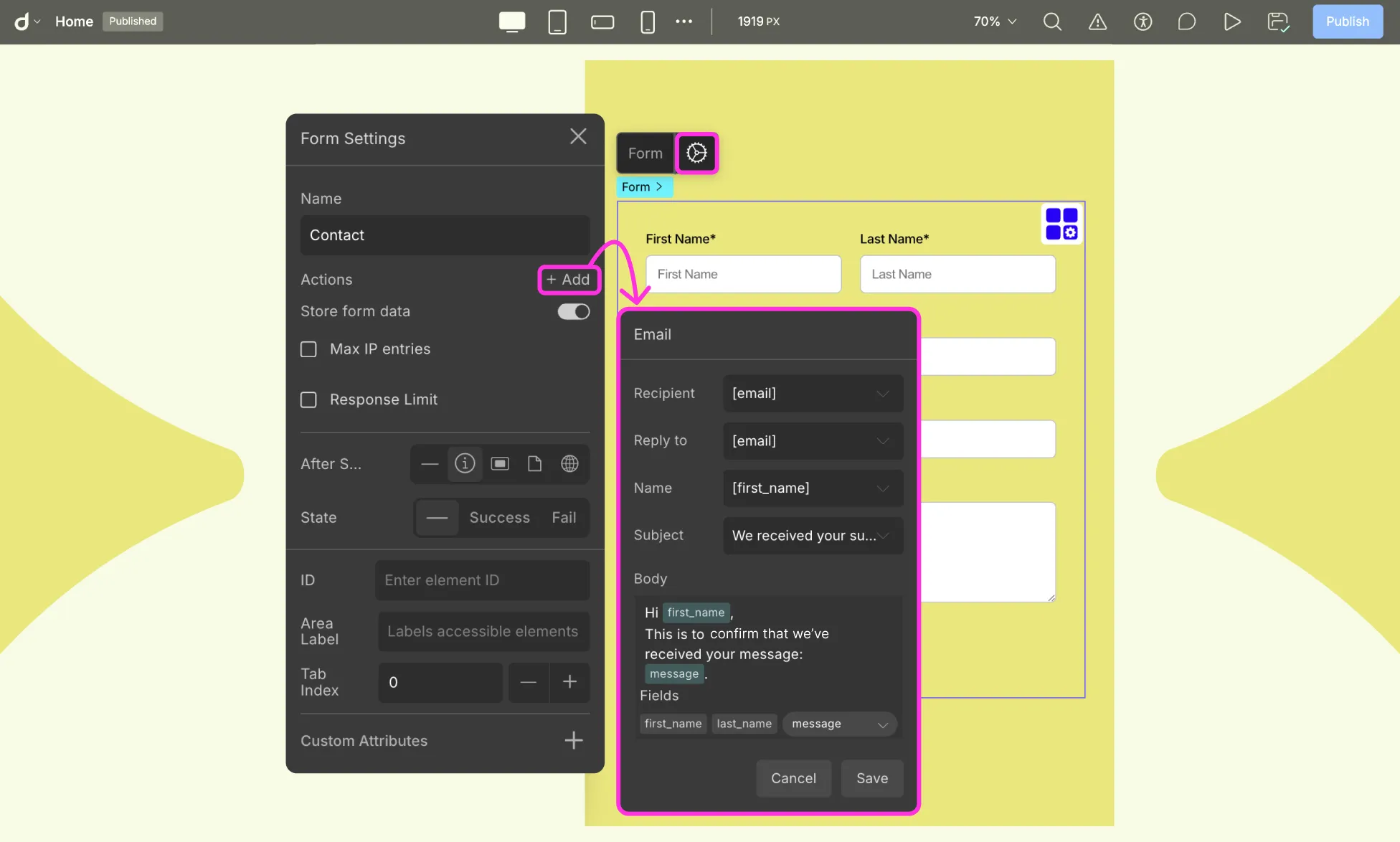
Step 1: Open Form Email Action Settings
Select your form on the canvas.
Open Form Settings > Actions > + Add > Email
Step 2: Setup Email Action
Recipient: Set Recipient to [admin_email] for admin notifications, or [email] if your form includes a user email field. Do not leave it as [email] unless your form has an email field.
Reply To: [email]. This ensures that when you click “Reply” in your inbox, the response goes directly to the user who submitted the form.
Name: [first_name] (optional).
Subject: Enter a subject for your email, e.g, New Contact Form Submission.
Email body: You can include field names to write your email body.
Example:
Hi [first_name],
Thank you for reaching out! We have received your message:
[message]
Our team will get back to you shortly.
Testing Your Setup
Fill out your form on the website.
Confirm that the email arrives at the recipient address.
Click “Reply” to verify it goes to the user’s email.
If emails do not appear, check your Spam/Junk folder.
Webhooks in Droip Forms
A Webhook is a way for your form to send data to an external URL in real-time whenever a submission occurs. Unlike email, which simply delivers a message, webhooks allow you to integrate your form with other apps or services, such as:
CRM systems (e.g., HubSpot)
Automation tools (e.g., Zapier)
Analytics or database platforms
Custom server endpoints for processing submissions
How to Set Up a Webhook in Droip
Open Form Settings > Actions > + Add > Webhook
Enter the URL of the service or endpoint you want to send data to.
Select the HTTP Method:
GET: Sends data as query parameters in the URL.
POST: Sends data in the request body (recommended for most integrations).
Save the webhook.
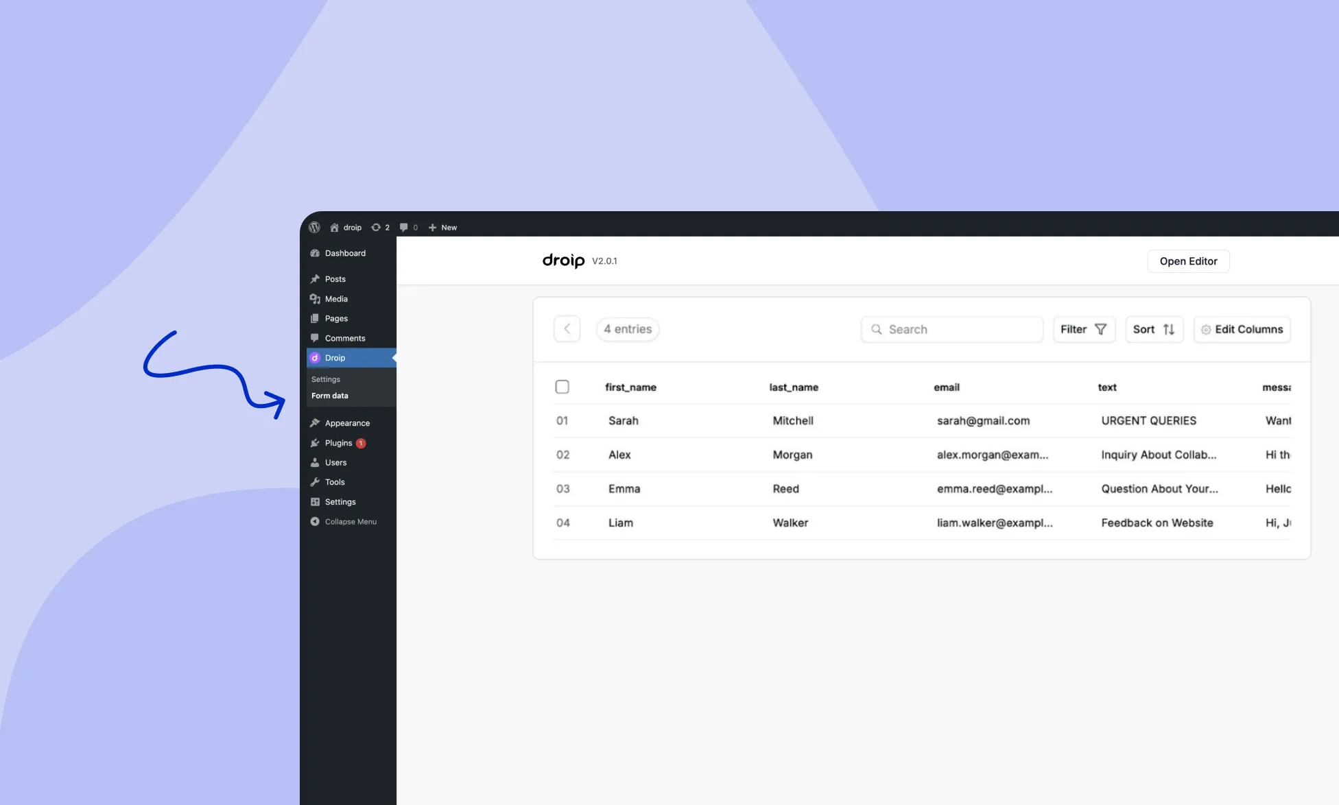
Droip provides a dedicated WordPress dashboard to manage form data efficiently. You can easily access and view all the forms you have created using the Form Block element in Droip. Additionally, you can export and analyze the data collected through these forms.
Accessing Form Data
To access your form data, follow these steps:
Go to your WordPress Dashboard.
Find the Droip menu.
Select Form Data.
Form List
In the Form Data section, you can view all the forms you have created using the Form Block element in Droip.
For each form, click on the three-dot menu to access the following options:
Open Form Data: View the collected data for the selected form in a separate dashboard. Filter, sort, and perform various actions on the data.
Export as .CSV: Download the form data for the selected form as a CSV (Comma-Separated Values) file for sharing or further analysis.
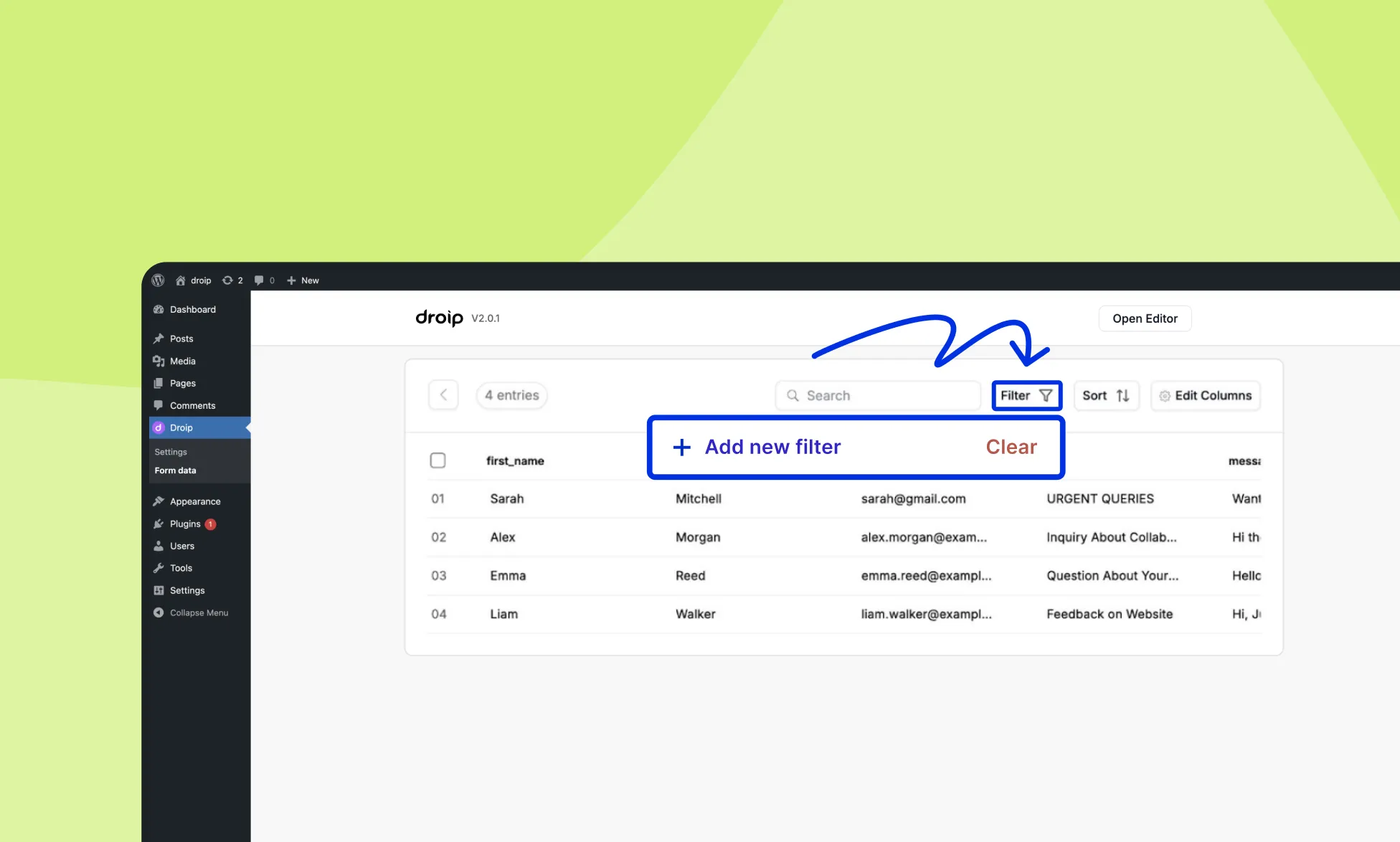
Filter Form Entries
Droip provides advanced filtering options for form entries in the WordPress dashboard. It allows users to create custom filters based on specific form fields such as Name, Phone, Email, message, etc., and then further refine their search results by applying specific conditions to find the exact information they are looking for.
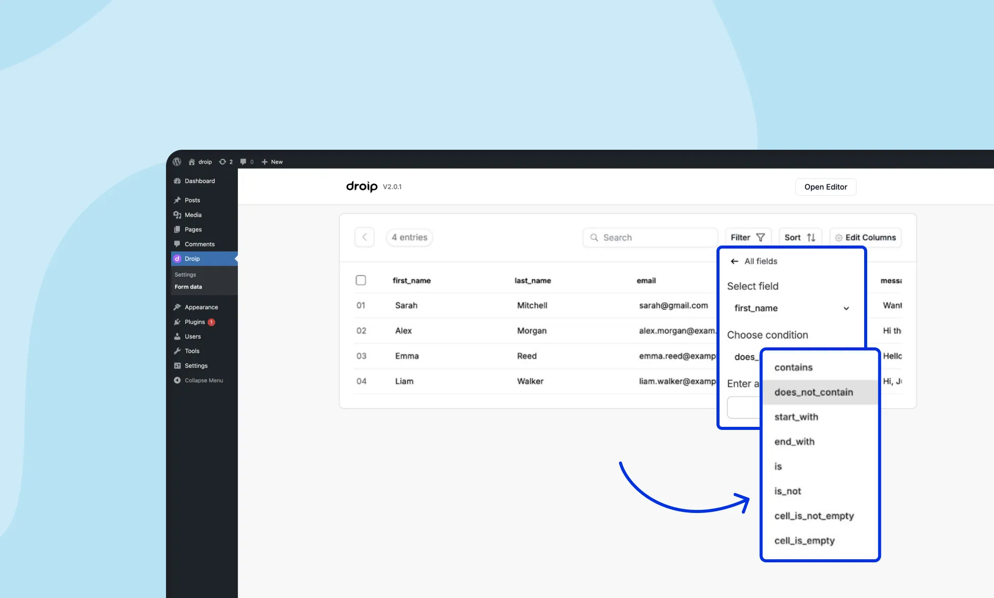
Create New Filter
To create a new custom filter, click on the Filter > Add New Filter button.
Now, you can select specific form fields and refine your search results by applying specific conditions. You can create custom search filters on the following fields:
Name
Phone
Email
Message
Created_at
Here are the following conditions that you apply to the form fields in Filter:
Contains: This condition searches for form entries that contain a specific text string, regardless of where the string appears within the field.
Starts_with: This condition searches for form entries where a field’s value starts with a specific text string.
Ends_with: This condition searches for form entries where a field’s value ends with a specific text string.
Does_not_contain: This condition searches for form entries where a field’s value does not contain a specific text string.
Is: This condition searches for form entries where a field’s value exactly matches a specified value.
Is_not: This condition searches for form entries where a field’s value does not exactly match a specified value.
Cell_is_not_empty: This condition is used to search for form entries where a specific field in the form is not empty.
Cell_is_empty: This condition is used to search for form entries where a specific field in the form is empty
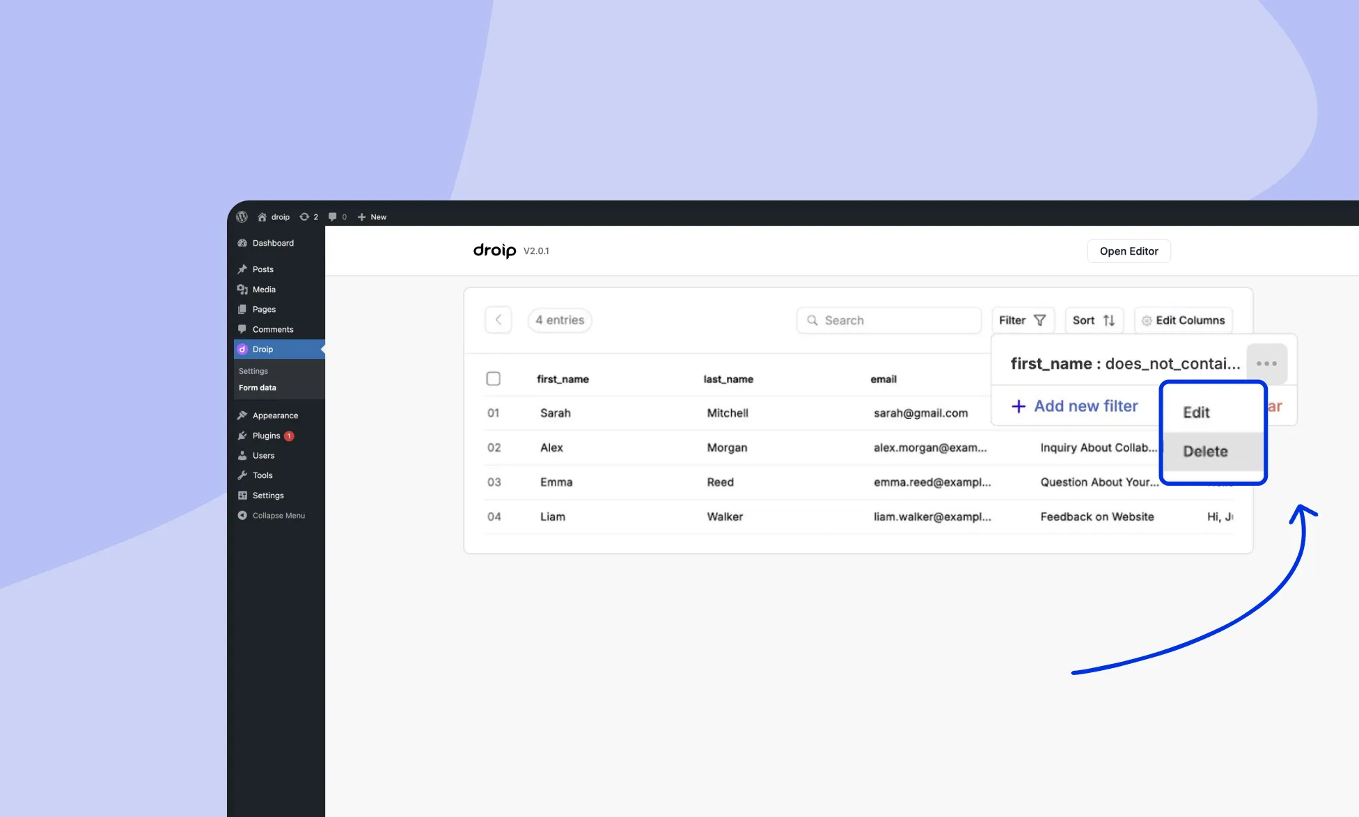
Edit or Delete a Filter
To delete a custom filter, click on the horizontal 3 dots menu beside the filter. Here, you will get the option to edit or delete the specific filter.
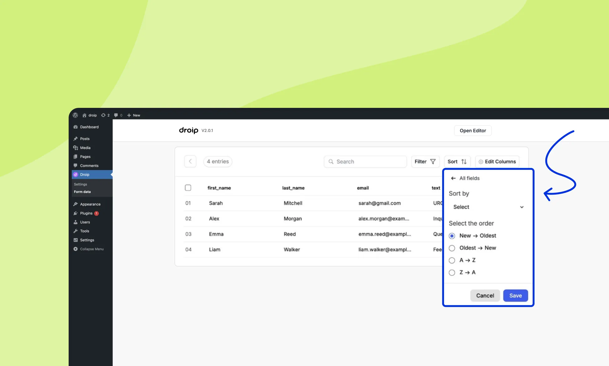
Sort Form Entries
You can also apply custom sorting conditions to form fields to filter and sort your form entries effectively. Here are the available sorting conditions:
New -> Oldest: Sort form entries in ascending order based on the date and time of creation (newest first).
Oldest -> New: Sort form entries in descending order based on the date and time of creation (oldest first).
A -> Z: Sort form entries in ascending alphabetical order based on the selected field.
Z -> A: Sort form entries in descending alphabetical order based on the selected field.
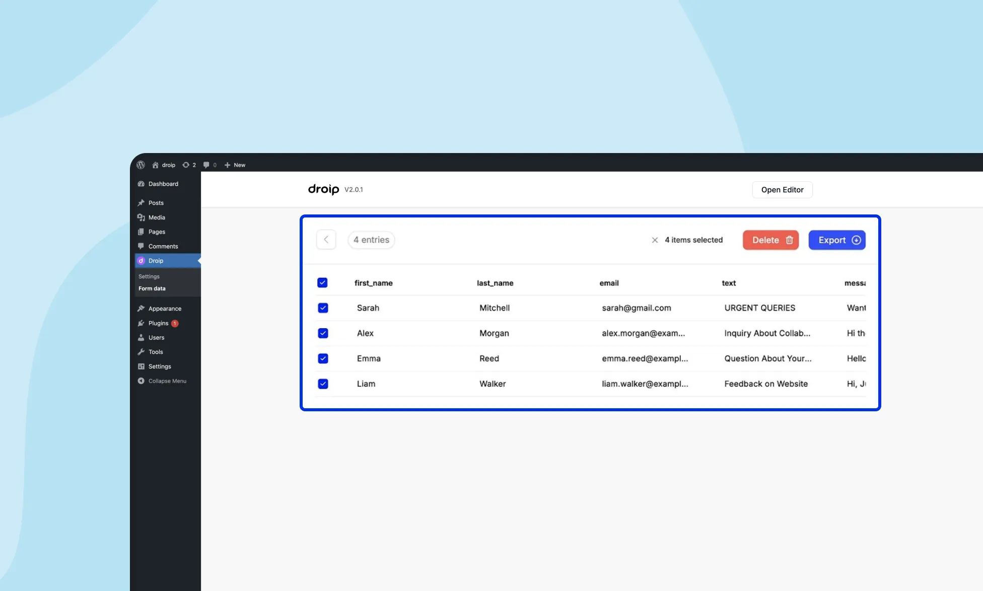
Perform Bulk Actions
Droip allows you to select multiple form entries and perform bulk actions like deleting or exporting them. This feature is beneficial for managing large amounts of data.
Delete: Permanently remove selected form entries from your database.
Export: Download selected form entries as a CSV file for further analysis.
A web form is an HTML form that lets users enter their information. There’s no “one size fits all” when it comes to web forms.
Depending on your business needs and the type of user data you want to collect, you can craft any web forms that fit your needs with Droip.
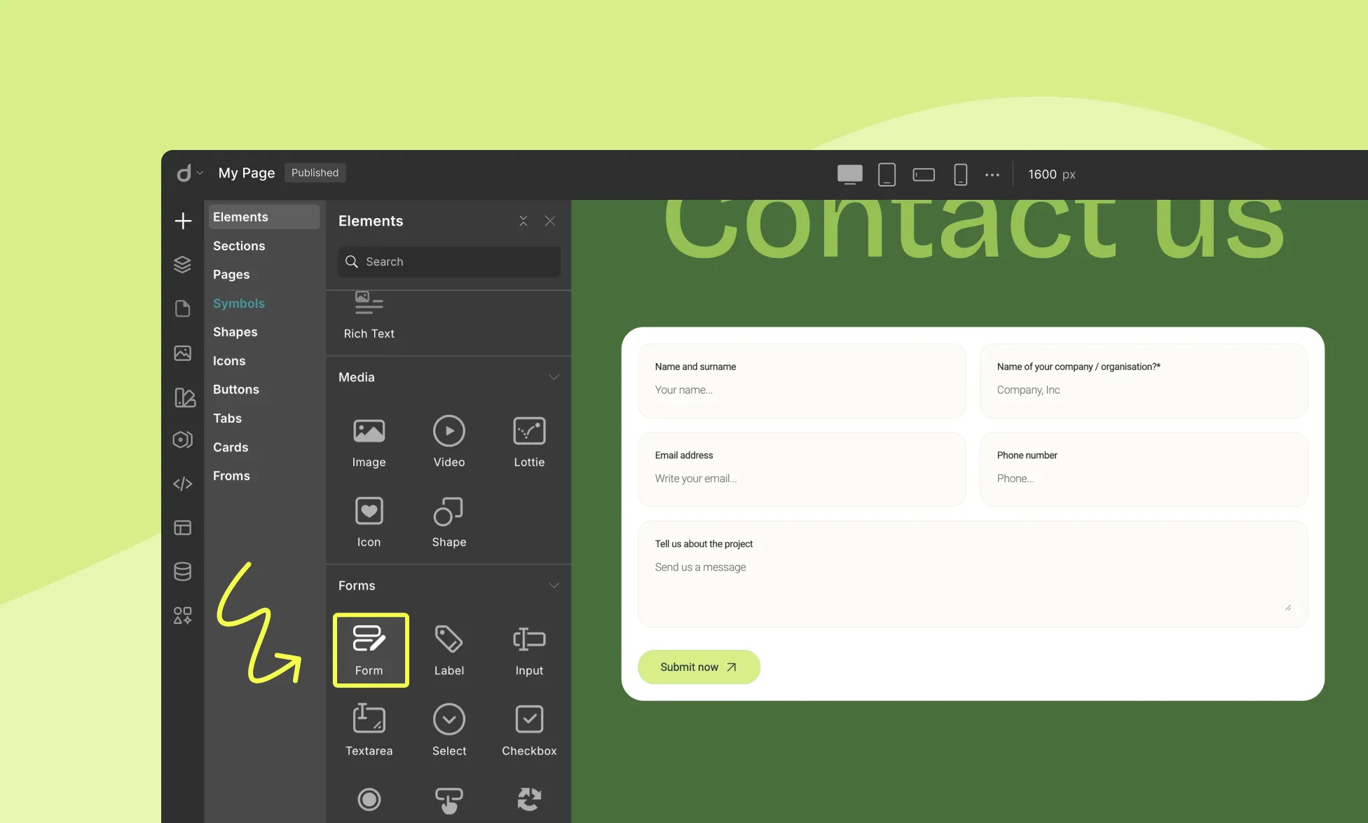
How to Add a Form
To add a Form to your page, follow these simple steps:
Open the Insert Panel from the right sidebar.
Navigate to Elements > Forms.
Drag and drop the Form element onto your canvas.
Default Form Structure
The Form comes with a set of default form elements, including:
Heading
4 input fields labeled as Name, Email, Subject, Description
Submit Button
Available Form Elements
Droip offers various elements to help you design functional forms:
Label: Describes a field’s purpose for users.
Input: Captures single-line text (e.g., name, email, phone).
Textarea: For multi-line input (e.g., comments, messages).
Selector: Provides a dropdown list of options.
Checkbox: Lets users select one or more options.
Radio Button: Allows selection of only one option from a list.
Form Button: Submits the form.
reCAPTCHA: Protects against spam using Google’s service.
File Upload: Enables users to attach files.
📝 Note: You can add or remove form elements only within the form block.
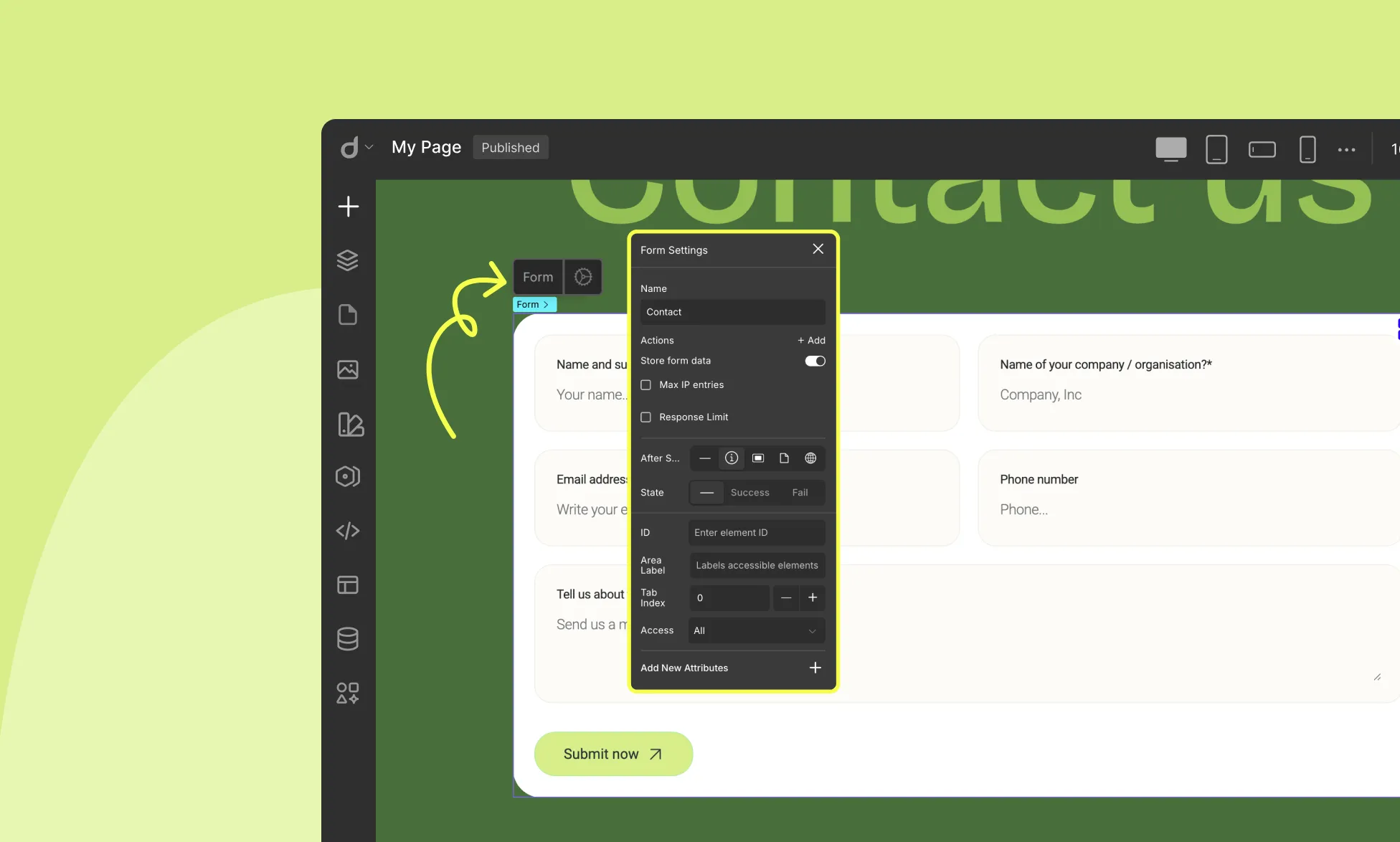
Form Settings
Once your form is built, configure its behavior in the Form Settings panel.
Name: Assign a unique name to identify the form (e.g., “ContactForm”).
Actions: Define what happens on submission:
Email: Send entries to an email address.
Webhook: Send data to an endpoint (for integrations like Zapier or CRMs).
Store Form Data: Enable to save submissions directly in Droip’s Form Data Manager.
Max IP Entries: Limit how many times a single IP can submit the form (e.g., set to “1” for one-time entry).
Response Limit: Set a maximum number of total submissions (useful for limited offers or registrations).
After Submit: Choose post-submission behavior:
None: No extra action
Show Notification: Display a success or failure message
Popup: Trigger a popup (you can set different popups for success and failure)
Page: Redirect to another page
External URL: Redirect to an external website
Each “After Submit” action, Droip lets you define different experiences based on the form’s submission result:
Default (None): The form’s normal state before submission.
Success: Shown if the form is submitted successfully (e.g., showing a success notification or popup).
Fail: Shown if the form submission fails (e.g., showing an error notification or popup).
You can customize the message, design, or triggered action for each state depending on the “After Submit” option you’ve selected, letting you control both what happens and how it looks for each scenario.
Customizing Form Elements
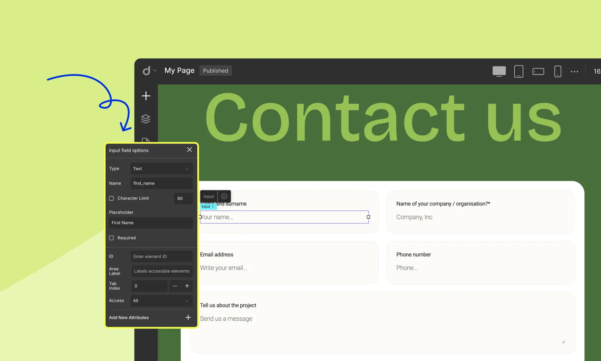
Input Field
Click an input field to access the Input Field Options:
Type: Specify input type (text, email, password, number, date, etc.)
Name: Assign an internal name for data tracking
Character Limit: Set a max number of characters (text inputs only)
Placeholder: Add guidance text inside the field
Required: Mark the field as mandatory
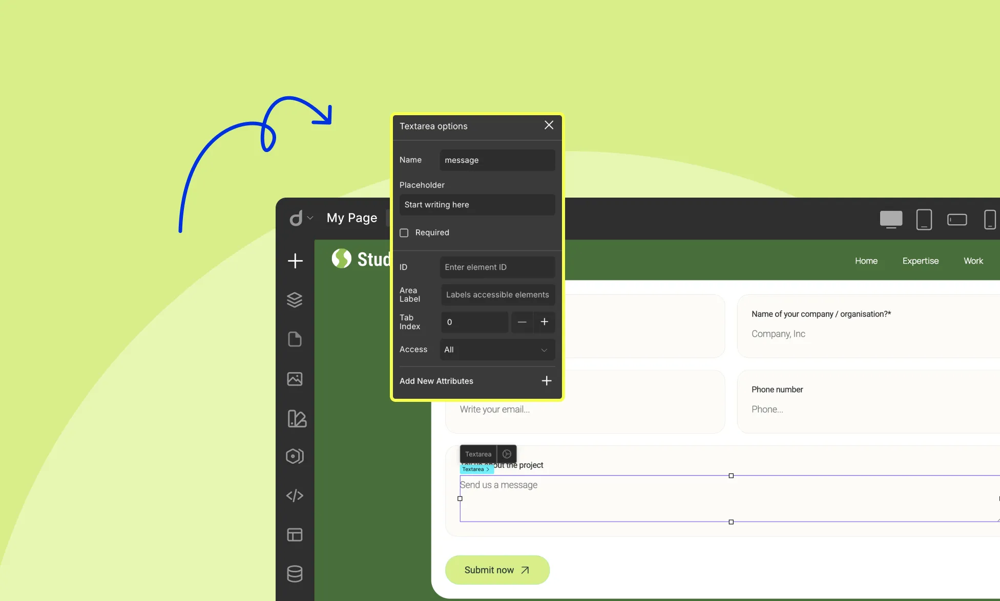
Text Area
Click a textarea to access its options:
Name: Assign a unique name
Placeholder: Add guidance text
Required: Mark the field as mandatory
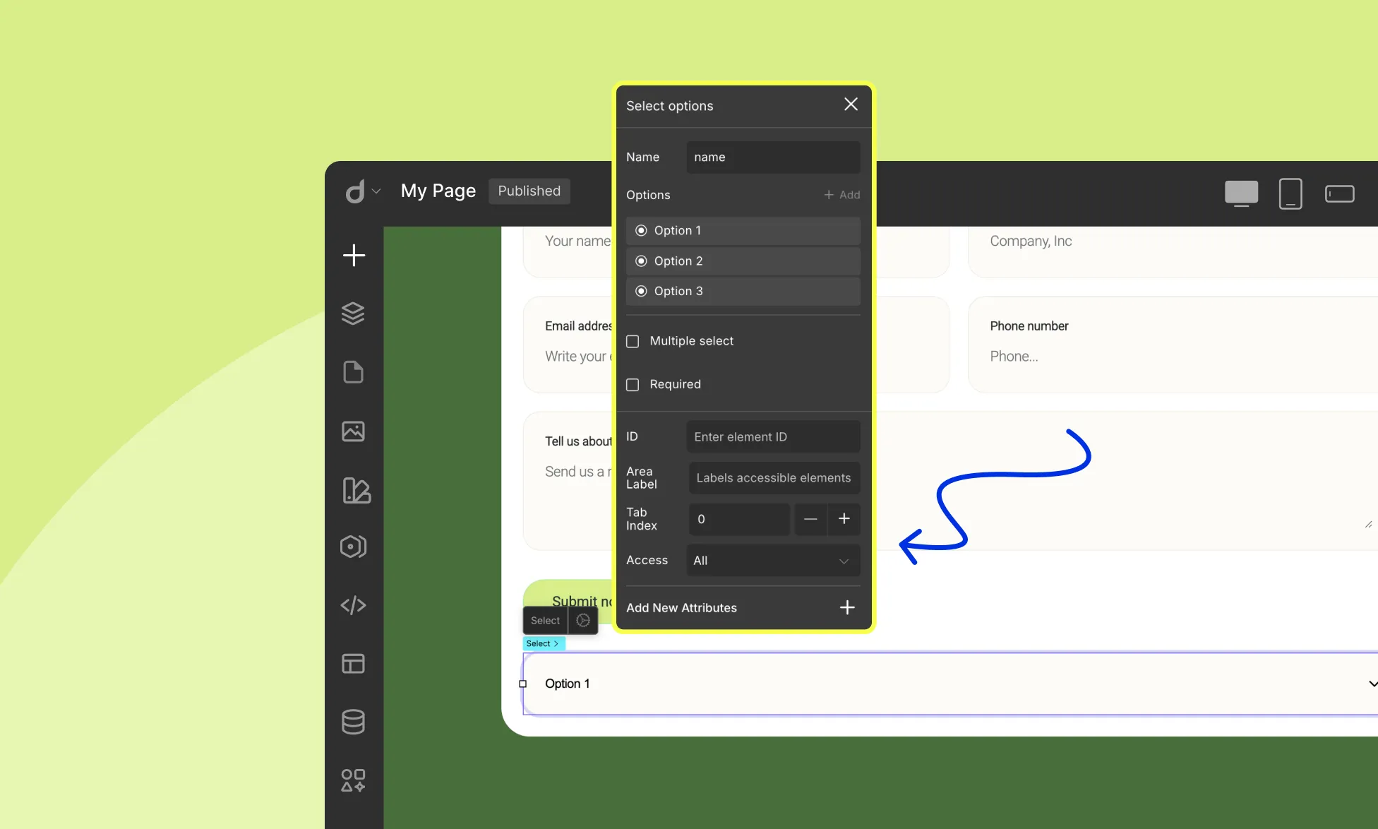
Select
Click the select element on the form to access its options:
Name: Assign an internal name. This name is used when processing form submissions (e.g., mapping the selected value).
Options: Add the choices that users can select. Click + Add to add new options. Reorder options easily by dragging them.
Multiple Select: Allow users to select multiple options (or disable for single selection)
Required: Make selection mandatory
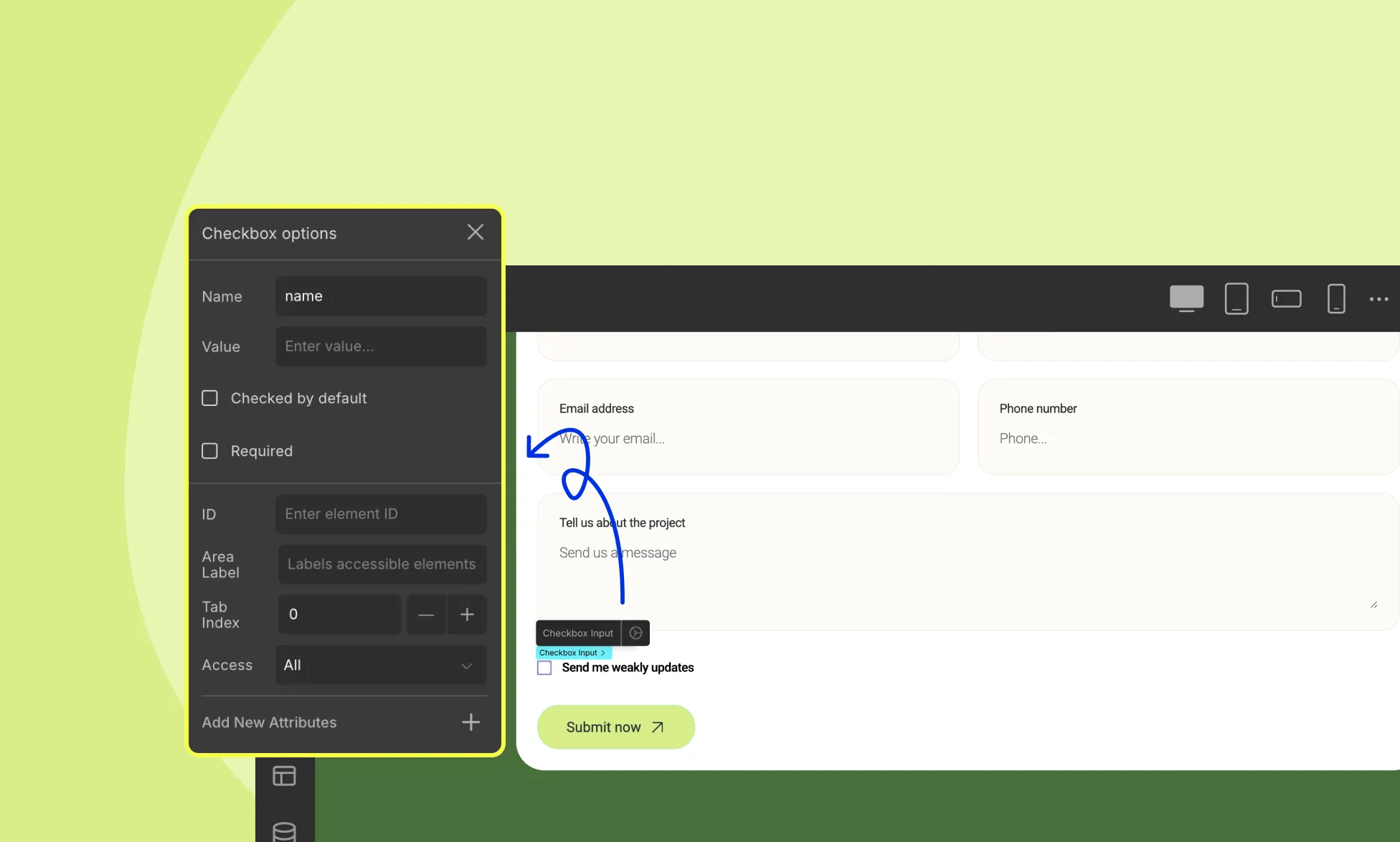
Checkbox Input
Inside the checkbox element, you’ll find:
Checkbox Input element
Text element
When you click the Checkbox Input, the Checkbox Options panel appears:
Here you can configure:
Name: Assign an internal name to track the checkbox.
Value: Set the value that will be submitted when the checkbox is checked.
Checked by Default: Enable this to have the checkbox pre-selected.
Required: Mark the field as mandatory (users must check it to submit).
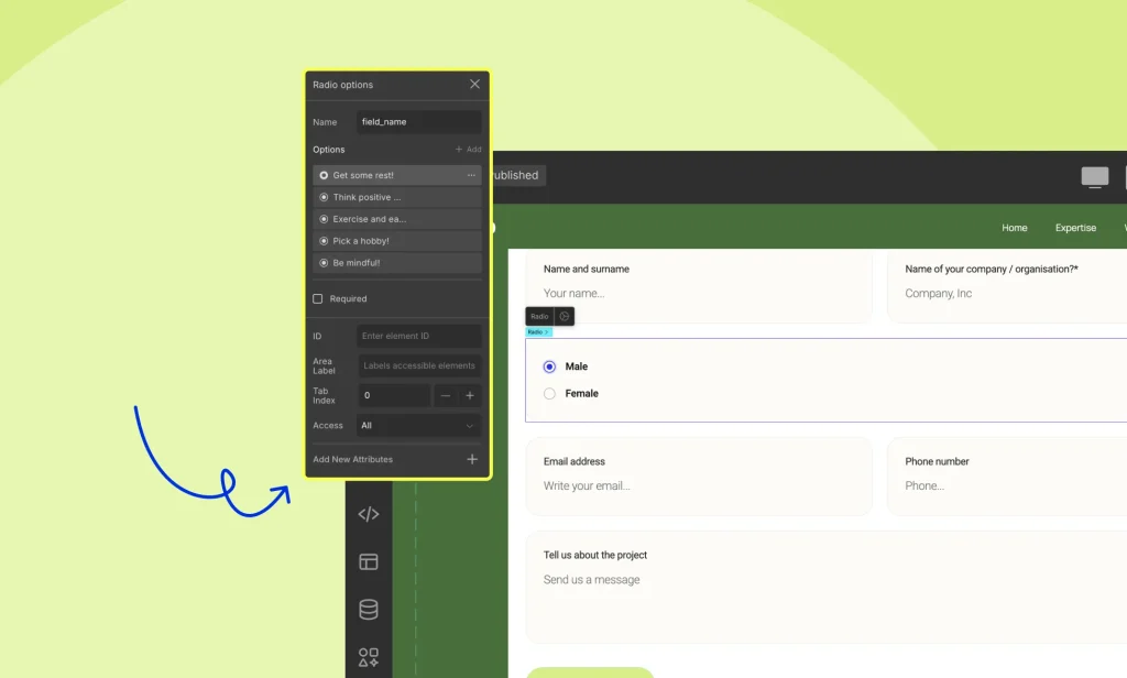
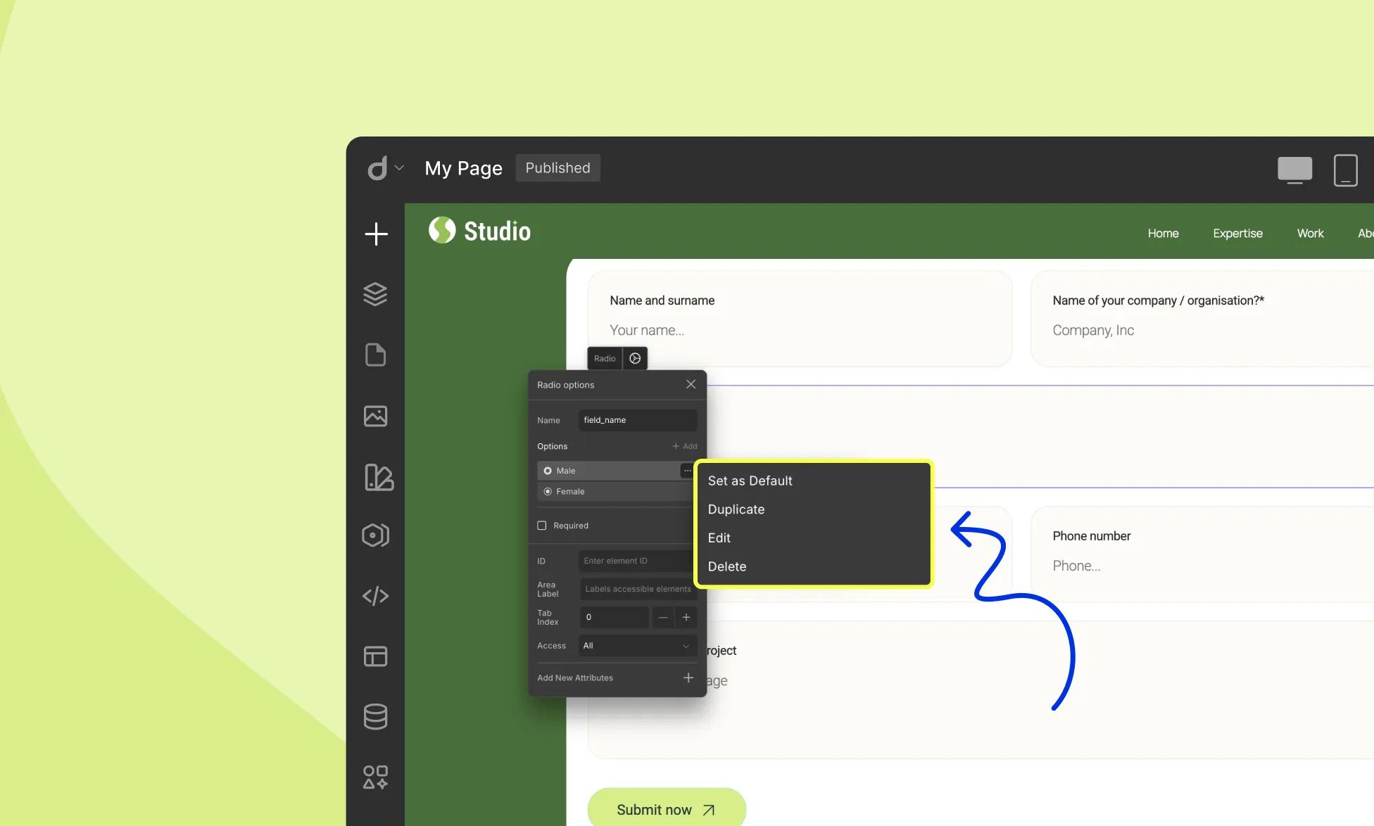
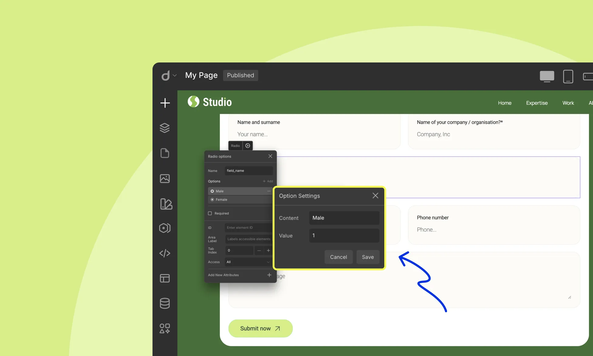
Radio Button
Click the Radio Button element to configure:
Name: Assign a name; this is used during form submission to collect the selected value.
Options: Add, edit, duplicate, delete, or reorder choices
Each option lets you specify:
Content: The visible label, what users will see (e.g., “Option A”)
Value: The actual data on form submission (e.g., “A1”)
Required: Make selection mandatory
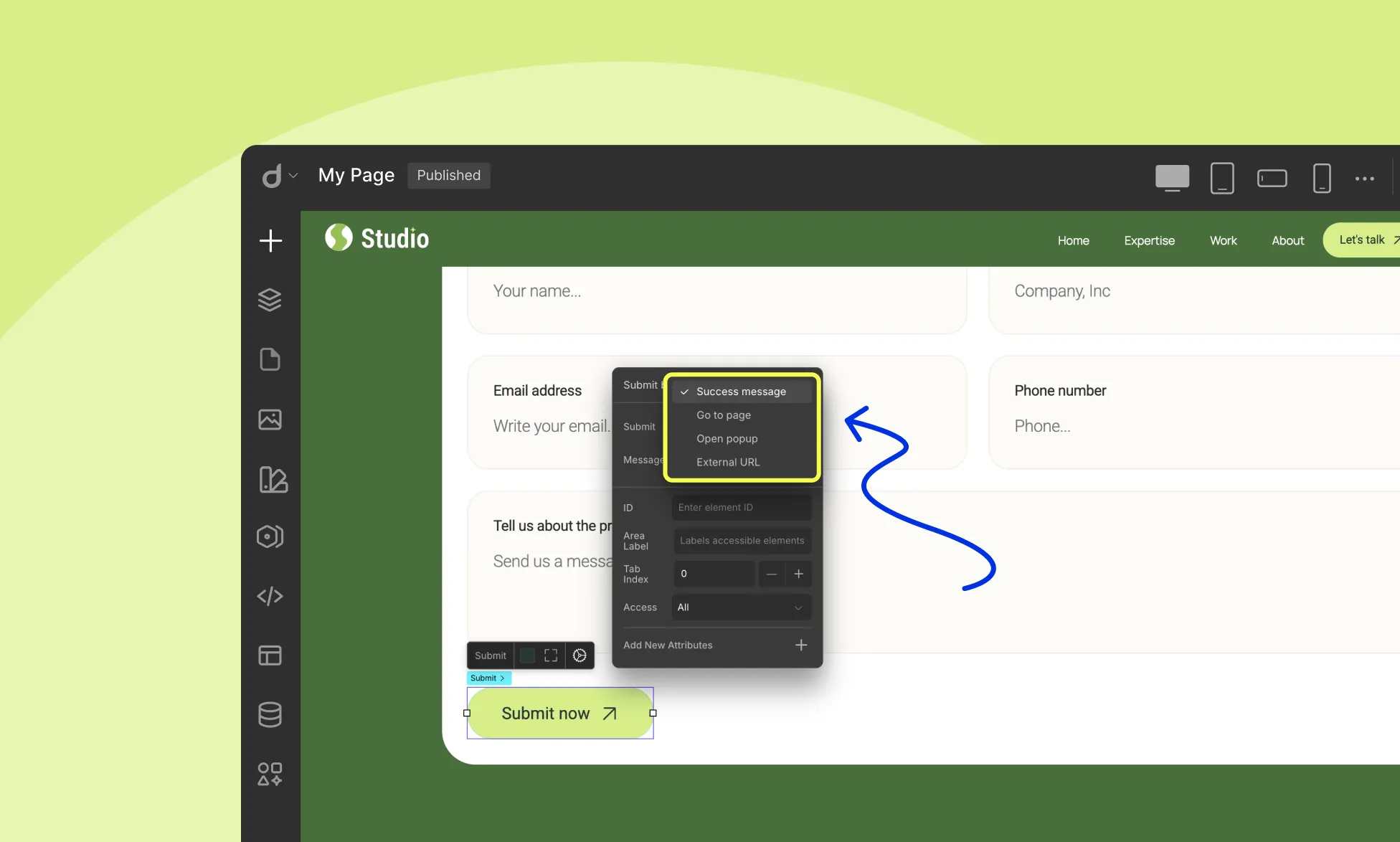
Form Button
When you select the Submit Button in your form, the Submit Button Options panel opens. This panel lets you define what happens after someone submits the form.
Under the Submit dropdown, you can choose one of four actions:
Success Message – Shows a success message on the page after submission. You can enter the message in the Message field.
Go to Page – Redirects users to another page in your project once the form is submitted.
Open Popup – Opens a popup window after submission. Make sure you’ve already created the popup and linked it properly.
External URL – Redirects users to an external website after submitting the form.
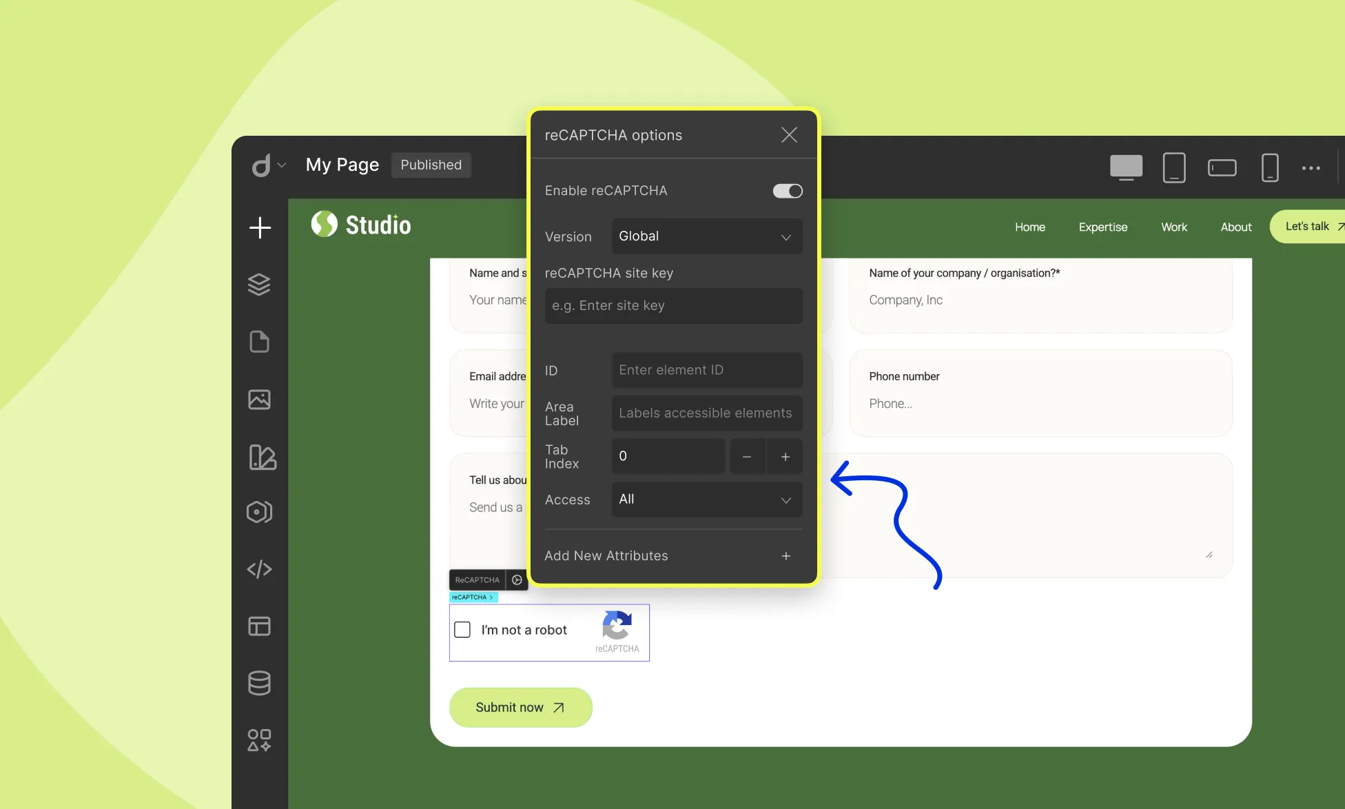
reCAPTCHA
Click on the reCAPTCHA element on the form to configure:
Enable reCAPTCHA: Toggle on/off
Version: Choose reCAPTCHA version
Site Key: Enter your reCAPTCHA site key
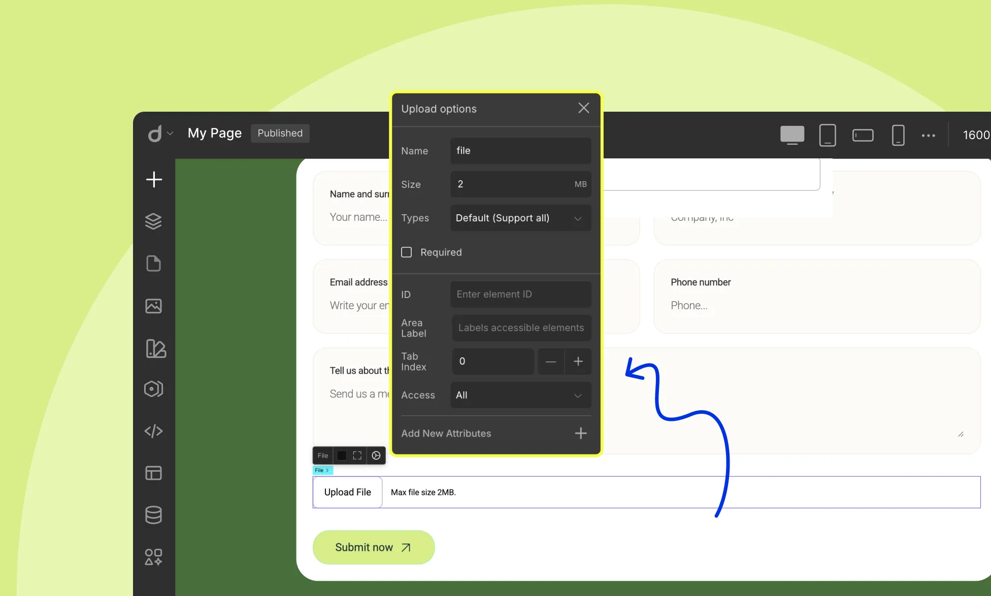
File Upload
Click on the File Upload element on the form to configure:
Name: Give your file upload field a name for identification.
Size: Define the max file size.
Select File Types: From this dropdown, select which file types the user will be allowed to upload:
Default: Supports all
Document: .doc, .pdf, .txt
Image: .jpg, .png, .gif
Video: .mp4, .mov
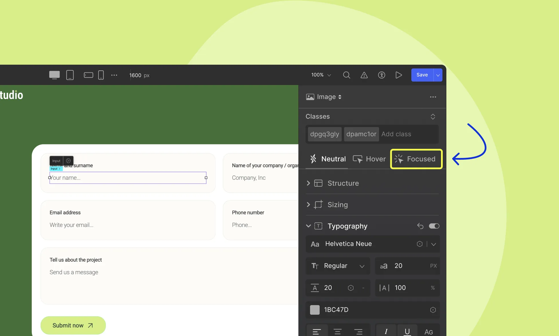
Style Form Field Focus State
Highlight the focused state of input fields when users click on them or use the keyboard to fill them in. To access the focused state:
Select the input field.
Go to the Style Panel on the right sidebar.
Select Focused from the States.
Now, you can add a border, change the background color, and style as you wish. This styling will be visible when the input form field is in the focus state only.
Droip also provides a dedicated WordPress dashboard to manage your form data efficiently. To learn how to manage your form data in Droip, refer to Form Data documentation.
Our website uses cookies to improve your browsing experience on our website. By continuing to use this website, you
agree to
their use. For details, please check our Privacy Policy.
Get started for free!
Start 90 days free trial!
Get Droip
Experience the power of Droip. Create stunning, responsive sites with pure creative freedom.