Picture this — you’ve designed a stunning website that should wow your audience. But instead, you’re seeing high bounce rates and wondering what went wrong.
Chances are, you missed one crucial detail: your site isn’t built to adapt across the growing range of devices people use to browse the web.
And this is where Breakpoints come in! So sit tight as we explore what are breakpoints in web design & how to use them to make sure your website looks its best on any device.
Breakpoints Explained — And Why You Need Them
Website breakpoints are essentially predefined screen sizes that a website’s design and layout will automatically accommodate.
In other words, from desktops to mobile phones and everything in between, you can say goodbye to awkward layouts and hello to a seamless website experience!
But some may wonder if it is really that necessary.
To answer that, here’s a quick breakdown (pun totally intended) of why breakpoints shouldn’t be optional in web design:
Seamless User Experience: The entire point of using breakpoints in web design is, of course, to ensure a seamless user experience across devices.
Better Engagement, Lower Bounce Rate: Users will bounce immediately if they land on a site with broken design or poor accessibility. A seamless website experience across devices ensures they stick around for longer.
Improved Accessibility: An accommodating design ensures that everyone — including users with disabilities — can access your website more easily on their preferred devices.
Expanded Audience: When your website looks flawless on more devices, you open the door to a wider audience. And more audience usually means more visitors to possibly convert.
Enhanced Professionalism & Credibility: A seamless website experience across platforms doesn’t just look good — it also helps solidify your brand’s professionalism & builds trust with your audience from the very first impression.
How to Use Website Breakpoints With No Code
By now, you know breakpoints are a crucial part of responsive website building. But the fact of the matter is — how do you use breakpoints in websites without writing a single line of code?
Using the right no-code website builder, of course!
The Hunt for the Right Website Builder
Not all website builders are truly no-code, nor do they handle breakpoints the same. When hunting for the perfect fit, here are a few key things to keep in mind:
Responsive Controls & Seamless Switching: Look for a website builder that allows you to switch between breakpoints seamlessly and effortlessly.
Custom & Unlimited Breakpoint Support: Apart from the standard website breakpoints, your chosen tool should also support custom breakpoints. Bonus points if it also allows you to define unlimited breakpoints!
Live Preview For Devices: Don’t leave your layouts to guesswork. Choose a website builder that offers a real-time preview of your design across different breakpoints instead of cleaning up later.
Drag & Drop Editor With Granular Control: Find a website builder with a drag & drop editor and granular controls. This will give you the freedom to fine-tune your design for every device.
Now this begs the question — what’s a no-code website builder that offers a real-time editor with granular controls, seamless switching between breakpoints, custom & unlimited breakpoints, and more?
It’s the Droip WordPress website builder!
With Droip, using breakpoints in web design becomes effortless. Between capabilities like unlimited custom breakpoints support and a fully visual real-time editor, you can ensure your website accommodates any screen size out there — with no code required.
Droip also follows the hierarchical approach, meaning any changes you make for a larger viewport automatically cascade down to smaller ones. This ensures a consistent, cohesive design across devices and saves you time by eliminating the need to repeat the same tweaks for every screen size.
Learn more in the Droip Breakpoints documentation.
Switching Between Breakpoints
So let’s get started. The first thing you need to know is how to switch between breakpoints in Droip.
In Droip, you can do so in the following two ways:
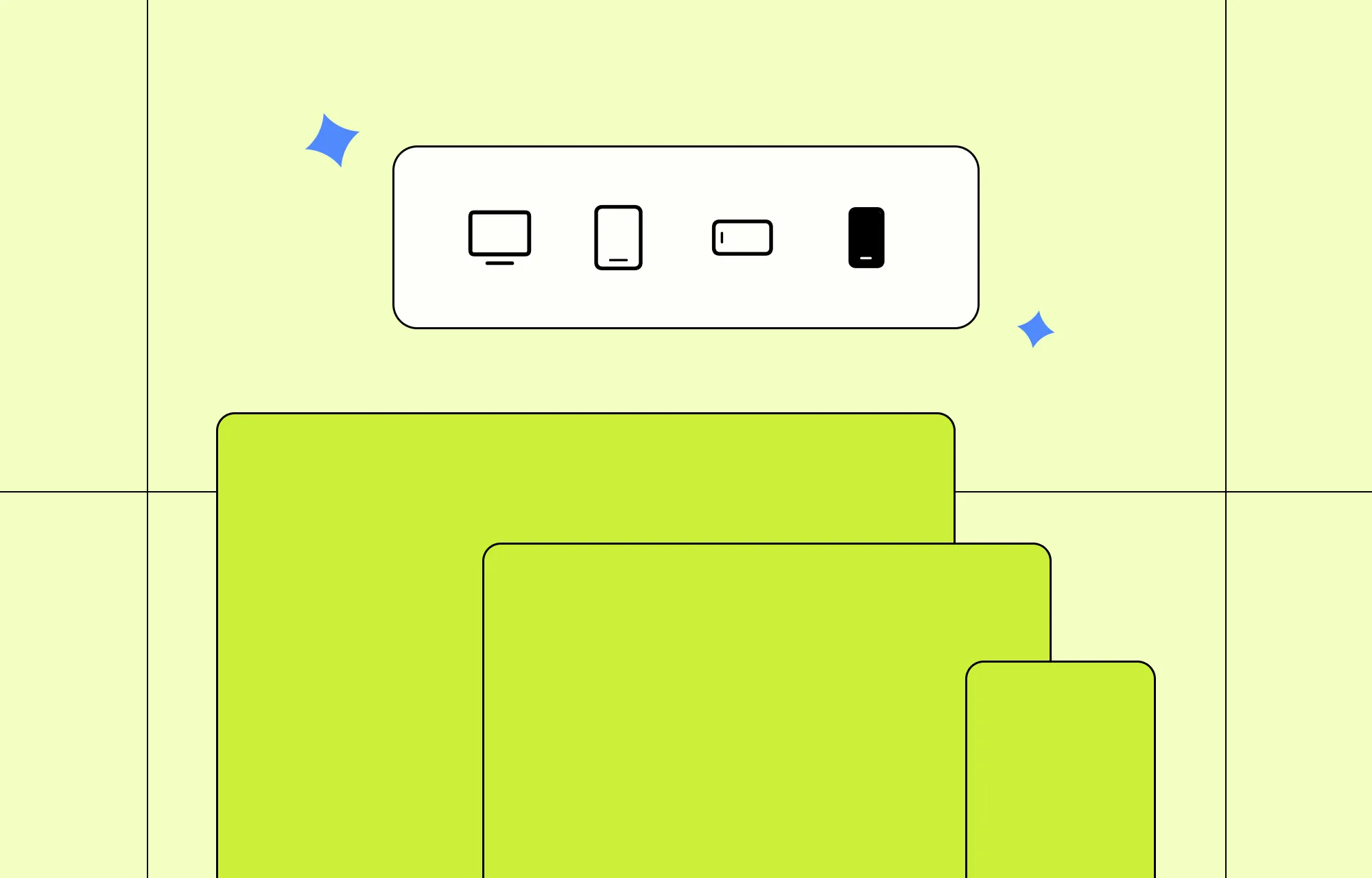
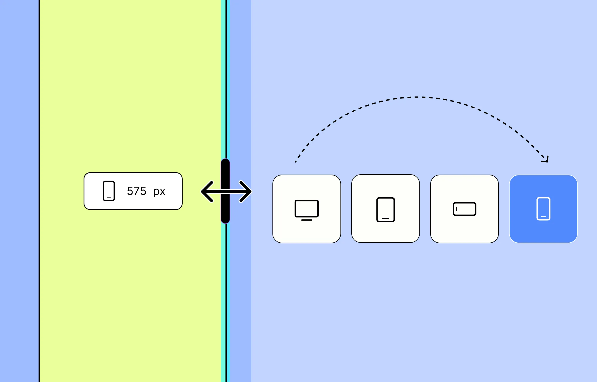
Using Breakpoint Icons: At the top of the Droip editor, you’ll see a set of default breakpoint icons. Just click any of these to switch instantly between screen sizes.
Dragging Canvas Sidebar: Alternatively, you can also drag the right edge of the canvas to seamlessly switch between viewport widths. This has the added bonus of letting you preview how your design looks as you go.
Defining Custom Breakpoints
If the default breakpoints don’t quite fit your needs, no worries! As mentioned earlier, Droip supports unlimited custom breakpoints.
With the Droip WordPress website builder, you can define as many custom breakpoints as you like, giving you complete control to tailor your website for any screen size.
To define custom breakpoints in Droip, just follow these simple steps:
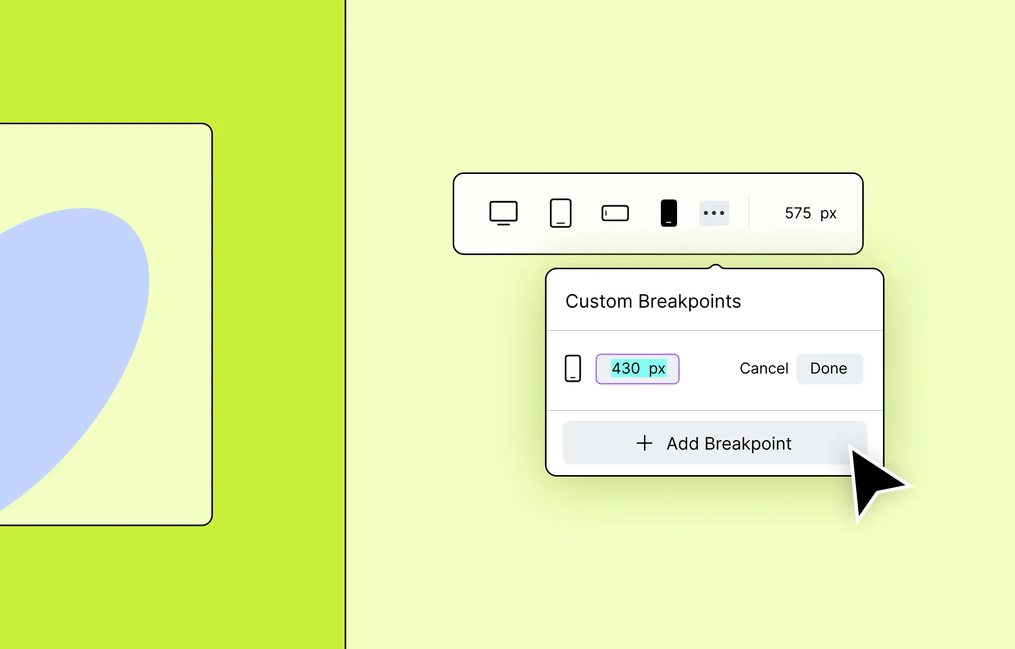
Step 1: From the top of the Droip editor, click on the ellipsis icon. This will open the Custom Breakpoints dropdown.
Step 2: Next, click on the + Add Breakpoint, enter your desired screen size, and hit Done to save.
Later, to switch between your custom breakpoints, just revisit the same dropdown and select any from the list.
And just like that, you can define as many screen sizes as needed — making it easy to switch between, preview, and perfect your site across every device.
Making Design & Layout Tweaks
Now that you know how to switch between breakpoints and even define your own custom breakpoints in Droip, it’s time to put them to work and start tailoring your website.
This is where Droip truly shines. As a one-stop, super solution for website building in WordPress, Droip empowers you to:
- Tap into a wide range of powerful elements to elevate your layout and design.
- Fine-tune every little detail with atomic-level, granular control.
- Visually customize your site using an extensive set of styling options — no coding needed.
- Tailor your interactions for every device.
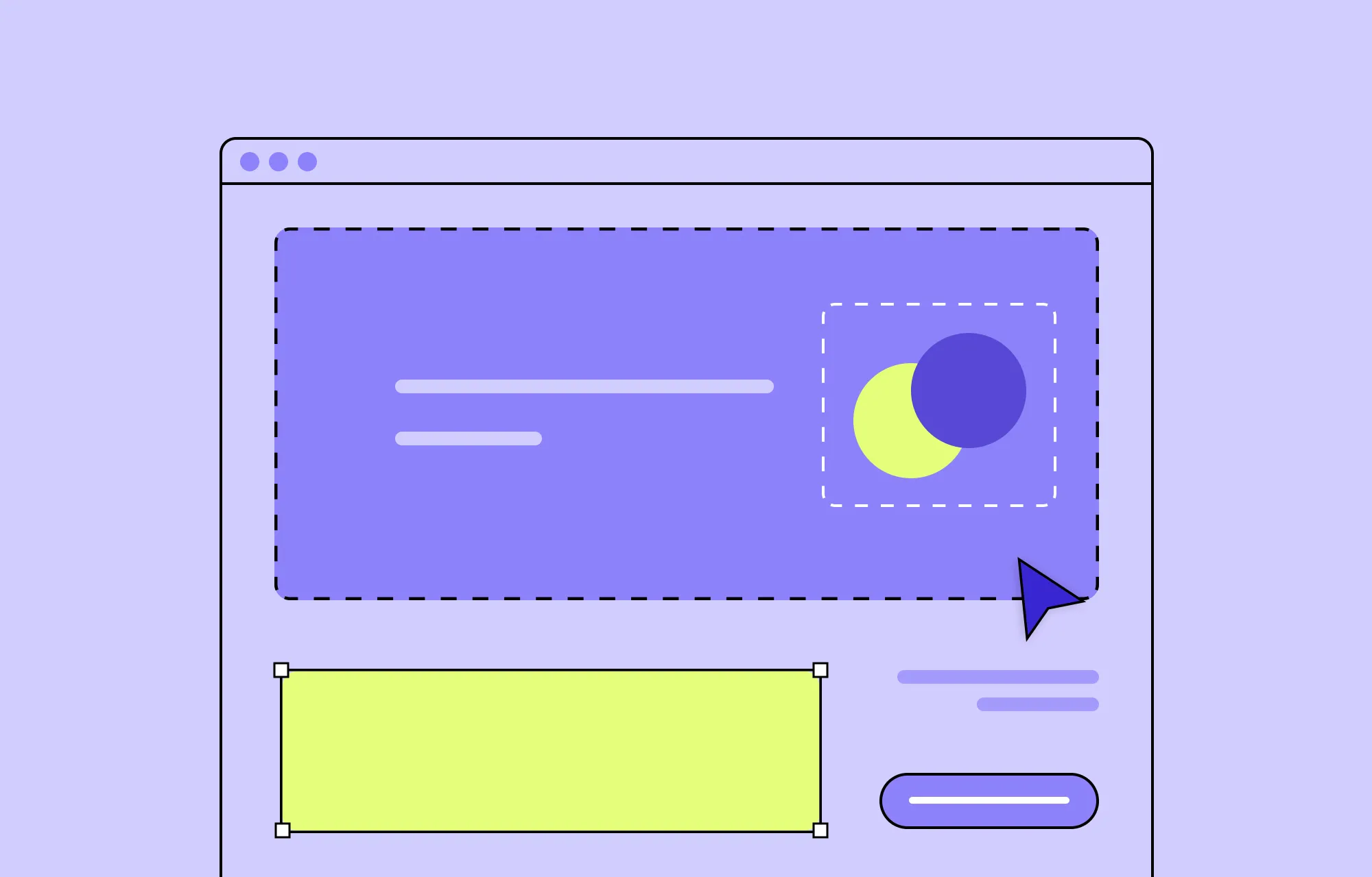
Take a simple card section, for instance.
On larger screens, these cards might be laid out side by side or arranged in a grid — which looks great.
But on smaller screens, like mobile phones, this layout can look cluttered and hard to read.
With Breakpoints in Droip, fixing this is easy. Here’s how:
Step 1: Head over to the Breakpoints panel and switch to the smaller screen you want to optimize for. You can choose the mobile preset or define a custom one if needed.
Step 2: Select the Grid or Flex element that holds your cards. Then in Style Panel > Structure, change the type to Flex and Direction to Column.
Step 3: Finally, you can adjust alignment, positioning, and other style settings to ensure the cards fit seamlessly within this new arrangement.
And just like that, your cards now stack vertically on smaller screens!
No more clutter. Just a clean, responsive web design.
With Droip, creating seamless experiences across all devices is as intuitive as it gets.
Hiding Elements For Specific Breakpoints
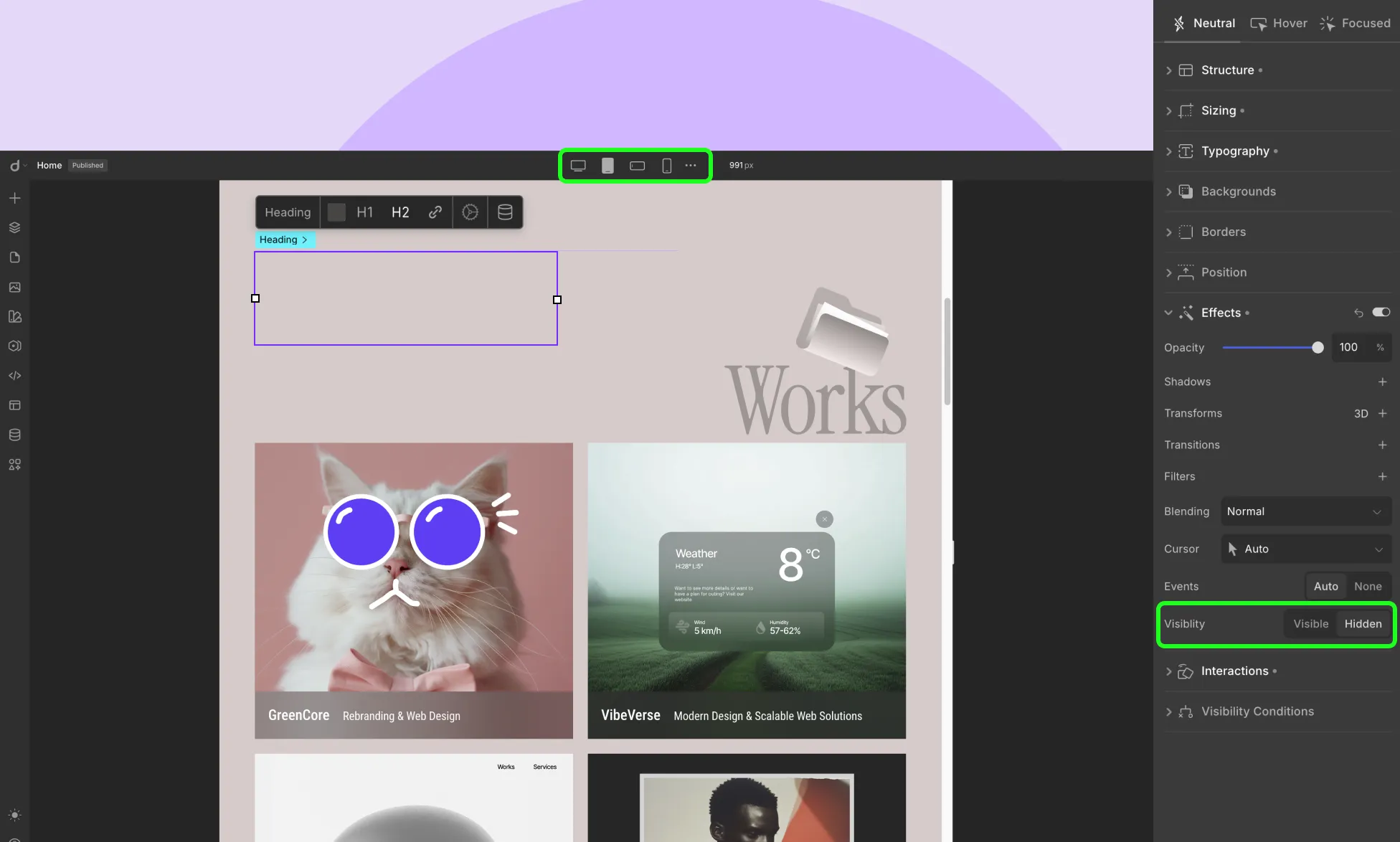
Another way to declutter your website design on smaller screens is to hide elements for specific breakpoints. Here’s how:
Step 1: Just like earlier, go to the Breakpoints panel and switch to the smaller screen you want to optimize for or define a new custom breakpoint if needed.
Step 2: Then, select the element you want to hide for this screen.
Step 3: Finally, navigate to Style Panel > Effects and set it’s Visibility to Hidden.
Choosing the Right Breakpoints
Defining breakpoints, switching between them, and tailoring your website design for every screen size is a breeze with Droip.
But one important question remains unanswered — how do you know which breakpoints to tailor your website for?
Let’s break it down.
Web Design Industry Standard Breakpoints
Learning the standard breakpoints in the web design industry is the first step towards choosing the right ones for your project — and crafting universally accessible websites.
While every site is unique, most bases can be effectively covered with breakpoints for Desktop, Tablet, and Mobile.
Based on these conventions, Droip’s default breakpoints are as follows:
- Desktop — 992px and above
- Tablet — Between 768px and 991px
- Mobile Landscape — Between 576px and 767px
- Mobile — 575px and below
These widely recognized devices and their widths are a solid foundation to start building responsive websites.
Factors That Influence Breakpoint Selection
Of course, choosing the right breakpoints isn’t always about sticking to the defaults. Certain factors do play a role in influencing breakpoint selection, such as:
Website Purpose: Think of the type of website you’re building, as it can greatly impact the breakpoints you’ll need and their number.
Target Audience and Devices: Consider the devices your audience is likely to use most. Are they primarily desktop users? Or do they prefer browsing on hand-held devices like tablets, mobile phones, or a mix?
Content Structure: Depending on how your content is structured, it may need certain adjustments for improved readability.
Design Complexity: The more complex your layout and interactions, the more breakpoints you may need. Highly animated designs often require finer control across various screen sizes.
Best Practices for Website Breakpoints
Choosing the right breakpoints and knowing how to use them is only half the journey. For best results, here are some best practices to keep in mind for optimal results:
Use Responsive Units for Best Results: Use responsive units to ensure smooth scaling between breakpoints, which only activate at specific widths. This will also help you avoid jumpy transitions and reduce the need for micro-breakpoints.
Design with Flex and Grid Layouts: Design using flexible layouts like flex or grid. Built for responsiveness, they adapt more naturally to different screen sizes and content changes.
Reserve Absolute Positioning for Minor Elements: Only use Absolute Positioning for small, controlled elements — like icons or tooltips. Avoid using it for core layout structures, as it removes elements from the normal flow of a page, and can break responsiveness across screen sizes.
Don’t Go Overboard With Breakpoints: Only add breakpoints that serve a clear purpose — like when a layout breaks on a device or content becomes hard to read. Unnecessary breakpoints only complicate things with no benefit.
Maintain a Visual Hierarchy Across Breakpoints: While Droip’s hierarchical breakpoint system already helps preserve design consistency, it’s still important for you to also ensure the visual hierarchy (for typography, spacing, etc) remains clear and consistent across devices.
Don’t Just Shrink, Restructure Instead: Another important tip to remember is not to always think of scaling elements to fix your design. Instead, go out of the box and rethink the layout.
Test on Real Devices: Yes, you can preview your design using Droip’s real-time editor as you switch between breakpoints. But it’s always best to test on real devices at least once to catch hidden issues, if any.
Elevate Website Experience With Droip
If you made it till the end, hats off. This means you know everything there is to know about what are breakpoints in web design and how to use them in Droip!
So what’s the wait for? Get Droip today and start building WordPress websites that stun your audience no matter the device!