Grids & Layouts
Unleash the power of advanced Layouts and Grids
Design with precision and flexibility using Droip's intuitive grid system.
Master layouts
with grid and flex
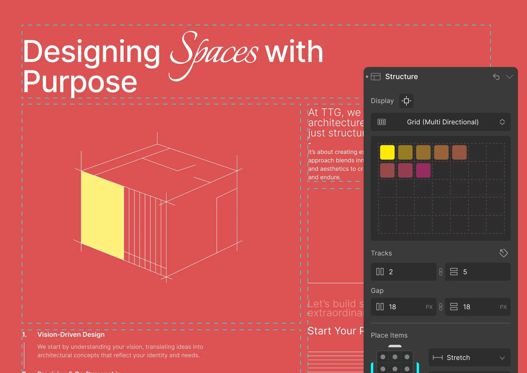
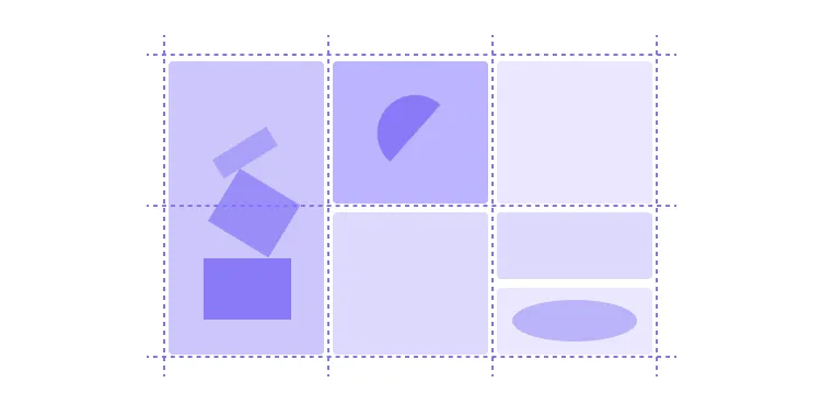
Grid
Neatly organize your content into rows and columns.

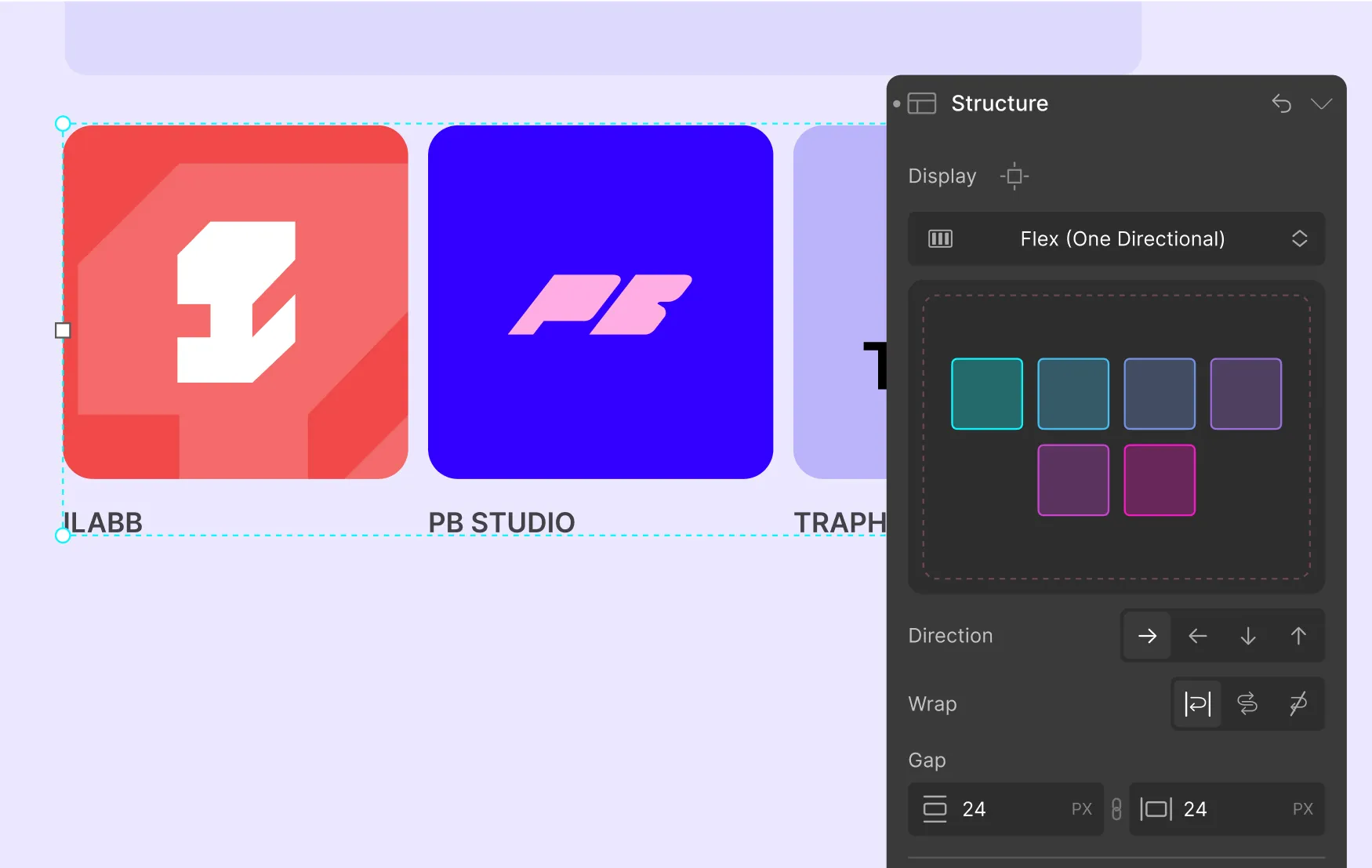
Flex
Seamlessly distribute content horizontally or vertically.
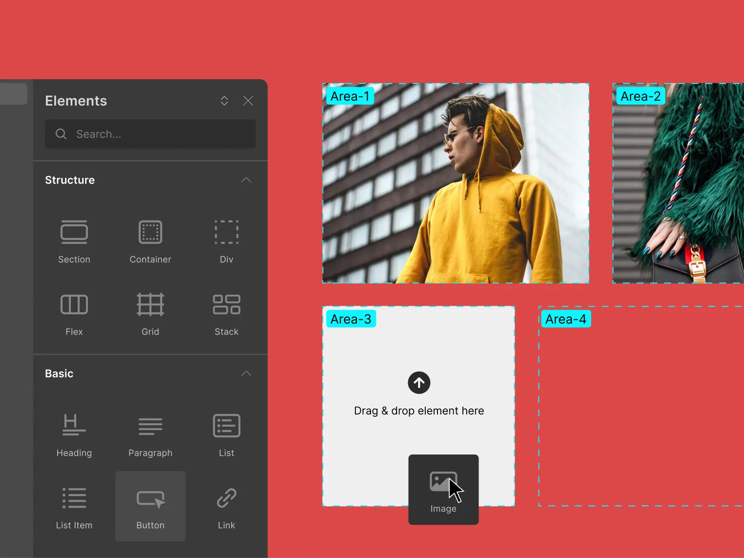
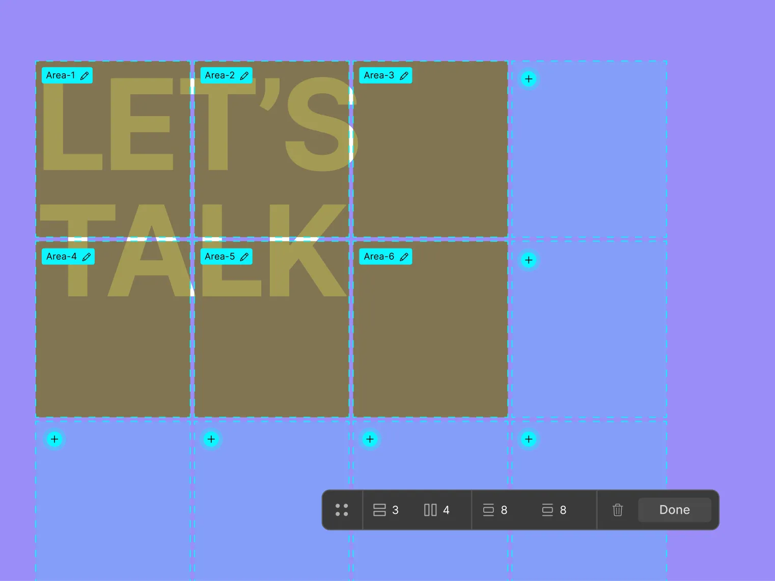
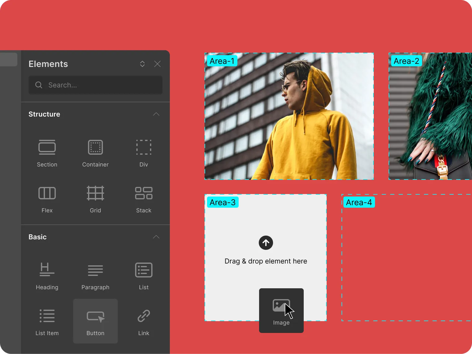
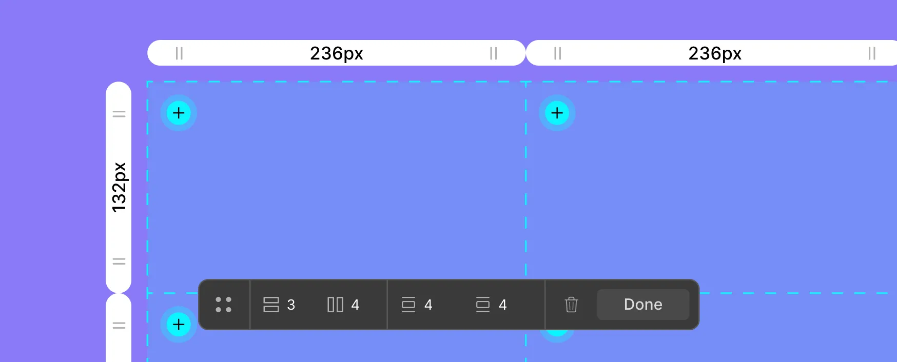
Place items into any cell
Place any element, pre-built item, or symbol into any cell of your choice.
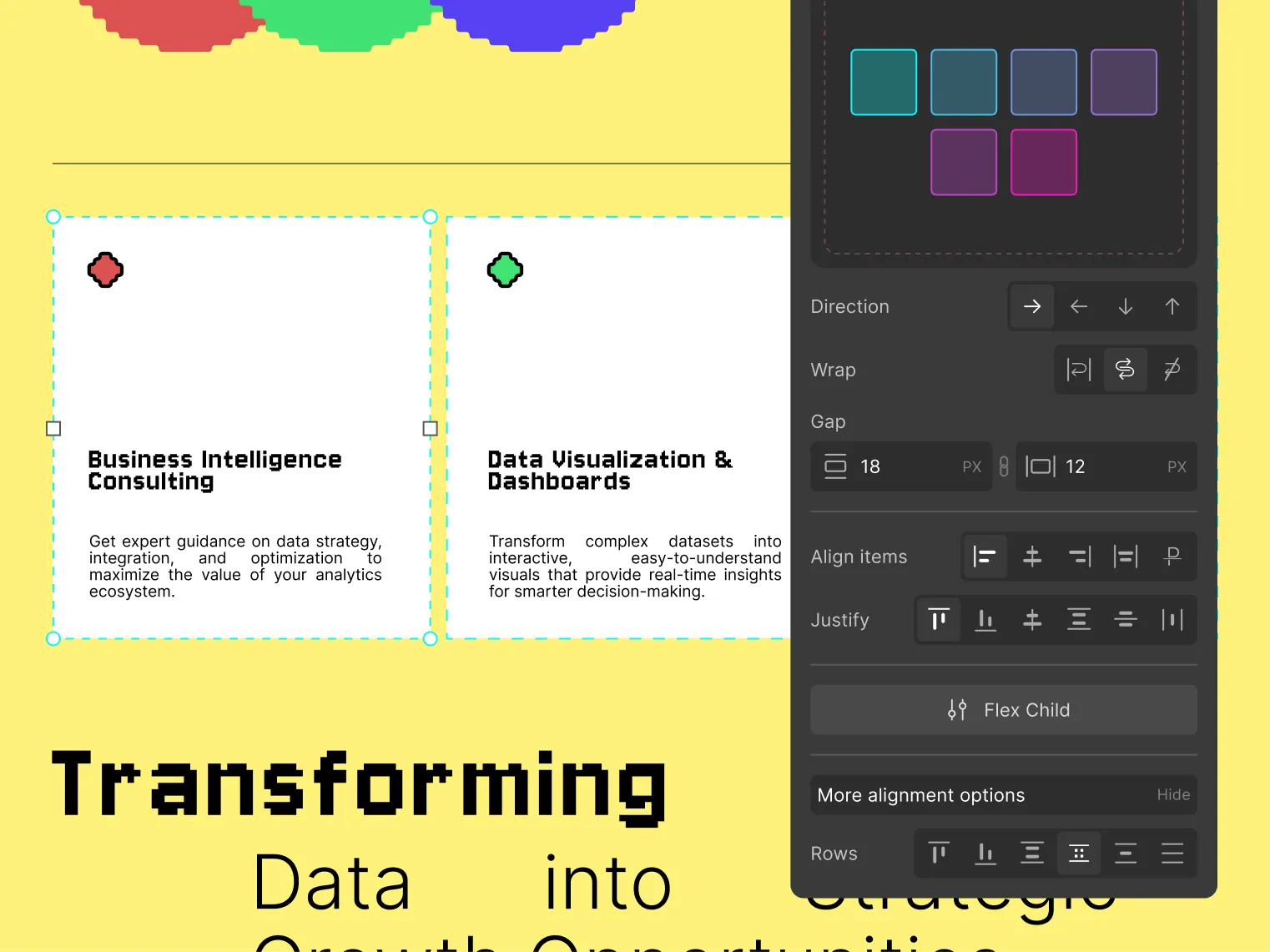
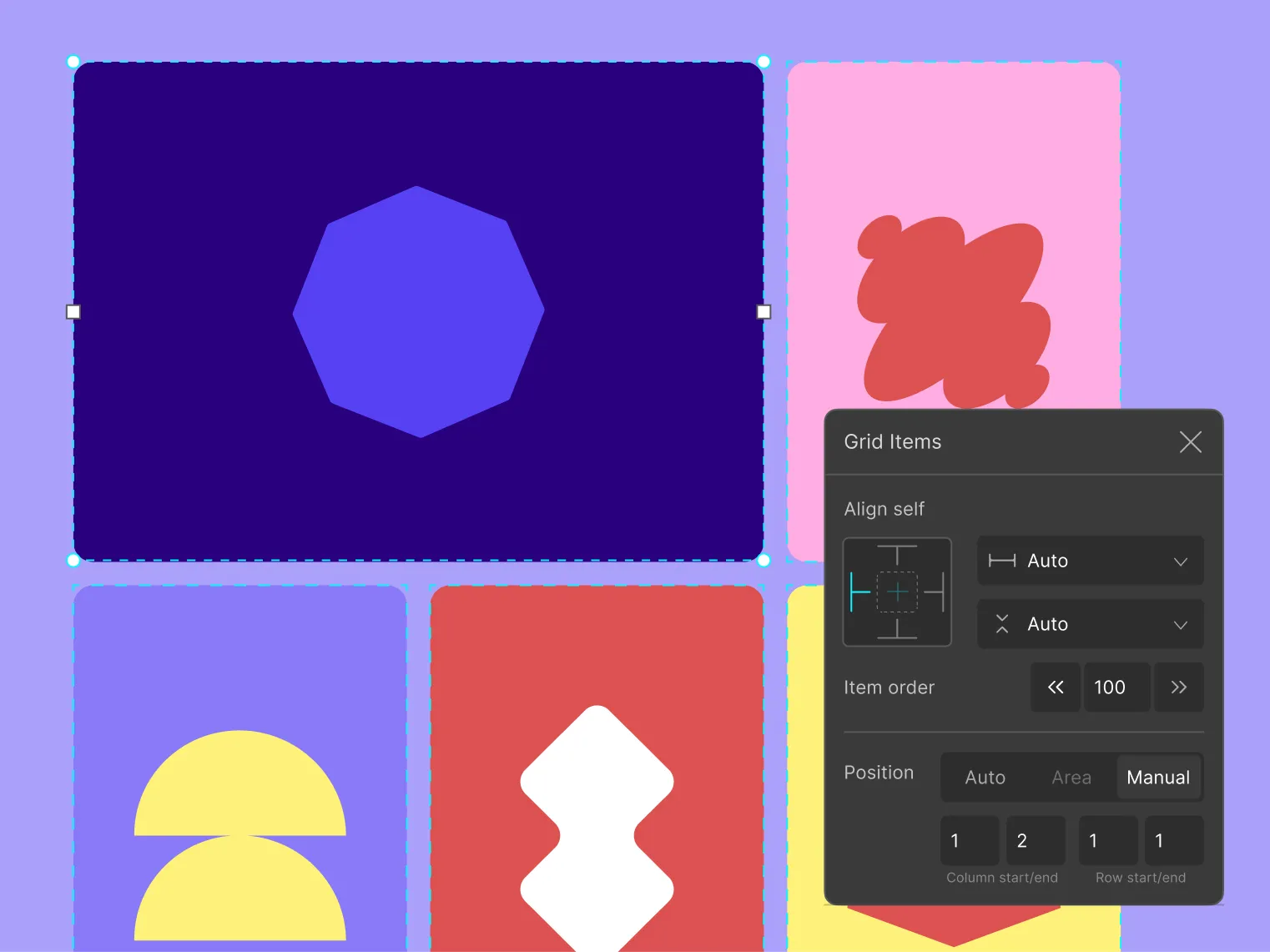
Adjust alignments
Perfectly place grid elements by adjusting vertical and horizontal alignment.
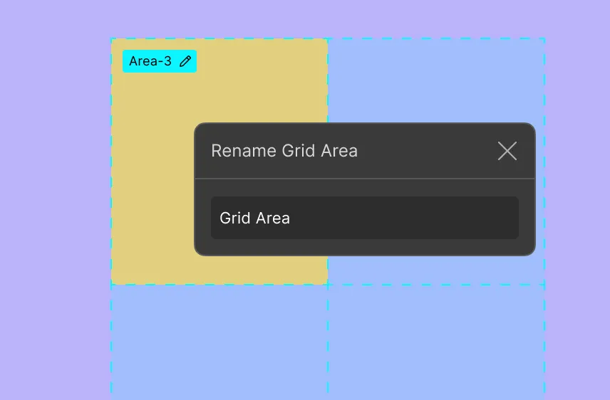
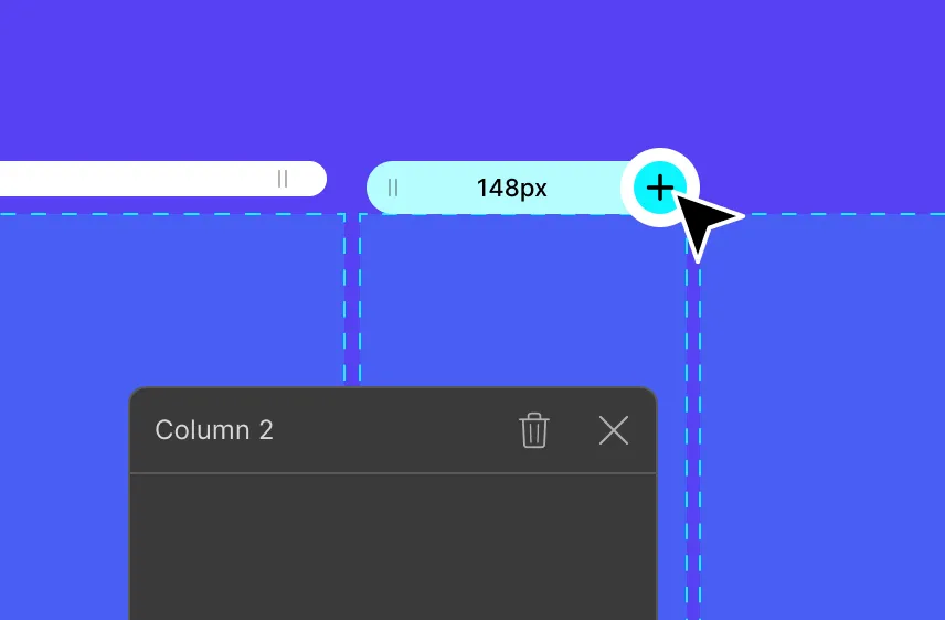
Grid area
Span your grid items across multiple cells by assigning it a grid area.
Repeat layout
Keep the style of all your rows and columns consistent using repeat.
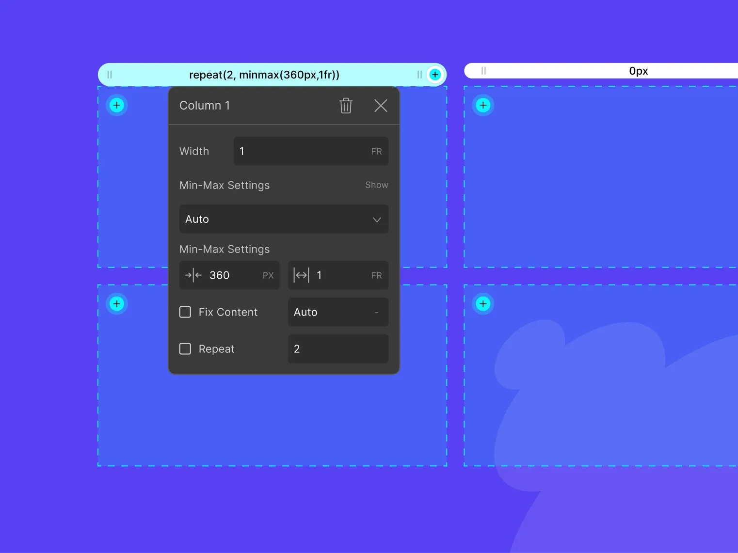
Grid item settings
Individually customize each grid item’s alignment, order, & placement.
Manage visually
Visually manage every aspect of your grid’s layout & its grid items.
Granular controls
Grid controller mode
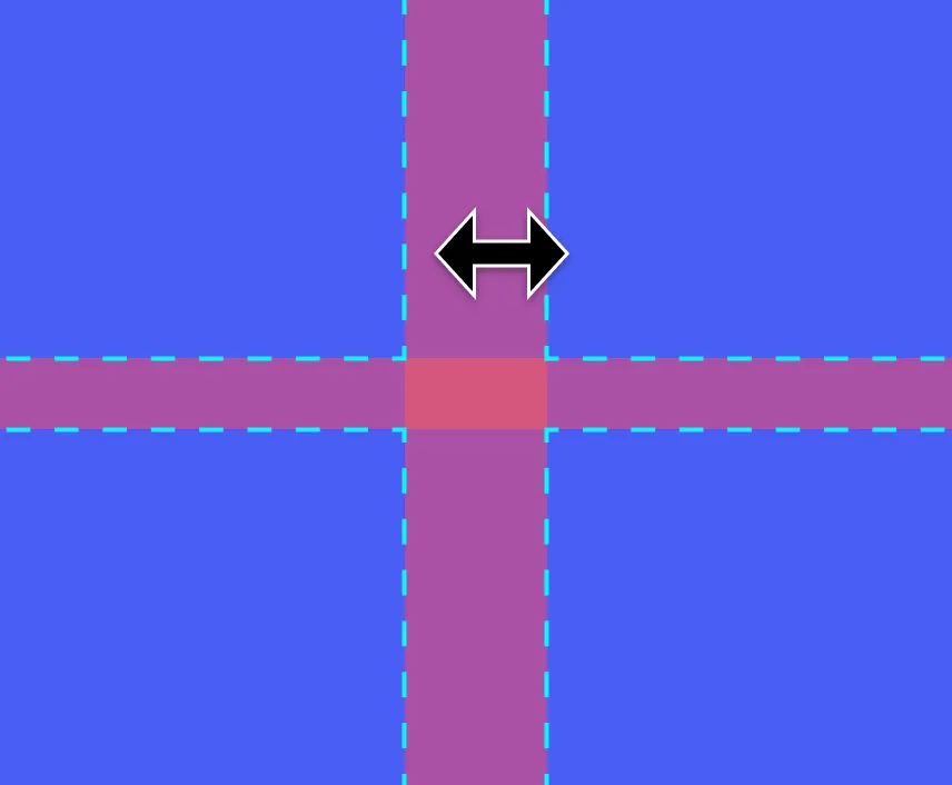
Adjust grid gaps
Define grid area
Control width/height
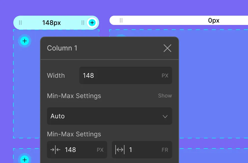
Add/delete grid tracks
Auto-responsive
by default
Ensure your website's adaptability with default auto-responsive webpages featuring fluid layout elements.
Explore more features
Discover more of what Droip has to offer to understand its true capabilities! Explore the features listed below to get started!

Editor
Design responsive websites using HTML5 elements and customize them your way with Droip's multi-featured editor.
Grid & Layouts
Harness the power of grid and flex elements to create stunning, responsive layouts effortlessly for your website.
Figma to Droip
Transfer Figma design to Droip preserving your styles, spacing, and layouts.

Interaction & Animation
Web interactions now simplified using a combination of CSS and JavaScript animation.

Content Manager
Design your pages visually, with dynamic content. Effortless content structuring with custom fields.