Symbols in Droip allow you to turn any element, along with all of its children, into a reusable component. This feature enables you to create consistent elements throughout your project and ensures that any changes made to a Symbol will automatically apply to all instances where it is used.

You can use Symbol for the Navbar, Footer, Testimonials, etc to reuse the sections throughout the projects.

How to Create a Symbol

To create a Symbol in Droip:

Go to the Layers tab and click on the Symbols icon. 

How to create a symbol

Select the element you want to turn into a Symbol and click on Create New Symbol.

Create new symbol

Select a Category from the drop-down, give the Symbol a name and press Create. The Categories include:

Choose category

Once you have created a Symbol, you can see the newly created Symbol on the Symbols panel. If you click on the horizontal three dots icon beside the Symbol name, you get the option to edit, rename, and delete the Symbol. 

How to Edit a Symbol

If you click on the Edit option, this will take you to the main mode of the Symbol. 

💡 Note: All changes in the main mode will update across all instances of that Symbol. 

How to edit a symbol

How to Reuse a Symbol 

To reuse a Symbol, simply select the Symbol you want to reuse from the Symbols panel and drag it to the section of the page where you want to add the Symbol.

Customizing a Symbol Instance 

If you want to customize a Symbol instance, you can easily do so by unlinking it from its main counterpart.

Unlinking a Symbol

You need to unlink the Symbol instance you have used on your page if you don’t want any changes made to the master Symbol on the main mode to be reflected on the instance used or want to customize the instance. 

Unlinking a symbol

To unlink a Symbol, simply right-click on the Symbol and click on Detach from Symbol. Now your Symbol will go back to its original state and you can customize its elements to your heart’s content! 

💡 Note: Keep in mind that since it’s no longer attached to the main Symbol, these adjustments will not reflect on the other instances nor will they affect the main instance.

Overriding the Main Symbol

Once you’re done customizing your element and its contents, you can also apply these new changes to reflect on the main Symbol. To do this, right-click on the element and select the option Push Overrides to Main Symbol.

Now your main Symbol will be updated to reflect these new customizations along with all the other linked instances. This also means the unlinked instance is again a Symbol instance and is reattached to the main Symbol.

Add Conditions to Header & Footer Symbols

Add Conditions to Header & Footer Symbols

As you know, when you create a new Symbol, you are able to select its Category (type). Options included are Header, Footer, or Other. 

When it comes to Header and Footer type Symbols, you may have the need to add them to all pages, a selection of pages, or even hide them from specific pages.

This can be achieved using the Add Conditions option which you’ll find by clicking on the ellipsis icon that’s under the specific Header/Footer Symbol on the panel.

On the new Add Conditions window, click on Add New Option to add a new rule. This will open another window where you can define the following:

Add Conditions to Header & Footer Symbols

Like this, you can add multiple conditions and they’ll all be listed on the Add Conditions window as shown in the image above. 

You can click on the ellipsis icon beside any one of the rules to access the options Edit Condition and Delete.

Ending Thoughts

To summarize, you can use Symbols in 2 main ways:

Layers represent the individual elements that make up a web page, stacked on top of one another. This allows you to easily access and manage all the elements used to create the page. 

By utilizing layers, you can customize every aspect of your page at any time, providing a streamlined and efficient way to work within the editor.

How to Use Layers

To access the Layers in Droip:

  1. Locate the Layers icon on the left sidebar.
  2. Open the Layers tab to view the organization of sections and their corresponding elements on the current page.
  3. In the Layers Panel, you can manage all the elements present on your canvas.
Layers Panel in Droip

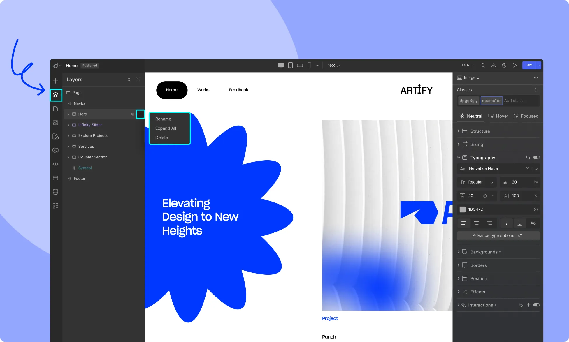
Each element in the Layers Panel can be interacted with for more control over your page’s design:

Layers Panel Features

This layered structure makes it easy to manage, customize, and organize the elements of your page efficiently within the editor.