Text Animations in Droip allow users to enhance their website’s visual appeal by adding dynamic movement to text elements. These animations help capture user attention, create engaging experiences, and add a professional touch to designs.
How to Use Text Animations
Follow these steps to add dynamic text animations.
1. Accessing Text Animations
To apply text animations in Droip:
Select a Text Element: Click on any text element within the Droip editor.
Open the Interactions Panel: Navigate to the Interactions panel in the right style panel.
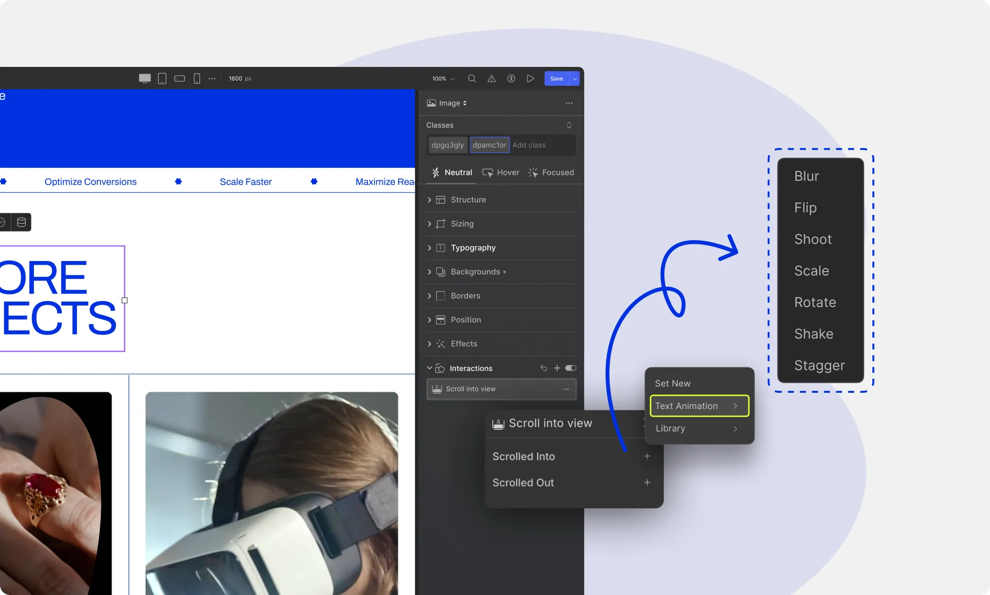
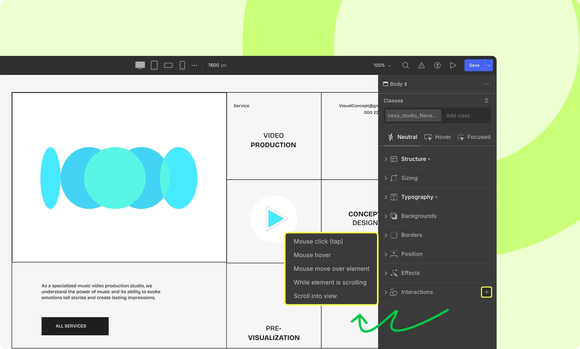
Add a New Interaction: Click the + (Add) icon to create a new interaction.
Choose a Trigger: Select a trigger that will activate the animation (e.g., On Page Load, Scroll into View, Hover, Click).
Select the Animation Type: From the animation options, choose Text Animations as the effect for the selected trigger.
2. Choose an Animation Type
Droip offers a variety of text animation styles to create unique effects. The available animation types include:
Blur – Gradually reveals the text by transitioning from a blurred state.
Flip – Rotates the text to create a flipping motion.
Shoot – Animates text into place with a rapid movement effect.
Scale – Expands or contracts the text for a zoom-like effect.
Rotate – Rotates the text at various angles for a dynamic appearance.
Shake – Adds a subtle or exaggerated shaking motion for emphasis.
Stagger – Animates text progressively, creating a staggered effect.
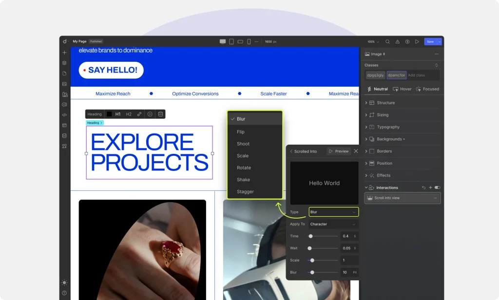
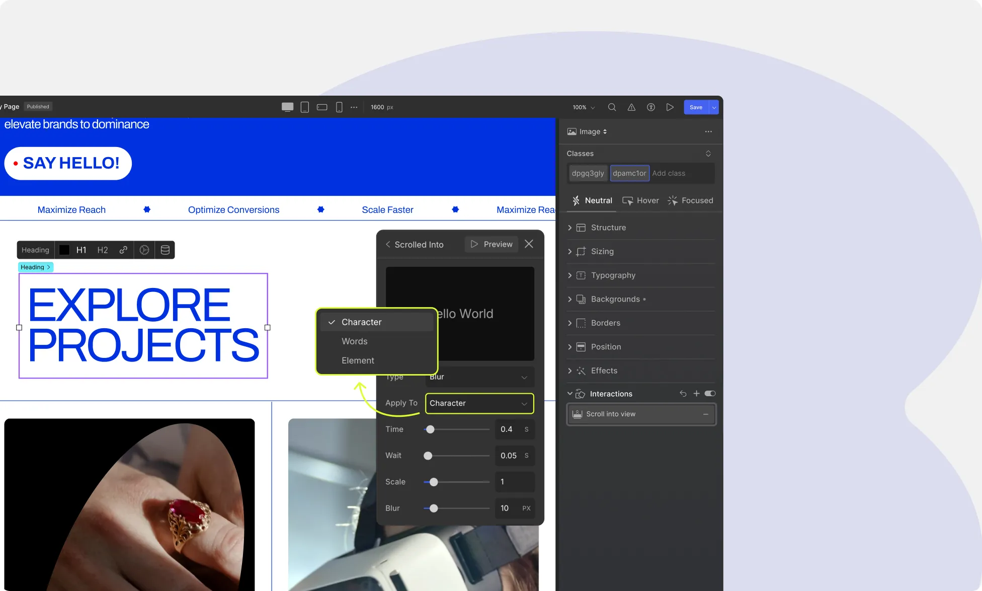
3. Select the Application Type
You can define how the animation applies to the text by selecting one of the following application types:
On Element – The entire text block moves as a single unit.
On Words – Animates each word individually within the text block.
On Character – Animates each character separately, creating intricate motion effects.
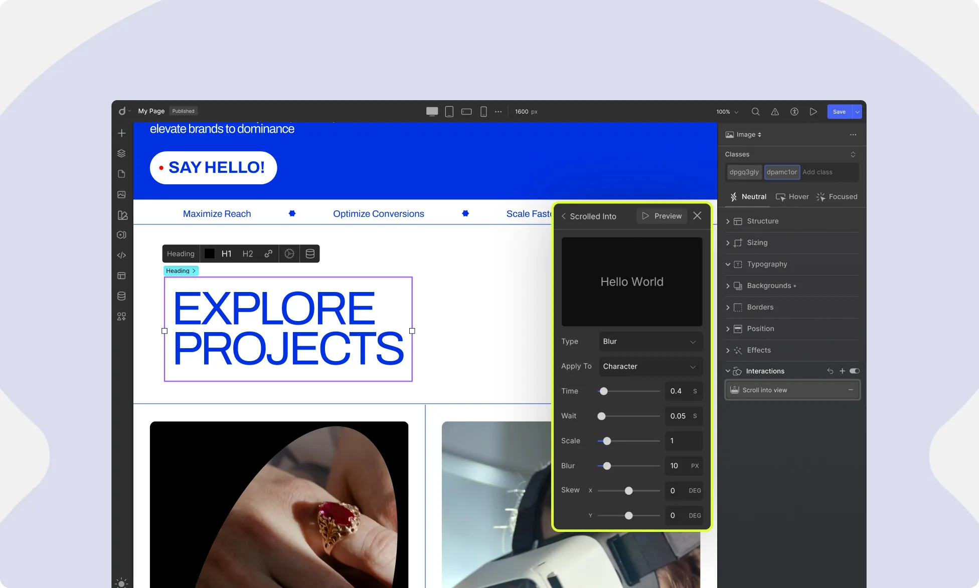
4. Customization Options
Droip provides extensive customization controls to fine-tune the text animation:
Time – Adjusts how long the animation lasts, from quick transitions to slow, dramatic effects.
Delay – Adds a wait time before the animation starts.
Wait: The pause time between each letter or word as it animates on screen.
Easing – Controls the speed curve of the animation (e.g., linear, ease-in, ease-out, ease-in-out).
Scale – Adjusts the size of the text dynamically, making it grow or shrink during the animation.
Blur – Controls the level of blur applied to the text, allowing for smooth fade-ins or motion blur effects.
Skew – Tilts or distorts the text along the X or Y axis to create a slanted effect.
Offset – Shifts the starting position of the text, allowing for directional movement before settling into place.
Looping – Choose whether the animation plays continuously or only once.
Repeat Count – Set a specific number of times the animation should repeat before stopping.
5. Preview & Save
Use the Preview button to see how the animation looks before finalizing. Once satisfied, click Save to apply the changes permanently.
Watch Text Animation in Action
See how different animation types, application styles, and custom settings come together to create a stunning visual experience.
What is an Interaction?
An interaction is any kind of visual movement or response that happens between a user and a website.
This could include an element sliding into view, growing on hover, or changing position as the user scrolls.
In Droip, an interaction is made up of two components:
Trigger – What initiates the animation (e.g., click, hover, scroll). Animation – The visual effect that is performed in response.
Types of Triggers
Triggers determine when an animation starts. In Droip, there are two categories of triggers:
1. Element Triggers
These are tied to specific elements on your page and activate when users interact with those elements.
Available Element Triggers:
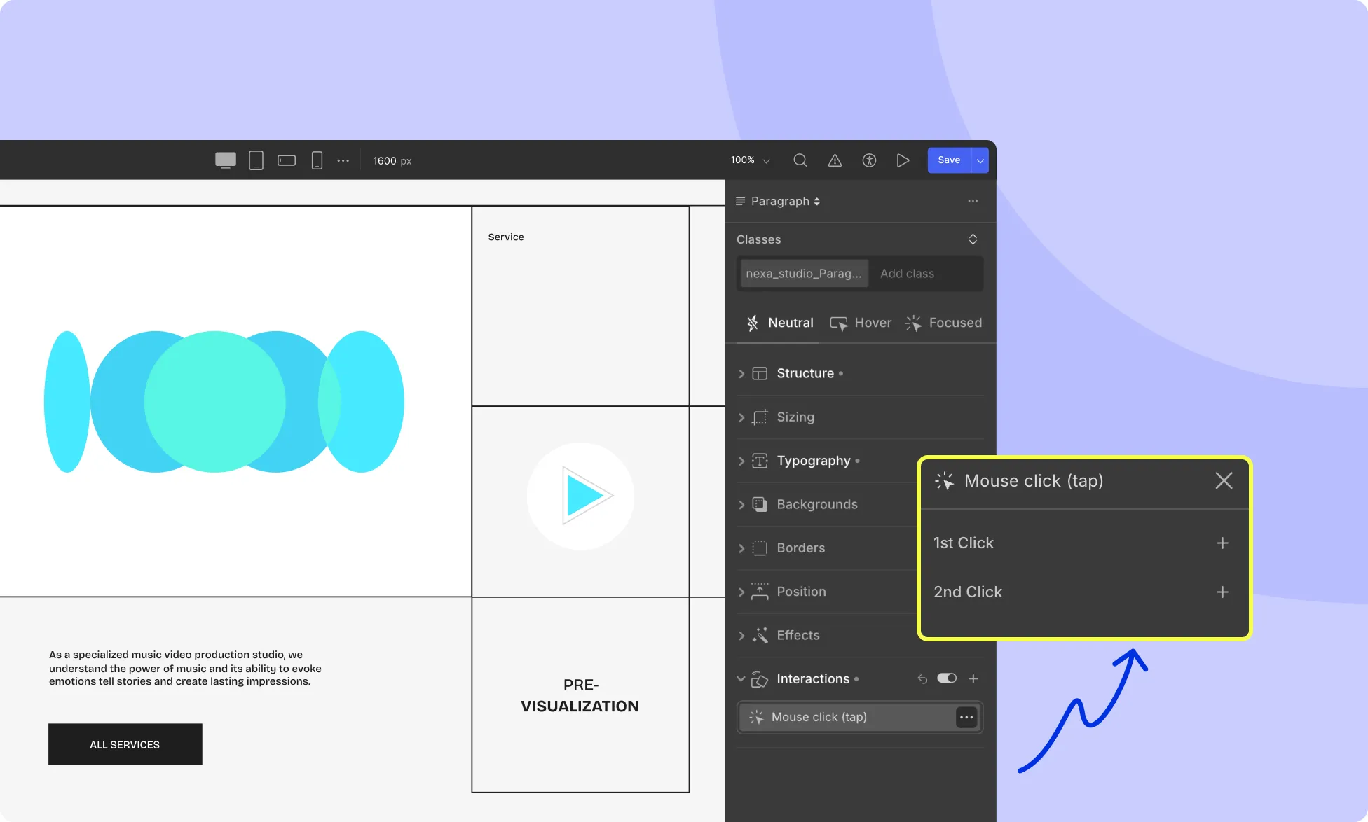
Mouse Click (Tap) – Runs the animation when the element is clicked.
Mouse Hover – Runs the animation on hover.
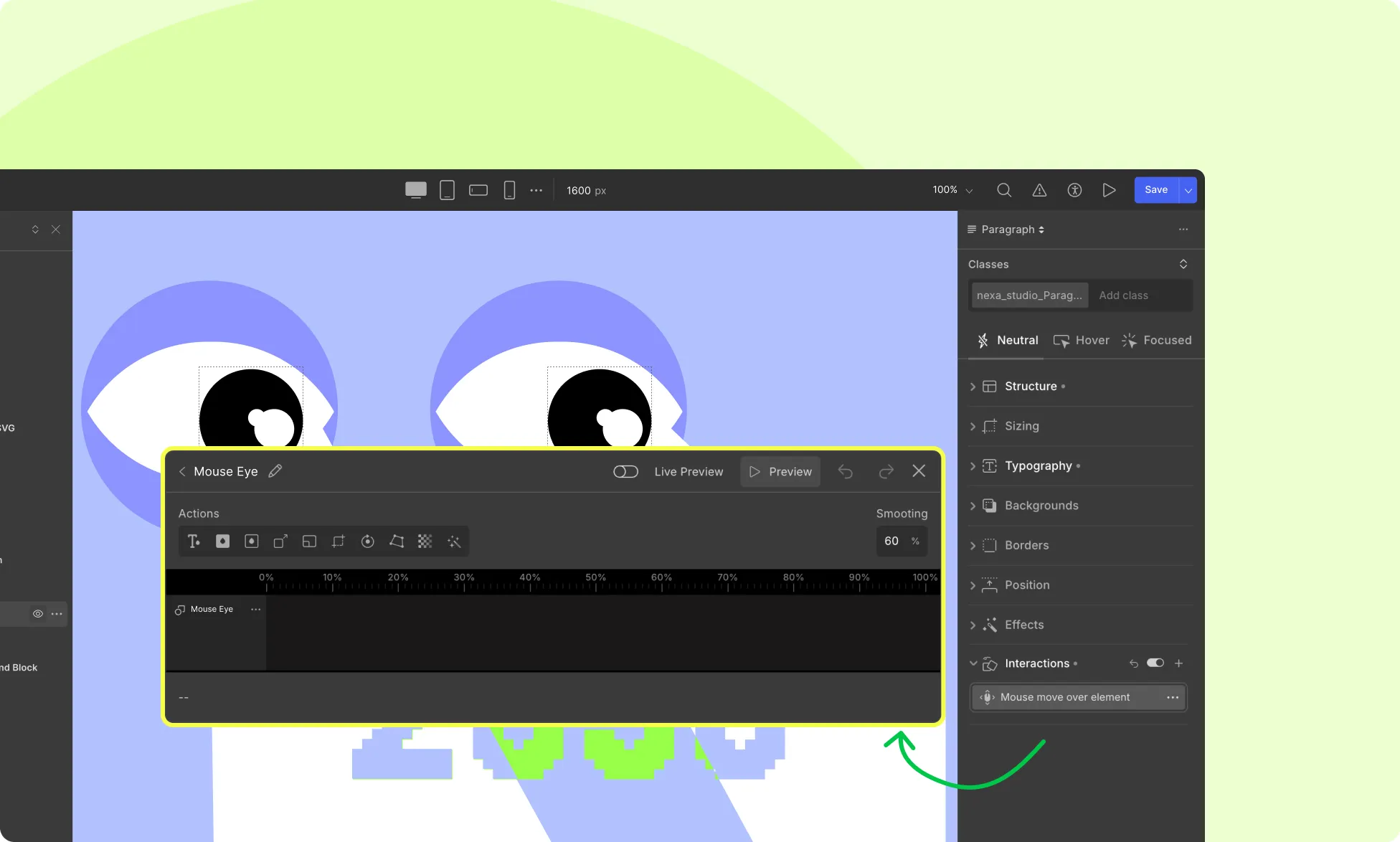
Mouse Move Over Element (Continuous) – Runs and continues the animation as long as the mouse moves over the element.
While Element is Scrolling – Continuously runs the animation based on the element’s position while it scrolls through the viewport.
Scroll Into View – Starts the animation when the element enters the viewport while scrolling.
You can trigger an animation on the same element or on a different one based on your setup.
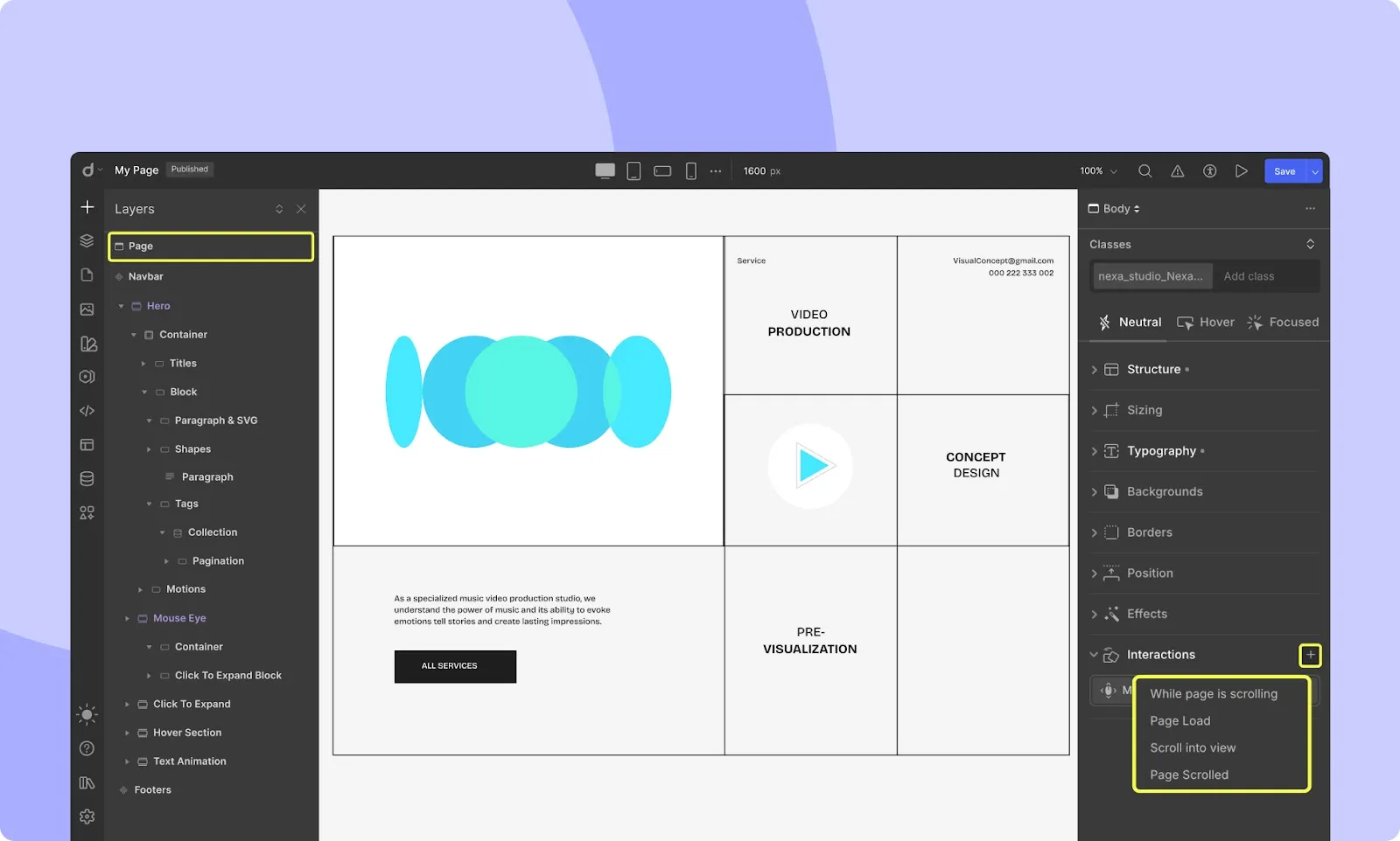
2. Page Triggers
These are activated by changes in the overall page state.
Available Page Triggers:
While Page is Scrolling – Activates when the page is being scrolled.
Page Load – Activates as soon as the page loads.
Scroll Into View – Activates when a specific element becomes visible while scrolling.
Page Scrolled – Activates when the user scrolls either up or down.
Step 1. Setting Up the Trigger
For an Element Trigger: Select the element (or group of elements), then click the + icon next to Interactions on the style panel.
For a Page Trigger: In the Layers panel, select Page, then click the + icon next to Interactions on the style panel.
Once added, you’ll get specific configuration options depending on the trigger type.
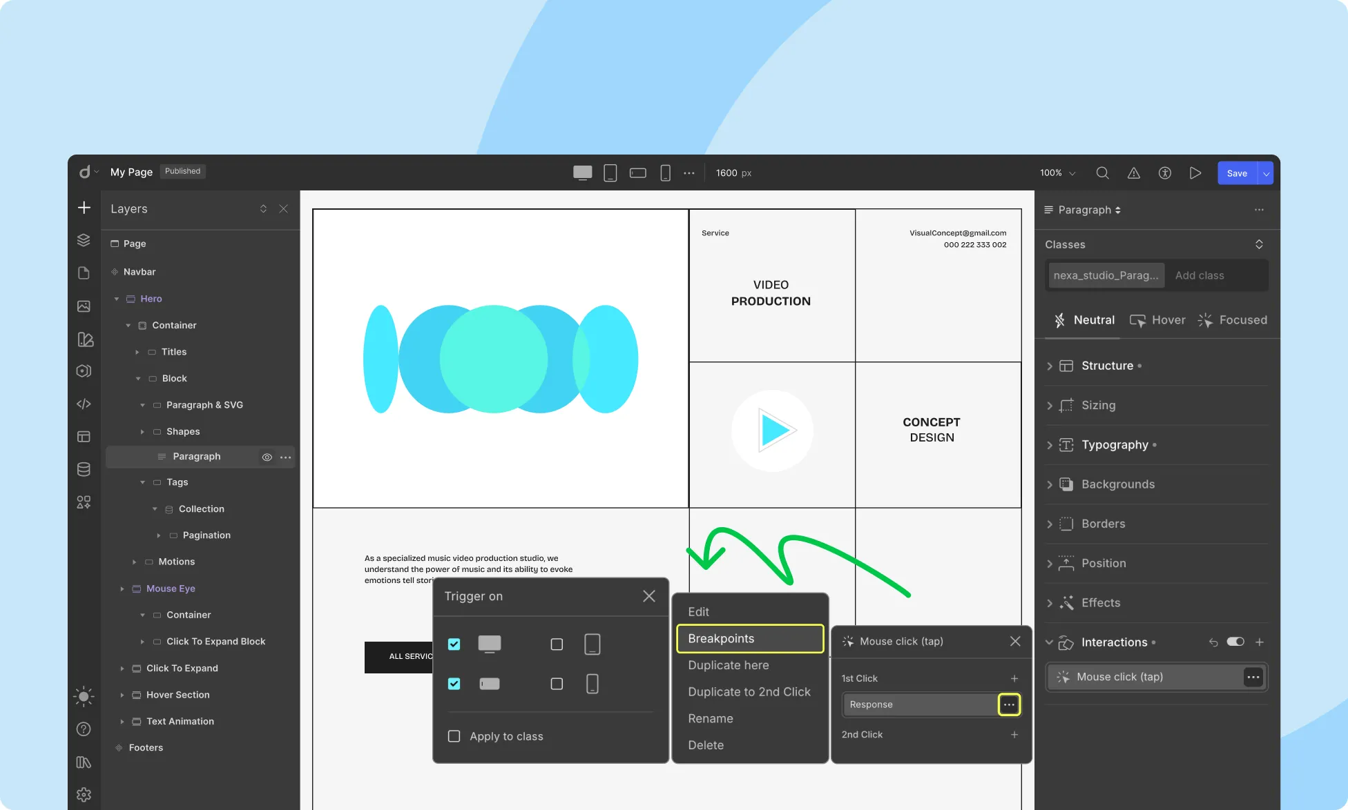
For example, with Mouse Click (Tap), you can set different animations for the first and second clicks.
Step 2. Setting Up the Animation
After defining the trigger, you can proceed to define the response (animation) that occurs when the trigger is activated.
Response Options:
Set New – Opens the Timeline Editor to create a custom response using precise controls.
Library – Choose from Droip’s preset animation effects.
Text Animations – Available when targeting a text element, offering preset animation styles for text. Learn more on Text Animations.
Using the Animation Library
The Library offers ready-made animation presets, including: Fade, Slide, Light-Speed, Flip, Bounce, Swing, Tada, Wobble, and more.
Each animation comes with configuration options like:
Direction – In / Out
From – Left / Right
Duration – How long the animation lasts
Delay – Time before animation starts
Loop – Repeat animation continuously
Repeats – Number of times to repeat
Fill Mode – Retain or reset animation state after it ends
Easing – Animation speed curve (e.g., linear)
Custom Animations with the Timeline Editor
Click Set New to launch the Timeline Editor. The Timeline Editor lets you create a custom response using precise controls.
How it works:
Target Elements appear on the left. To add one, select the target element from the canvas.
Choose an action. Action icons are located above the Timeline and are basically style attributes like color, move, scale, size, etc., that you can alter for your target element in response to the trigger.
Similarly, when you hover your mouse over the timeline, a vertical blue line with a plus + icon will appear. This indicates where a new animation action can be inserted. Clicking the plus icon opens a dropdown with various animation actions you can apply, such as Move, Scale, Rotate, Opacity, and more.
You can also choose Variable Mode from this list to assign it as an action. This allows you to animate a property based on a variable, perfect for creating responsive animations that adapt to user-defined or dynamic values.
Once added, the new action will appear as a block on the timeline where you can further adjust its start and end time, as well as edit its properties.
Editing:
Click on any timeline action to select it.
Drag its start/end points to control when it happens. Or you can specify the value in percentage at the bottom of the timeline. For example, if you set:
Start: 2%
End: 95%
It means the animation will begin slightly after the animation starts (at 2%) and finish just before the end (at 95%). This gives you precise control over the timing of each animation within the overall interaction.
Set keyframe values for properties like size, position, or opacity.
Example: If you’re animating the opacity of an element:
At Start (2%), set the opacity to 0 (fully transparent).
At End (95%), set the opacity to 1 (fully visible).
This will create a smooth fade-in effect that happens between 2% and 95% of the animation timeline
Tools:
Smoothing – Adjust how fluidly the animation plays.
Viewport Only – Limit animation to when the element is visible.
Example Workflow:
To animate an element’s size during scroll:
Select the target element.
Go to Interactions → + → While Page is Scrolling.
In the Response panel, click the Size action.
Drag the animation block in the timeline.
Adjust scroll percentages and size keyframes.
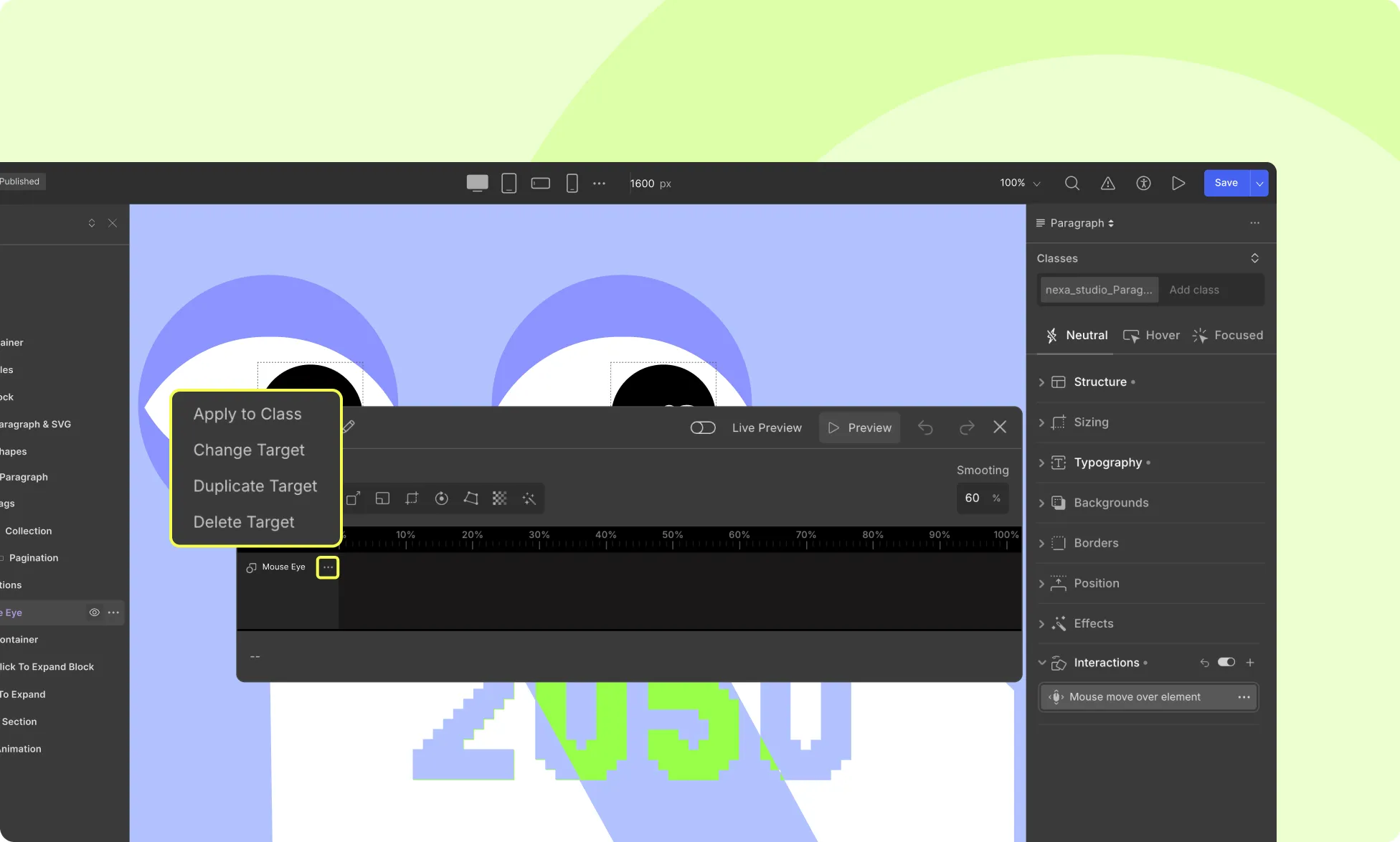
You can also click on a target to:
Apply to Class – Apply animation to all elements with the same class.
Change Target
Duplicate Target
Delete Target
Trigger Animations on Specific Breakpoints
You can control which devices an animation should run on.
In the Interactions panel, once you’ve added an animation, click the three-dot icon next to the Response label.
Select Breakpoints from the dropdown that will appear.
Select the breakpoints (devices) where you want the animation to apply.
This ensures your animation only runs on selected screen sizes, helping you create responsive and performance-optimized experiences.
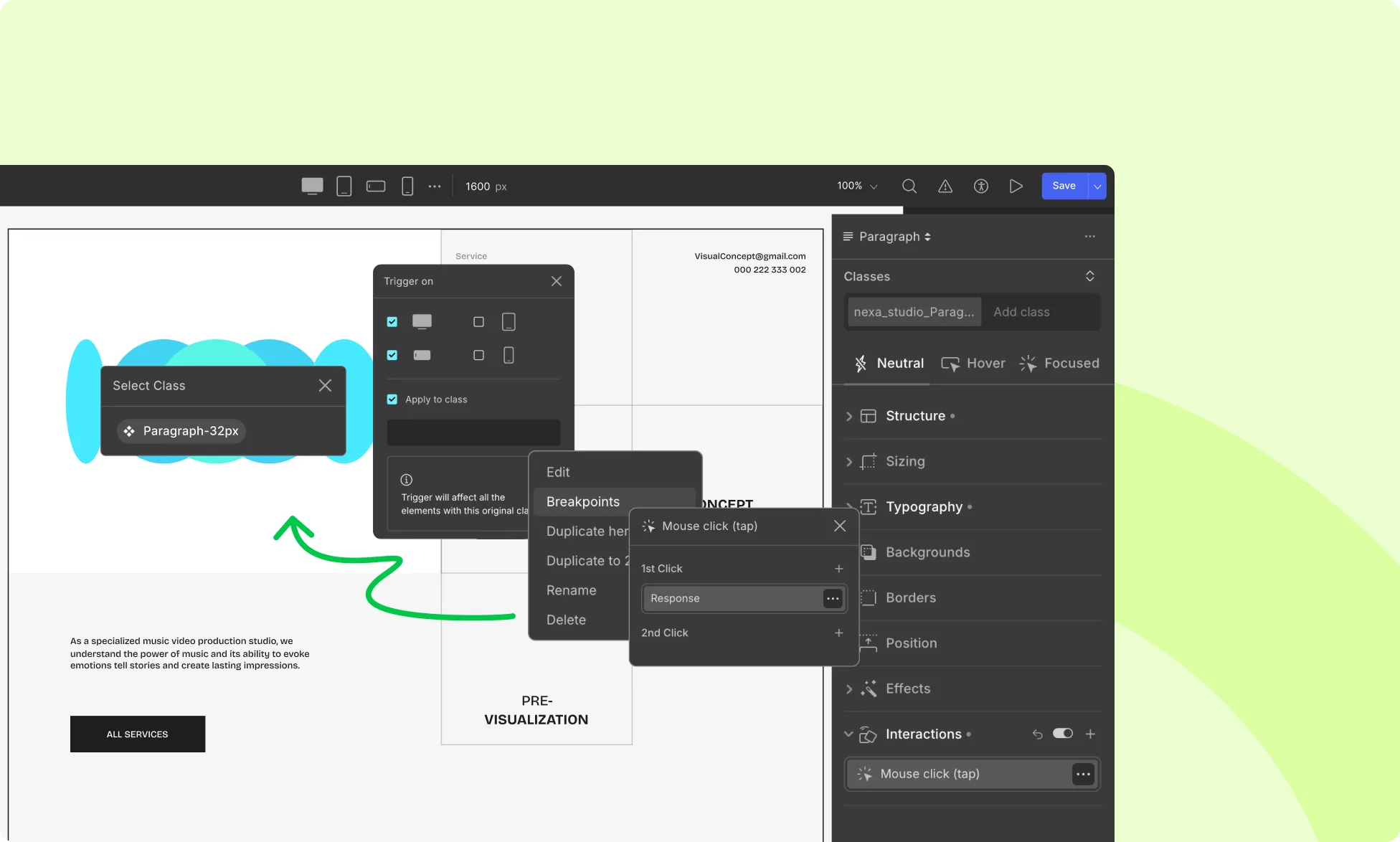
Apply Animation to All Elements with the Same Class
To reuse the same interaction across multiple elements sharing a class:
In the Interactions panel, once you’ve added an animation, click the three-dot icon next to the Response label.
Select Breakpoints from the dropdown that will appear.
Toggle the option Apply to Class.
Select the class you want the animation to apply to.
Now, all elements with that class will automatically inherit the same animation for the same interaction event.
This is especially useful for repeated components like cards, buttons, or list items, where you want consistent animation behavior across the board, without having to manually animate each element.
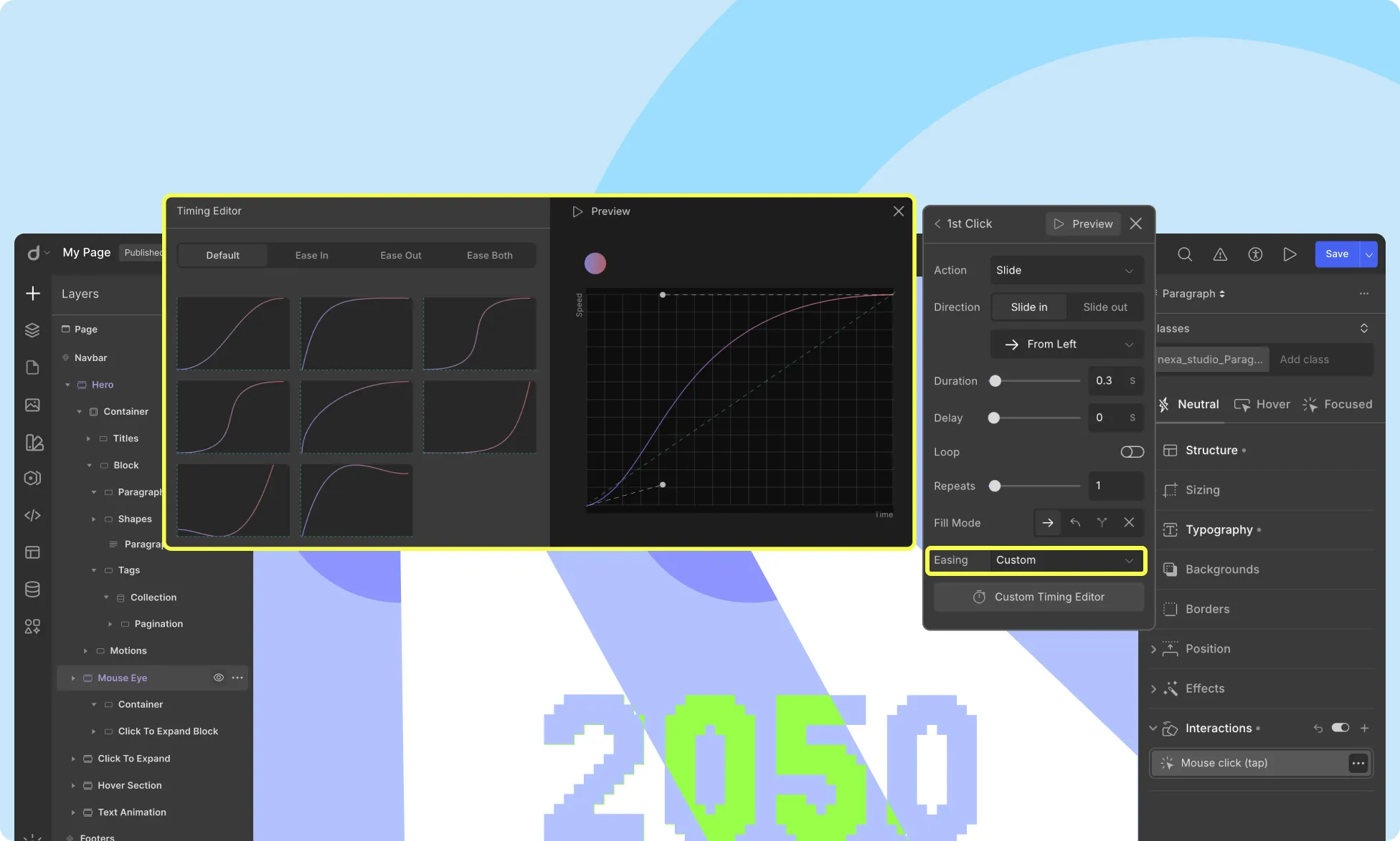
Custom Timing Editor
The Custom Timing Editor lets you define your own easing curves and animation pacing.
With the Custom Timing Editor, you can define a custom easing curve and set keyframe values to create a more natural and dynamic animation.
Timing Function Styles:
Ease In: This style starts the animation slowly and gradually speeds up. This is useful for creating a sense of acceleration.
Ease Out: This style starts the animation fast and gradually slows down. This is useful for creating a sense of deceleration.
Ease Both: This style starts the animation slow, speeds up in the middle, and then slows down again. This is useful for creating a more natural and dynamic animation.
Using the Graph:
Create curves by adjusting keyframe values:
Bottom curve = slow start
Top curve = fast start
Add peaks/troughs for springy effects
You can also:
Adjust the duration by dragging endpoints
Preview animations before publishing
By experimenting with different styles, you can create unique and engaging animations that will make your website stand out.
Here’s how to use the graph to create different timing function styles:
Ease In: To create an “Ease In” style animation, start by setting the keyframe values at the bottom of the graph. This will create a slow start to the animation. As you move toward the middle of the graph, gradually increase the keyframe values to create a sense of acceleration.
Ease Out: To create an “Ease Out” style animation, start by setting the keyframe values at the top of the graph. This will create a fast start to the animation. As you move toward the middle of the graph, gradually decrease the keyframe values to create a sense of deceleration.
Ease Both: To create an “Ease Both” style animation, start by setting the keyframe values at the bottom of the graph for a slow start, then gradually increase the keyframe values to create a sense of acceleration. As you reach the top of the graph, gradually decrease the keyframe values to create a sense of deceleration.
Our website uses cookies to improve your browsing experience on our website. By continuing to use this website, you
agree to
their use. For details, please check our Privacy Policy.
Get started for free!
Start 90 days free trial!
Get Droip
Experience the power of Droip. Create stunning, responsive sites with pure creative freedom.