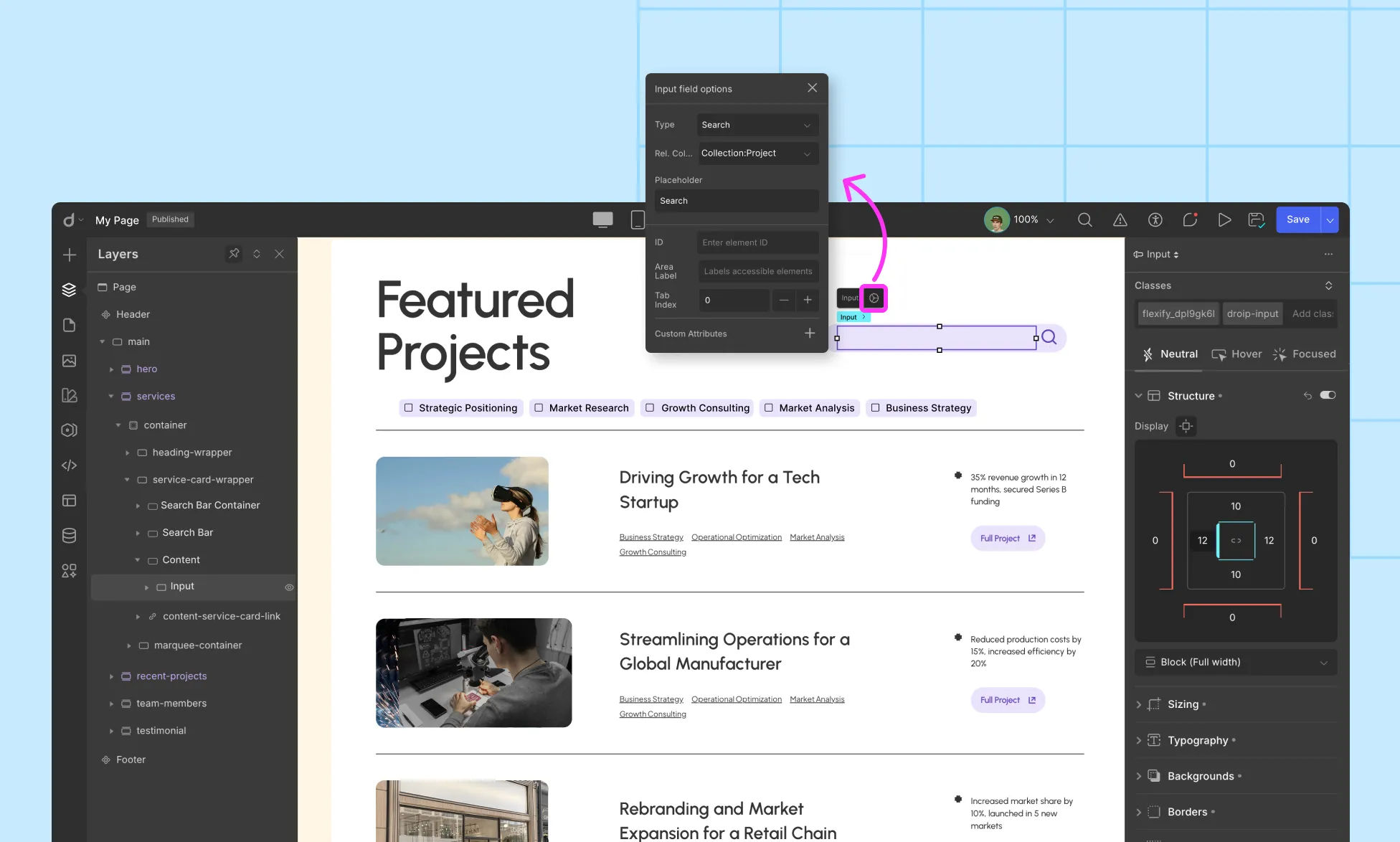
For ref. Collection: choose the Collection you want to search in.
Set Placeholder (e.g., Search…)
Note: In the dropdown, you’ll only see the Collections already used on that page. The names of the Collections will appear exactly as you’ve named them in the Layers panel. If you didn’t name your Collection element in the Layers panel, it will simply appear as Collection.
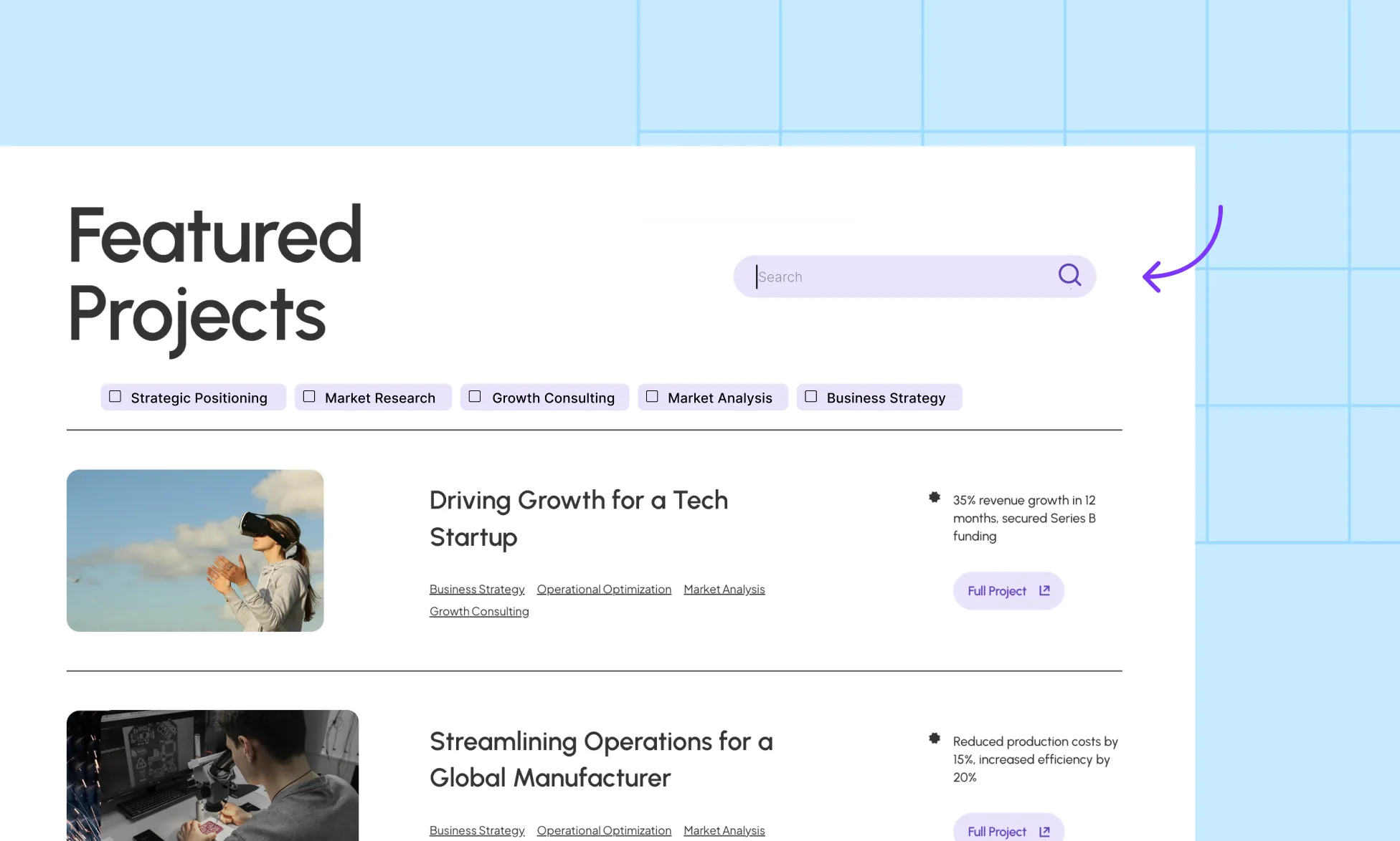
Step 2: Style the search bar (optional)
Use Design controls to customize radius, padding, border, and focus states.
Add an Icon inside the input (prefix) and a Clear button (suffix) for better UX.
Ensure the focus outline is visible for accessibility.
Step 3: Test the search
Type a few queries and verify the Collection List updates.
If nothing changes, confirm that both the search input and the results list reference the same Collection.
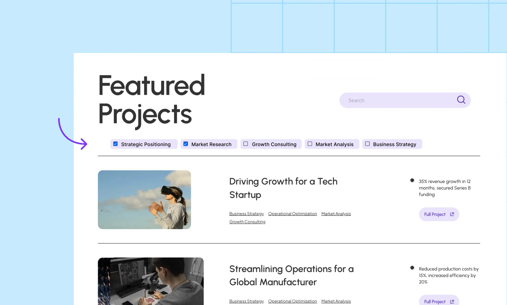
Add a Checkbox Filter to a Collection
A checkbox filter lets users narrow down items in a Collection based on specific fields, like Category, Tags, or any referenced Collection.
For example, you can let visitors filter your Projects Collection by selecting different Project Tags.
Here’s how to set it up step by step:
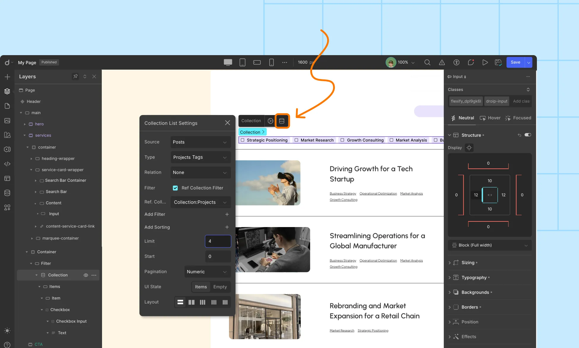
Insert a Collection element onto your page.
Set up the Collection Source:
Source: Posts
Type: Project Tags
Relation: None
Enable Ref Collection Filter, then choose the referenced Collection (in this case, Projects).
Note: In the dropdown, you’ll only see Collections already added to that page. The names match what you’ve called them in the Layers panel (not in the Content Manager). If you didn’t rename a Collection, it will simply appear as Collection.
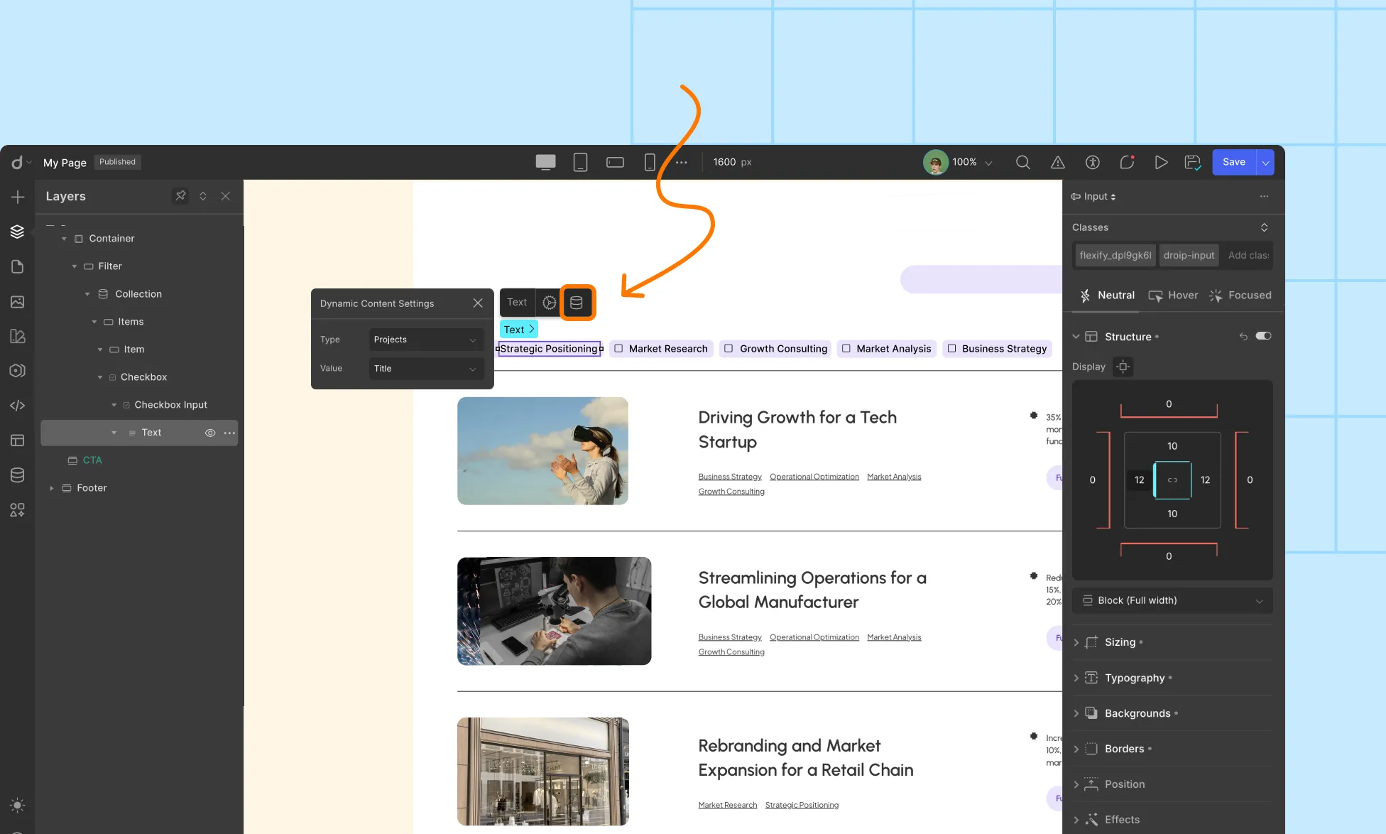
Inside the Collection Item, delete the default Heading and Paragraph.
Drag aCheckboxelementinside the Item div. Now, each Project Tag will automatically generate its own Checkbox.
Select the Text element inside the Checkbox and set its dynamic settings to:
Type: Project Tags
Value: Title
Preview and test your filter. Selecting a Checkbox should filter the Projects Collection instantly.
Droip’s Content Manager supports scalable, relationship-driven architecture using Reference and Multi-Reference fields. These fields allow you to create relational data models, making content reusable, consistent, and dynamic across your website.
What Is a Reference?
A Reference field creates a one-to-one relationship between two content collections.
Think of it as a “foreign key” where one item points to another, rather than storing duplicated data.
What Is a Multi-Reference?
A Multi-Reference field forms a one-to-many relationship, where one item can link to multiple items in another collection.
This enables advanced relational setups like tags, multi-instructors, etc.
Reference Field
A Reference Field lets you connect a single item from one collection to another. It’s perfect for one-to-one relationships — like assigning a Department to a Course, or a Contributor to a Project.
Why Use It?
Reuse data instead of typing it again and again.
Keep your content consistent across the site.
Update once, and it changes everywhere it’s used!
Example: Instead of typing the department’s name for every course manually, you can connect each course to a department from the Departmentscollection.
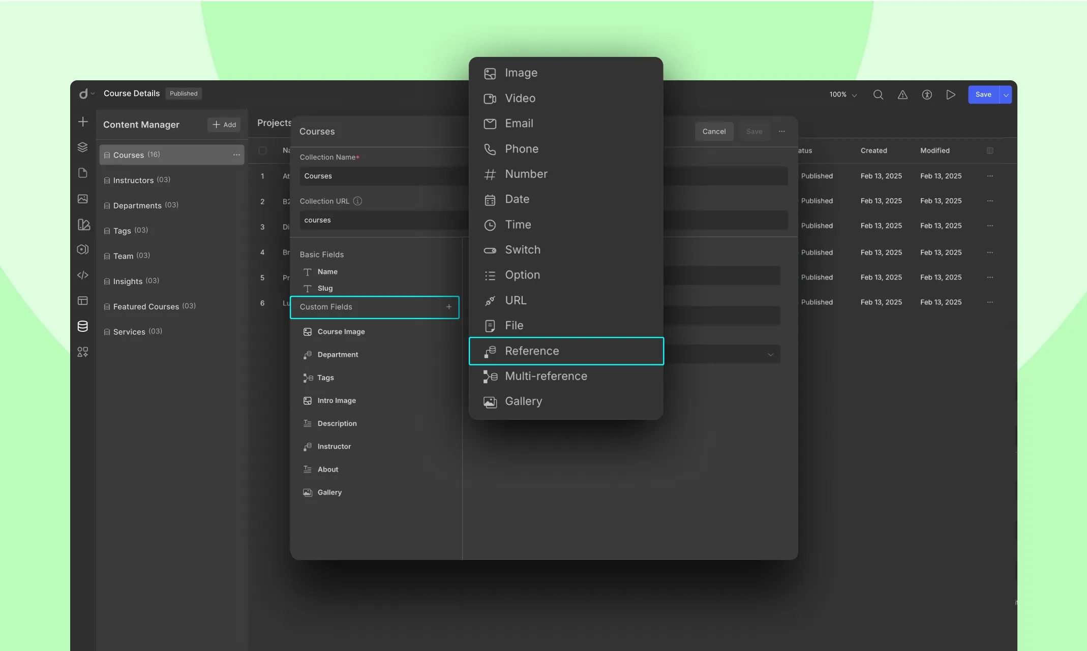
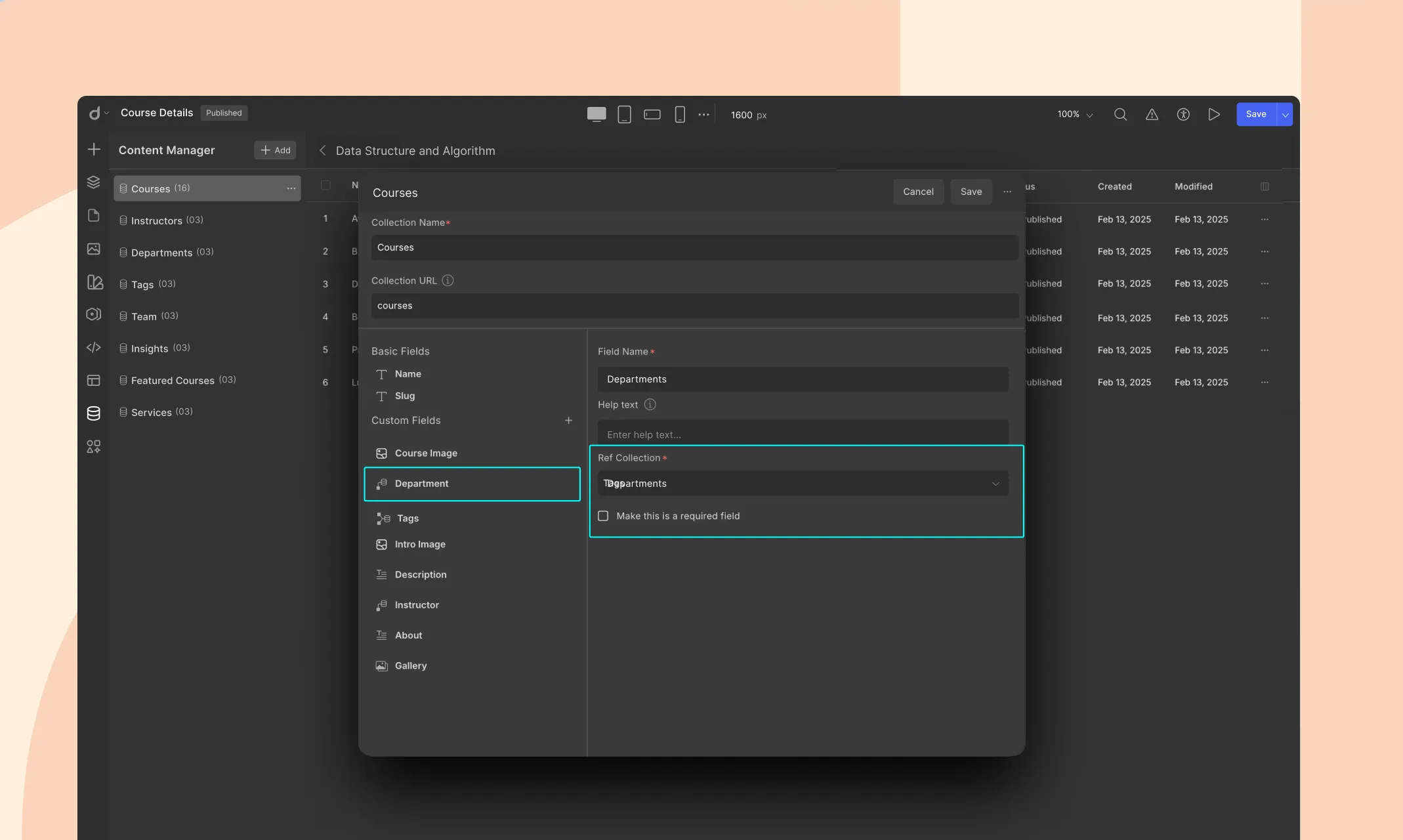
How to Add a Reference Field
Let’s say you already have a Courses collection, and you want to reference a Department from another collection called Departments.
Go to the collection where you want to add the reference (e.g., Courses).
Click + Custom Fields, then choose Reference.
Set the Target Collection: Pick the target collection you want to reference (e.g., Departments)
Name the Field: Give the field a name (e.g., Department)
Hit Save to apply the changes.
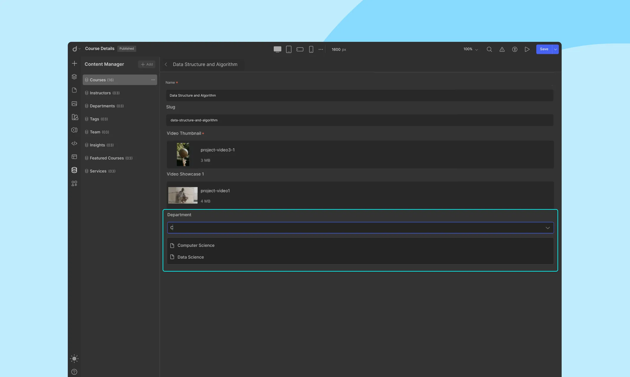
Add Data to the Field
When you’re adding or editing a Course in your Courses collection:
You’ll now see a dropdown for the reference field (e.g., Department)
Choose one of the items from the Departmentscollection — that’s it!
Displaying Reference Field on Your Website
Once you’ve connected data, you can display it on your page.
On a List Page (e.g., all Courses)
Add a Collection Element to the page.
Set the Source to Courses
Inside the Collection Element, add design elements (e.g., text).
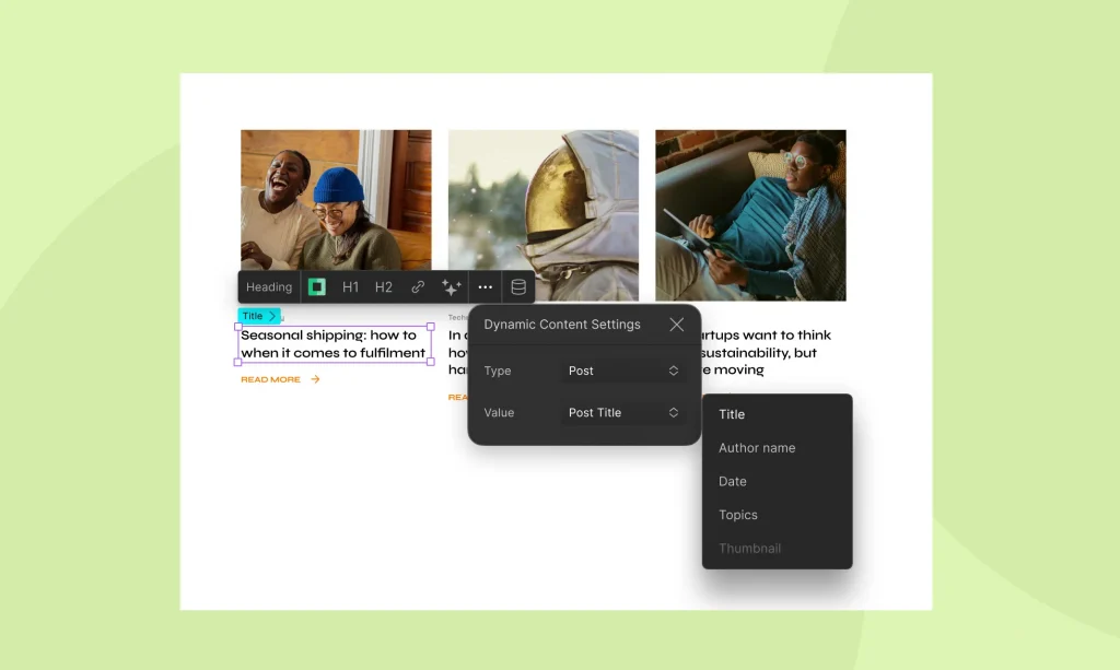
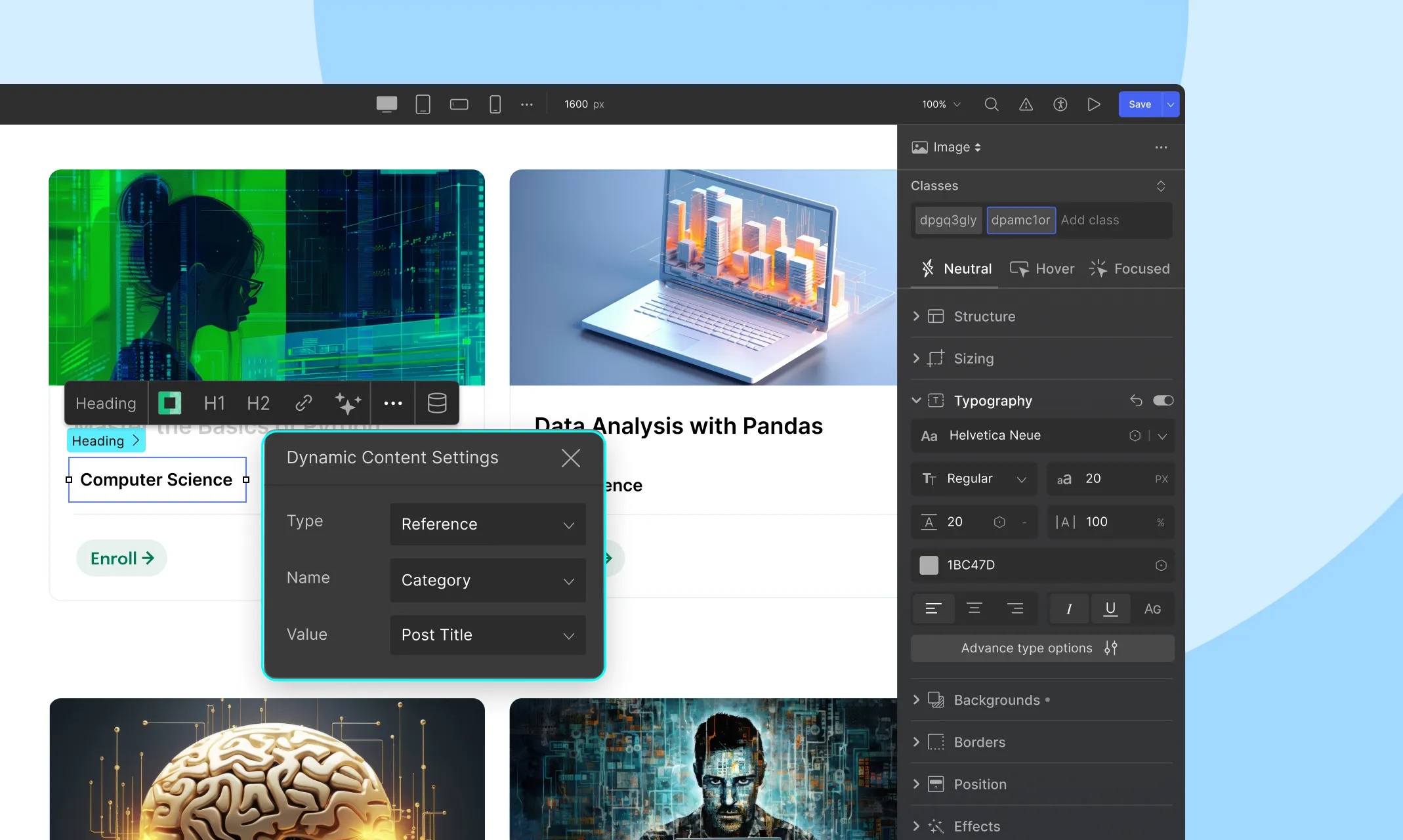
For each element, click the Dynamic Content icon and set:
Type: Reference
Name: Department
Value: What you want to display — like Post Title, etc.
On a Template Page (e.g., single Course page)
On a template page (e.g., dynamic page for each Course), the context of the current item is already known — so you don’t need a Collection Element for Reference Fields.
Drag a text/image or any design element anywhere on the page.
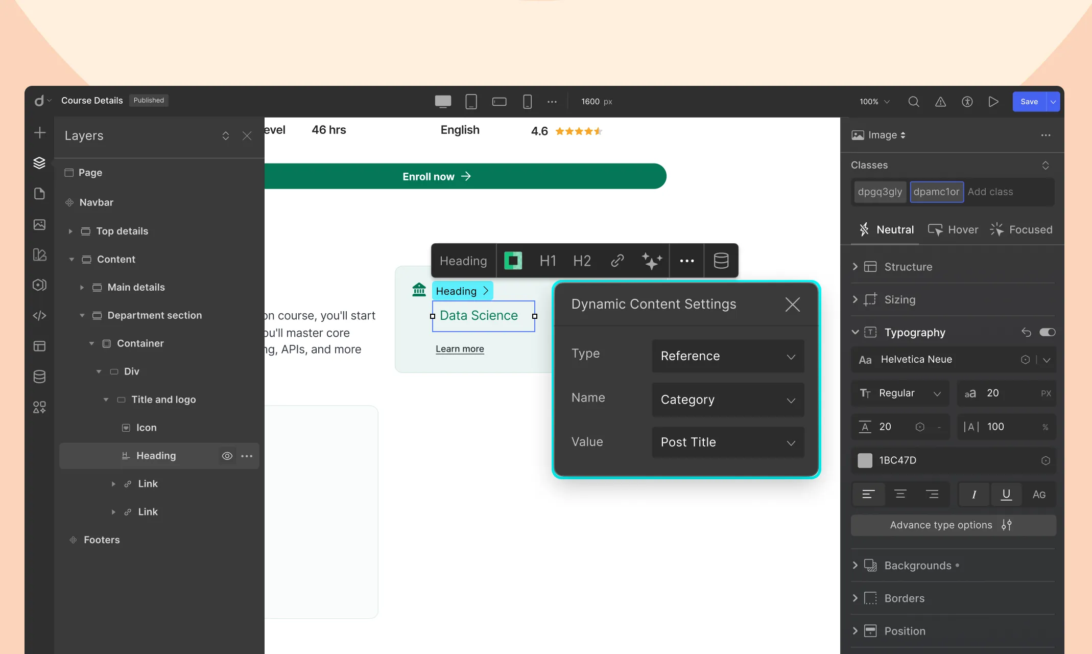
Click the Dynamic Content iconand set:
Type: Reference
Name: Department
Value: Choose what to show — like Name, Description,etc
Multi-Reference Field
A Multi-Reference Field lets you link multiple items from another collection. This is ideal for one-to-many relationships — like assigning multiple Tags to a Course, or multiple Awards to a Project.
Example: If you want to assign multiple tags to a course, instead of typing them all in manually, connect them from a Tags collection.
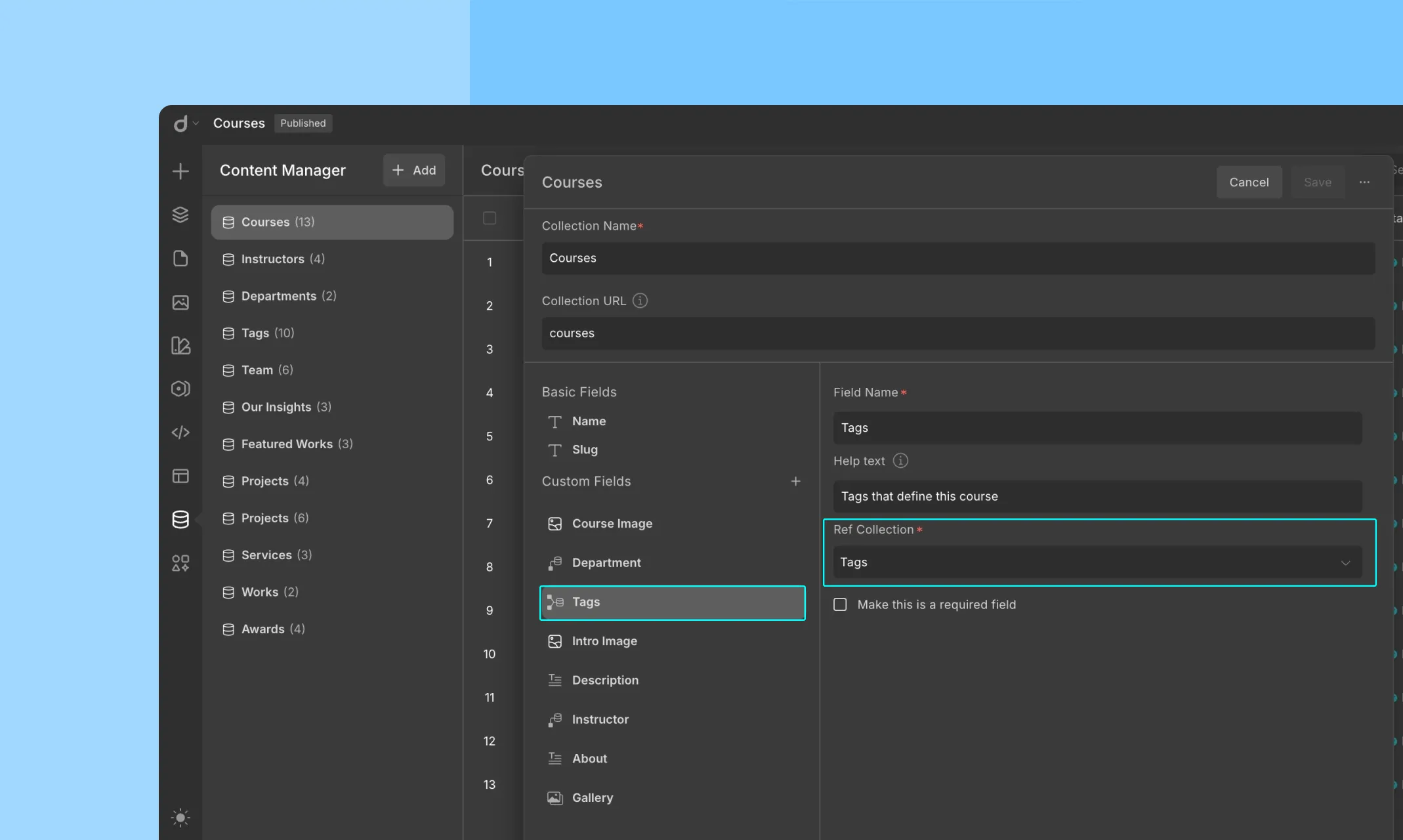
How to Add a Multi-Reference Field
Let’s say you want to add multiple Tags to your a Course.
Go to the collection where you want to add the multi-reference (e.g., Courses).
Click + Custom Fields, then choose Multi-Reference.
Choose the Target Collection: Pick the target collection you want to link. (e.g., Tags)
Name the Field: Give the field a name. (e.g., Tags)
Click Save to finish.
Add Data to the Field
When editing a Course:
You can add multiple items from the Tags collection.
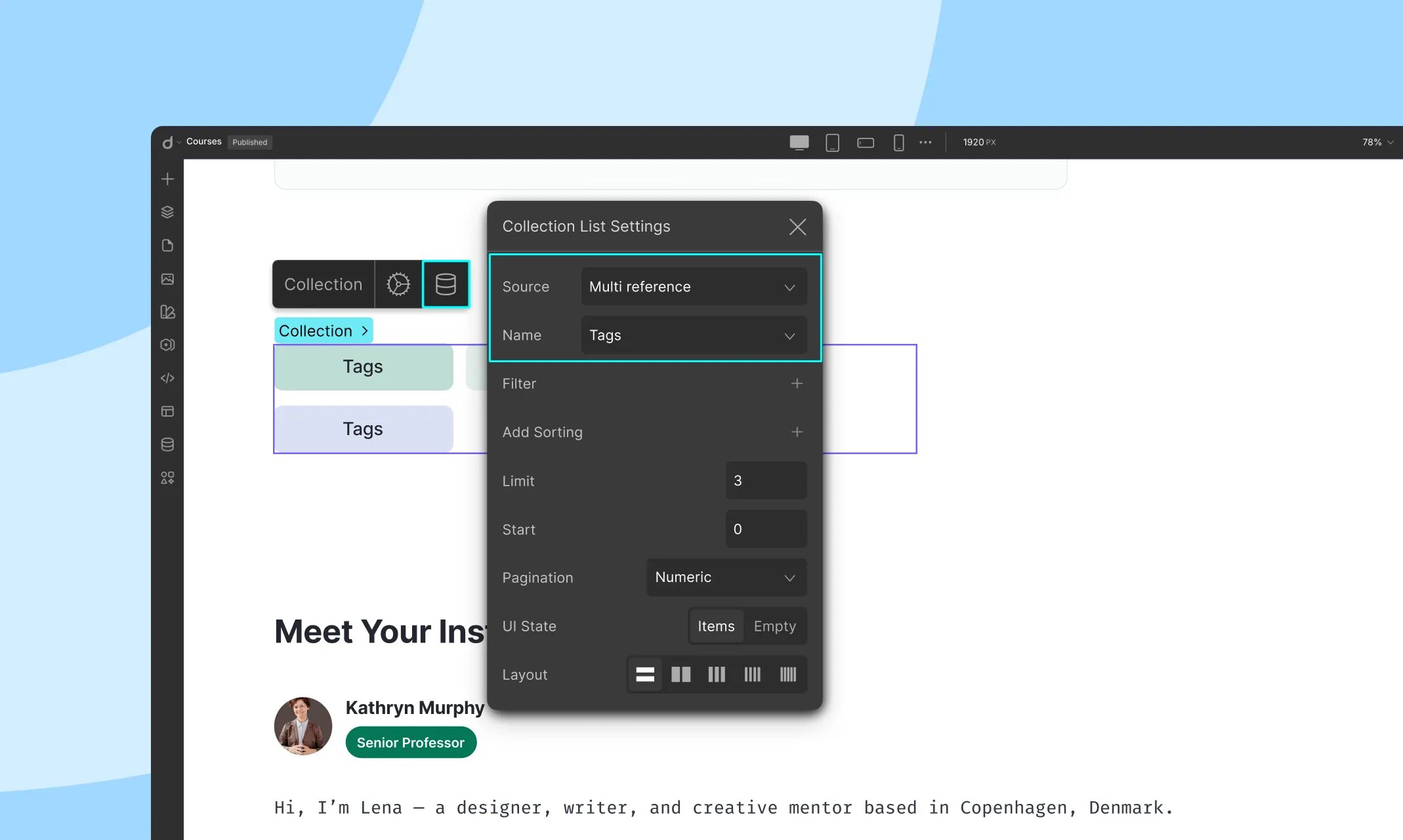
Displaying Multi-Reference Data on Your Website
Since you’re referencing multiple items, this part is a little different from single references. You’ll need a collection element to display your multi-reference items.
On a List Page (e.g., all Courses)
Add a Collection Element andset the Source as Courses
Inside this element, add another Collection Element. This nested one will display the multi-referenced items.
Set the nested Collection Element:
Type: Multi-Reference
Name: Tags (or whatever your referenced collection is called)
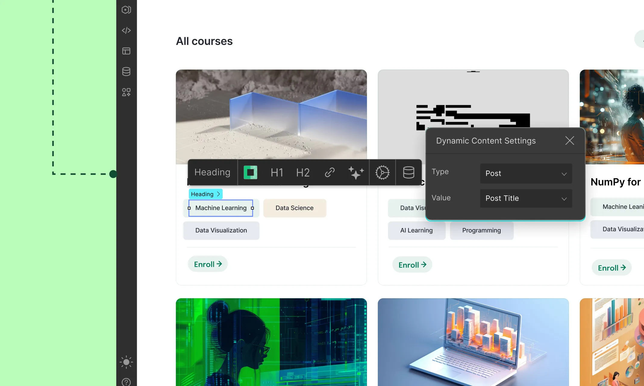
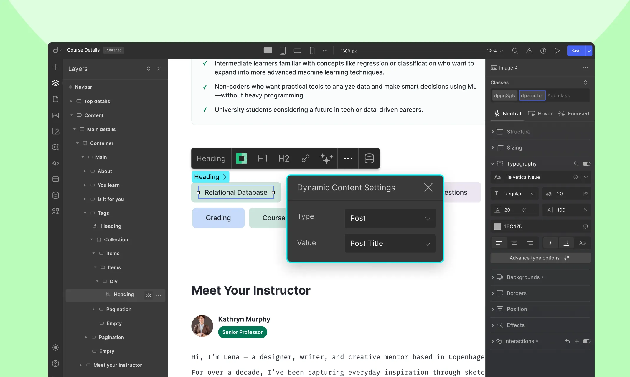
Inside this nested collection element, add a text, image, or any design element. Click the Dynamic Content iconand set:
Type: Post
Value: The field to display (e.g., Post Title)
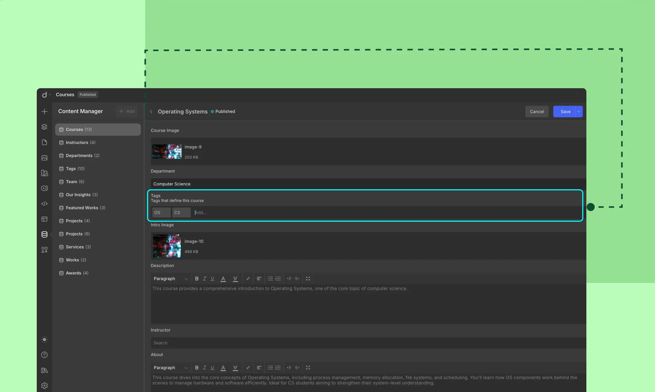
On a Template Page (e.g., a single Course page)
Drag a Collection Element onto the page and set it as:
Type: Multi-Reference
Name: Tags (or whatever your referenced collection is called)
Inside it, add elements to show each Tag.
Use the Dynamic Content iconand set:
Type: Post
Value: The field you want to show (e.g., Tag Name)
Updating Reference Content
Any changes you make in a referenced collection automatically reflect wherever that reference is used:
Example: Change a department’s info in Departments→ it updates across all courses referencing them.
This is especially powerful when managing large portfolios, product specs, or vendor info, etc.
Best Practices
✅ DO:
Reference instead of duplicate — especially for categories, tags, sponsors, clients, etc.
Name your fields clearly (e.g., Primary Author, Related Tags)
Populate referenced collections first to avoid null dropdowns
Use Multi-Reference when multiple associations are guaranteed or expected
🚫 AVOID:
Over-nesting references (e.g., Contributor → Company → Country) unless necessary, it may complicate display
Using Multi-Reference when a single reference is enough.
Once you have created your collections and added your collection items, it’s time to display this dynamic content on your site.
By using the Collection element and Collection pages, you can efficiently manage and display your dynamic content, keeping your site both dynamic and cohesive.
Droip makes this process straightforward with the use of Collection elements and Collection pages.
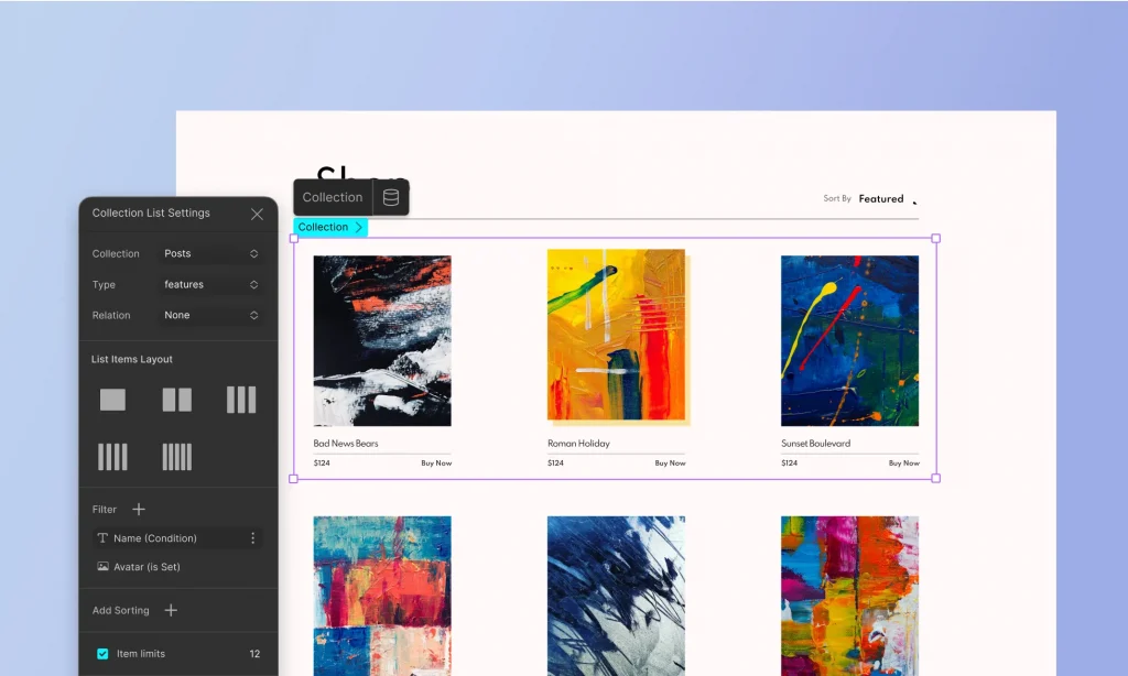
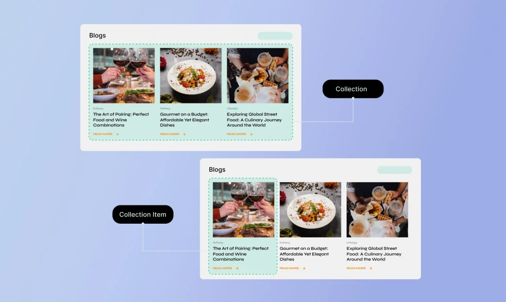
Using the Collection Element
The Collection element allows you to display a list of items from any of your collections on any page of your site.
Add a Collection Element
Drag and drop the Collection element onto your page where you want the list to appear.
Select the Collection & Collection Type
Choose which collection you want to display from the dropdown menu. This could be blog posts, team members, recipes, etc.
List Item Layouts
Choose from a variety of pre-defined layouts to display your collection items.
Connect the Fields
Select the fields you want to display within the Collection element. This can include text, images, links, and more, depending on the data in your collection.
Bind these fields to your collection data, ensuring that the displayed content updates automatically as the underlying data changes.
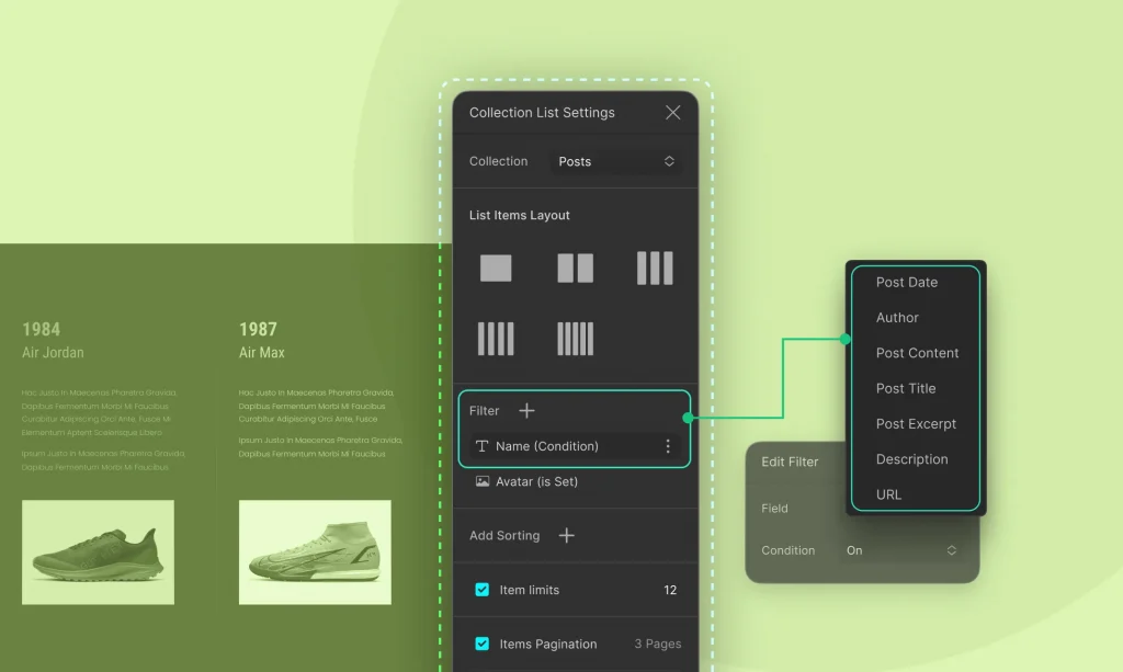
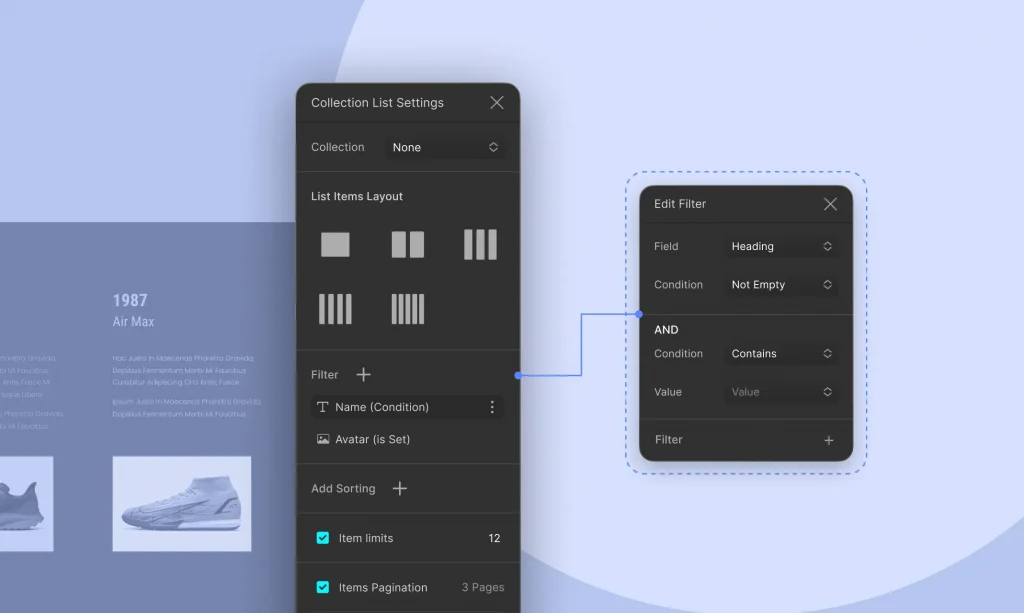
Filter Collection Items
Filtering allows you to display specific items from your collection based on certain conditions:
Choose which collection items to display based on individual field values. For example, if your collection includes a field called “Newly Launched,” you can filter items to only display those marked as newly launched.
You can also add multiple conditions in certain fields to fine-tune which items appear. For instance, you might filter to show only items where the title is not empty and contains a specific keyword.
Style the Collection
Use Droip’s design tools to style the Collection to match your site’s look and feel.
Creating Template Page for Collection Items
Collection pages serve as templates for displaying individual items from your collections, ensuring that each item is presented consistently across your site. This is particularly useful for product pages, individual blog posts, portfolio entries, and more.
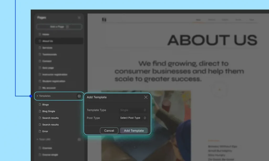
Step 1: Create a Collection Page
Access the Templates: Navigate to the Templates section under Pages.
Create a New Template: Click the + icon beside Templates, select the desired post type (e.g., blog post, product), and click on Add Template to create a new Collection Page template.
Step 2: Design the Template
Add Elements: Drag and drop elements onto the page to design the layout. For example, add text elements for titles, image elements for photos, and more.
Bind Elements to Collection Fields: Connect each element to the relevant fields in your collection. For instance, bind a text element to the “Title” field and an image element to the “Featured Image” field.
Customize the Layout: Adjust the layout and styling to ensure that each page looks polished and professional.
Dynamic Content Display: Each Collection Page dynamically pulls in content from the corresponding collection item, ensuring unique pages for each item.
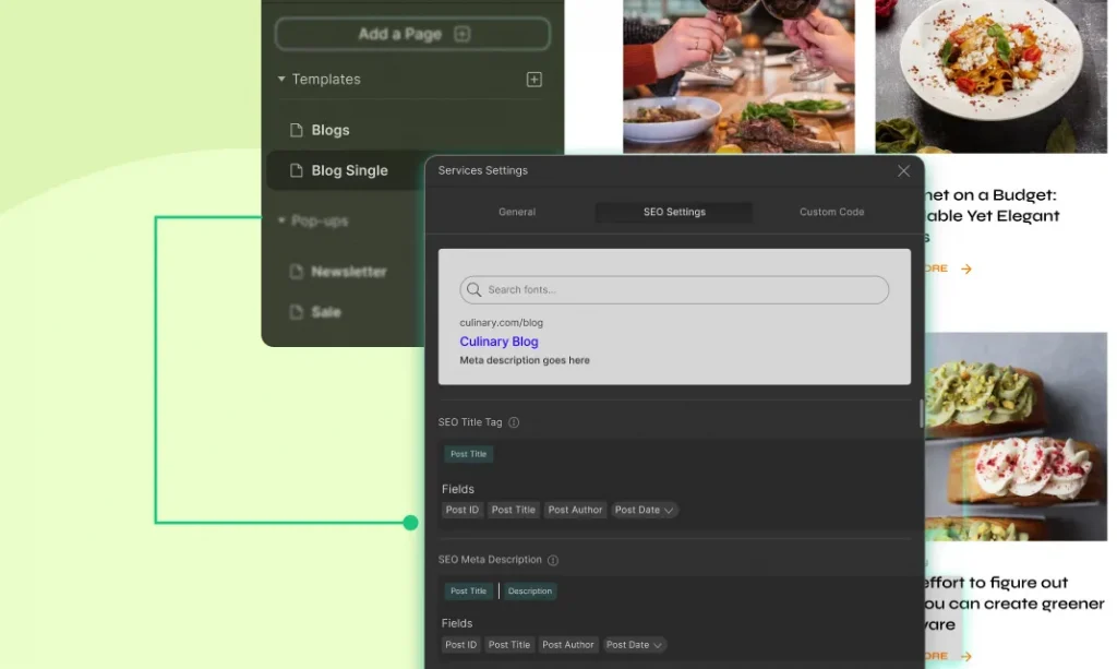
Step 3: Add Dynamic SEO
You can optimize the SEO for your Collection Pages by setting up dynamic titles and meta descriptions.
To do that, define a pattern for SEO titles and meta descriptions using field tags that will automatically apply to all items in the collection.
Access SEO Settings
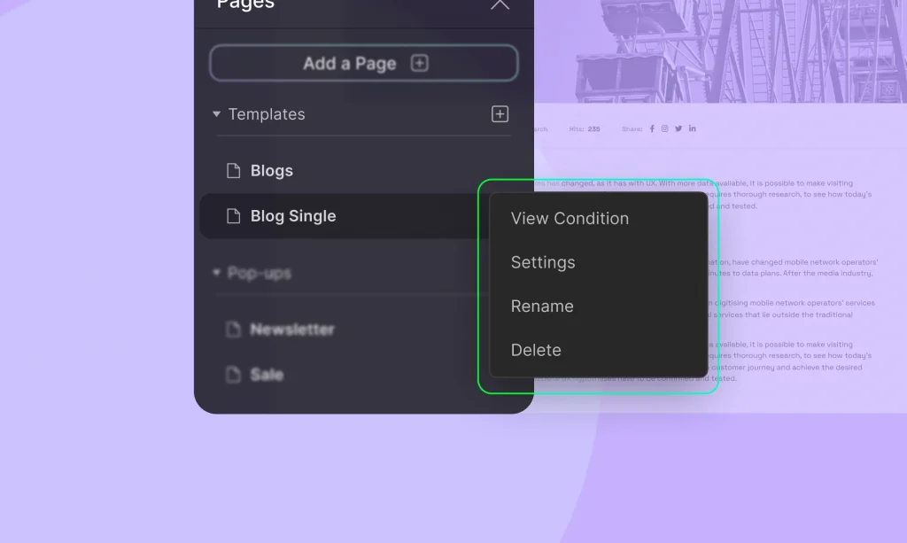
Click the three-dotted icon beside the template page, then click on Settings. Navigate to the SEO Settings tab to configure your dynamic SEO.
Field Tags
Use field tags to populate SEO settings with dynamic data, ensuring each page is optimized based on its unique content.
Open Graph Settings: Similarly, you can dynamically set the Open Graph image, title, and description, ensuring that your content is correctly represented when shared on social media platforms.
General Settings: Adjust other general settings for the template page, including:
Page Name and URL: Set a descriptive name and URL for the template.
Page Description: Add a brief description of the page’s purpose.
Theme Elements Visibility: Control the visibility of global elements like the header and footer.
Customizing a Specific Collection Item Page
You can also make unique changes to individual collection item pages within a Collection template, without impacting the layout of other items.
This can be particularly useful if you want to highlight or customize a specific item with unique content or design elements.
Step-by-Step Guide:
Navigate to the Collection Template Page: Open the Droip editor and go to the Collection template page you wish to customize.
Add an Element for Customization: Drag and drop any element onto the template page where you want the unique content to appear. For example, you might add a text block, image, or any other design element.
Link the Element to Dynamic Content: With the new element selected, open the Dynamic Content Settings. Set the Type to “Post” and the Value to “Post Content”. This ensures that the element is linked to the specific collection item’s content.
Access the Specific Collection Item for Editing: Go to the specific collection item’s page in your browser. In the URL, add “?action=droip” at the end. Press Enter to reload the page in the editor mode.
Customize the Collection Item Page: The editor will now open, allowing you to make unique changes to that specific collection item. Any modifications made here will only affect this particular item, leaving the rest of the collection pages untouched.
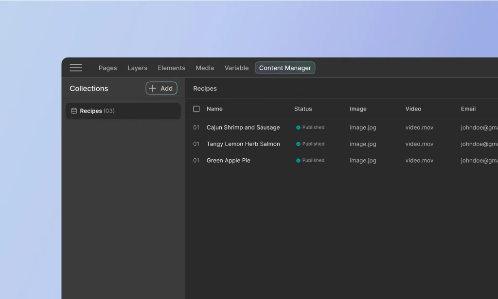
Once you’ve created a Collection, you need to populate the collection with collection items. Managing entries in the Content Manager involves various actions that help you maintain and organize your content effectively.
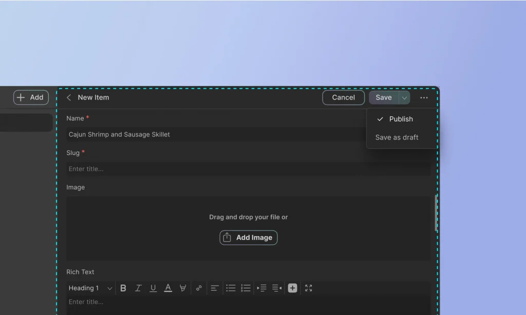
Adding New Entries
Open Collection: Navigate to the desired collection within the Content Manager.
Add New Entry: Click on the “+ Add New” button.
Fill in Fields: Enter the required data in each field of the new entry form. For example, when adding a new team member, you might fill in fields for the name, slug, profile picture, bio summary, job title, email, and phone number.
Save Entry: Choose to “Publish” or “Save as Draft” and click “Create.”
Schedule Collection Items for Automatic Publishing
You can schedule Collection items in Droip to go live at a specific date and time. It comes handy for planning ahead and managing content releases automatically.
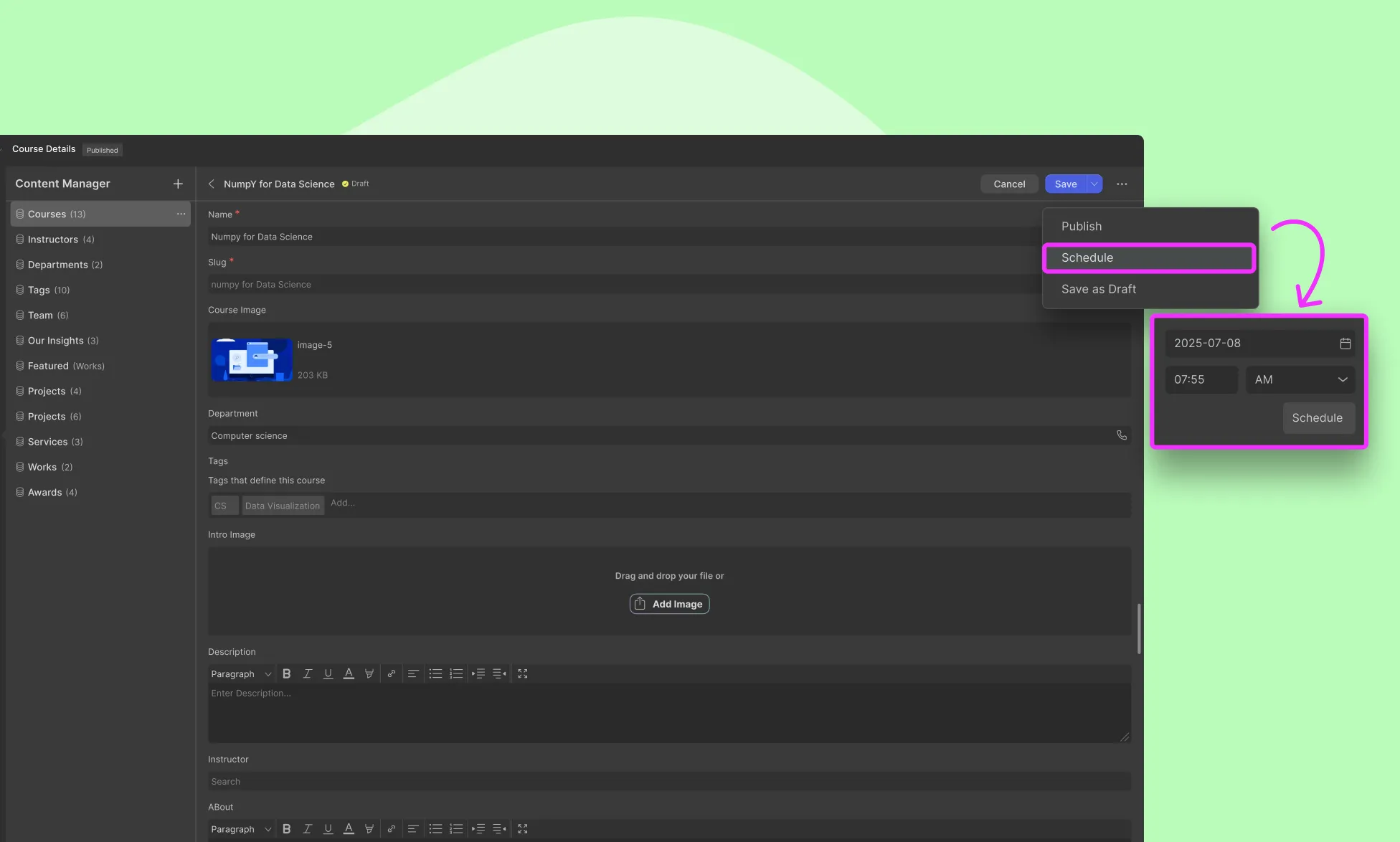
How to Schedule a Collection Item
Open the Collection item you want to schedule.
Click the Save dropdown at the top-right corner.
Select Schedule.
Set the desired date and time (based on your site’s configured time zone).
Click Schedule to confirm.
How to Unschedule or Reschedule
To unschedule, change the item’s status to Save as Draft.
To reschedule:
Open the scheduled item.
Click the Save dropdown.
Select reschedule.
Adjust the date and time.
Click Schedule to apply the new timing.
Managing Collection Items
Using the following features, you can efficiently manage your collection items and ensure that your collection table remains organized and up-to-date.
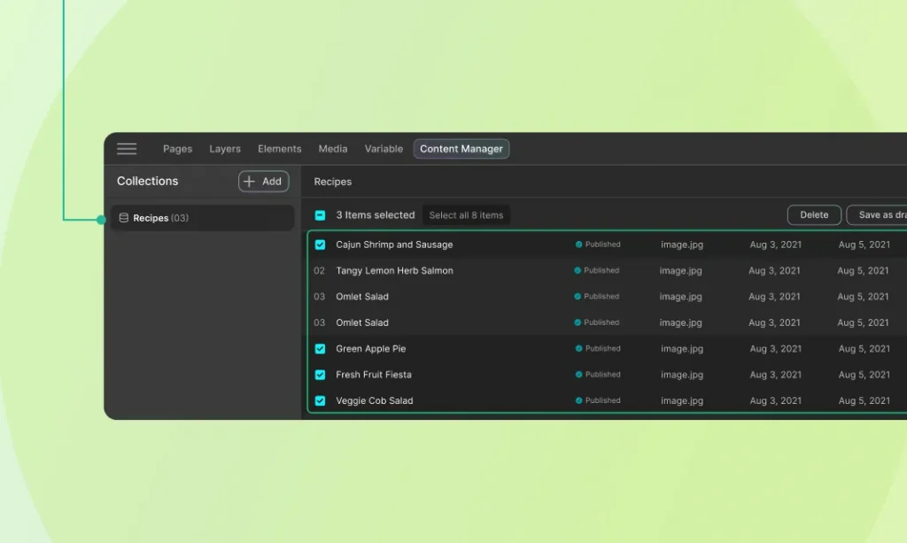
Perform bulk actions
Perform bulk actions on multiple items simultaneously. This could include publishing, unpublishing, deleting, or moving items between collections.
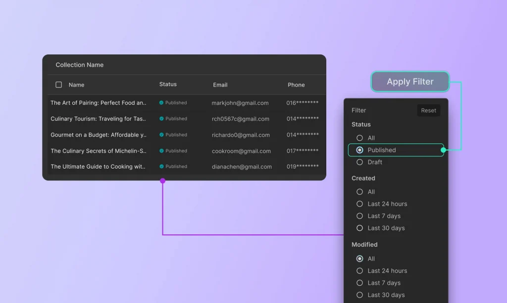
Filter Collection Items
Use filters to quickly find specific items based on criteria such as date of creation, status, or last modified date. This feature is particularly useful for managing large collections.
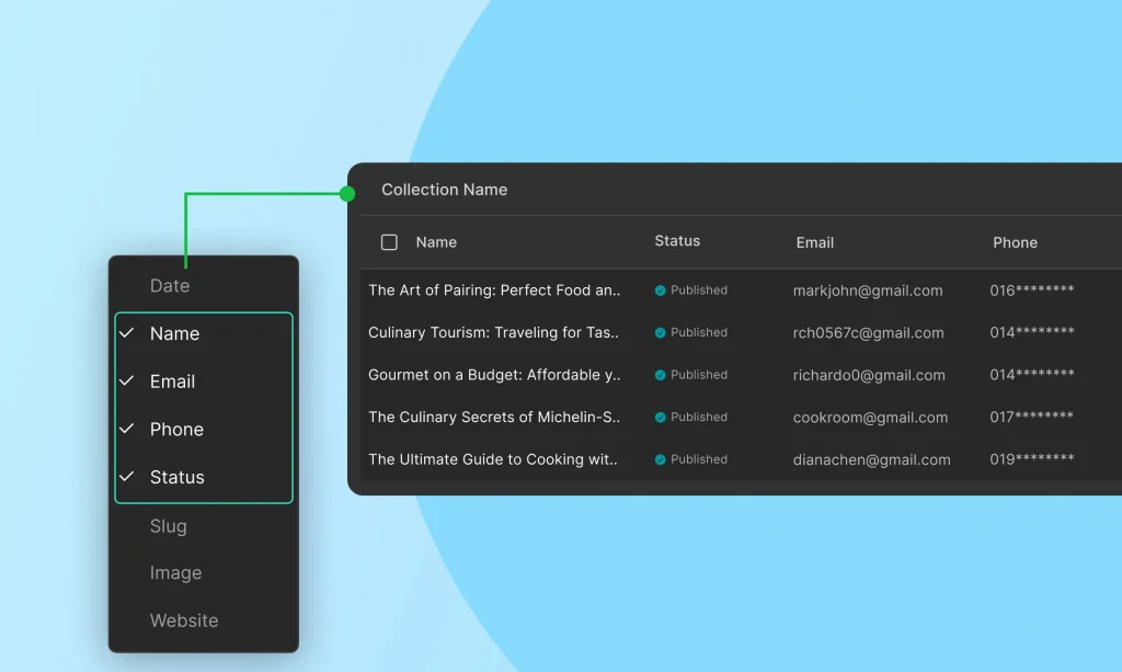
Organize Collection Table
Customize the display of the item table by adding, removing, or rearranging columns based
on the fields. This allows for a more tailored and efficient content management experience.
In the next sections, we’ll cover advanced topics such as dynamic content integration and best practices for content management.
Each field type can be configured in the Content Manager interface, allowing you to tailor the data entry process to your specific needs.
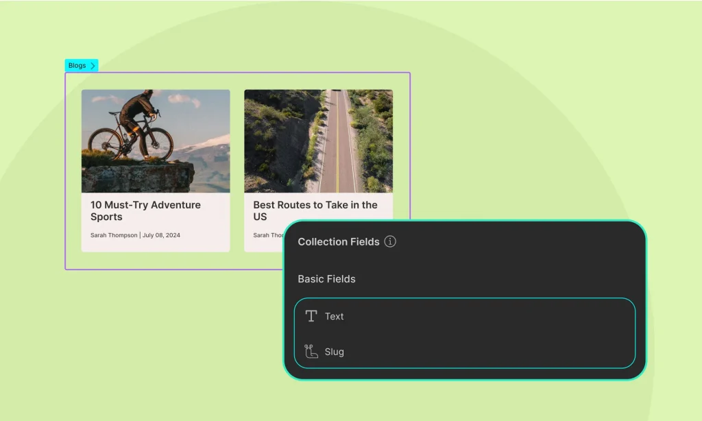
Basic Fields
Basic fields in the Content Manager are essential for defining the structure of your content. The two mandatory basic fields are:
Name: This field is used to specify the title or name of the entry.
Slug: This field is used to define a URL-friendly version of the name, which helps in creating clean URLs for your content.
These fields are automatically included when you create a new collection item and are essential for organizing and referencing your content.
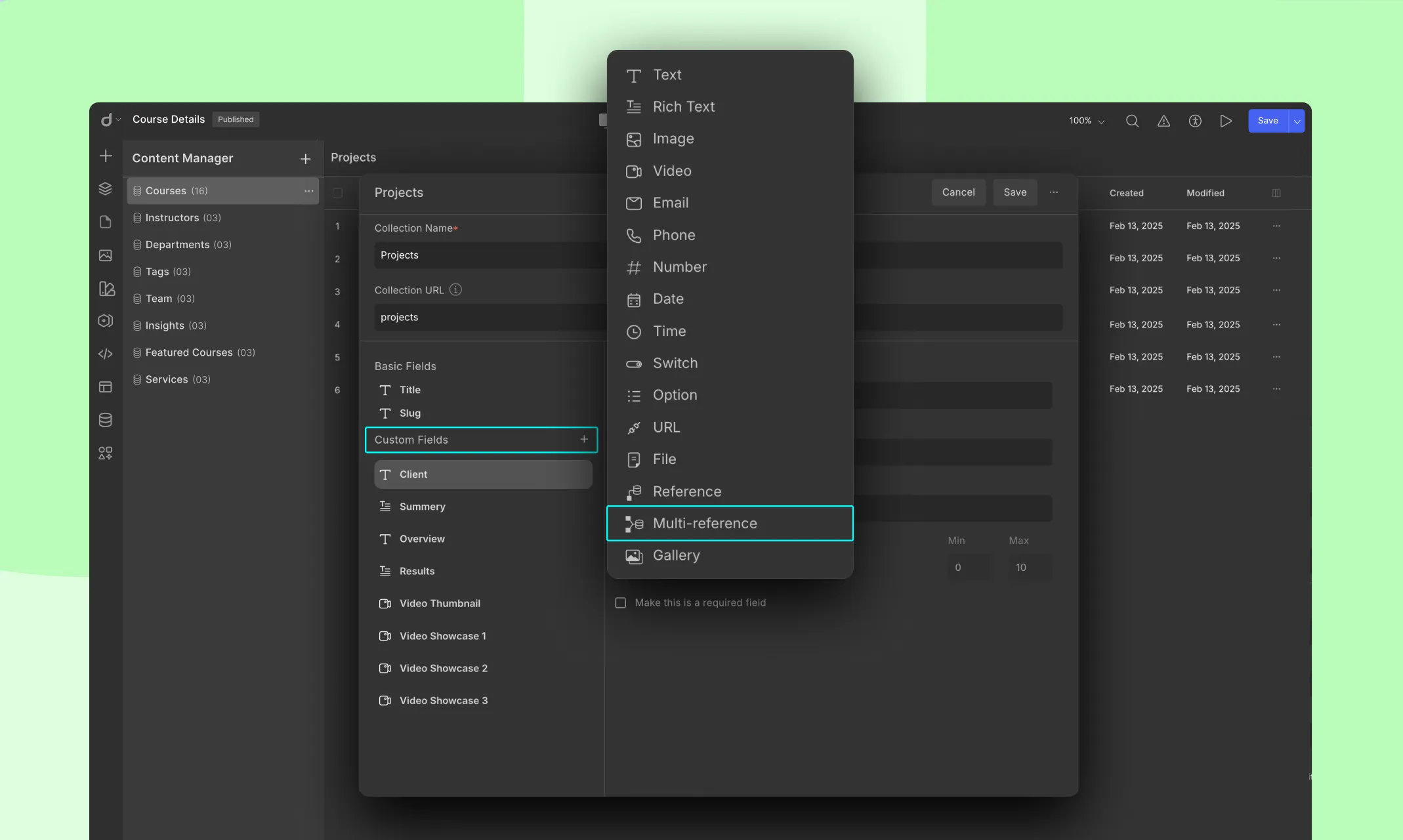
Custom Fields
Custom fields allow you to extend the functionality of your collections by adding specific types of data that suit your needs.
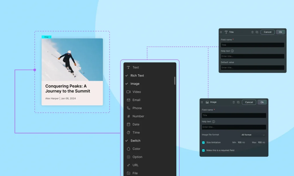
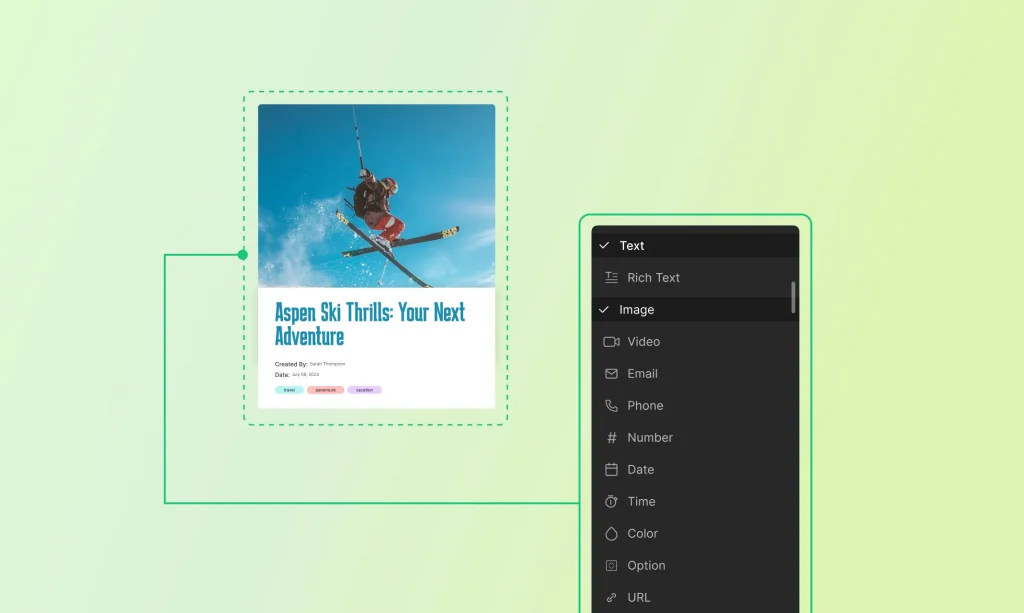
Text Field
Purpose: For adding short pieces of text.
Configuration: Specify the field label, help text, and validation rules such as required or maximum length.
Required: Tick to set the field as mandatory.
Character Limit: Specify the maximum number of characters allowed.
Required: Tick to set the field as mandatory.
How to display: Connect the text field to a heading, paragraph, or any text element.
Rich Text Field
Purpose: For adding formatted text with various styling options.
Configuration:
Formatting Tools: Enable options like bold, italic, lists, links, and more.
Word Count: Set a word limit for the content.
Required: Tick to set the field as mandatory.
How to display: Connect the text field to a heading, paragraph, or any text element.
Image Field
Purpose: For uploading and displaying images.
Configuration:
Image Formats: You can accept all formats or choose JPG, PNG, or GIF.
Size Limitations: You can set the minimum and maximum file size allowed.
Required: Tick to set the field as mandatory.
How to display: Connect the image field to an image element.
Video Field
Purpose: For embedding video content.
Configuration:
Video Formats: You can choose to accept from MP4, MOV, AVI, or all.
Video Type: You can set it to upload a file or insert a URL
Size Limitations: You can set the minimum and maximum file size allowed.
Required: Tick to set the field as mandatory.
How to display: Connect the video field to a video element.
Email Field
Purpose: For storing email addresses.
Configuration:
Required: Tick to set the field as mandatory.
How to display: Connect the email field to any text or link element.
Phone Field
Purpose: For storing phone numbers.
Configuration:
Required: Tick to set the field as mandatory.
How to display: Connect the phone field to any text or link element.
Number Field
Purpose: For storing numerical values.
Configuration:
Number format: Select decimal or integer format or both
Allow negative number: Tick to allow negative number
Required: Tick to set the field as mandatory.
How to display: Connect the to any text or link element.
Date Field
Purpose: For selecting dates.
Configuration:
Default Date: Specify a default date if needed.
Required: Tick to set the field as mandatory.
How to Display: Connect the date field to text element on your site.
Time Field
Purpose: For selecting times.
Configuration:
Default Date: Specify a default time if needed.
Required: Tick to set the field as mandatory.
How to Display: Connect the date field to text element on your site.
Switch Field
Purpose: To add a toggle or switch option (e.g., on/off).
Configuration:
Default State: Set the default state (e.g., on or off).
Required: Tick to set the field as mandatory.
Option Field
Purpose: To select from predefined options.
Configuration:
Define the options list and default selected option.
How to Display: Connect the option field to any text element on your site.
URL Field
Purpose: For storing web addresses.
Configuration:
Default Value: Specify a default URL if needed.
Help Text: Add help text to guide users on the expected input.
Required: Check to set the field as mandatory.
How to Display: Connect the URL field to any text or link element, enabling dynamic linking to web pages directly from your content manager.
Reference Field
A Reference Field lets you connect a single item from one collection to another. It’s perfect for one-to-one relationships — like assigning an Instructor to a Course, or a Contributor to a Project.
Multi-Reference Field
A Multi-Reference field forms a one-to-many relationship, where one item can link to multiple items in another collection.
This enables advanced relational setups like one course to multiple tags or multi-instructors, etc.
Purpose: The Gallery field in Droip allows you to upload and manage multiple images for a single collection item, ideal for showcasing media-rich content like project galleries, product photos, etc.
Configurations:
Name: Name your field (e.g., Project Gallery).
File Format: Select file format as you want: JPG, PNG, GIF, or All Format.
Uploading Gallery Images
When you’re adding or editing a project in your Projects collection:
Scroll to the Gallery field.
Click Add Image.
Add as many files as you want.
Rearrange them if needed (just drag and drop).
Note: All uploaded images are automatically optimized for performance.
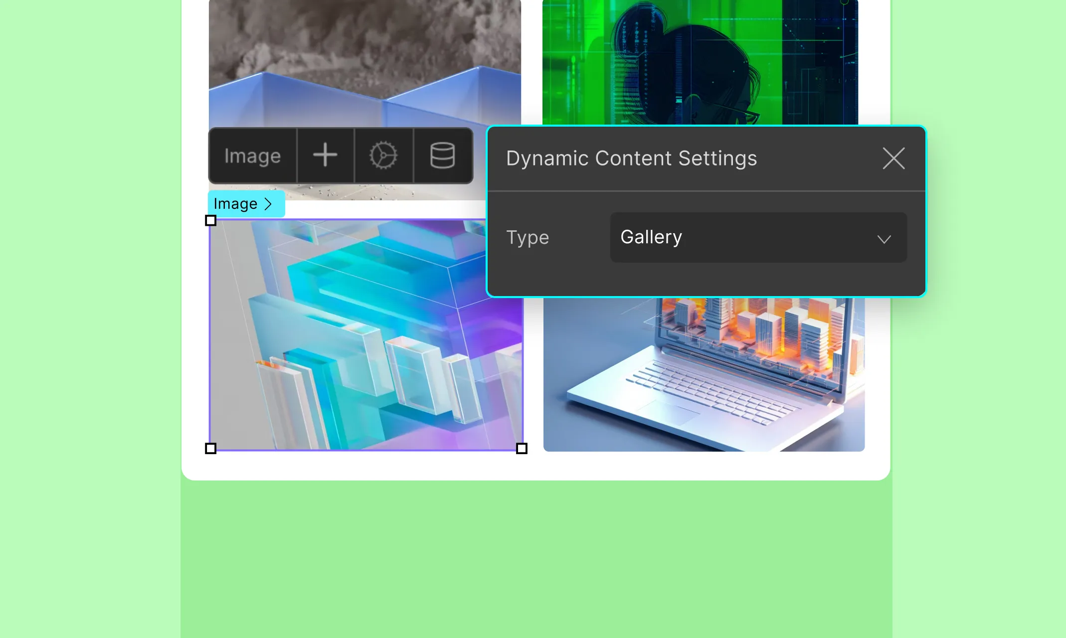
How to Display
You can dynamically show your image galleries on any page either as part of a list (e.g., all projects) or a template (e.g., a single project page).
On a Template Page (e.g., Single Project Page)
Drag a Collection Element onto the canvas.
Set the Collection Element:
Source: Gallery
Name: Your Gallery field’s name
Inside the Collection Element:
Add an Image element.
Click the Dynamic Content icon and set Type as Gallery
Since you’re on a template page, Droip already knows which project you’re working with. It’ll pull and display all the images from that item’s gallery field.
On a List Page (e.g., All Projects)
This is where you need to be intentional. Only use it wheneach list item benefits from visual storytelling or you want to show multiple images at a glance (e.g., portfolios, properties, etc.).
Add a Collection Element to the page.
Set the Source as Posts and Type as Projects (or your collection name).
Inside that Collection Element, add another Collection Element. This nested element will display the gallery images.
Set the nested Collection Element:
Type: Gallery
Name: Your Gallery field’s name
Inside the nested element:
Add an Image element.
Click the Dynamic Content icon.
Set Type to Gallery
This will show each image in the gallery field for each project.
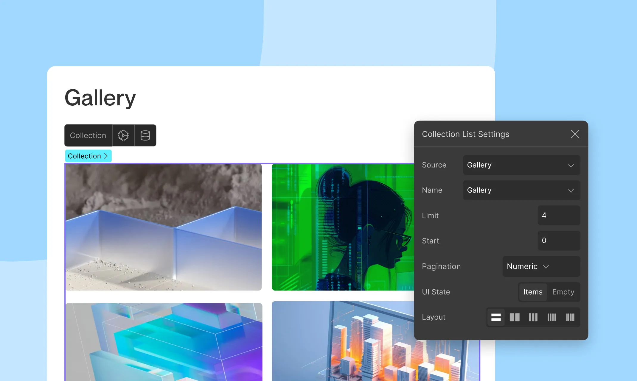
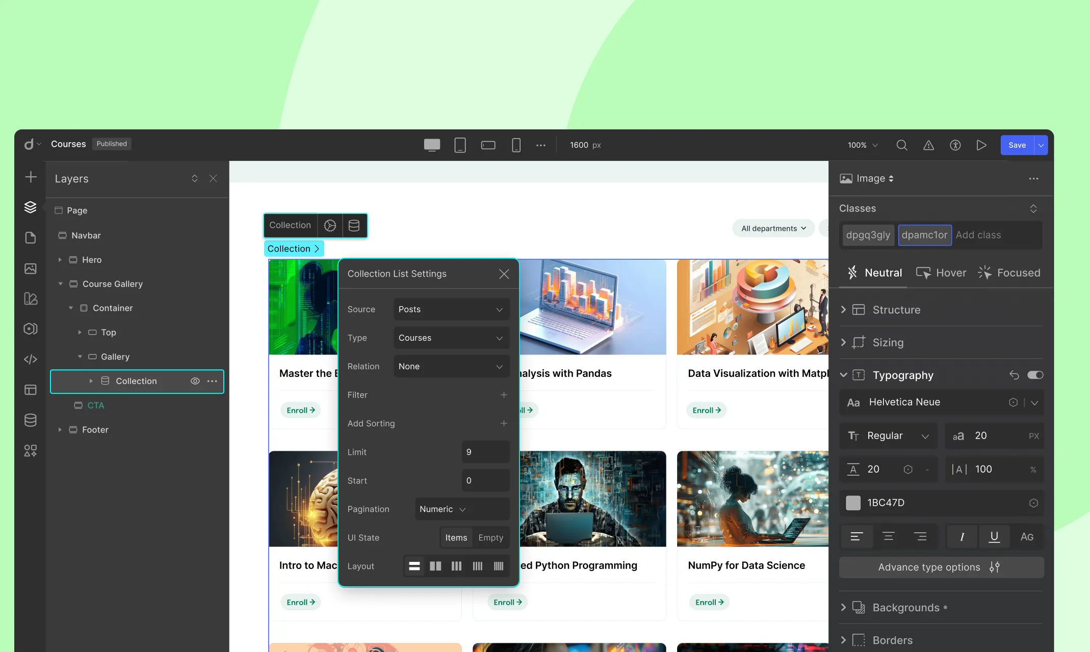
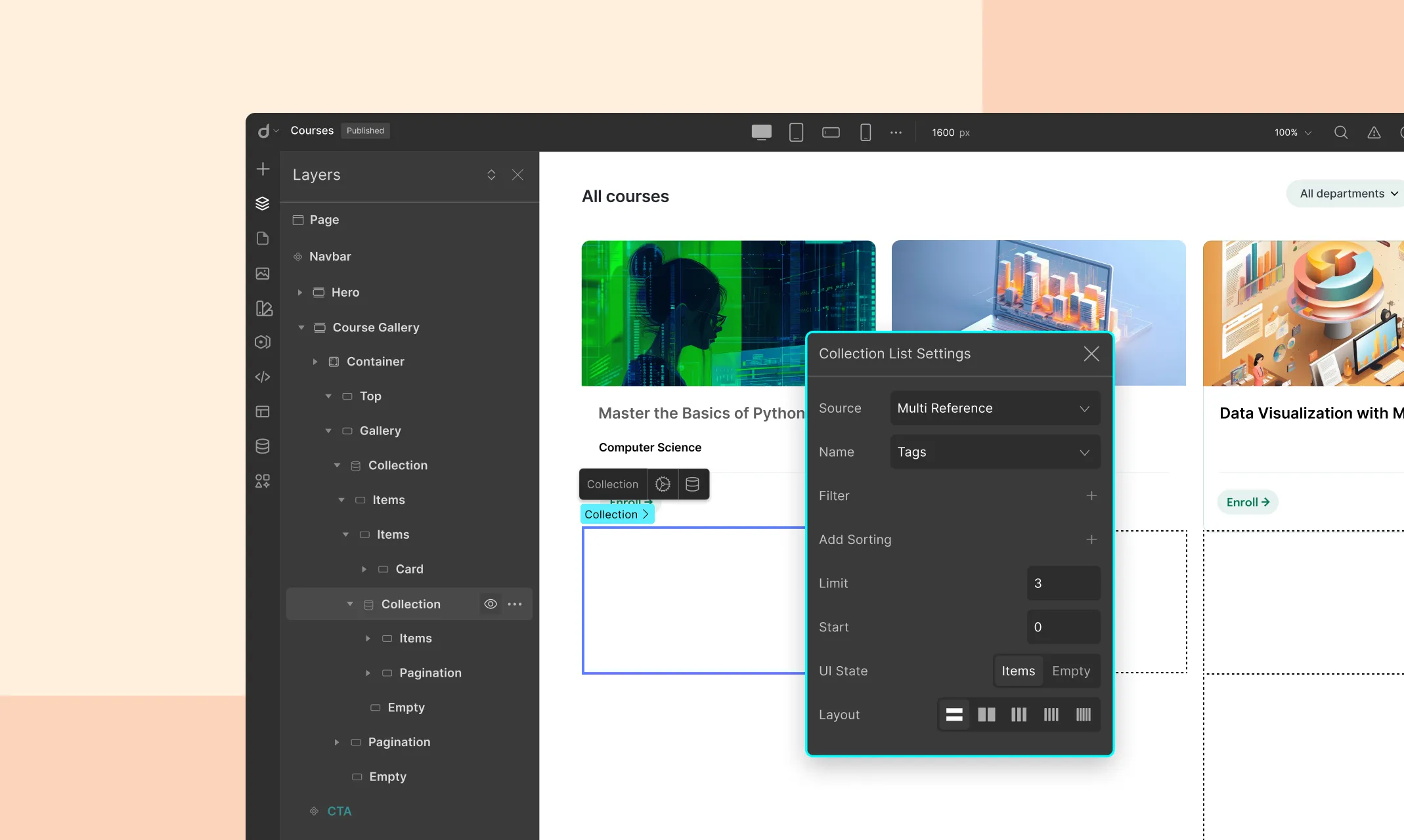
You can dynamically limit the number of images displayed from the Gallery field on the list page using Limit from Collection List Settings.
In Droip, a collection is a structured set of related content items that you can manage centrally and display dynamically on your website.
Collections allow you to group similar types of content, such as blog posts, projects, or team members, and manage them efficiently within the Content Manager.
Each collection is composed of individual entries, each entry being a unique instance of the content type defined by the collection.
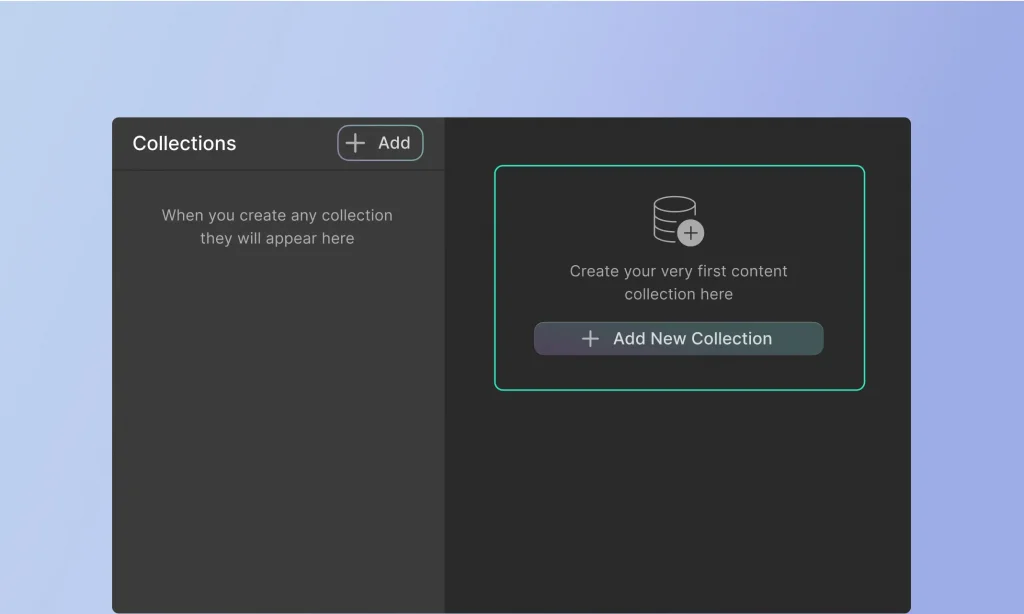
Creating a New Collection
Step-by-Step Guide to Creating a Collection:
Access the Content Manager: Open the Droip editor, then navigate to the “Content Manager” option on the top bar.
Add New Collection: Click on the “+ Add New” button to start creating a new collection.
Choose a Preset or Start from Scratch: You can either select a collection preset (like Team Members or Recipes) to get started quickly or choose to create a custom collection from scratch.
Name Your Collection: Enter a name for your collection that clearly describes its content, such as “Blog Posts” or “Portfolio Projects.”
Define the Collection URL: Specify the URL for your collection, which will be used in your website’s address bar.
Add Fields: Define the fields for your collection. Click on the “+ Add” button under “Custom Fields” to add new fields. You can add text fields, images, videos, dates, and more, depending on what data you need to capture.
Configure Field Settings: For each field, configure its settings such as label, required status, and any validation rules.
Save Your Collection: Once you’ve added all the necessary fields and configured them, click the “Create” button to save your new collection.
Collection Presets
Droip provides several collection presets to help you get started quickly with commonly used content types. These presets come with predefined fields tailored to their specific use cases, making it easy to set up and start adding content.
Team Members: Includes fields for name, position, bio, profile picture, and contact information.
Portfolio: Designed for showcasing projects, with fields for project name, descriptions, images, and links.
Projects: Similar to the portfolio preset, focused on detailed project descriptions and related media.
Clients: Includes fields for client names, testimonials, project history, and contact details.
Listings: Ideal for real estate, job postings, or product catalogs, with fields for title, description, price, and location.
Recipes: Comes with fields for recipe name, ingredients, steps, cooking time, and images.
Customizing Presets
While the presets provide a solid starting point, you can customize them to better fit your specific needs:
Select a Preset: When creating a new collection, choose a preset that closely matches your requirements.
Modify Fields: After creating the collection, you can add, remove, or edit fields to suit your needs. For example, you might add a “video tutorial” field to the Recipes preset or a “client logo” field to the Clients preset.
Rearrange Fields: Adjust the order of fields by dragging and dropping them in the desired sequence.
Field Settings: Customize each field’s settings, such as making a field required, changing its label, or adding validation rules.
Save Changes: After customizing the preset, save your changes to update the collection.
By understanding and utilizing collections, you can effectively manage and display dynamic content on your Droip website.
In the next sections, we’ll delve deeper into managing entries, using dynamic content, and integrating collections into your website design.
The Content Manager is a powerful feature in Droip designed to streamline the creation, organization, and management of dynamic content on your website.
It serves as a central hub where you can define content structures, input data, and seamlessly integrate this data into your site’s design dynamically.
Whether you’re managing a blog, portfolio, client database, or any other type of content, the Content Manager provides a user-friendly interface to handle it all efficiently.
Key Features and Benefits
Centralized Content Management: Manage all your content in one place, making updates and organization simple and efficient.
Dynamic Content Integration: Easily integrate your content with your website’s design, ensuring that updates are reflected across all relevant pages automatically.
Custom Fields: Utilize a variety of field types (text, images, videos, dates, etc.) to capture exactly the information you need.
Collection Presets: Start quickly with predefined collections for common content types like portfolios, projects, and team members.
Scalability: Effortlessly handle a growing amount of content without compromising on performance or usability.
Efficiency: Save time with bulk actions, conditional visibility rules, and other features designed to enhance your workflow.
Accessing the Content Manager
To access the Content Manager in Droip:
Access the Droip editor: Start by logging into the backend of your Droip website and open the Droip editor.
Navigate to the Content Manager: From the editor, find and click on the “Content Manager” option on the Topbar.
Content Manager Overview
Static content describes content that must be manually updated. Whereas when you use dynamic content, your design is linked to Content Manager data so you can update multiple content instances all at once.
Step 1: Create Collections
To start, navigate to the Content Manager and click on Add New. Name your collection based on the type of content it will hold (e.g., “Blog Posts,” “Products,” “Team Members”).
If you prefer, you can start with a predefined collection template that matches your content type. This can save time and provide a ready-made structure for your content.
Step 2: Define Collection Fields
Collection Fields define the structure of your Collection, dictating the type of information each item will hold. For instance, a “Blog Post” Collection might include fields for the title, author, publish date, and content.
Add Fields: When creating or editing a Collection, you can add various fields such as text, image, date, number, URL, etc. Each field type is designed to capture specific kinds of data, allowing for precise content management.
Customize Fields: Customize each field to suit your needs. For example, you can set a text field as mandatory, limit the number of characters, or allow rich text formatting.
Step 3: Add Collection Items
Once your Collection is set up, you can start adding individual items. Each item in the Collection will have the fields you defined where you can input data for each field.
Step 4: Display Dynamic Content
With your Collection items ready, you can now integrate them into your website using Droip’s elements:
Collection Lists: The Collection element allows you to display lists of your Collection items on any page. For instance, you can create a dynamic blog feed on your homepage or showcase team members on an “About Us” page. Map the fields from your collection to the corresponding elements in your design (e.g., map the “Name” field to a text element, and the “Profile Picture” field to an image element).
Collection Pages: Collection Pages enable you to design a single layout that applies to all items in a Collection. For example, if you have a “Team Members” Collection, you can design a page layout with placeholders for the team member’s name, picture, bio, and contact information. The data for each team member will automatically populate these placeholders when the page is viewed.
Our website uses cookies to improve your browsing experience on our website. By continuing to use this website, you
agree to
their use. For details, please check our Privacy Policy.
Get started for free!
Start 90 days free trial!
Get Droip
Experience the power of Droip. Create stunning, responsive sites with pure creative freedom.