We are bringing an infinite canvas, along with some other changes in Droip.
Before anything rolls out, let’s talk about what’s changing, why we’re doing it, and what it means for you. This is us being completely open about what we’ve learned over the past year and how we’re evolving Droip to better serve you.
Because if you’ve invested time, projects, and trust into Droip, you deserve to know exactly why we’re making these decisions.
Why We’re Making These Changes
It’s been over a year since we launched Droip 2.0. Since then, we shipped a ton of new features, nearly 100 ready-to-use templates, and built a growing community of creators using Droip every day.
As we continued to grow, we listened closely to your feedback. And a few things came up repeatedly:
- Droip has a learning curve, and it’s not always obvious where to start.
- People wanted a free version to explore before committing.
- Finding Droip is harder than it should be. The name is constantly autocorrected to “Drop,” which hurts our search visibility.
These challenges forced us to pause and ask the big question:
How do we make Droip easier to learn, easier to find, and easier to get started with, without losing what makes it powerful?
The answer guided everything you’re about to see. We approached it from three directions:
- Rebuilding the product experience so creation feels natural, visual, and intuitive.
- Introducing a free version so anyone can explore Droip without barriers.
- Rethinking our identity so people can actually discover us.
And this is why we’re making some of the biggest product and brand decisions since Droip began.
The New Creation Experience
To solve the learning curve and make building feel more natural, we’ve completely reimagined the Droip editor.
Infinite Canvas
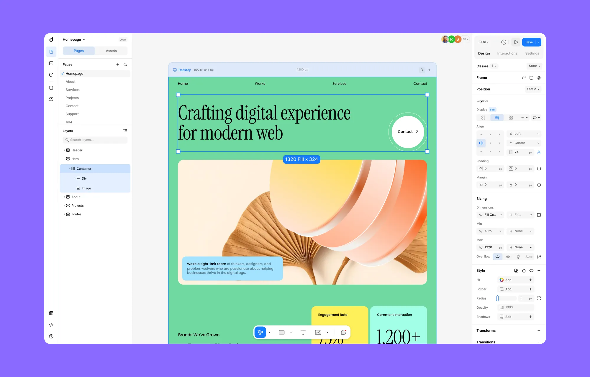
Instead of working inside a fixed space, Droip is moving to an infinite canvas, a seemingly limitless canvas where you can build your website without feeling boxed in.
You can smoothly zoom in to get an overview and zoom out to work on details, move freely across your layout, and focus entirely on your work without constantly switching modes.
Things like padding, spacing, radius, and grid layouts can now be adjusted directly on the canvas, visually, with improved drag & drop controls.
All Responsive Views, Side by Side
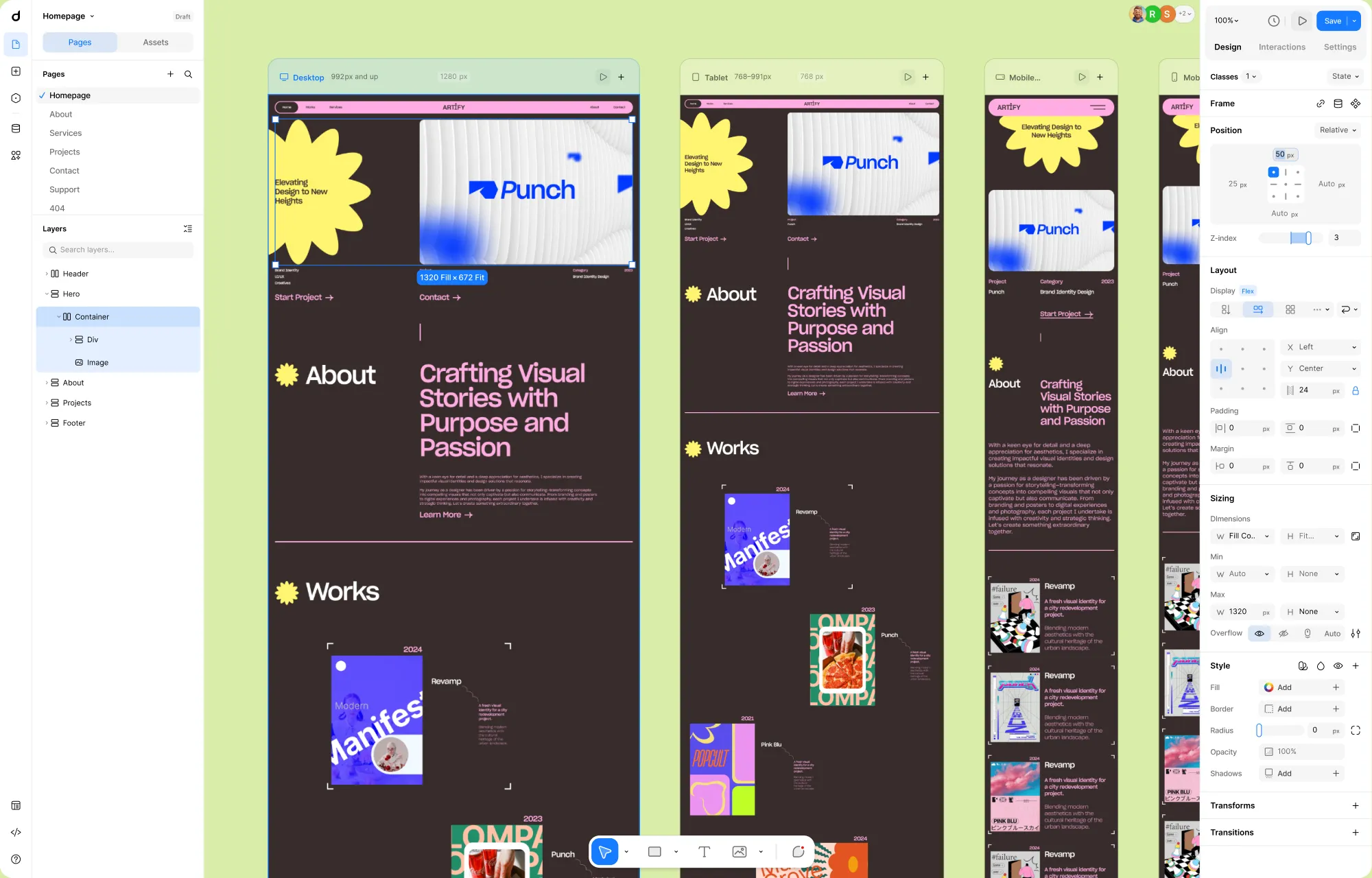
One of the biggest shifts is that all responsive layouts now live on the canvas at the same time.
Instead of switching between desktop, tablet, and mobile modes, you can see every breakpoint side by side on the canvas.
You can compare layouts instantly, spot inconsistencies, and fine-tune responsiveness as part of your creative flow, not as a separate step at the end.
Element Island: Fewer Elements, Same Power
We replaced the old, bulky elements panel with Element Island, a lightweight creation layer that stays at the bottom of the canvas, where your attention already is. This will let you access the Elements and the Layers panel in parallel while creating layouts, drastically reducing the constant back-and-forth movement in sidebars.
The old editor had more than 30 elements. For many users, choosing where to start was harder than building itself.
We’ve reduced this to just five core elements – with the same capabilities as before, but simple enough that you don’t need to understand the entire system before creating your first layout.
A Cleaner, More Guided Interface
A major pain point in the previous editor was navigation.
We had Pages, Layers, and Symbols all living in different places. For complex projects, this added a lot of unnecessary mental load.
In the new interface, we’ve introduced a much clearer and more predictable structure.
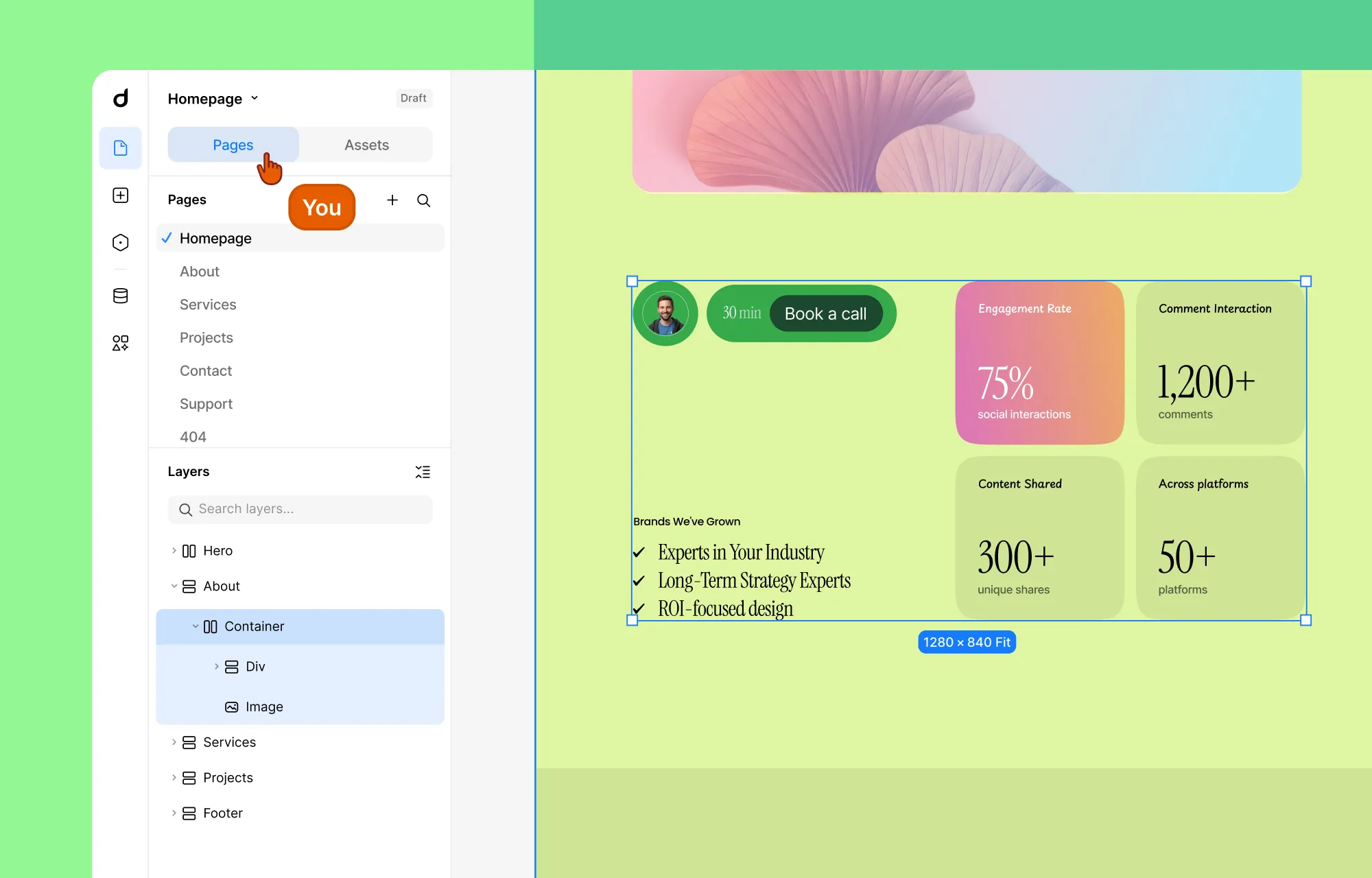
Pages and Layers now live together in a single panel called Pages. This panel is always open by default and acts as your main navigation hub inside Droip.
Symbols are now Components and live under Assets, as a tab inside the Pages panel. This gives you instant access to reusable elements without breaking your flow or opening yet another section of the UI.
Most importantly, Pages becomes the “home base” of the editor. If you open other panels like Variables, Dynamic Content, or Apps, pressing Escape will always bring you straight back to the Pages panel.
The result is an experience where you don’t feel lost or stuck inside the interface anymore.
A Better Way to Build Interactions
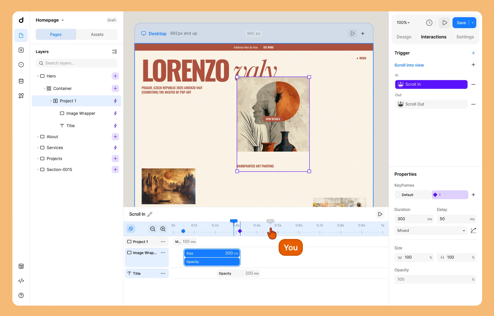
We also redesigned the entire interaction system around clarity, control, and visual feedback.
All interaction properties now live separately inside the Interaction tab on the right panel. The interaction timeline itself has been significantly upgraded. You can now:
- Apply bulk actions across multiple timeline items
- Group multiple items and control their Duration, Delay, and Curve as a single unit
- Use a playhead to scrub through the sequence, previewing any specific moment in time
- Add target elements more intuitively, with a customized layer panel that lets you select target layers visually.
What This Means for Your Existing Projects
This is probably the question on your mind right now.
No, your existing projects won’t suddenly break. The core capabilities of Droip remain intact. What’s changing is how you access and use them.
Some workflows will feel different. Certain panels are gone. Some features live in new places. But the intention isn’t to force you to relearn everything; it’s to remove the friction that made things harder than they needed to be.
Launching a Free Version on WordPress
Alongside the new editor, we’re also preparing something many of you have asked for: a free version of Droip.
Soon, anyone will be able to explore Droip’s core capabilities without restrictions. We’re planning to bring Droip to the WordPress plugin repository, making it easier than ever to discover and try.
Rest assured, the free version will be genuinely useful and powerful enough to build real websites. And when you start using Droip regularly, upgrading to Pro will feel like a natural next step, not a barrier.
Exploring a Rebranding for Droip
There’s one more thing we want to be open about. We’re currently exploring a possible rebrand for Droip.
As Droip has grown, we’ve started to run into a very real problem. We have been trying for three years to rank on search engines, but because the word “Droip” is constantly autocorrected to “Drop,” we have suffered a lot in terms of visibility. From a discoverability standpoint, it has been an uphill battle for people to find the product even when they’re actively looking for it.
Search visibility plays a huge role in whether a product can grow sustainably. At the same time, with the direction we’re heading and the capabilities we’re building, we need an identity that’s easier to find and more reflective of what the product can actually do.
The rebrand will be about aligning the name, the story, and the product for the next phase of our journey.
A Bold Future Awaits
Phew – that’s a lot of changes.
We know that reading about a new UI isn’t nearly as exciting as actually clicking through it. When the update goes live (expected by the end of February), the “why” behind these changes will become clear the moment you touch the canvas. We’re also aiming to roll out the free version and rebranding soon after that.
Our goal is to make building for the web feel like a flow state, not a struggle. Whether you’re a pro or a first-timer, you should be able to create something meaningful in five minutes with Droip.
That’s the future we’re building toward, and this next chapter is our commitment to that belief.